Typography
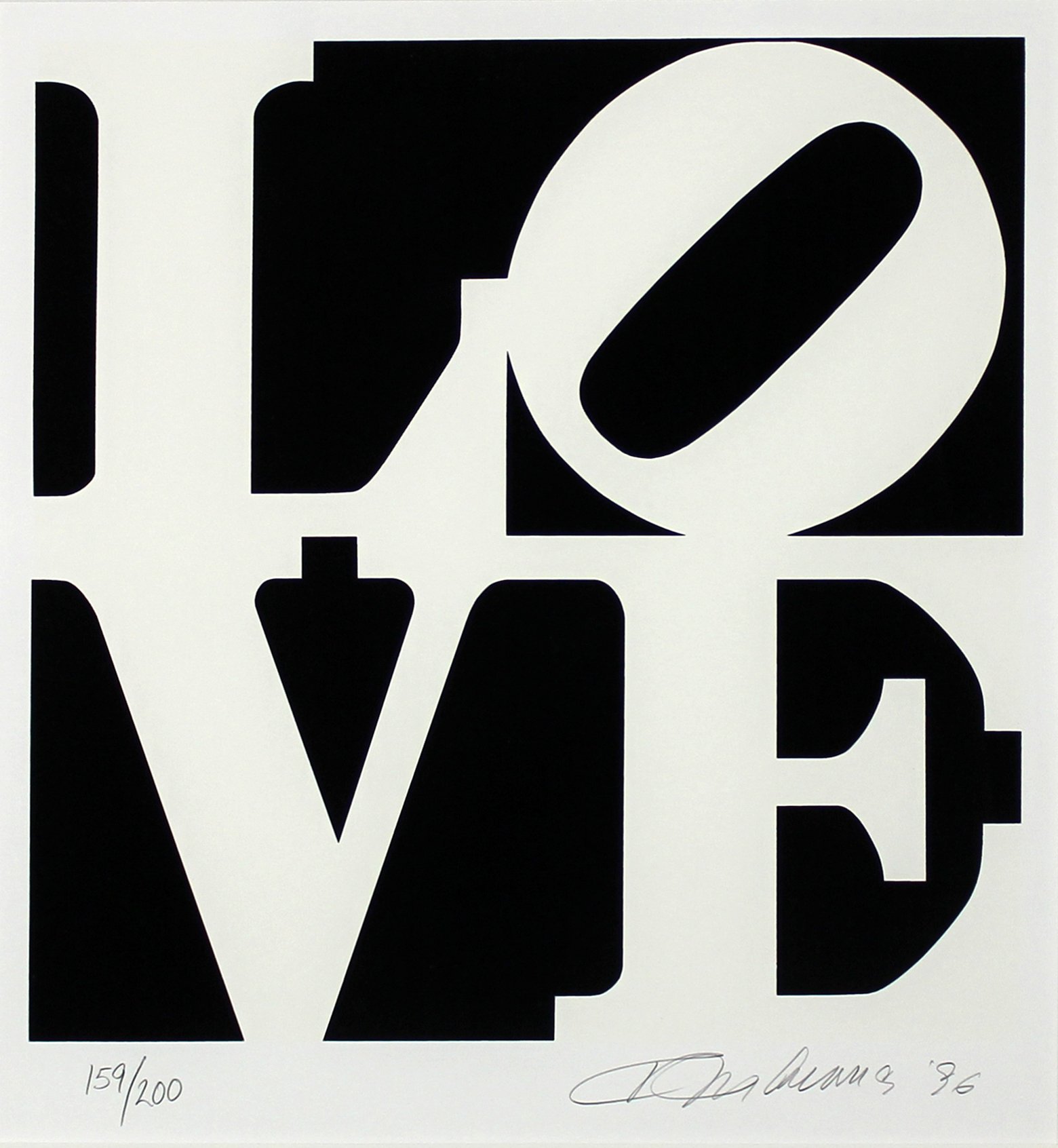
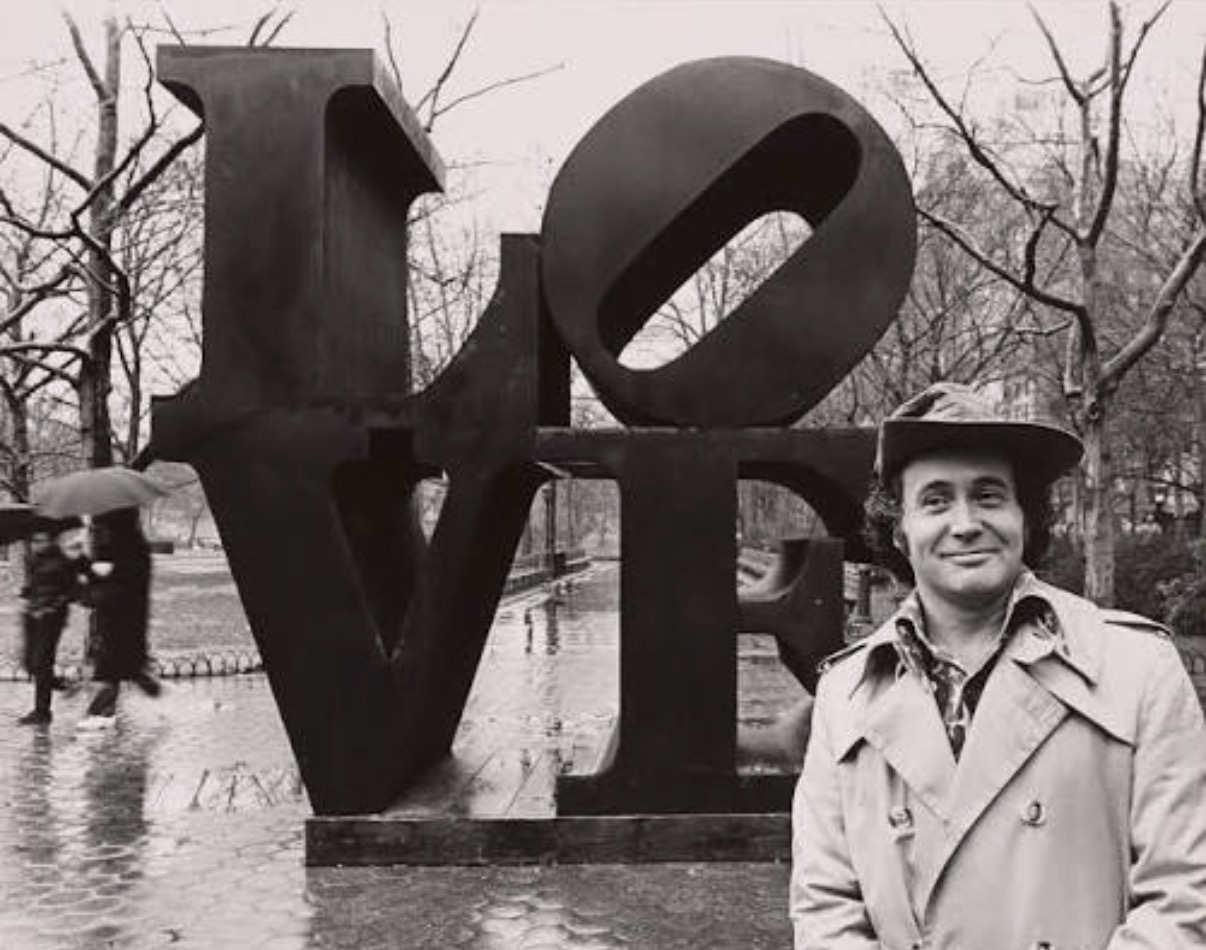
Robert Indiana
Love, Black and White from The Book Of Love, 1996
When Words on a Wall Become Everything
There is something almost primal about being stopped by a word. Not a word in a book, not a word on a screen, but a word rendered in paint or ink or neon, given scale and weight and intention, hung on a wall and asked to carry meaning in a way that language rarely gets to do in everyday life. This is what draws collectors to text based art, and once it gets you, it rarely lets go. Living with a work that uses language is a fundamentally different experience from living with a landscape or an abstract canvas.
The work talks back. It shifts depending on your mood, the hour, what happened at dinner. That mutability is not a weakness. It is the whole point.
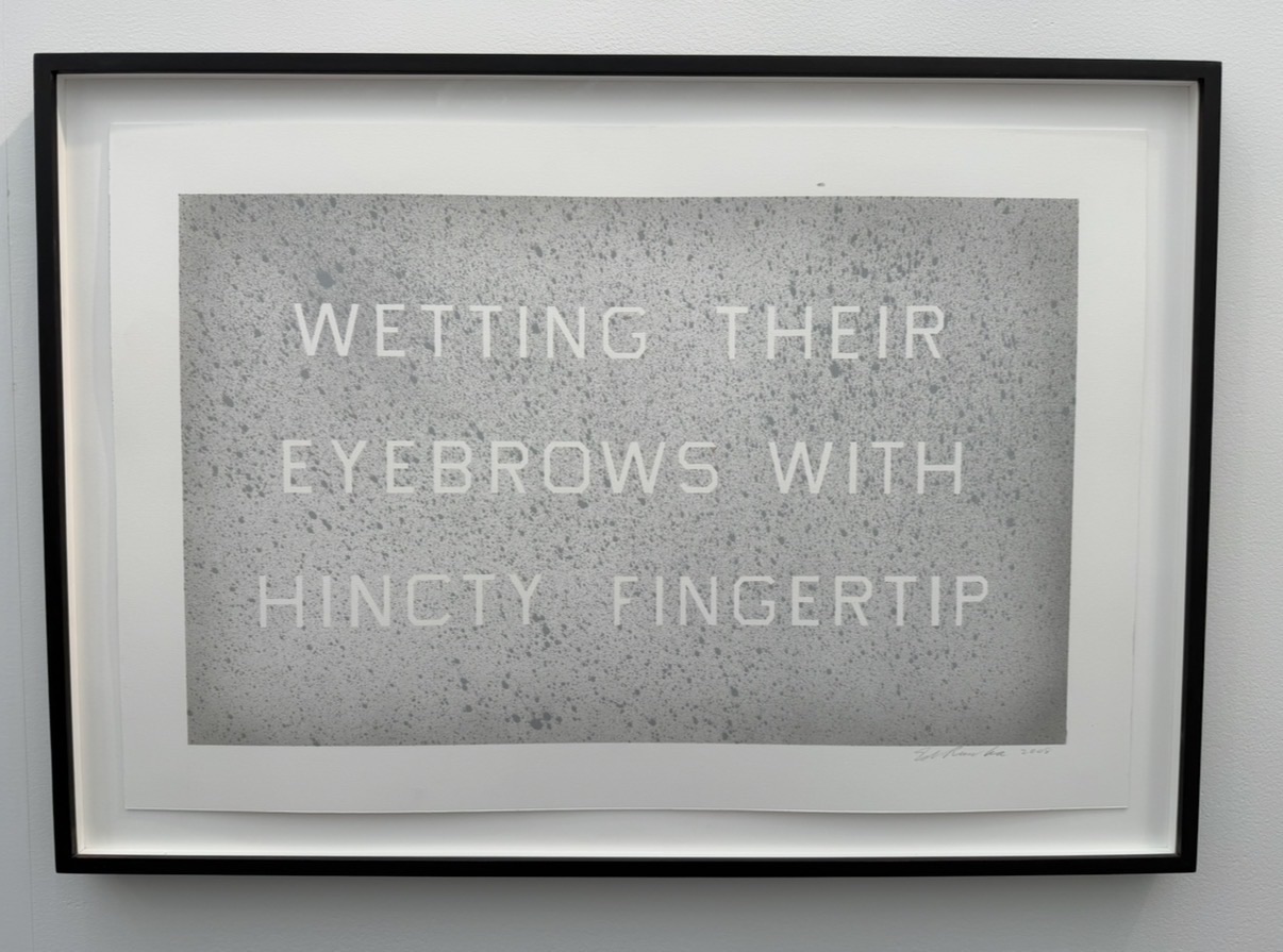
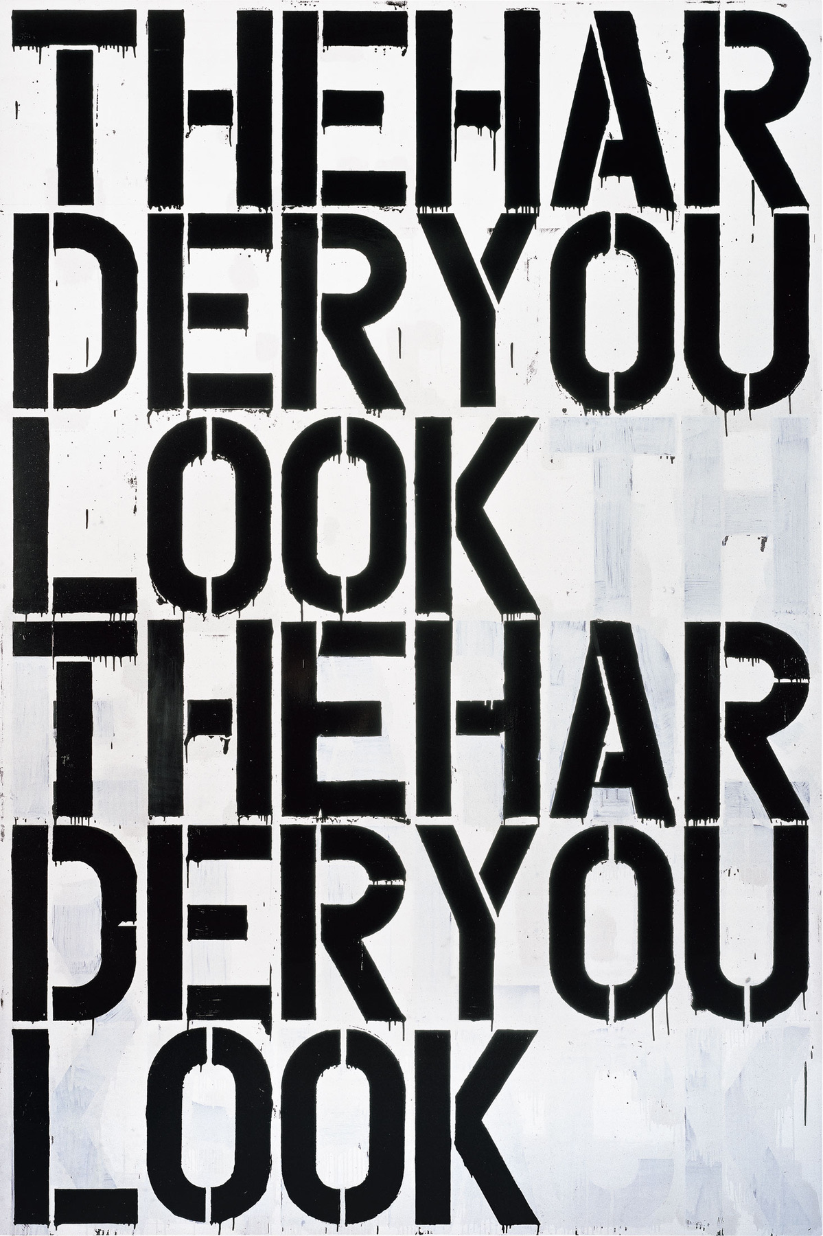
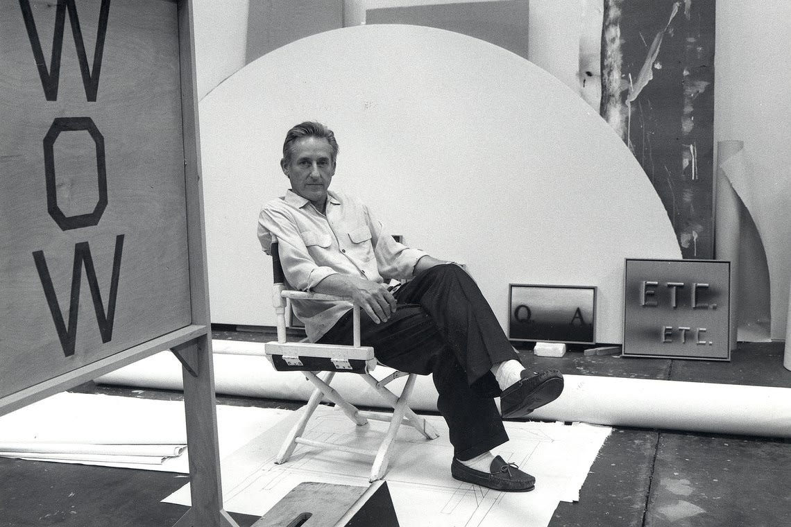
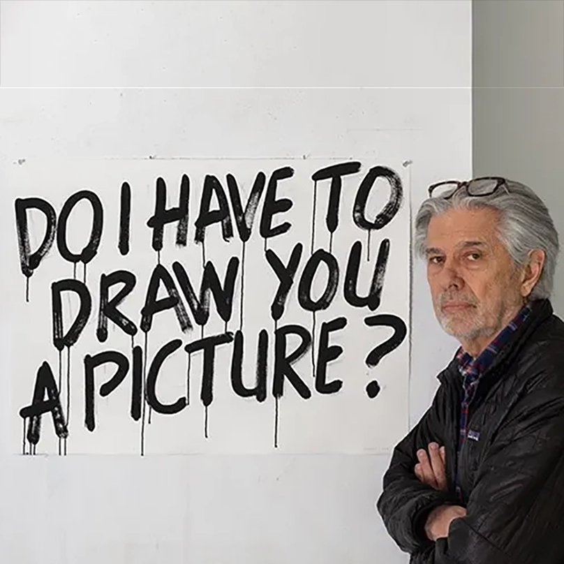
Ed Ruscha
Hincty, 2008
The pull is also deeply personal in a way that other categories can struggle to match. A collector who spent thirty years in advertising might respond to Barbara Kruger's appropriation of commercial graphic language with a recognition that goes beyond aesthetic pleasure into something closer to confrontation. A collector who grew up in the American Midwest might find Ed Ruscha's deadpan presentation of words like NOISE or BOSS or LIARS to be both intimate and hilarious, familiar and strange all at once. The best text based works create this productive friction between what you know and what you feel, and that friction tends to deepen rather than fade over years of living with a piece.
Knowing what separates a good work from a great one in this area requires understanding that the relationship between word and image, or word and material, is where the real intelligence lives. A great work does not simply transfer a message. It complicates one. Mel Bochner's thesaurus paintings, in which he clusters synonyms for words like BLAH or NOTHING in bold sans serif lettering, are not just funny, though they are funny.
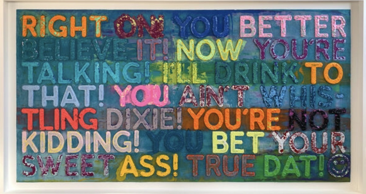
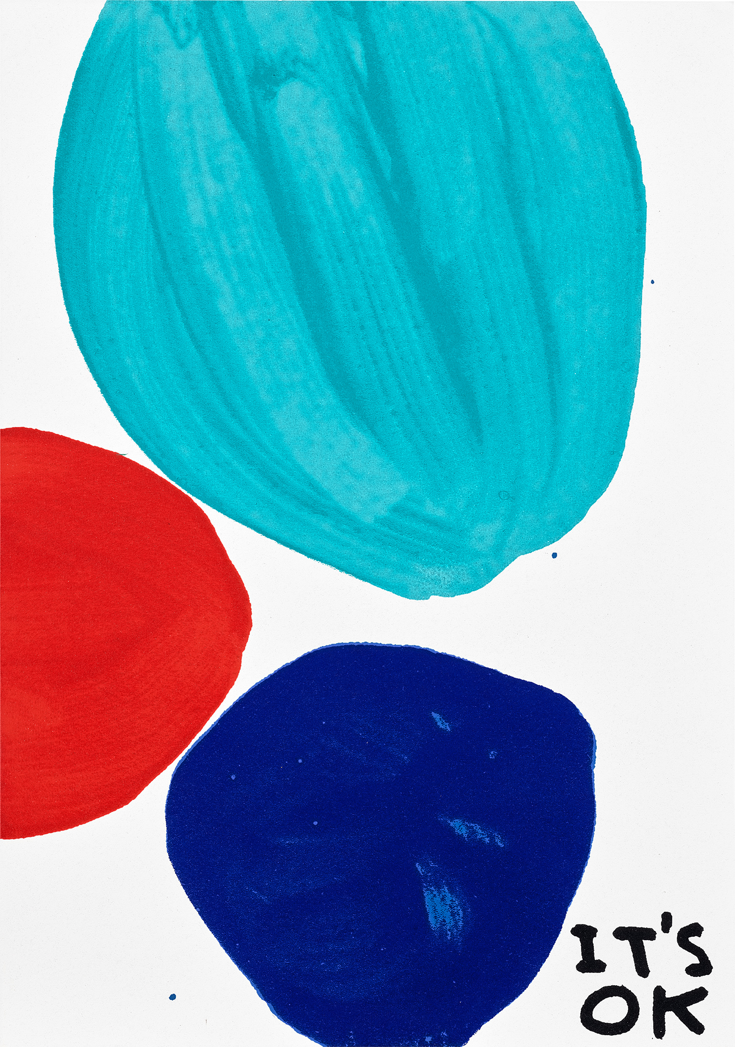
Mel Bochner
Right On, 2023
They are genuinely philosophical, asking what language is for when words drain of meaning through sheer accumulation. Similarly, Jenny Holzer's truisms gain their power not from any single statement but from the formal delivery, the bronze plaques, the LED boards, the stone benches, that turns pronouncements into monuments and makes you question whether you agree with what you are reading. Collectors should ask themselves whether the work would survive the removal of the text. If the answer is yes, the text is probably decoration.
If the answer is no, you are likely looking at something genuinely resolved. In terms of artists who represent the strongest position in a collection, Ed Ruscha remains the anchor of this entire conversation. His large scale word paintings from the 1960s onward established a visual grammar that almost every subsequent artist working in this mode has had to reckon with. His works on The Collection represent that range well, from print editions to unique paintings, and the breadth of his output means there are still entry points at various price levels for the committed collector.
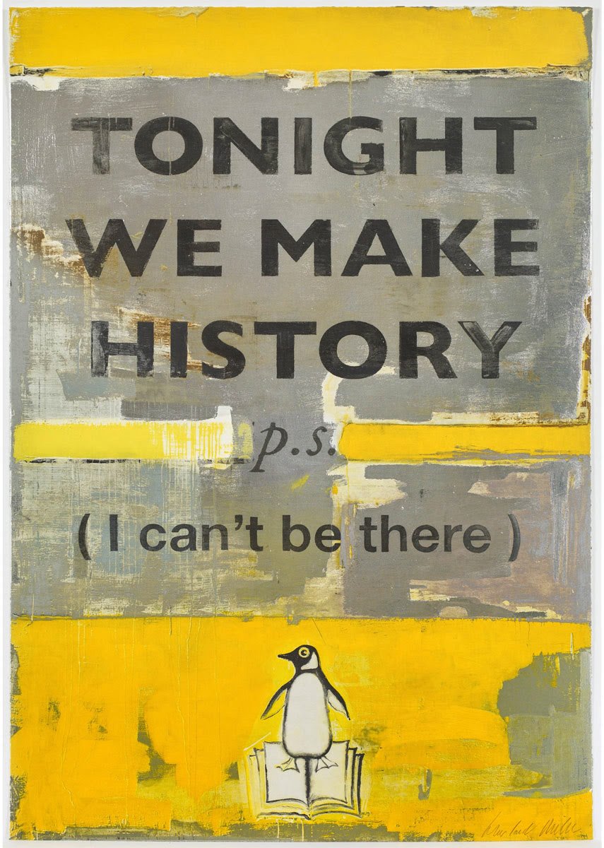
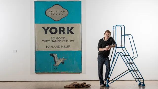
Harland Miller
Tonight We Make History, P.s. I Can't Be There (Small), 2018
Robert Indiana carries enormous cultural weight, and while LOVE remains the image most people know, his number paintings and word based works from the early 1960s are where the real art historical interest lies. Harland Miller brings a distinctly literary sensibility to the tradition, his large paintings riffing on Penguin paperback cover design to create works that are equal parts elegy and comedy. The fact that his reputation continues to grow in both Europe and North America suggests his market has not yet reached its ceiling. Christopher Wool occupies a different register entirely.
His black enamel word paintings, beginning seriously in the late 1980s, have a rawness and physical urgency that sits uncomfortably between graffiti and modernist painting, which is precisely where they need to sit. Auction results for major Wool word paintings have been exceptional and consistent, with primary works from that period now largely out of reach for most collectors, though works on paper and prints still offer genuine access. Kay Rosen is an artist whose reputation among curators and other artists has long outpaced her commercial visibility, and that gap is beginning to close. Her work strips language down to its structural bones, playing with letters and spacing and size in ways that produce meaning through form rather than content.
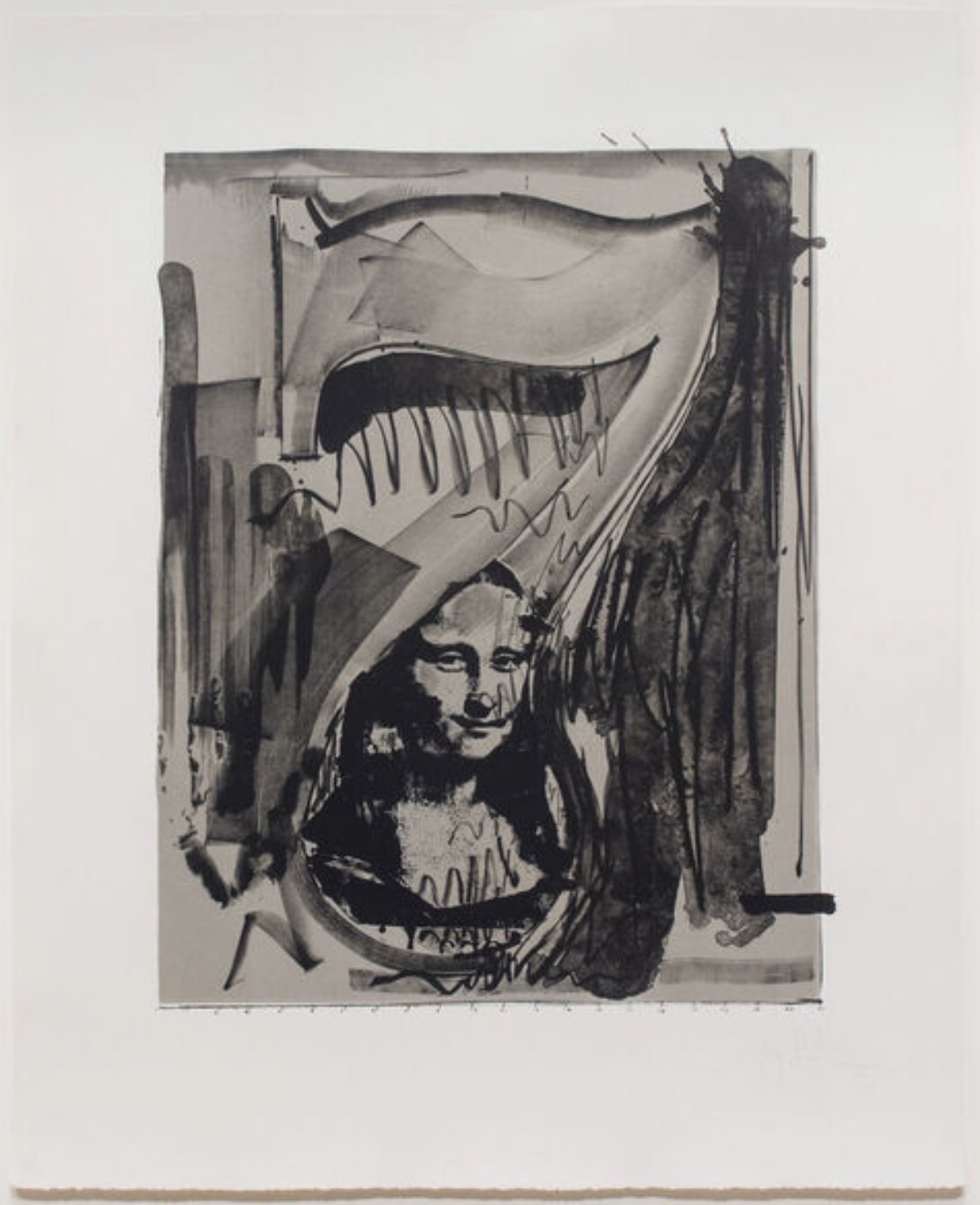
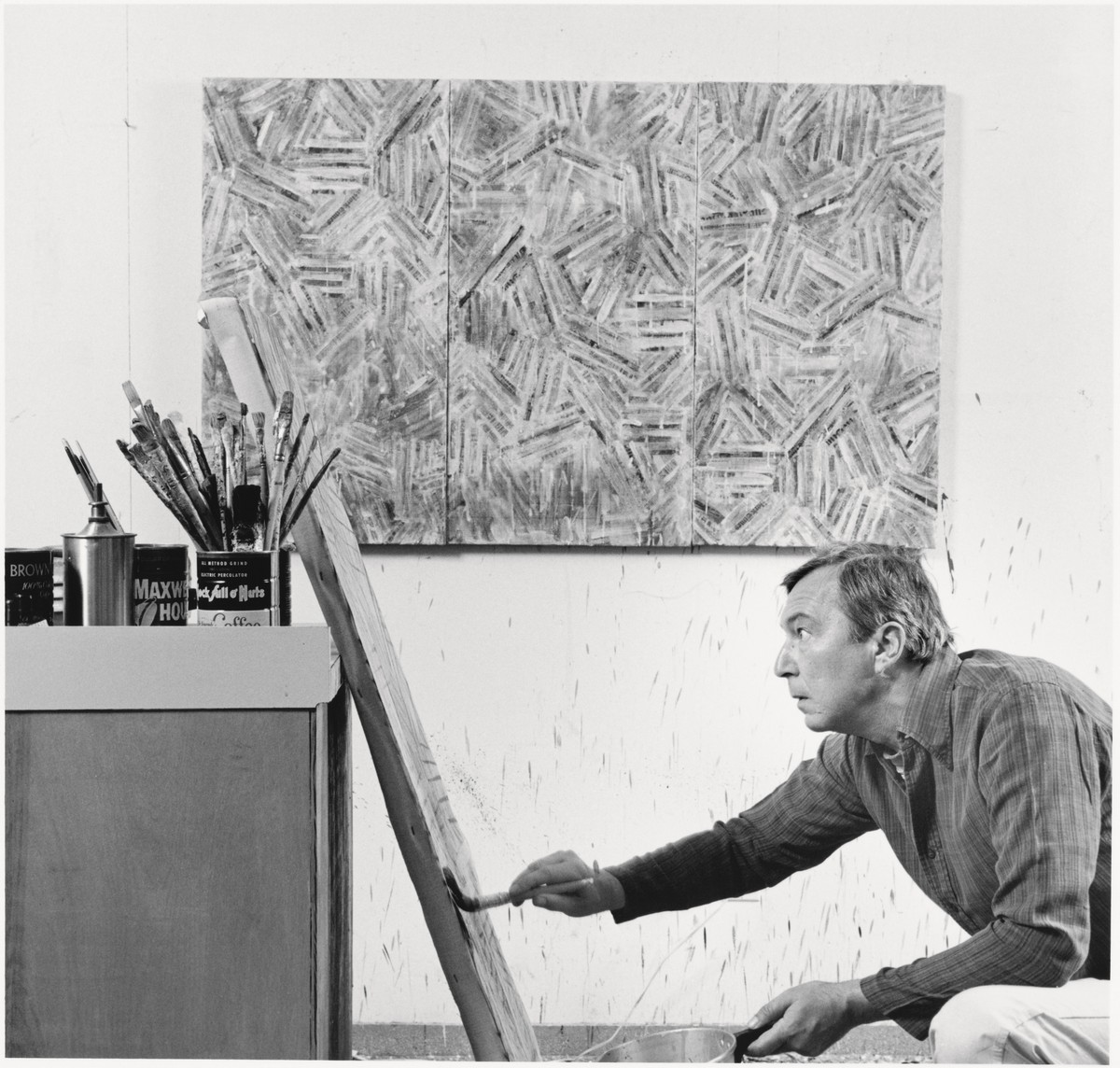
Jasper Johns
Figure 7, from the Black Numerals series, 1968
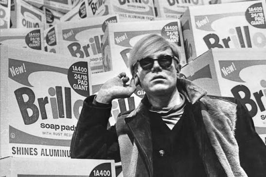
For collectors willing to do the research, she represents exactly the kind of opportunity that feels obvious in retrospect. On the question of auction performance, text based art has proven remarkably resilient across market cycles. Works by artists like Jasper Johns, whose flag and target works incorporate stenciled letters and numbers as fundamental elements of the composition, tend to hold value with a consistency that reflects both institutional support and genuine collector demand. The secondary market for Warhol works incorporating text, the Campbell's soup labels, the dollar sign paintings, the Death and Disaster series with its tabloid typography, has been robust for decades, with even modest print editions trading well above estimate in strong sale seasons.
The caution worth noting is that mid career works by artists who are still producing can be volatile. Auction results for living artists in this category are sometimes driven by single collector relationships, and when those collections come to market all at once, price anomalies can appear in either direction. Practically speaking, condition is everything with text based work in a way that differs from other categories. In an abstract painting, a small area of inpainting can be acceptable.
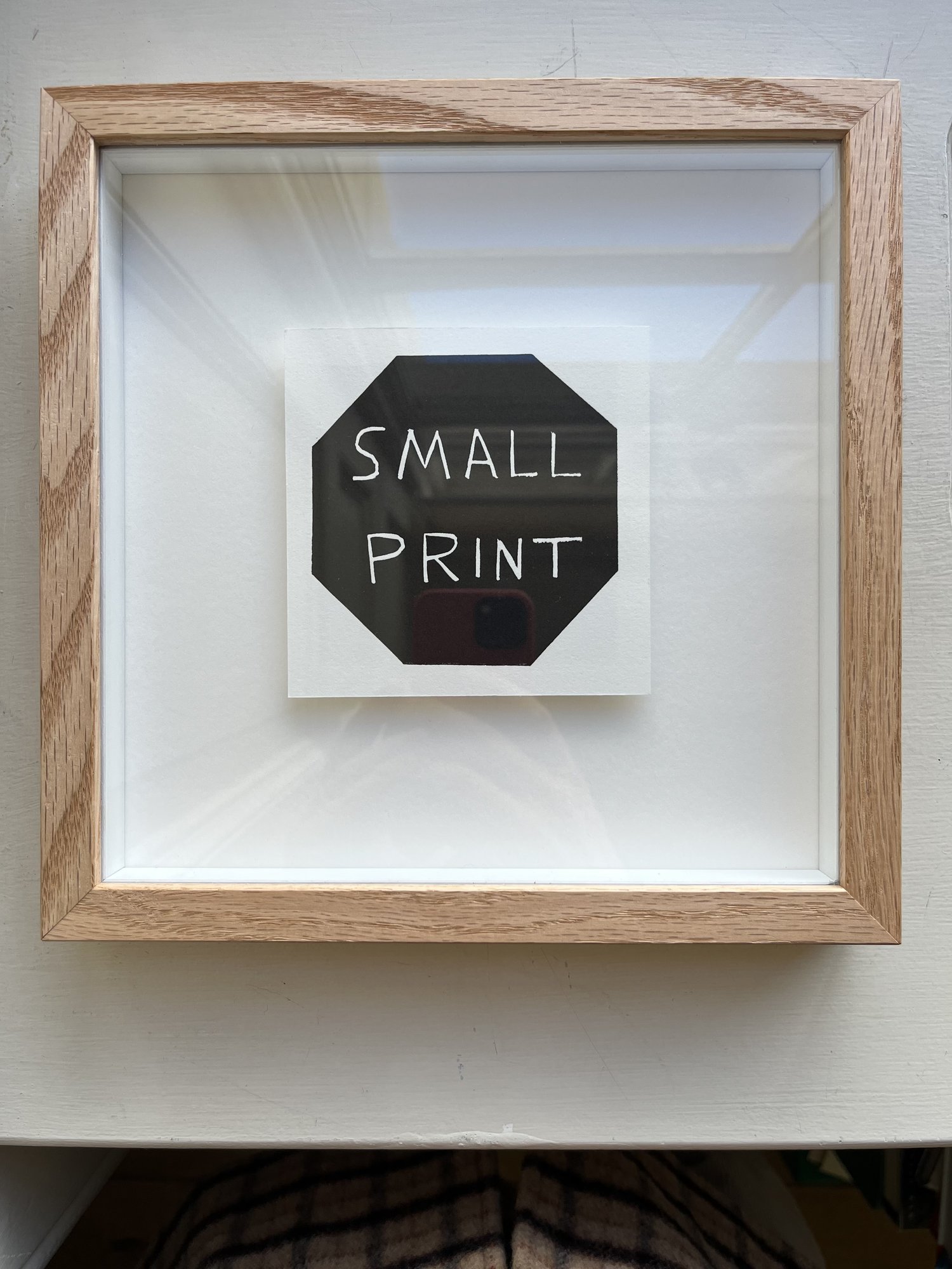
In a work where every letter carries structural weight, any loss of surface integrity in a key area compromises the meaning. Always request a full condition report and ask specifically whether the work has been cleaned, lined, or restored. For print editions, understand the full edition size and ask where in the edition the work sits, since lower numbers do not always indicate earlier printing but matter to some buyers in the secondary market. Works on paper by artists like David Shrigley or Corita Kent require careful attention to light exposure, as fading shifts not just color but legibility, and a word you cannot read is a different work entirely.
When dealing with neon or LED works by artists in the Holzer tradition, ask about the artist's policy on replacement components and whether the work comes with documentation for that process. The best galleries in this space will have clear answers to all of these questions without hesitation.