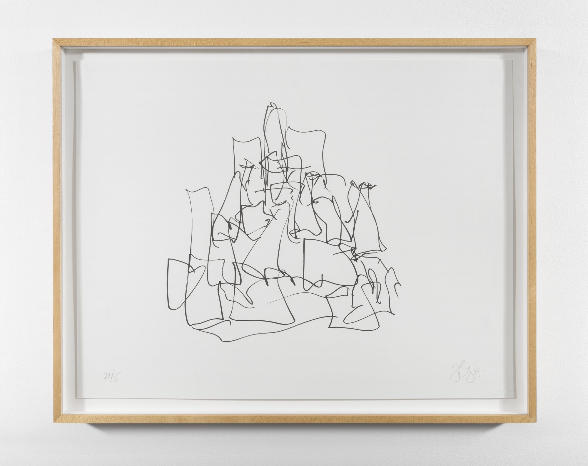
Lithograph
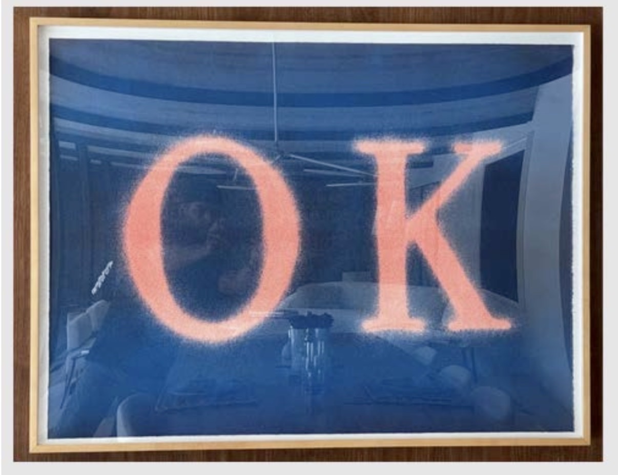
Ed Ruscha
OK (State I), 1990
The Stone Doesn't Lie: Collecting Lithographs Now
There is something quietly seductive about a lithograph that collectors tend to discover rather than seek out. You come for the name on the sheet and stay for the surface, that particular velvet density of ink on paper that no other printmaking process quite replicates. Living with a lithograph is different from living with a painting. It asks less of a room and gives back in subtler ways, a kind of daily conversation rather than a declaration.
Collectors who begin with one rarely stop there. The medium has an intimacy built into its logic. Because lithography works through the chemistry of grease and water on a flat stone or aluminum plate, the artist's mark transfers with unusual directness. A drawn line stays a drawn line.
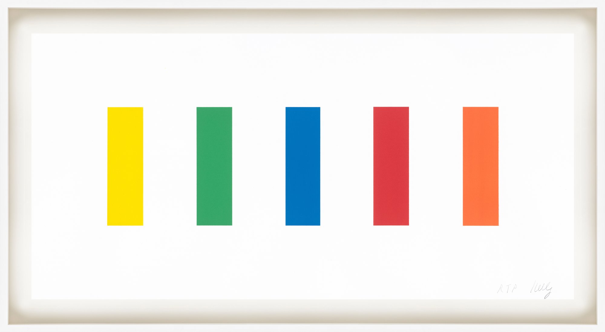
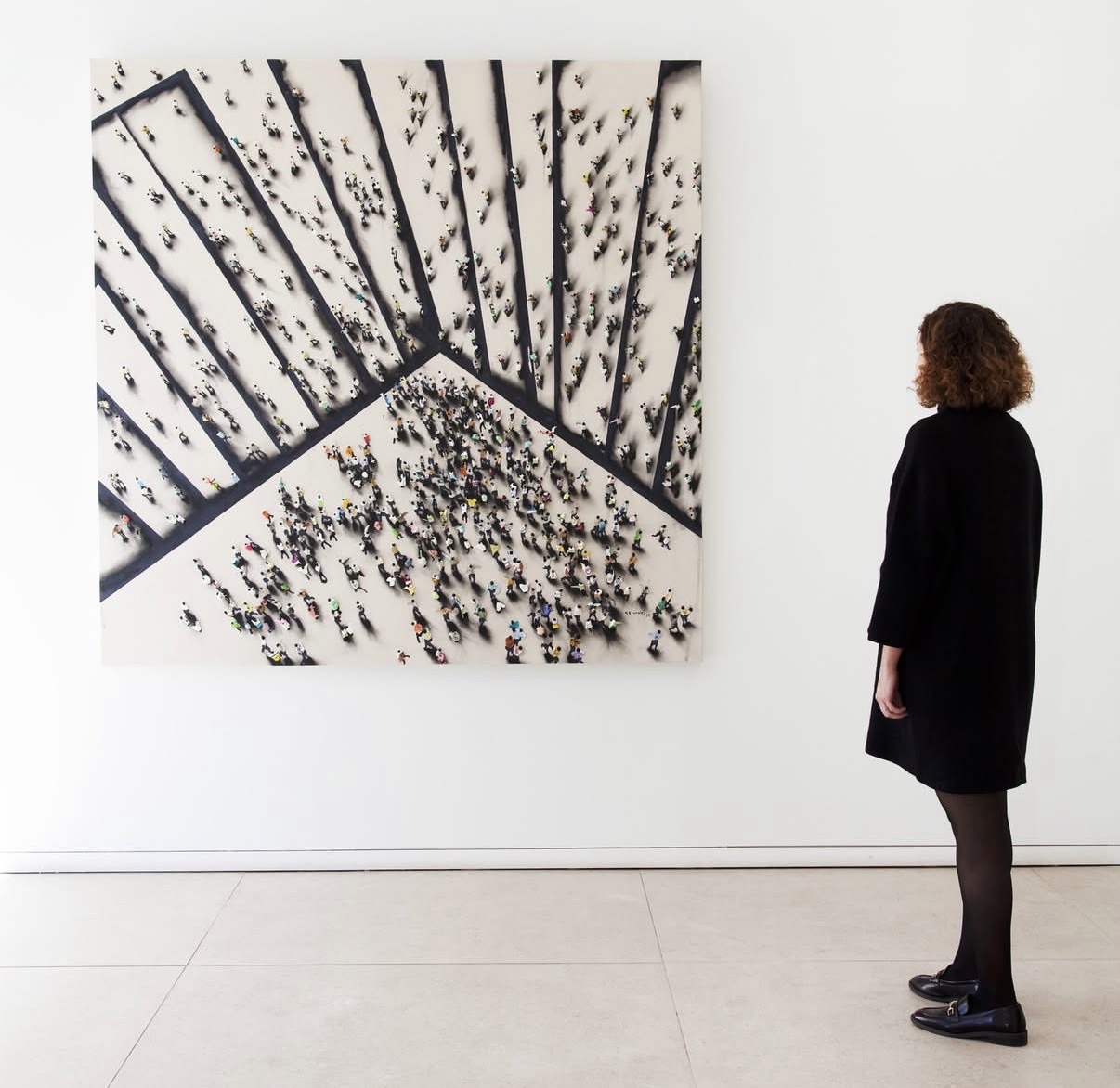
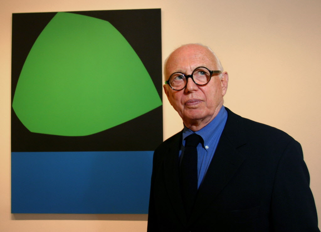
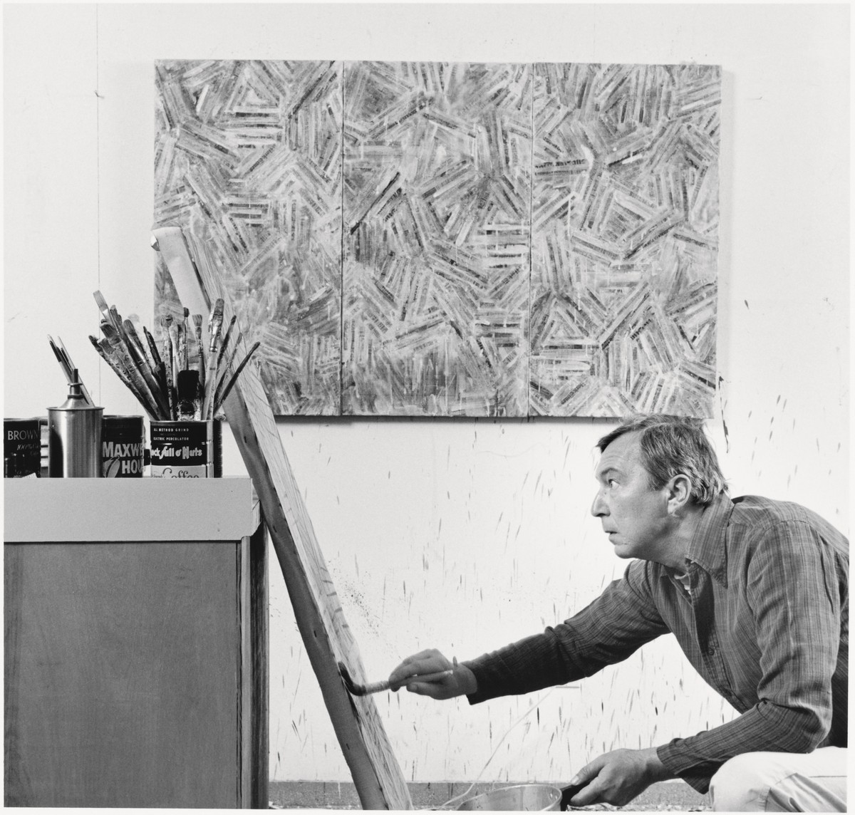
Ellsworth Kelly
Dartmouth, 2011
There is no relief, no incised groove, nothing standing between the gesture and the printed result. This directness is why so many painters turned to lithography not as a commercial sideline but as a genuine extension of their studio practice, a place to think out loud in editions. What separates a good lithograph from a great one is rarely the subject and almost always the print quality. Collectors should train their eyes to look for impression quality first, meaning how early in the edition the print was pulled, before the stone or plate began to show wear.
Early impressions carry more tonal range, richer blacks, and cleaner transitions in color work. The paper matters enormously too. Works printed on quality laid or wove paper, often with watermarks from prestigious French or German mills, hold up across decades in ways that lesser substrates do not. Always ask whether you are looking at a lifetime impression or a posthumous one, the distinction affects both value and authenticity in ways that cannot be overstated.
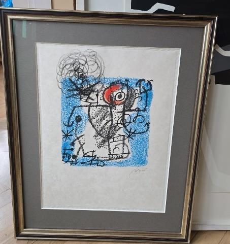
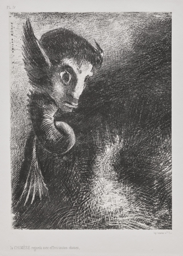
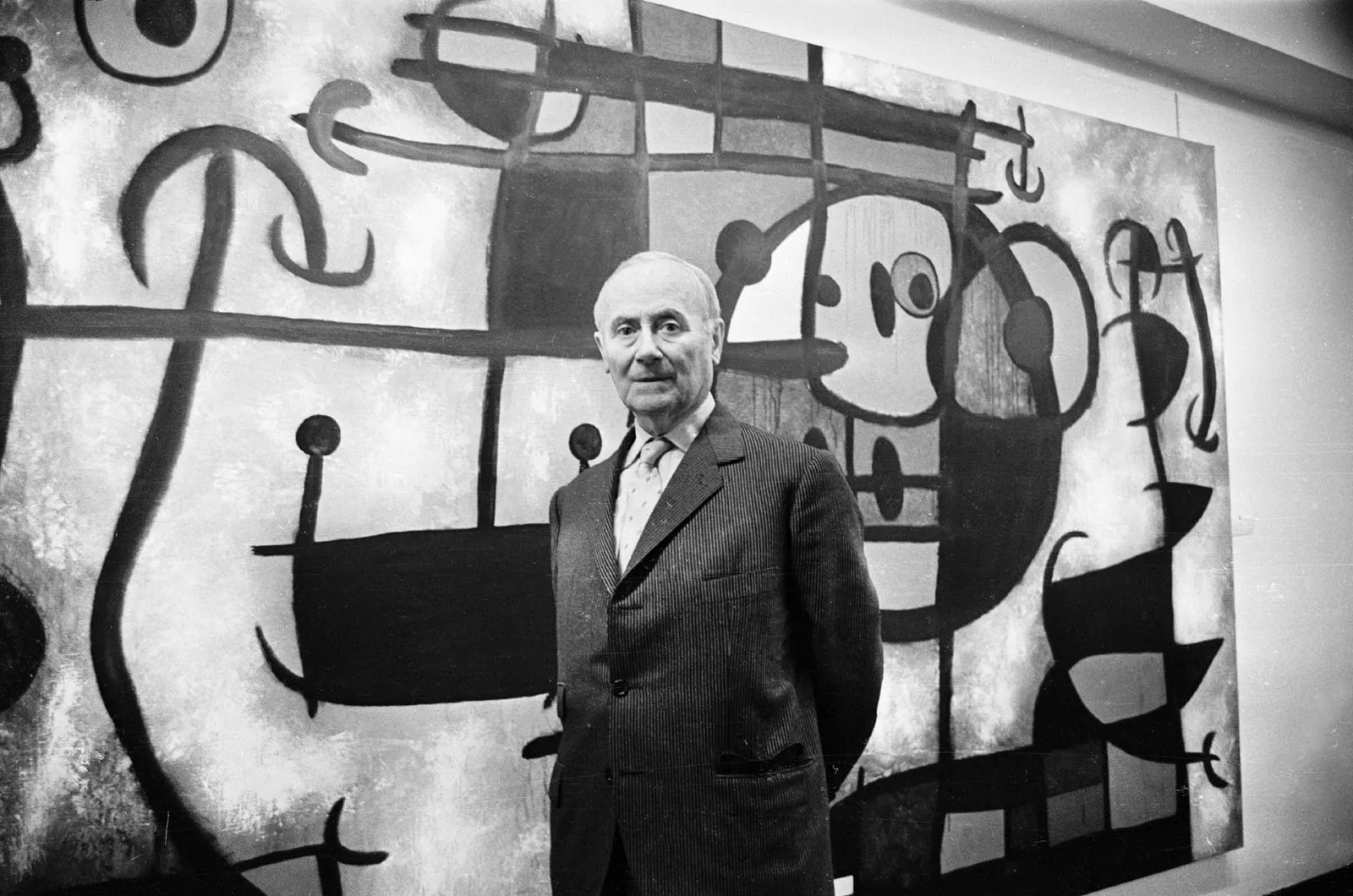
Joan Miró
Las Esencias de la Tierra, 1968
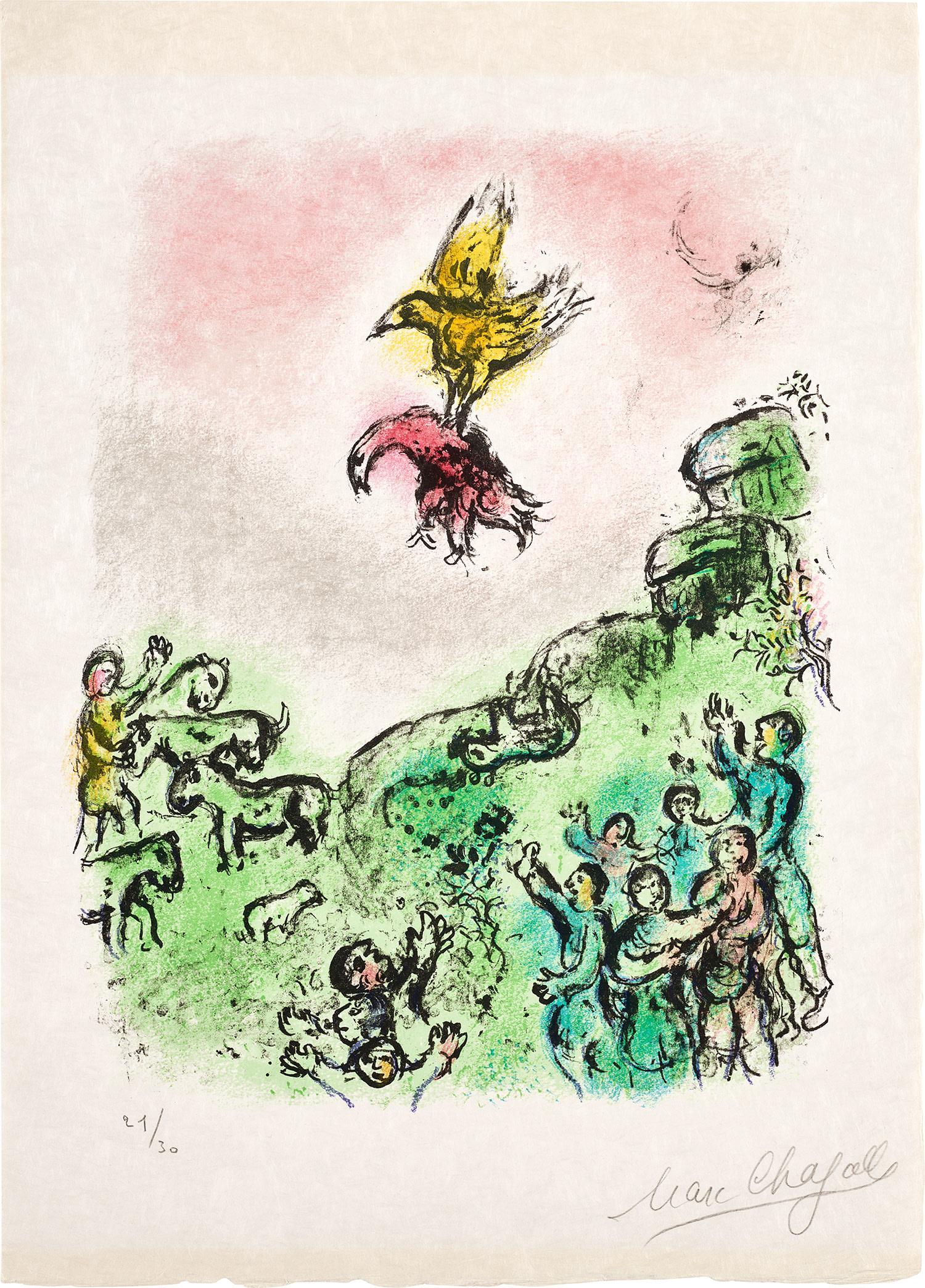
Marc Chagall understood lithography as a world unto itself. His color lithographs, particularly those produced at the Mourlot workshop in Paris through the 1950s and 1960s, show a painter completely at home in the medium, layering translucent color with a confidence that still looks fresh. Fernand Mourlot worked with nearly every significant artist of the twentieth century, and the prints that came out of that collaboration carry a pedigree that the market consistently rewards. Joan Miró brought a similar freedom to the stone, using it to push his biomorphic vocabulary into saturated, joyful territory.
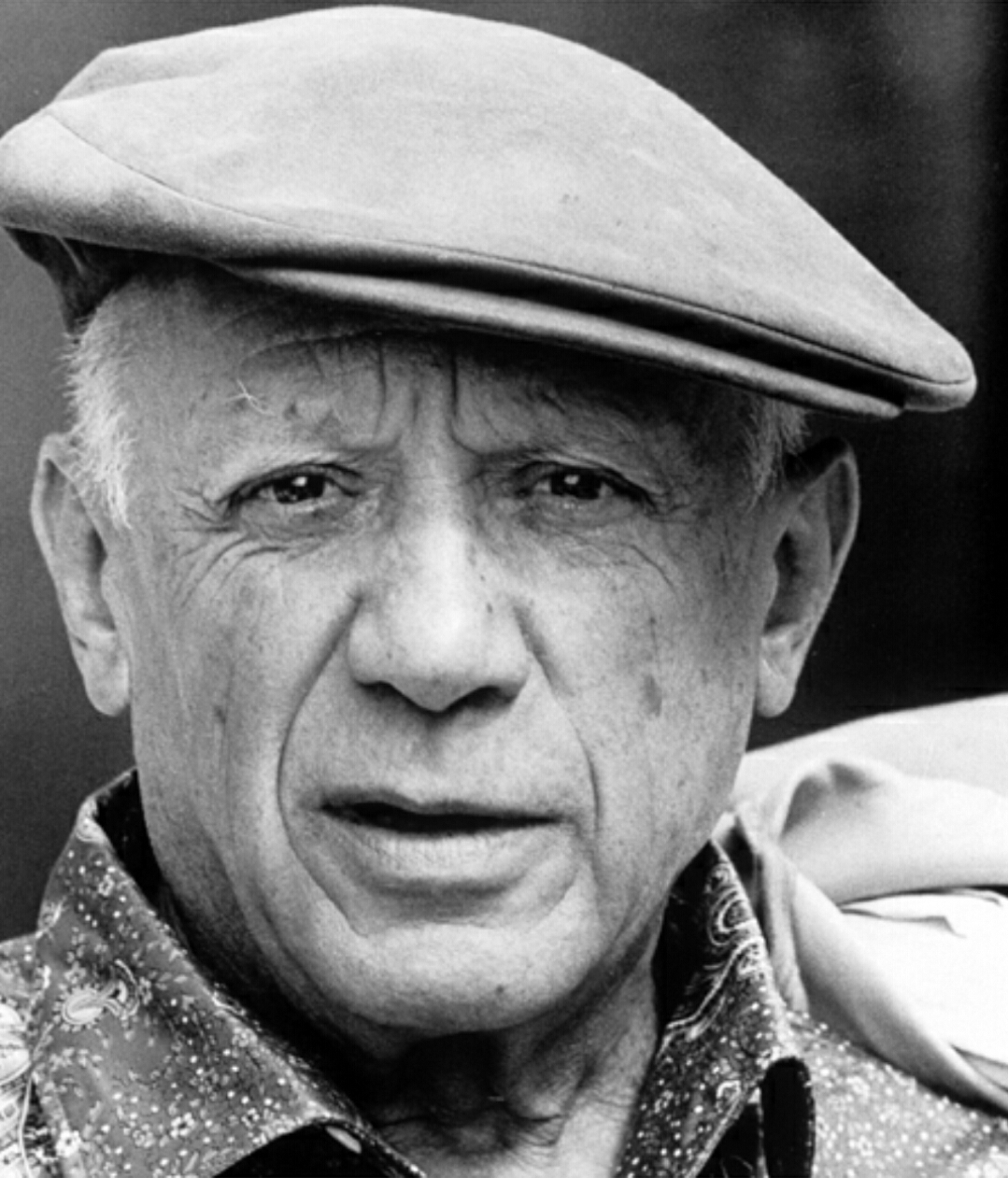
Both artists are well represented on The Collection, and they offer an accessible entry point into work of genuine museum quality. Henri Matisse produced a smaller but exceptional body of lithographs, his line drawings in particular achieving that impossible balance of economy and fullness he spent a lifetime chasing. Pablo Picasso's engagement with lithography was obsessive and technically daring. Between 1945 and 1949 he produced a concentrated series of lithographs at Mourlot that pushed the medium's physical limits, scraping and reworking stones in ways that printmakers considered impossible.
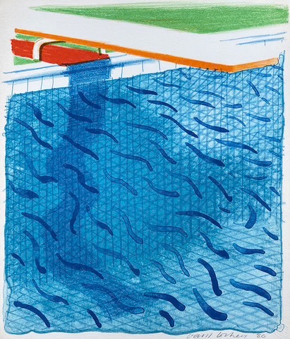
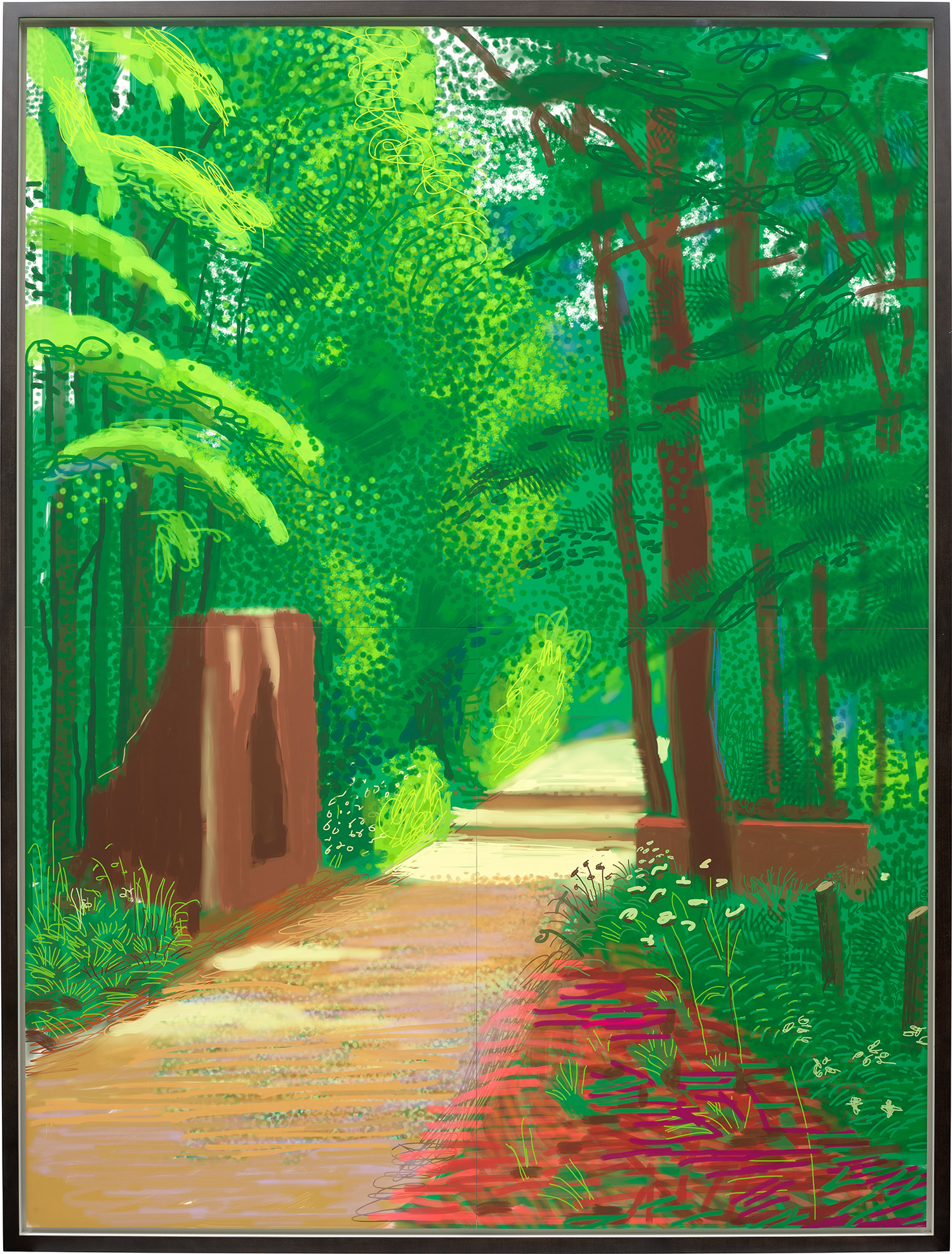
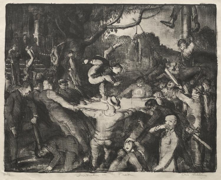
David Hockney
Pool Made with Paper and Blue Ink for Book, 1980
These works command serious prices at auction and deserve their reputation. Henri de Toulouse Lautrec essentially invented the modern color poster through lithography, his works from the 1890s still among the most recognizable images in the history of print. David Hockney returned to lithography repeatedly across his career, and his relationship to the medium reveals a collector's truth: the best artists use it to do something they cannot do anywhere else, not to reproduce but to discover. Among the Pop generation, Roy Lichtenstein and Jasper Johns both produced lithographic work that holds its value with unusual stability.
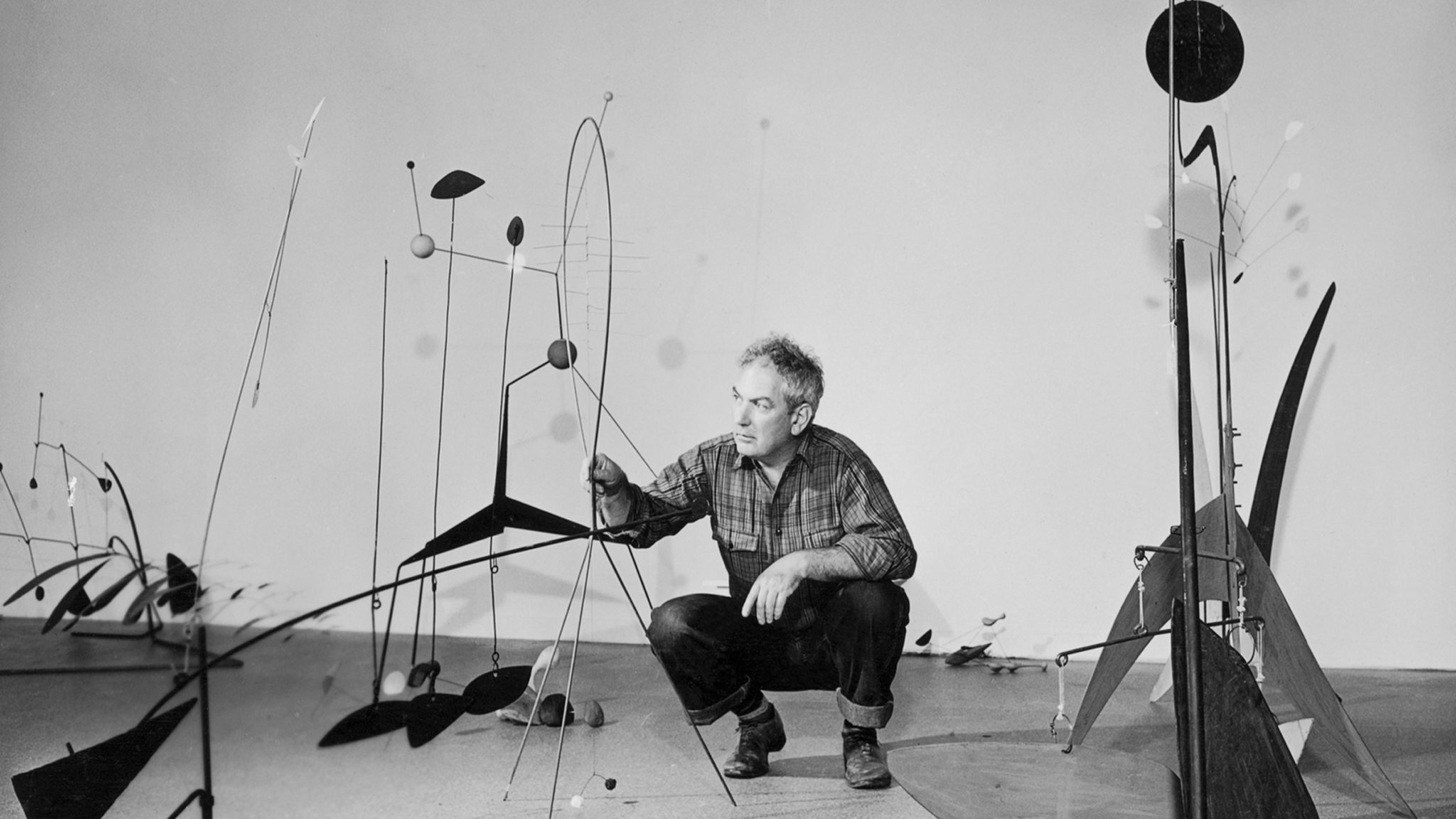
Johns in particular treated the medium with the same philosophical seriousness he brought to painting, and his prints are among the most studied of the postwar period. Ed Ruscha's lithographs occupy a quieter corner of the market that rewards patient collectors. His word based works have the same dry wit as his paintings but at a fraction of the price, and their critical standing has only grown. Robert Motherwell and Frank Stella both used lithography to extend Abstract Expressionist and Minimalist ideas into print, producing editions that sit comfortably in serious collections.
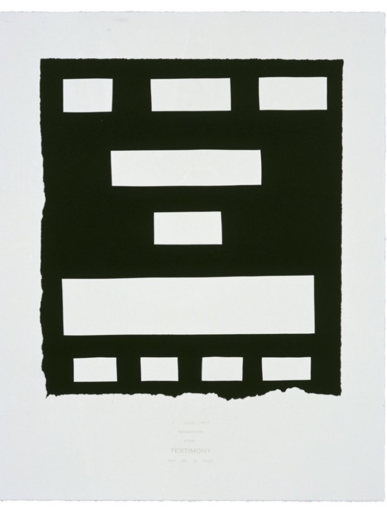
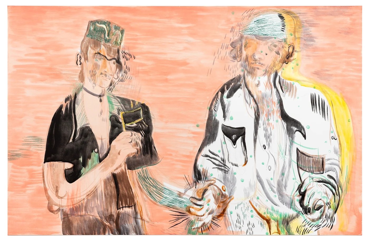
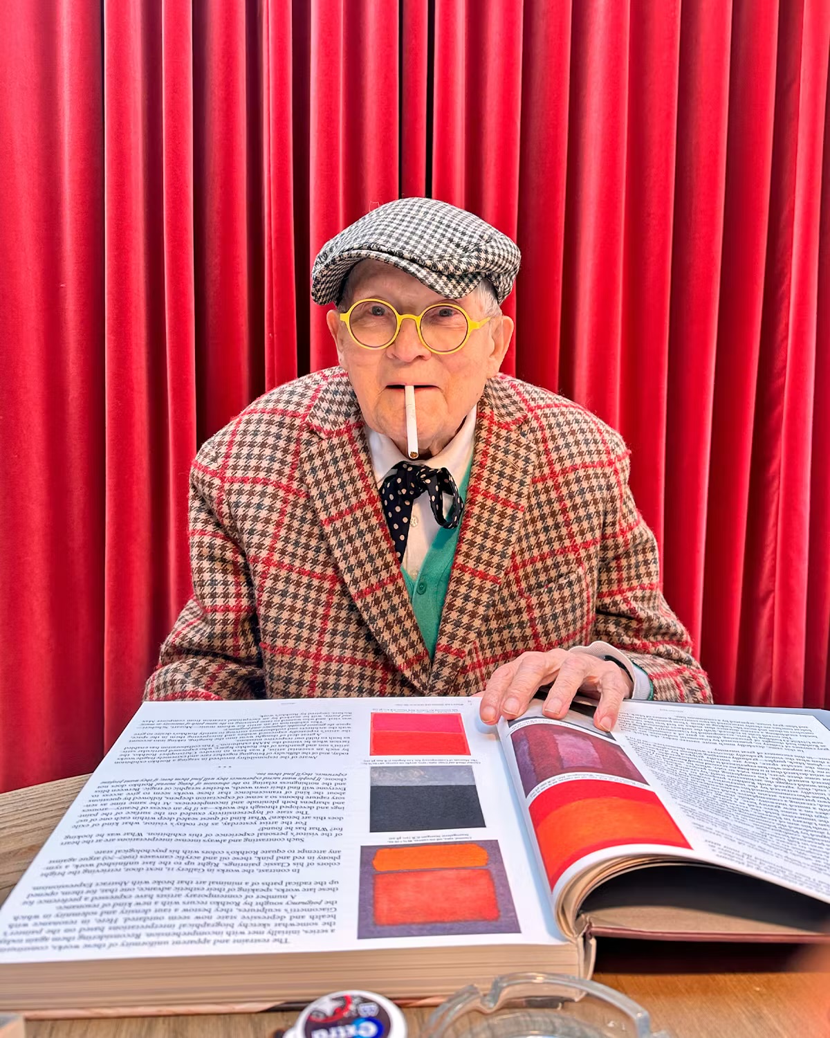
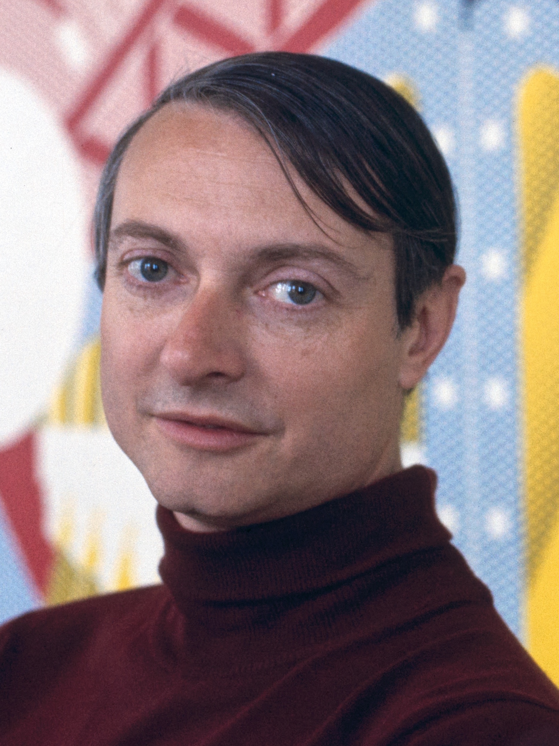
Ed Ruscha
I Have Not Forgotten, 2007
For collectors watching the emerging end of the market, the conversation around lithography has opened up in interesting ways. Younger artists are returning to traditional print workshops not out of nostalgia but because the medium offers something digital tools cannot, a physical resistance that slows the process down and forces decisions. Workshops like Gemini G.E.
L. in Los Angeles and Universal Limited Art Editions in New York have long served as incubators for serious print based work, and their newer collaborations are worth following closely. The secondary market for prints by artists associated with these workshops has historically been stronger than for prints produced outside such structured collaborations, largely because provenance and documentation are cleaner. At auction, lithographs by the canonical figures move with confidence when condition is excellent and provenance is clear.
Works on paper require more due diligence than paintings in one specific regard: condition is everything and recovery is limited. Foxing, toning, mat burns, and old repairs are not dealbreakers but they suppress value significantly and should be reflected in any offer price. When acquiring through a gallery, ask directly whether the work has been examined under UV light, whether it comes with a certificate from the original publisher, and whether it appears in the relevant catalogue raisonné. For artists like Chagall and Miró, the catalogue raisonné is not optional research but essential verification.
Display considerations are straightforward but often neglected. Lithographs should be framed behind UV protective glazing and kept away from direct light, humidity fluctuations, and exterior walls. Archival mounting materials are non negotiable. The prints that survive beautifully in collections fifty years from now are the ones whose first owners treated them with the same care they gave their canvases.
The medium rewards that attention. A great lithograph does not announce itself. It earns its place slowly, and then becomes impossible to imagine the room without.