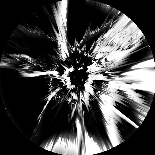
Op Art
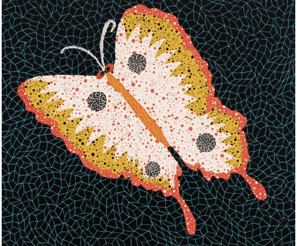
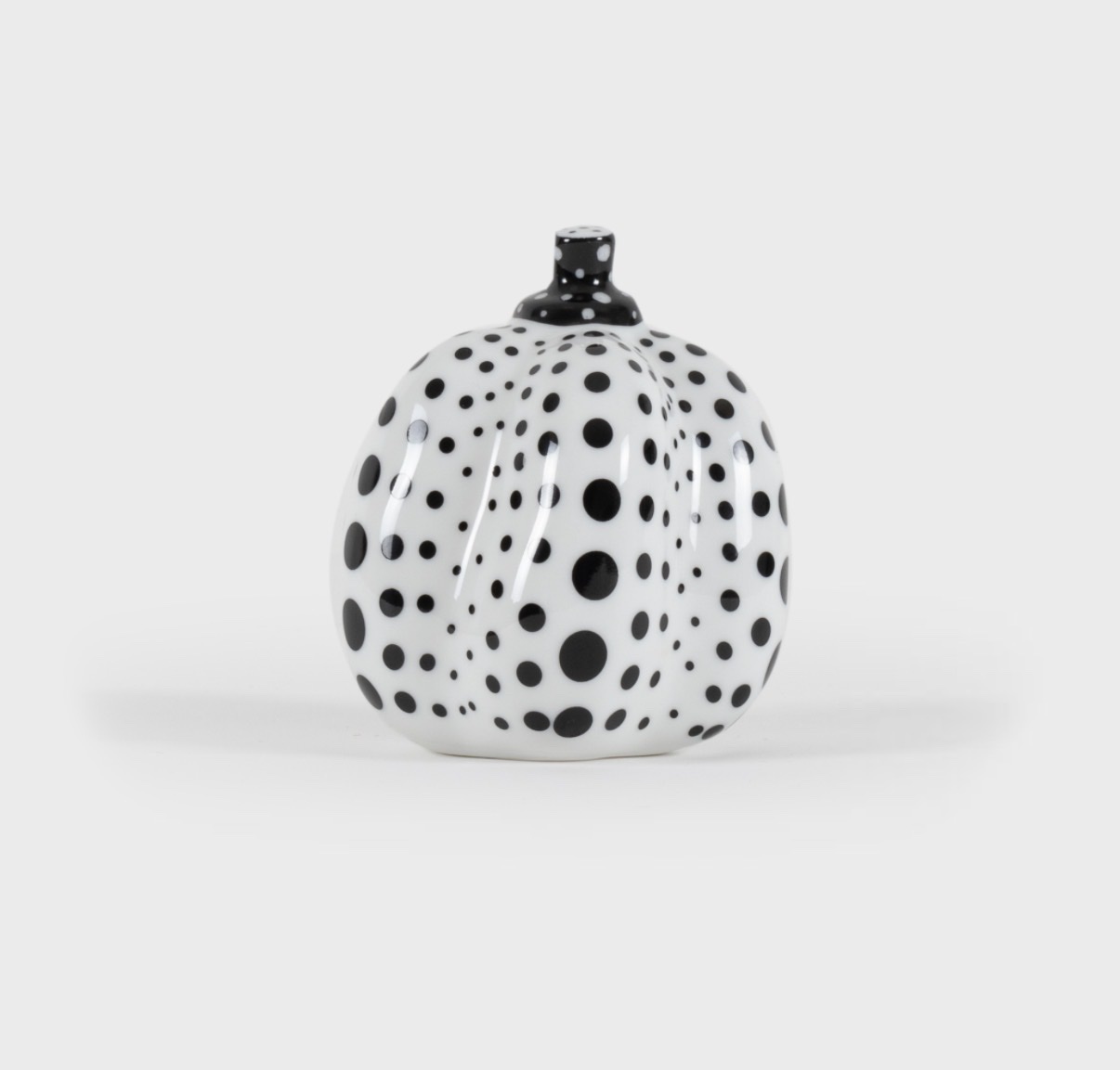
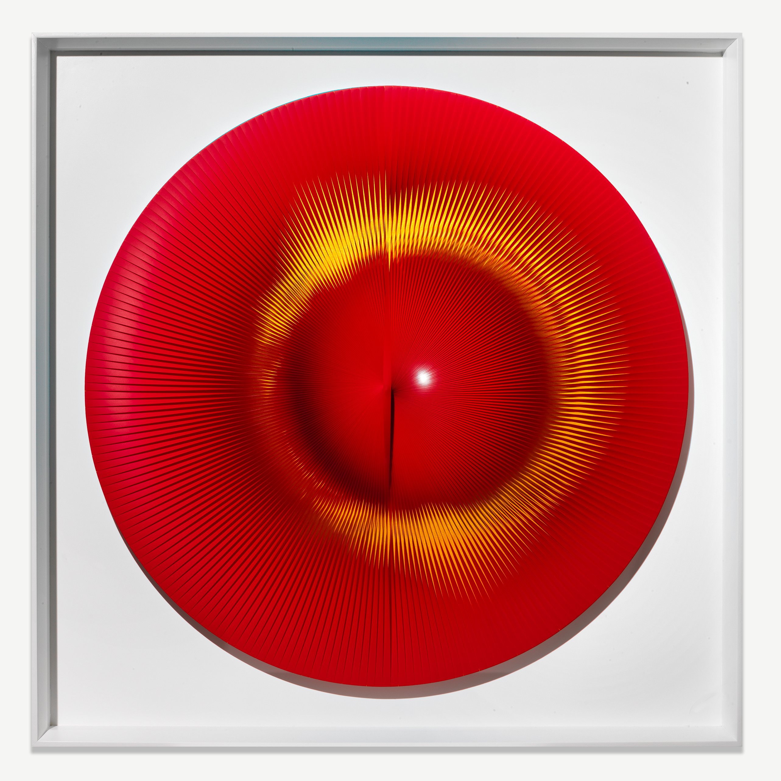
Yayoi Kusama
Butterfly, 1985
The Art That Makes Your Eyes Lie
There is something almost transgressive about Op Art, and that quality is precisely what draws serious collectors to it. These works do not hang quietly on a wall. They pulse, shimmer, advance and recede. They make demands on the viewer that most art, even very good art, simply does not.
Living with a Bridget Riley or a Victor Vasarely means accepting that your perception itself becomes the subject, that your own nervous system is part of the work. For collectors who have grown restless with decorative painting or art that simply rewards knowing its references, Op offers something rarer: a genuinely physical experience that renews itself every time you walk past. The movement also carries a fascinating tension between rigorous intellectual structure and immediate sensory pleasure. Every work begins as a problem in perception, worked out through mathematics, color theory, and spatial logic before a single mark is made.
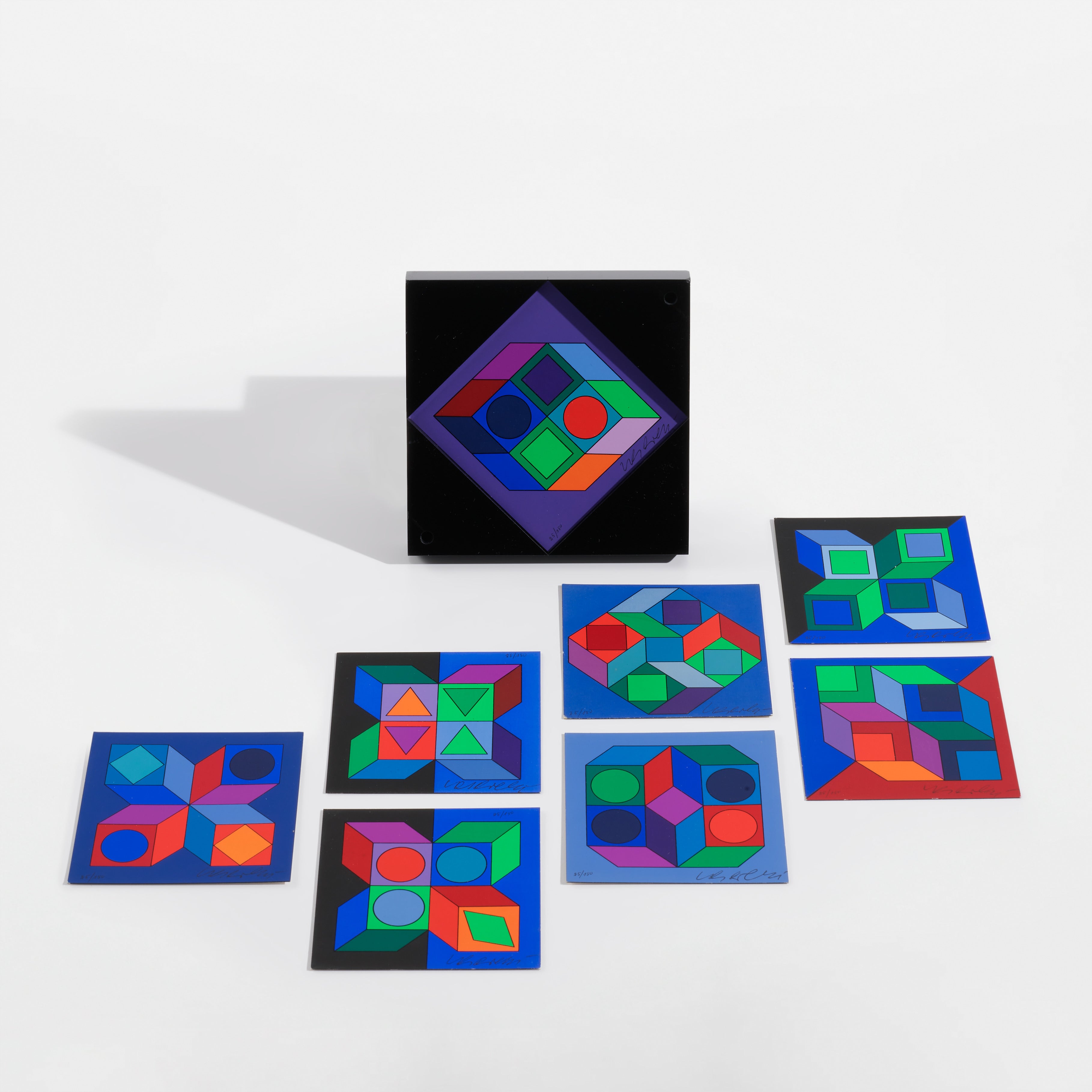
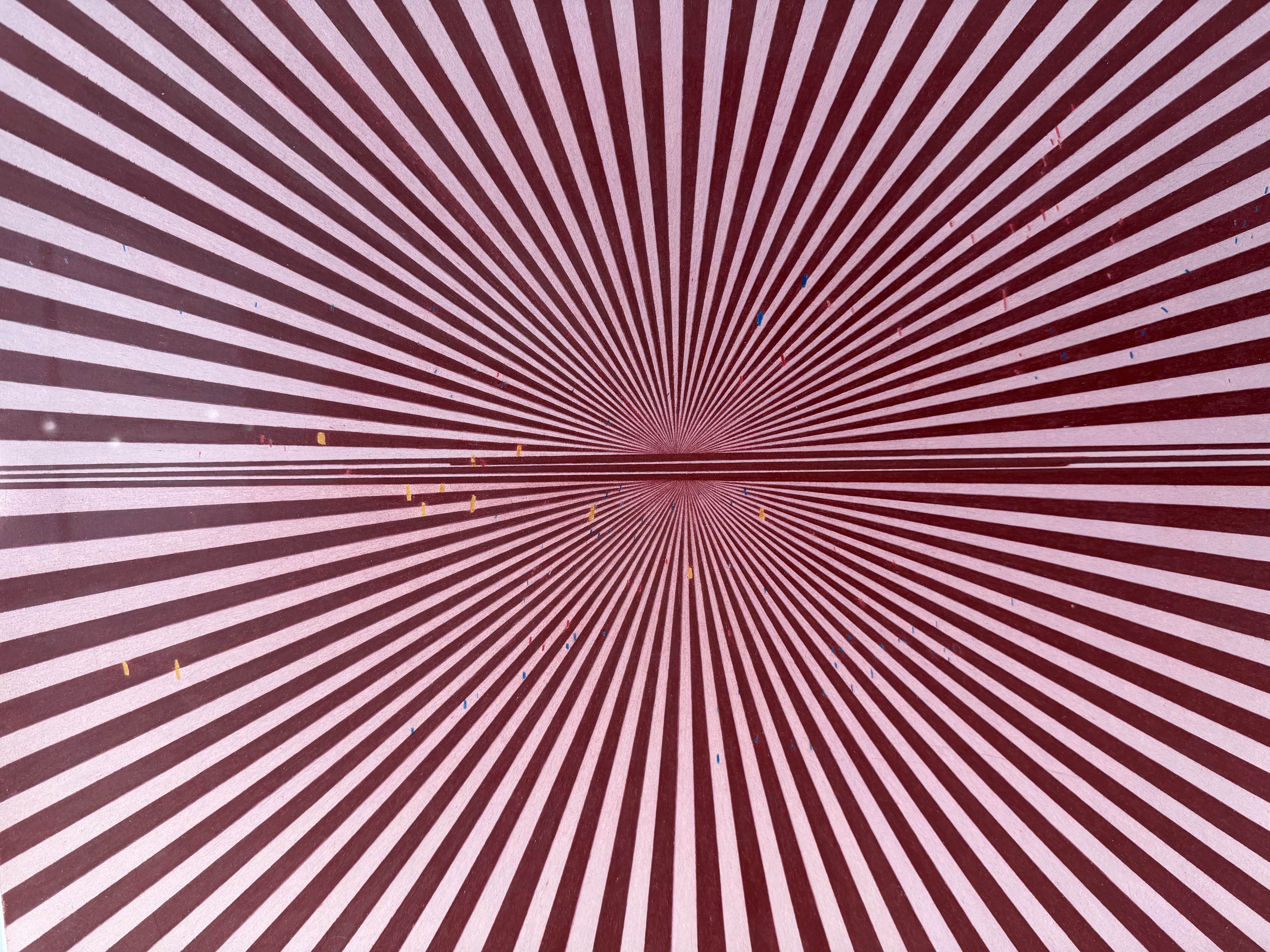
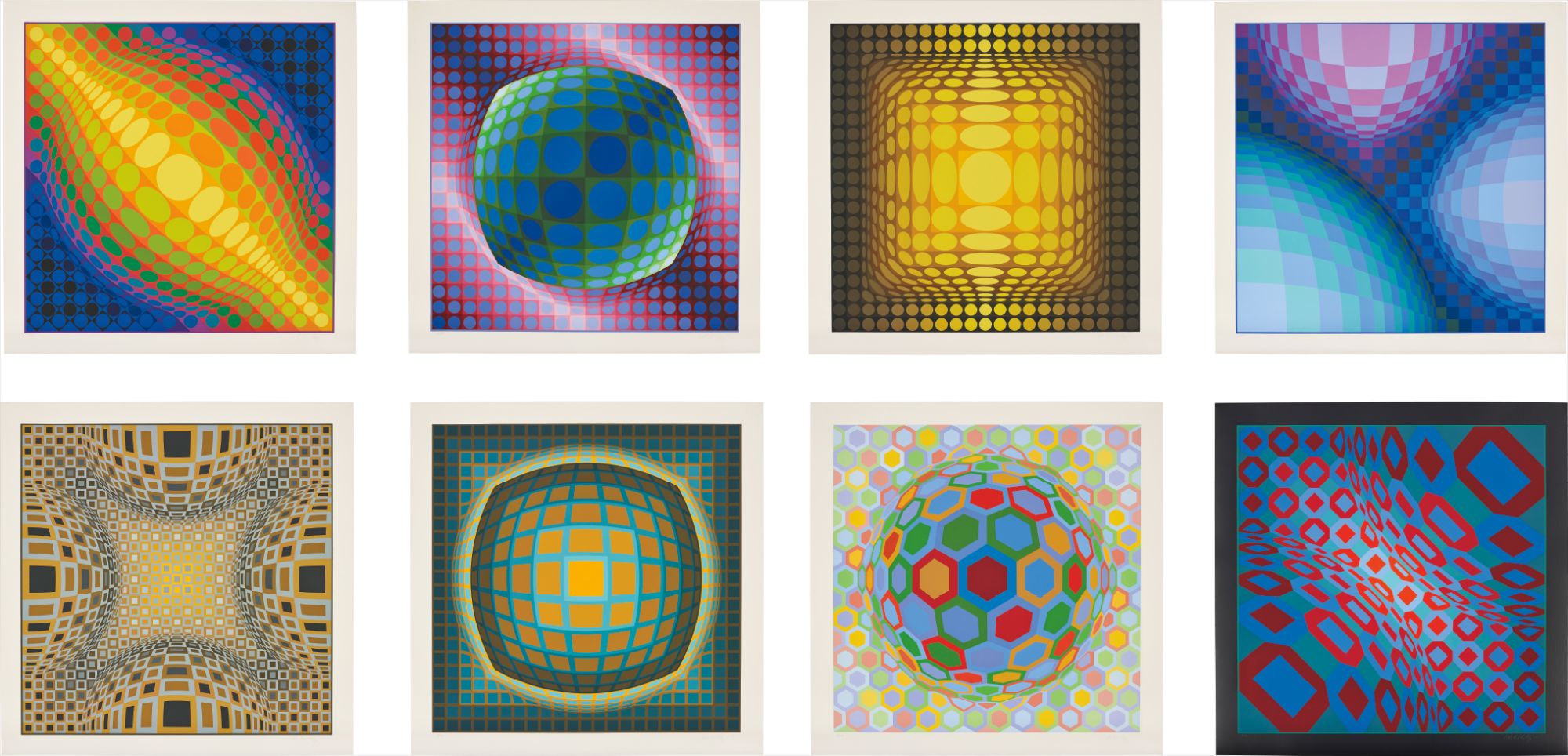
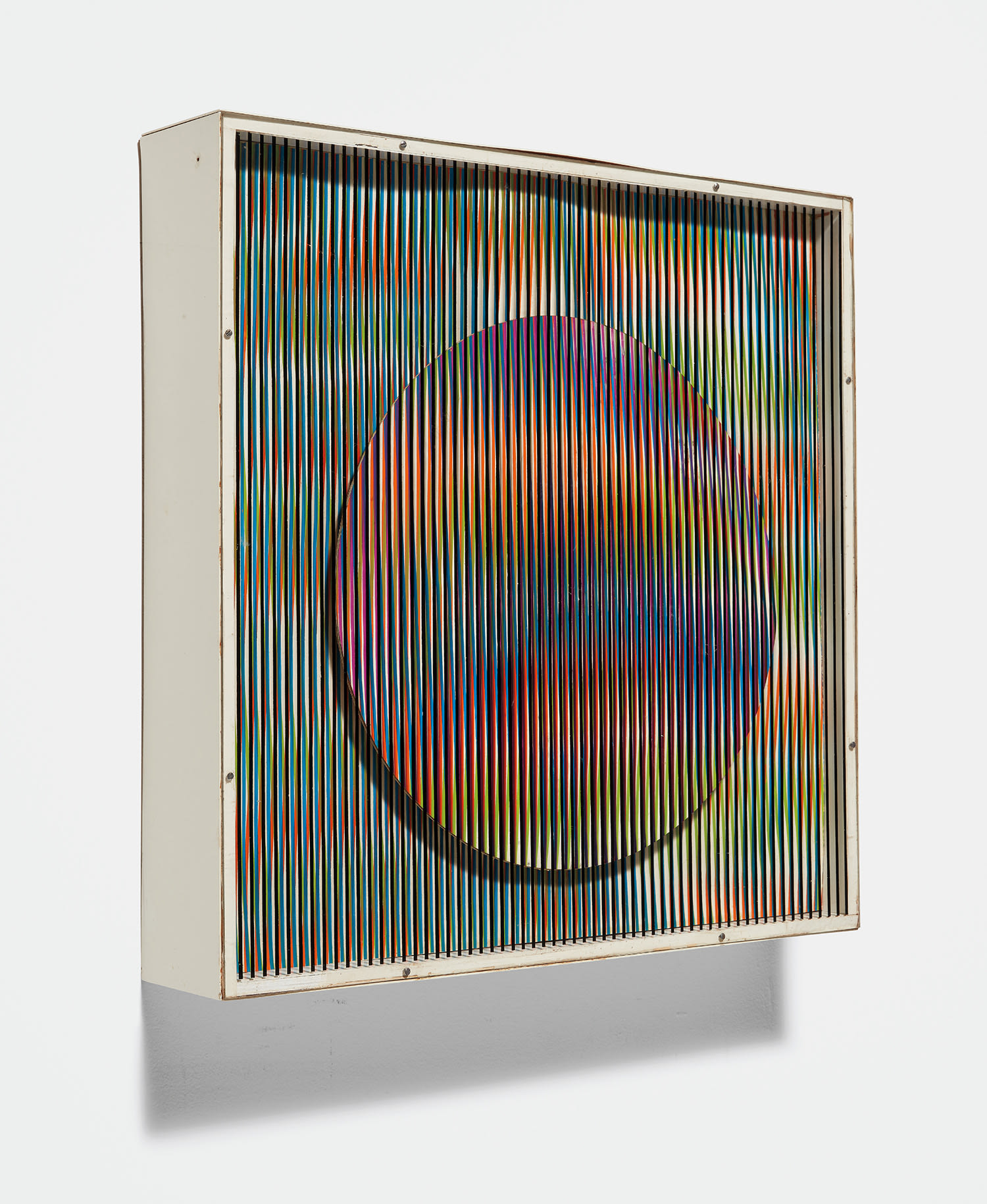
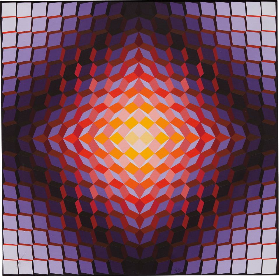
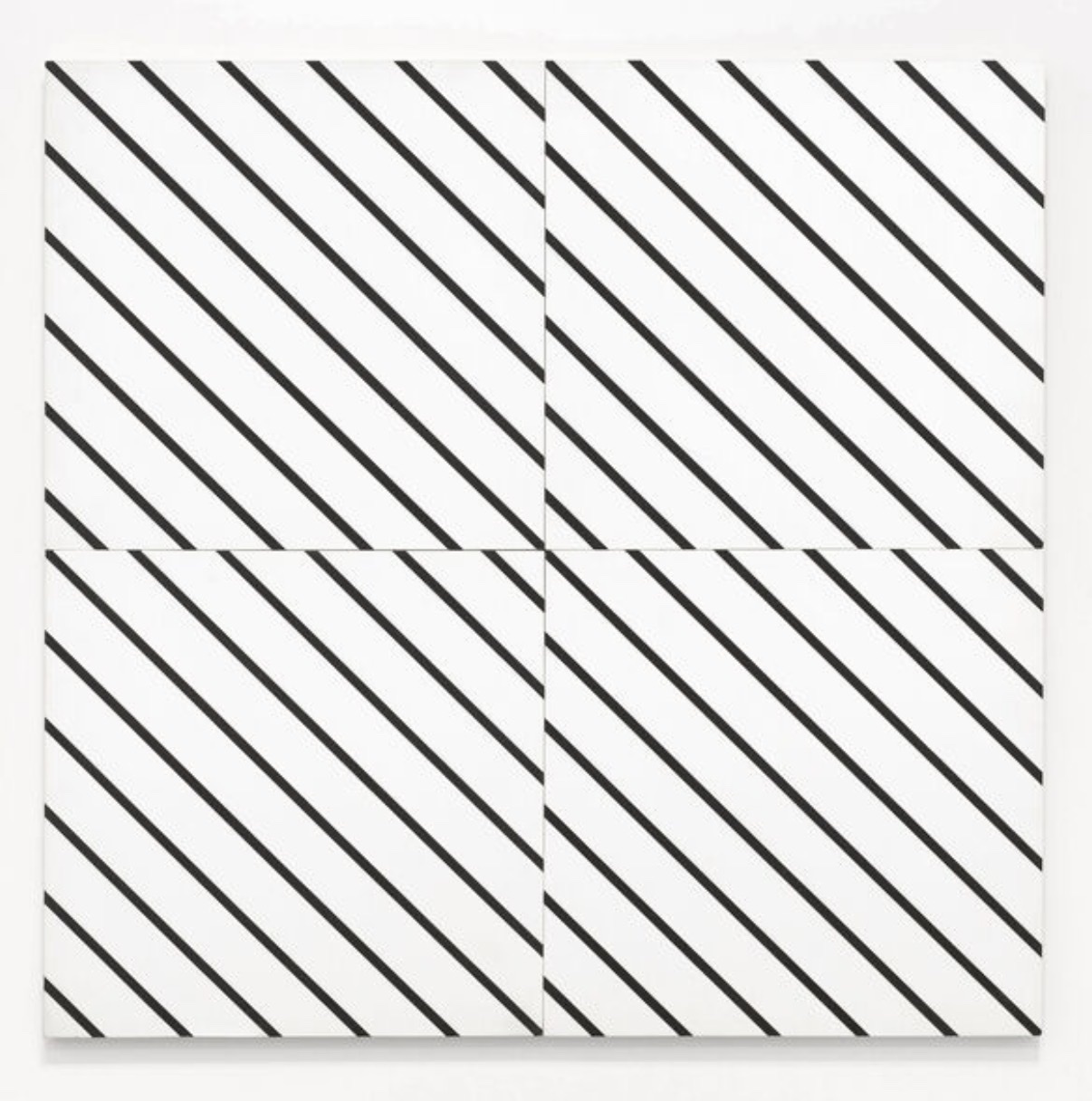
Victor Vasarely
Lapidaire 2
Yet the result can be viscerally beautiful in a way that bypasses all of that thinking entirely. That combination of head and gut is not easy to find, and it explains why collectors who discover Op Art tend to pursue it with real commitment. Knowing what separates a strong work from a truly great one in this category requires looking past surface dazzle. The best works are those where the optical effect and the formal composition are inseparable, where you could not achieve one without the other.
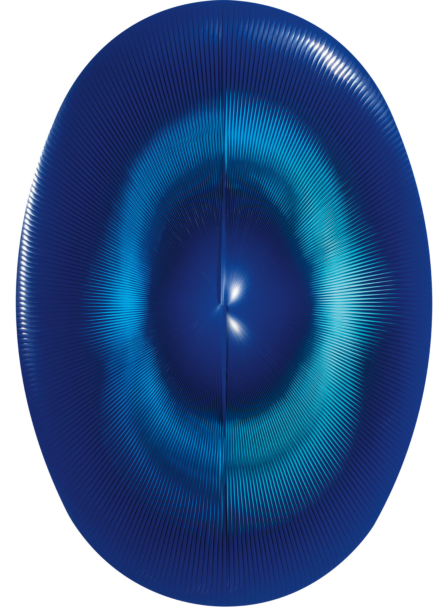
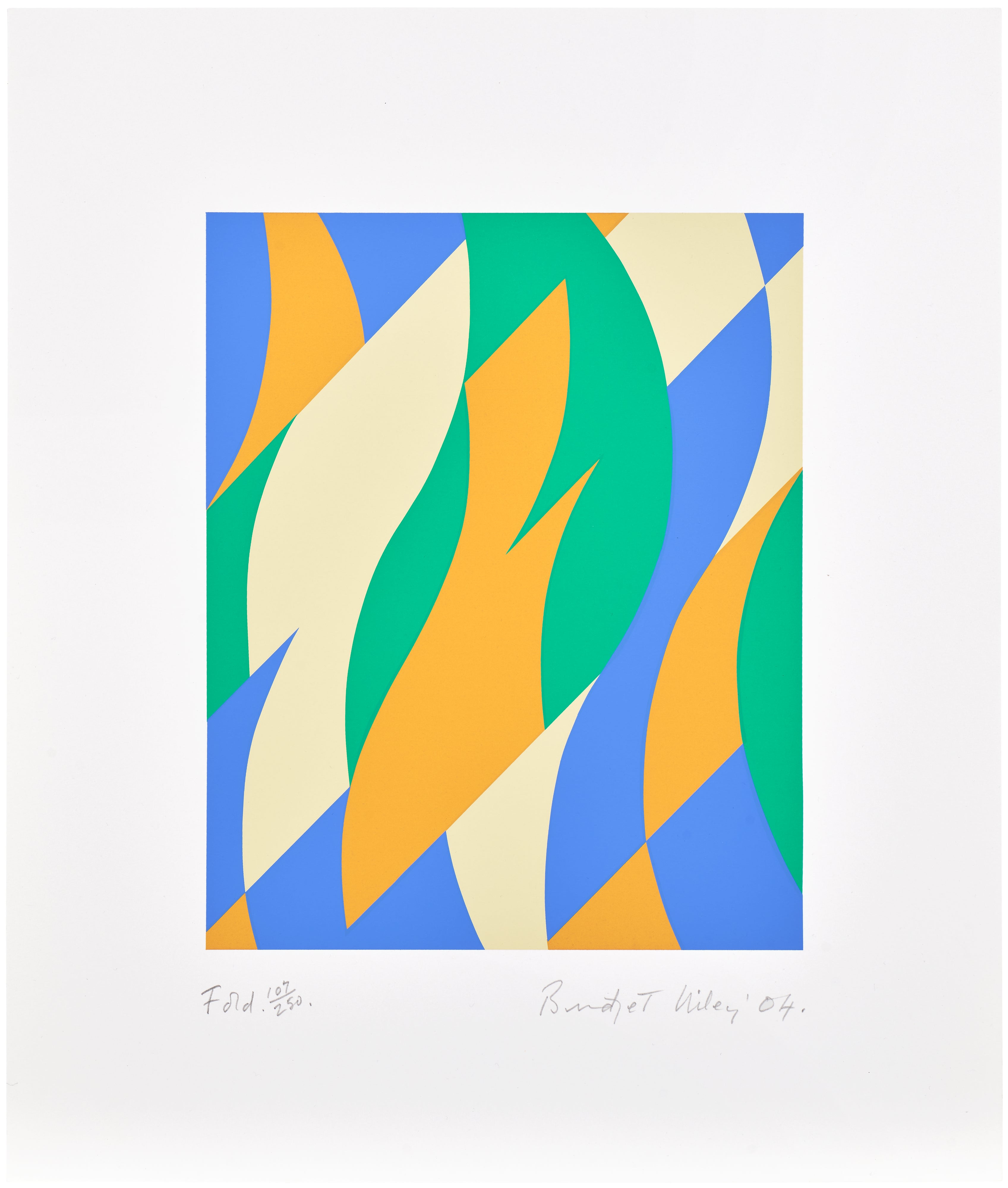
In the weaker examples, the effect feels like a trick applied to a neutral ground. In the finest works, every decision about scale, interval, color relationship, and edge quality is integral to the perceptual event. When Bridget Riley began working in color in the late 1960s, moving from the stark black and white works that defined her early reputation, she was not adding a new element so much as discovering a new dimension of the same essential inquiry. Works from her mature color periods reward extended looking precisely because the relationships are so precisely calibrated.
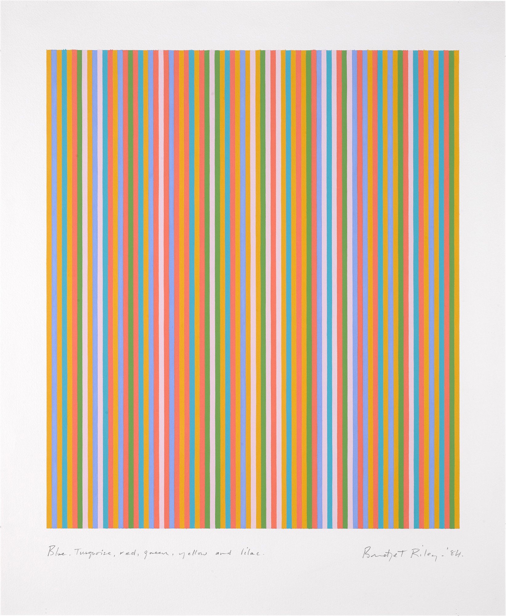
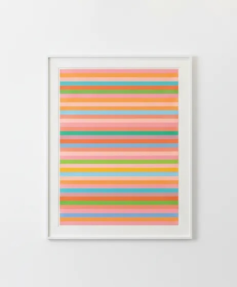
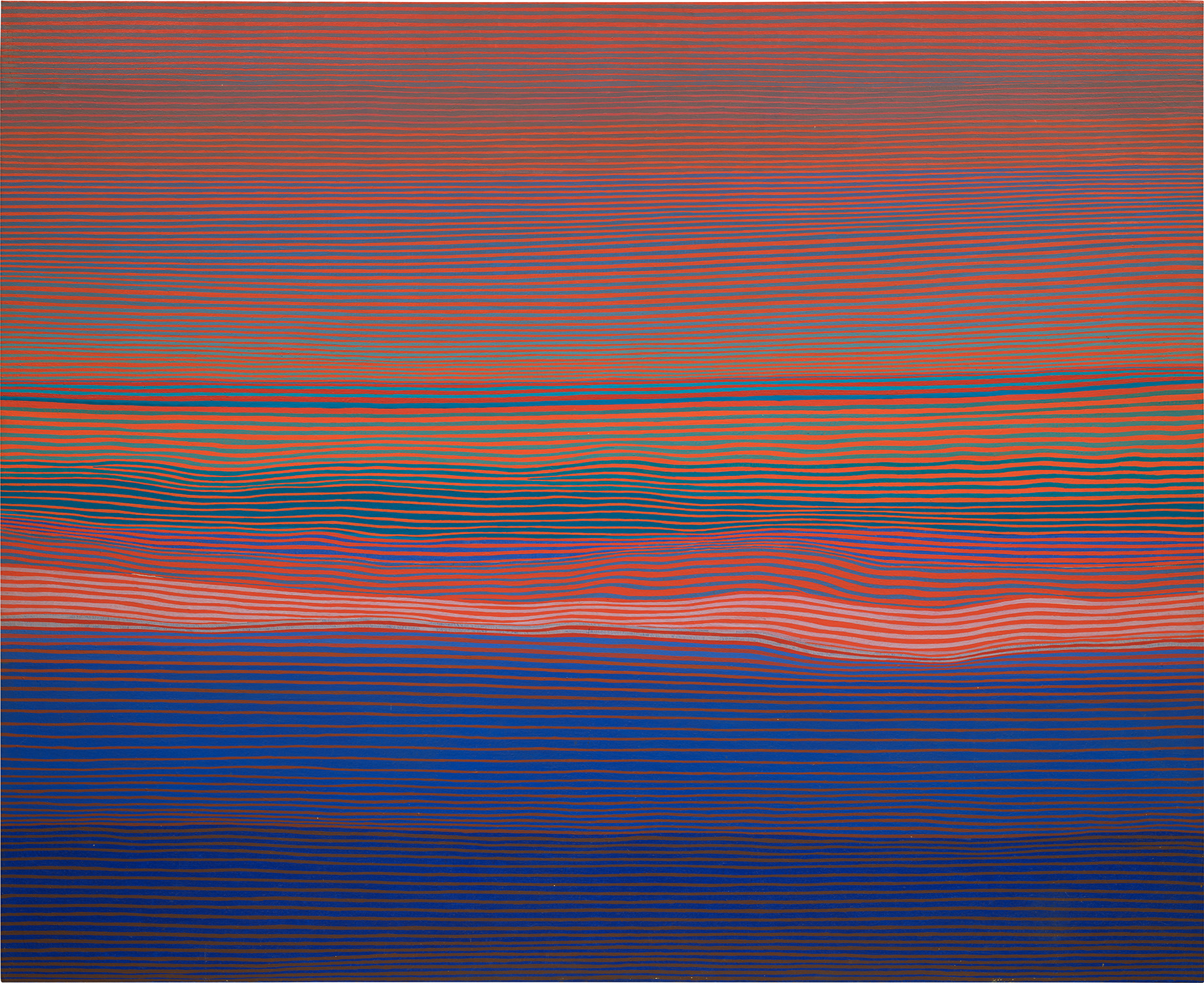
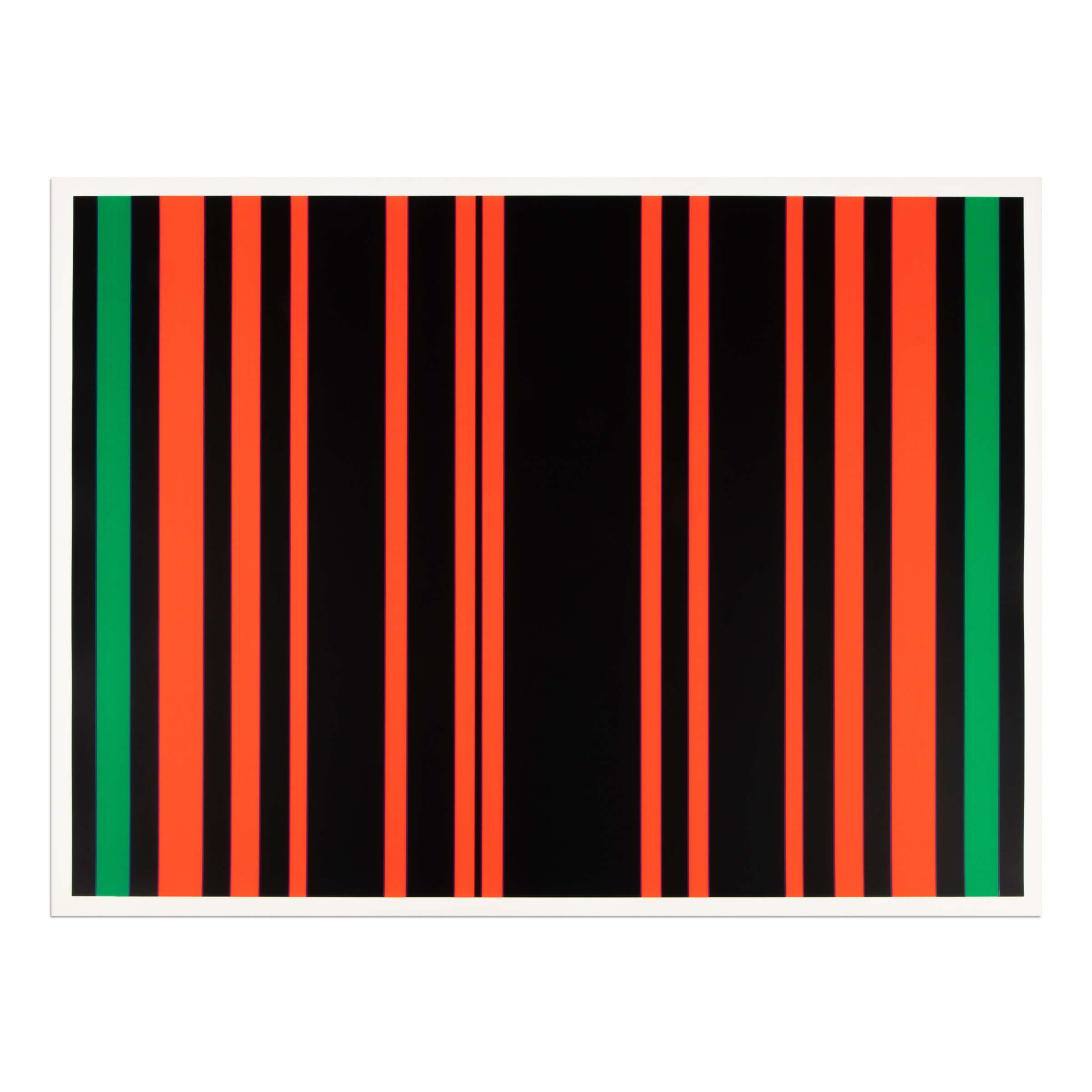
Bridget Riley
Blue, Turquoise, Red, Green, Yellow and Lilac, 1984
Victor Vasarely remains the central figure in any serious Op collection, and his presence on The Collection reflects that centrality. His contribution was not merely stylistic but genuinely theoretical: he understood that optical illusion was a language with its own grammar, and he spent decades extending and refining that grammar. Works from the 1960s and 1970s represent his most resolved thinking, and within that period there is real variation in quality and ambition. Collectors should look carefully at works where Vasarely pushes beyond the merely clever into something spatially vertiginous, where the surface of the picture plane feels genuinely unstable.
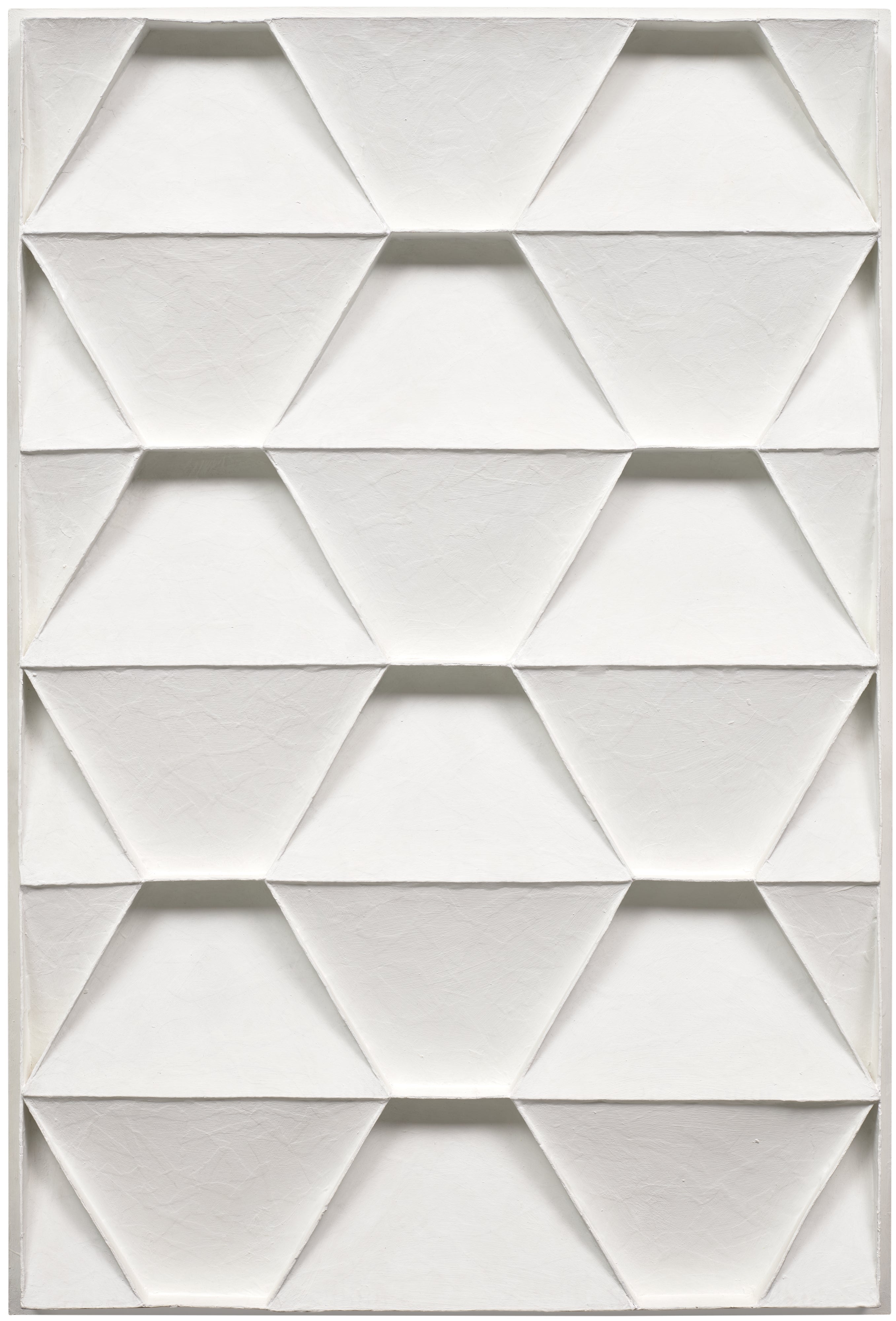
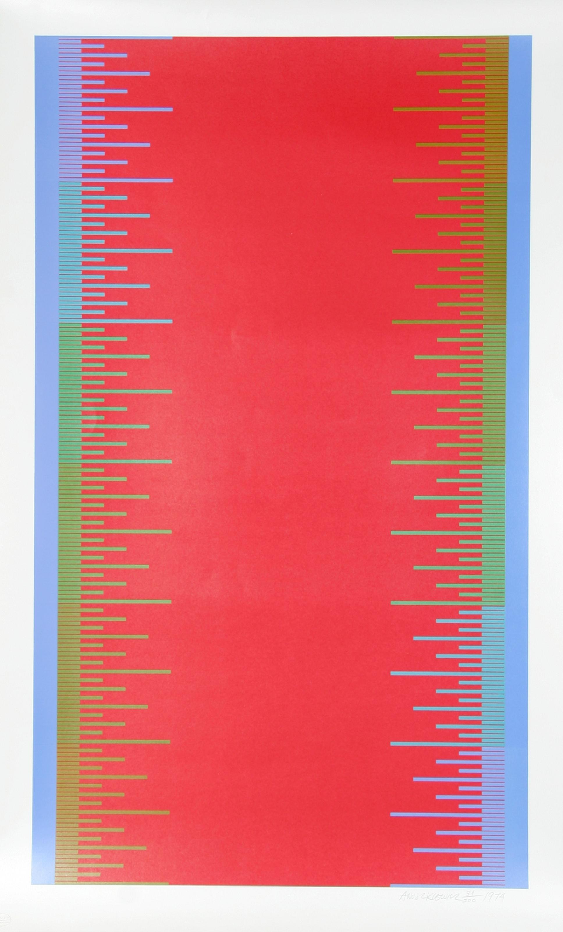
His son Yvaral, also known as Jean Pierre Vasarely, worked in closely related territory and offers a compelling point of comparison, as well as a more accessible entry point for collectors building in that lineage. Richard Anuszkiewicz studied directly under Josef Albers at Yale in the 1950s and brought the Albers chromatic intelligence into a more overtly optical idiom. His best works are among the most undervalued in the movement. Albers himself, through the Homage to the Square series, provides a masterclass in how color interaction creates spatial illusion without any geometric distortion at all, pure perceptual consequence of adjacency and contrast.
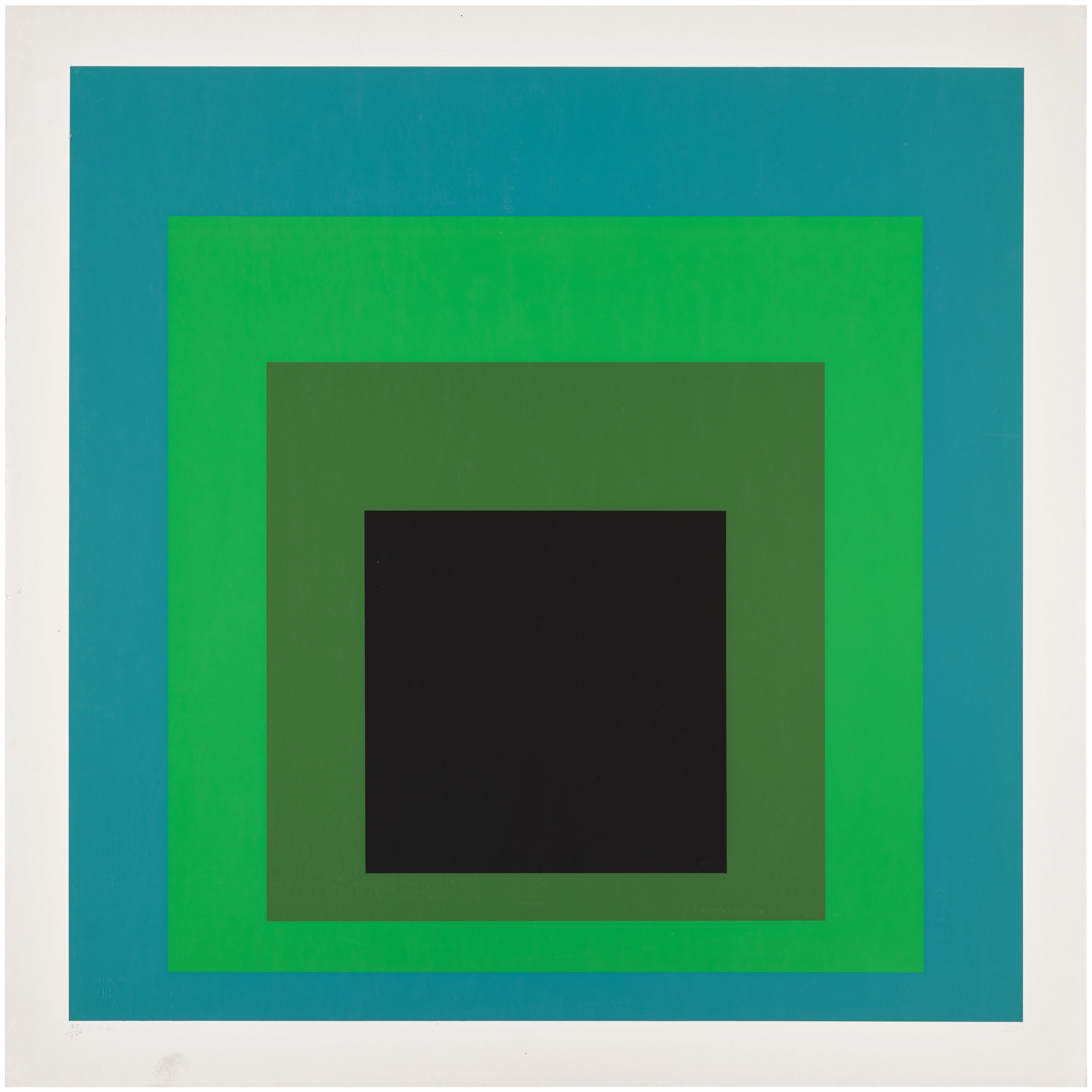
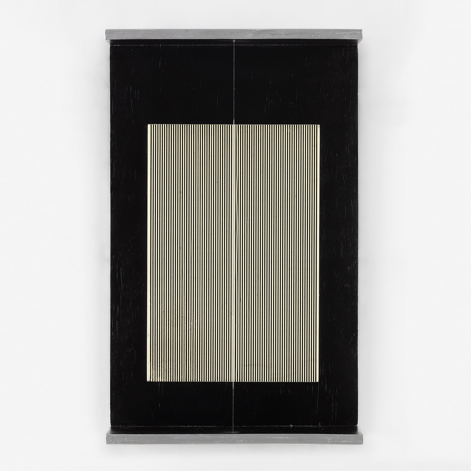
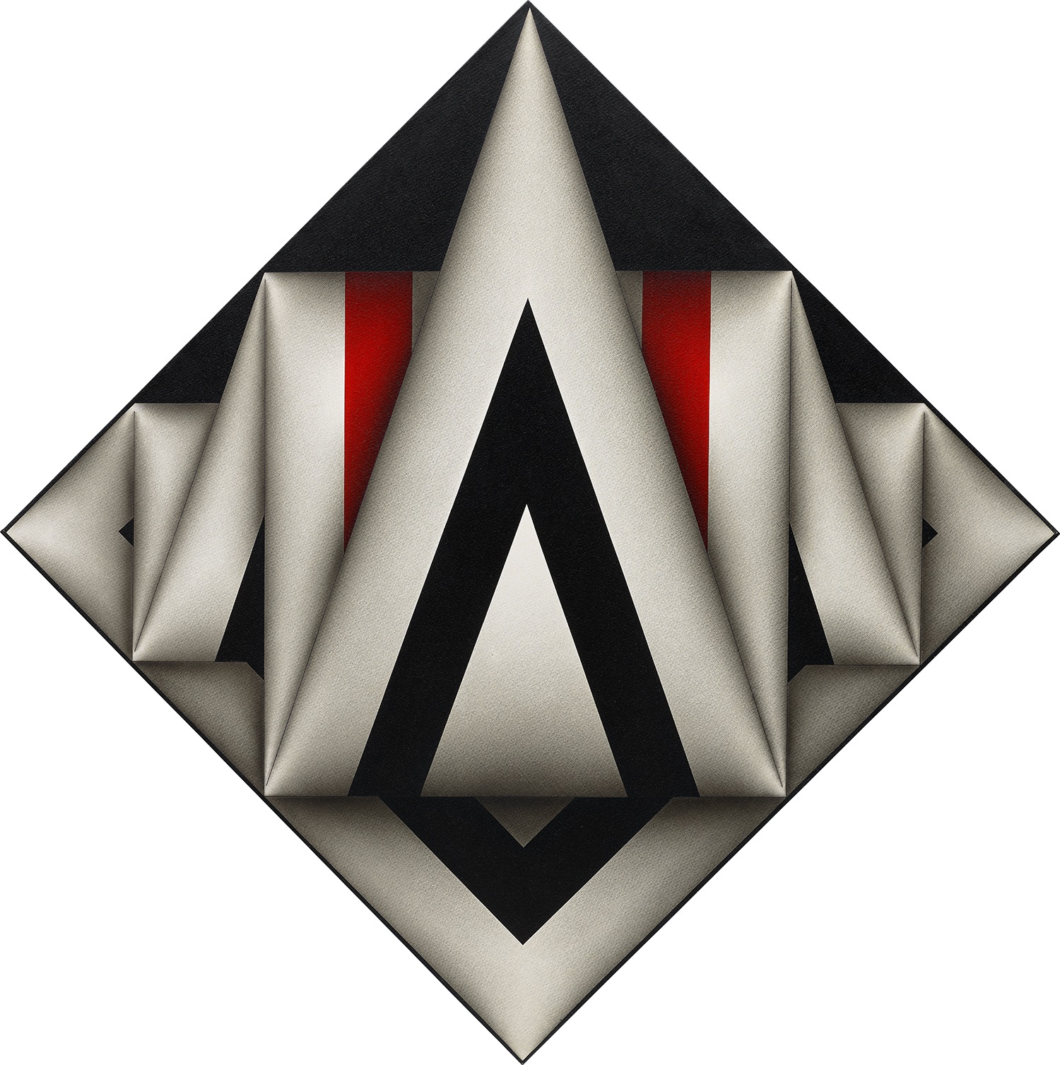
Josef Albers
DR-b
Both artists are well represented on The Collection and together they offer a remarkably coherent collecting theme around the American reception of European Constructivist ideas. Carlos Cruz Diez and Jesús Rafael Soto represent the Latin American strand of Op and Kinetic art that developed largely in Paris during the 1950s and 1960s, and this is an area where the market has not yet fully caught up with the critical reputation. Cruz Diez spent decades investigating chromatic induction, the way colors transform one another through proximity, and his Physichromies have a physical presence in a room that reproductions cannot convey. Soto's Penetrables, the environments made of hanging nylon threads that viewers can walk through, represent a logical extension of optical principles into three dimensions and remain genuinely influential on spatial art practice today.
Julio Le Parc, another member of this Paris based Latin American circle and a founder of the Groupe de Recherche d'Art Visuel in 1960, is similarly positioned at the intersection of critical acclaim and relative market accessibility. For collectors thinking about emerging value, several artists on The Collection deserve close attention. Alberto Biasi, a founder of the Italian Gruppo N in Padova in 1959, worked in relief and rotary structures that bridge Op and Kinetic concerns in ways that feel increasingly relevant to contemporary spatial art. François Morellet brought a kind of dry conceptual wit to systematic geometric abstraction that anticipates certain strands of contemporary practice.
François Morellet
1 simple trame 45° coupée, décalée, 1973
Antonio Asis, Argentine born and Paris based, produced small format works of extraordinary refinement that have begun attracting the sustained institutional attention that typically precedes significant secondary market movement. At auction, the Op Art market has shown consistent strength in the blue chip tier, with Riley and Vasarely commanding prices that reflect genuine institutional demand, not just collector fashion. Works on paper and prints require careful attention to edition size, publication history, and condition. In a category where the optical effect is everything, any foxing, fading, or surface abrasion is not merely an aesthetic problem but a structural one: it interrupts the precise chromatic relationships the artist constructed.
When working with a gallery, the right questions concern provenance documentation, whether a work has been exhibited under gallery lighting that may have caused fading, and in the case of works on paper, the precise paper stock and inks used since these affect long term stability significantly. Display matters enormously with Op Art in a way that it simply does not with most other categories. Lighting angle and intensity affect the perceived depth of many of these works dramatically. Natural light is often ideal but can cause fading over time, so UV filtering glass deserves serious consideration.
Scale relationships also matter: a work that feels powerful in a gallery can be overwhelmed in an oversized domestic space, or conversely can feel cramped if the eye needs room to register the full optical event. Living with Op Art is a commitment, but for collectors who make it, the reward is a daily reminder that perception itself is the most extraordinary and unreliable instrument we possess.