Graphic
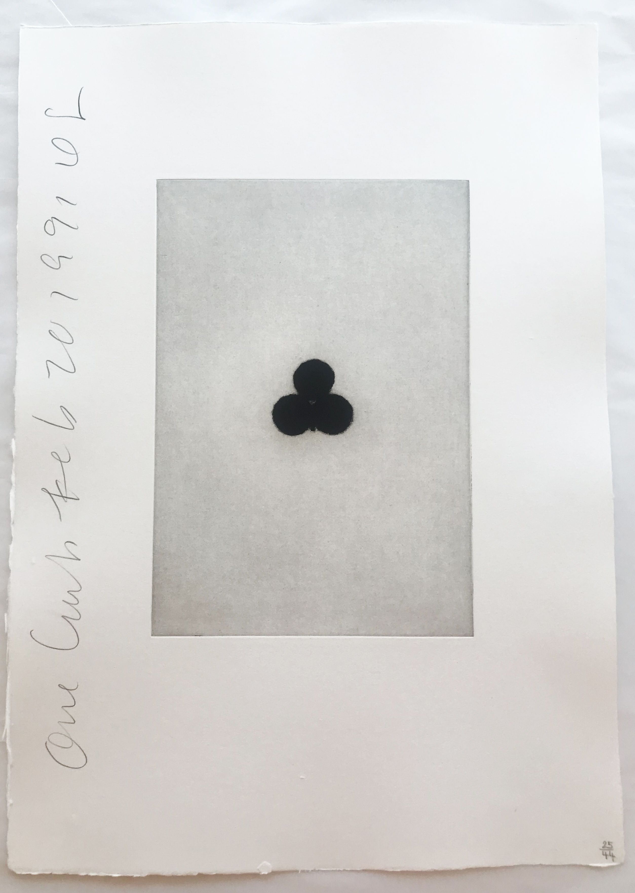
Donald Sultan
Playing Cards (Ace of Clubs), 1990
Bold Lines, Louder Truths: The Graphic Impulse
There is something almost primal about the appeal of graphic art. A flat field of color, a hard contour, a word rendered as image: these are tools that bypass the polite conventions of fine art and speak directly, sometimes uncomfortably, to the eye. The graphic impulse has run through art history like a current, but it found its most charged expression in the second half of the twentieth century, when artists began raiding the visual language of commerce, advertising, and popular culture and holding it up to the light. The story has roots well before Pop.
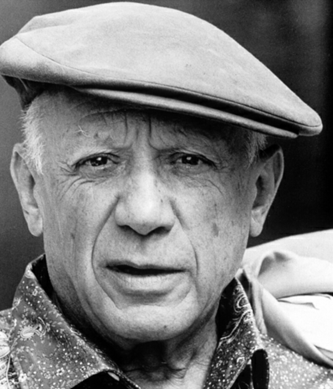
The early twentieth century saw the boundaries between fine art and graphic design collapse and reform repeatedly. Constructivists in Soviet Russia, the Bauhaus in Weimar Germany, the Futurists in Italy: all of them recognized that the flat, the bold, and the typographic carried an energy that easel painting often lacked. Pablo Picasso, whose restless formal intelligence touched almost every visual mode, incorporated newspaper collage and stenciled lettering into his Cubist works as early as 1912, acknowledging that the printed world had its own aesthetic force. Marcel Duchamp went further still, questioning what separated a designed object from an artwork at all.
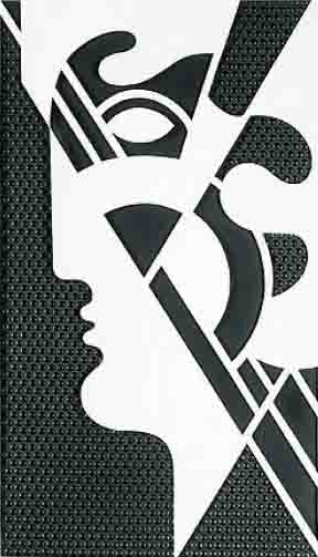
Roy Lichtenstein
Modern Head #5
But it was in New York and London in the late 1950s and early 1960s that the graphic sensibility became a full artistic program. The Independent Group in London, gathering at the Institute of Contemporary Arts from around 1952 onward, was among the first to treat advertising imagery with genuine intellectual seriousness. Then, almost simultaneously, a generation of American artists arrived at a similar conclusion from a different direction. Roy Lichtenstein looked at the Ben Day dot, the blunt speech bubble, the melodramatic close up of comic book panels, and saw not kitsch to be transcended but a formal vocabulary worthy of the canvas.
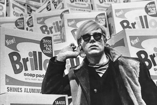
His 1962 solo show at Leo Castelli Gallery in New York was a kind of declaration of intent. The flatness was not a limitation. It was the entire point. Andy Warhol understood this as acutely as anyone.
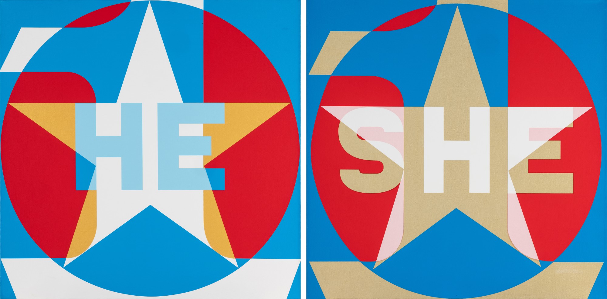
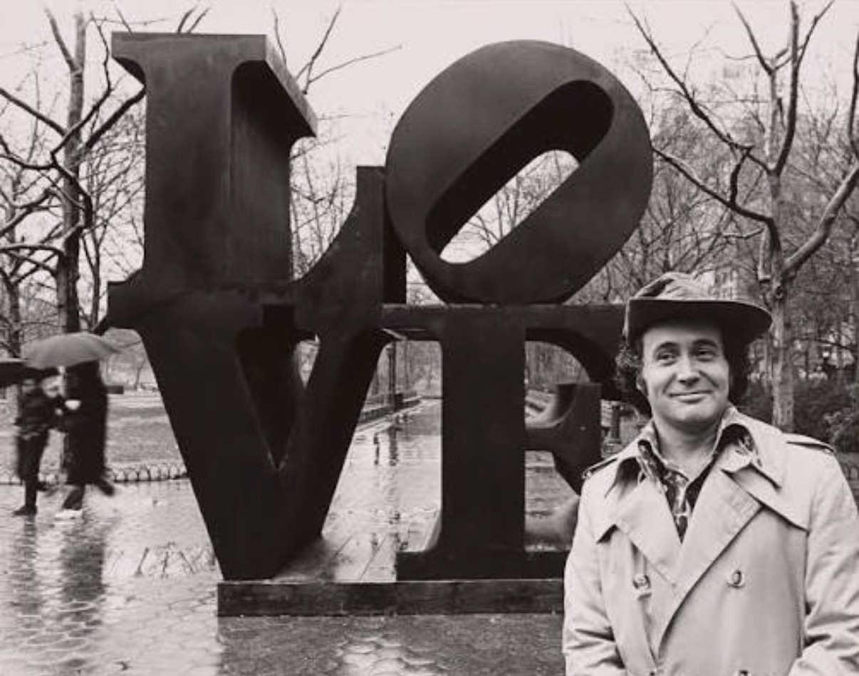
Robert Indiana
He She
His silkscreen technique, which he developed seriously from around 1962, was borrowed directly from commercial printing, and the choice was not accidental. By flattening the photographic image into repeatable, color field units, Warhol made visible something that had always been true about fame, about consumer culture, about the way images circulate and lose and regain meaning. The graphic surface was not a simplification of reality but an argument about it. Both Lichtenstein and Warhol are represented extensively in The Collection, and together they anchor an understanding of just how intellectually rigorous that apparent simplicity really was.
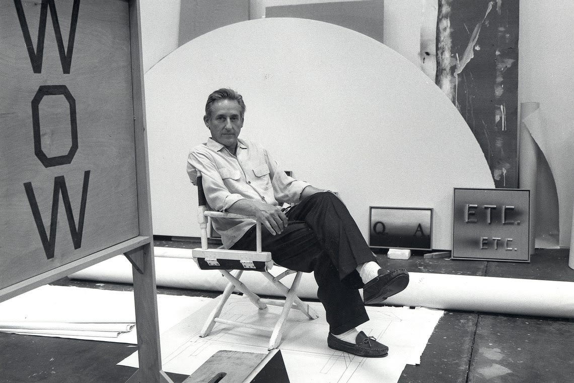
The British contribution to this story deserves more credit than it sometimes receives. Patrick Caulfield, working in London through the 1960s and beyond, developed a graphic language of his own: thick black outlines, flat unmodulated color, the visual shorthand of interior scenes that felt borrowed from somewhere between a menu illustration and a Matisse. His paintings look simple until you sit with them, at which point they become unexpectedly complex meditations on representation and ordinariness. Peter Phillips, another figure from the Royal College of Art generation, brought a harder edged, more aggressive graphic energy drawn from pinball machines and commercial signage.
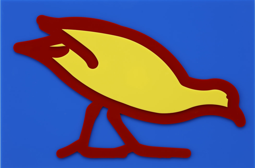
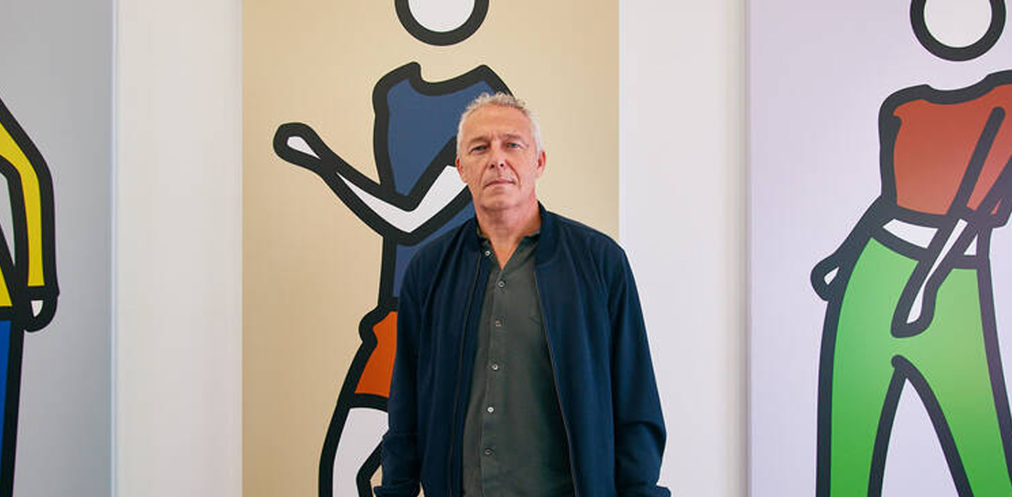
Julian Opie
Swamp Hen from Small Birds, 2020
Both artists are part of The Collection, representing a strand of British graphic practice that existed in productive tension with its American counterpart. Ed Ruscha occupies a singular position in this lineage. His word paintings, which he began producing in earnest in the early 1960s, treat language as pure visual material. A word floats against a ground, rendered with a sign painter's precision, and the question of whether you are reading it or looking at it remains productively unresolved.
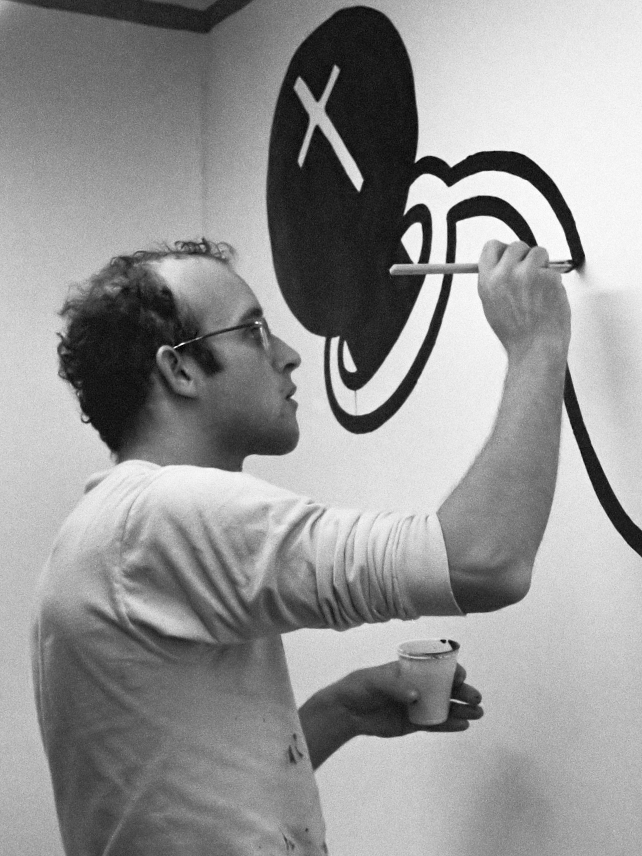
Robert Indiana pursued a related inquiry, turning words like LOVE and EAT into formal compositions that existed somewhere between logo and icon. The fact that Indiana's LOVE image eventually became one of the most reproduced images of the twentieth century only adds to the complexity of what he was doing with graphic convention in the first place. By the 1980s and 1990s, a new generation had grown up inside graphic culture rather than observing it from the outside. Keith Haring began his career drawing in the subway system of New York, working in chalk on the black paper used to cover expired advertising spaces.
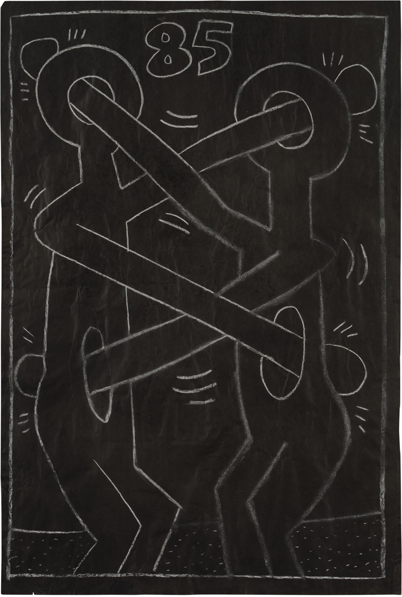
Keith Haring
Untitled (Subway Drawing), 1985
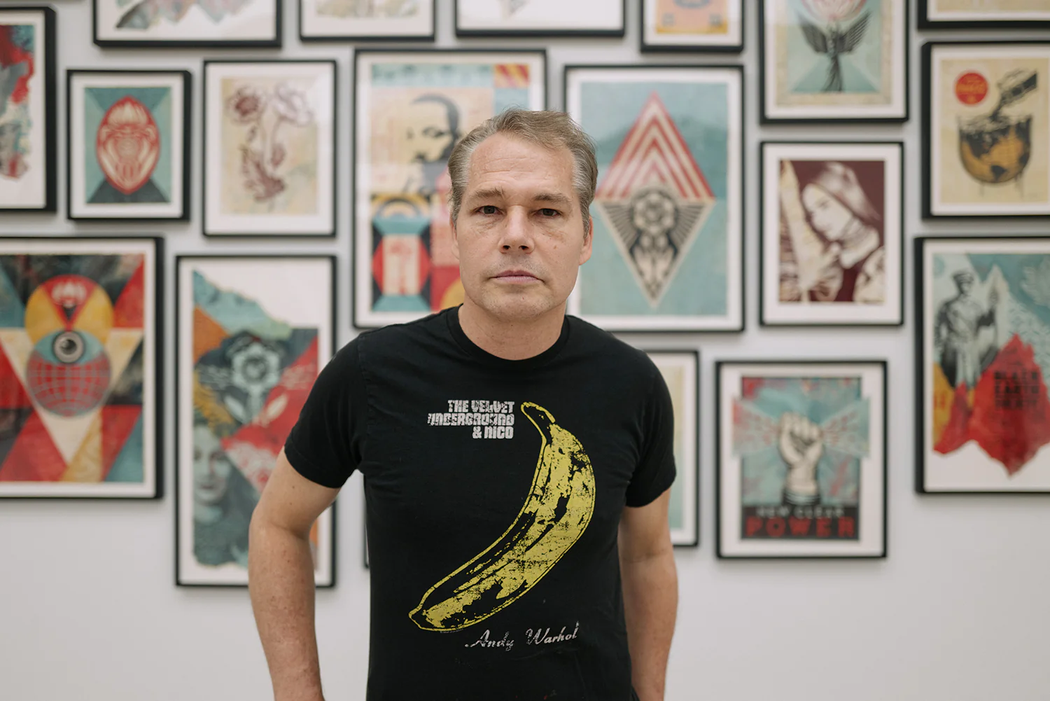
His figures, radiant and kinetic, had the speed and clarity of a universal sign language. Shepard Fairey came out of the skateboarding and street culture of the late 1980s, developing a graphic aesthetic that owed as much to Soviet propaganda posters as to sticker culture. His 2008 Obama Hope image demonstrated that the graphic poster tradition retained its capacity to move through culture at extraordinary velocity. The relationship between graphic art and commercial culture has always been the central tension in this story.
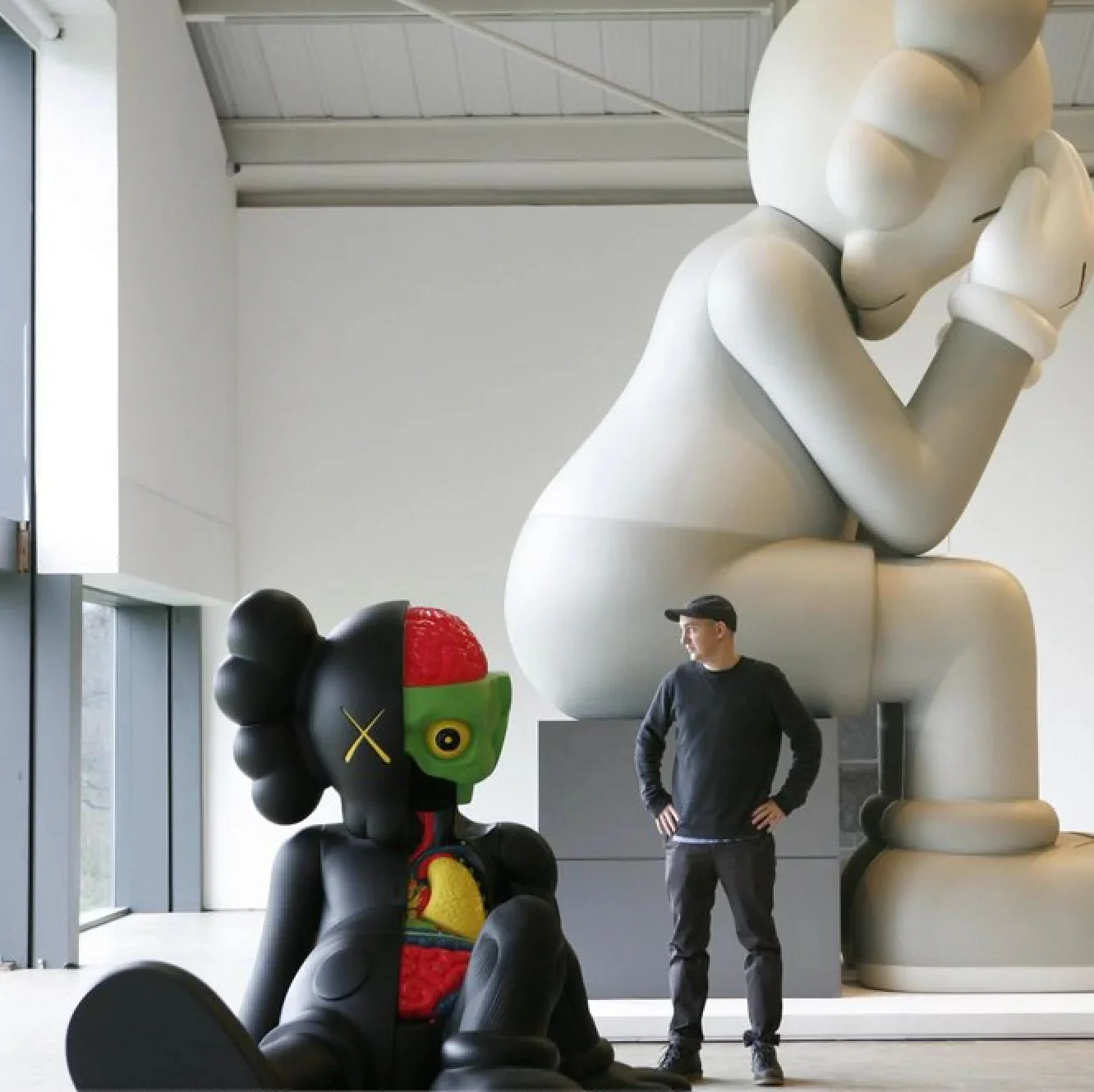
Artists like KAWS and Takashi Murakami have navigated that tension by working simultaneously in fine art and design contexts, treating the boundary as a creative space rather than a problem to solve. Julian Opie reduces the human figure to the most economical possible set of marks: a circle for a head, two dots for eyes, a line. The result is immediately recognizable and strangely affecting, a portrait stripped to its graphic essence. Yoshitomo Nara and Donald Baechler both use a rough, almost childlike drawing quality that reads as graphic precisely because of its deliberate refusal of academic finish.
What holds all of this together, across decades and continents and very different intentions, is a shared conviction about the power of clarity. The graphic work on The Collection represents not a single movement but a recurring recognition: that the direct image, the flat color, the legible mark, can carry as much weight as any other approach to the picture plane. In a cultural moment when images compete for attention at unprecedented speed, that recognition feels less like a historical position and more like a permanent condition of seeing.