Blue And Yellow
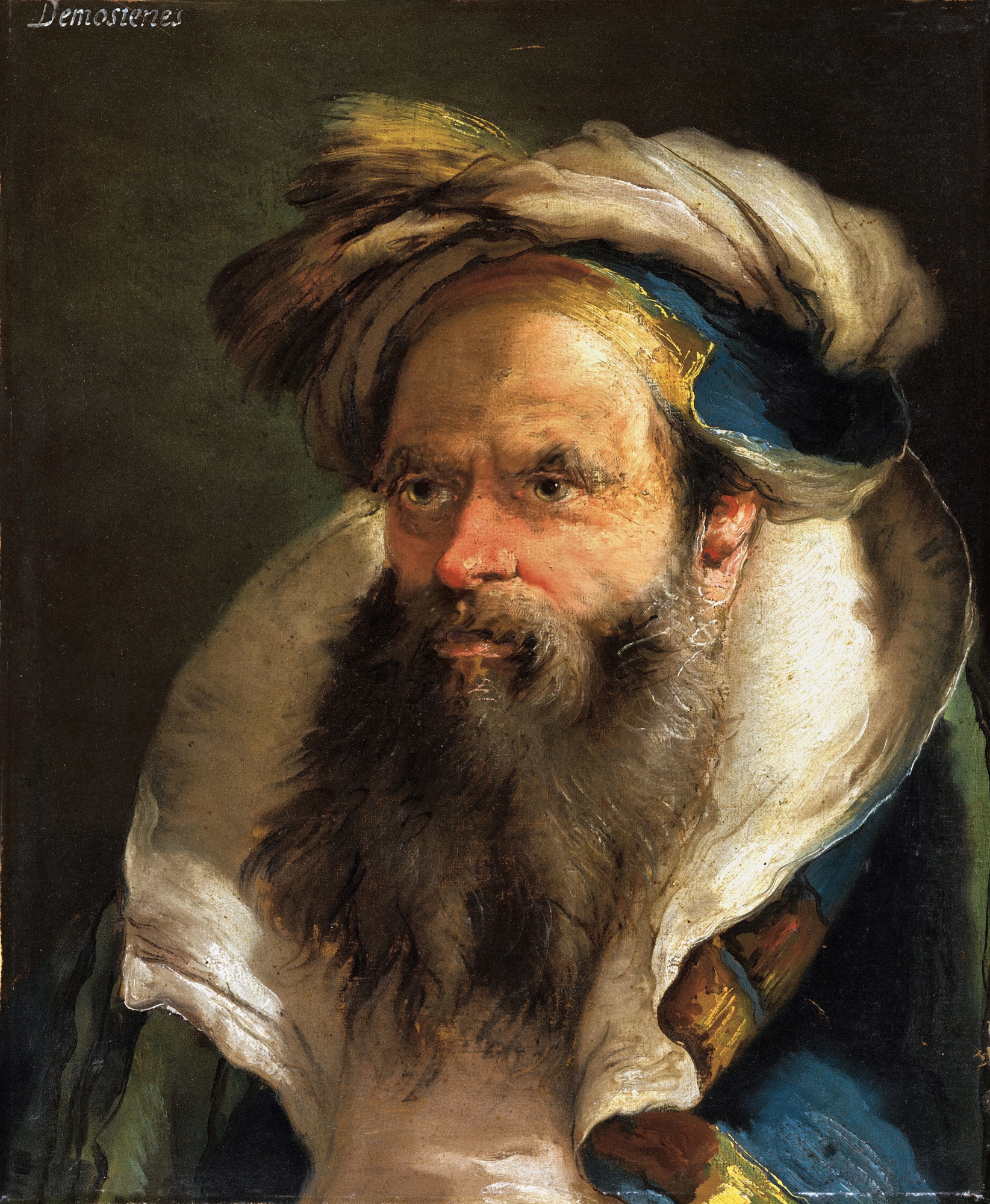
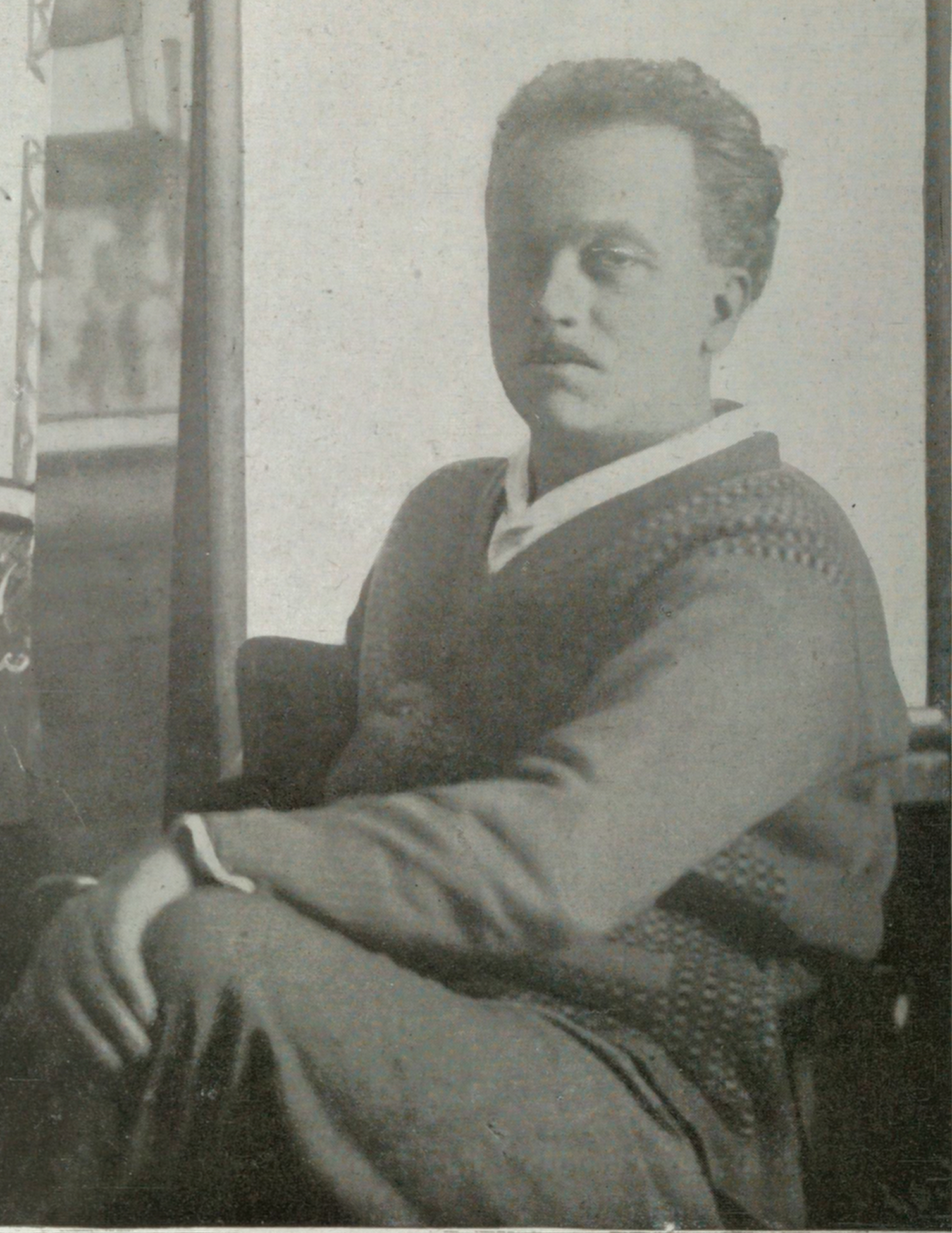
Giandomenico Tiepolo
Head of a bearded man in a blue and yellow collared robe
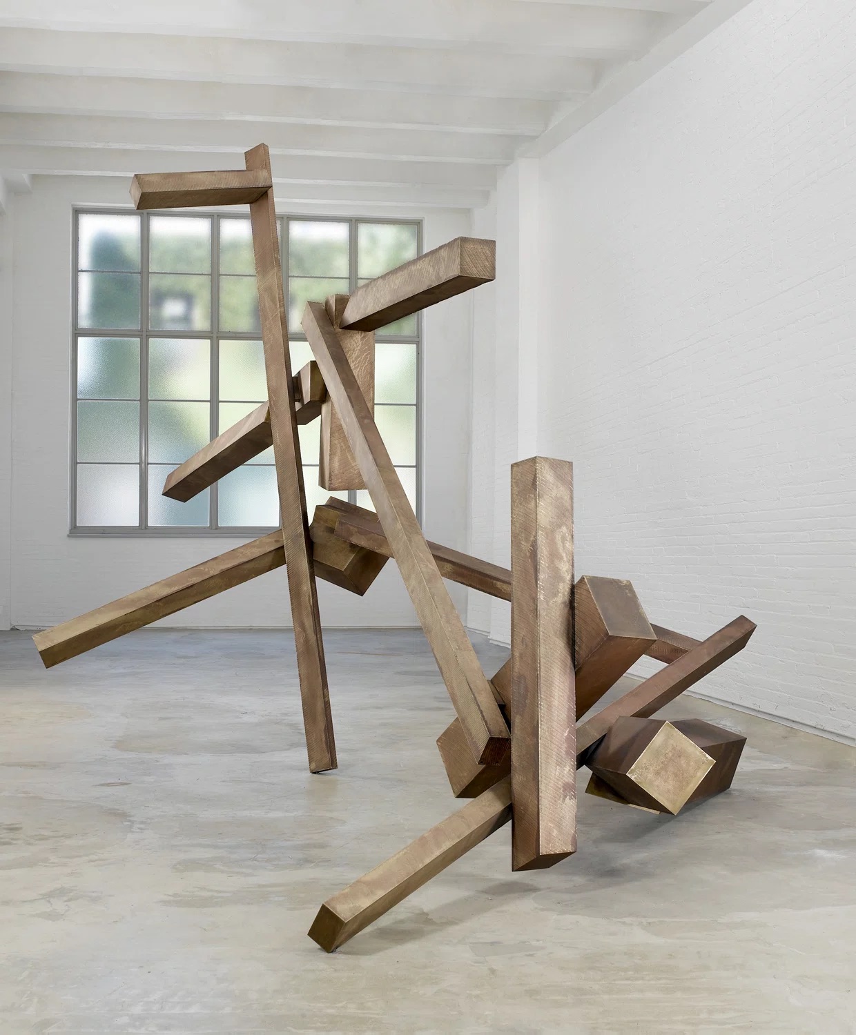
Two Colors, Infinite Conversations
There is something almost primordial about the pairing of blue and yellow. Before theory, before pigment chemistry, before the academies codified what a painting should be, these two colors were already in dialogue with one another across cave walls, temple friezes, and illuminated manuscripts. They sit at opposite ends of the emotional spectrum and yet pull toward each other with an almost gravitational insistence. To look at the history of blue and yellow in art is to look at the history of human perception itself.
The story begins, as so many color stories do, with materials. For centuries, the ability to produce a true, stable blue was among the most expensive and technically demanding challenges a painter could face. Ultramarine, ground from lapis lazuli imported from Afghanistan, cost more than gold by weight in the medieval period. Yellow, by contrast, was everywhere: ochre pulled from the earth, lead tin yellow mixed in the workshop, saffron dissolved in binding agents for manuscript work.
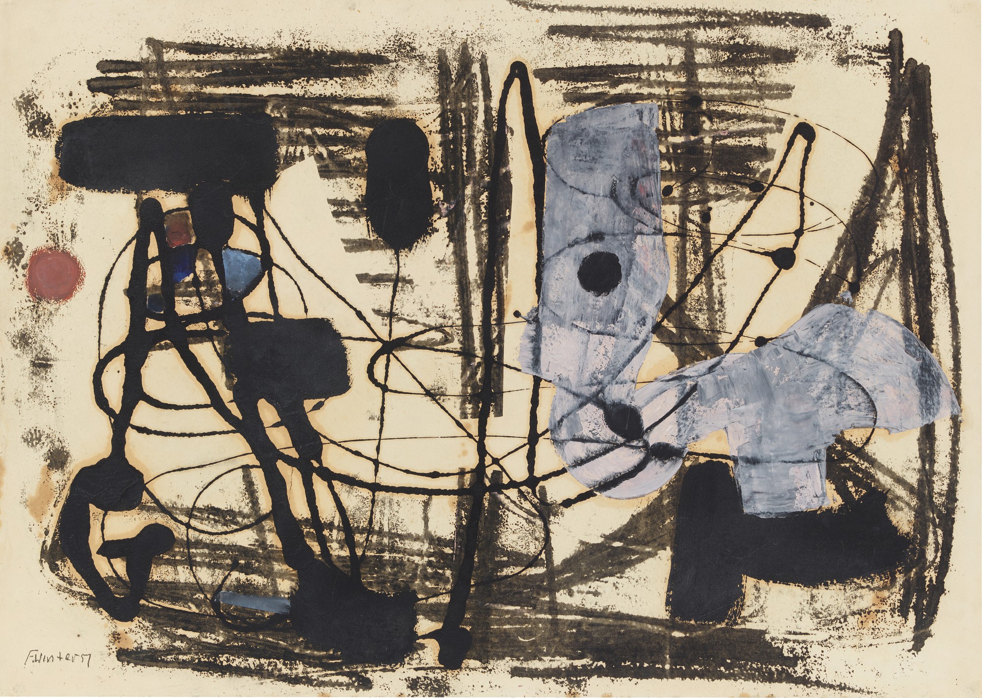
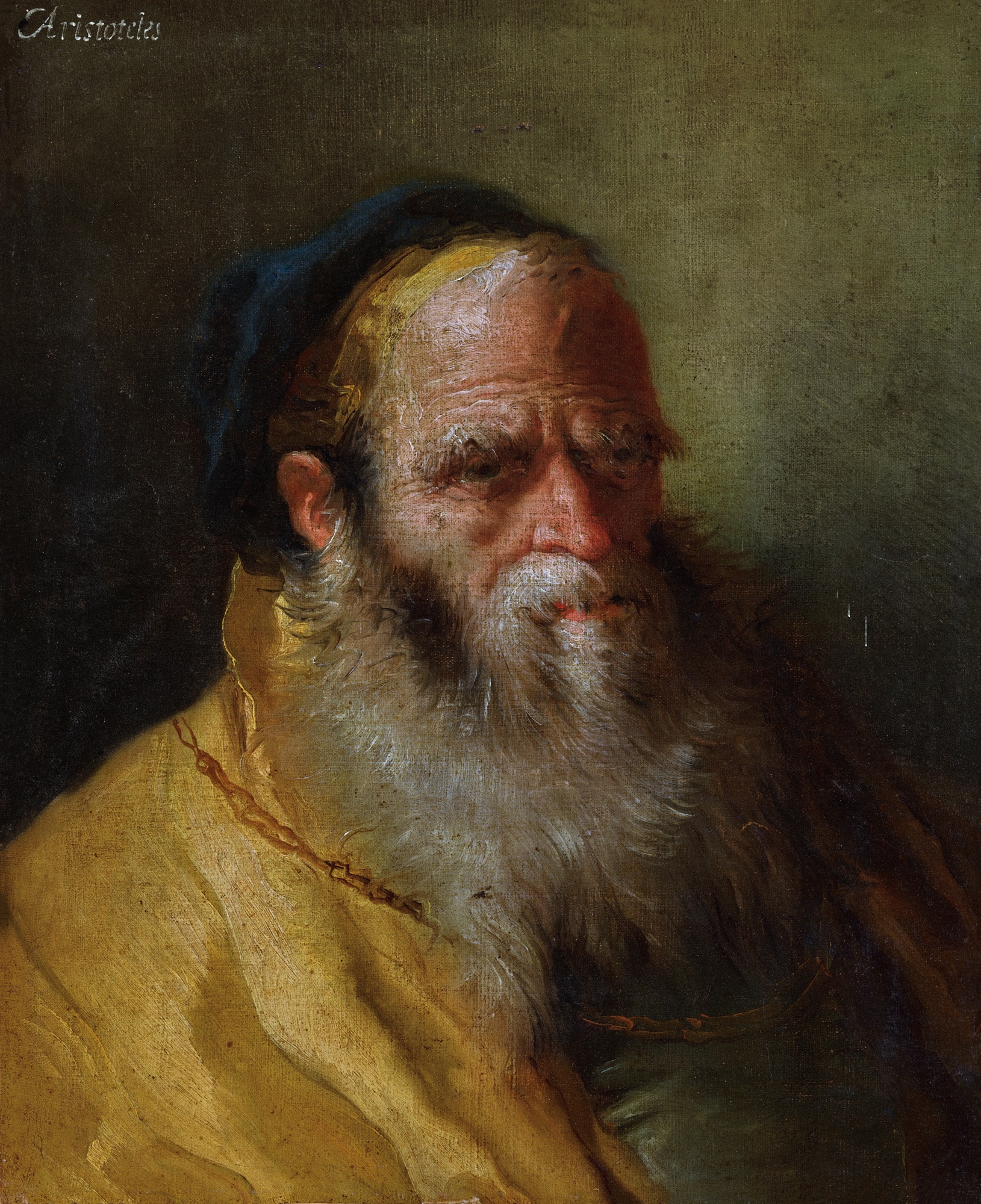
Fritz Winter
Ohne Titel (Schwingend im Raum) Untitled (Swinging in Space), 1951
This asymmetry in availability created an asymmetry in meaning. Blue was sacred, reserved for the Virgin's mantle, for celestial domes, for the robes of power. Yellow was earthly, warm, agricultural, human. The tension between those associations gave painters an almost inexhaustible subject.
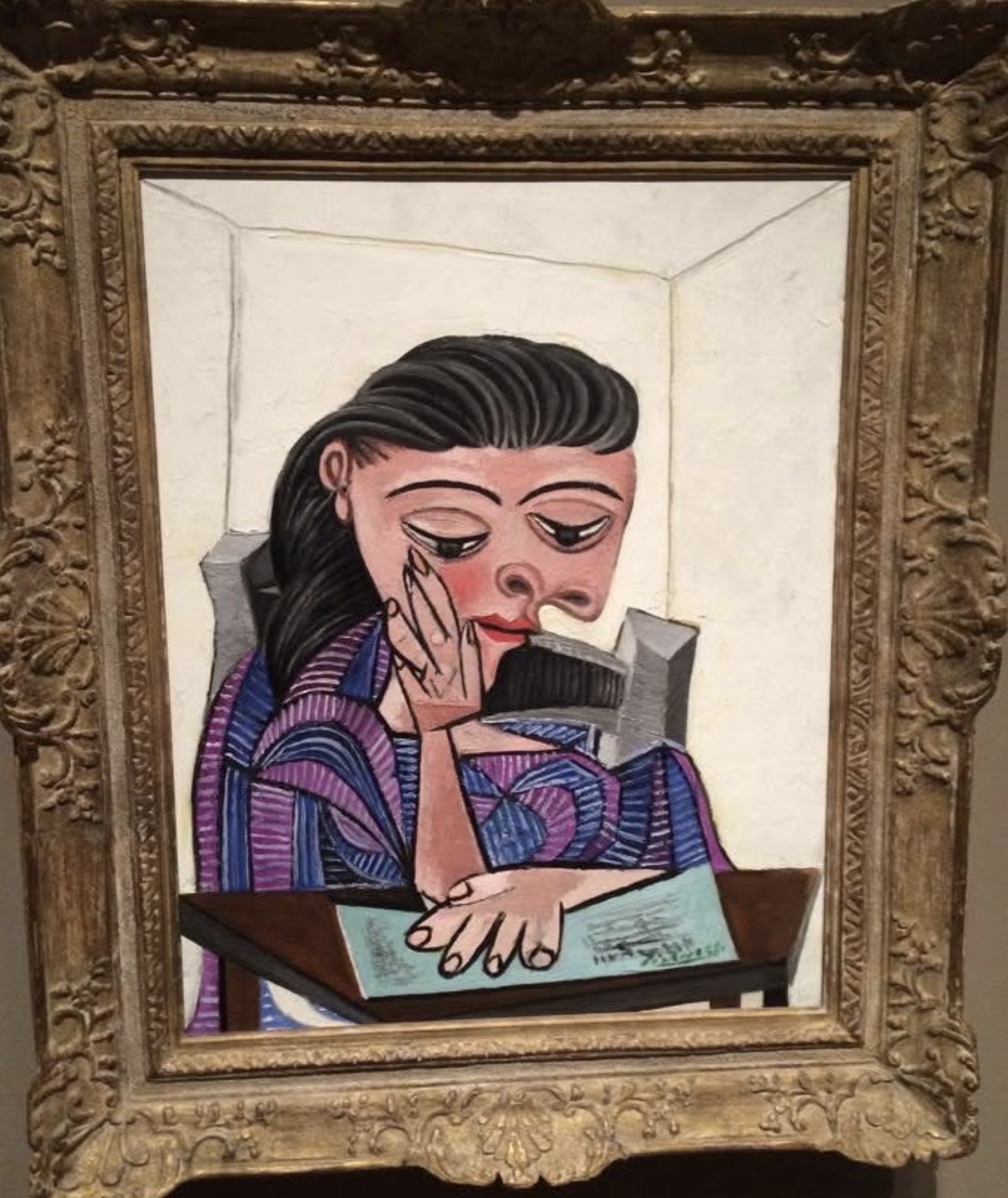
By the eighteenth century, the pairing had moved from symbolic shorthand into something more nuanced and sensory. Giandomenico Tiepolo, working in the tradition of his celebrated father Giambattista, understood the theatrical possibilities of color contrast with exceptional sophistication. The Tiepolo workshop mastered the way golden yellow light could make an expanse of painted sky feel genuinely luminous, the blue becoming deeper and more resonant in the presence of its warm opposite. This was not mere decoration.
Giandomenico Tiepolo
Head of a bearded man in a blue and yellow collared robe
It was an understanding of simultaneous contrast that would only receive its scientific articulation a century later, when Michel Eugène Chevreul published his landmark study of color relationships in 1839. Chevreul's work reverberated through the studios of the nineteenth century and eventually detonated something entirely new in the twentieth. The Impressionists had already begun to understand that color in nature was relational rather than fixed, that a shadow was not simply a darker version of a local color but a complex of complementary hues. By the time Fauvism arrived in 1905 at the Salon d'Automne, the liberation was complete.
Raoul Dufy, one of the movement's most joyful and underestimated practitioners, built much of his visual language around the exhilarating opposition of warm and cool, using yellow as a kind of internal light source against which his blues could sing. His regattas, his racecourses, his festival scenes all depend on this dynamic. The colors are never simply descriptive. They are the subject.
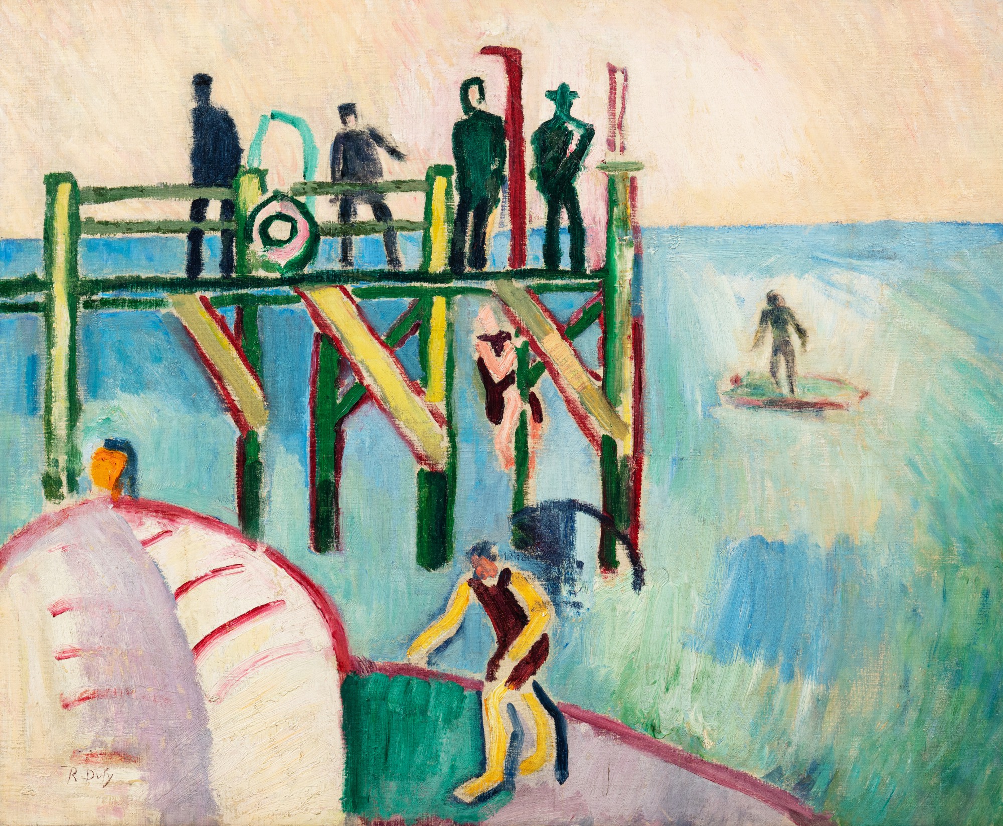
Raoul Dufy
L'Estacade au Havre, 1907
The mid twentieth century brought a more rigorous, philosophical dimension to the conversation. Fritz Winter, working in the aftermath of devastation in postwar Germany, approached color with both urgency and restraint. Associated with the Zen group and deeply influenced by his time at the Bauhaus under Paul Klee and Wassily Kandinsky, Winter understood blue and yellow as carriers of emotional charge that transcended representation entirely. His abstractions from the late 1940s and through the 1950s use these colors as structural forces, anchoring compositions that feel both inevitable and mysterious.
For Winter, painting was a means of reestablishing contact with something essential in human experience at a moment when that experience had been violently disrupted. No survey of this territory could proceed without Yves Klein, whose IKB, International Klein Blue, patented in 1960, made a single color into a philosophical manifesto. Or without Josef Albers, whose Homage to the Square series devoted decades of patient, systematic inquiry to the way colors transform one another through proximity. These figures gave later generations a rigorous language for something painters had long understood intuitively.
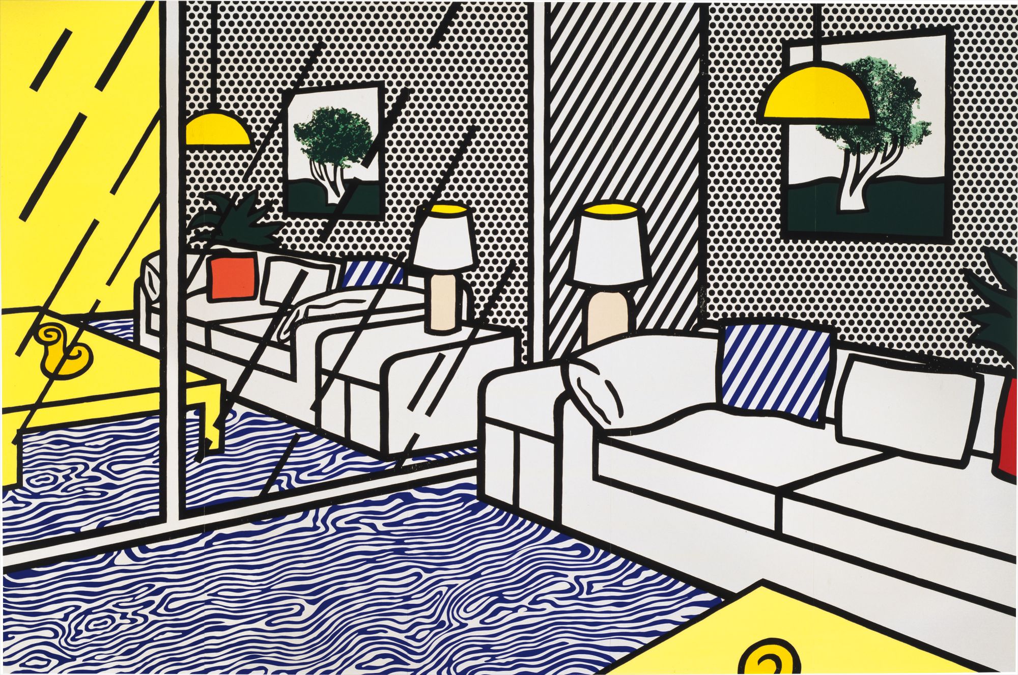
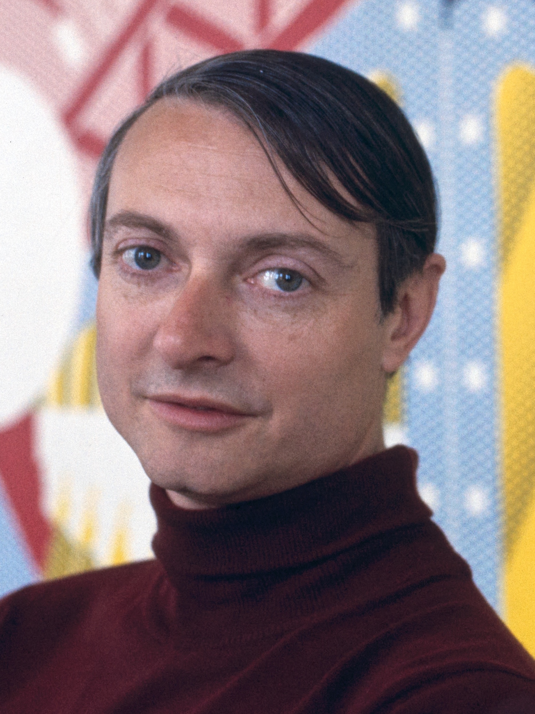
Roy Lichtenstein
Wallpaper with Blue Floor Interior
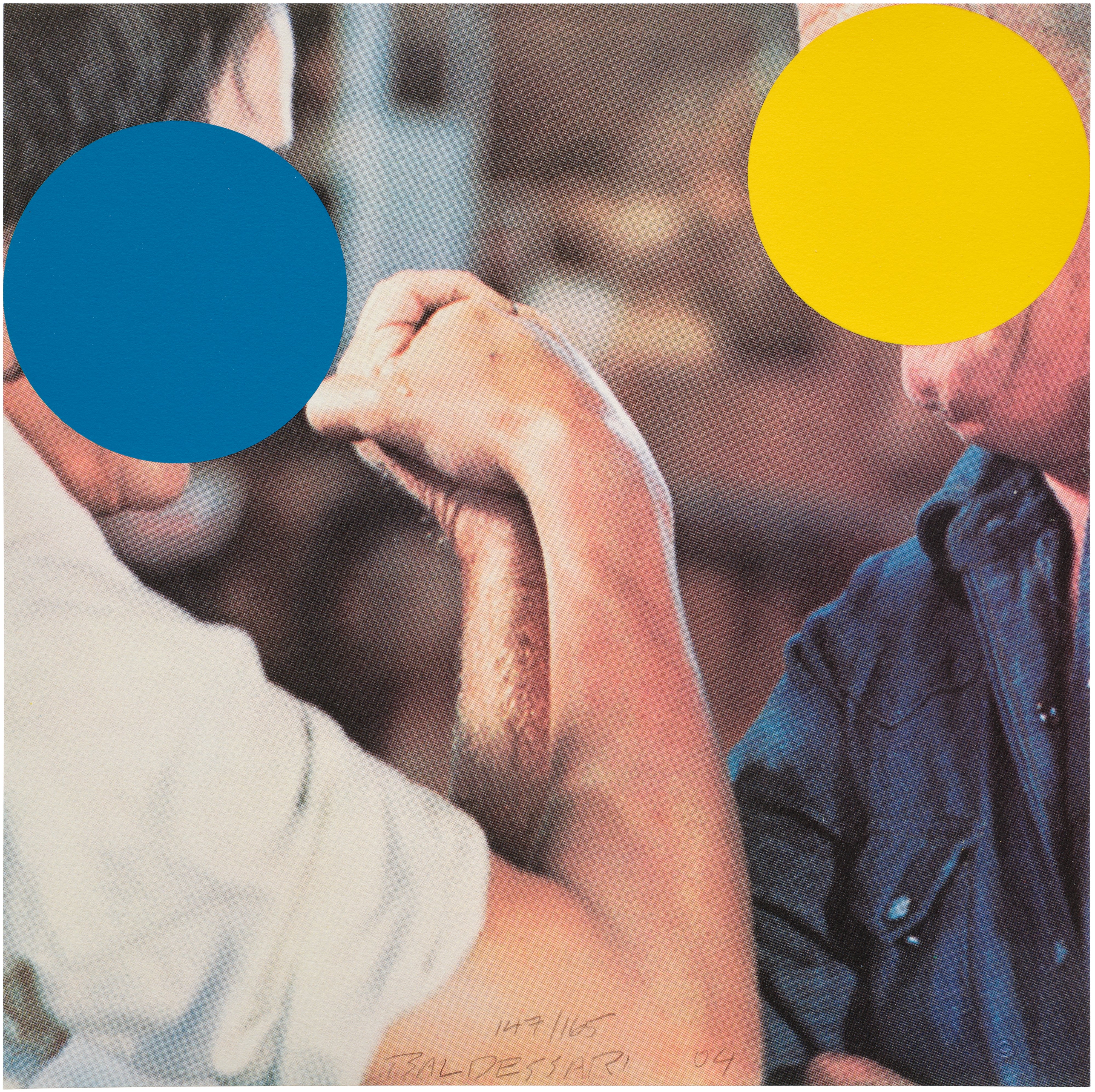
By the time Roy Lichtenstein began working his way through the visual codes of commercial printing in the 1960s, blue and yellow had acquired an entirely new register. In Lichtenstein's hands, the Ben Day dot, that modest artifact of industrial reproduction, made these colors simultaneously ironic and oddly moving. The flatness was the point. The familiarity was the point.
The work on The Collection gives a clear sense of how committed Lichtenstein was to color as both form and content, as both critique and affection. John Baldessari, whose conceptual practice never entirely abandoned the visual pleasures he claimed to distrust, returned repeatedly to color as a way of interrogating what images actually do to us. His use of colored dots to obscure faces in appropriated photographs is perhaps the most famous example, but his broader engagement with how we read and misread visual information runs through everything he made. Blue and yellow, in Baldessari's world, are not merely colors but signs, placeholders in a system of meaning that is always slightly out of reach.
That conceptual skepticism is itself a kind of tribute to how much these colors still carry. What endures about blue and yellow as a pairing is precisely their refusal to resolve into a single meaning. They have been sacred and commercial, lyrical and analytical, romantic and rigorous. They have served the needs of altarpieces and advertising campaigns, of Baroque theatrical illusion and postwar existential searching.
The works gathered on The Collection that engage with this theme demonstrate something that any collector with sustained looking experience eventually comes to understand: color is never incidental. It is always, in the most literal sense, the first thing you see and often the last thing you remember. In blue and yellow, two of the most culturally saturated colors in the Western tradition, that truth becomes impossible to ignore.