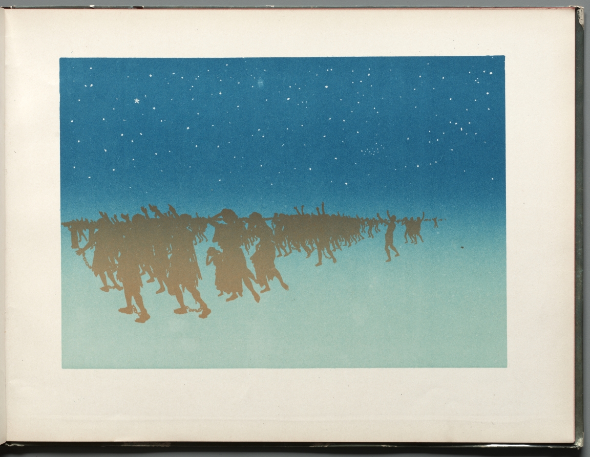
Multi-Color
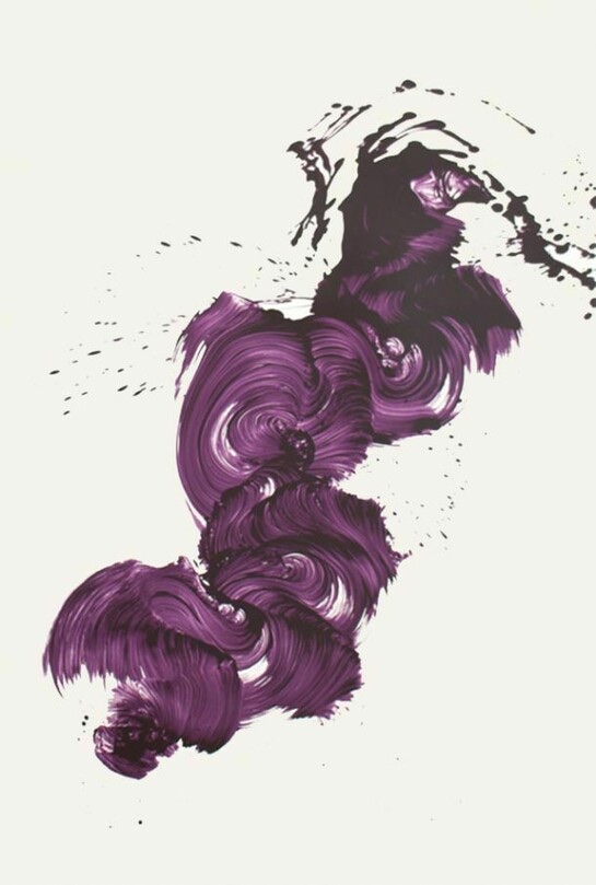
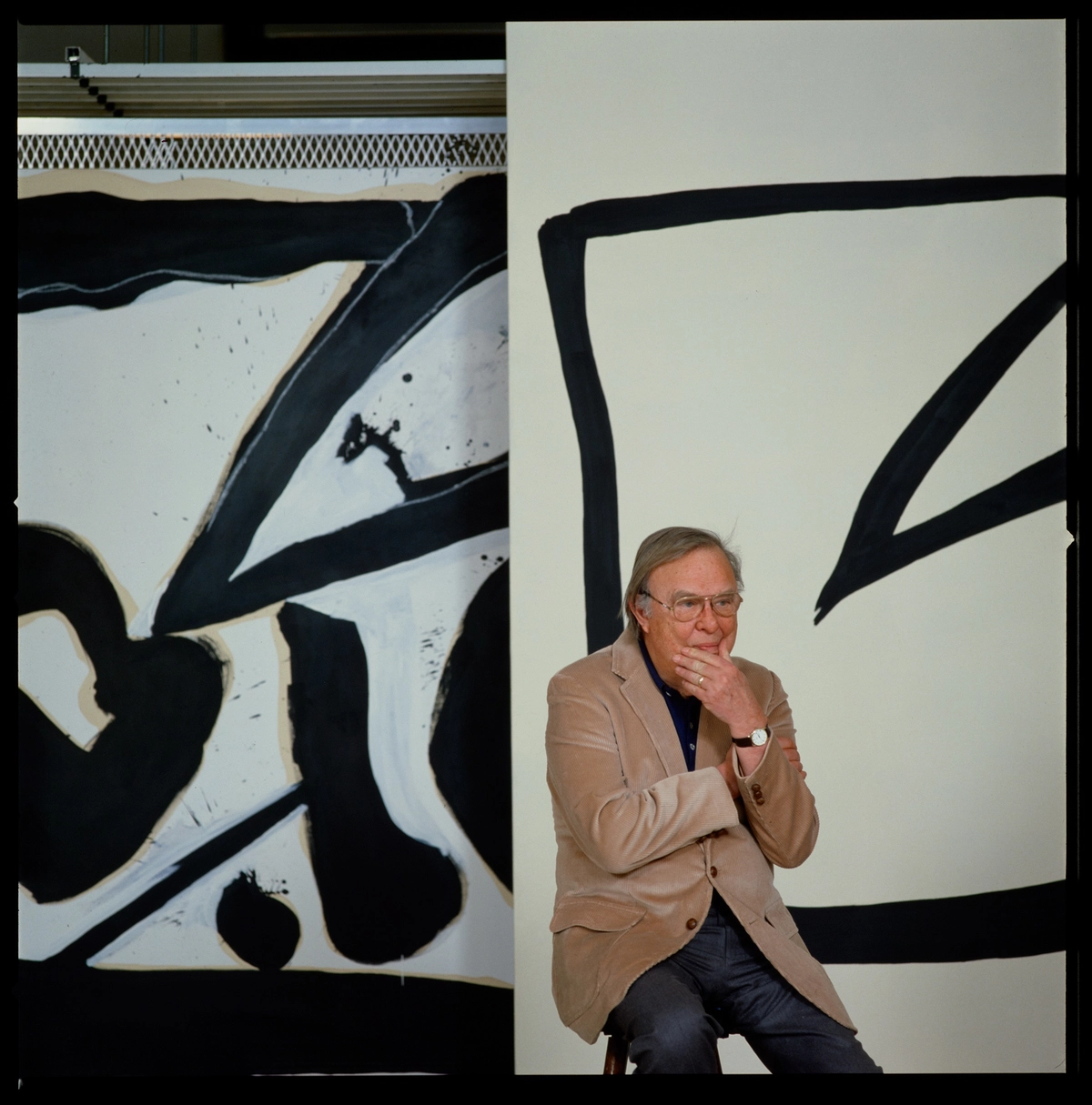
Jamie Nares
Step up, 2013


```json
{ "headline": "Every Color at Once, Nothing Left Out", "body": "There is a particular kind of collector who is drawn to multi color work not despite its complexity but because of it. Living with a painting or print that refuses to settle into a single mood is a very different proposition from living with something monochromatic or restrained. The multi color work changes across the day as the light shifts, seems almost to breathe differently depending on the season, and demands an ongoing conversation rather than a single declarative statement. For collectors who find themselves bored by the predictable, work that orchestrates many colors simultaneously offers something closer to a continuous experience than a fixed object.
", "Separating a good multi color work from a truly great one comes down to a deceptively simple question: does the color feel inevitable, or does it feel arbitrary? In the strongest examples, every color decision appears to have been arrived at through necessity rather than whim, each hue in tension or dialogue with its neighbors in a way that creates an internal logic. This is what makes Frank Stella's work from his Irregular Polygon series and later his maximalist reliefs of the 1970s and 1980s so instructive to study. The color never decorates the structure; it is the structure.
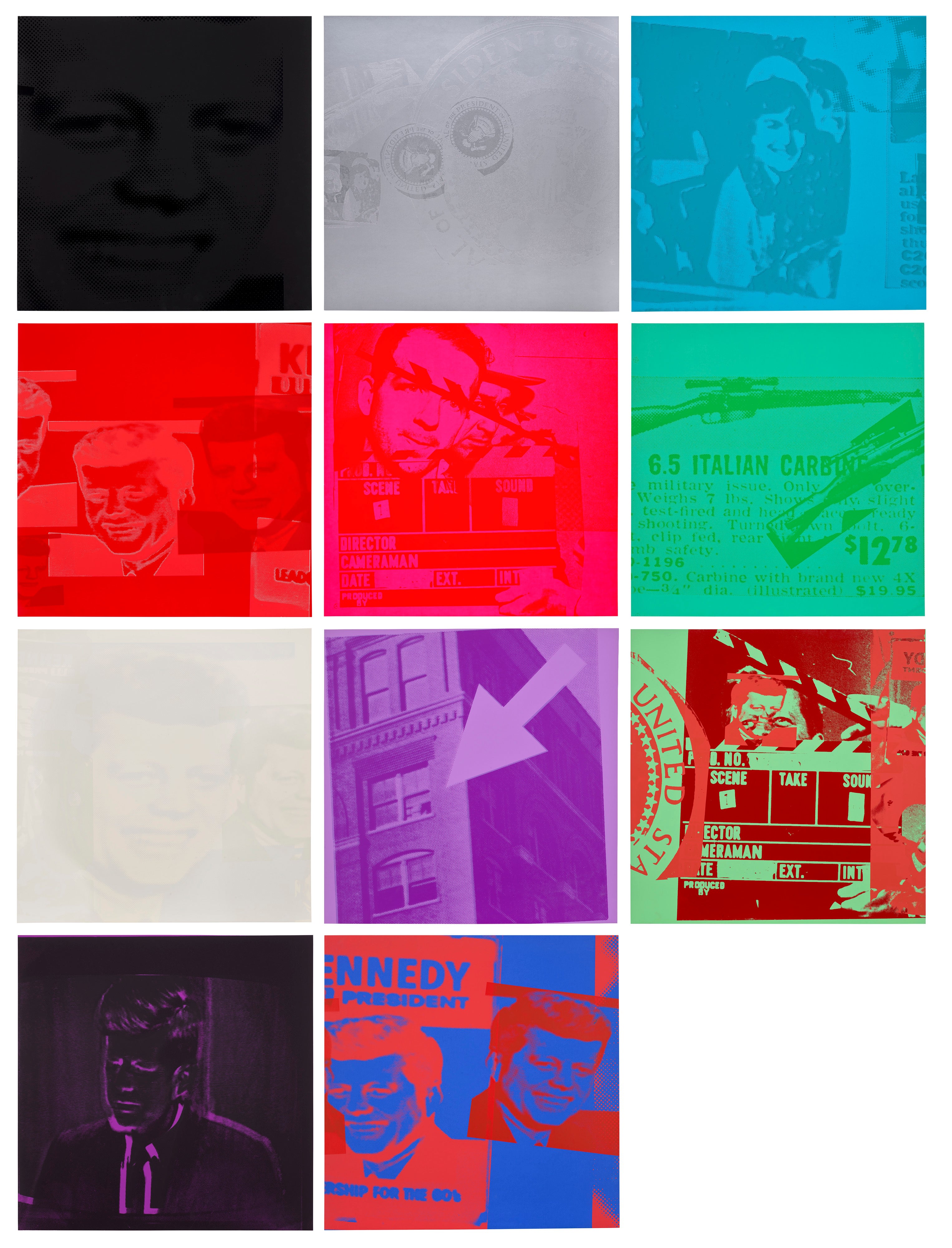
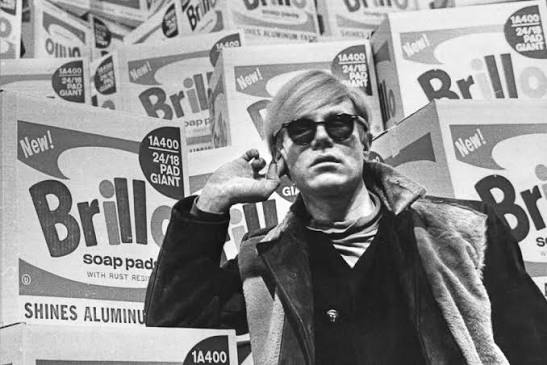
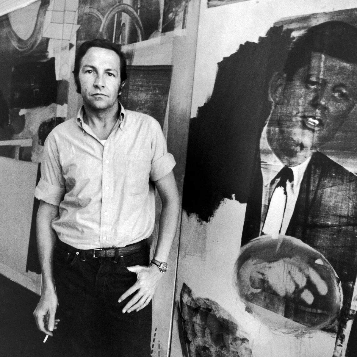
Andy Warhol
Flash - November 22, 1963 (F. & S. 32-42)
Collectors should look carefully at whether a work holds together at the edges, where lesser artists often falter, letting the composition dissolve or become incoherent.", "Andy Warhol remains one of the most compelling arguments for multi color collecting, and not simply because of his market dominance. His understanding of color as cultural signal rather than aesthetic exercise was genuinely radical. When he repeated the same image across different colorways, he was making a philosophical argument about perception and desire, not just a graphic decision.
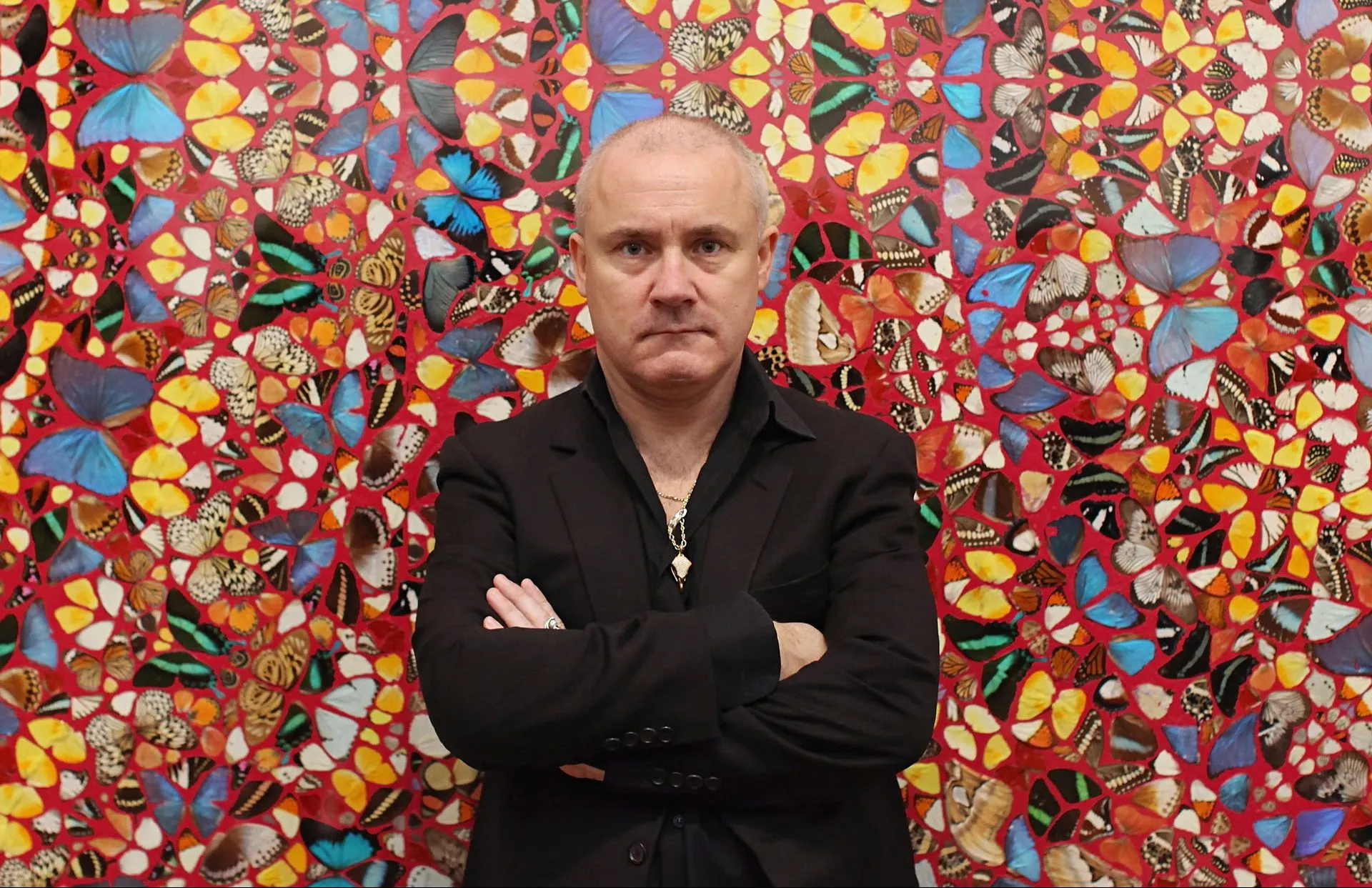
His work is well represented on The Collection and for good reason: it performs consistently across market cycles because it appeals both to the pure aesthetics crowd and to collectors motivated by art historical significance. Joan Miró occupies a similarly durable position. His biomorphic forms in blazing primaries and unexpected earthy tones carry a kind of joyful structural discipline that has never gone out of fashion and continues to find new admirers across generations.", "Damien Hirst's Spot Paintings are perhaps the most polarizing multi color works of the past thirty years, and that polarization is itself a market signal worth attending to.
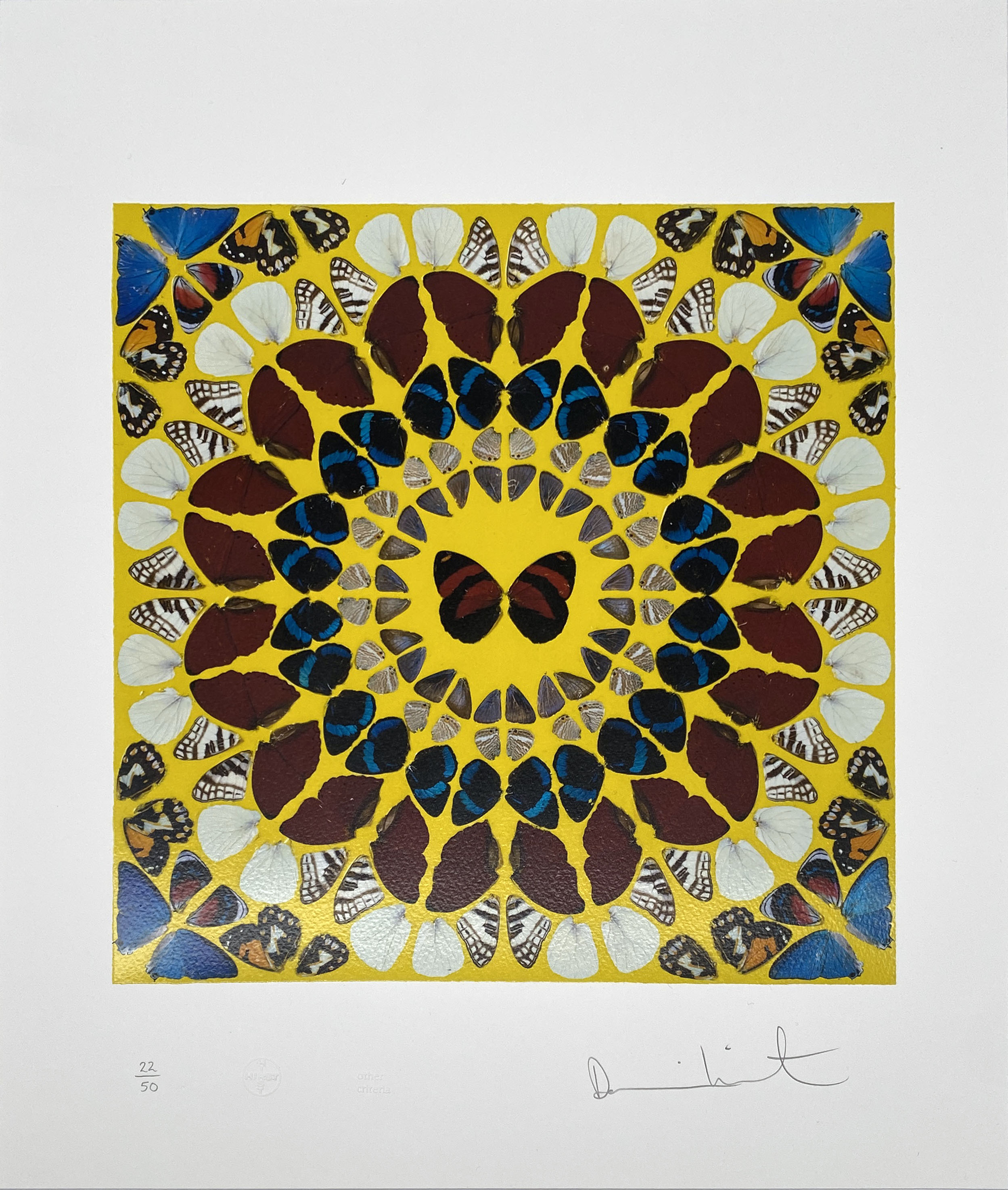
Damien Hirst
Miracle, 2015
The works divide opinion so sharply because they strip color of gesture and emotion entirely, presenting it as pure optical phenomenon. Whether one finds this liberating or cold, the series has demonstrated remarkable secondary market consistency, particularly for larger format works with unusual or rare color combinations. Howard Hodgkin, whose works are also represented on The Collection, operated at the opposite emotional register: his color was drenched in memory and sensation, layered over time in ways that rewarded patient looking. The market for Hodgkin has deepened appreciably since his death in 2017, with collectors recognizing that supply is finite and that his best works occupy genuinely singular territory.
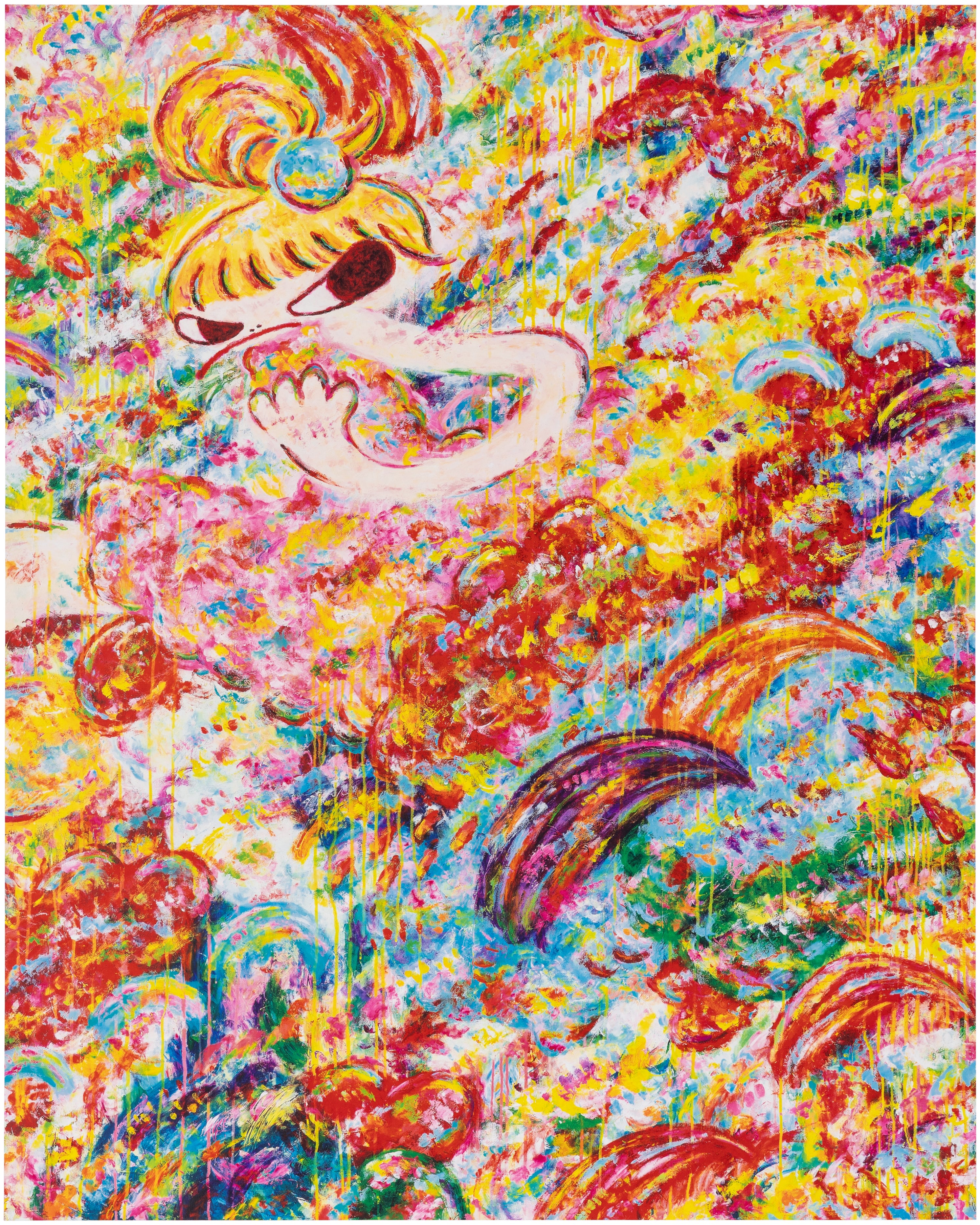
", "For those looking toward emerging and underrecognized positions, Ayako Rokkaku deserves serious attention. She works without brushes, applying paint directly with her hands and fingers, generating surfaces of extraordinary chromatic density that carry a rawness and spontaneity rare in contemporary painting. Her auction results have accelerated sharply in recent years, particularly in Asia and Europe, suggesting she is moving from emerging to established faster than the critical conversation has quite caught up with. Brenna Youngblood is another figure worth watching, her work interrogating color through collage and found material in ways that complicate the boundary between painting and object.
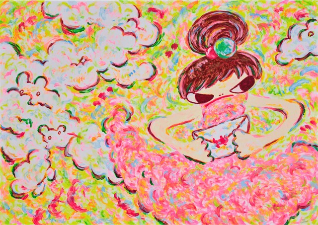
Ayako Rokkaku
Untitled (Print B), 2021
Both artists represent the kind of moment where engaged collectors can still acquire significant work before institutional validation locks prices into a higher tier.", "On the secondary market, multi color works present some specific dynamics that collectors should understand before buying or selling. Strong color saturation and surface integrity are essential to value retention. Fading, foxing, or surface abrasion in a work where color is the primary vehicle of meaning is not a minor condition issue; it fundamentally compromises what the work is.
For prints and editions, which feature prominently in the output of artists like Robert Rauschenberg and Chuck Close, buyers should always ask for the edition number and size, examine impression quality against known references, and verify that colors match documented states. A late pull from a degraded screen or plate can look superficially similar to an early impression while differing dramatically in chromatic vibrancy.", "When approaching a gallery about a multi color work, there are several questions that quickly reveal how much the seller understands what they are offering. Ask about the specific pigments or media used, particularly for works made after 1950 where synthetic materials vary widely in lightfastness.
Ai Weiwei
Serpentine Gallery Pavilion
Ask whether the work has been exhibited and under what lighting conditions, since prolonged exposure to UV or halogen light can affect certain fugitive colors over time. Ask about provenance with genuine curiosity rather than mere due diligence; the ownership history of a work often tells you something about how it was valued and by whom. And if you are looking at an edition, ask to see the printer's proof or artist's proof documentation, which can illuminate how the final published work relates to the artist's original intention.", "Display considerations for multi color work are more consequential than collectors often realize until it is too late.
The wrong wall color can suppress or distort the palette of even a major work, and lighting temperature matters enormously. Warm tungsten light will push a cool blue toward gray and amplify reds and yellows in ways the artist never intended. Museum standard LED lighting with a high color rendering index is now accessible at reasonable cost and makes a genuine difference. The great advantage of building a collection around multi color work is that when it is displayed thoughtfully, the results can be transformative.
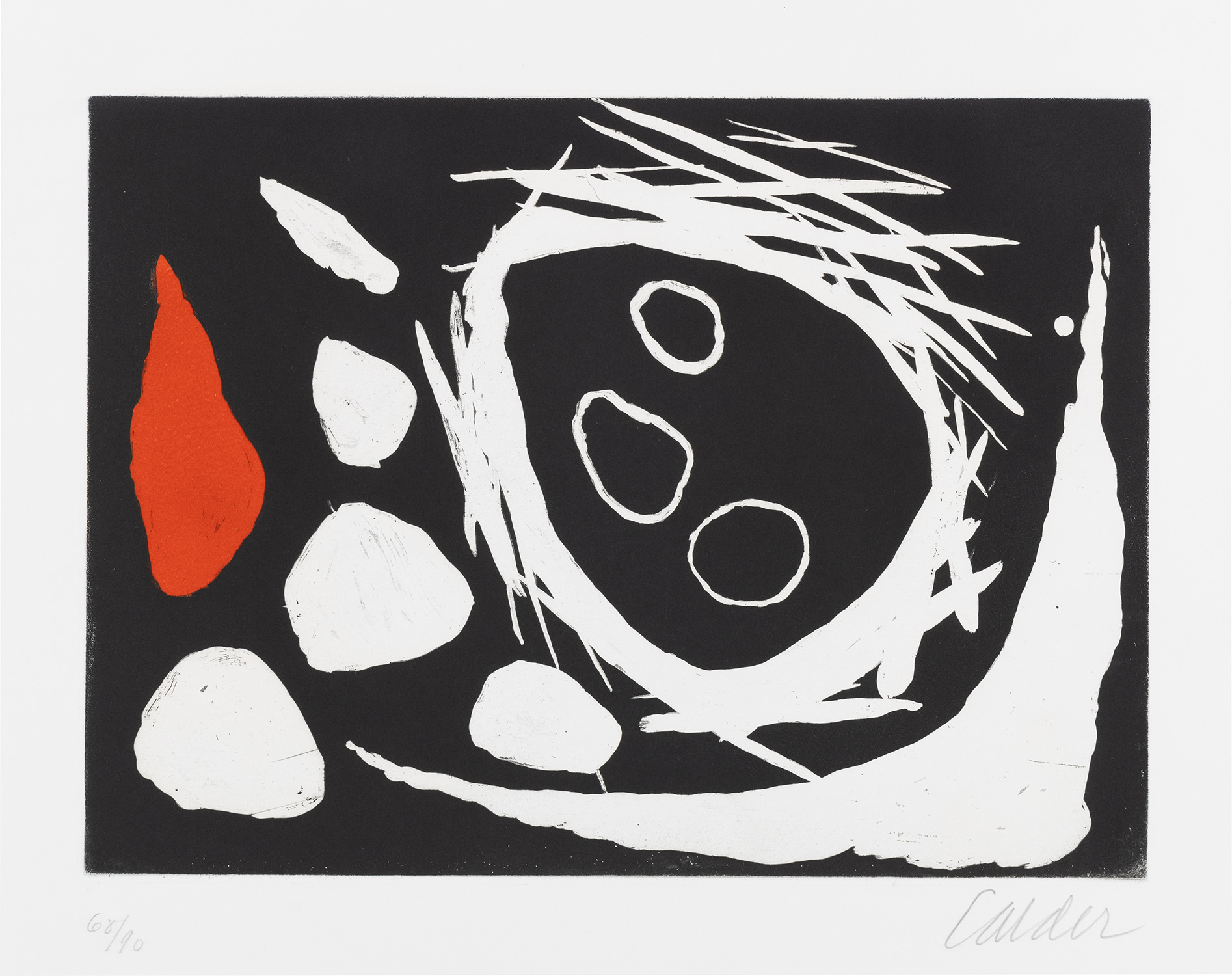
A single strong work by Miró, Stella, or Calder can shift the entire emotional atmosphere of a room in ways that more restrained work simply cannot achieve. That capacity to transform a space is, ultimately, why collectors keep returning to color with such devotion.