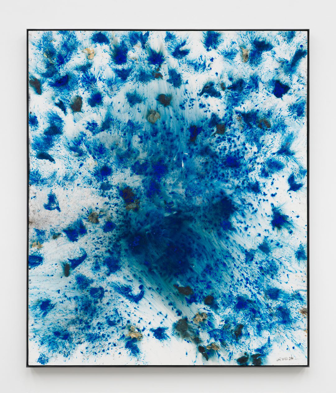
Chromatic Intensity
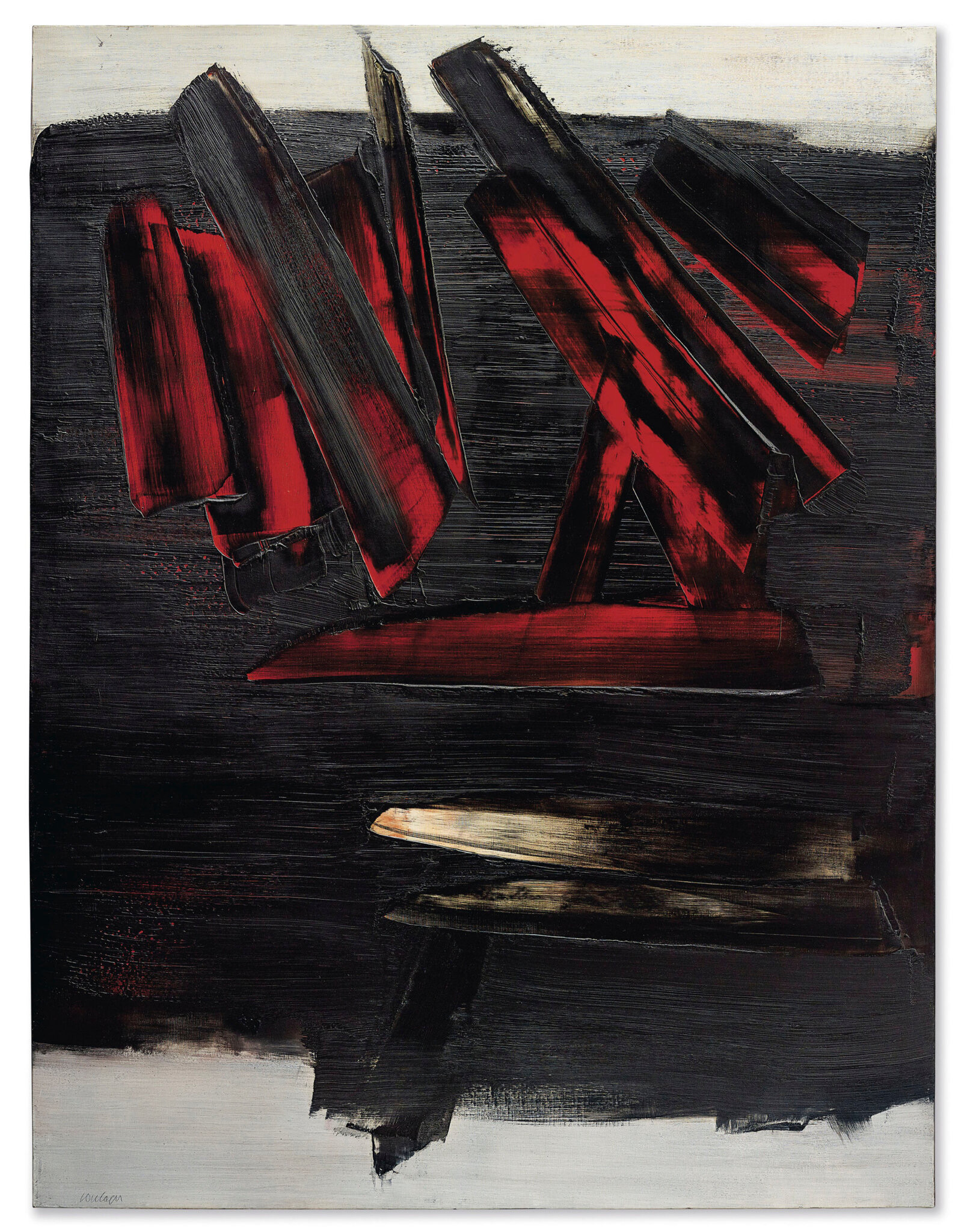
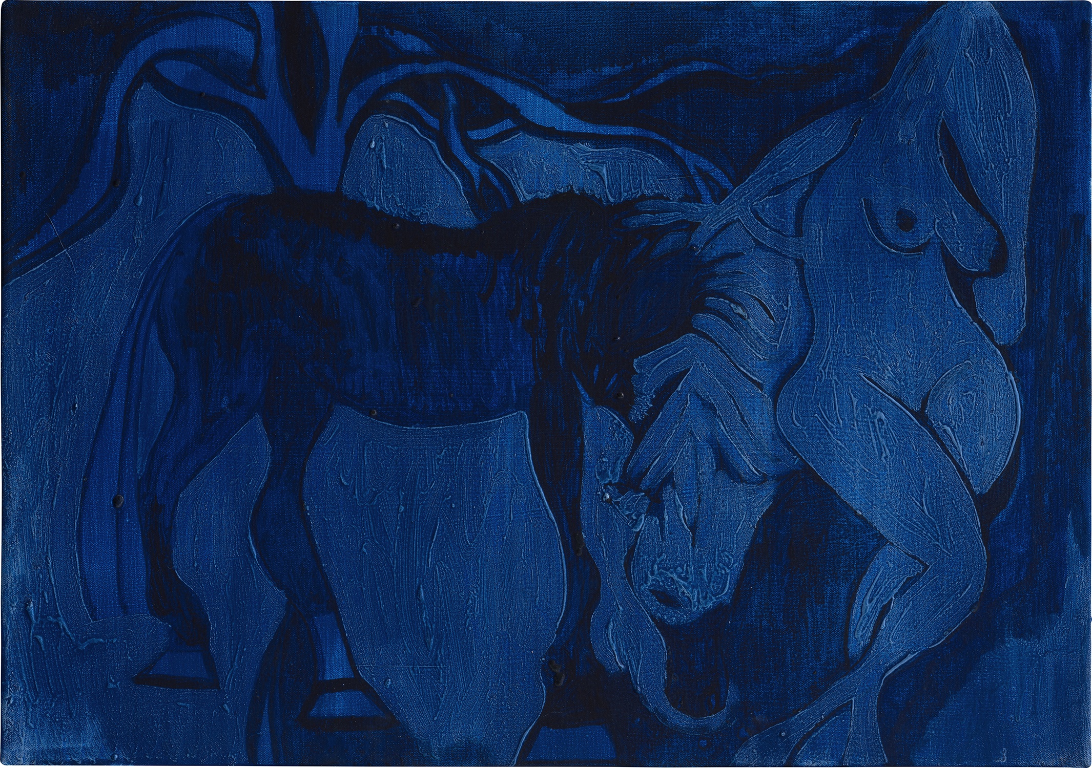
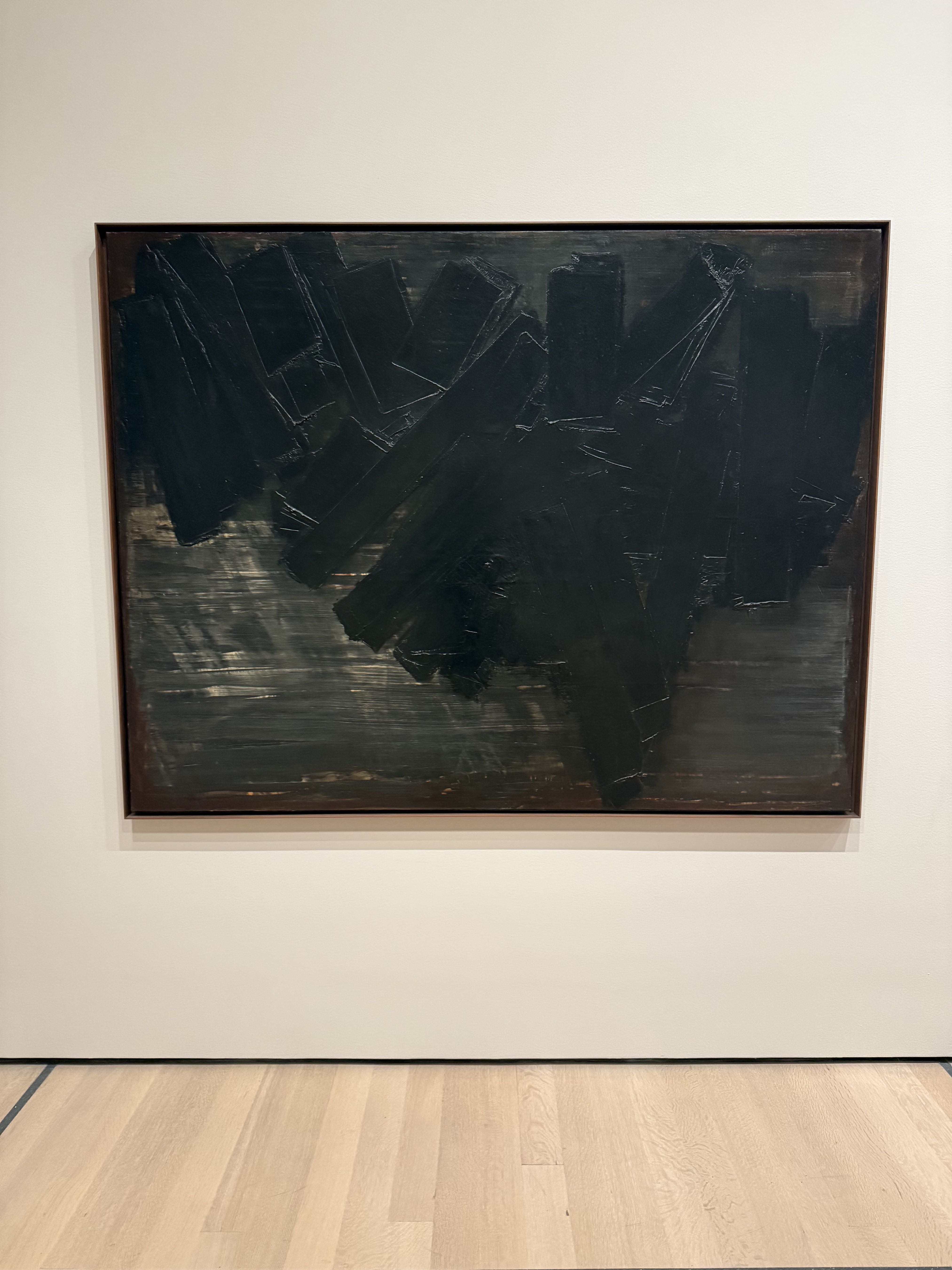
Pierre Soulages
Peinture 186 x 143 cm, 23 Décembre 1959, 1959
Color Has Never Been Neutral
There is a moment, standing before a canvas saturated with pure, unmediated color, when intellectual distance collapses entirely. You stop analyzing and start feeling. Chromatic intensity, the deliberate marshaling of color to its most concentrated, emotionally charged potential, is one of the oldest ambitions in painting and one of the least exhausted. It is not about brightness exactly, nor about palette size.
It is about the pressure color can exert on consciousness, the way a field of deep ultramarine or a collision of cadmium orange and viridian can seem to breathe, pulse, or press outward from the surface toward the viewer. The roots of this pursuit stretch back centuries, but the modern chapter begins in earnest with the Post Impressionists. Van Gogh's letters to his brother Theo in the late 1880s read almost like a manifesto for chromatic ambition, describing how he chose colors not for their descriptive accuracy but for their suggestive force. Gauguin, working alongside him in Arles in 1888, was developing similar ideas from a different direction, flattening form in order to let color carry meaning on its own.
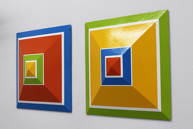
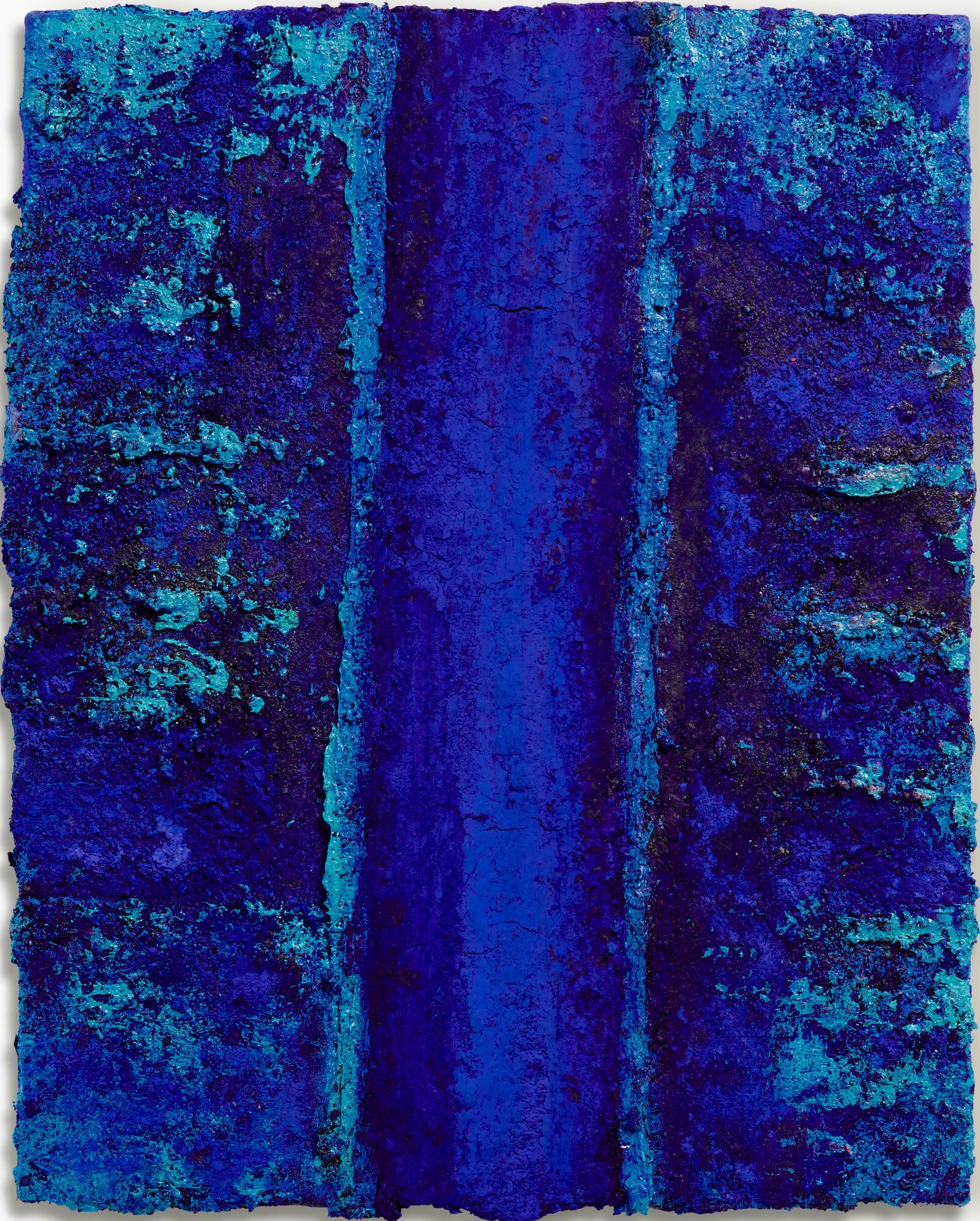
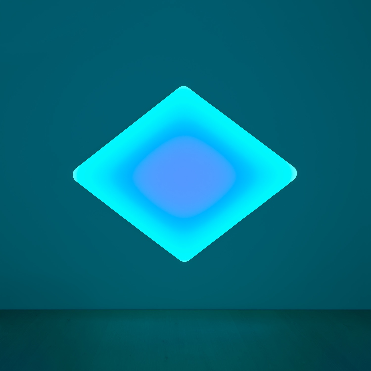
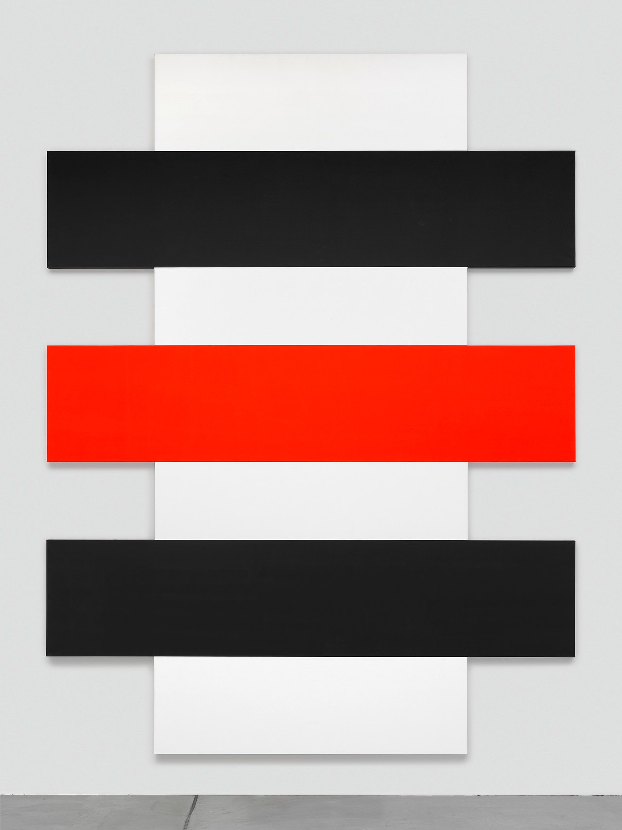
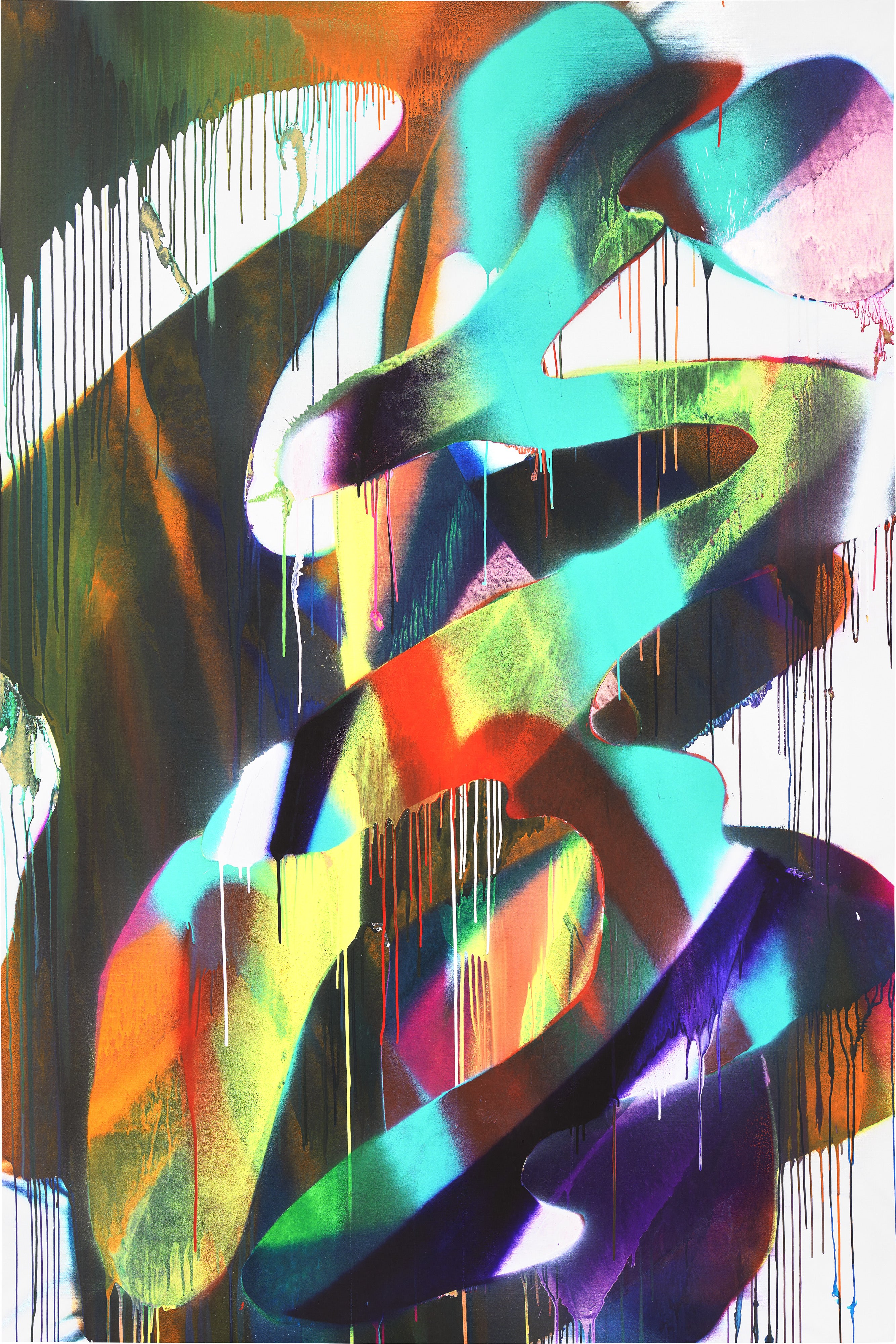
Delos Van Earl
Alber's Square Diptych, 2018
These two artists understood, intuitively and then theoretically, that color was not decoration. It was argument. The Fauves crystallized this understanding into a movement. When Henri Matisse, André Derain, and their circle submitted work to the Salon d'Automne in Paris in 1905, the critical response was largely hostile but historically inevitable.
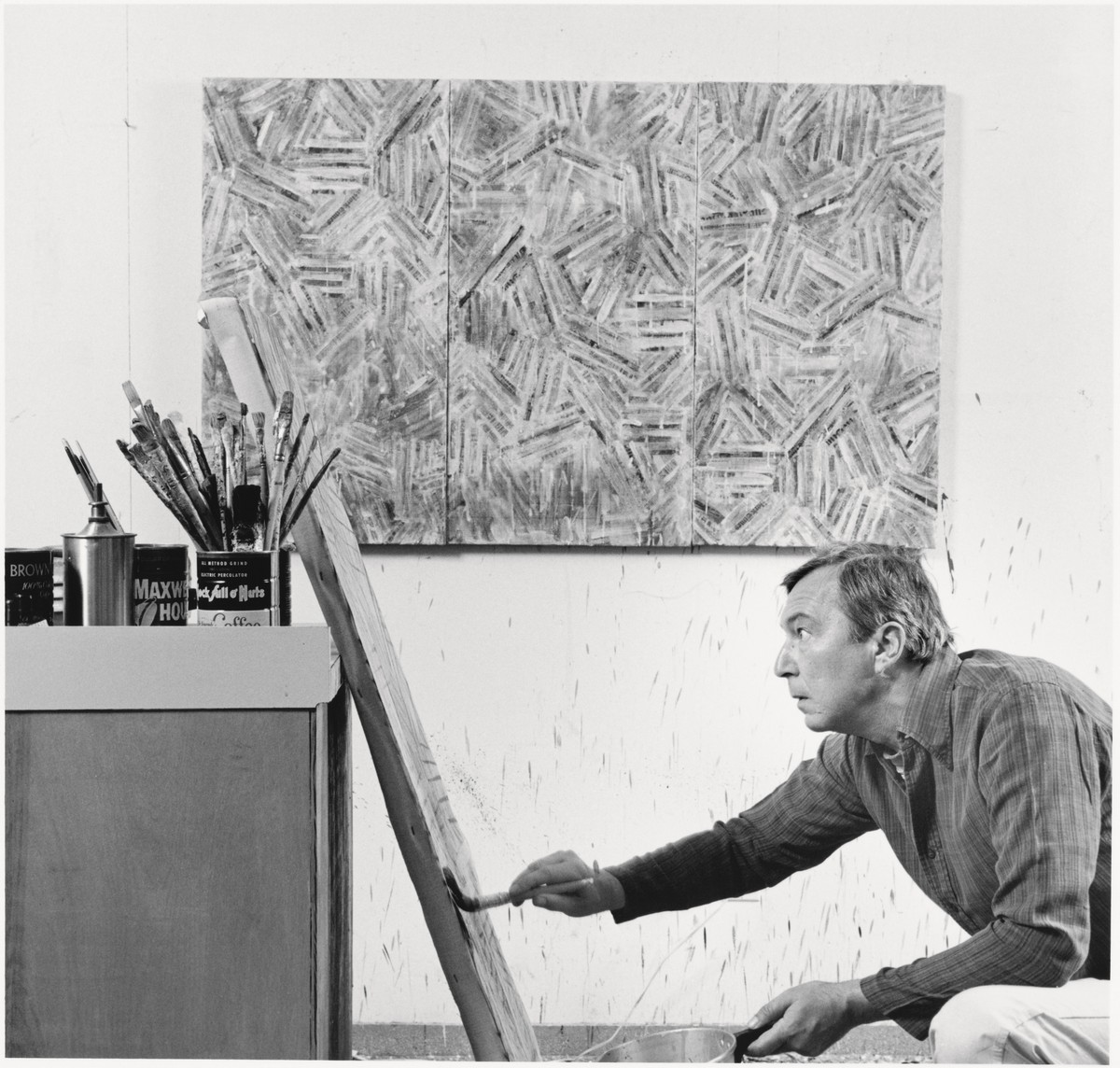
The nickname the Fauves, the wild beasts, was meant as an insult. It became a description of exactly what color could do when released from the obligation to describe nature faithfully. Matisse would spend the rest of his career refining this release, working toward what he called the art of balance, where color relationships generated a specific emotional temperature in the viewer rather than simply representing the visible world. Abstract Expressionism in postwar New York pushed chromatic intensity into new philosophical territory.
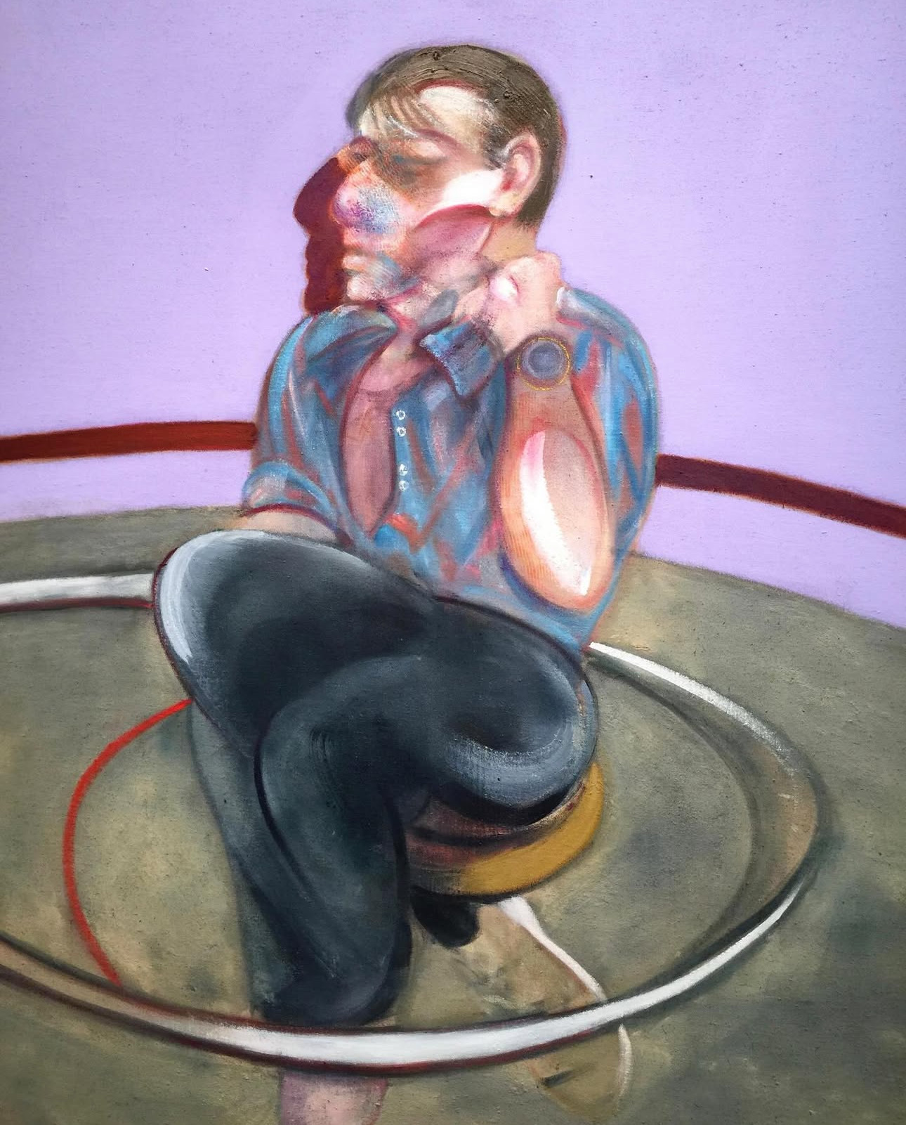
Pierre Soulages
Peinture 186 x 143 cm, 23 Décembre 1959, 1959
Mark Rothko's mature paintings from the 1950s onward asked whether color alone could bear the full weight of human feeling, grief, transcendence, and vulnerability included. Barnett Newman's famous zip paintings, with their vast expanses of single colors divided by thin vertical lines, proposed that color at scale was an almost physical encounter. It is within this lineage that Pierre Soulages occupies such a singular and fascinating position. Known for his investigation of black, what he called outrenoir or beyond black, Soulages demonstrated that even the apparent absence of color could generate intense optical and emotional experience through the manipulation of light on textured surfaces.
His work on The Collection stands as a reminder that chromatic intensity is finally about perception and sensation, not simply the visible spectrum. Nicolas de Staël represents a different but equally compelling chapter in this history. His paintings from the late 1940s through the mid 1950s move between figuration and abstraction, but the constant across all of it is the almost sculptural density of his paint application and the extraordinary confidence of his color choices. De Staël was building color in thick impasto passages, creating surfaces that read differently depending on light conditions and viewing distance.
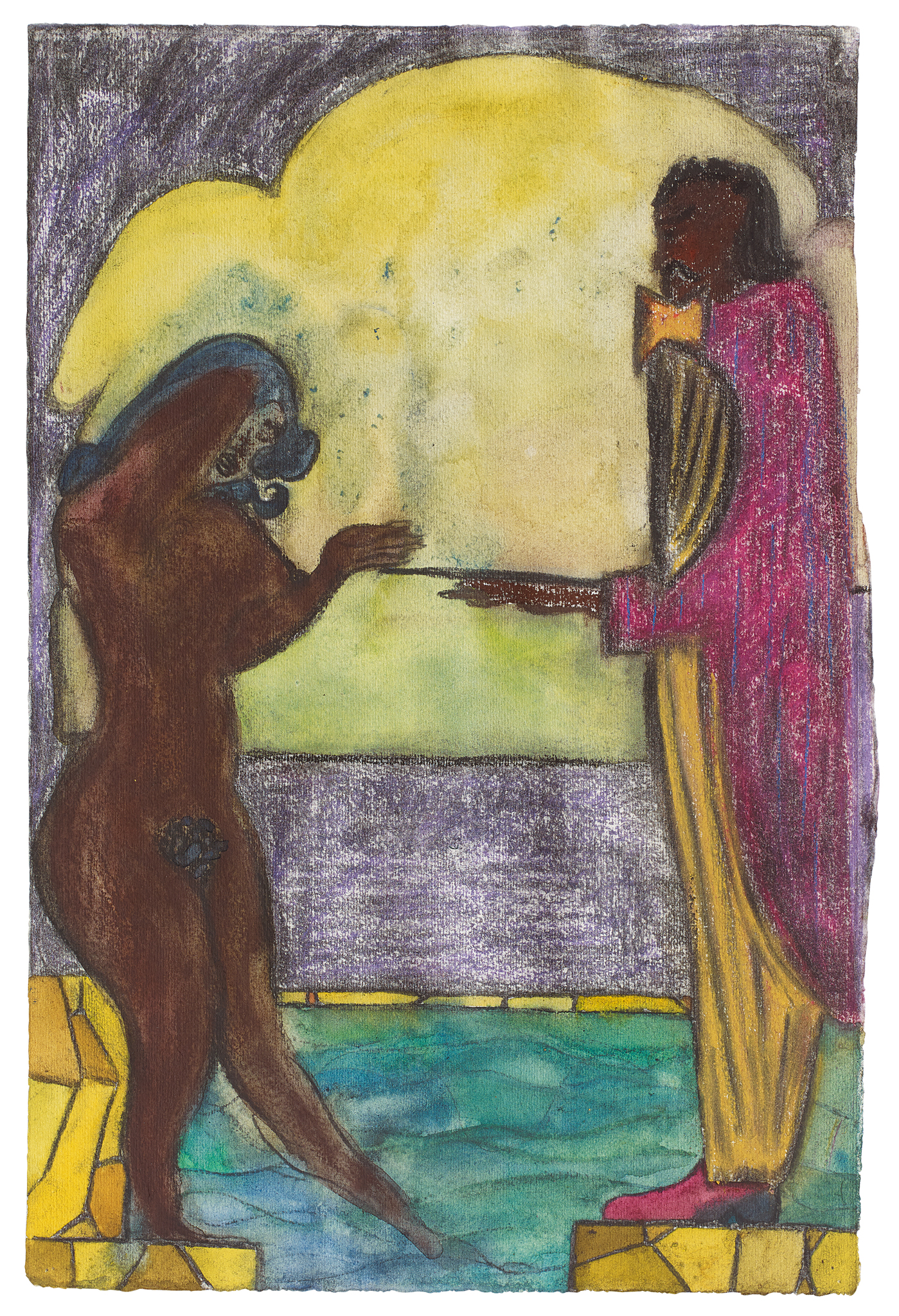
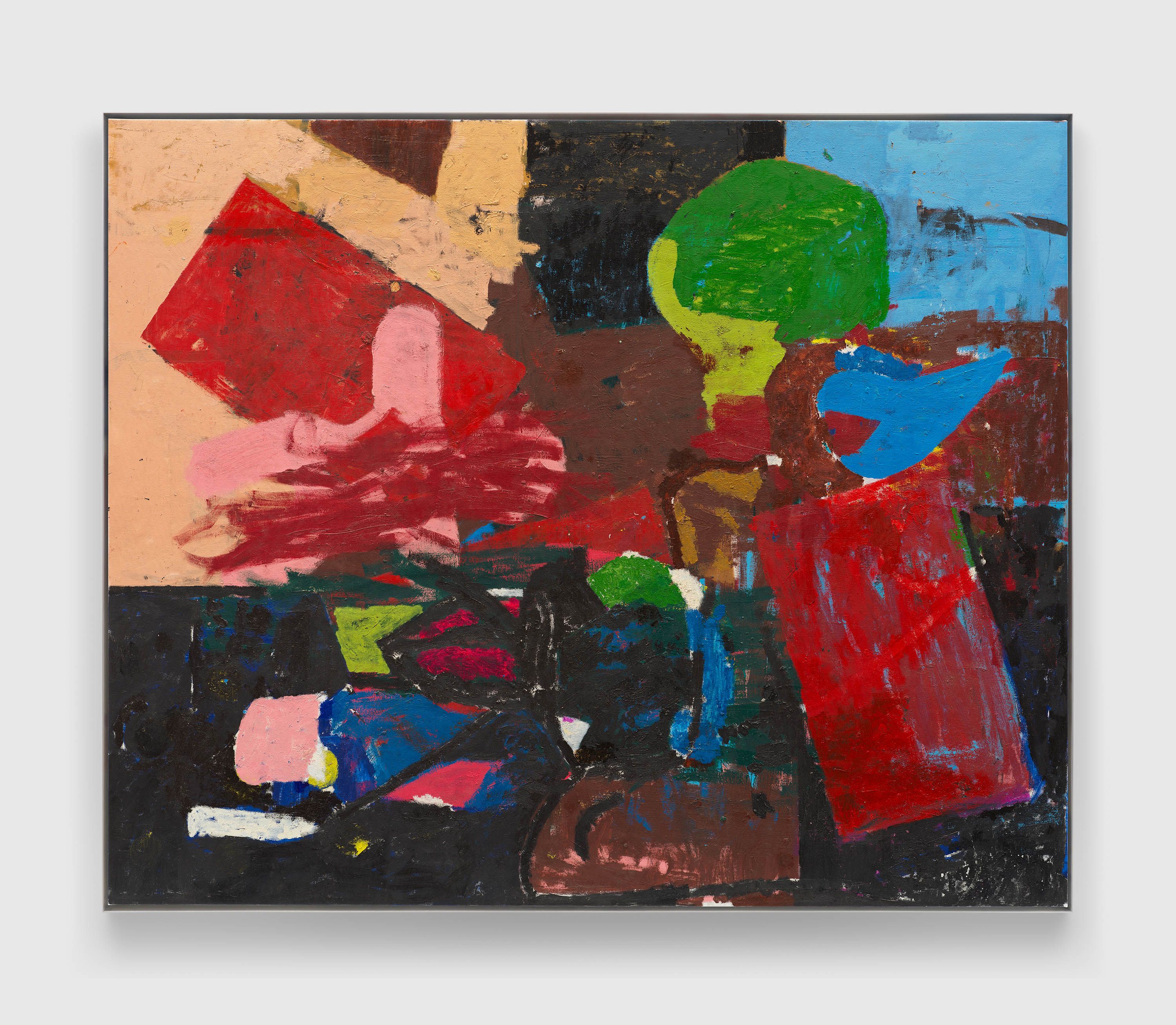
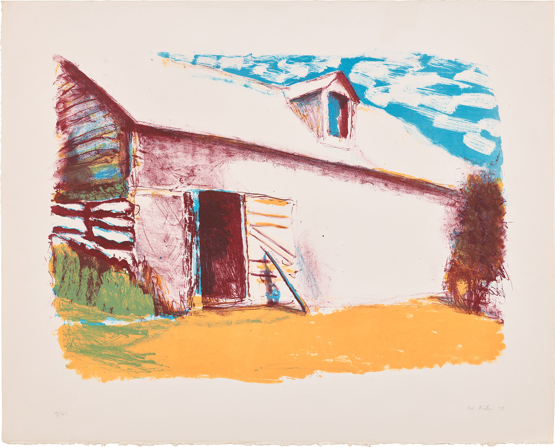
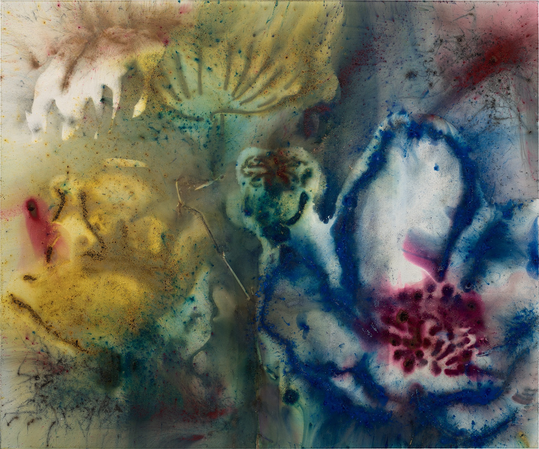
Chris Ofili
Poolside Magic 16, 2013
His palette was neither timid nor gratuitous. It was calibrated, always in service of a particular emotional register that felt simultaneously Mediterranean and melancholic, sun drenched and interior. Seeing his work is to understand that chromatic intensity does not require loudness. It requires conviction.
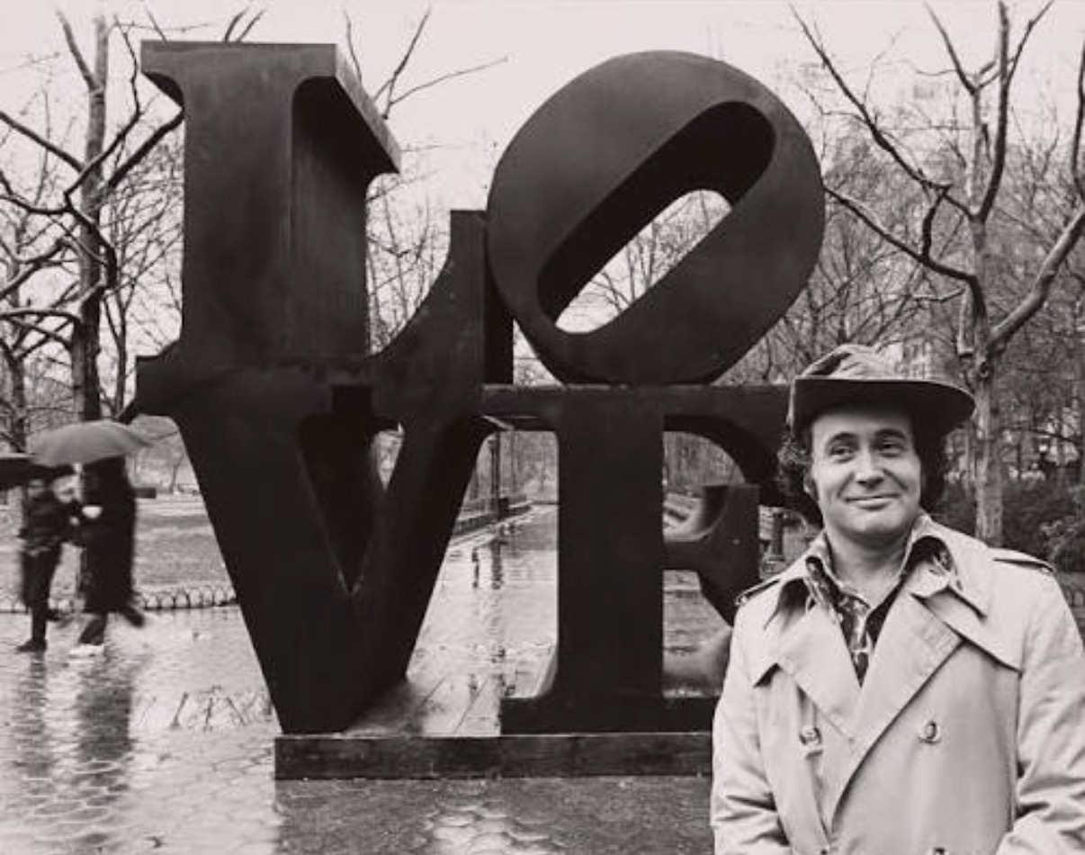
Robert Indiana brought a different cultural intelligence to the question of color. Coming out of the Pop Art movement in the 1960s, Indiana worked with hard edges, sign painting traditions, and the visual vocabulary of American commercial life. His iconic use of primary colors and bold graphic forms transformed familiar language into something that felt monumental. Where the Abstract Expressionists had located emotional intensity in gesture and scale, Indiana found it in legibility itself, in the strange power that comes from a known word rendered in a color so direct it bypasses irony entirely.
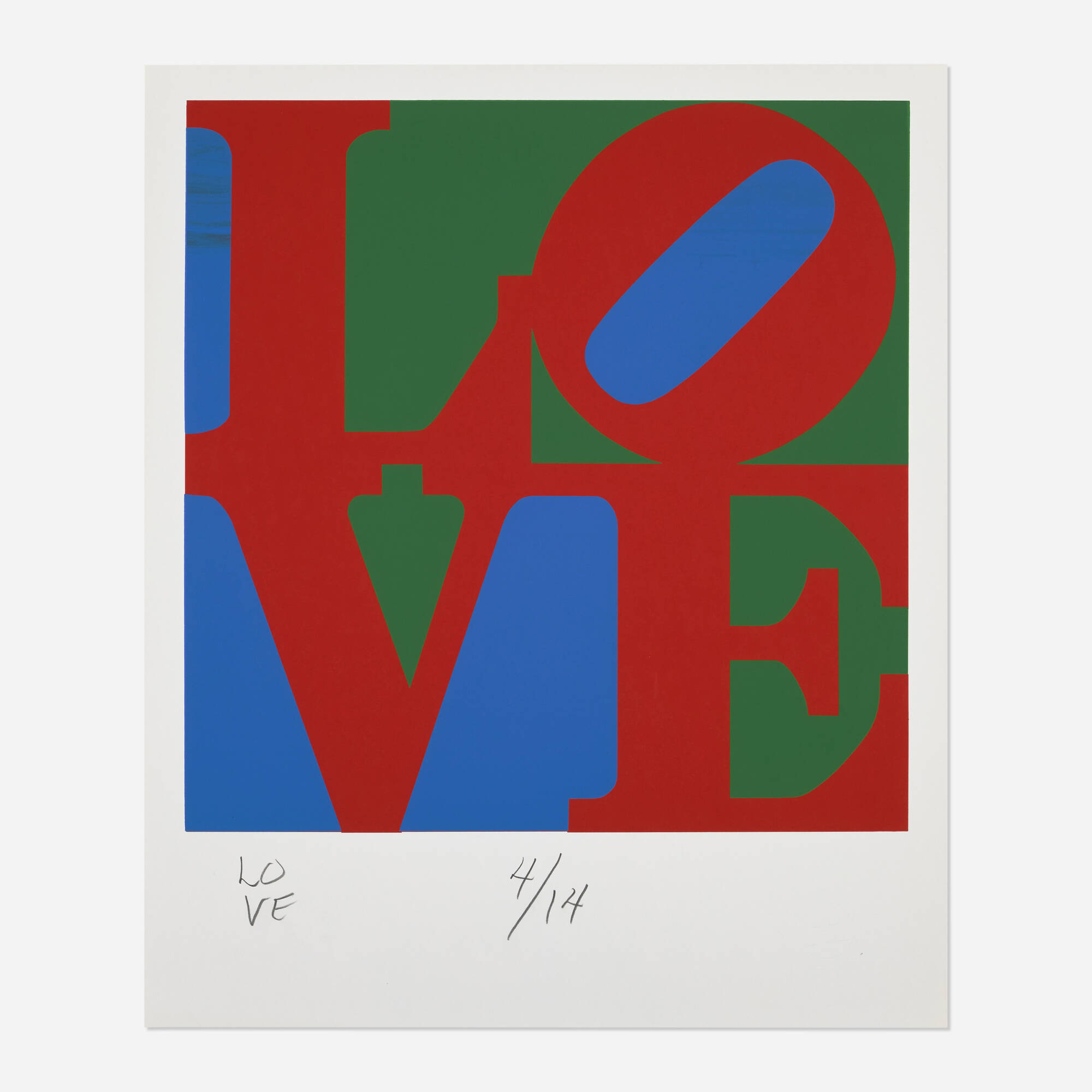
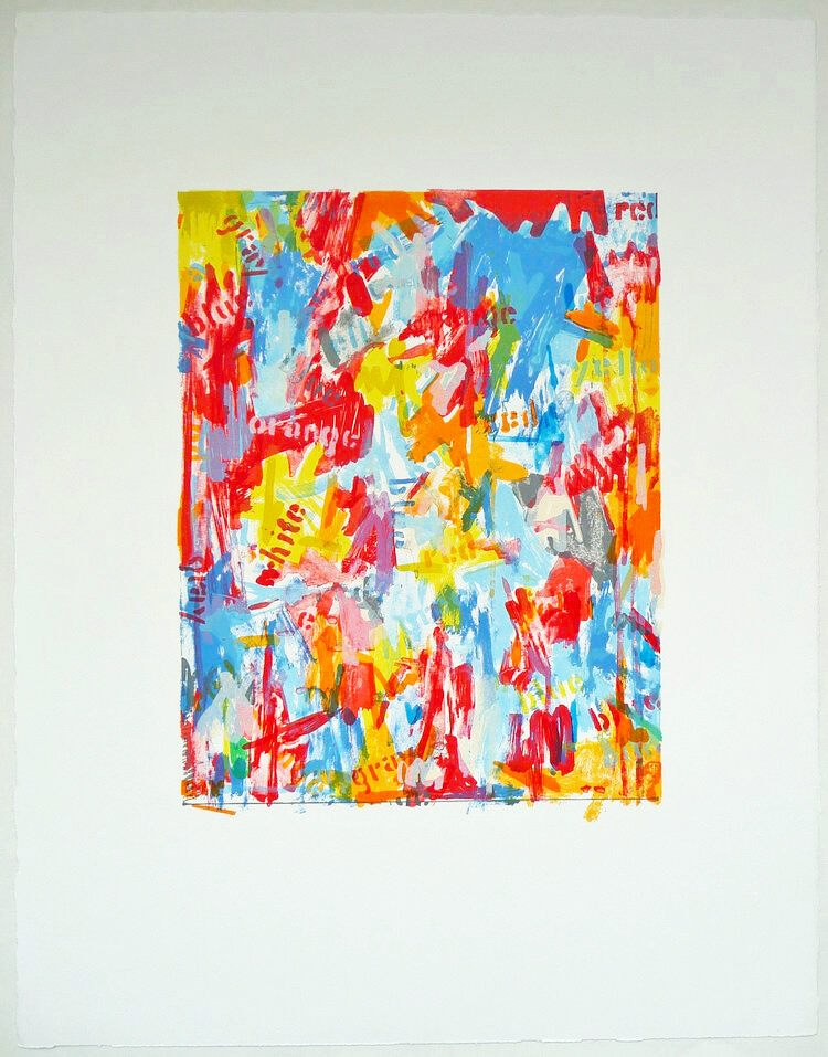
Robert Indiana
Love (from The Book of Love: Art & Poetry booklet), 1996
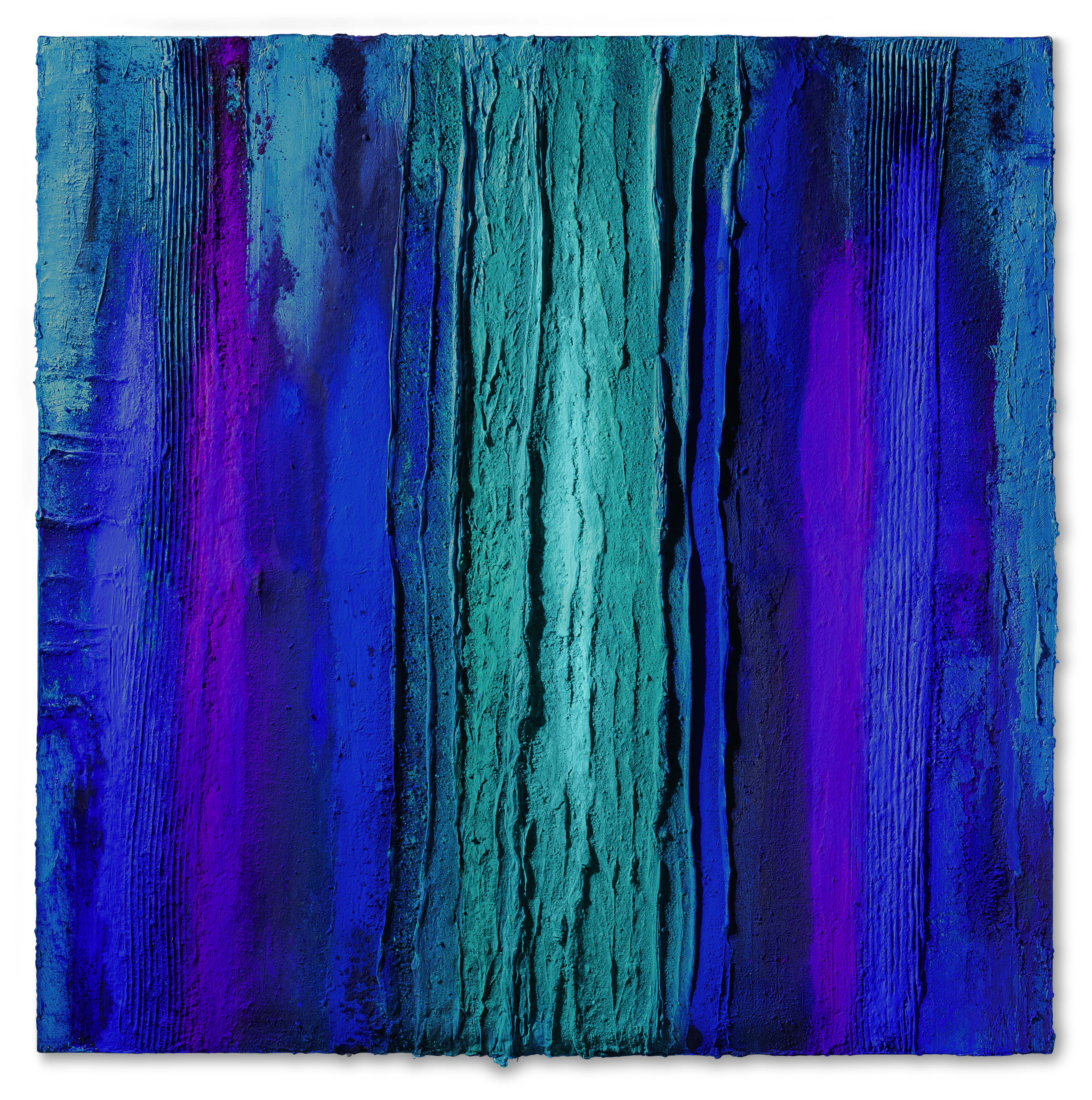
His engagement with color was inseparable from his engagement with American identity, desire, and longing. Contemporary painters working in this space carry these inheritances with varying degrees of awareness and varying degrees of willingness to engage with them directly. Chase Langford approaches color with a structural rigor that has clear debts to Color Field painting, using layered transparent glazes to build surfaces of considerable optical complexity. Jean de Caldain works with a palette that reads as intensely personal, rooted in observation but transformed through an interior emotional logic.
Austin Eddy brings figuration back into contact with chromatic ambition, allowing color to operate at a temperature that sometimes outpaces narrative, so that the feeling of a painting arrives before its subject does. These three artists, all represented on The Collection, suggest that the conversation about what color can do is nowhere near finished. What unites painters across this history, from Gauguin's flat tropical oranges to Soulages's light absorbing blacks, is the understanding that color is a form of address. It speaks directly to the viewer at a register that bypasses language.
This is why chromatic intensity has always attracted serious painters who are interested in the full range of what painting can communicate, not just its descriptive or narrative functions. It is also why collectors who care about this quality find themselves returning to certain works again and again, not to decode them but to be in their presence. For the contemporary collector, chromatic intensity is one of the more reliable indicators of an artist's seriousness and ambition. It is easy to use color decoratively.
It takes genuine commitment to use it as the primary structural and emotional logic of a work. The artists gathered here around this theme, whether working in abstraction, figuration, or somewhere in between, are all engaged in that more demanding project. They are making the case, each in their own language, that looking at color with full attention is one of the more profound experiences painting can offer.