Serigraph
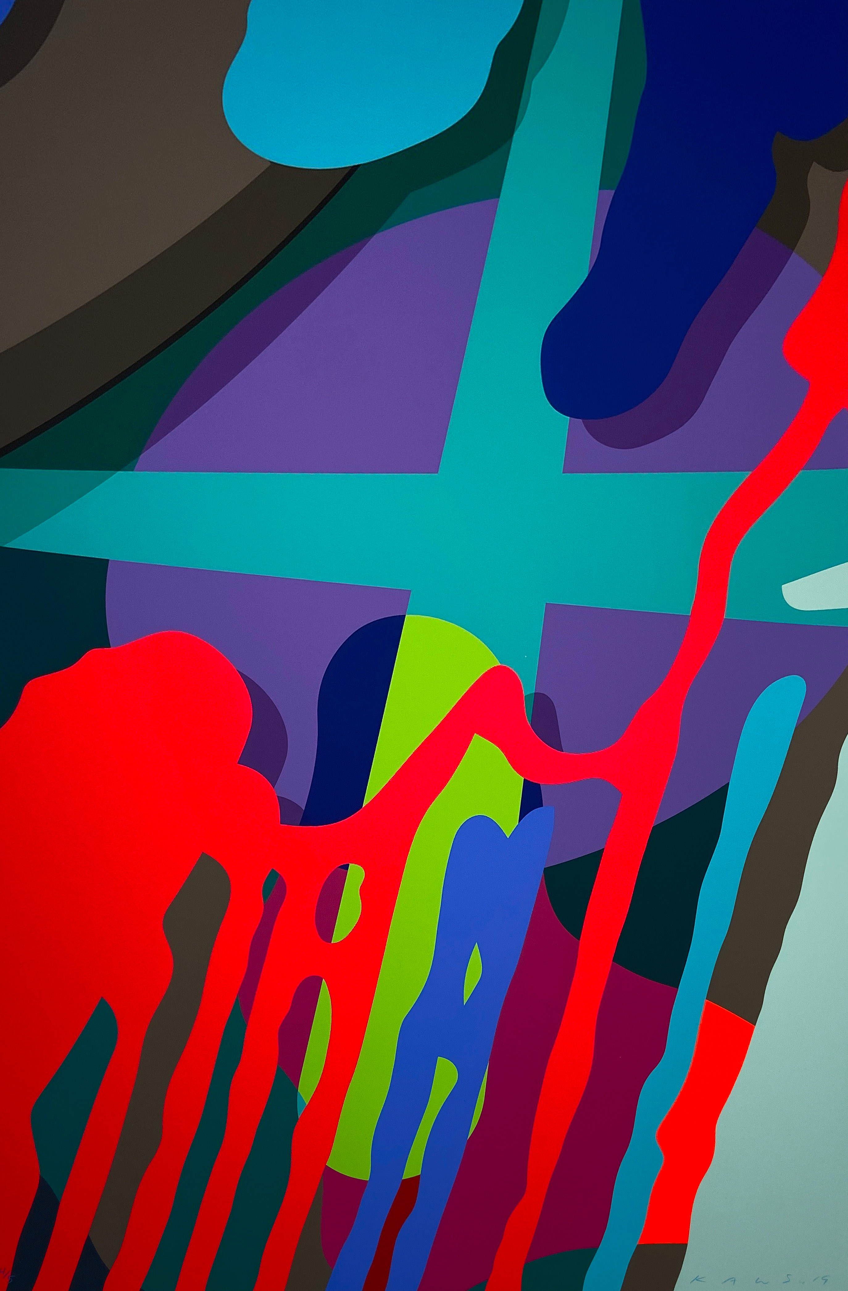
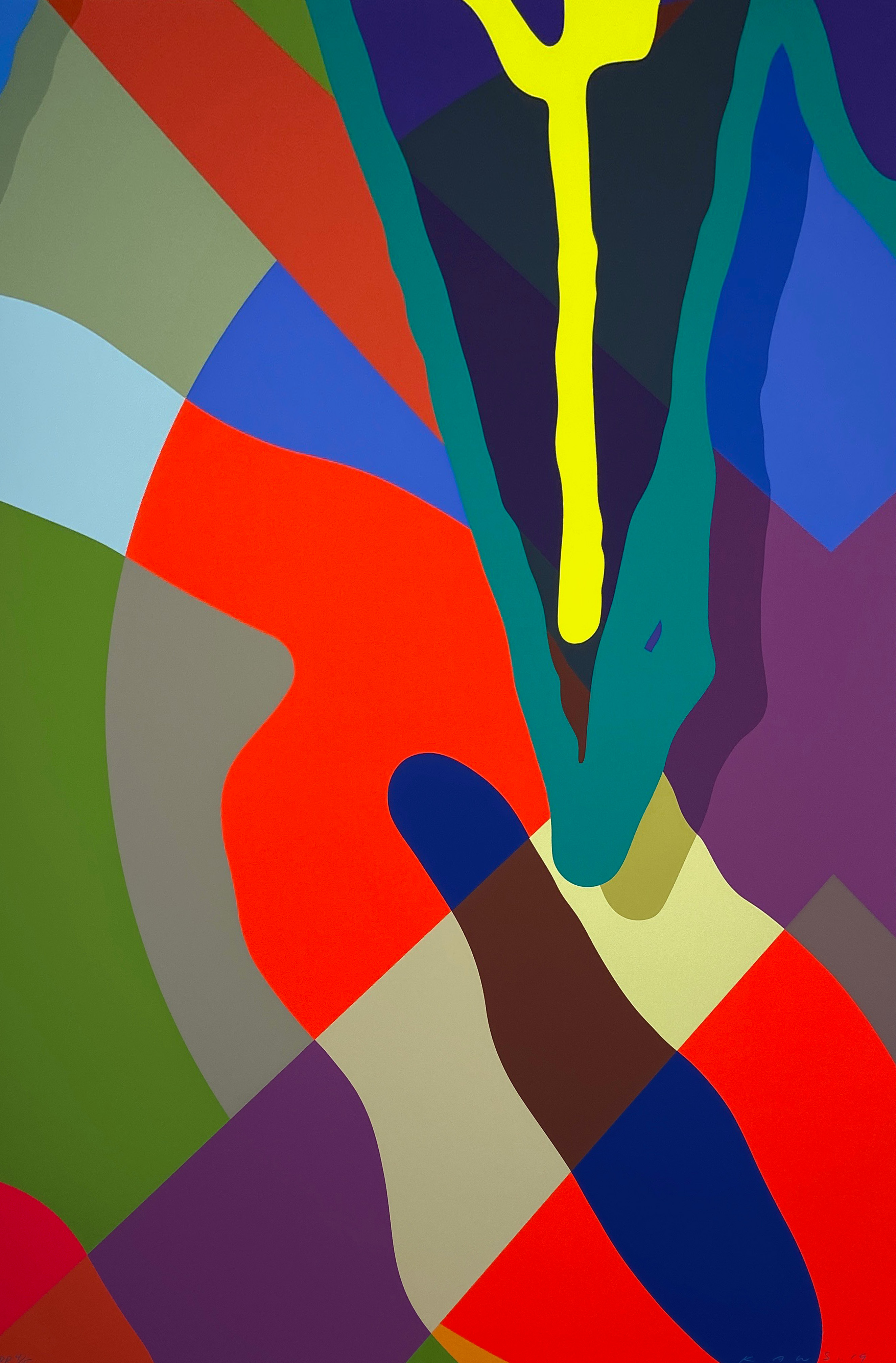
KAWS
Tension #6, 2019

The Screen Print That Conquered Everything
There is something almost alchemical about the serigraph. Ink forced through a fine mesh screen, one color at a time, building up layers of pigment that seem to vibrate against each other with a presence that no digital reproduction can fully approximate. It is a medium that rewards patience, precision, and a certain appetite for repetition as creative act, and it has produced some of the most visually arresting works in the twentieth and twenty first century canon. To hold a fine serigraph is to understand immediately that this is not a reproduction of something else.
It is the thing itself. The roots of screen printing stretch back further than most collectors realize. Stenciling techniques using silk mesh were practiced in China and Japan as early as the Song Dynasty, and by the late nineteenth century Japanese artisans were using similar methods to apply color to textiles with remarkable refinement. The medium arrived in the West in the early twentieth century, initially as a purely commercial process used for advertising and signage.
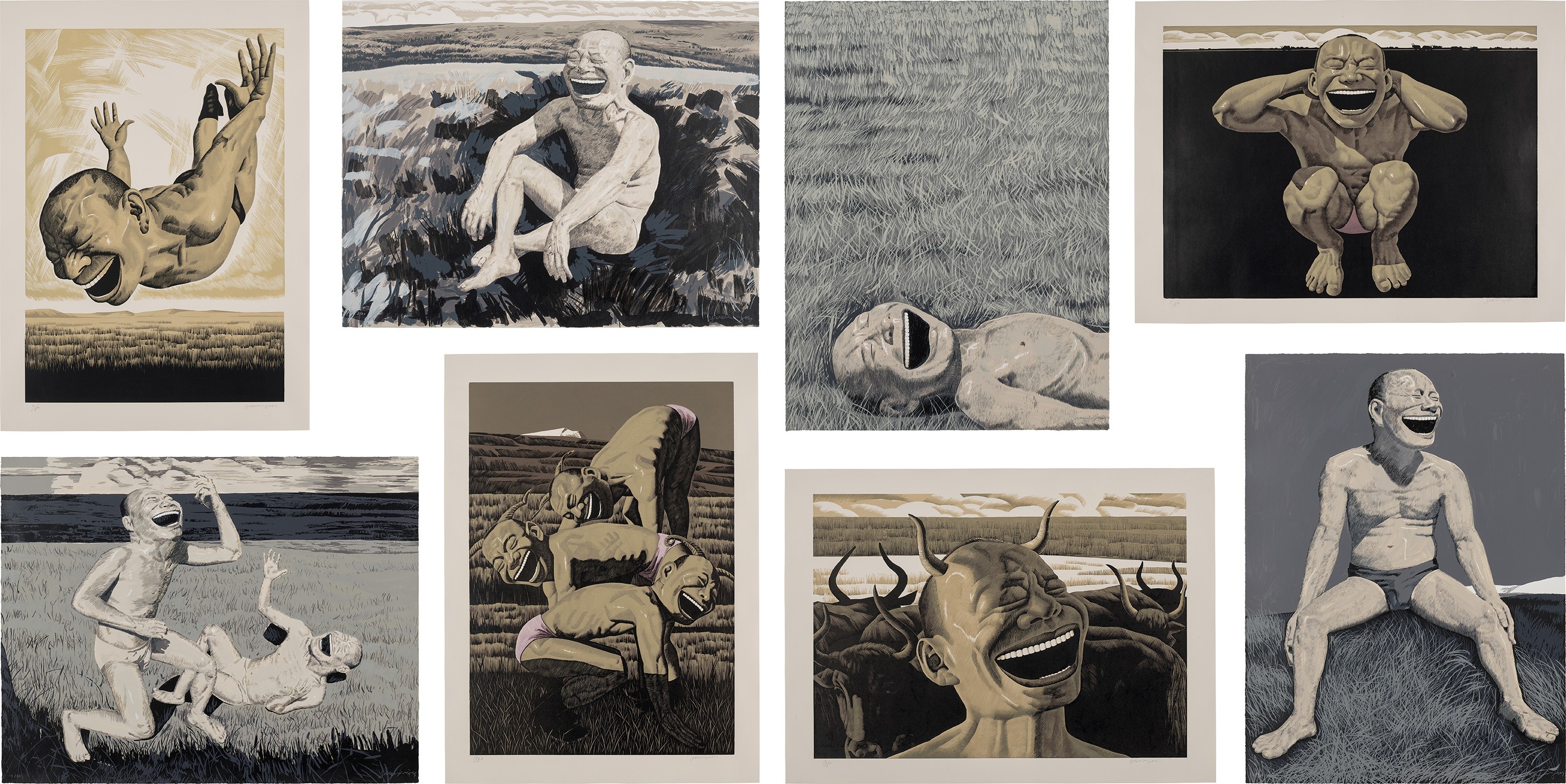
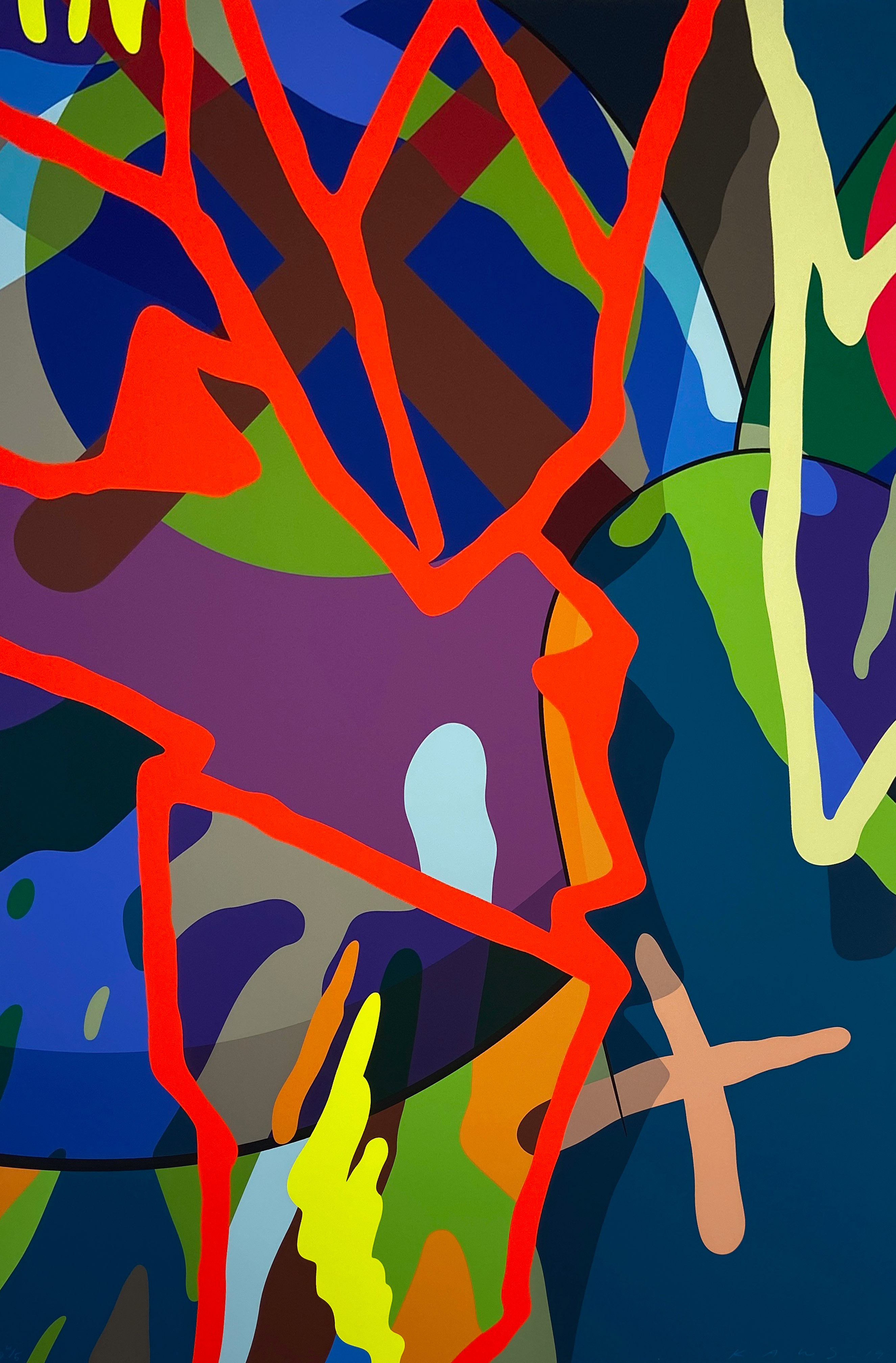
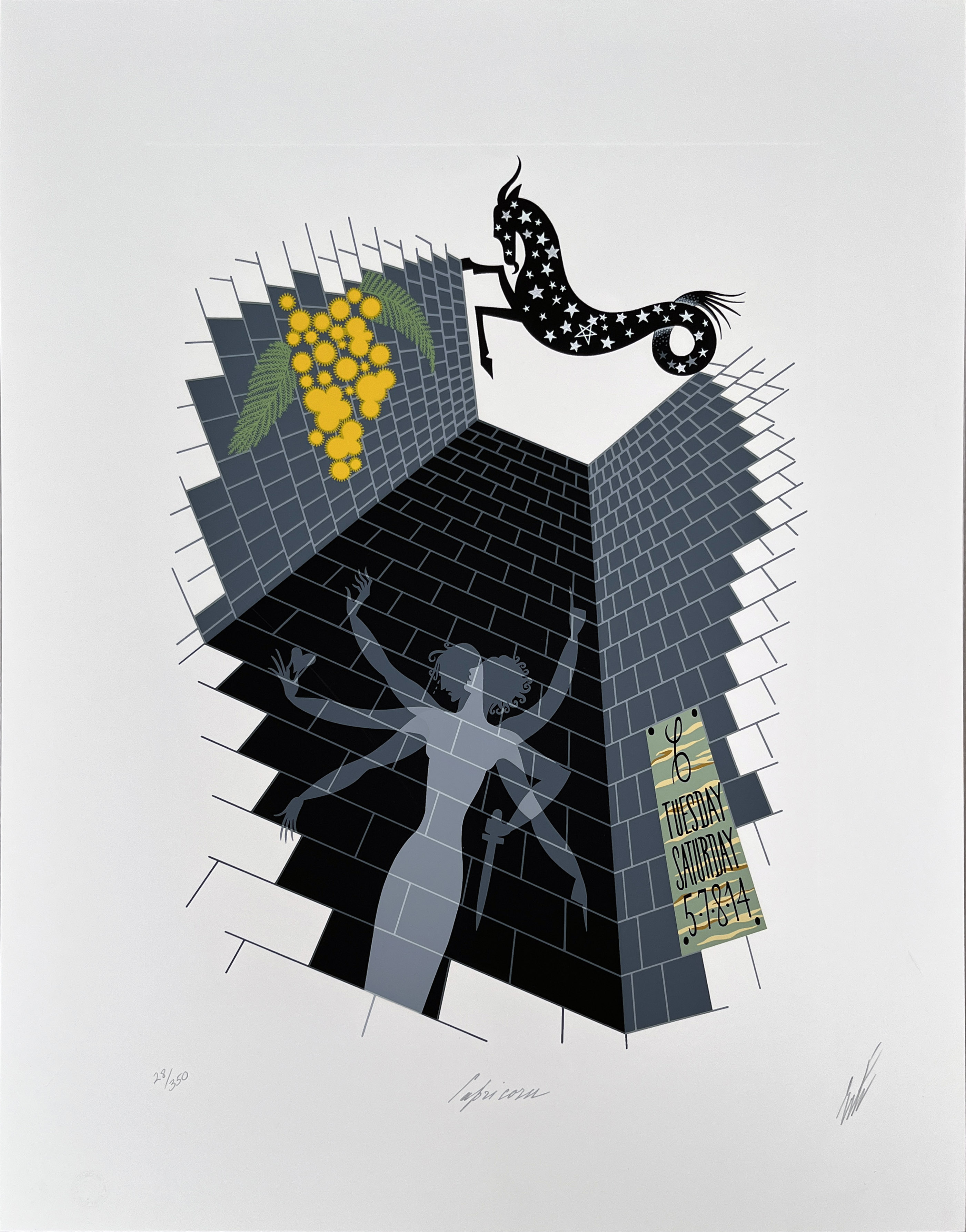
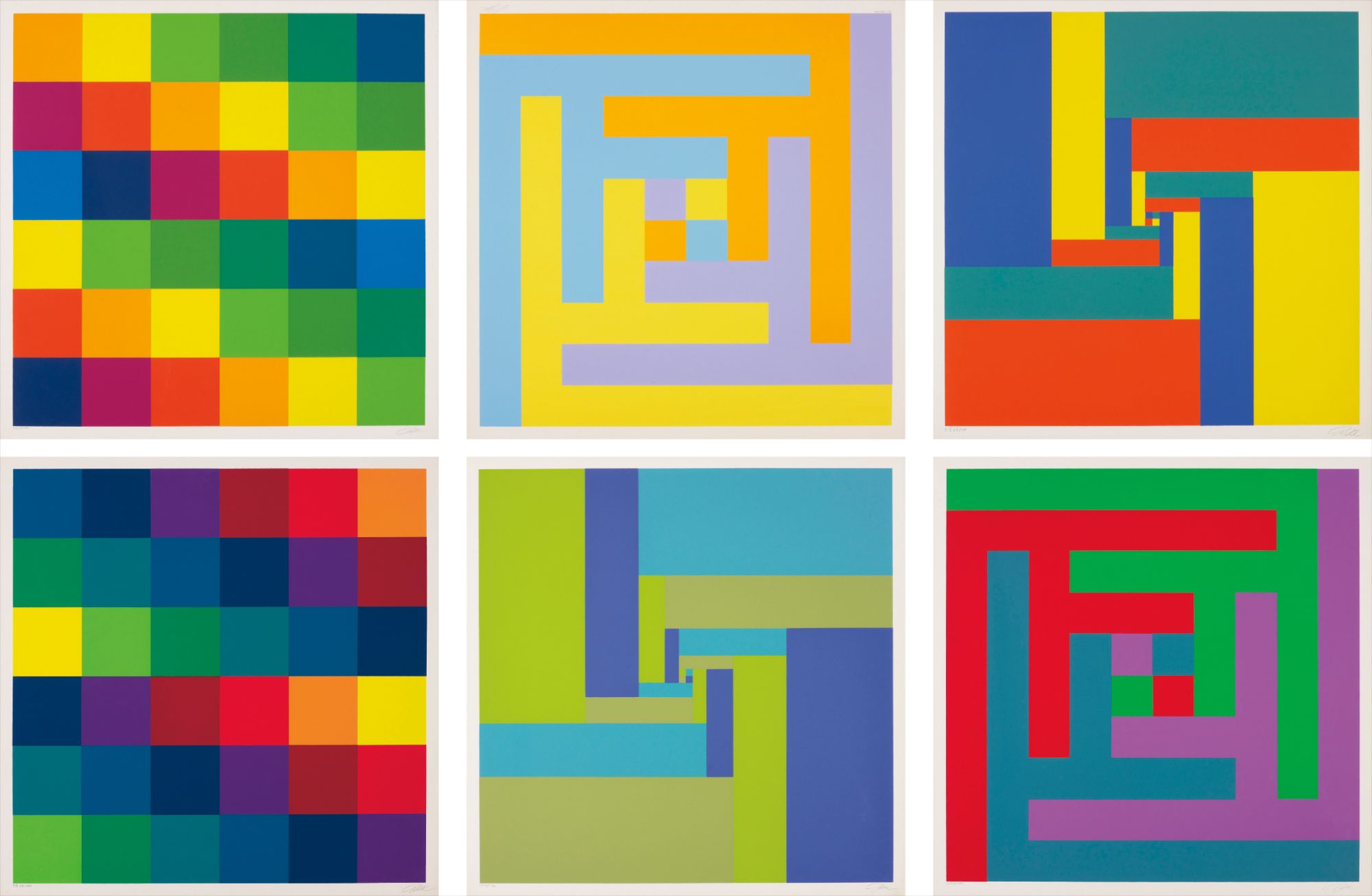
Yue Minjun
Eight works:, 2008
The word serigraph, derived from the Latin for silk and the Greek for writing, was coined in the late 1930s specifically to distinguish fine art screen printing from its industrial cousin, and the distinction mattered enormously to the artists who would soon claim the technique as their own. The real transformation came in the 1960s, when Pop Art turned the visual language of mass production into high culture. Andy Warhol understood intuitively that the mechanical flatness of screen printing was not a limitation but a statement. His Marilyn series from 1962 used the serigraph to collapse the distance between celebrity image and consumer product, between painting and poster.
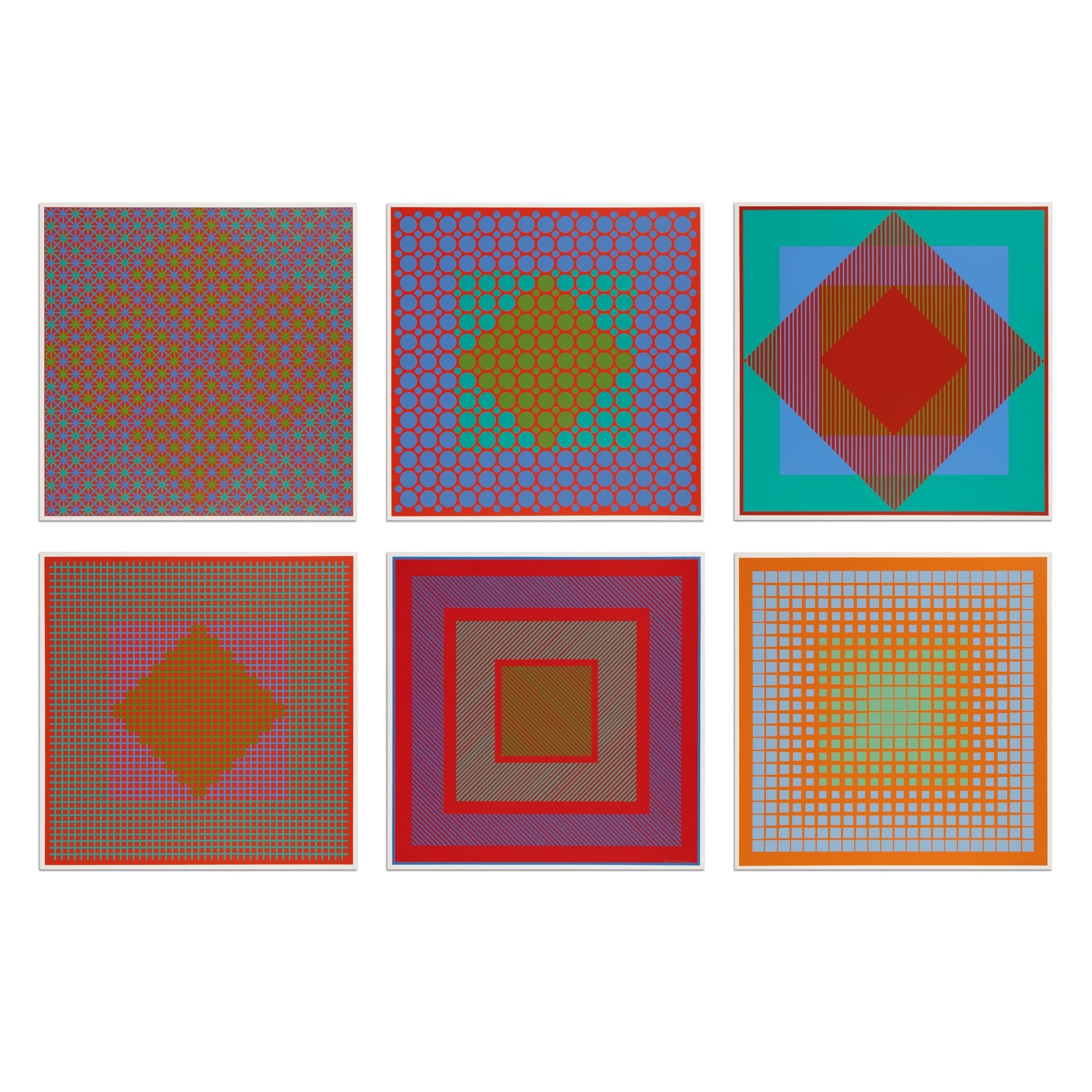
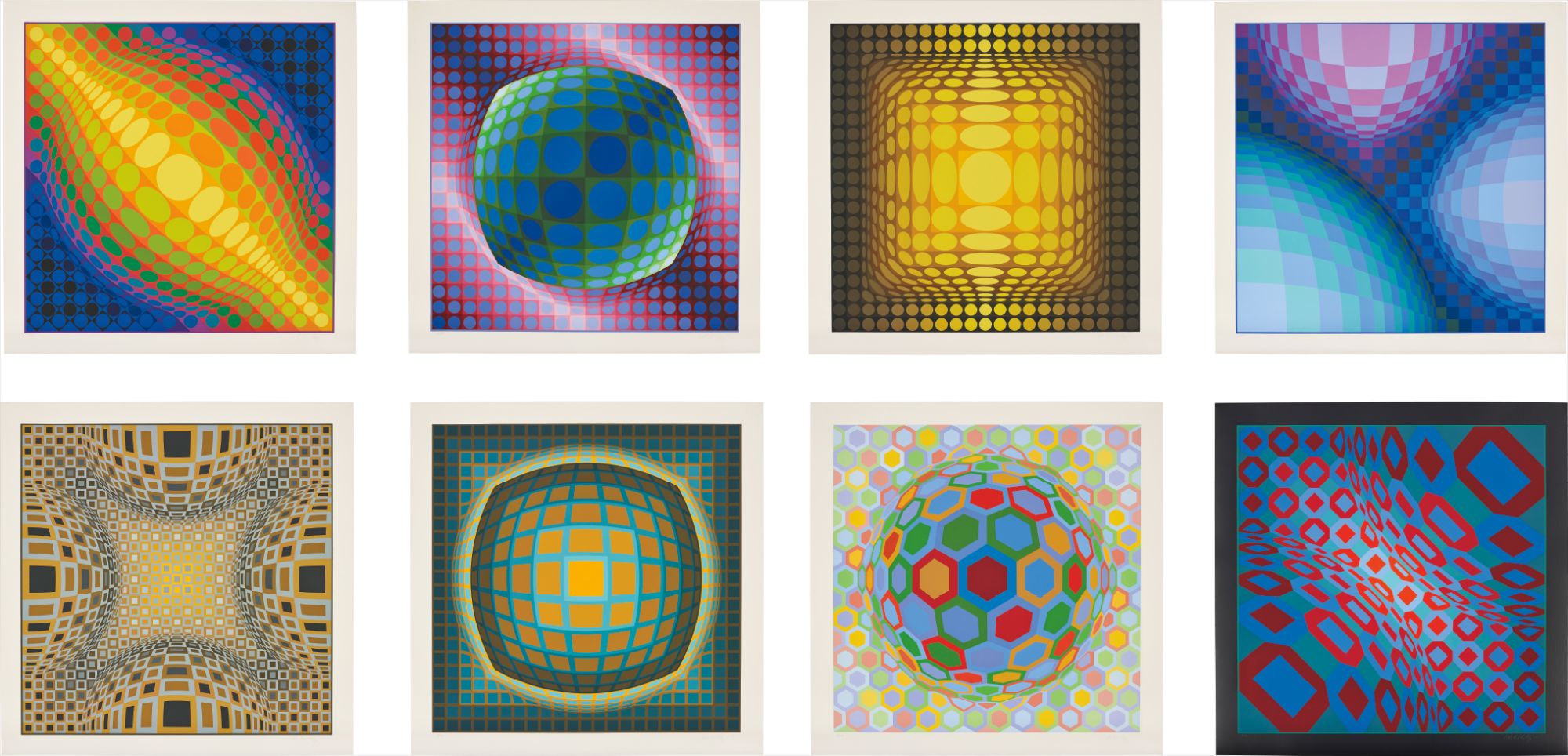
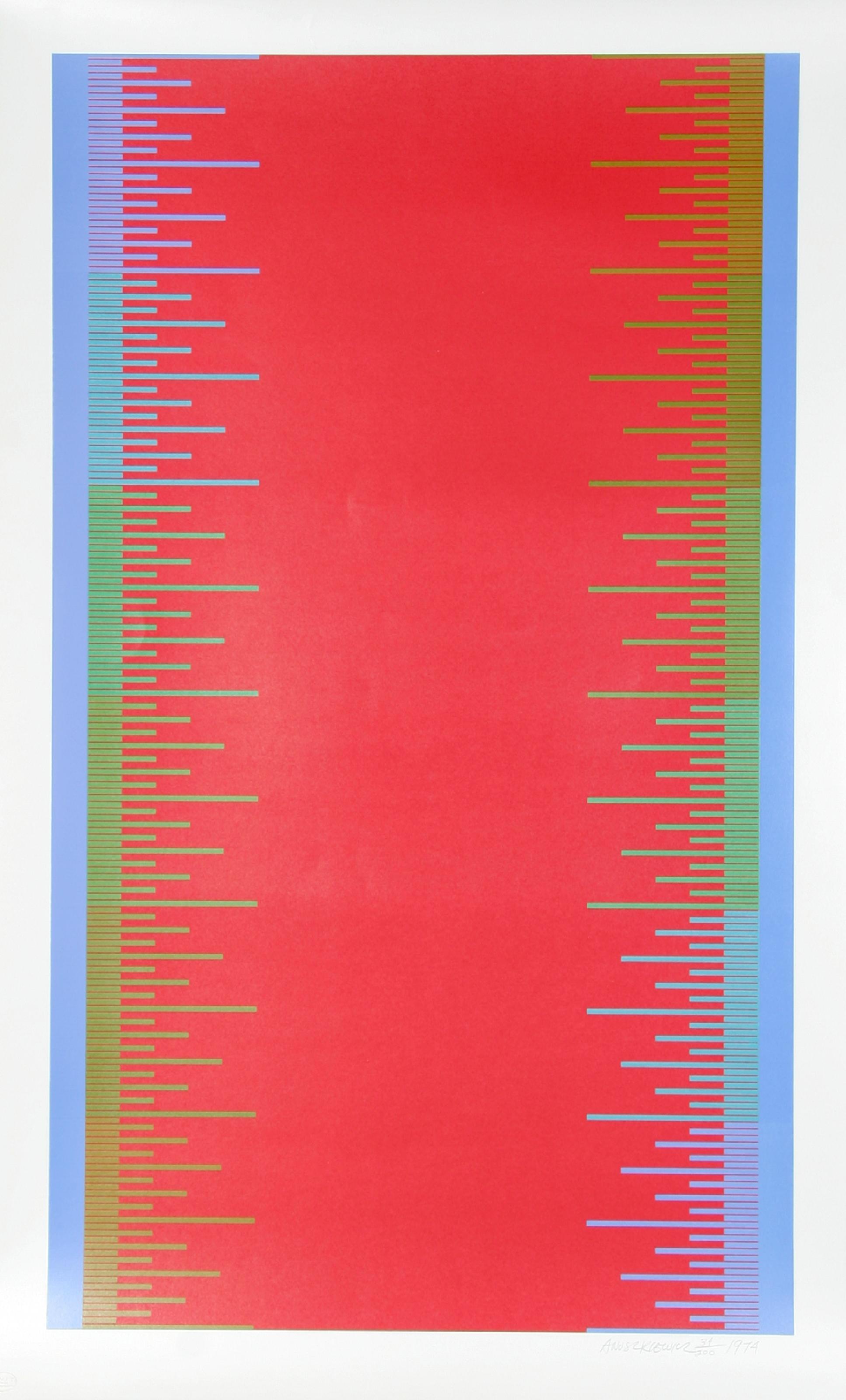
Around the same time, artists across Europe were exploring the medium with equal rigor. Victor Vasarely, whose geometric investigations of optical perception defined the Op Art movement, found in screen printing a tool ideally suited to his system of visual units and modular color relationships. His precisely calibrated compositions demanded the kind of clean edge and repeatable color that serigraph excels at delivering, and the works he produced in this medium remain among the most compelling arguments for print as primary art form. For Vasarely, the serigraph was never a secondary object.
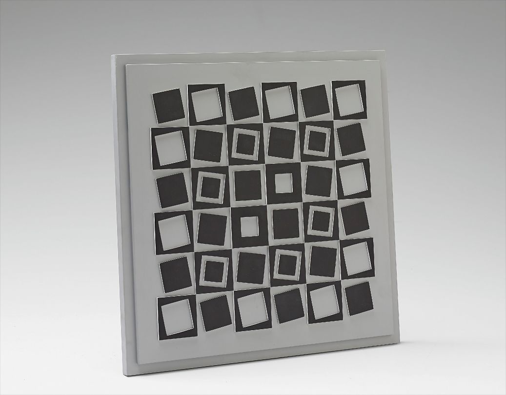
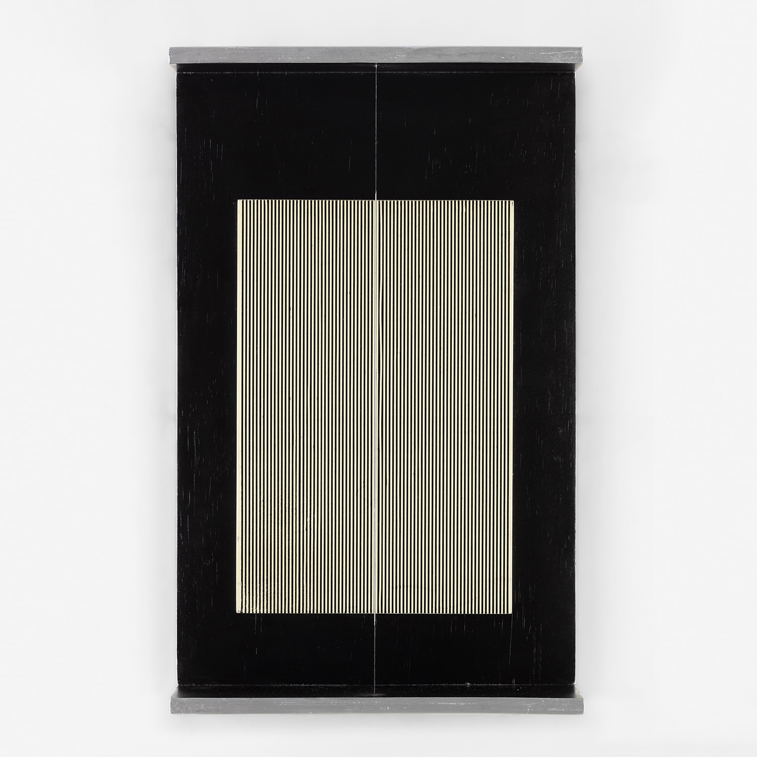
Victor Vasarely
Eridan
It was central to his democratic vision of art, his belief that original works of high aesthetic quality could exist outside the singular precious object. This idea resonated powerfully with artists who followed, including the Venezuelan kinetic sculptor Jesús Rafael Soto, who used printed geometric elements to create that characteristic vibrating tension between surface and depth. Richard Paul Lohse, the Swiss Concrete artist, brought similar intellectual rigor to his printed work, using the reproducible nature of the serigraph to extend his systematic investigations of color order and grid structure to a wider audience without compromising the formal integrity of his vision. By the 1970s and 1980s, screen printing had embedded itself deeply in the DNA of American art.
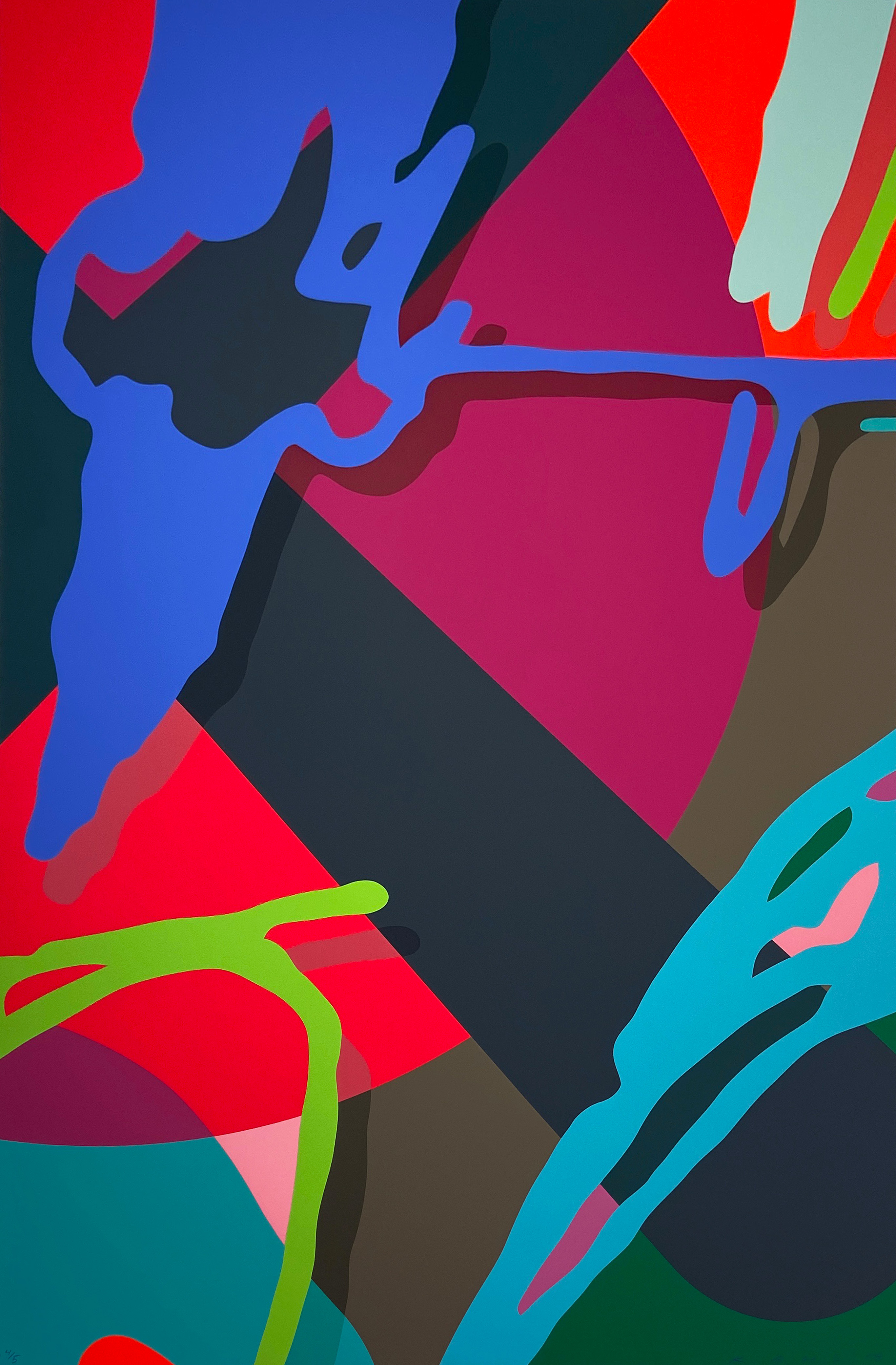
Artists working in wildly different registers found it equally useful. Peter Max embraced the medium's capacity for saturated psychedelic color and bold outlines, creating a visual vocabulary that fused commercial appeal with genuine graphic ambition. Alex Katz used it to extend his signature flat, cool figuration into print, finding that the screen's resistance to painterly incident suited his pared back aesthetic perfectly. Lee Krasner, working later in her career, approached printmaking with the same ferocious energy she brought to painting, and her prints carry a gestural urgency that complicates any easy reading of serigraph as a purely controlled medium.
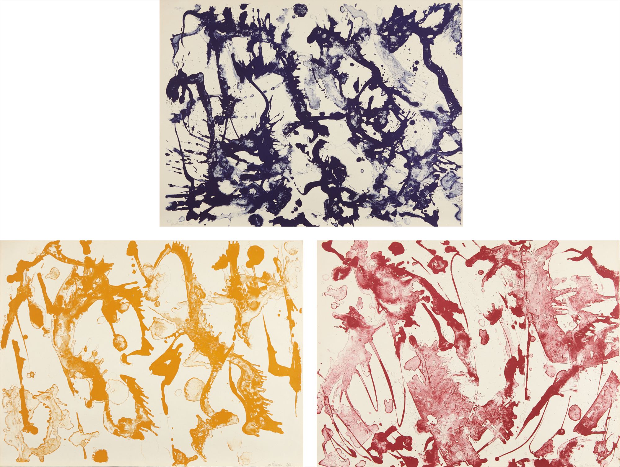
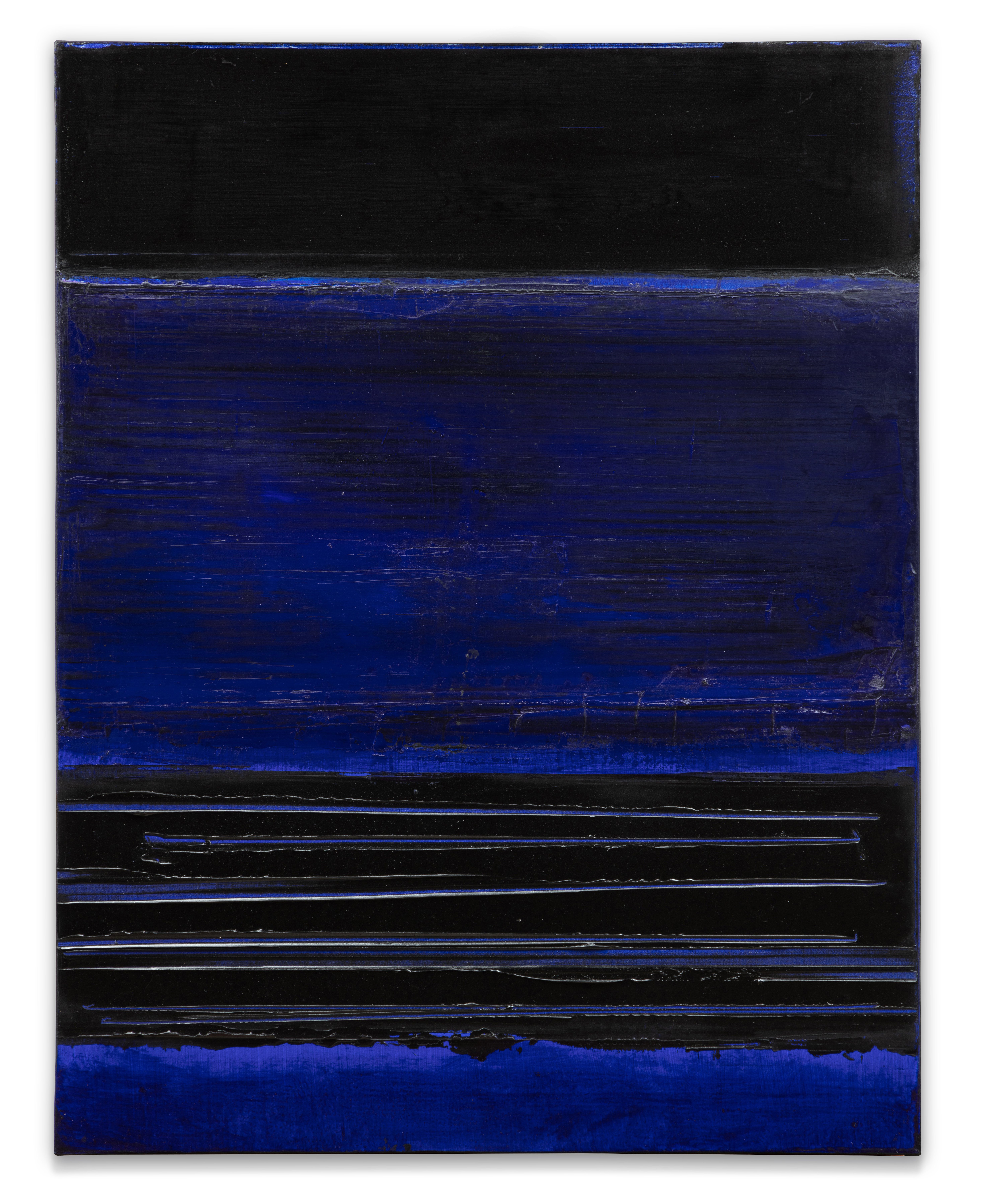
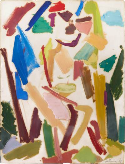
Lee Krasner
Primary Series
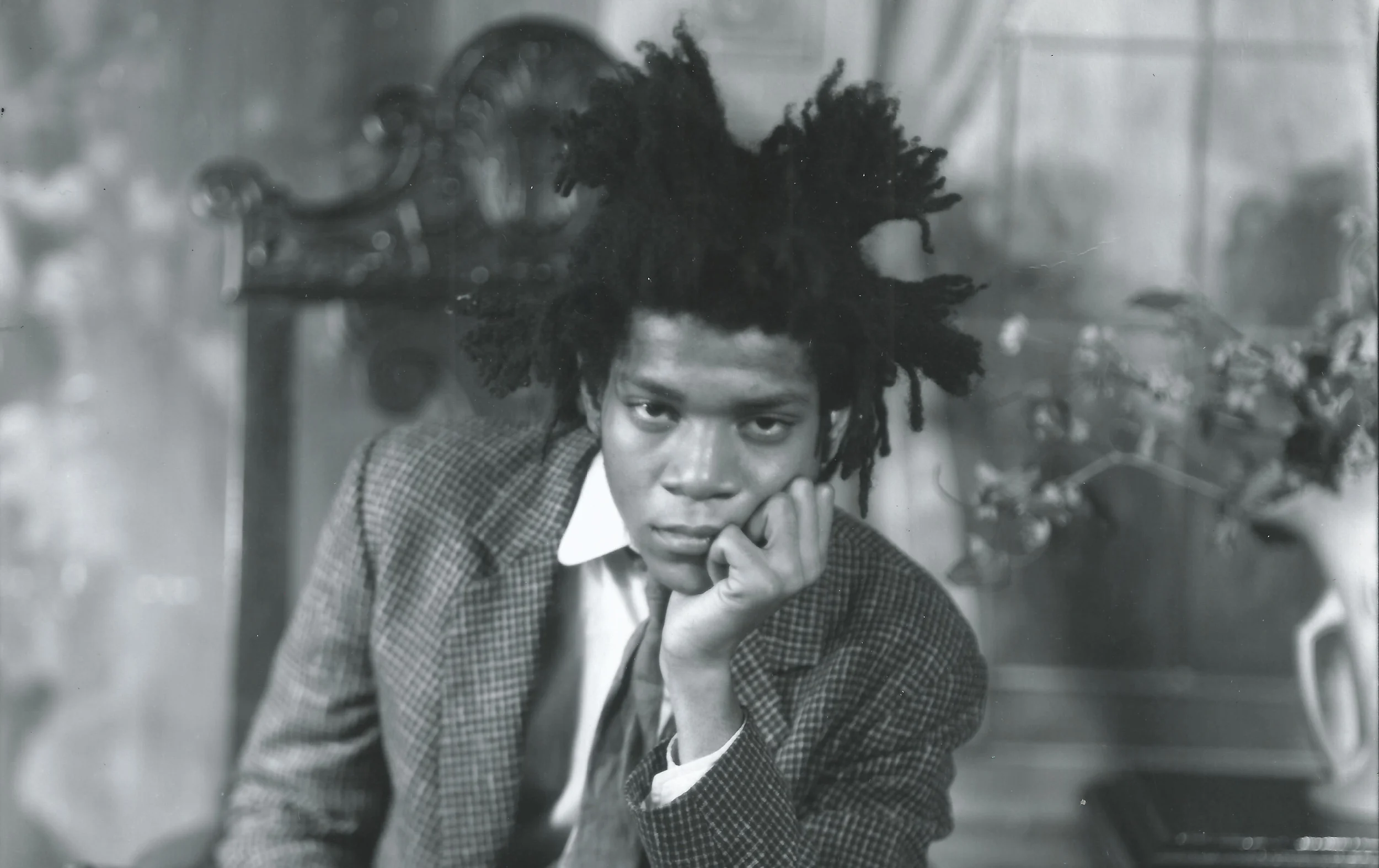
The arrival of Jean Michel Basquiat and the downtown New York scene of the early 1980s brought a raw, text driven expressionism into contact with printed media. Basquiat's screened works retain the nervous, layered quality of his canvases, his crossed out words and crown motifs translated into ink with a charge that feels anything but mechanical. The Chinese painter Yue Minjun, known for his grinning self portrait figures rendered in bold flat color, has similarly found in serigraph a natural ally, the medium amplifying the graphic clarity and pop inflected irony of his imagery. Erte, the Russian born Art Deco master whose career spanned nearly the entire twentieth century, produced serigraphs of extraordinary decorative elegance, demonstrating the medium's equal facility with sinuous line and jewel like color.
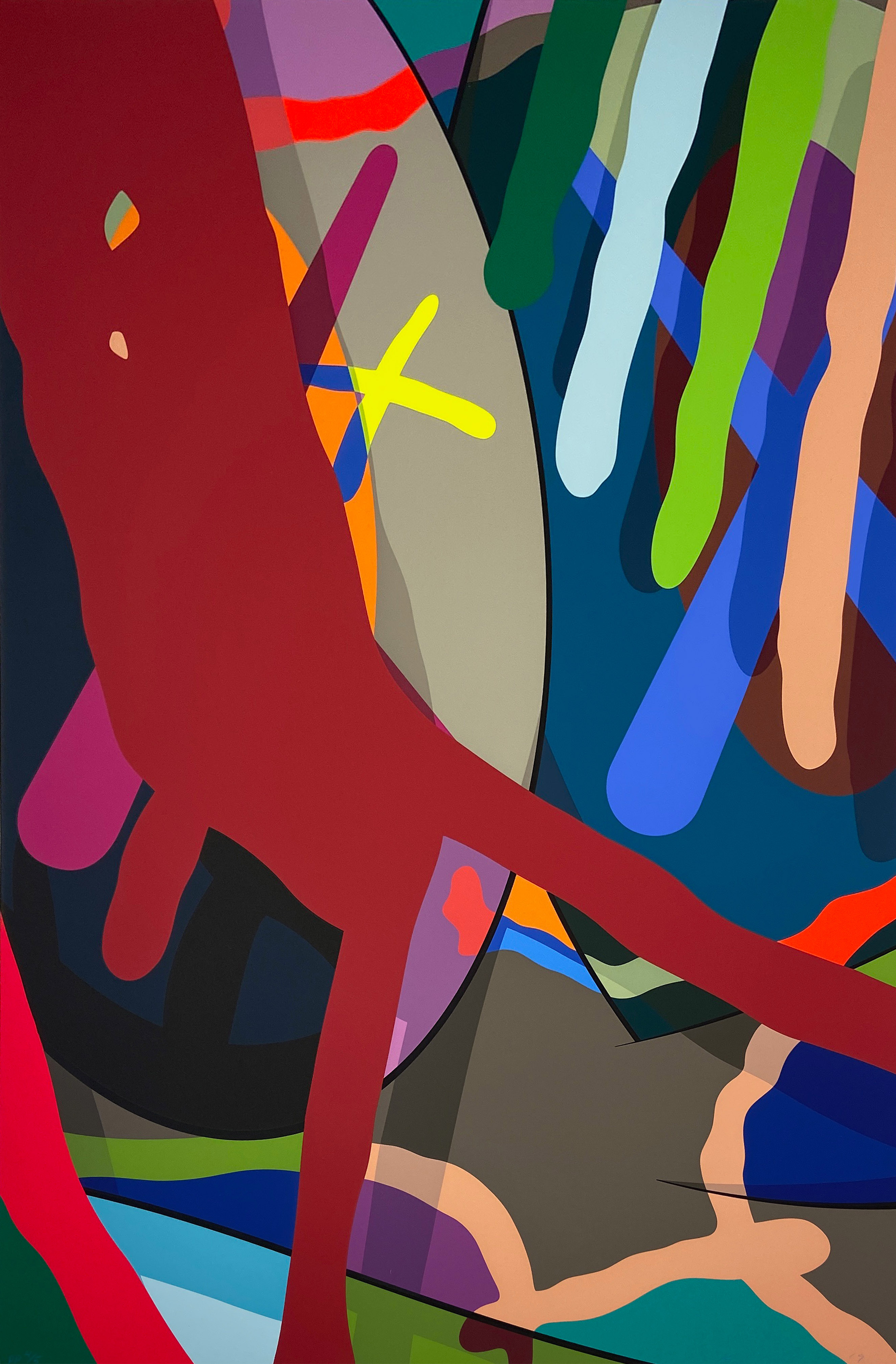
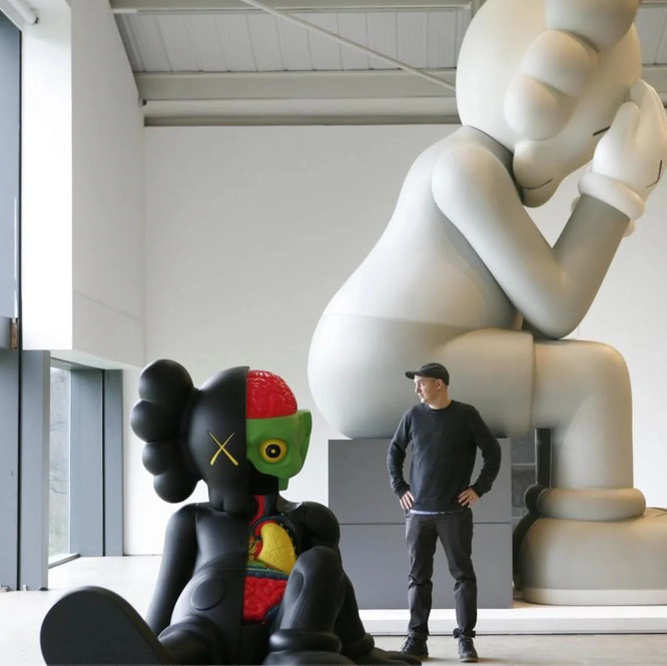
Perhaps no artist has more thoroughly shaped the contemporary understanding of the serigraph than KAWS. Working initially as a graffiti artist and graphic designer, KAWS moved into fine art printmaking with a fluency that reflected his deep roots in street art and commercial culture. His screen prints, with their characteristically masked and X eyed figures, occupy a fascinating territory between streetwear drop and museum edition, between irony and genuine emotional resonance. KAWS is among the most strongly represented artists on The Collection, and looking across those works, you see exactly what the serigraph can do when handled by someone who understands both its graphic potential and its cultural weight.
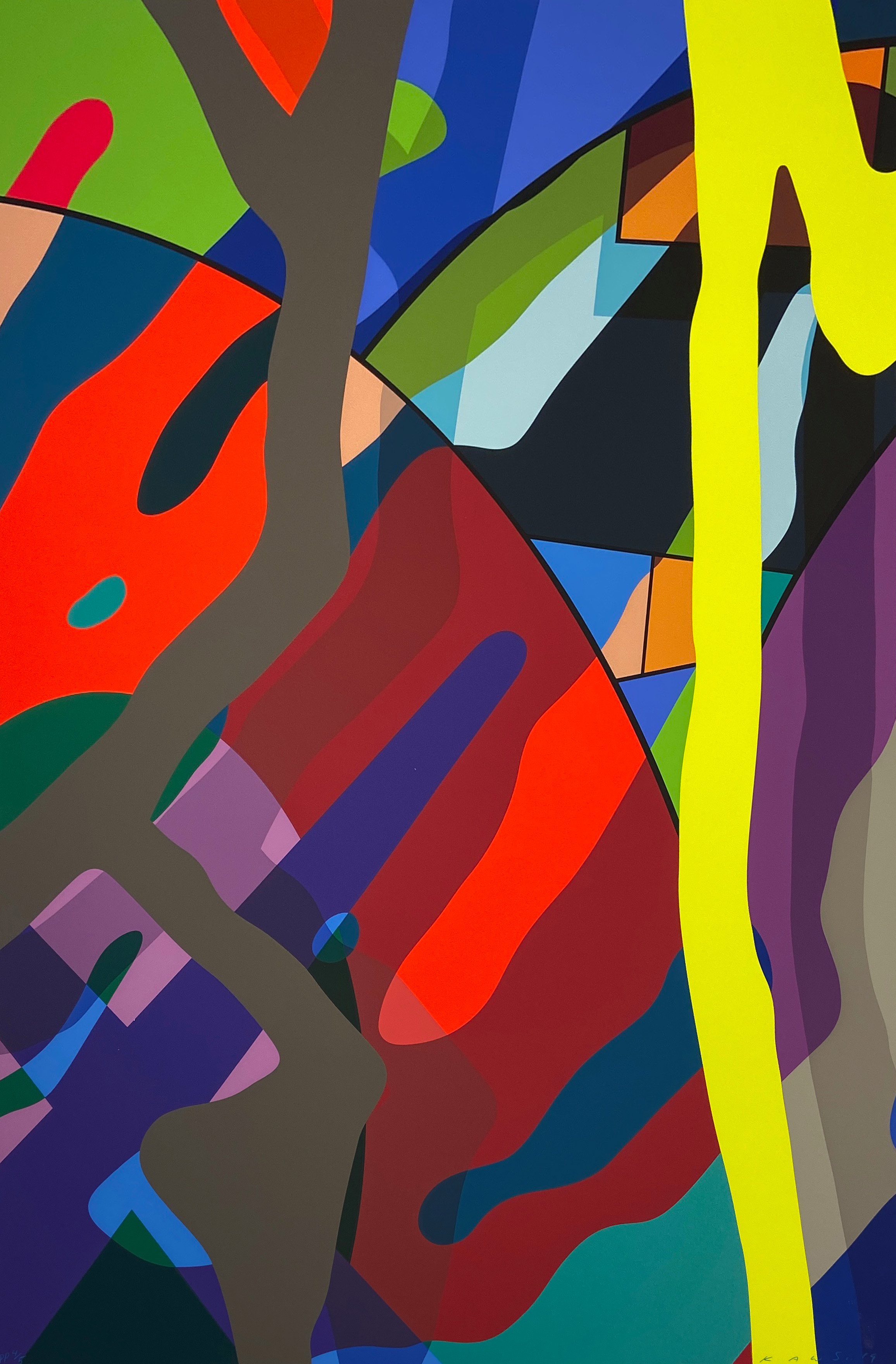
KAWS
Tension #2, 2019
The question of what a serigraph means in an era of AI generated imagery and infinite digital reproducibility is one the art world is only beginning to think through carefully. In some ways, the medium's values, its insistence on physical process, its embrace of the multiple as legitimate form, its history of bridging commercial and fine art contexts, feel newly relevant rather than nostalgic. The serigraph has always been interested in what happens when an image is repeated, translated, multiplied, and asked to carry meaning across many surfaces rather than one. That turns out to be a very contemporary question.
For collectors, the serigraph offers something rare: a point of entry into some of the twentieth century's most significant artistic conversations at a level of quality and authenticity that rarer unique works cannot always provide. A fine serigraph by any of the artists represented on The Collection is not a consolation prize. It is often where that artist's visual thinking appears most concentrated, most deliberate, most purely itself. The medium demands that much, and the best artists have always risen to meet it.