Pop Art Influences

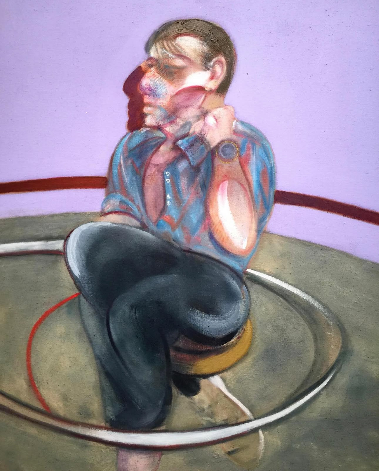
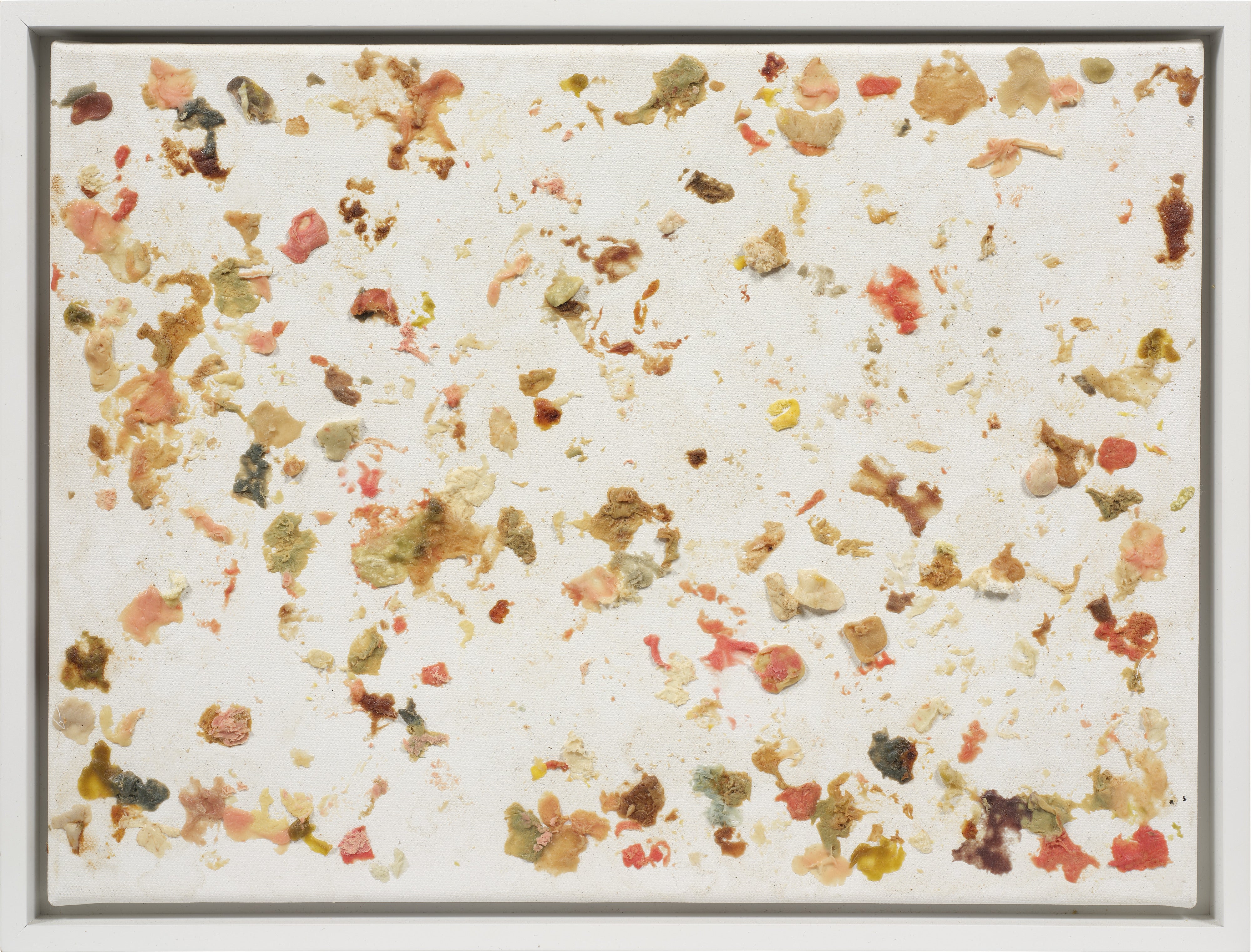
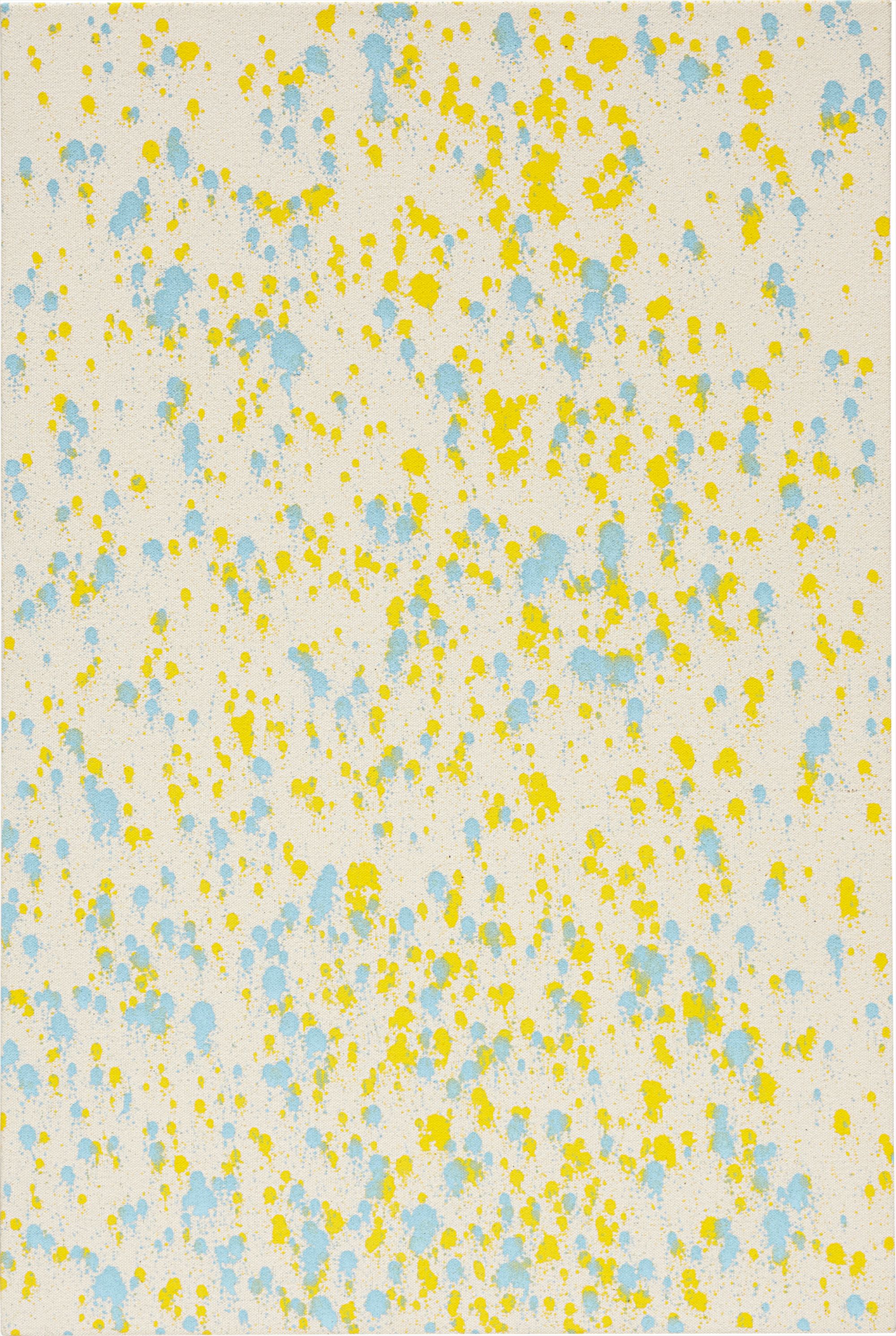
Lucien Smith
Mystic Pizza, 2012


The Thrill of the Familiar, Made Strange
There is something almost confessional about collecting Pop Art and its descendants. You are admitting, cheerfully and without apology, that you find the world around you interesting. Not the ancient world, not the imagined world, but this one, with its product packaging and celebrity faces and the particular quality of light falling on a diner counter. Collectors who gravitate toward Pop influenced work tend to be people who move through culture with their eyes open, who notice how images accumulate meaning through repetition, and who feel a genuine pleasure in seeing that attentiveness transformed into something you can hang on a wall and live with every day.
What makes this category so rewarding to collect is precisely what once made it controversial: its refusal to draw a firm line between high and low culture. Works in this tradition tend to be enormously livable. They are often bold in color, confident in composition, and charged with the kind of cultural energy that makes a room feel awake. A great Pop influenced work does not exhaust itself on first viewing.
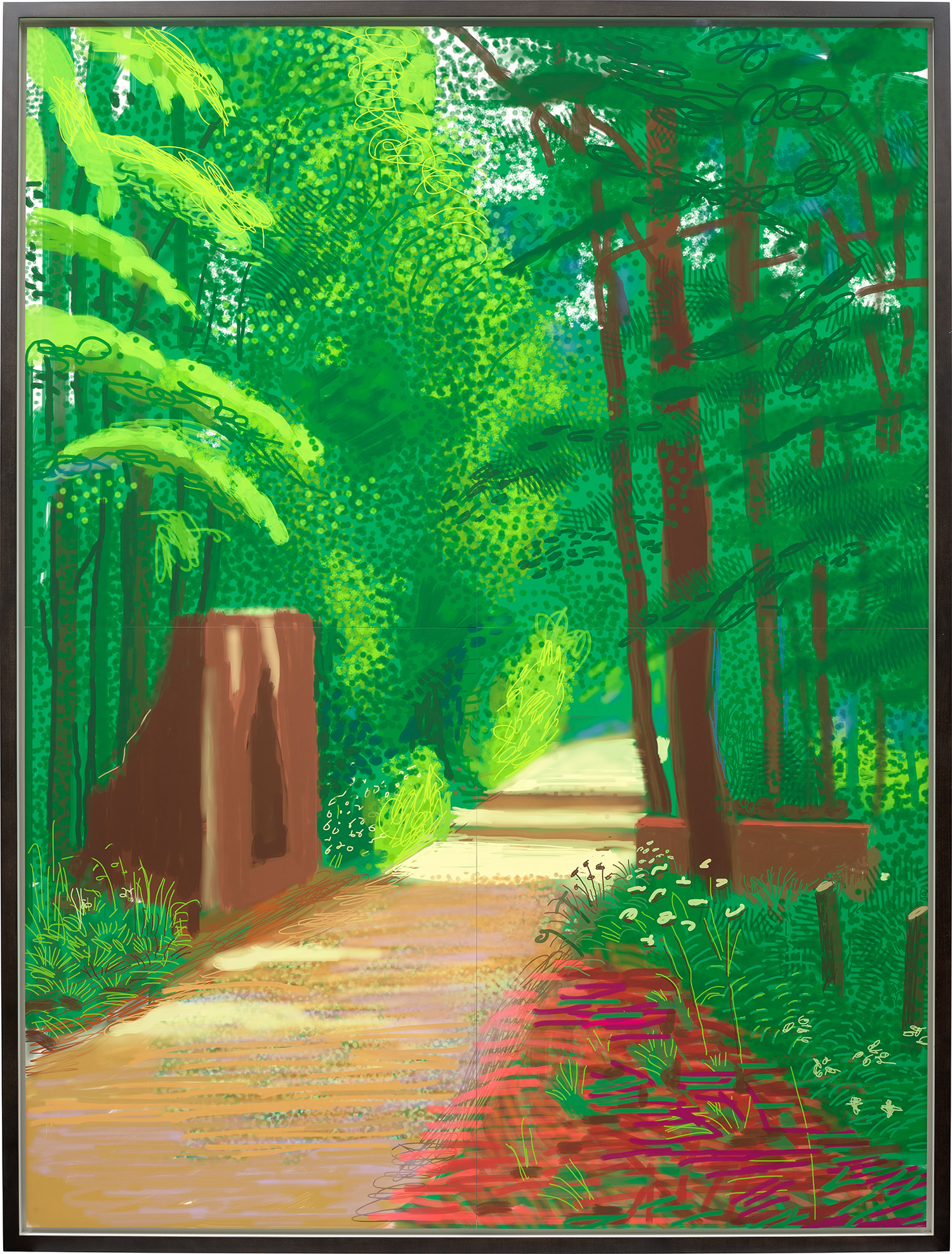
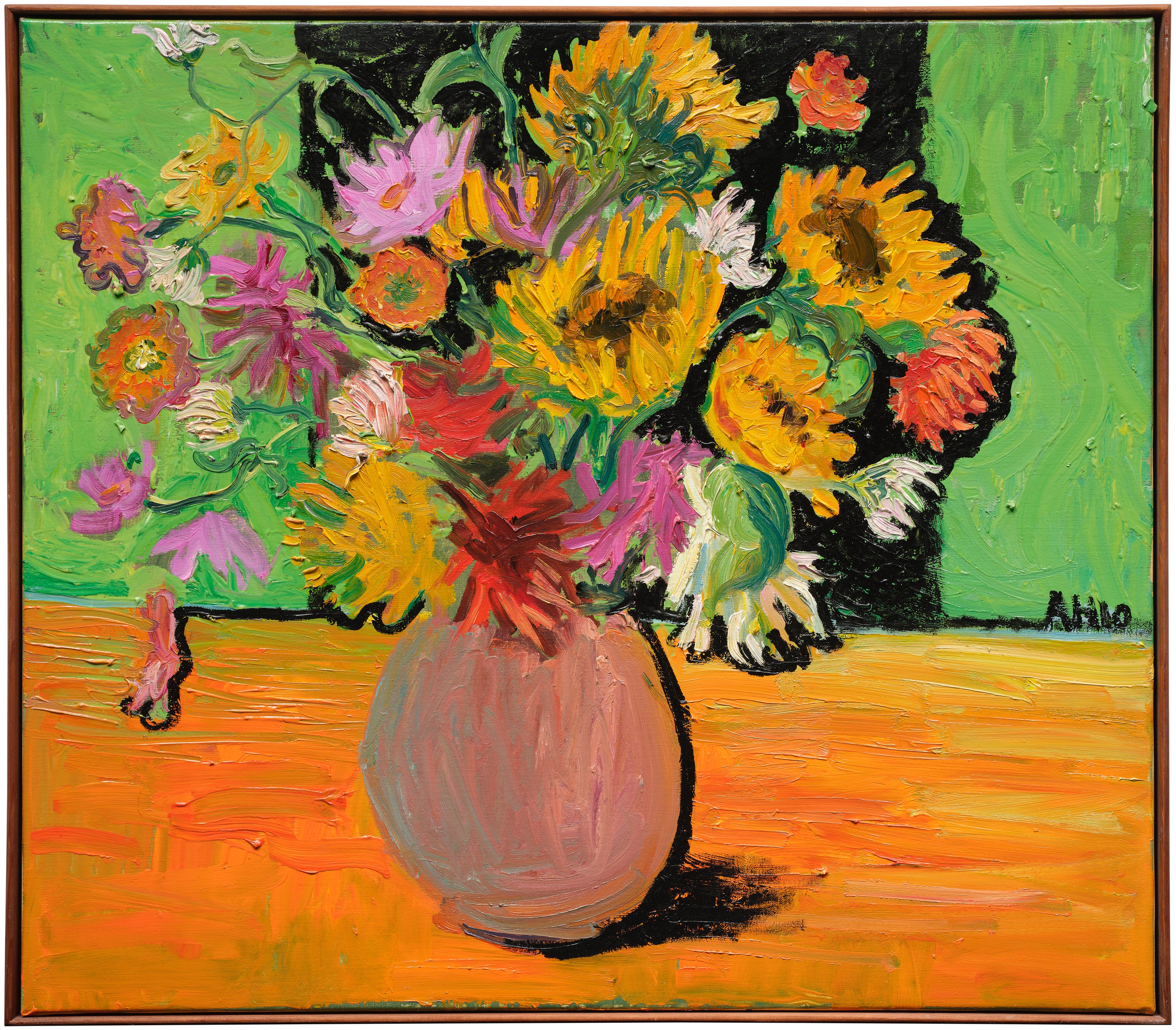
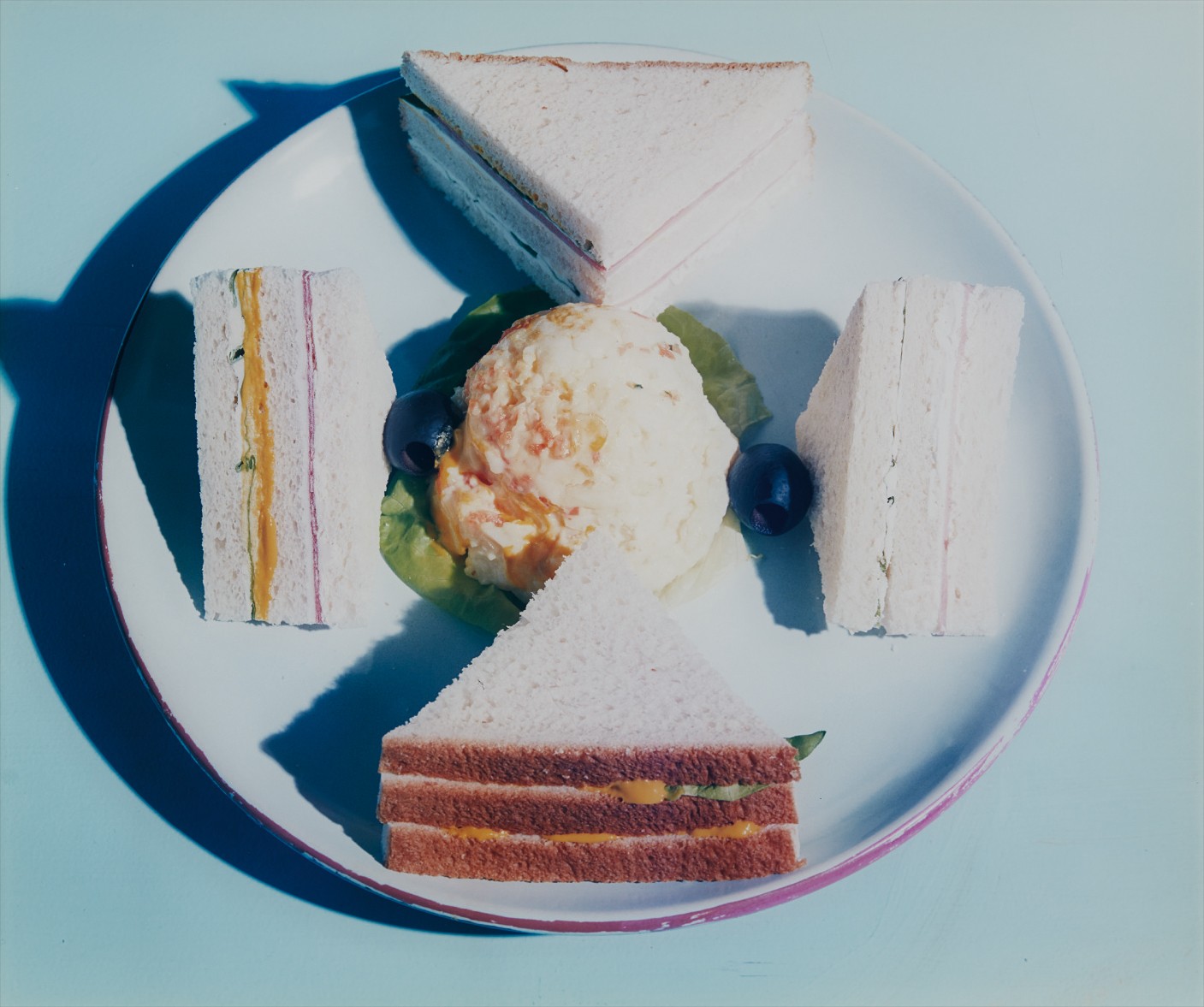
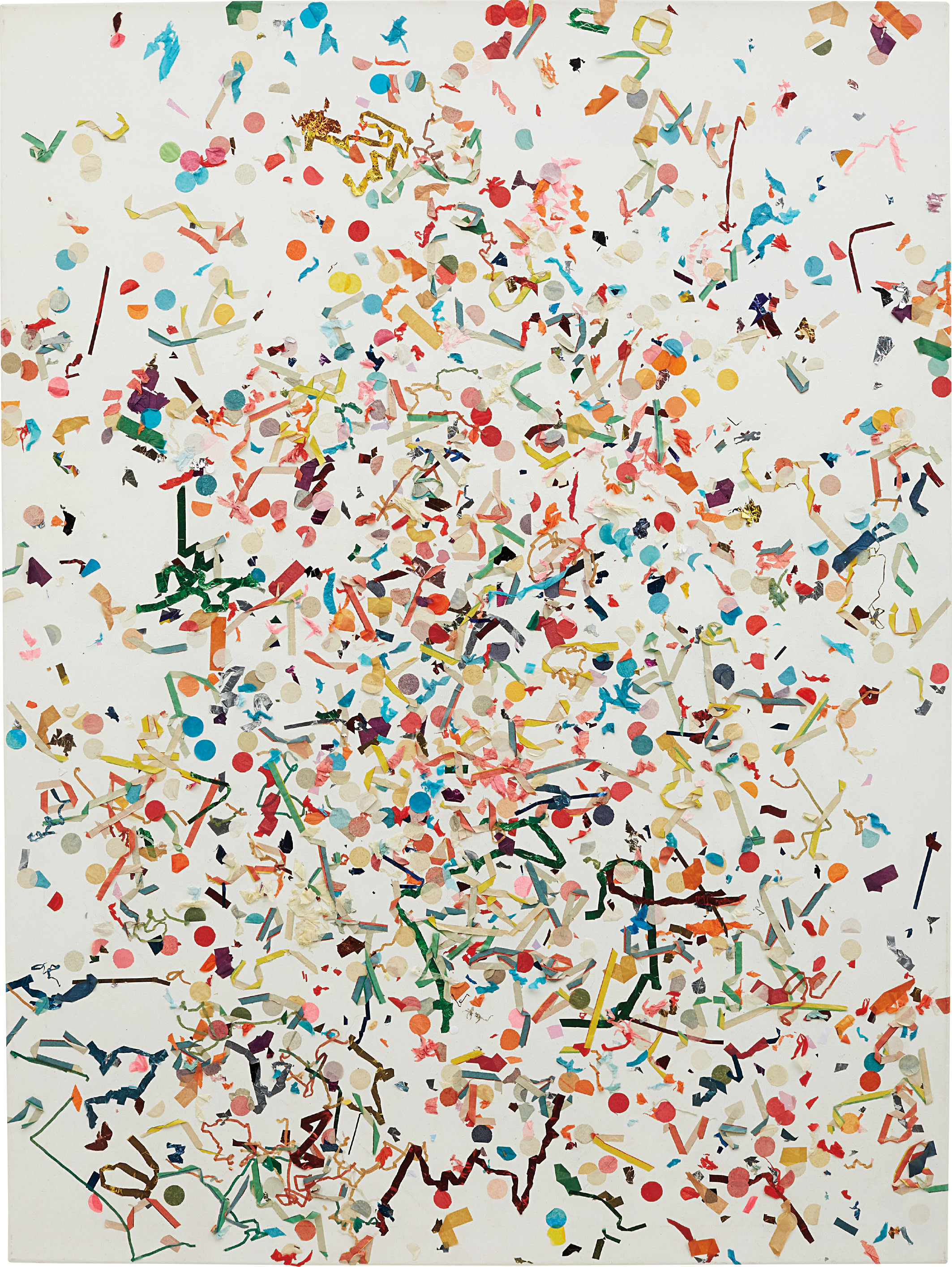
Nick Darmstaedter
Knuckleball, 2013
It rewards you differently depending on what you bring to it, what you know, what you have seen, what advertisements you half remember from childhood. The conversation between the work and your own stored visual memory is one of the quieter pleasures of living with this kind of art. Separating a good work from a great one in this space requires looking past surface appeal. The strongest works in the Pop tradition do something more than quote culture back at you.
They find a genuine friction in that quotation, a place where familiarity and strangeness press against each other and produce something unexpected. When KAWS reconfigures familiar cartoon figures into objects of unexpected tenderness and formal rigor, the best works are the ones where you feel that tension most acutely, where the humor and the melancholy are genuinely inseparable. Similarly, Kelley Walker's work, which engages corporate imagery and mass media with a kind of studied provocation, is most successful when the conceptual engine and the visual pleasure are equally strong. Collectors should be wary of work that delivers only one or the other.

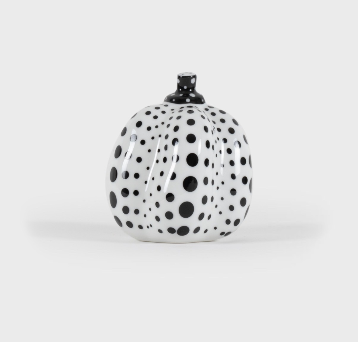
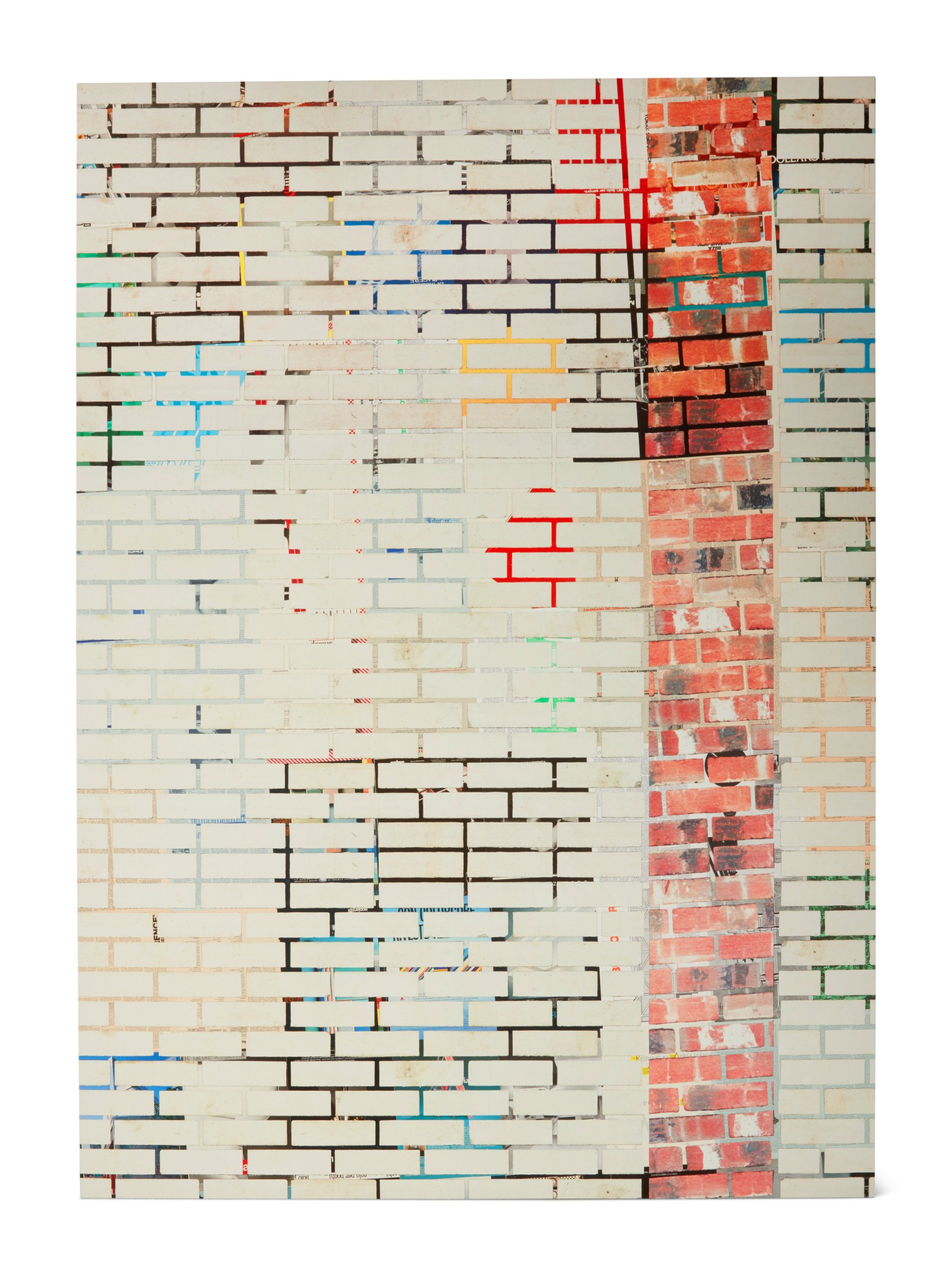
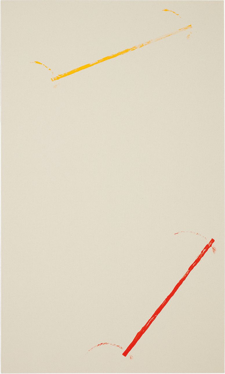
KAWS
Together, 2017
Provenance and context matter enormously in this category. A work's exhibition history and its relationship to the artist's broader practice can be decisive factors in both quality and long term value. William N. Copley, whose eccentric paintings occupied a singular space between Pop, Dada, and outsider wit, is an artist whose best work tends to come from his most focused periods and whose market has rewarded collectors who looked carefully at where individual works sat within his development.
Vik Muniz, who builds images from unexpected materials and then photographs them, produces work that ranges widely in ambition. The pieces that resonate most deeply are those where the chosen material carries genuine conceptual weight rather than decorative surprise. For collectors thinking about where genuine opportunity exists in this space, a few names on The Collection deserve close attention. Dan Colen, who emerged from the downtown New York scene of the early 2000s and brought a charged romanticism to his engagement with surface and material, remains undervalued relative to peers whose market trajectories took off earlier.
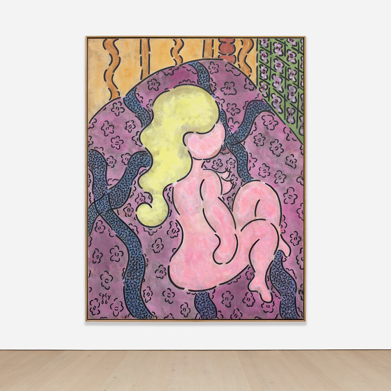
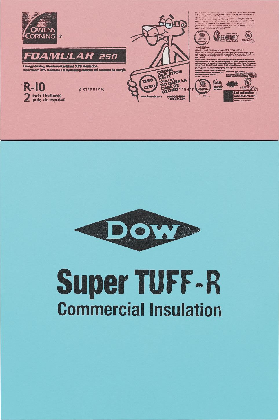
Dan Colen
The Space Between Dow Jones and Jim Jones, 2010
Lucien Smith, associated with the market frenzy of the early 2010s, has done the harder work of developing a practice that moves beyond his early rain paintings, and collectors with patience and a genuine interest in his development may find real value. Nick Darmstaedter's work, with its loose irreverence and knowing art historical wit, is the kind of thing that serious collectors tend to discover quietly and regret not having looked at sooner. Anton Henning, a German artist who constructs elaborate dialogues between abstraction, figuration, and interior space, has a rigorous intelligence that his market has not yet fully caught up with. At auction, Pop influenced work has shown considerable resilience, though it is a category where the distance between the strongest and weakest examples is significant at the block.
The top tier, anchored by artists like KAWS whose secondary market is extraordinarily liquid, can show stratospheric results, particularly for works with strong provenance and early exhibition records. Mid market works by artists in genuine critical development tend to perform more modestly but steadily, which is often a better sign of long term health than a dramatic early spike. Auction performance in this category is also highly sensitive to condition, since the bold surfaces and graphic elements that define many of these works show wear and improper storage in ways that are difficult to remediate. Condition is worth discussing practically and at some length.

Sharon Core
Boston Creams, 1962
Works that engage with commercial printing techniques, photographic processes, or unconventional materials require particular care. Sharon Core and William Eggleston, both of whom work in photography and whose practices carry the influence of American vernacular imagery in ways that rhyme with Pop sensibility, produce works where edition size, printing process, and authentication documentation are essential conversations to have before any purchase. Always ask a gallery for the specific edition number within the print run, the total edition size including artist proofs, the substrate and process used, and any known provenance from previous owners. For unique works on canvas or panel, request any available conservation reports and ask directly whether the work has been exhibited under strong light for extended periods.
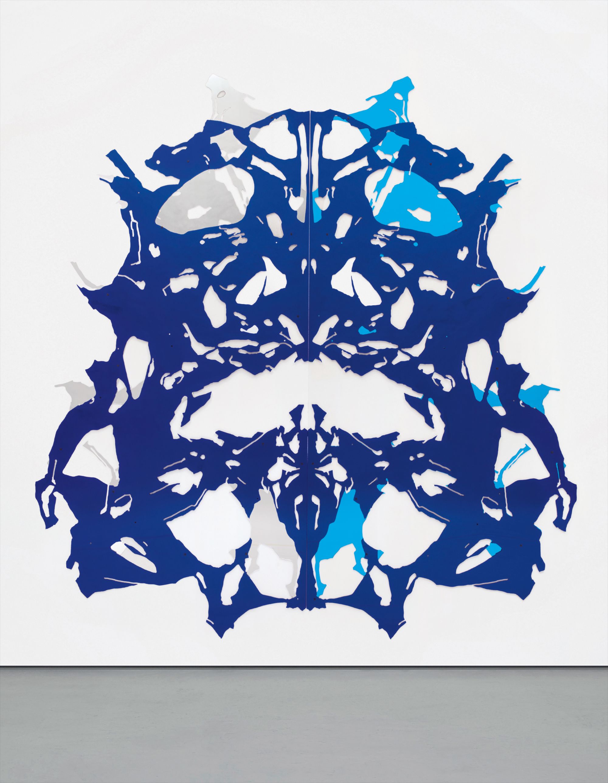
Display choices matter more than many collectors initially realize. Joana Vasconcelos and Grear Patterson both produce work that has specific spatial and environmental requirements, and understanding how a work is meant to be encountered is part of understanding it fully. For works on paper or light sensitive photographic prints, UV filtering glass is not optional. For works that incorporate text or appropriated imagery, the quality of framing and the neutrality of the surrounding wall can make or break the visual argument the work is trying to make.
The best advice, ultimately, is to buy what genuinely stops you, to ask every question you can think of before the purchase, and to trust that work made with real intelligence will continue to reward you in ways you cannot fully anticipate on the day you first see it.