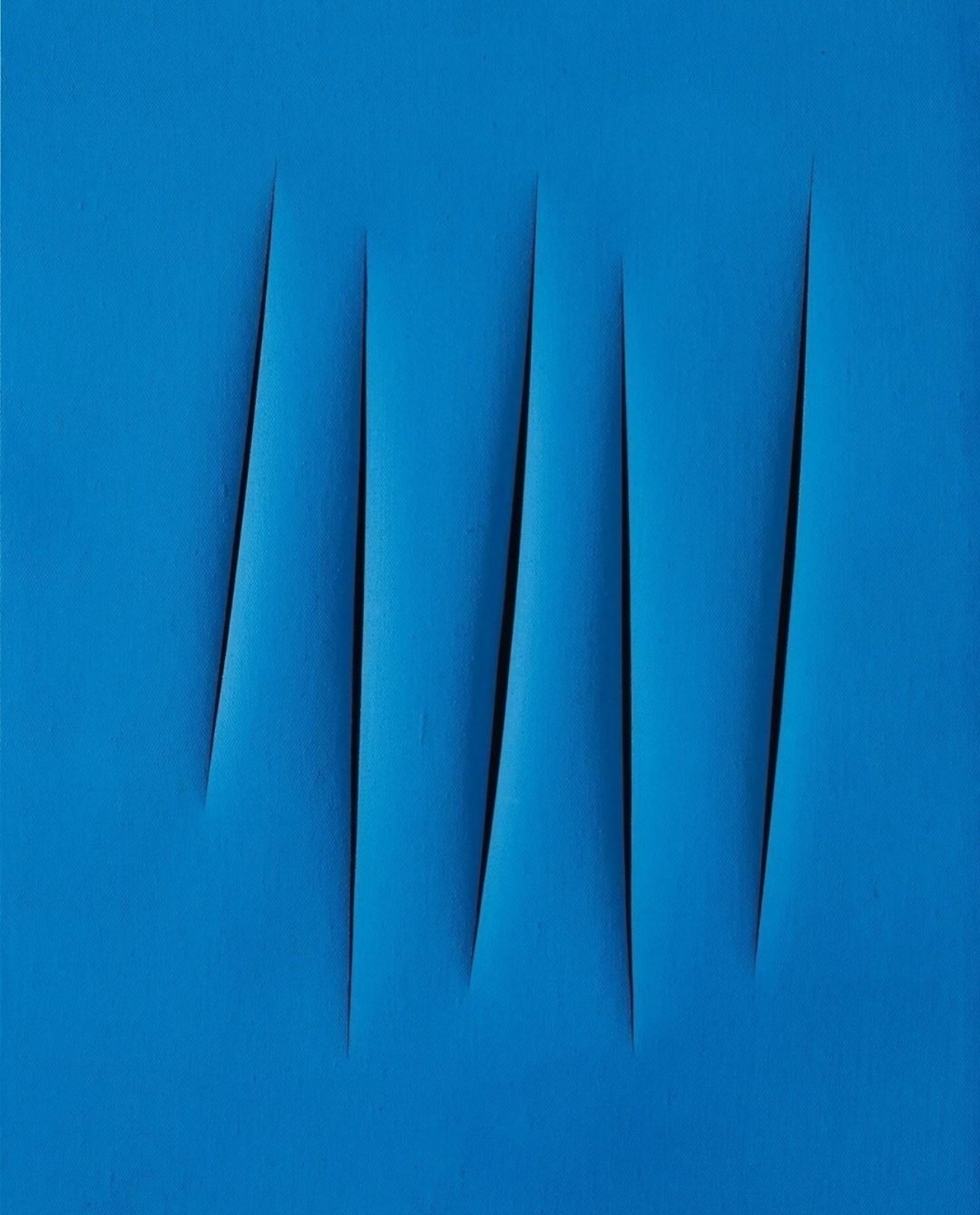
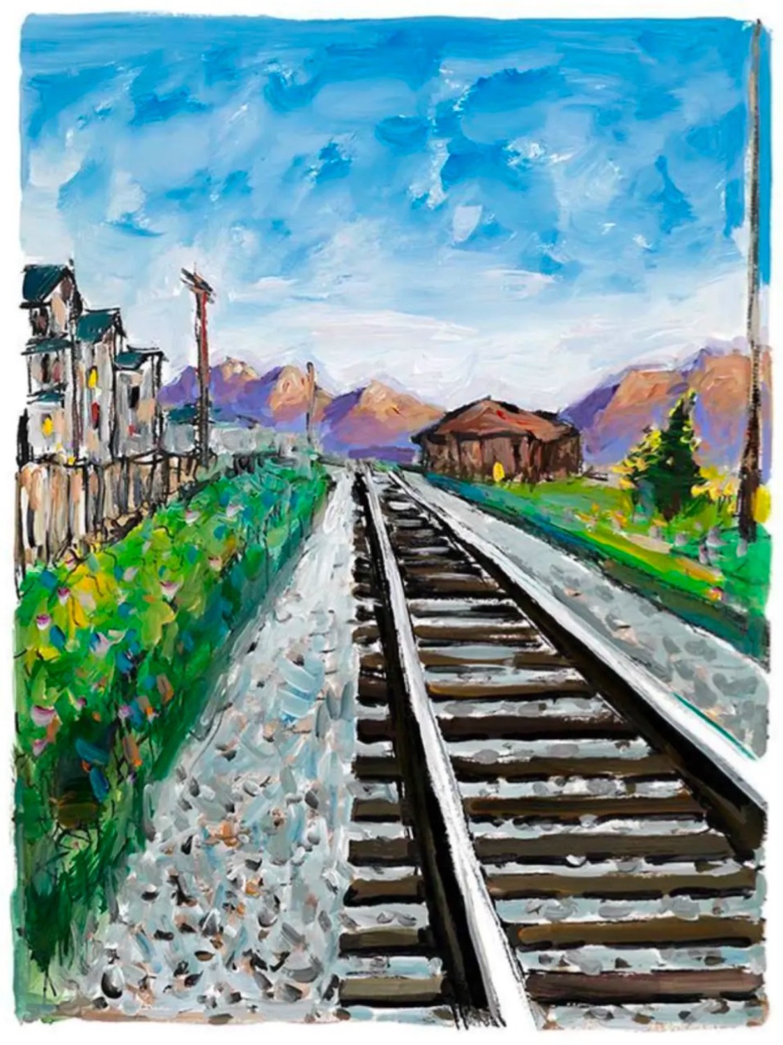
Monochromatic
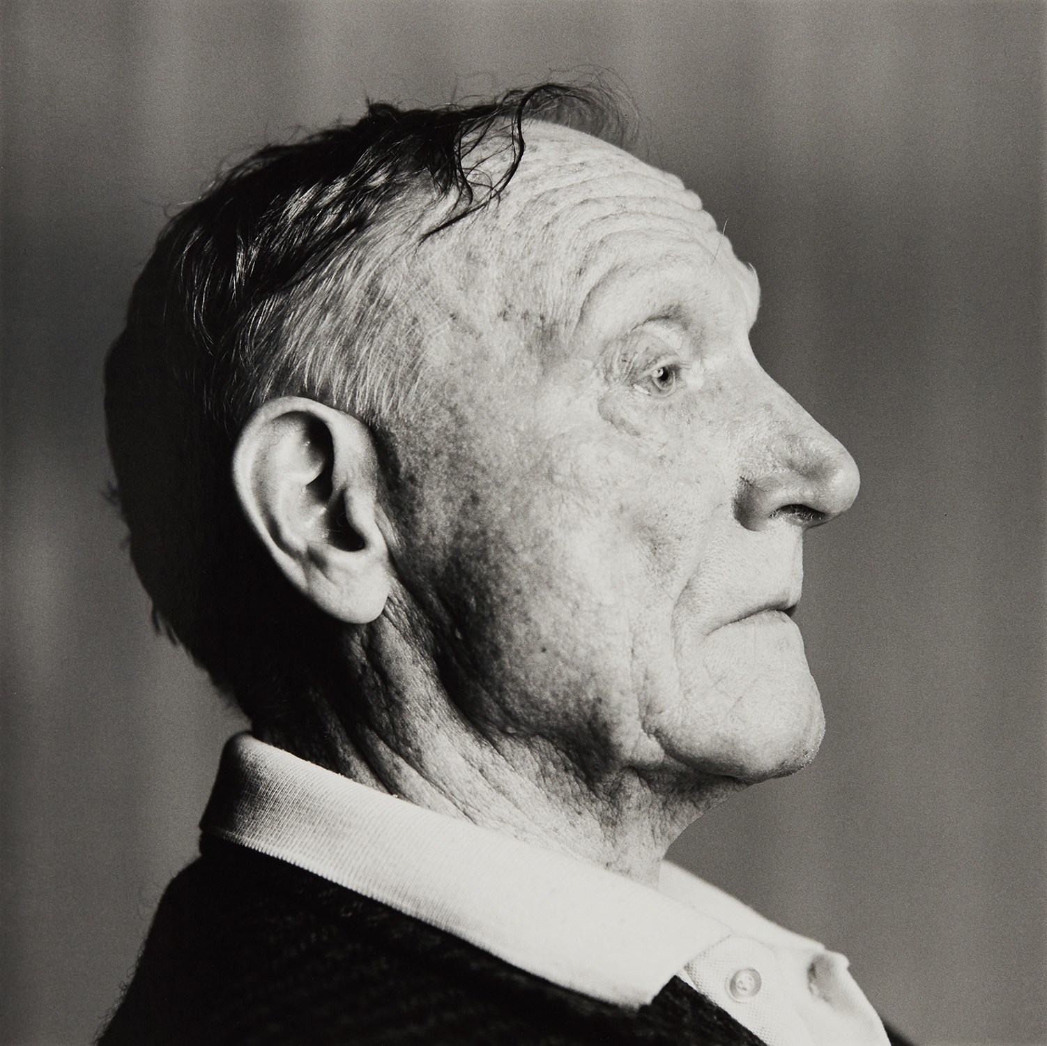
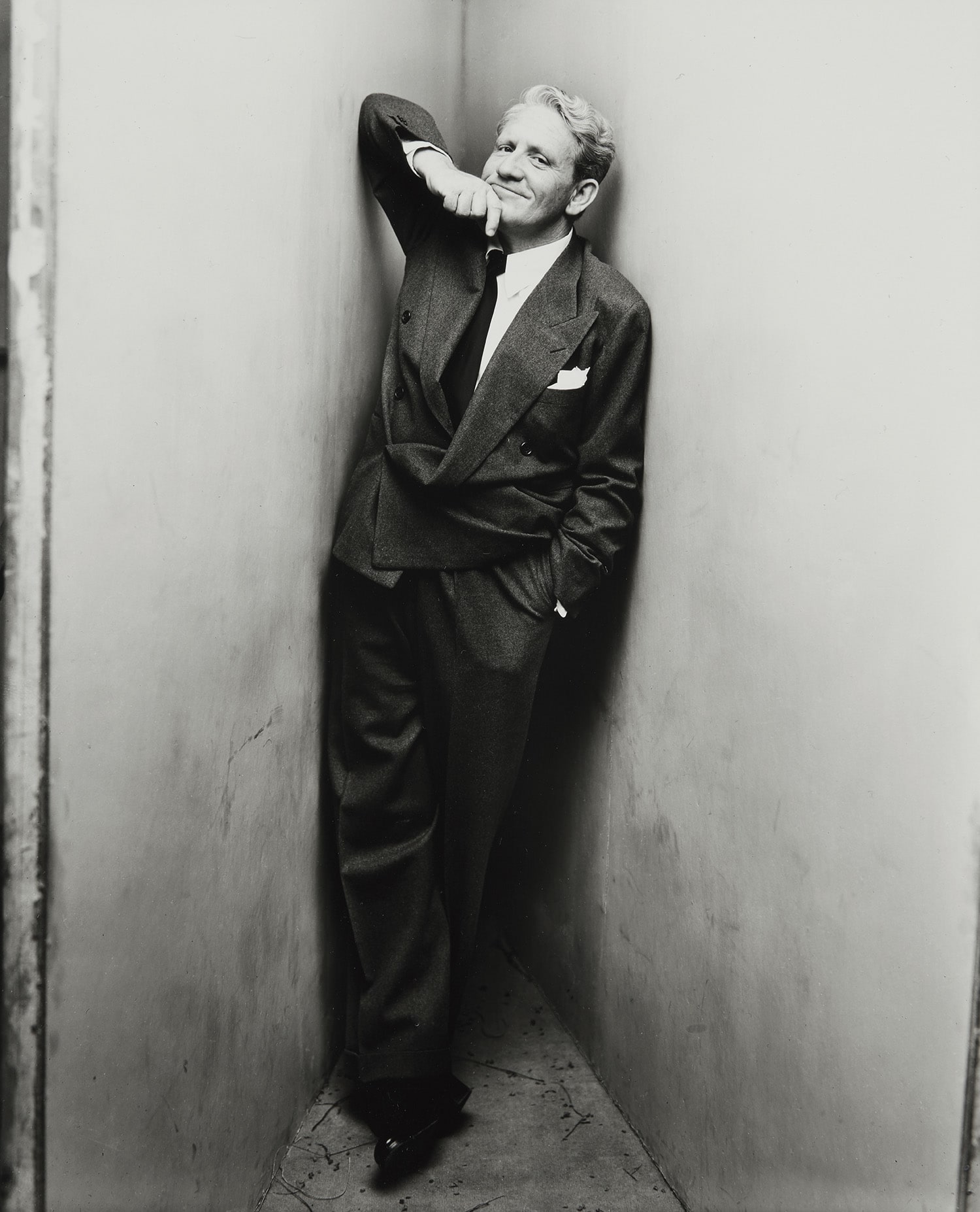
Hiro
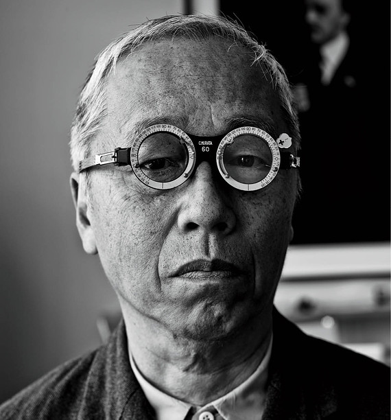
Robert Penn Warren, poet, fairfield, CT, 10-13-78


The Power of One Color Done Right
There is something quietly radical about a collector who chooses to live with a monochromatic work. Not because it signals restraint or minimalist taste, though it may do both, but because it demands a different kind of attention. Color, when reduced or eliminated, stops being a distraction and starts being a presence. The room shifts around it.
Visitors pause. What looks at first like simplicity reveals itself over time as a field of infinite decision. This is what draws serious collectors to the monochromatic: not austerity, but depth that accumulates the longer you look. Living with a work that operates in a single register of color or in pure black and white is also, collectors consistently report, remarkably easy on the domestic environment.
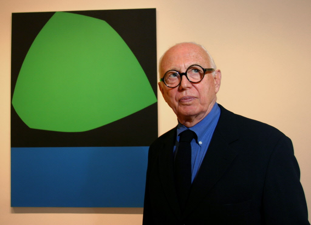
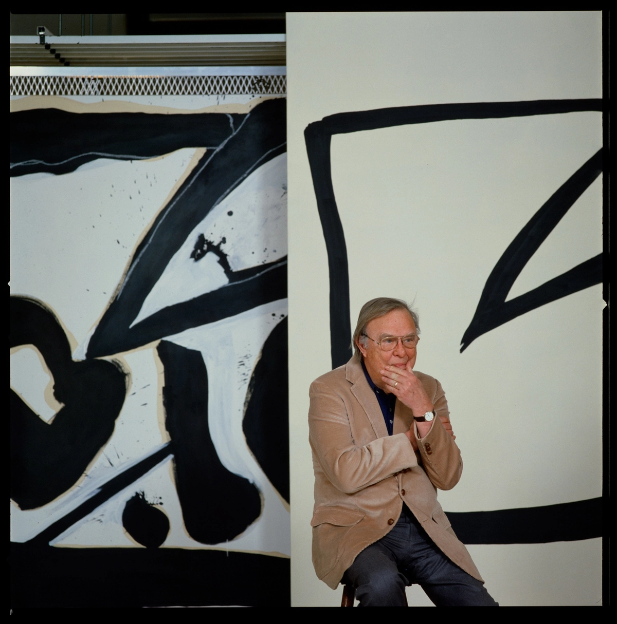
Barnett Newman
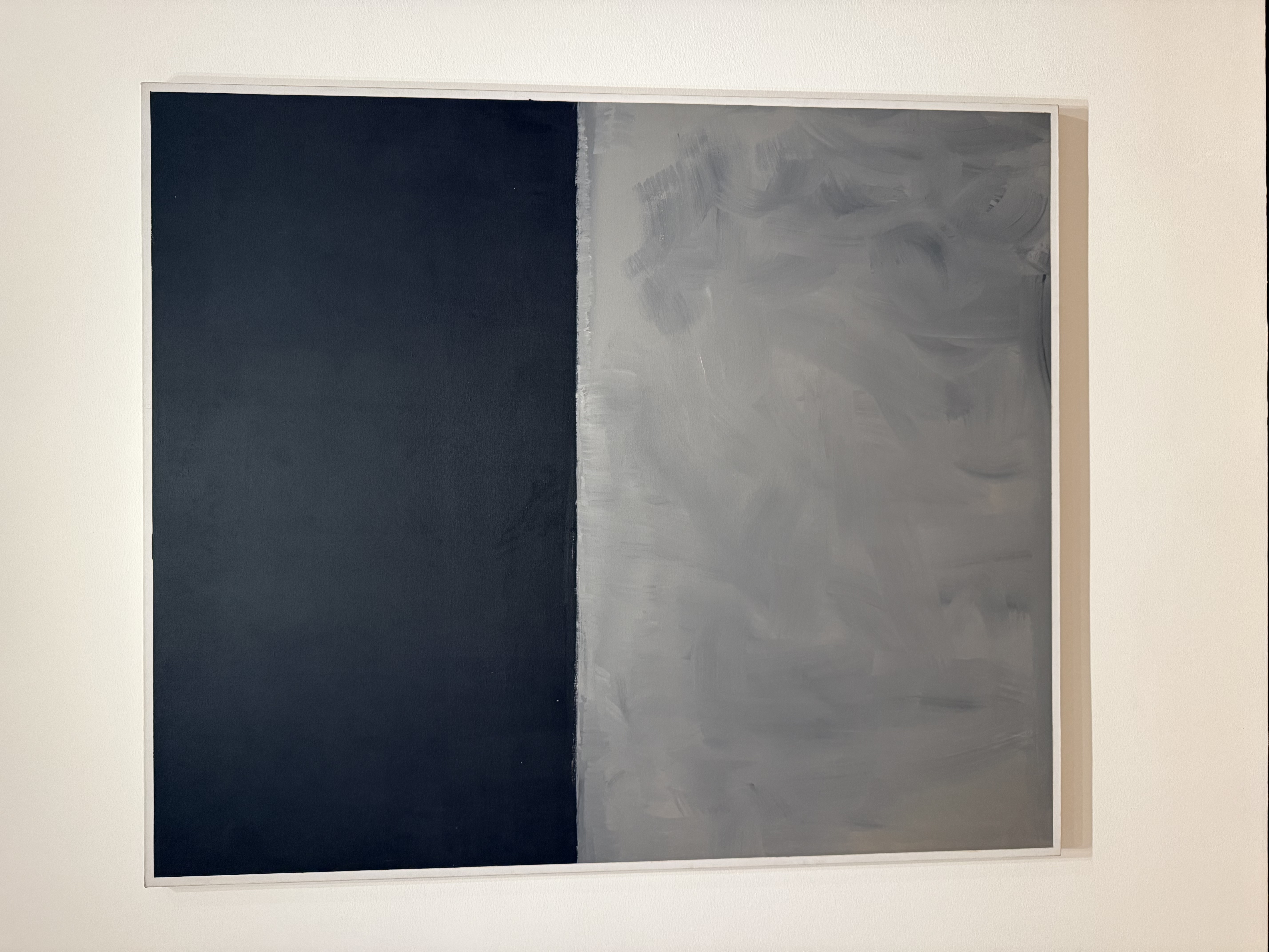
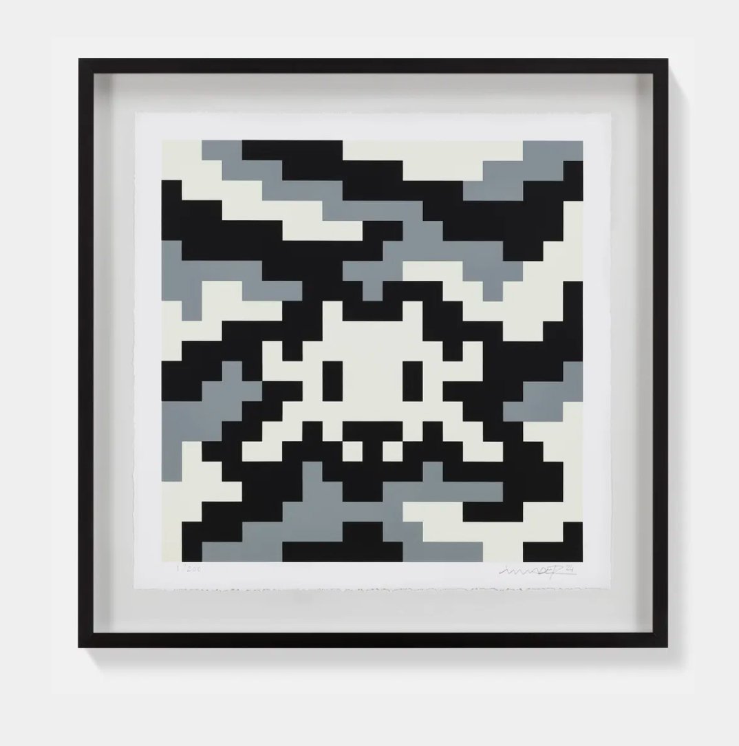
Black and Grey
These works hold their ground across changing light conditions, across different furniture and textiles, across the years in ways that more chromatically busy works sometimes cannot. But do not mistake that adaptability for neutrality. The best monochromatic works are not polite background objects. They are confrontational in the most measured possible sense, objects that insist on your presence in front of them.
Separating a good monochromatic work from a great one requires looking closely at how the surface was built and why. The great works in this territory are not reduced versions of something more complex. They were conceived from the beginning as complete statements within their chosen limits. Pierre Soulages, who described his practice after 1979 as working not with black but with the light that black reflects, understood this completely.
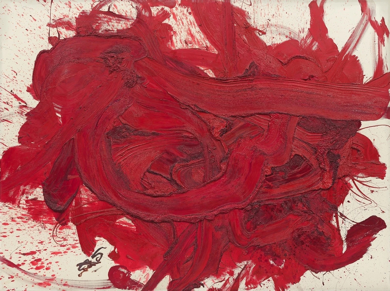
Kazuo Shiraga
Untitled
His Outrenoir canvases are not black paintings. They are paintings about what happens to light when it moves across a carefully constructed dark surface. The difference is everything. When considering a work in this category, ask yourself whether the artist was working toward the monochromatism or working within it from the start.
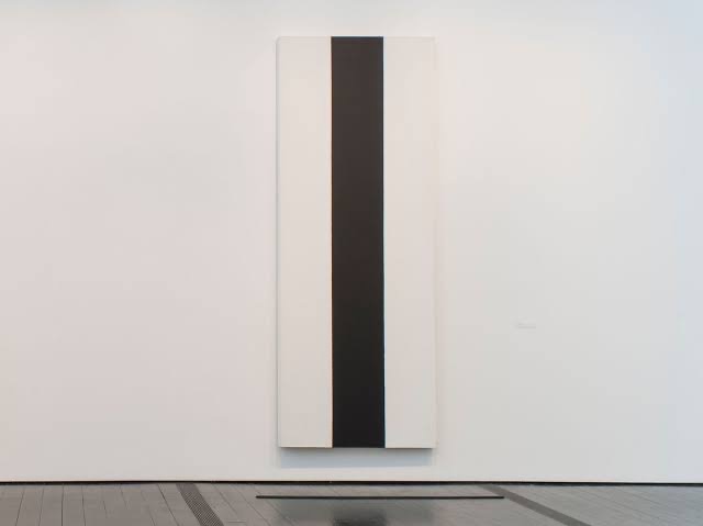
The latter almost always produces the stronger object. Surface handling is the real measure of quality here. Robert Ryman built an entire practice around the question of how paint sits on a surface, how white is not one thing but thousands of things depending on the support, the tool, the gesture, and the edge. His works on The Collection demonstrate why he became a touchstone for collectors interested in painting at its most essential.
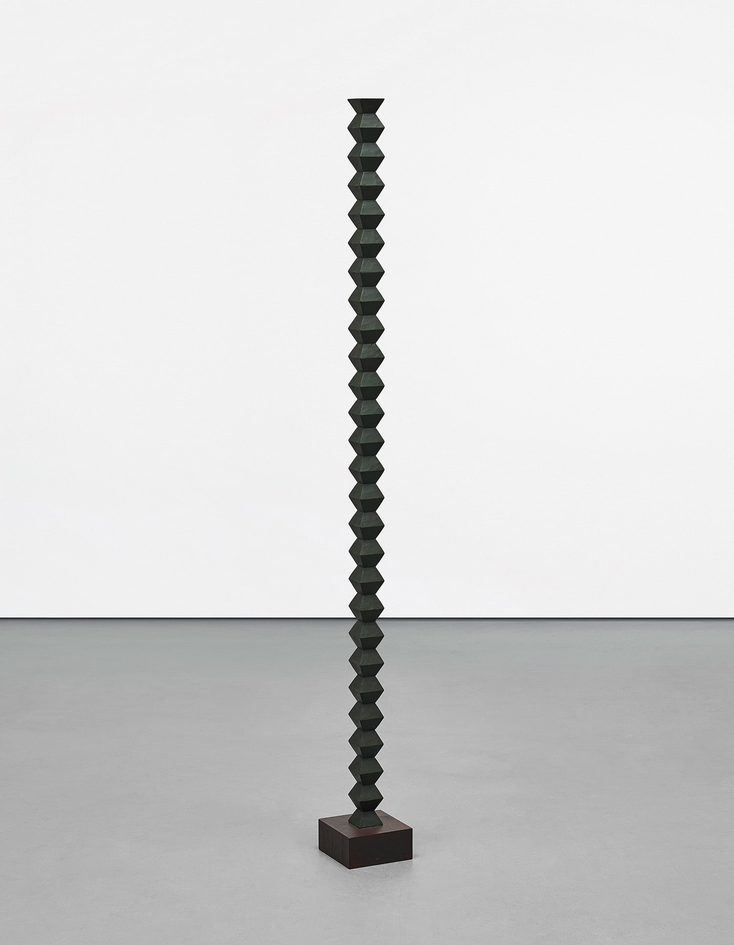
Richard Pettibone
Constantin Brancusi Endless Column, 1992
Similarly, Brice Marden, whose early wax and oil panels carry a warmth and material intelligence that photographs can never fully convey, rewards close looking in person in a way that matters enormously when making a purchase decision. With both artists, condition is paramount. Small losses or abrasions in the surface of a monochromatic painting are proportionally far more damaging than comparable issues in a densely colored or heavily composed work because there is simply less visual information to absorb the eye's attention. Within this territory, Ellsworth Kelly occupies a position of enormous market strength.
His shaped canvases and prints, including the lithographs and screenprints that remain accessible to collectors at a range of price points, have seen sustained demand across decades. Kelly's work benefits from extraordinary institutional support, clear catalogue documentation through the Yale catalogue raisonné project, and a broad international collector base. Yves Klein's International Klein Blue monochromes, first exhibited in Paris in 1957, represent one of art history's most concentrated and recognizable bodies of work, and authenticated examples, particularly the Anthropometries and pure IKB panels, perform strongly at major auction houses whenever they appear. Both artists are well represented on The Collection and offer collectors the relative security of established market positions.

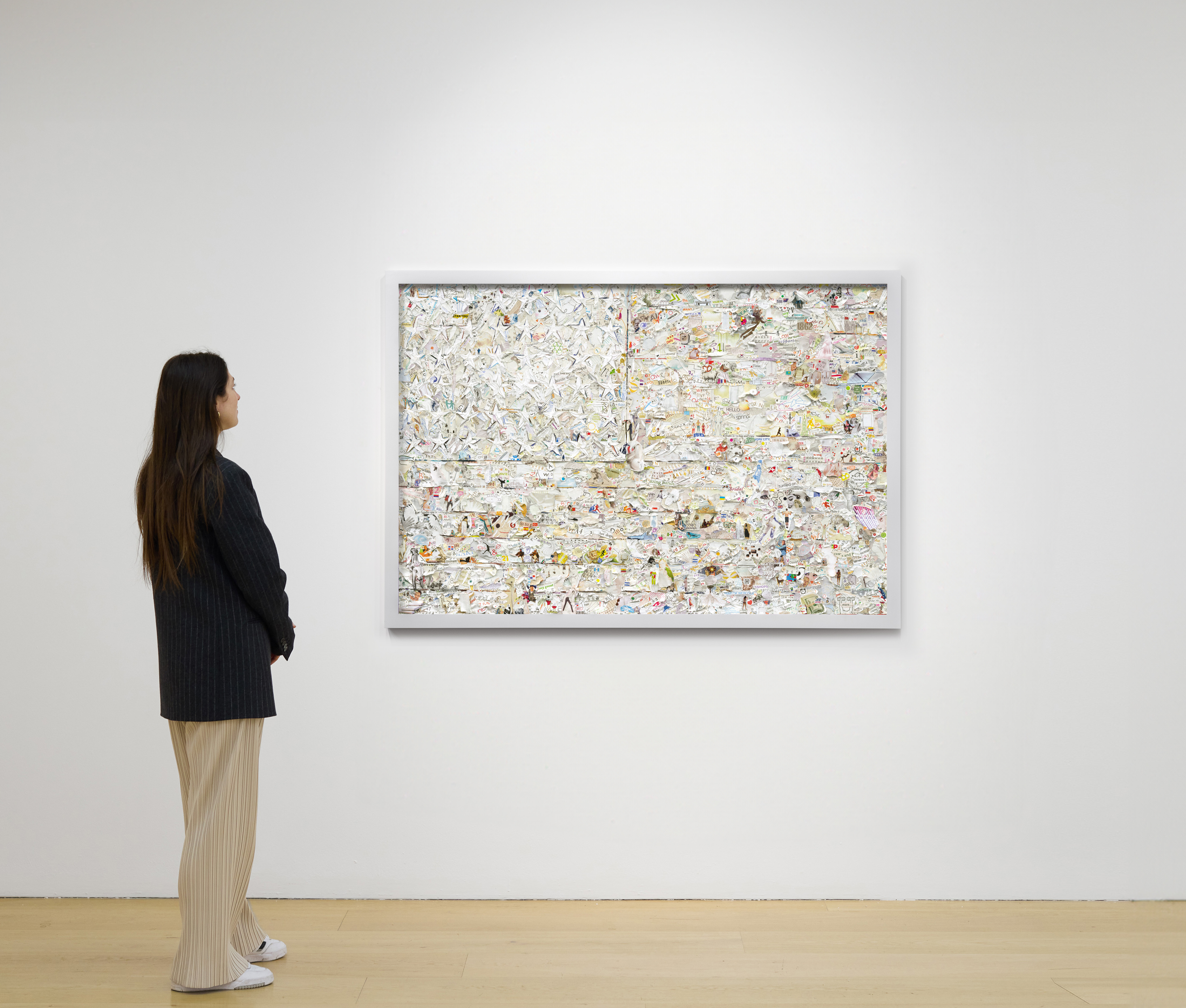
Anthony James
Dodecahedron (Solar Black), 2025
For those looking toward less charted territory, the work of Tomoo Gokita deserves serious attention. Working in black and white acrylic gouache, Gokita creates figurative works of remarkable psychological intensity, where the absence of color becomes a kind of structural unease. His market has developed steadily over the past decade, with prices moving meaningfully at auction, and his work sits in a compelling position between illustration culture, figure painting, and the formal concerns of artists like Richter. Matias Faldbakken, the Norwegian artist whose practice engages text, institutional critique, and a deliberately cold visual palette, is another figure whose work rewards early attention.
Both are represented on The Collection and reflect the way younger practices are finding genuinely new reasons to work within monochromatic constraints rather than simply continuing a historical conversation. At auction, monochromatic works across the major categories including post war abstraction, photography, and works on paper have shown consistent resilience in uncertain market conditions. The clarity of attribution and the ease of condition assessment in many works in this space make them relatively lower risk in secondary market transactions. Aaron Siskind's photographs, with their close focus on surfaces and marks that recall abstract painting, and Hiroshi Sugimoto's long exposure theater and seascape photographs, both carry strong secondary market records and benefit from being well documented within known series and editions.
Edition size matters here: Sugimoto's smaller edition photographs command premiums, and collectors should always verify edition numbers against known documentation before purchasing. Practically speaking, display of monochromatic works requires more care than is often assumed. Lighting is everything. A Ryman that sings under warm incandescent light can look flat and cold under fluorescent sources.
Before installing a significant work of this kind, it is worth bringing a lighting consultant or working with the gallery to test the piece in your space. Ask galleries about the specific pigments used, particularly in works from the 1960s and 1970s where certain blacks and whites have known stability issues. For any work described as monochromatic but involving layered processes, ask for full technical documentation. And when choosing between an edition and a unique work within this category, consider that the unique object, whatever the price difference, carries a particular authority that prints and multiples, however fine, rarely replicate.
In an area of practice where the entire meaning can rest on a single physical surface, the original is not simply one version among others. It is the thing itself.