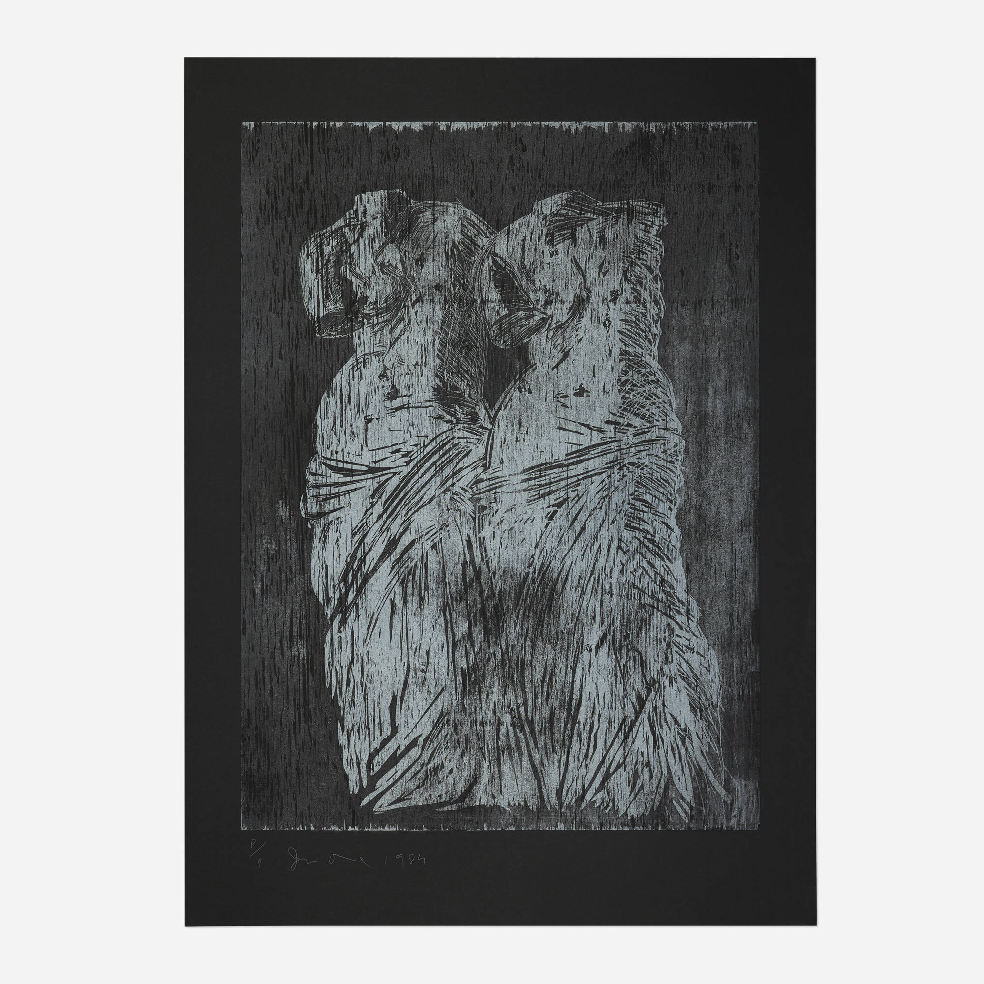
Color Woodcut
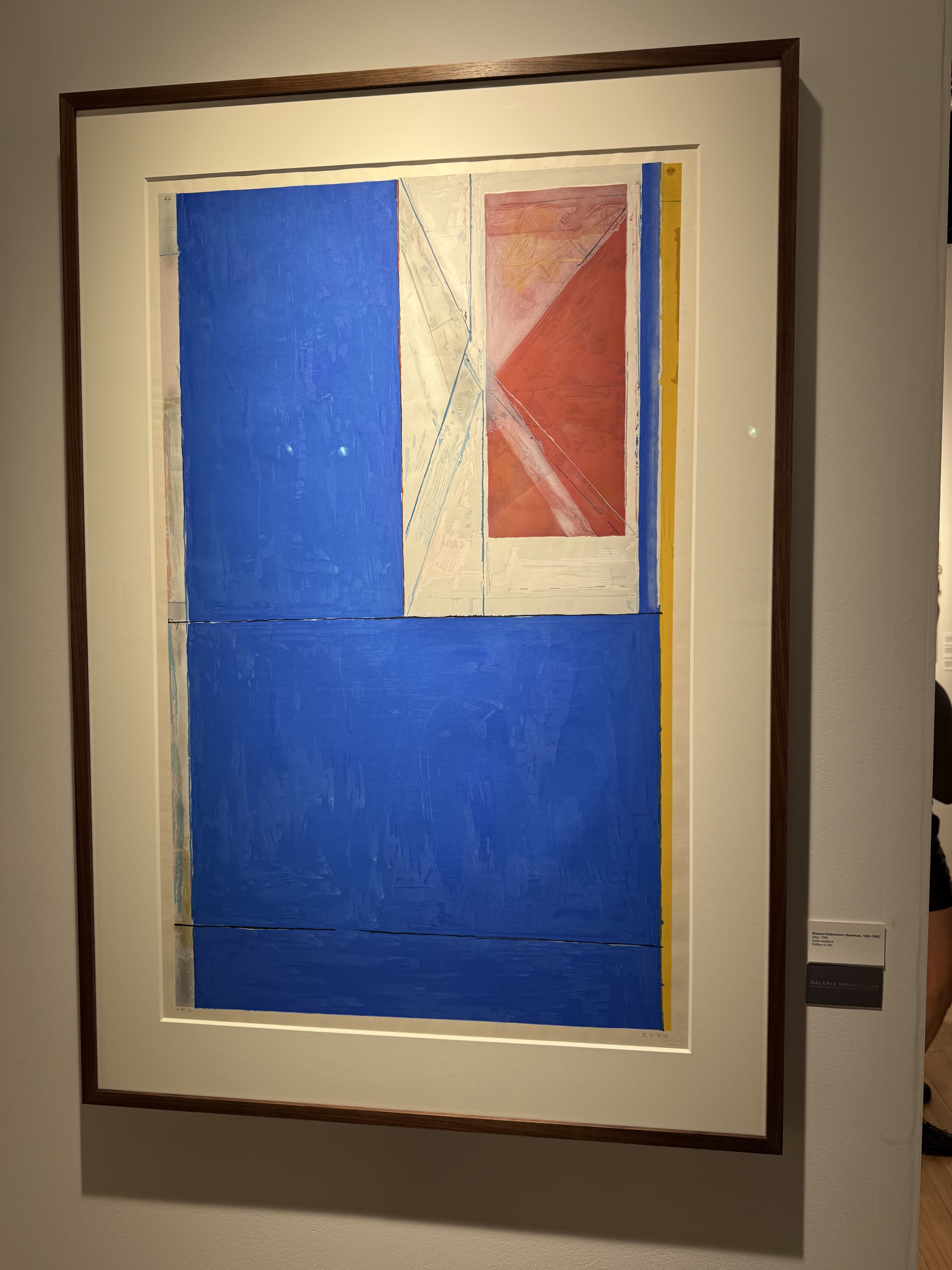
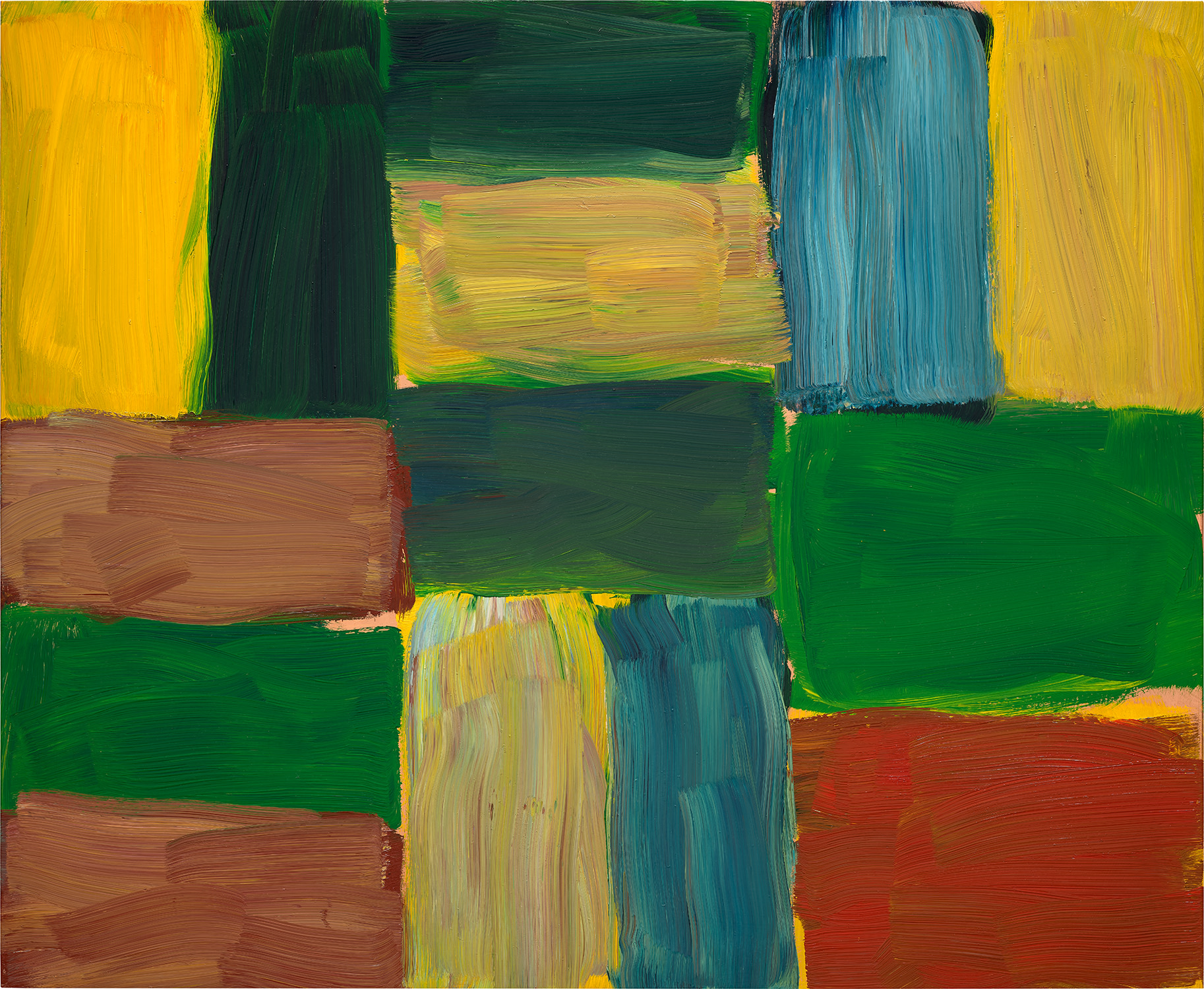
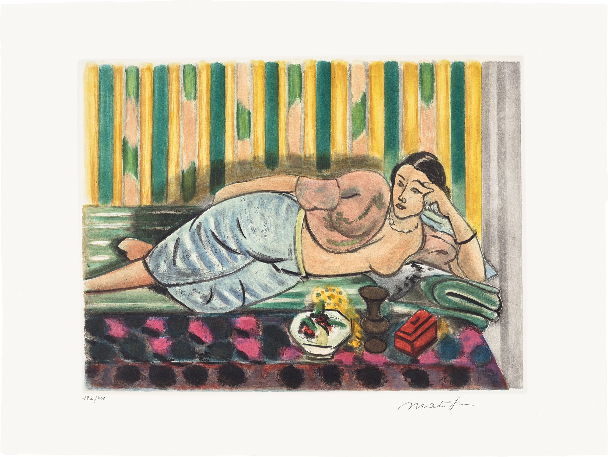
Richard Diebenkorn
Blue, 1984
Cut Deep, Print Bold: Collecting Color Woodcut
There is something almost alchemical about a great color woodcut. The image arrives through pressure and wood grain and pigment, through the physical act of carving away what does not belong, and what remains has a presence on paper that no photographic reproduction can adequately convey. Collectors who discover this medium tend to become devoted to it quickly, and for good reason. Living with a strong color woodcut means living with something that rewards close looking, something that changes character in morning light versus lamplight, something with a tactile depth that pulls you back to the wall again and again.
The appeal runs deeper than aesthetics alone. Color woodcut sits at a compelling intersection of Western and Japanese printmaking traditions, a dialogue that began in earnest during the late nineteenth century and produced some of the most visually radical work of the modern era. Collectors who understand that history find themselves holding not just beautiful objects but evidence of one of the most productive cross cultural exchanges in the history of Western art. The weight of that context, worn lightly, makes for an unusually rich collecting experience.
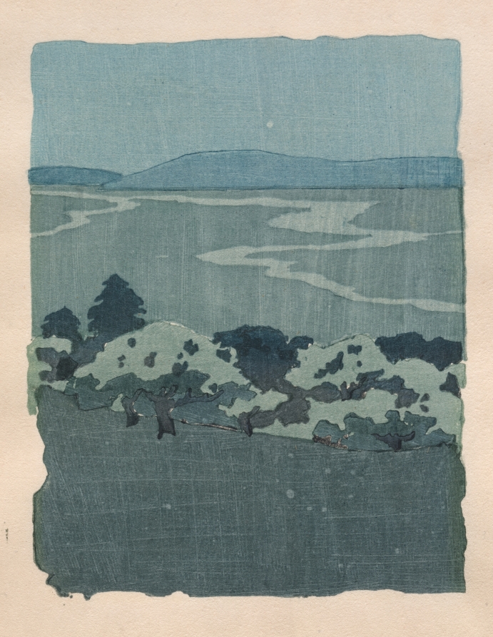
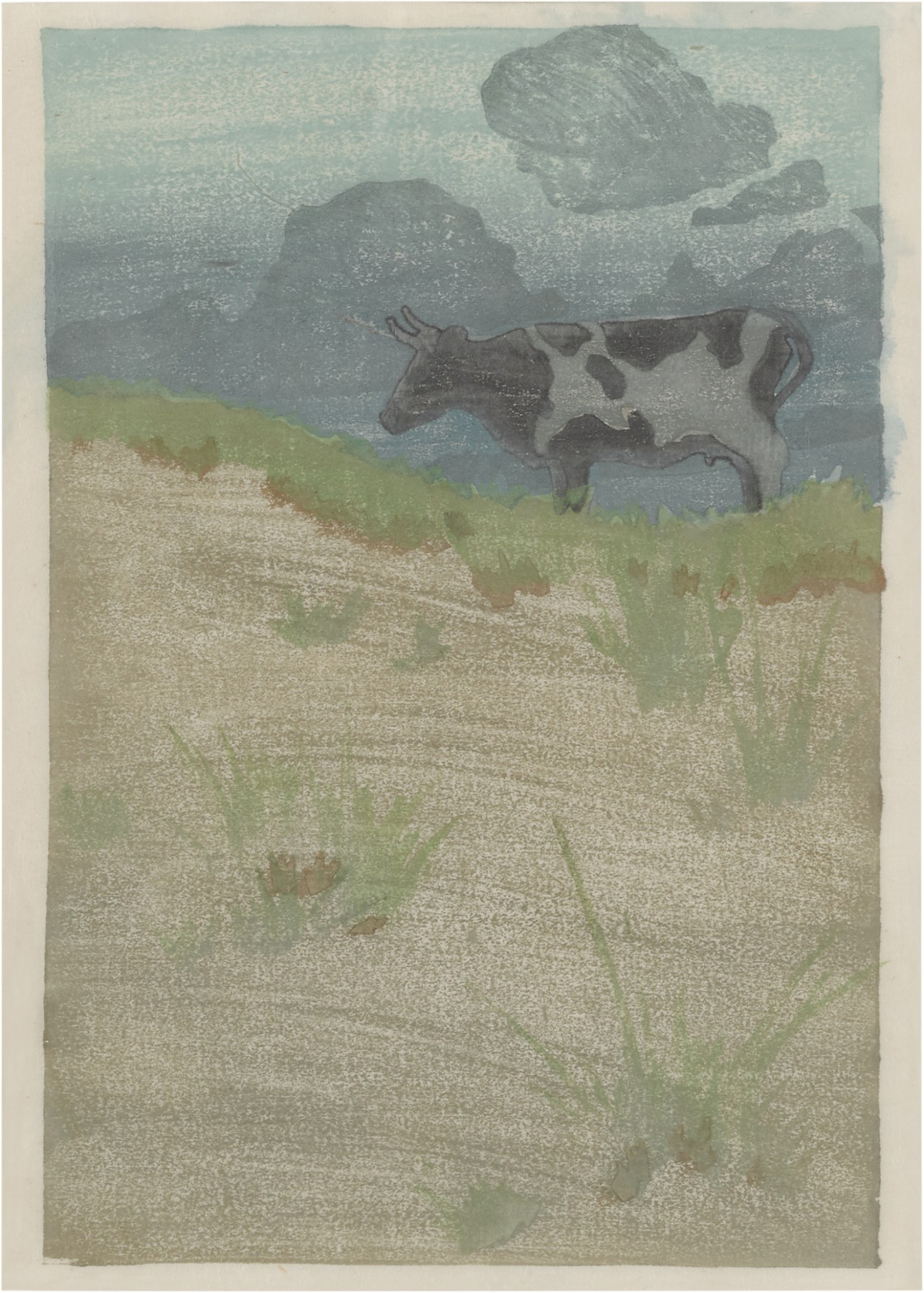
Arthur Wesley Dow
Dragon and Orchard, 1908
Separating a good work from a great one in this category requires attention to a few specific qualities. Registration is fundamental: the precision with which each color block aligns with the others speaks directly to the technical command of the maker and the care taken during printing. Misregistration that looks accidental is very different from the kind of deliberate looseness that creates vibrancy, and experienced eyes learn to tell the difference. Beyond registration, look at how the artist has used the grain of the wood itself, whether it becomes a visual element rather than simply a substrate.
The best works in this medium use the material honestly, letting the character of the block contribute to the final image rather than fighting against it. Ink quality and paper choice matter enormously as well. Japanese kozo papers, with their long fibers and luminous surfaces, respond to water based pigments in ways that Western papers simply do not replicate, and works printed on period appropriate papers carry an authenticity that becomes immediately apparent. The artists well represented on The Collection offer a remarkable cross section of the medium at its most ambitious.
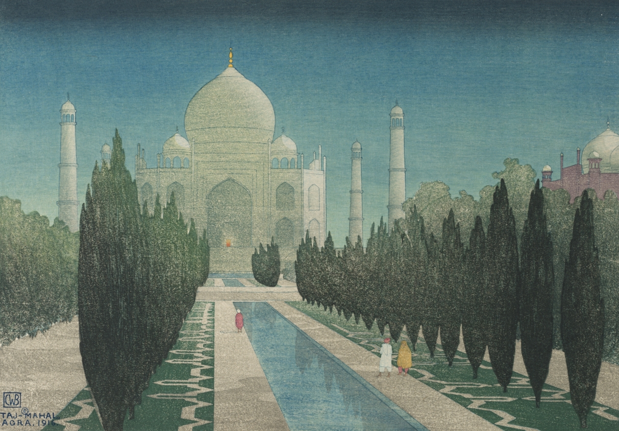
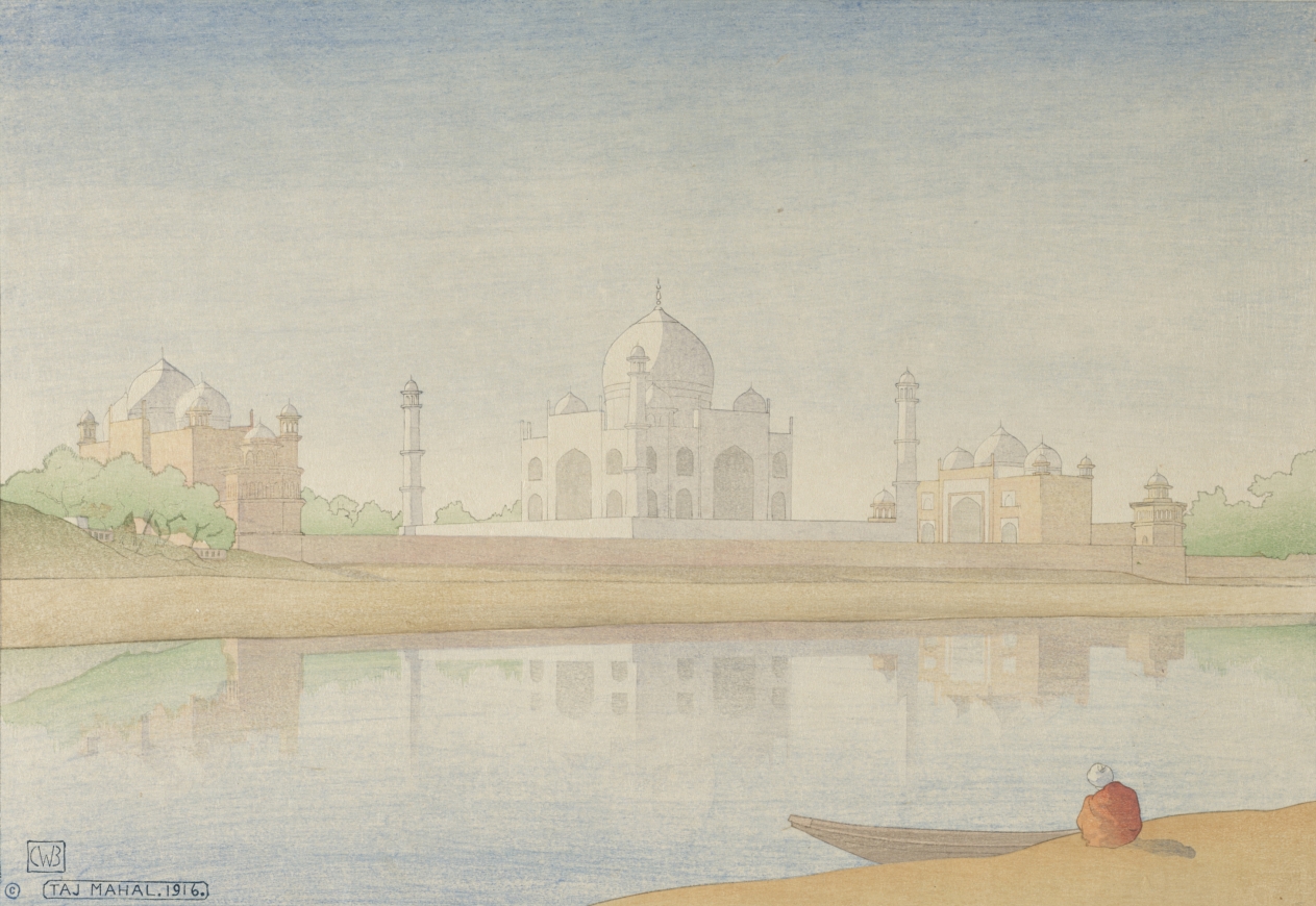
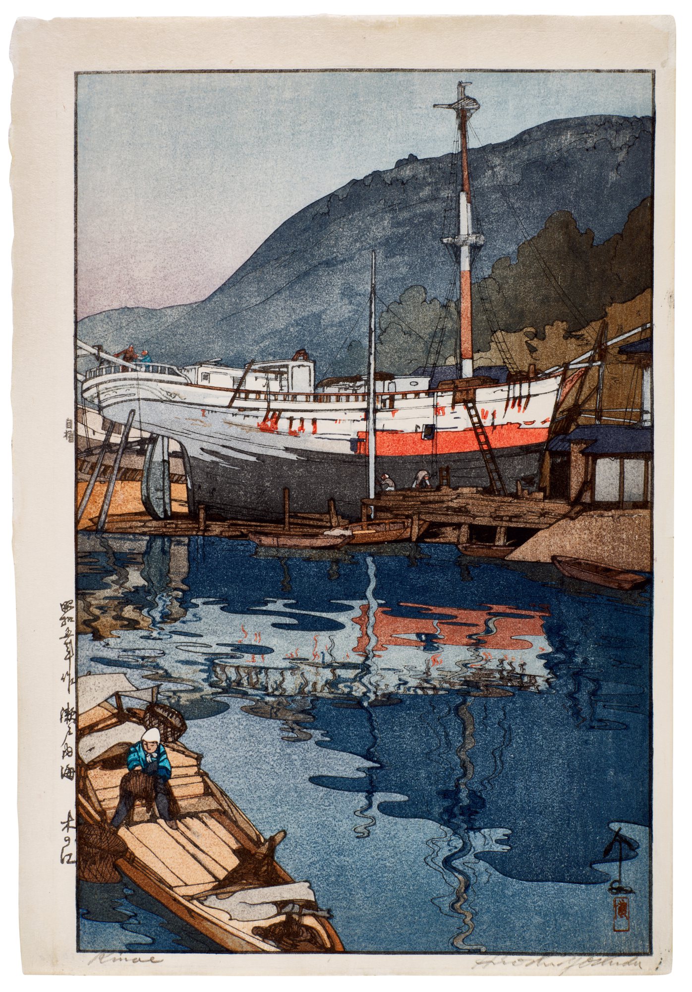
Charles William Bartlett
Taj Mahal, Agra, 1916
Frank Morley Fletcher, who studied in Paris and later codified the Japanese woodblock technique for English speaking audiences in his 1916 manual, brought a disciplined understanding of flat color and bold outline to his landscapes and figures. His works remain undervalued relative to their art historical importance and their visual power. Arthur Wesley Dow, who taught at Columbia University and whose influence on American modernism extended through Georgia O'Keeffe and many others, approached the woodcut as a vehicle for exploring what he called notan, the dynamic balance of light and dark. Dow's prints are genuinely scarce on the market and represent the kind of foundational modernist works that serious collections tend to anchor themselves around.
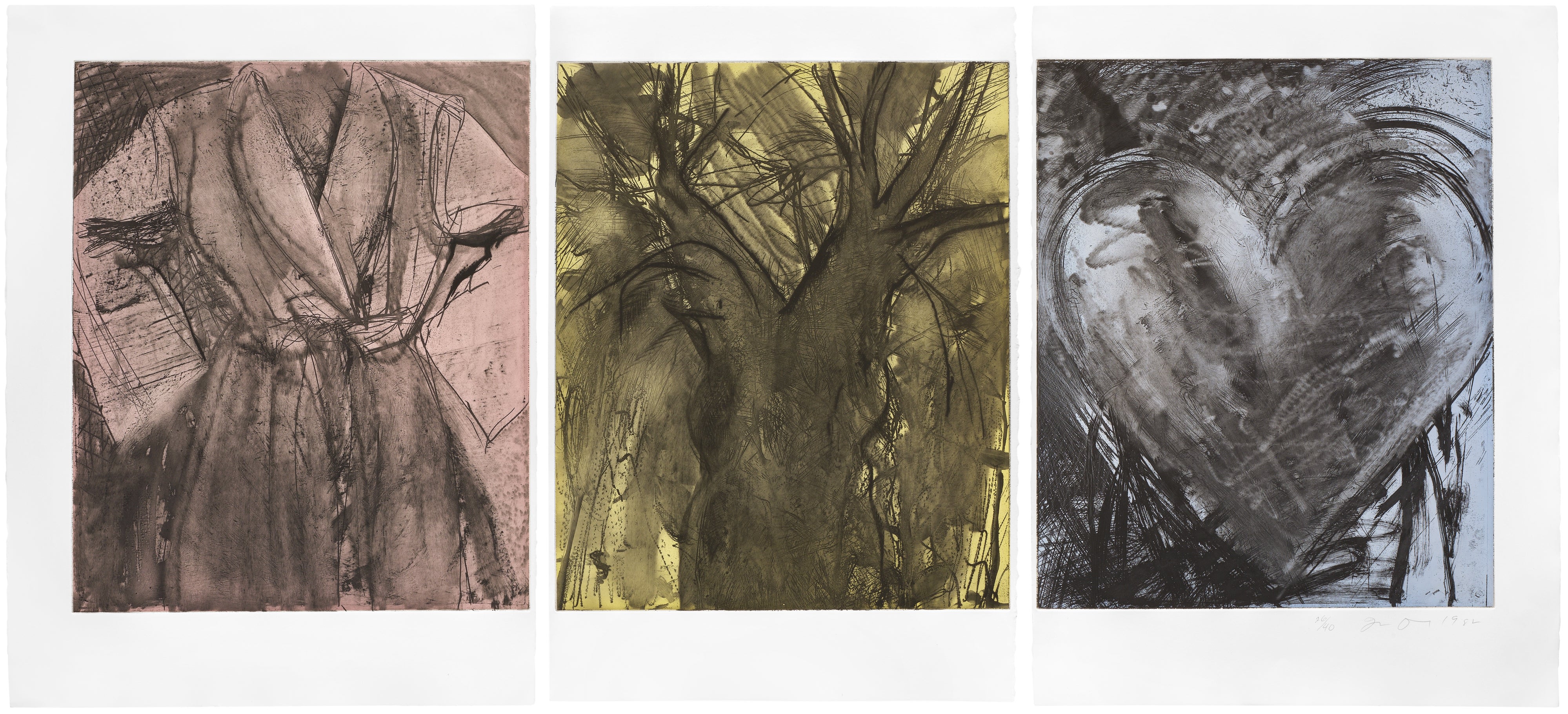
Charles William Bartlett, working across India, Japan, and the Pacific, produced color woodcuts of enormous warmth and compositional confidence that sit beautifully in domestic spaces and continue to attract new collectors who encounter them for the first time with an almost startled appreciation. The case for Lucien Pissarro in this medium is equally compelling. As the son of Camille Pissarro and a founder of the Eragny Press in London during the 1890s, Lucien brought a painter's eye and a genuine understanding of Post Impressionist color theory to his woodcut work. His prints are small in scale but large in ambition, and they carry a provenance that connects them to one of the great networks of late nineteenth century European art.
Lucien Pissarro
The Queen of the Fishes: Plate 7, 1894
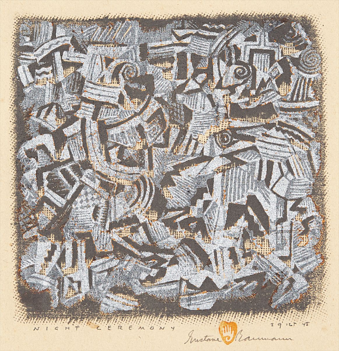
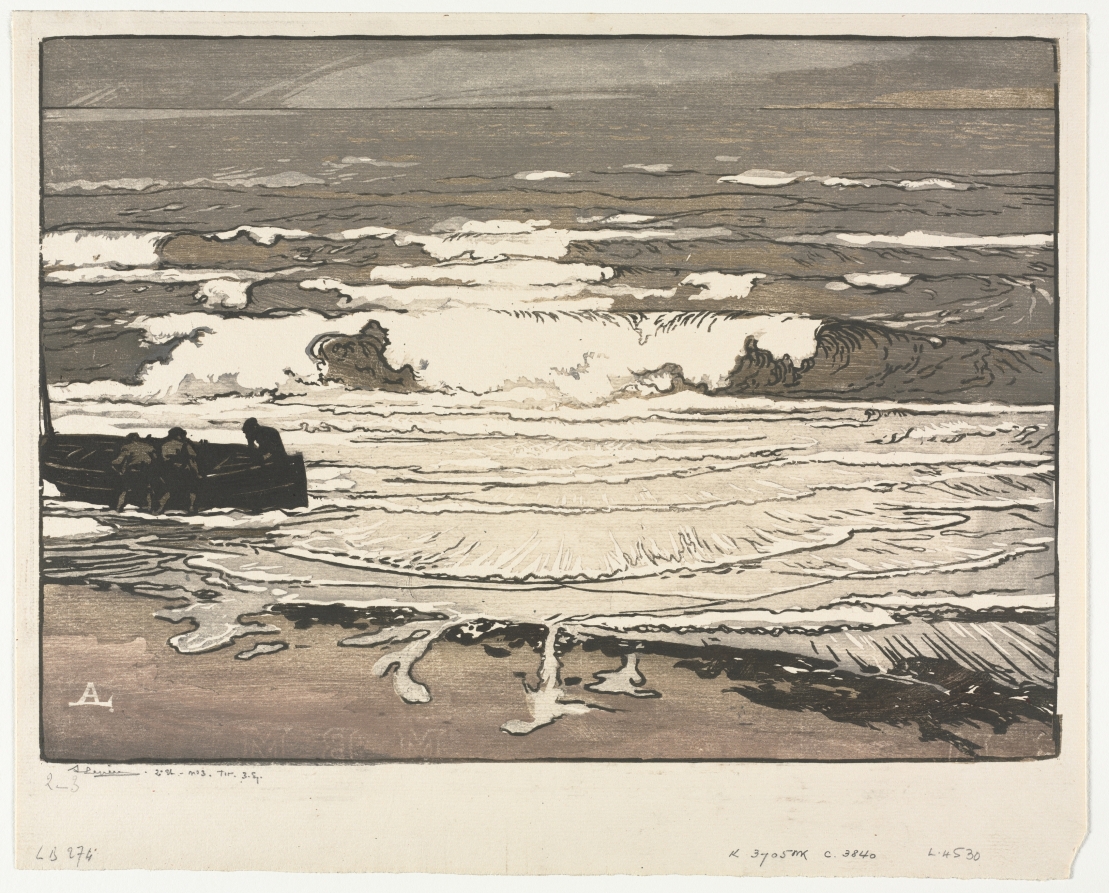
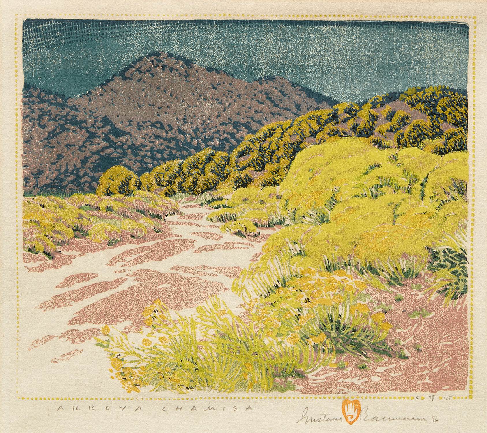
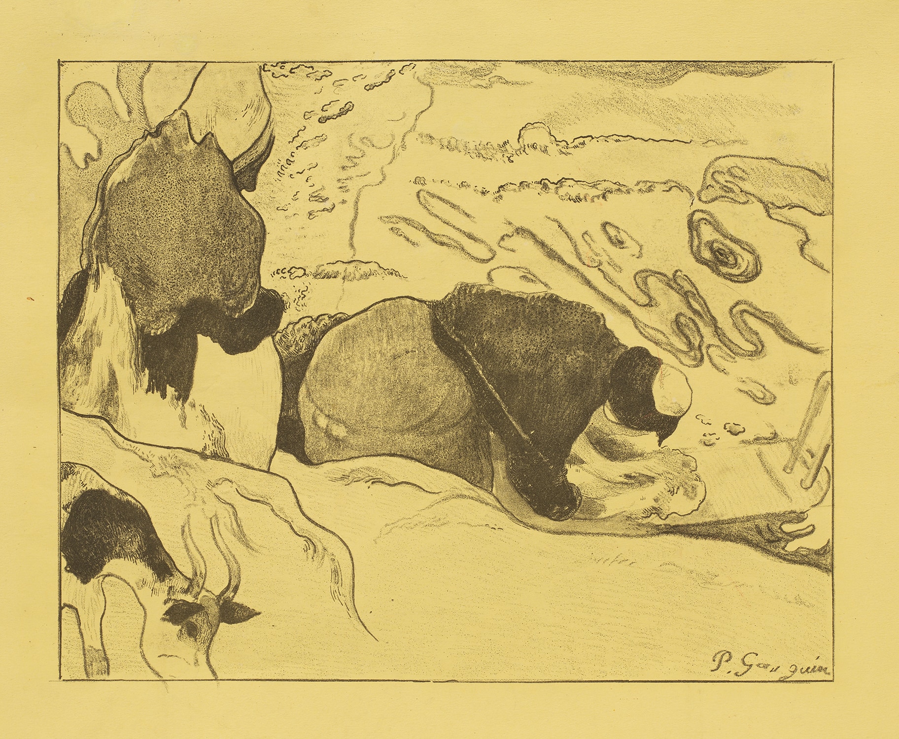
Auguste Louis Lepère, working in France during roughly the same period, produced woodcuts that demonstrate how the medium could absorb lessons from Japonisme while remaining rooted in a distinctly European graphic tradition. Gustave Baumann, who spent much of his career in Santa Fe, developed a color woodcut practice of exceptional technical refinement that documented the American Southwest with an affection and visual intelligence that makes his prints perpetually appealing. Paul Gauguin's singular presence on The Collection reminds us that the woodcut, at its most radical, could be used to dismantle pictorial convention entirely, his rough and spiritually charged prints remaining among the most influential objects in the history of the medium. For collectors watching for emerging and underrecognized opportunities, the contemporary artists working in color woodcut represent an interesting frontier.
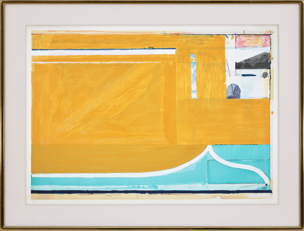
The medium has attracted serious practitioners who are engaging with its traditions critically rather than nostalgically, and their work tends to be priced well below what comparably ambitious work in other print media commands. Sean Scully's presence on The Collection in this context is worth noting: his engagement with printmaking has always been serious and the woodcut format suits his architectural sensibility and his interest in layered color fields. Richard Diebenkorn and Henri Matisse represent the opposite end of the spectrum, names whose works in any medium attract sustained institutional and private demand, and whose presence anchors any collection. At auction, strong color woodcuts by well documented artists have shown consistent demand over the past two decades, with particular momentum in the works of artists associated with the American Arts and Crafts movement and the Japonisme influenced printmakers of the 1890s and early 1900s.
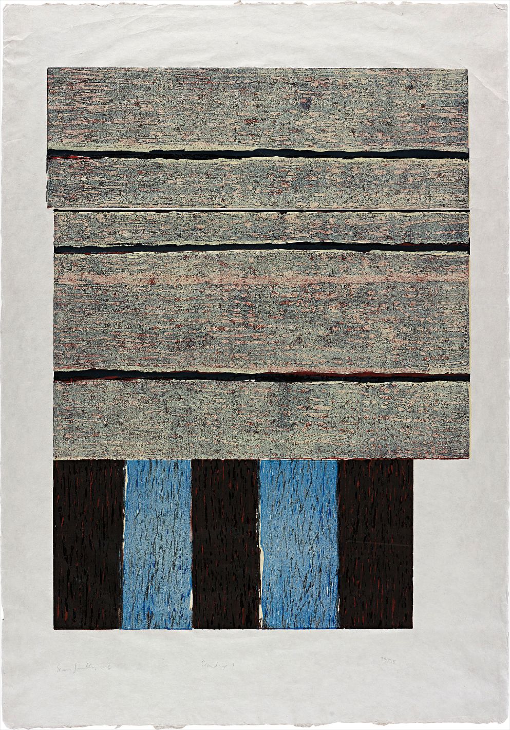
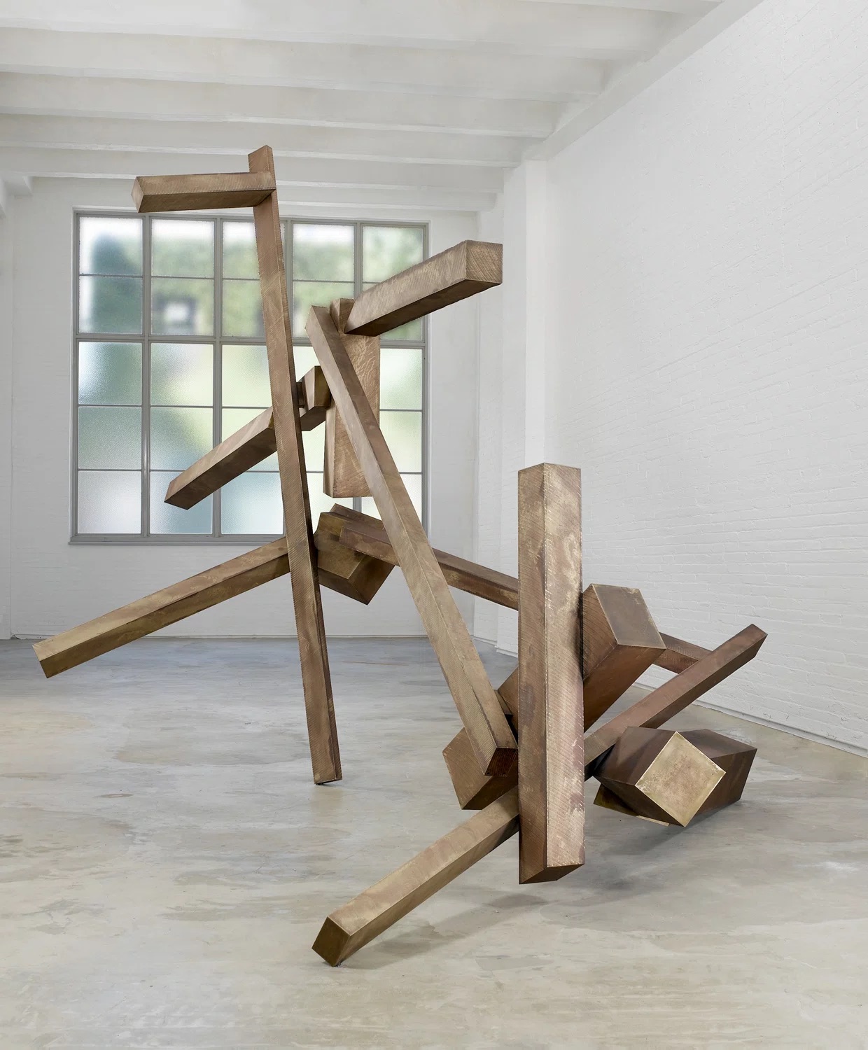
Sean Scully
Standing I
Baumann and Dow in particular have seen meaningful price appreciation as museum collections and scholarly attention have elevated their profiles. Works in fresh condition with documented printing histories and, where applicable, artist signatures tend to outperform estimates reliably. Practically speaking, condition is everything in this medium. Water based pigments on paper are vulnerable to light, humidity, and foxing, and works that have been displayed in direct sunlight often show fading that is essentially irreversible.
Ask galleries directly about provenance, exhibition history, and any known restoration. For editions, understand that smaller numbered editions from the artist's own hand are categorically different from later posthumous printings, which exist for some of the most collected artists in this space. Frame behind UV filtering glass, keep relative humidity stable, and if possible store or hang works away from exterior walls where temperature fluctuates. These are simple precautions that protect objects worth protecting.
When a work is this carefully made, it deserves the same care in return.