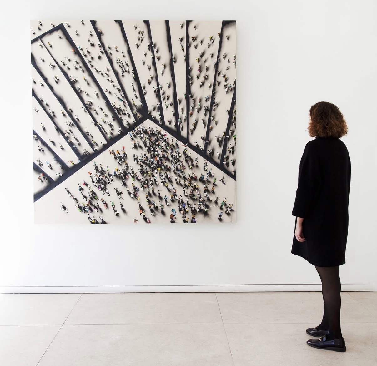
Gray Palette
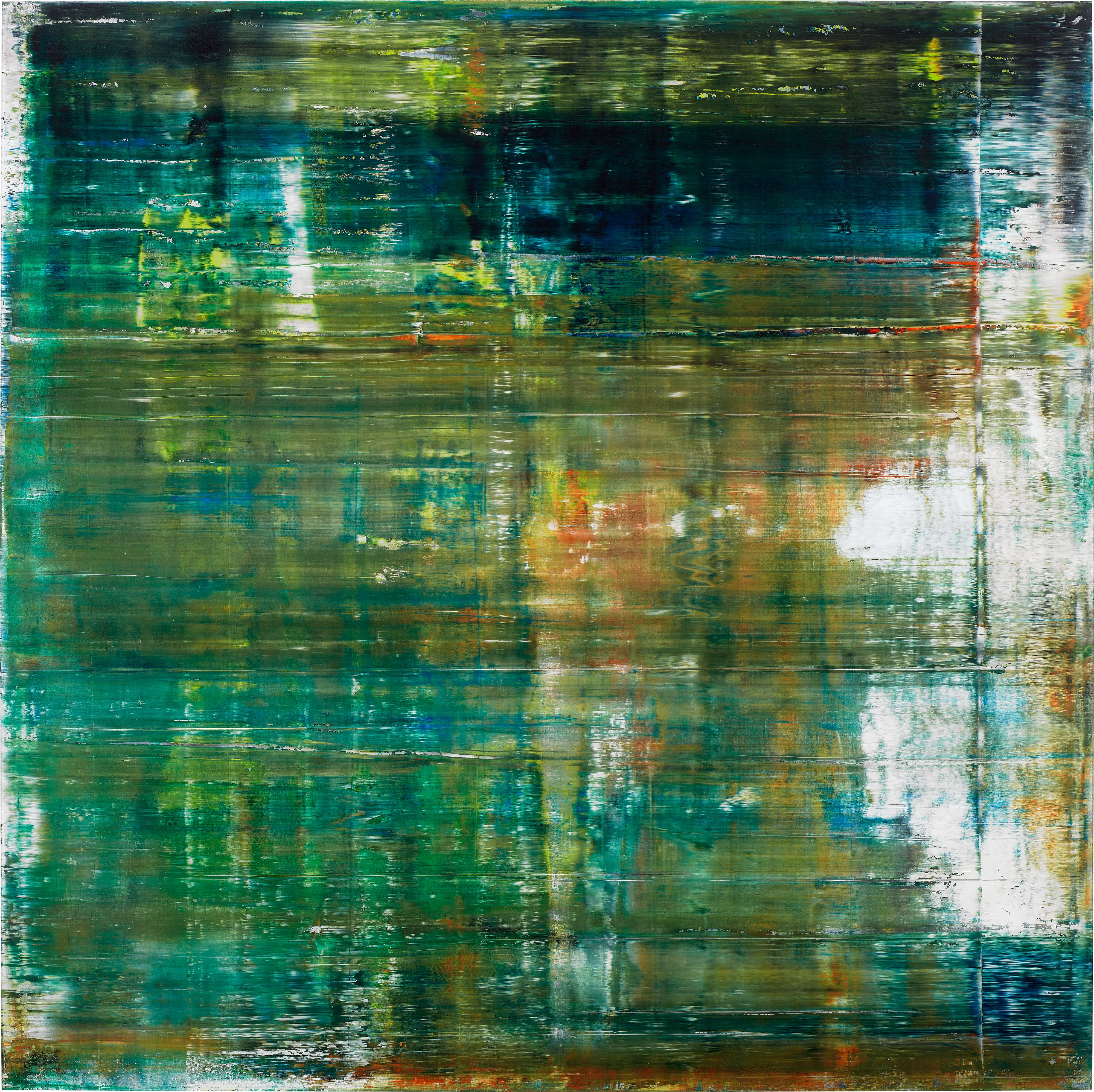
Gerhard Richter
Cage 1 (P19-1)

The Infinite Depth of Nothing
There is a particular kind of courage in choosing gray. Not the gray of indecision or absence, but gray as a fully inhabited territory, a spectrum that contains multitudes. Gray palette work asks something unusual of both artist and viewer: the willingness to find drama, warmth, and psychological complexity in a range of tone that most people associate with overcast skies and concrete. That collectors and institutions have returned to it again and again across more than a century tells you something important about its staying power.
The serious embrace of gray as a primary expressive register has roots in several traditions at once. Nineteenth century academic painting valued grisaille, the technique of working entirely in gray tones, as both a preparatory method and a finished mode in its own right. Grisaille altarpieces from the Flemish tradition show just how much emotional range those tones can carry. But the modern reimagining of the gray palette arrived with something sharper and more interrogative, beginning in the postwar period when artists across Europe and North America began treating gray not as a neutral ground but as a charged field.
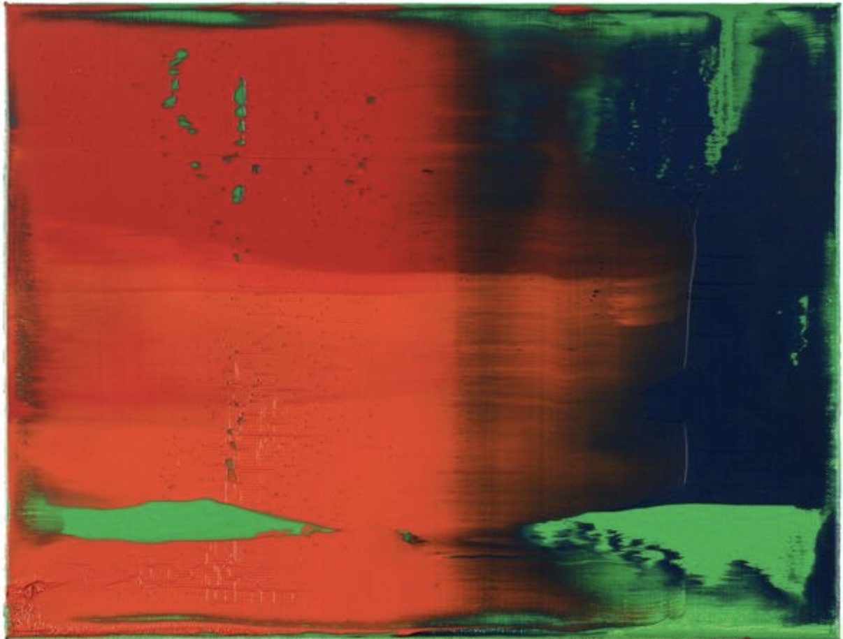
Gerhard Richter
Cage 1 (P19-1)
Gerhard Richter is perhaps the figure most associated with the radical possibilities of gray in contemporary painting. His Grey Paintings, begun in the late 1960s and continuing through the 1970s, presented flat, monochrome canvases of varying gray tones that seemed to hover between presence and erasure. Richter spoke of gray as the only color that carries no psychological or associative baggage, a statement that was itself a kind of provocation. His works in this mode were shown at Documenta in 1972 alongside conceptual and minimal works, and their cool refusal of gesture or narrative placed them squarely in conversation with the most urgent debates of that moment.
What makes the gray palette philosophically interesting is precisely its refusal to declare itself. Antoni Tàpies, the great Catalan artist whose practice spanned painting, assemblage, and printmaking from the 1950s onward, worked obsessively with materials that produced dense, matte, dusty surfaces. His grays carried the weight of stone, of eroded wall, of something ancient and bodily at the same time. Tàpies was deeply influenced by both Zen thought and the political situation in Franco's Spain, and the heaviness of his surfaces reads as a kind of resistance.
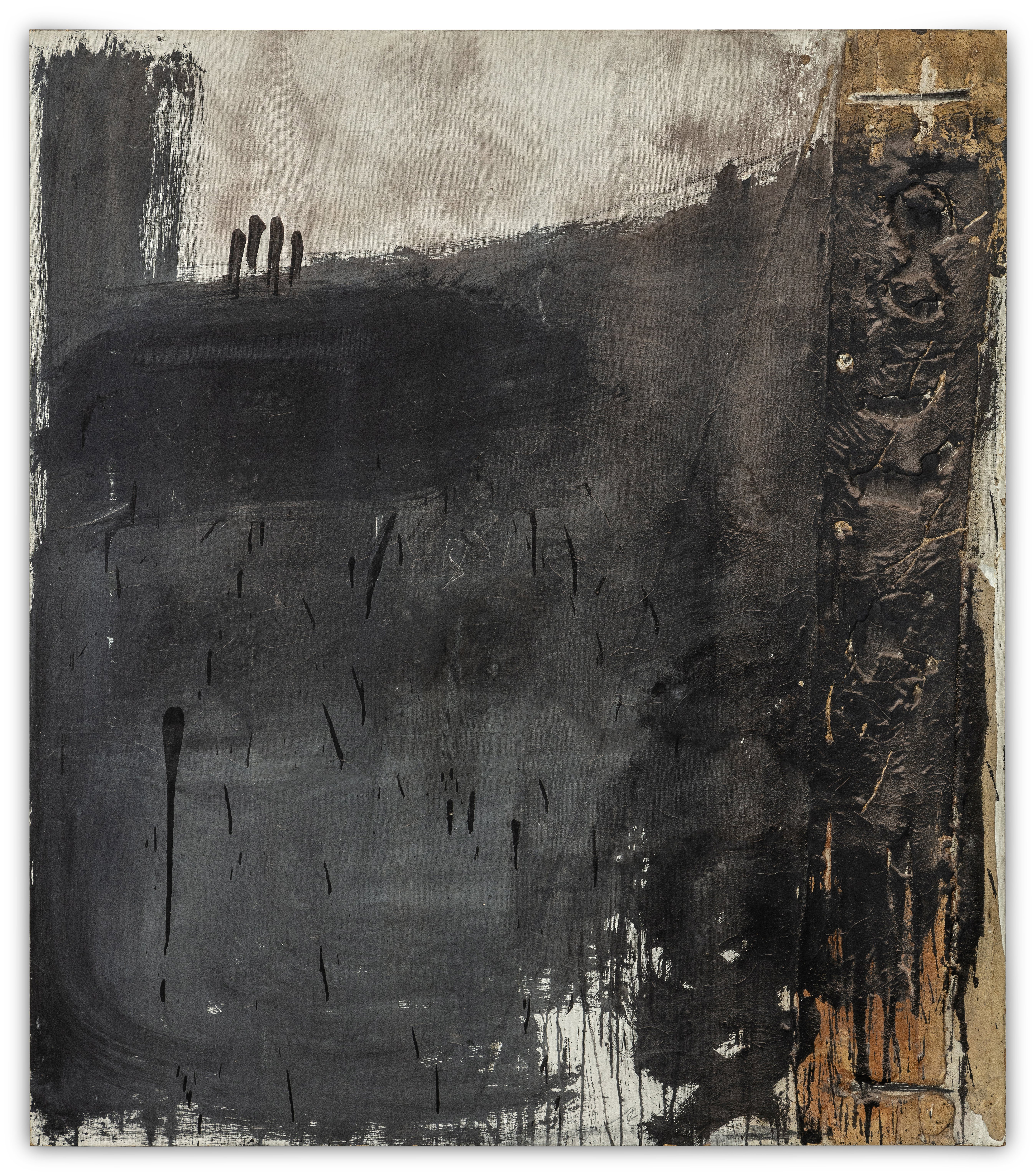
Antoni Tàpies
Gris au relief latéral, 1967
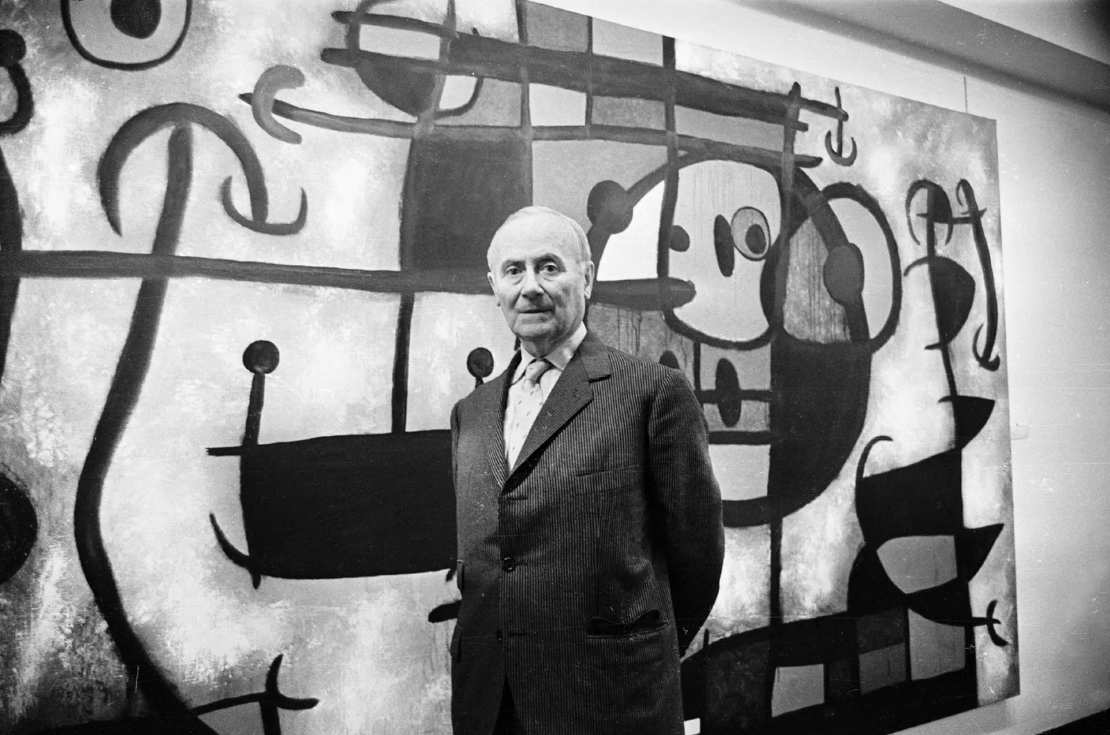
The works he produced through the 1960s and 1970s feel like excavations, as if the gray itself had been laid down over centuries. Joan Miró, whose exuberant use of color is often what people remember first, was equally capable of deploying gray to extraordinary effect. His later works, particularly the lithographs and paintings made after 1960, often use areas of cool gray to anchor compositions that might otherwise float away into pure fantasy. Gray becomes the gravity in those works.
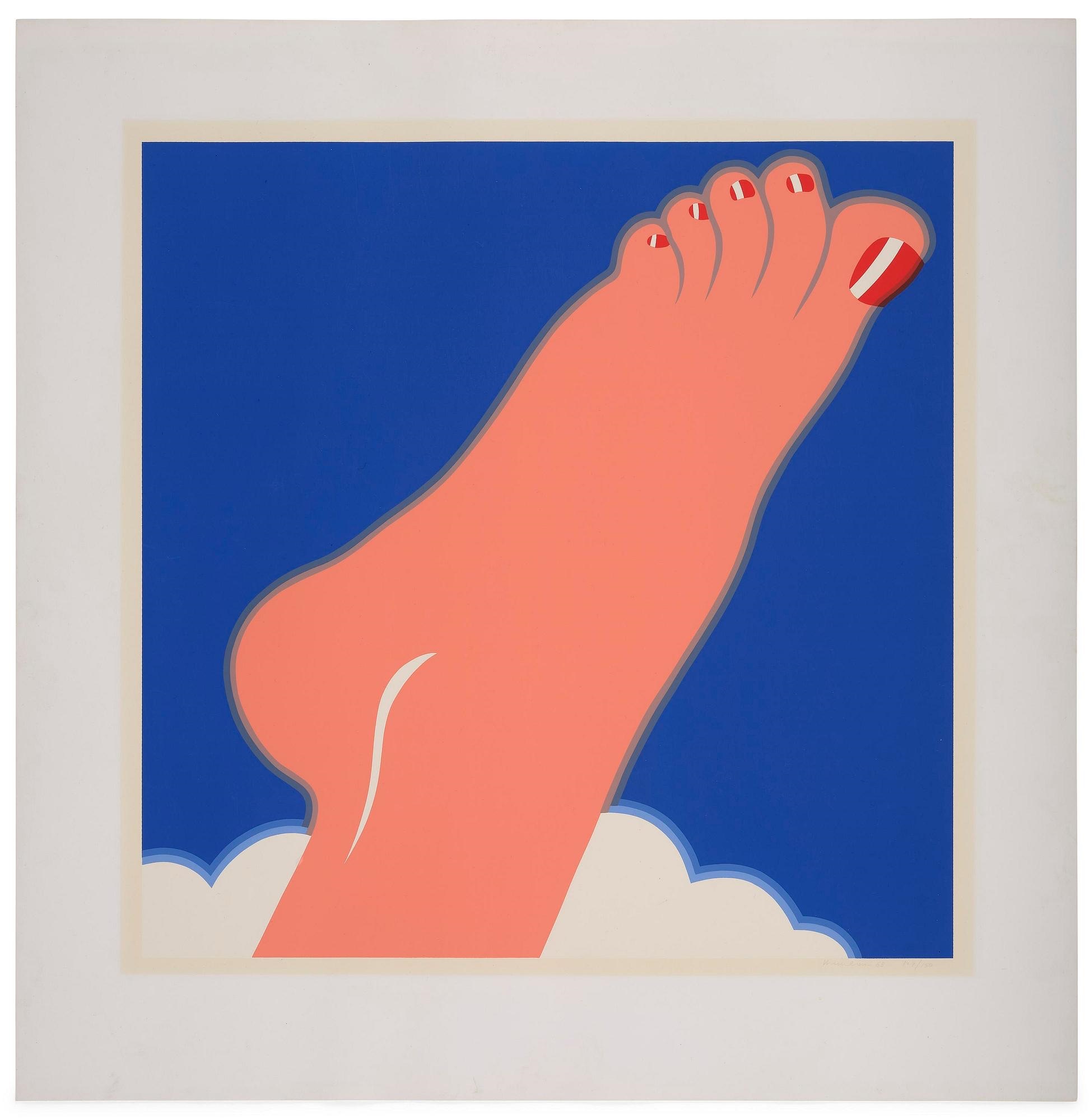
The contrast between Miró's instinct for levity and his equally sophisticated feel for weight and ground is one of the more underappreciated aspects of his late practice, and it is on full view in works held in major collections from the Fundació Joan Miró in Barcelona to the MoMA in New York. American artists entered this conversation from a different direction. Tom Wesselmann, most famous for his Great American Nude series, also worked extensively in monochrome and limited palette modes that pushed against the Pop brightness he was known for. The tension in that work between the saturated and the drained is part of what makes it so interesting on second or third encounter.
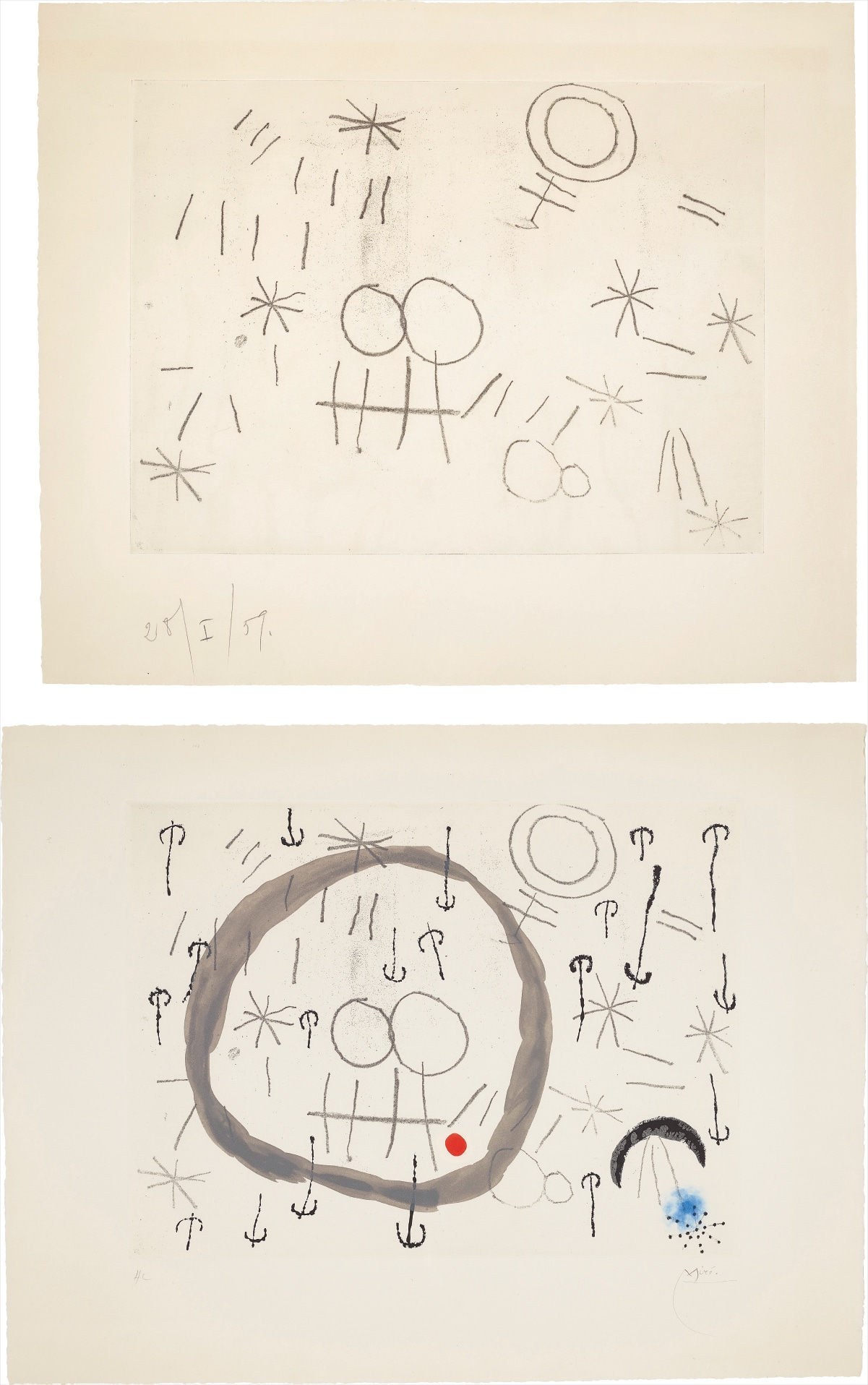
Joan Miró
Giboulées (Hail Storm): two impressions
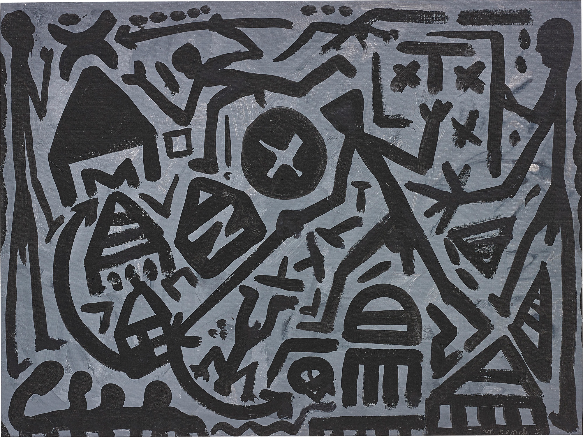
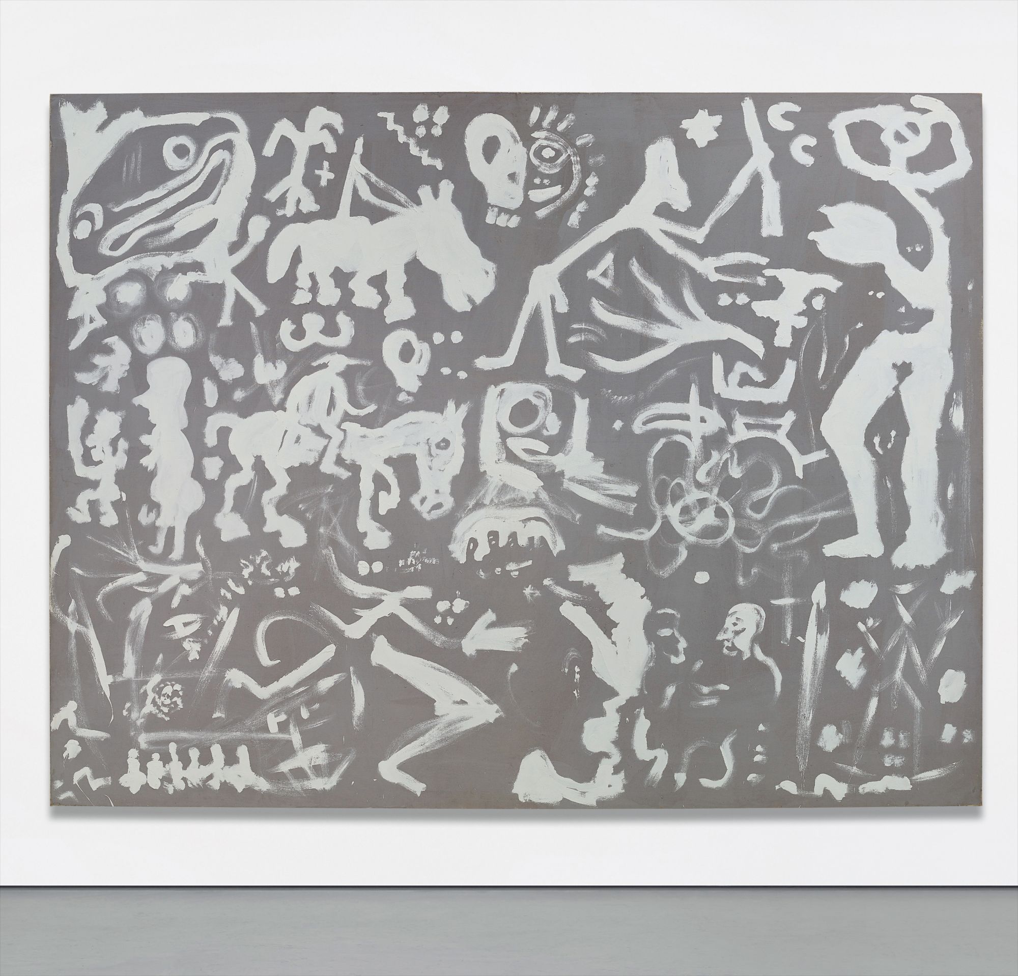
Meanwhile, A.R. Penck, the East German artist who developed a pictographic language of simplified figures and signs, frequently worked against gray and ochre grounds that gave his gestural marks a raw, almost prehistoric quality. His grays feel atmospheric, like weather.
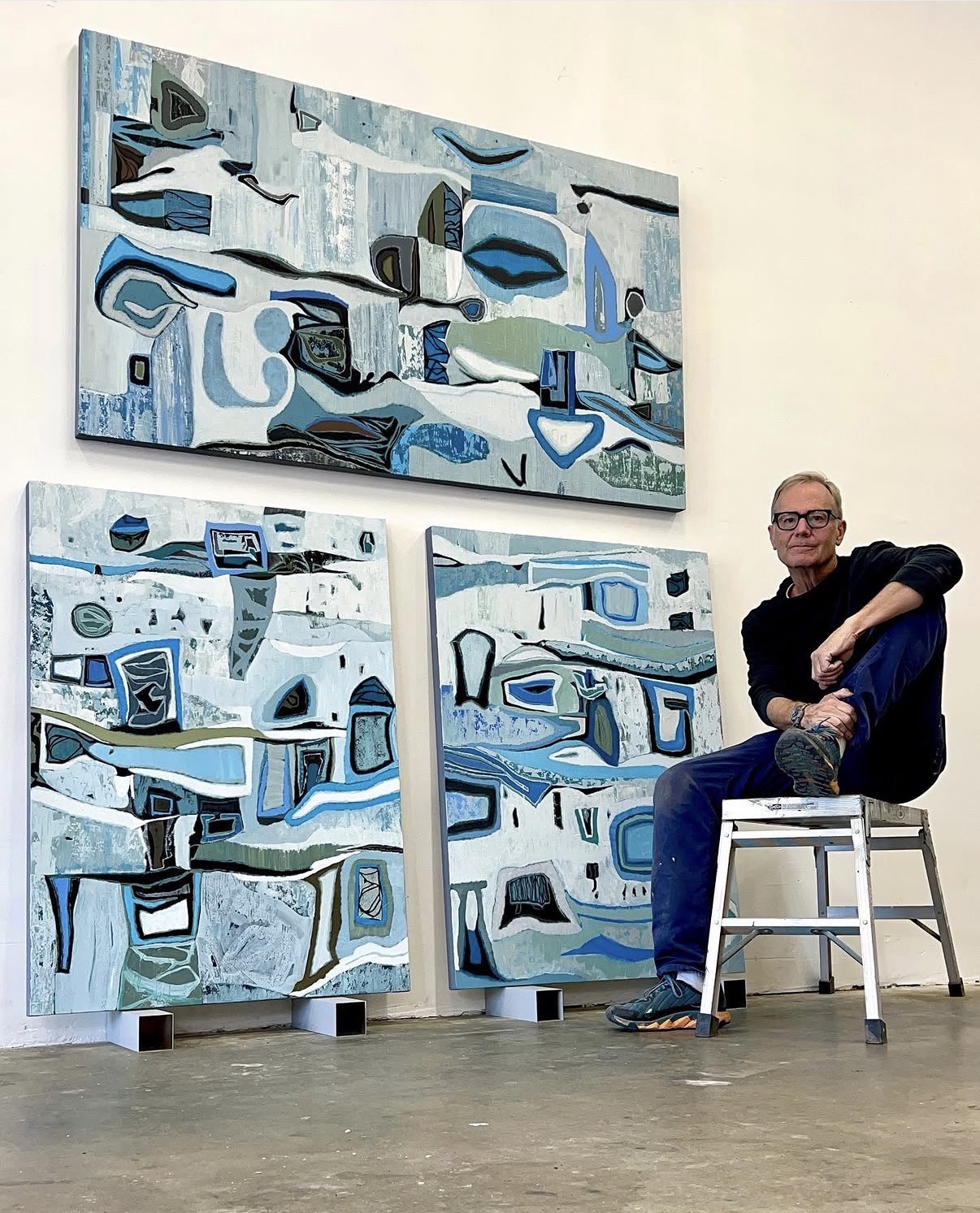
Chase Langford, whose practice centers on color theory and the behavior of pigment on surface, brings a different sensibility to the gray palette. Langford's work involves layering and the careful management of tone, and gray in his hands becomes a kind of testing ground for perception itself. There is a lineage from Josef Albers through to Langford's investigations, a tradition of asking the viewer to look more carefully, to slow down and register what is actually happening at the level of surface and light rather than what the eye assumes it is seeing. Technically, the gray palette demands a great deal from its practitioners.
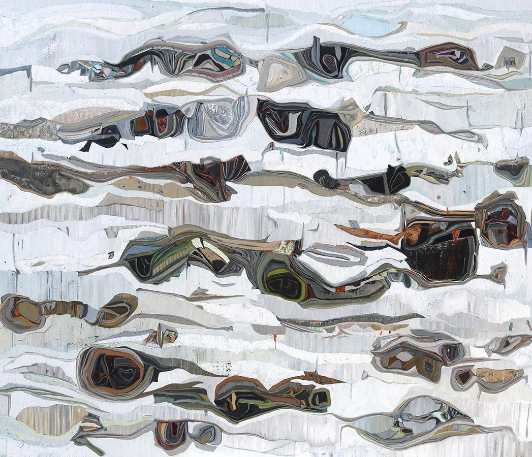
Chase Langford
Whitewater Wash, 2023
Gray mixed from complementary colors behaves very differently from gray mixed from black and white, and the chromatic temperature of a gray, whether it pulls toward blue, green, red, or yellow, determines its entire emotional register. Painters working in this mode often speak of the instability of gray, how it changes radically depending on what surrounds it, how the same tone can read as warm or cool, near or far, depending on context. That instability is part of what makes it such a rich field for investigation. Culturally, the persistence of the gray palette speaks to something enduring in how we understand restraint and depth.
In a visual culture that prizes immediacy and saturation, work that asks you to look harder and find richness in apparent quiet carries a kind of countercultural weight. Museum surveys of monochrome painting, from the 2006 exhibition at the Städel Museum in Frankfurt to more recent presentations at Tate Modern, have consistently drawn large audiences, suggesting that appetite for this mode of looking is genuine and widespread. The works gathered on The Collection across this territory reflect the full range of what the gray palette can do. From the material weight of Tàpies to the analytical cool of Richter, from Miró's tonal anchoring to Langford's perceptual investigations, these are works that reward time and attention.
They are, in the best sense, quiet works that are never silent. What they offer is not the absence of color but the presence of something more difficult to name: a sustained and committed looking at the world stripped of its usual loudness.