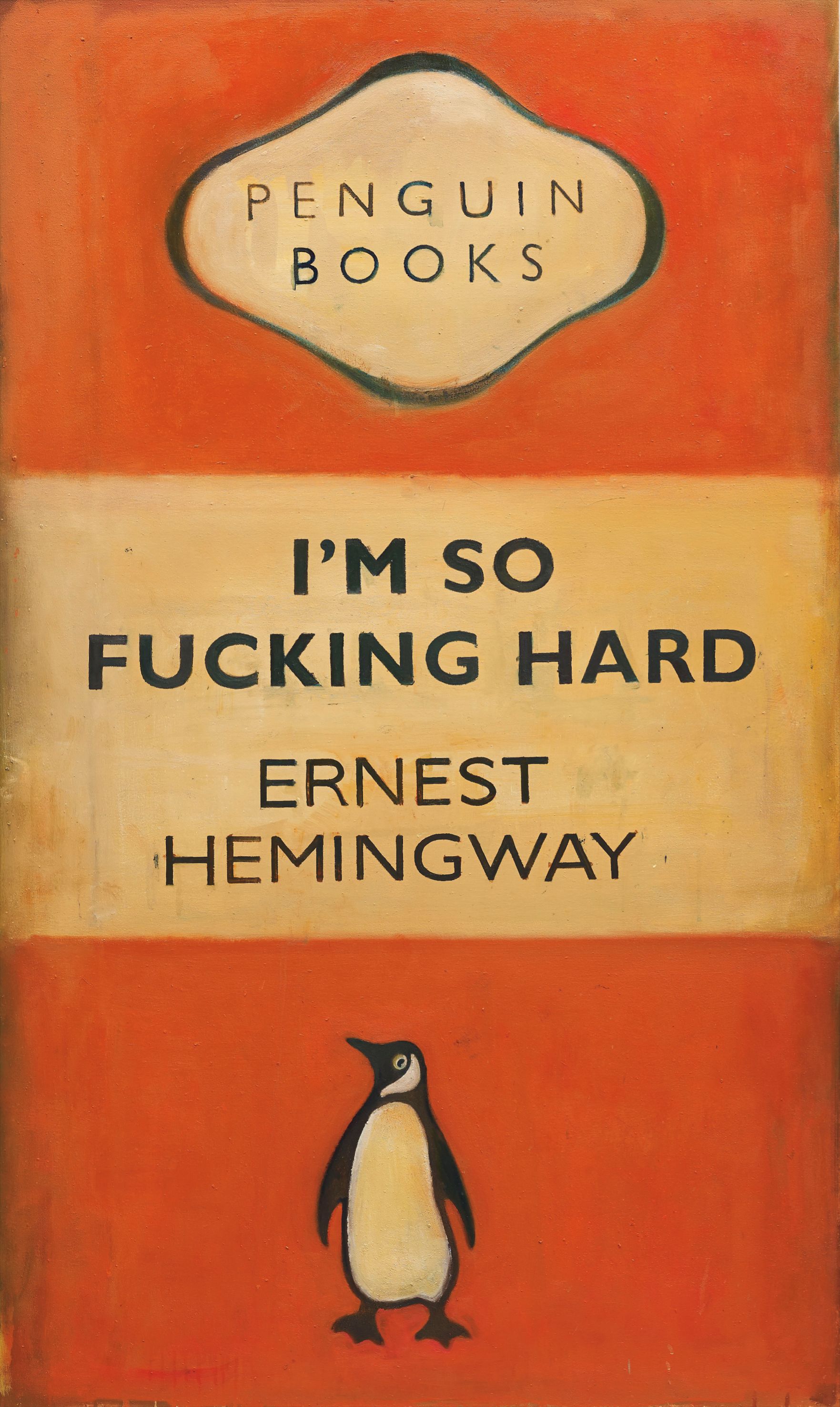
Flat Color Palette
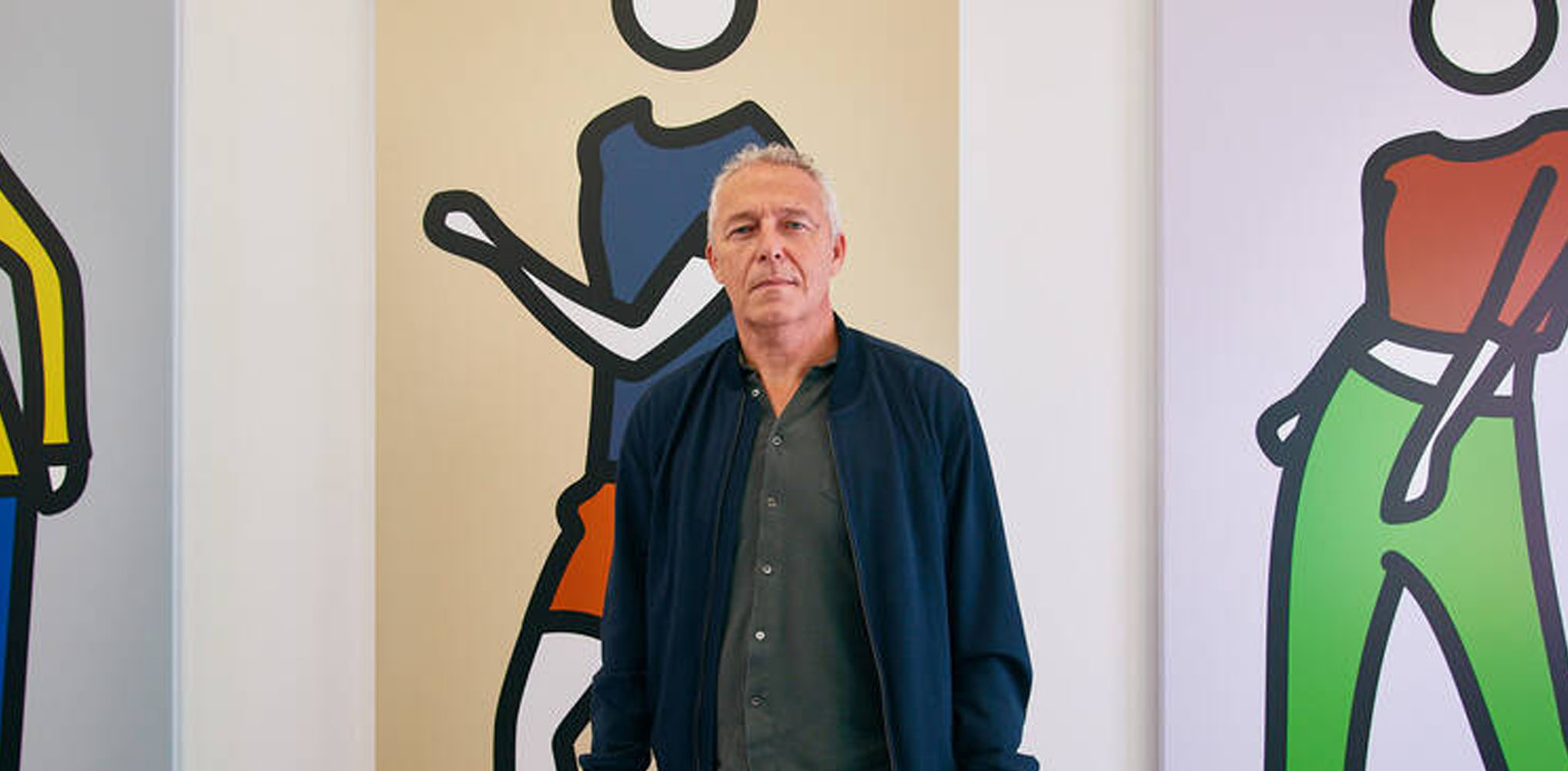
Christoph Ruckhäberle
Plakatwand
The Quiet Power of Flat Color
There is something almost counterintuitive about the pull of flat color painting. In a market saturated with gesture, texture, and painterly bravura, works that strip back to clean zones of unmodulated color feel almost radical in their stillness. Yet collectors who have lived with these paintings often describe them as the most demanding works in their homes, not in a difficult sense, but in the sense that they hold attention without ever seeming to try. The flatness is not emptiness.
It is compression, and what gets compressed is a great deal of feeling. The appeal to collectors begins with something practical and then quickly becomes something more philosophical. Flat color paintings read beautifully across different lighting conditions and architectural contexts. They do not depend on a particular angle of afternoon light to reveal their depth, the way an impasto surface might.
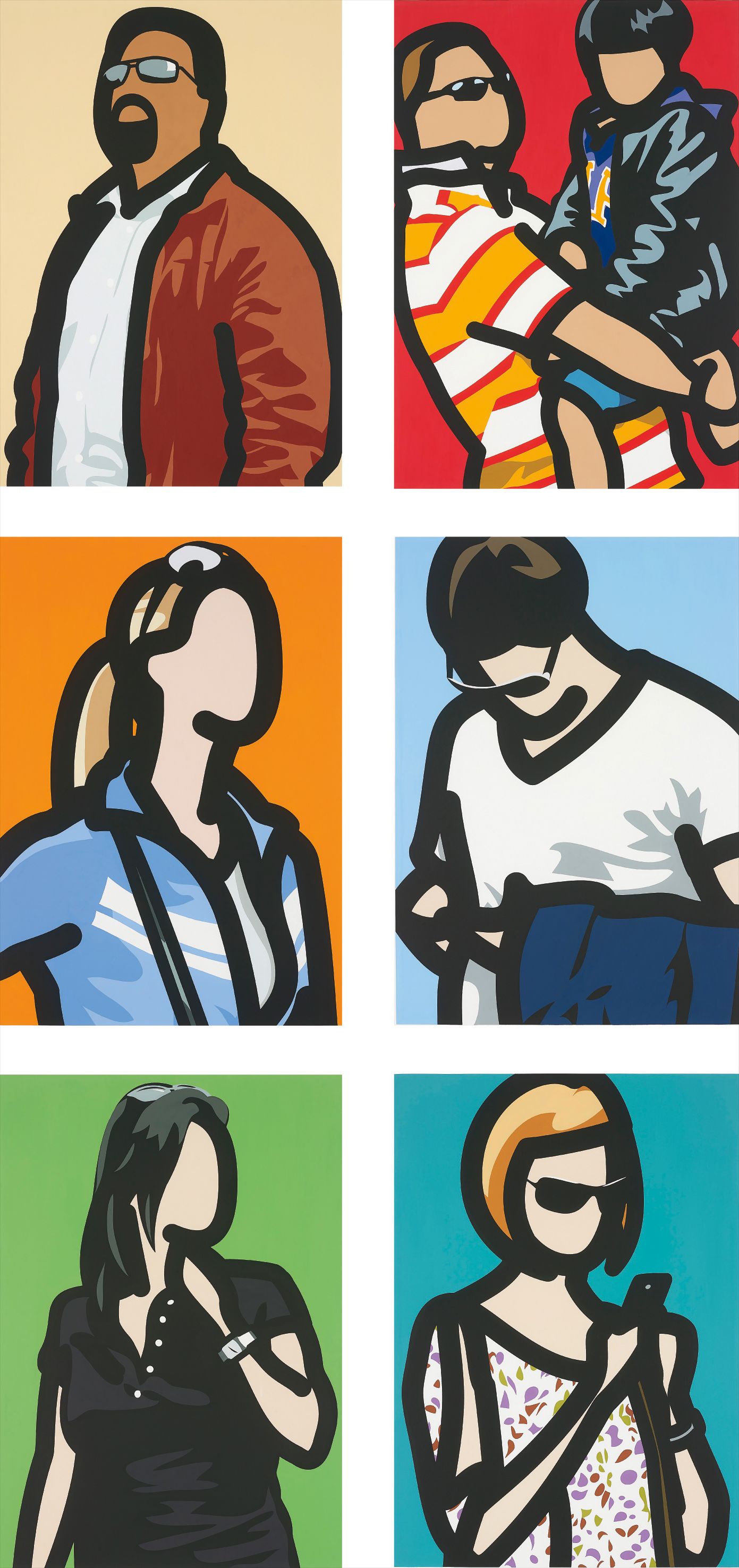
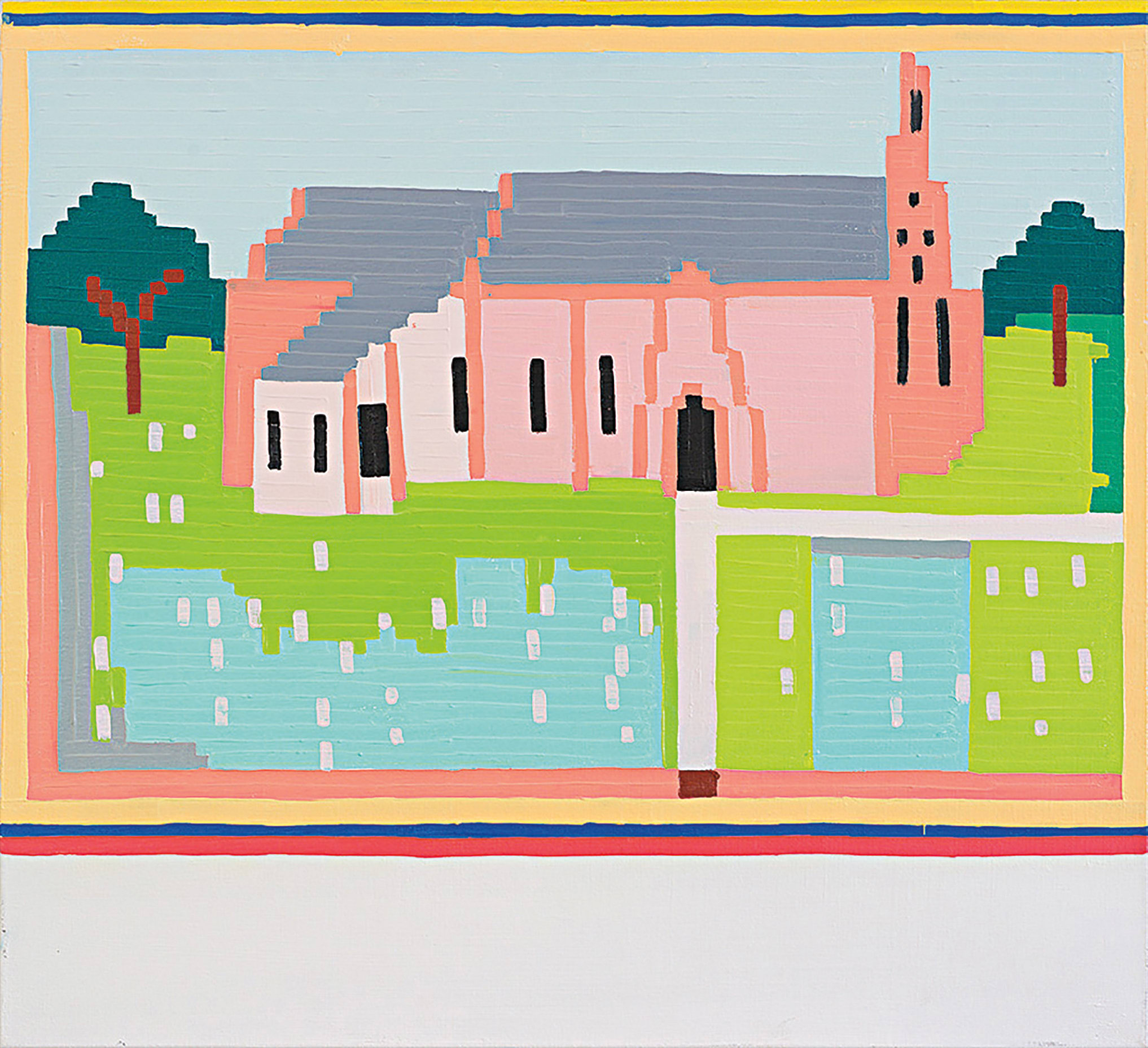
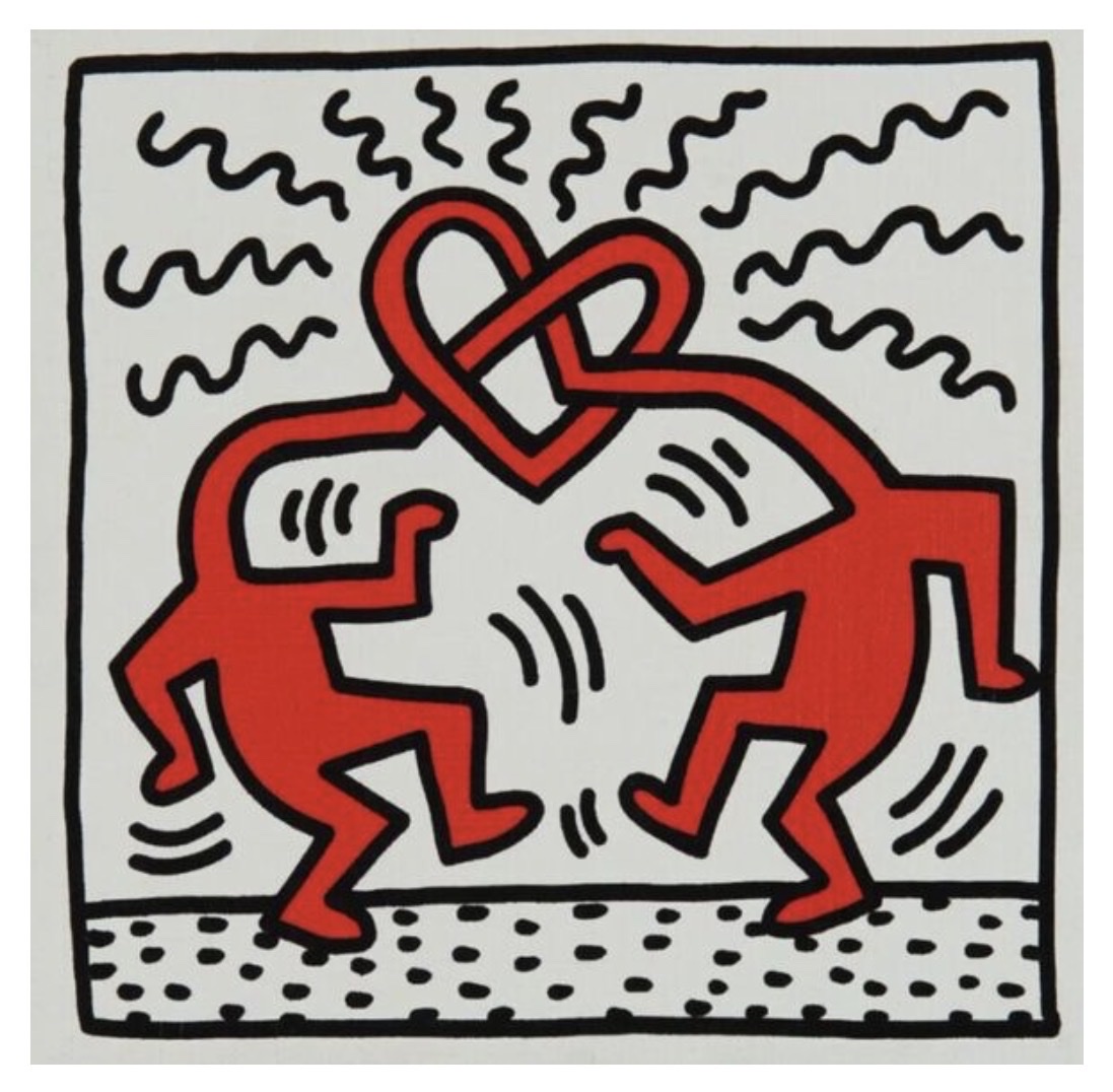
Julian Opie
Tourists
But beyond the domestic logic, collectors are drawn to the intellectual proposition these works make. When color does not blend, does not shade, does not perform its traditional illusionistic function, it becomes language. The collector is invited to read rather than simply look. Separating a good work from a great one in this territory requires attention to a few specific qualities.
The first is chromatic intelligence. A painter working in flat color cannot hide behind accident or atmospheric incident. Every color relationship is a decision, and the best works in this mode demonstrate an almost musical sensitivity to how colors behave next to each other. Look at the temperature differentials, the way a cool green might hold a warm ochre in tension without either dominating.
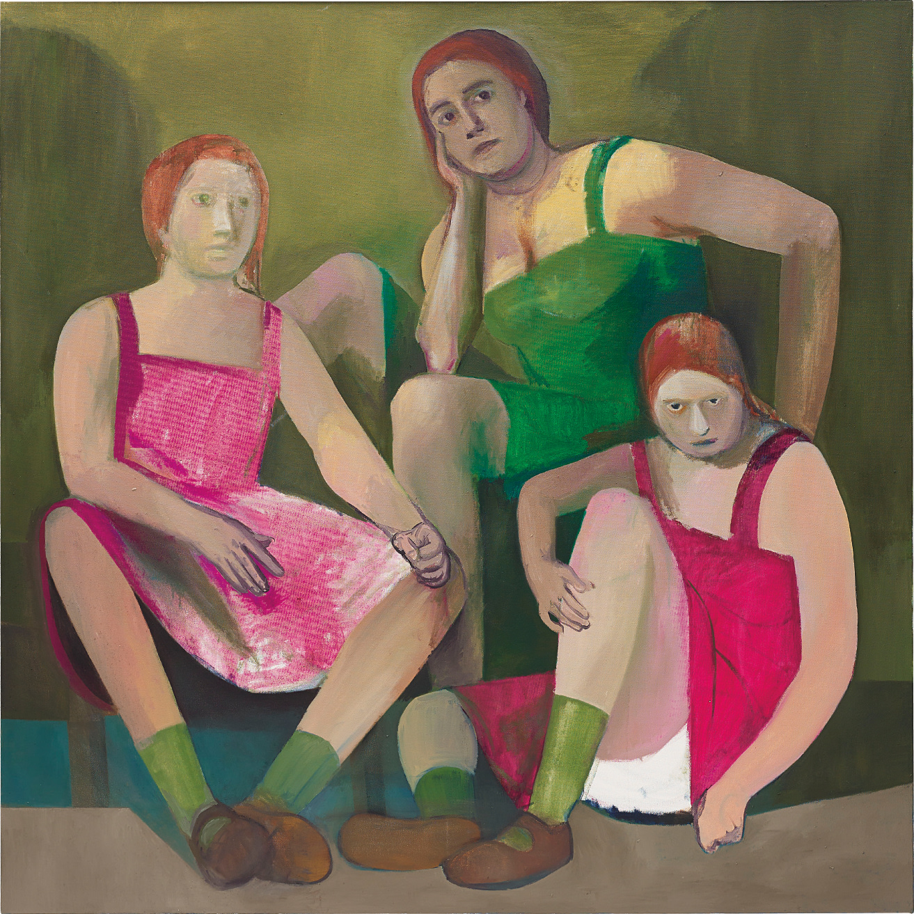
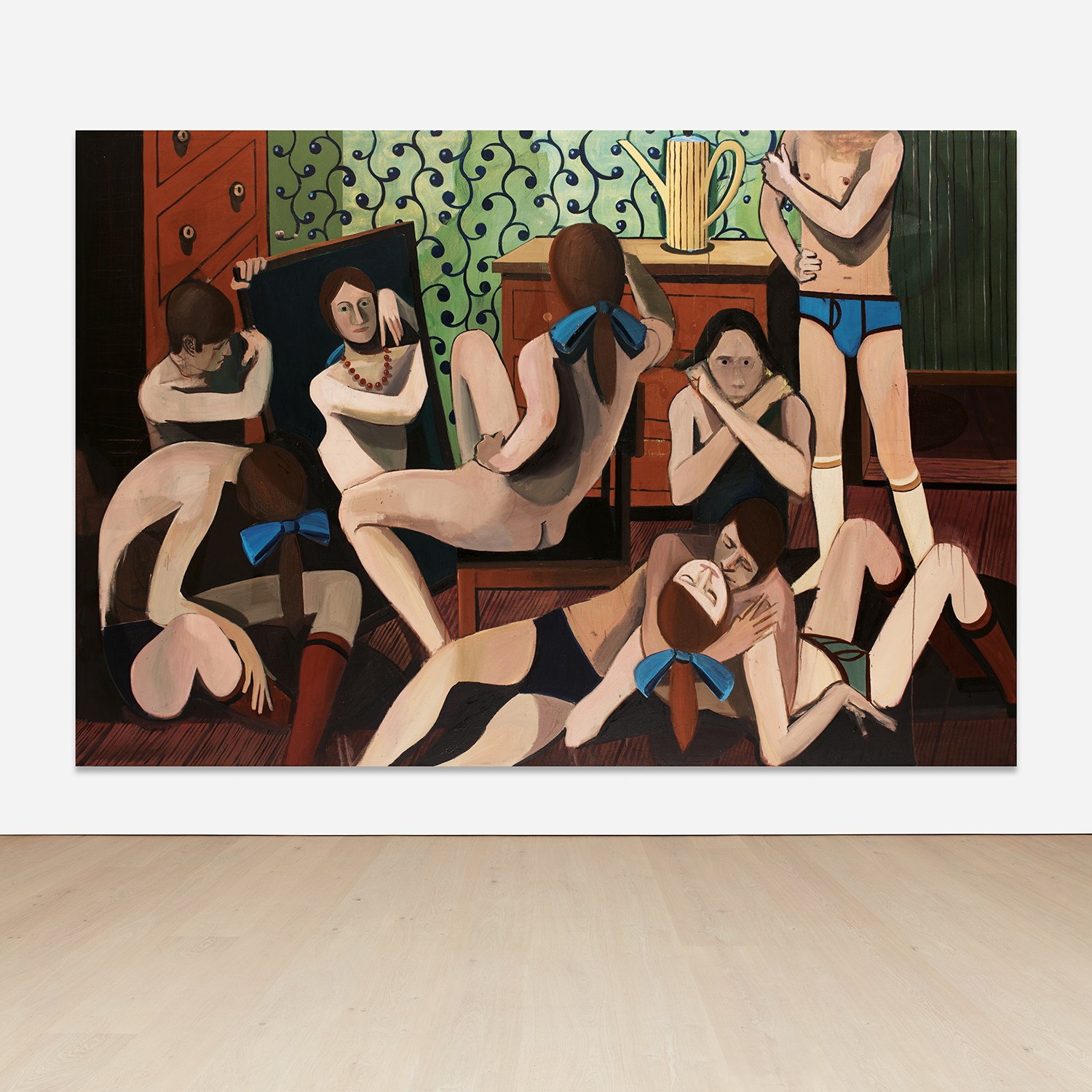
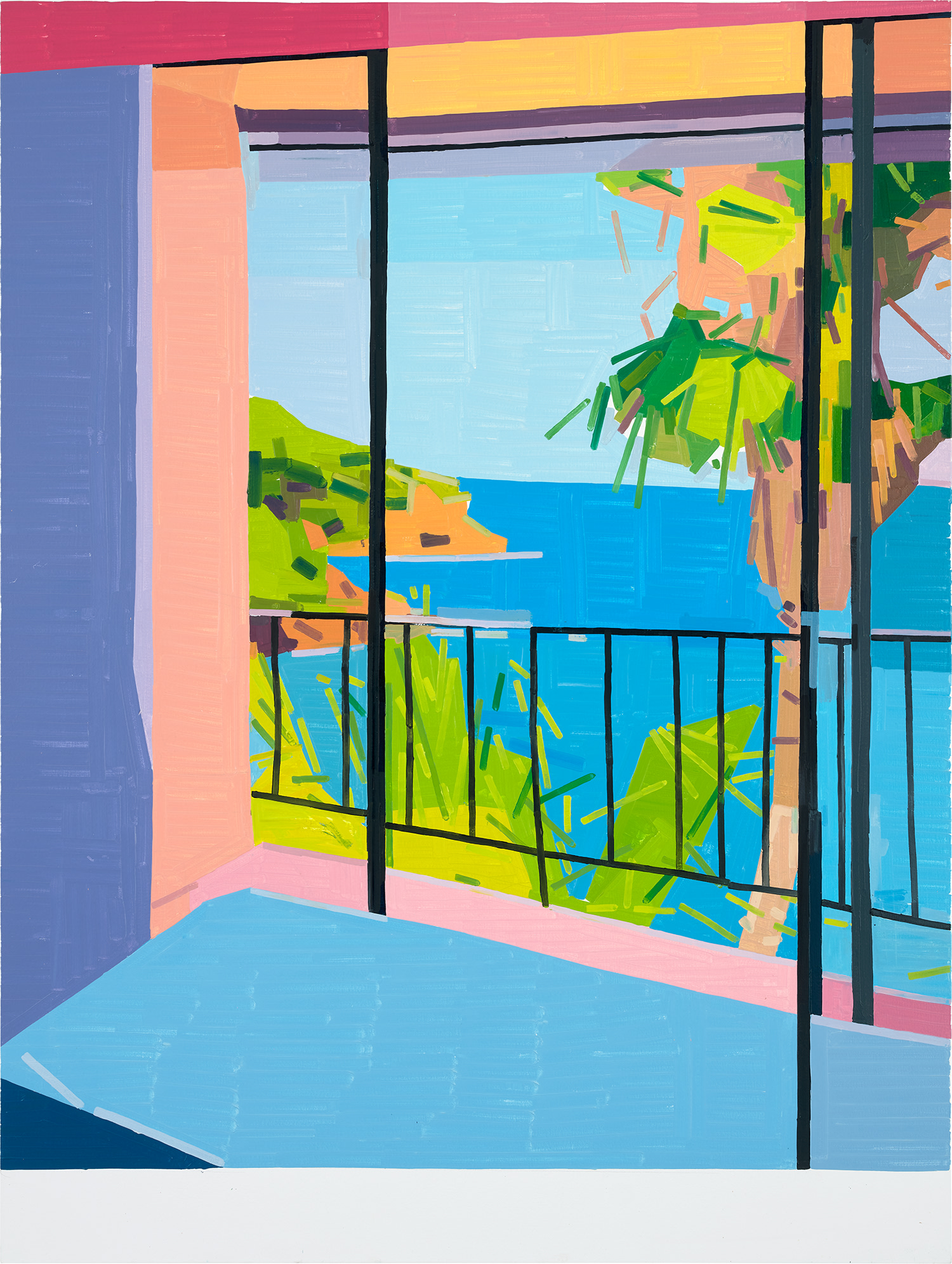
Brian Calvin
Florist, 2016
The second quality is compositional confidence. Because there is no graduated tone to guide the eye, the arrangement of shapes and forms must carry the full structural load. Great flat color paintings feel inevitable in their composition, as though no other configuration could have worked. Among the artists well represented on The Collection, Julian Opie stands apart as someone who has built an entire visual language around the premise of flatness.
His figures, reduced to outline and solid fill, draw on the visual vocabulary of signage and screen culture while maintaining a strangely intimate quality. Collectors who acquire Opie works are not buying decoration. They are buying a very specific argument about how we perceive the human form in a mediated world. His market has remained consistently strong through multiple auction cycles, supported by institutional recognition and a highly legible aesthetic that photographs well and travels internationally.
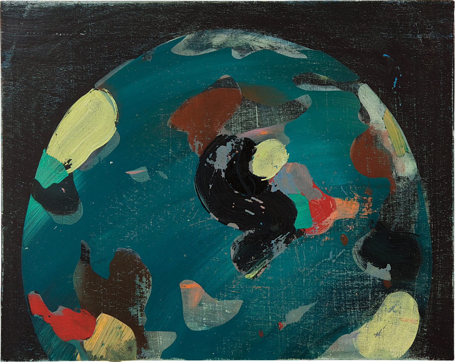
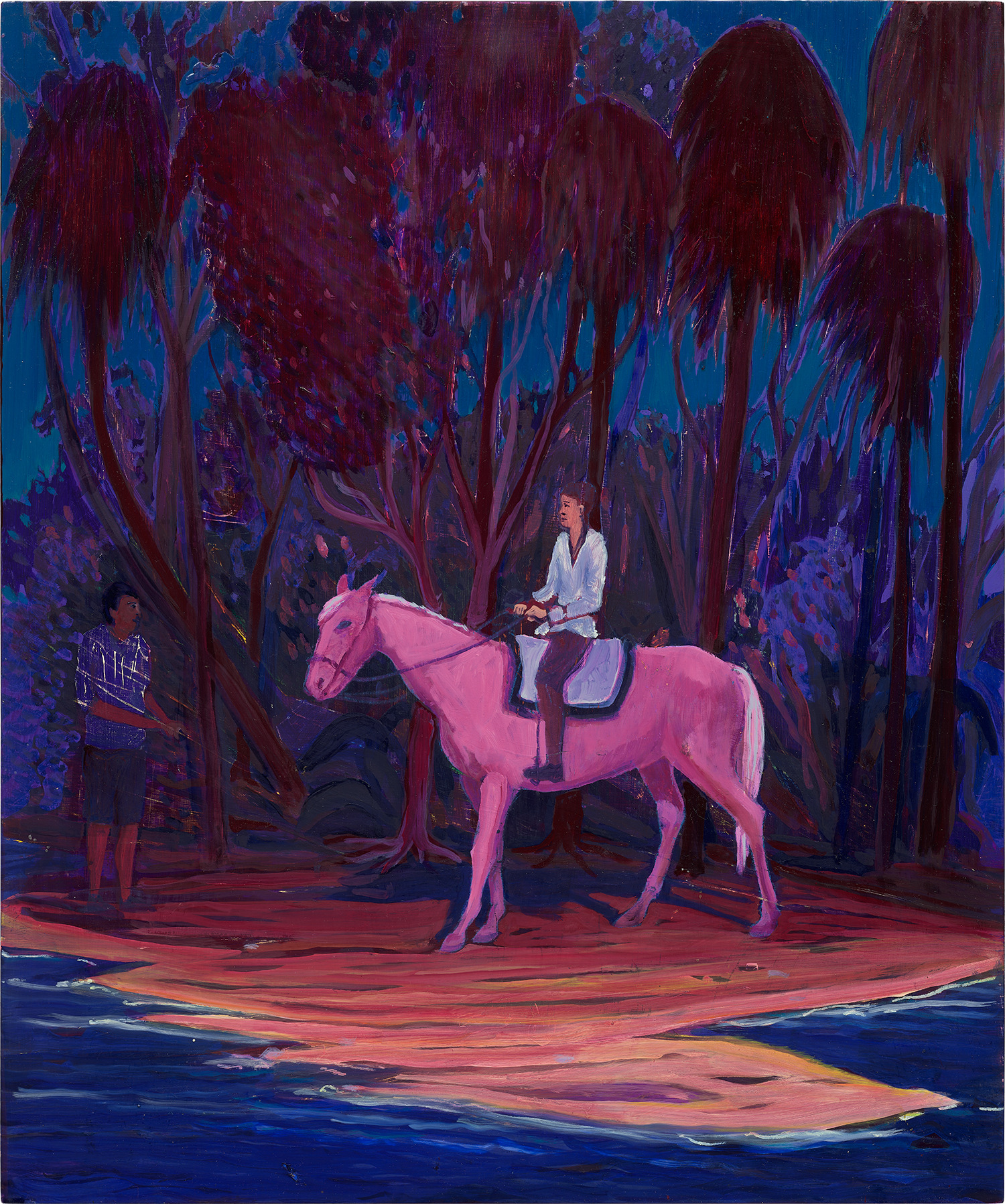
Jules de Balincourt
Painting the World, 2011
Guy Yanai occupies a different register, warmer and more intimate, his scenes of domestic and observed life rendered in flat planes that suggest Matisse without ever quoting him directly. Yanai has attracted serious collector attention in recent years, particularly in Europe and the United States, and his prices at auction have moved meaningfully upward as his gallery representation has strengthened. Brian Calvin and Jules de Balincourt represent a compelling strand of figurative painting that uses flatness as psychological tool rather than formal statement. Calvin's paintings, which have been shown extensively in Los Angeles and with Galerie Eva Presenhuber in Zurich, use simplified color to create figures that feel suspended in a kind of lucid daydream.
The lack of modeling in the faces and forms is not a limitation but a method. It keeps the emotional temperature ambiguous in ways that reward long acquaintance. De Balincourt, working with broader scenes of collective life, uses flat color to create a slightly airless, slightly ominous quality that sits somewhere between utopia and critique. Works by both artists have strong secondary market support, with prices that reflect genuine collector enthusiasm rather than speculative momentum alone.
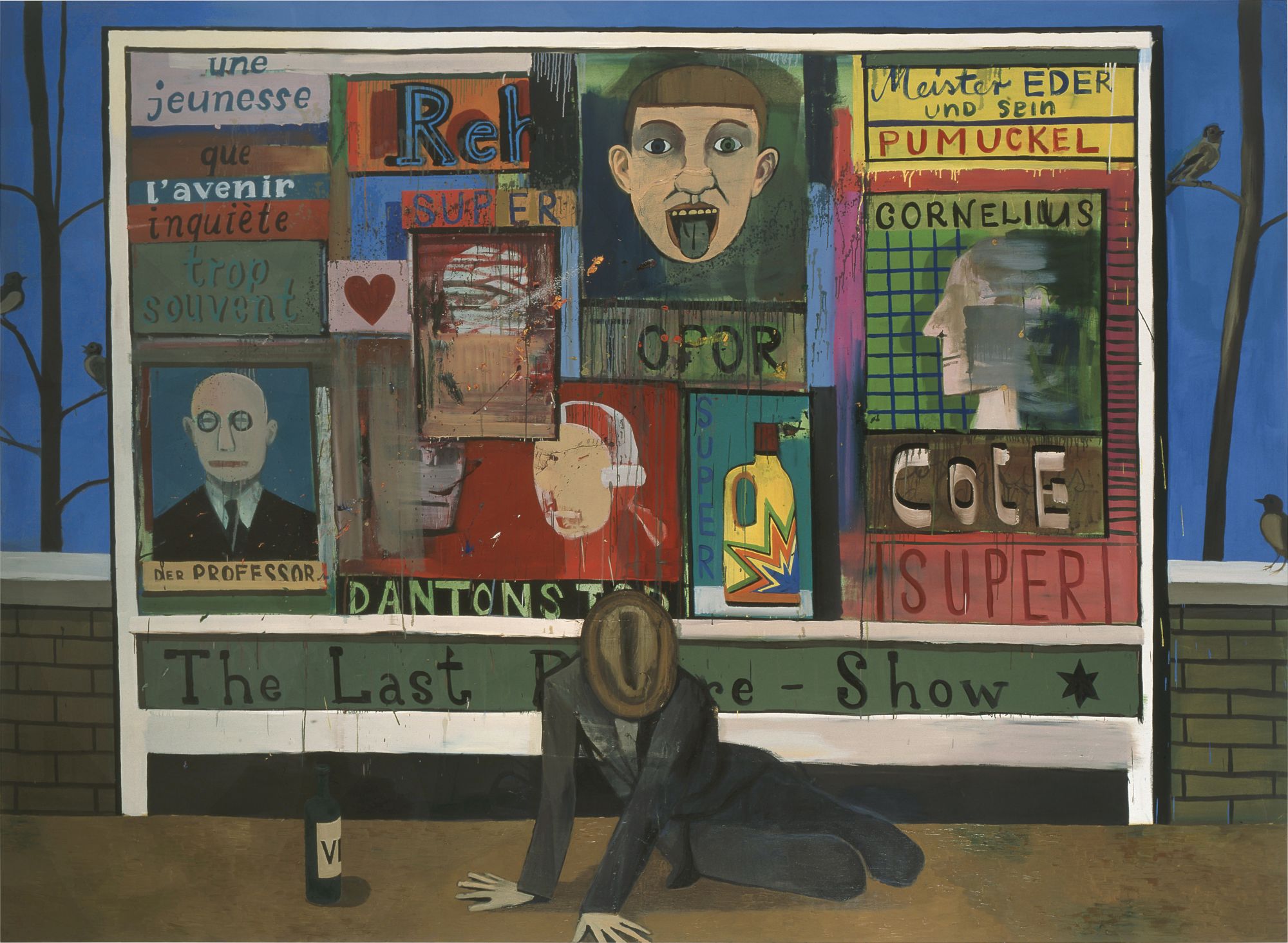
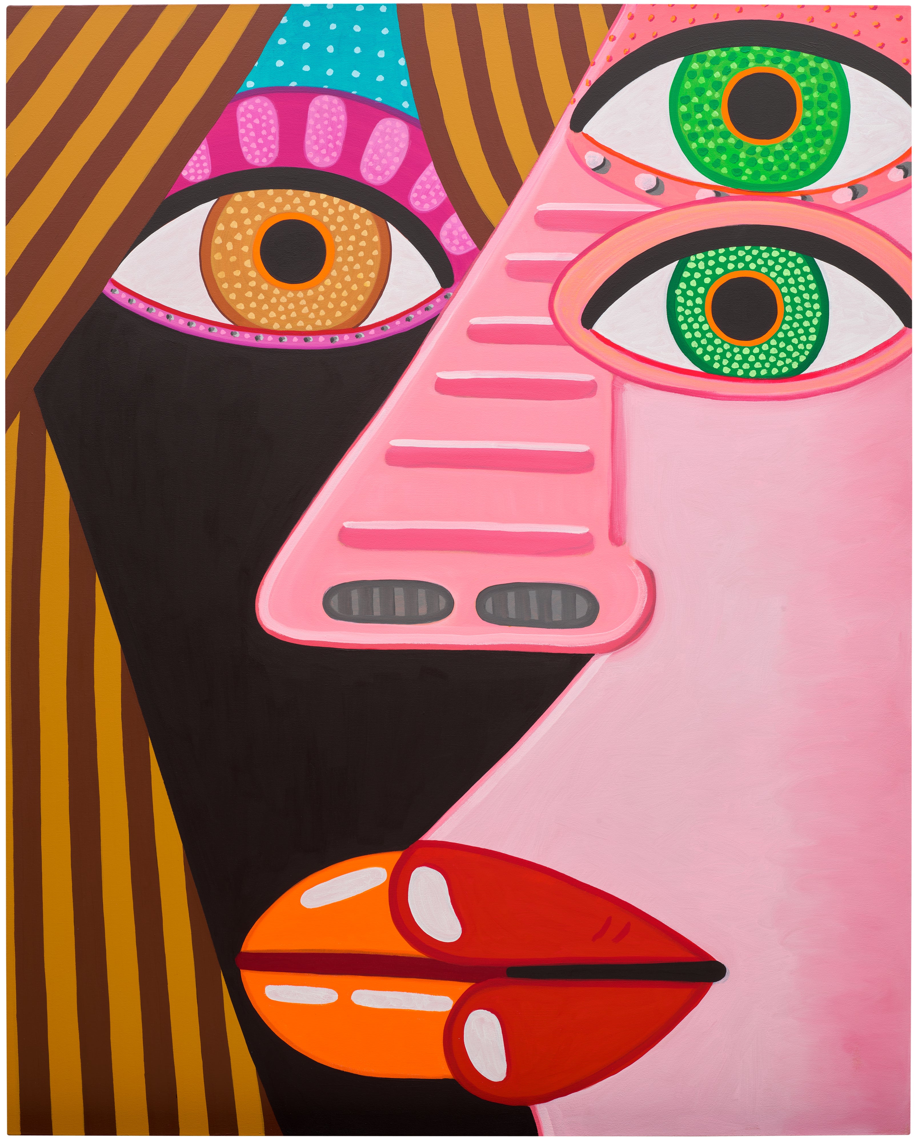
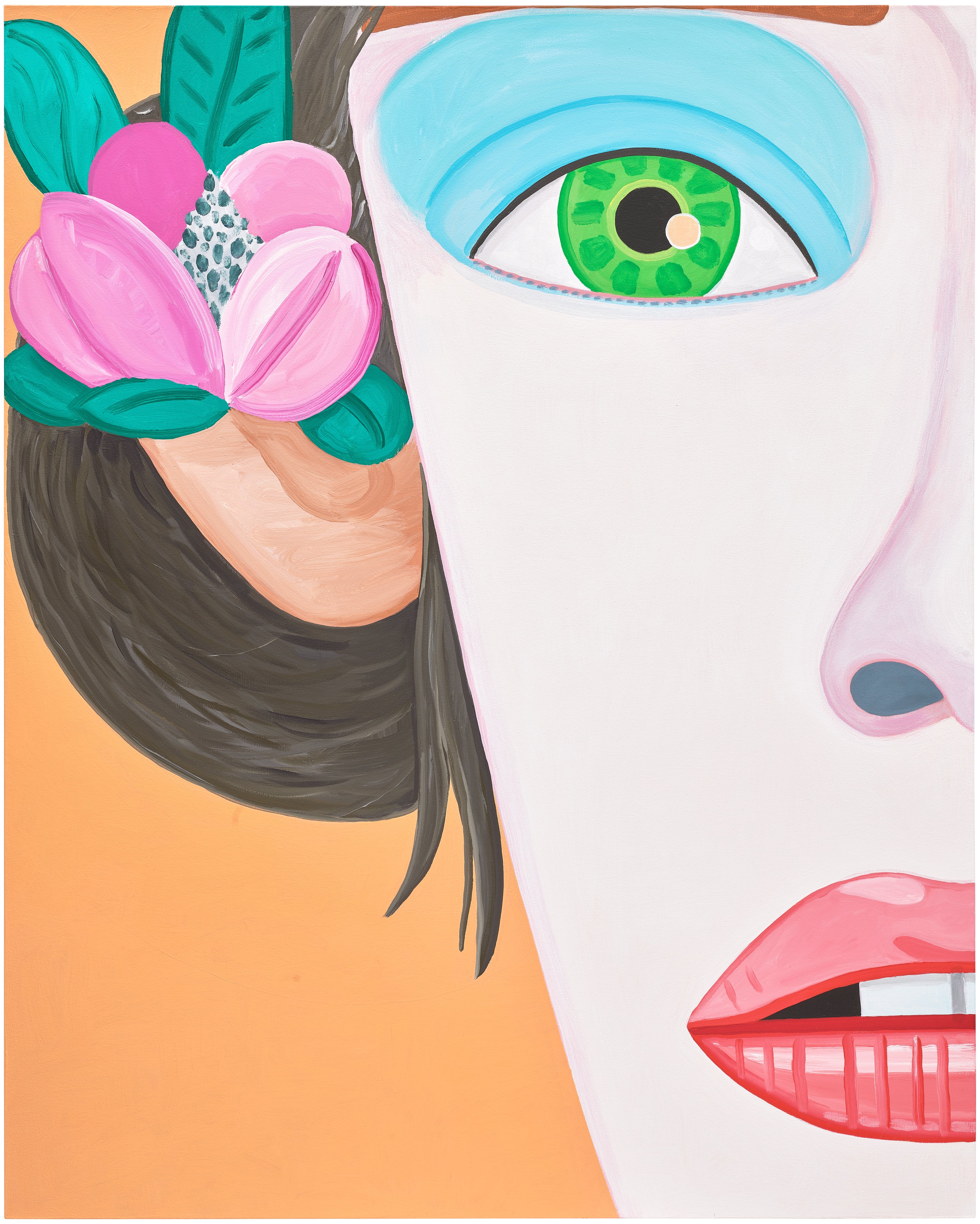
Christoph Ruckhäberle
Plakatwand
Christoph Ruckhäberle, whose work carries a distinct graphic energy rooted in his Leipzig training, brings yet another dimension to this conversation. His paintings reference printmaking traditions and the visual culture of the German Democratic Republic in ways that reward art historically informed collectors. For collectors looking at emerging opportunities, the flat color conversation is increasingly happening in painting communities in Seoul, Oslo, and Mexico City, where younger artists are using reduced palettes to address questions of cultural identity and visual heritage. The influence of digital image culture has made a new generation of painters deeply comfortable with the logic of flat color, having grown up designing and viewing images on screens where gradients and modeling are choices rather than defaults.
Watch for artists who are thinking seriously about the relationship between painting and graphic communication, those whose work holds up to scrutiny as painting even when it borrows the visual syntax of other media. At auction, flat color works by established artists in this category tend to perform with reliable consistency rather than spectacular volatility. This is partly a function of the aesthetic. These paintings photograph clearly, reproduce well in catalogs and on screens, and appeal to a broad base of design conscious collectors alongside more traditionally oriented art buyers.
Opie works in particular have a robust and well documented auction history, with results that provide meaningful pricing benchmarks. For newer acquisitions by artists like Yanai or Calvin, the primary market remains the more active venue, and building a relationship with the representing gallery before a work comes to auction is always the better strategy. On the practical side, condition considerations for flat color paintings are somewhat specific. Because the surfaces are unmodulated, any damage, whether a scratch, an area of fading, or a repaired tear, is far more visible than it would be in a textured or gestural work.
Ask galleries and auction houses directly about any restoration history, and consider having a conservator assess the work before purchase if you have any doubt. In terms of display, these paintings need wall space to breathe. They reward isolation rather than clustering. When it comes to editions versus unique works, be clear on what you are acquiring.
Some artists in this space produce prints and multiples that use the same flat color vocabulary as their paintings, and while these can be excellent acquisitions on their own terms, the market distinguishes clearly between them. Ask the gallery explicitly about edition size, printing method, and any certificate of authenticity. Then ask yourself what drew you to the work in the first place, and trust that answer.