Carborundum
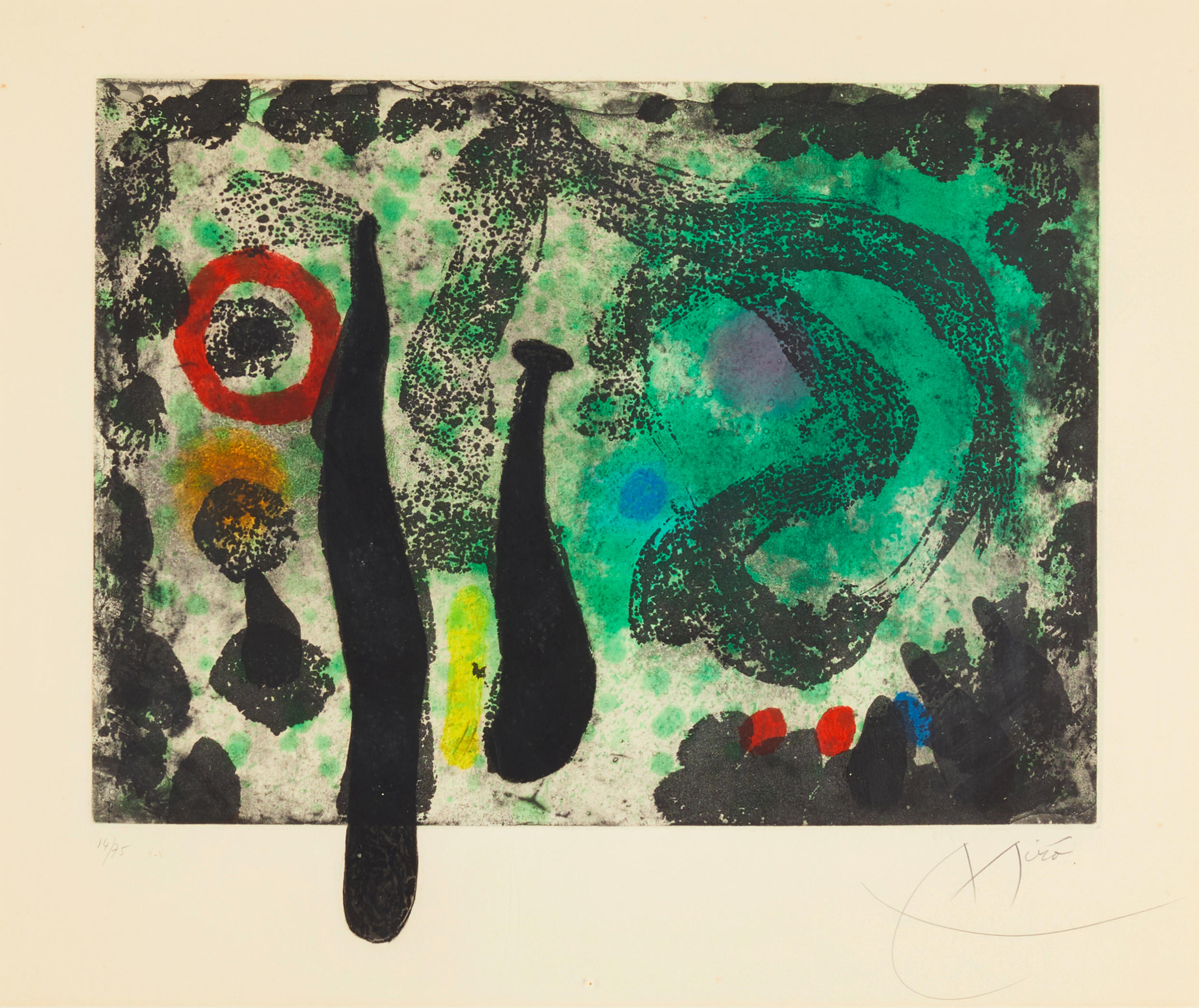
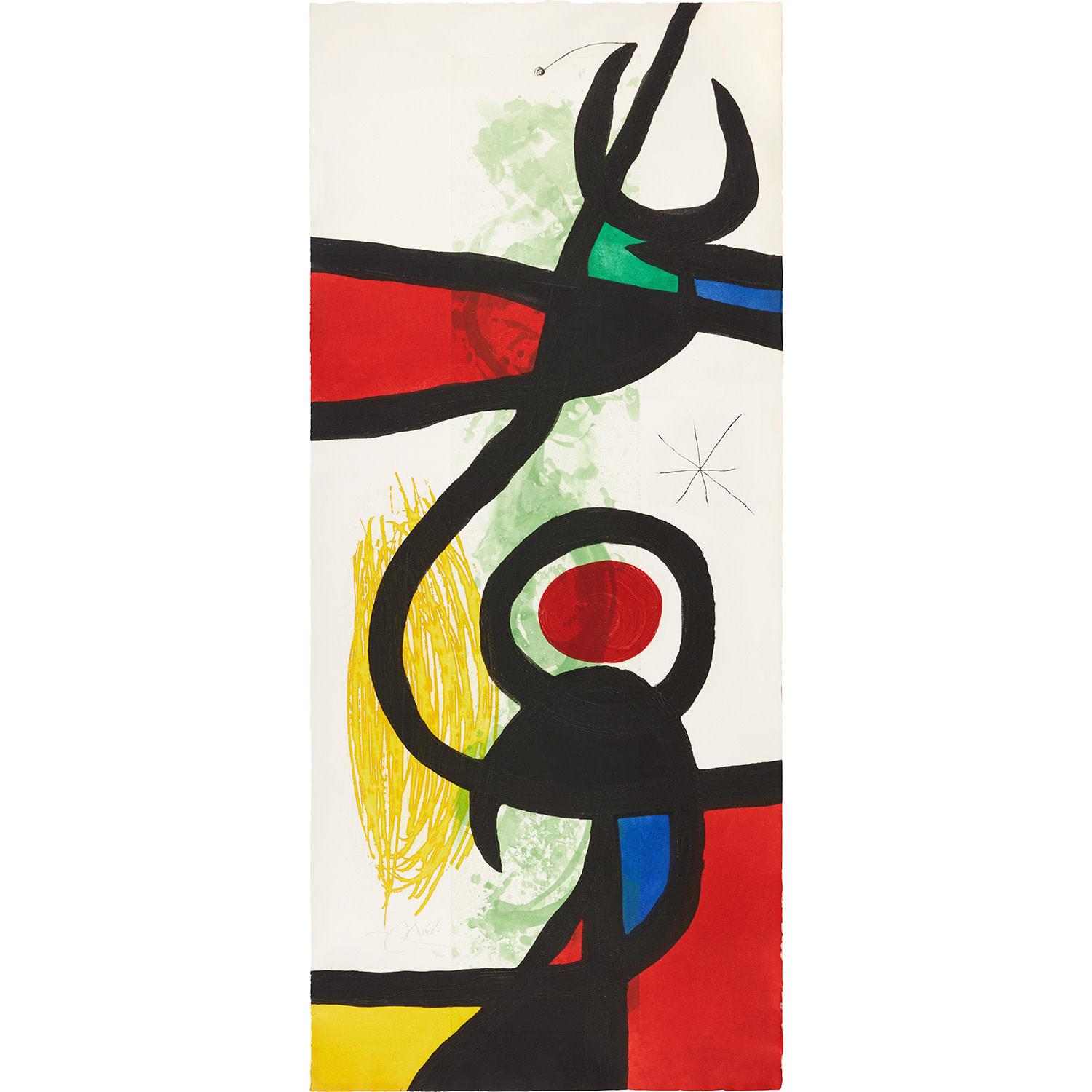
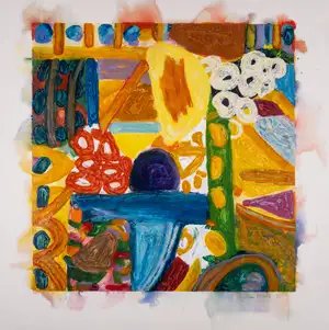
Joan Miró
Le Jardin De Mousse , 1968


The Grit Beneath the Surface Changes Everything
When a late Miró carborundum print sold at Christie's Paris for well above its high estimate a few seasons ago, the room paused in that particular way rooms do when something confirms a feeling everyone had but nobody had quite articulated yet. The print was dense, tactile, almost sculptural on the page, bearing that rough, luminous quality that carborundum alone produces. It was a reminder that certain techniques do not just serve an artist's vision but genuinely extend it into territory that neither painting nor conventional printmaking can reach. That sale was less a market moment than a kind of reckoning.
Carborundum mezzotint, sometimes simply called carborundum printing, is a technique that emerged seriously into the fine art world in the mid twentieth century, though its roots are older. The process involves adhering carborundum powder, a silicon carbide abrasive, to a plate surface, which then holds ink in its rough grain and releases it under pressure onto paper. The result is velvety, rich, and dimensional in a way that seems to breathe. What it does to color is almost unreasonable in its depth.
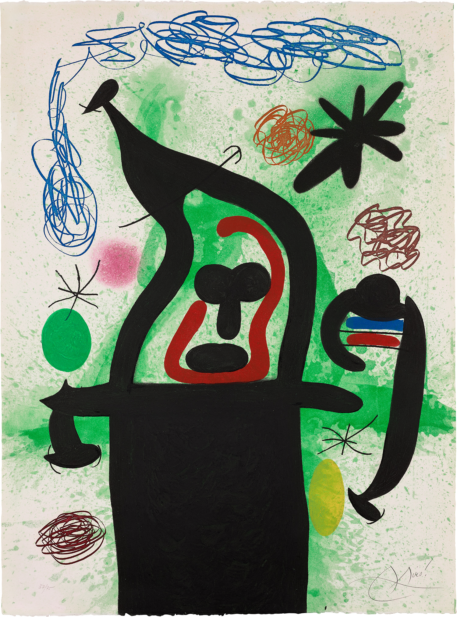
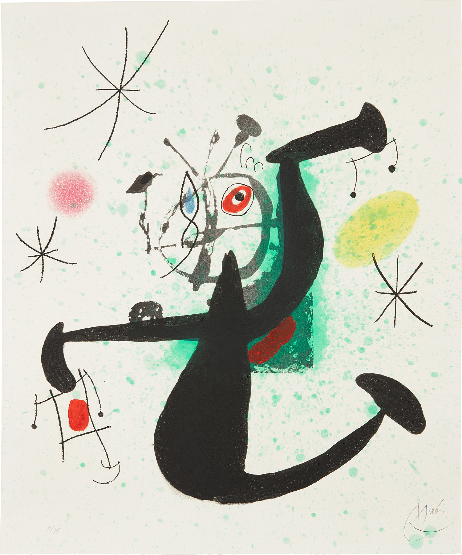
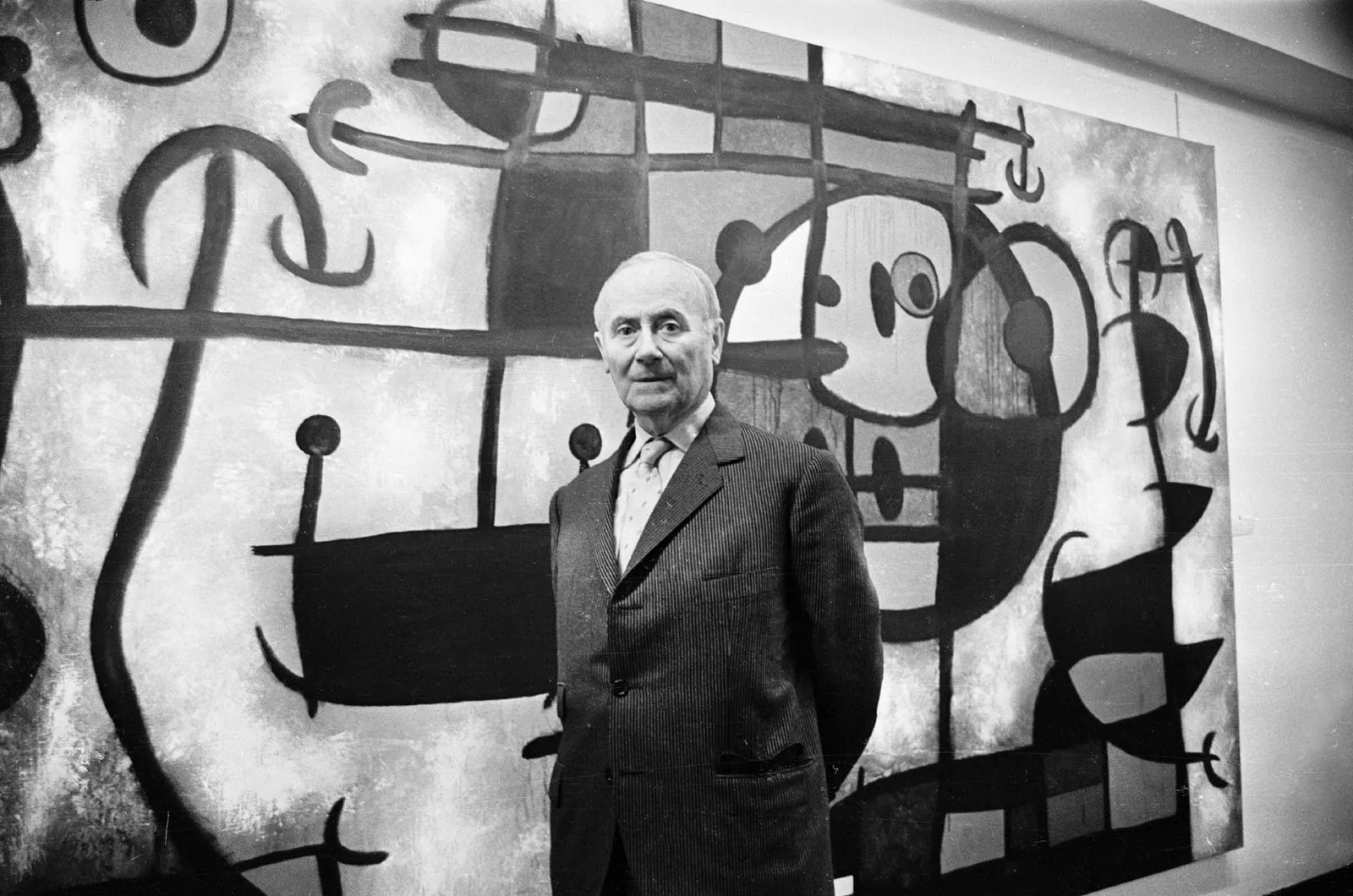
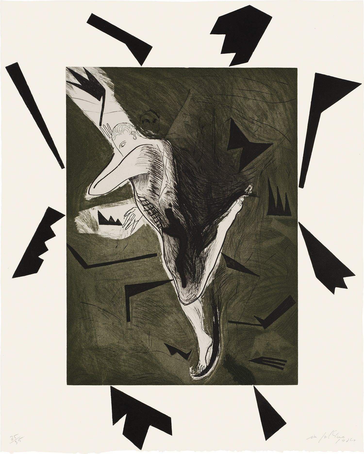
Joan Miró
Femme aux bijoux (Woman with Jewelry) (D. 452)
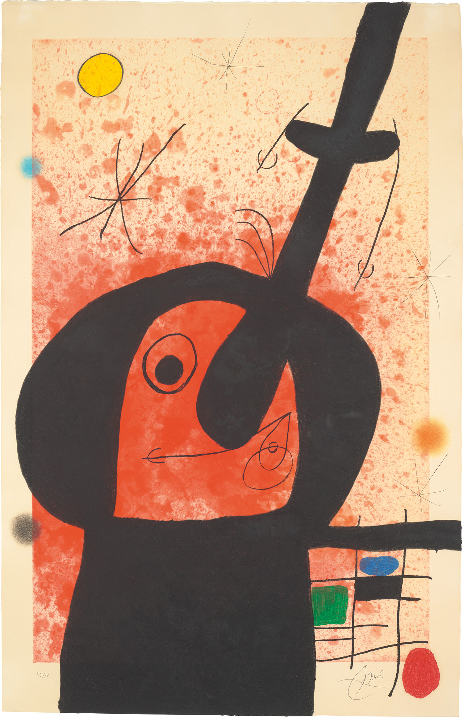
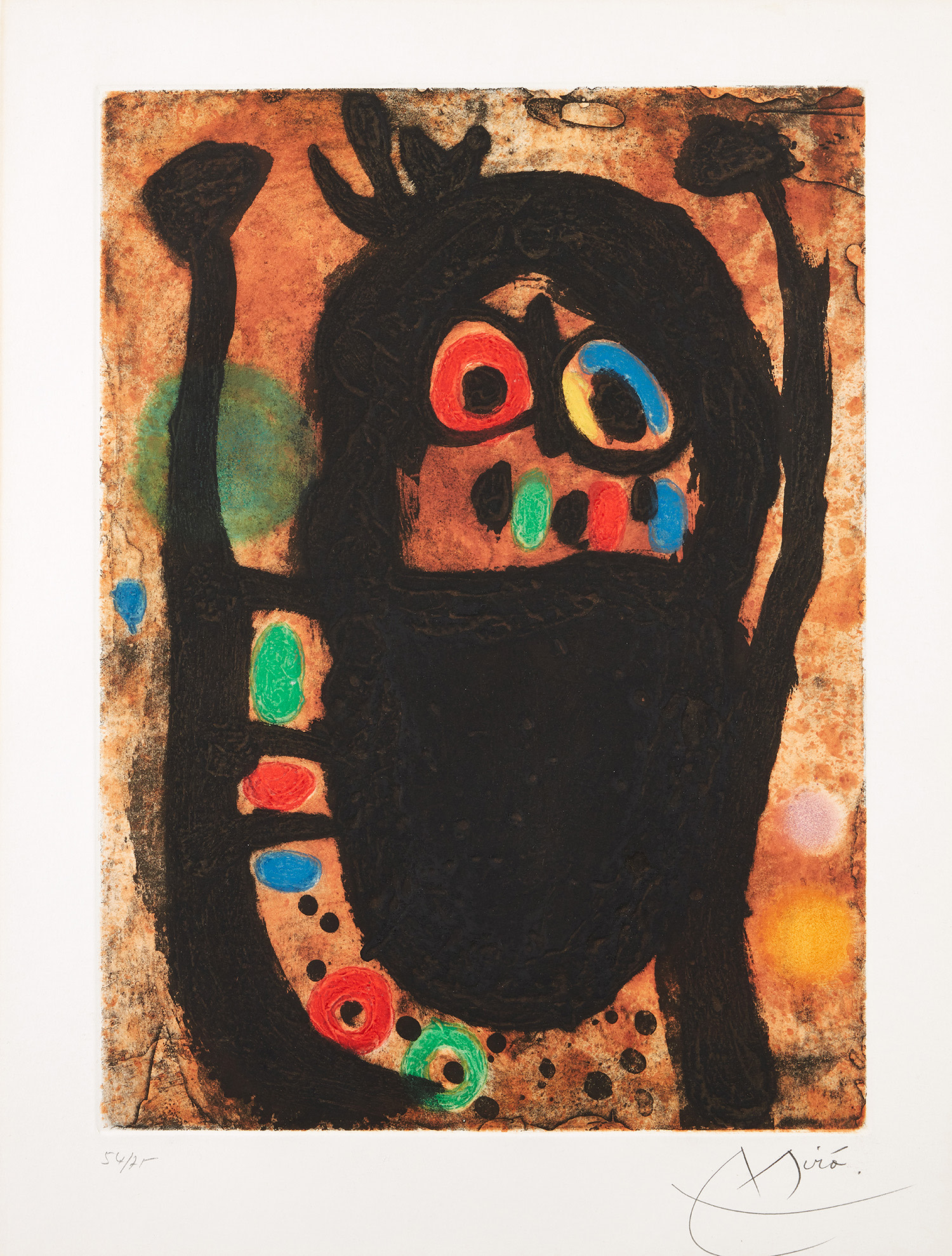
Artists drawn to materiality, to surfaces that carry weight and memory, recognized immediately what it could do. Joan Miró is the figure most synonymous with carborundum's artistic flowering, and his collaborations with the master printer Joan Barbara at the Taller d'Arts Gràfiques in Barcelona during the 1960s and 1970s produced some of the most celebrated prints of the twentieth century. Miró understood that carborundum was not merely a reproductive tool but a genuinely expressive medium. The technique suited his late visual vocabulary perfectly, those biomorphic forms swimming in fields of saturated color, the blacks especially achieving a depth that seemed to pull the eye through the surface rather than simply stopping it.
His carborundum works remain among the most sought prints in any auction room, and they are well represented on The Collection for very good reason. Antoni Tàpies, whose work on The Collection reflects his sustained engagement with materiality and surface, found in carborundum a natural ally. Tàpies spent his career investigating what surfaces remember and what they withhold, working in everything from mixed media canvases embedded with sand and marble dust to prints that feel more like excavations than impressions. His carborundum prints carry that same philosophical weight.
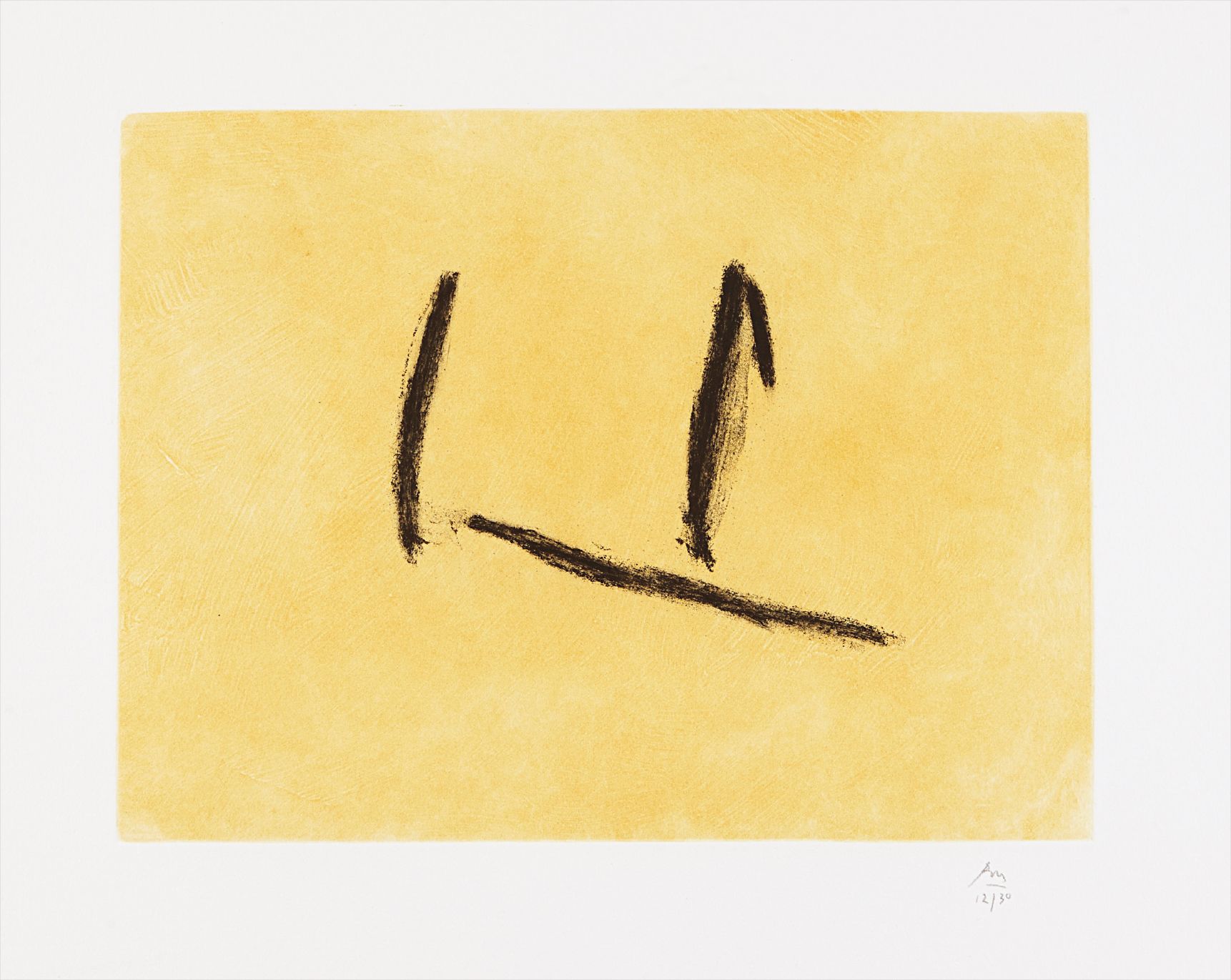
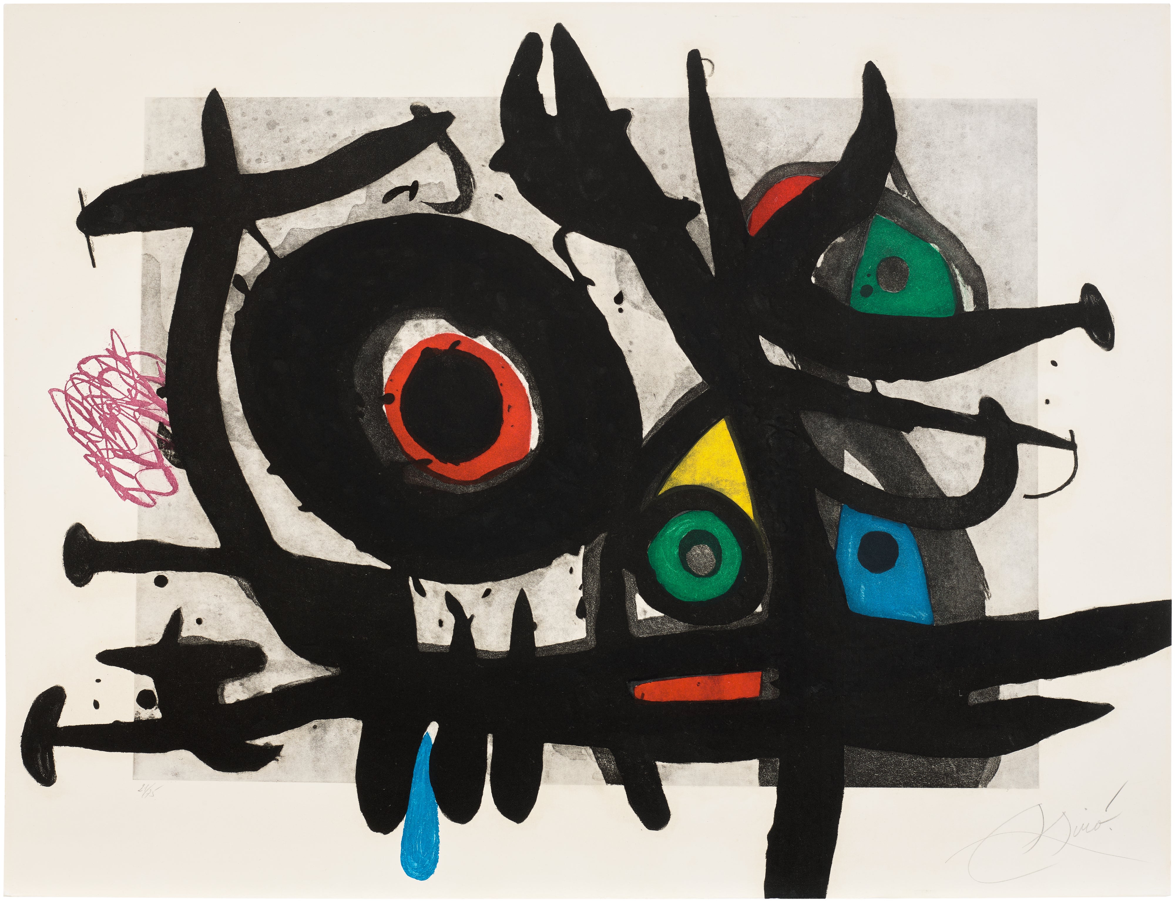
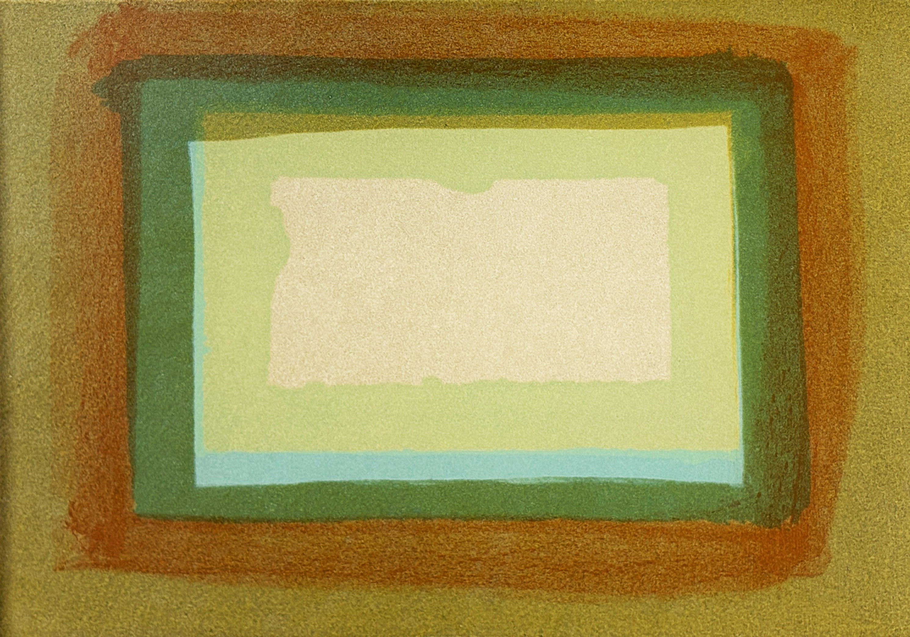
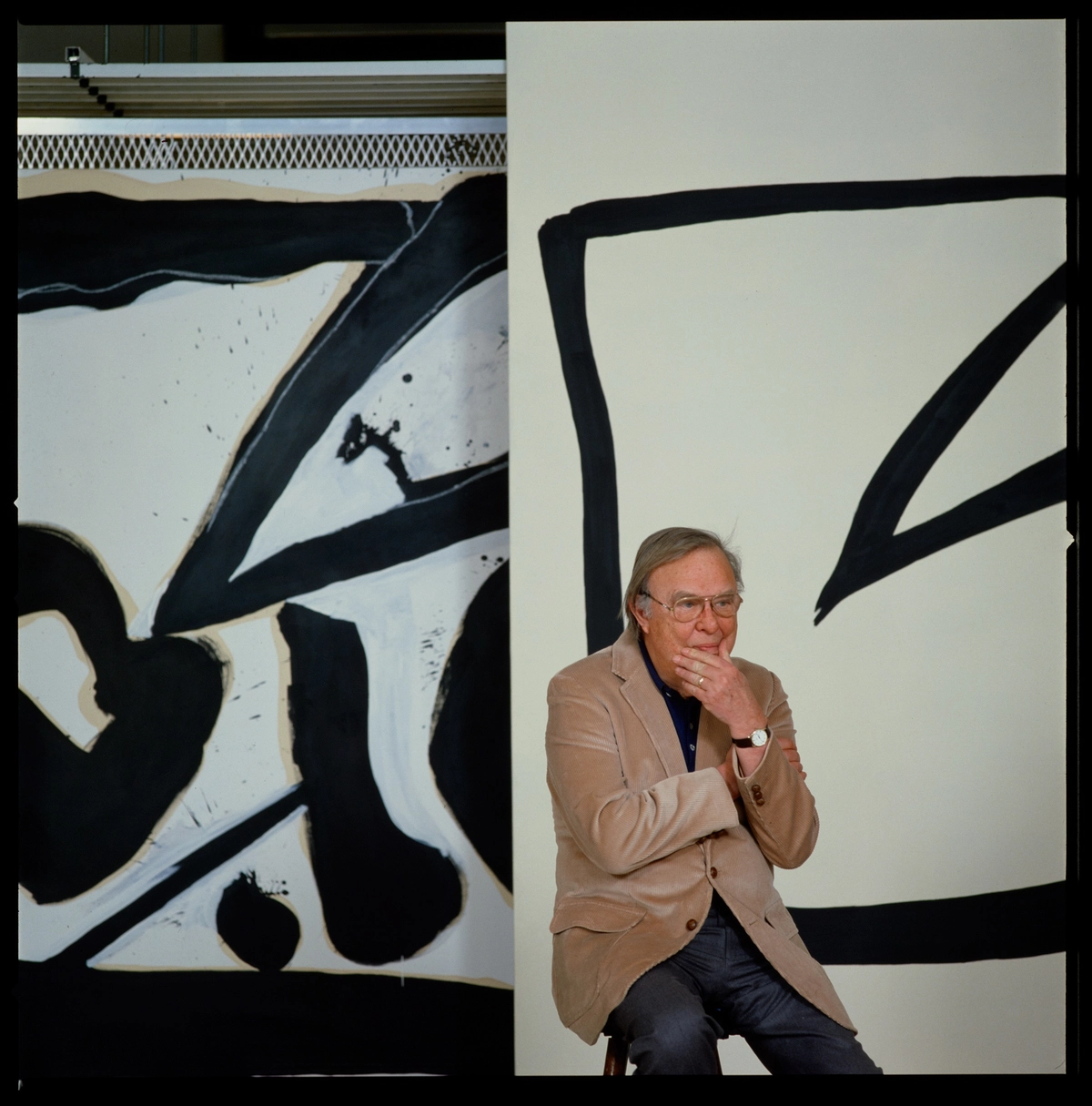
Robert Motherwell
Window
When Tàpies works appear at auction, they tend to attract serious collector attention precisely because the prints feel so continuous with his larger practice rather than peripheral to it. Sotheby's and Christie's have both recorded strong results for his graphic work in recent years, particularly in London and Barcelona sales. The broader market for carborundum prints has been shaped not just by individual artist reputations but by a growing critical understanding of printmaking as a primary medium rather than a secondary one. Institutions have played a decisive role here.
The Museum of Modern Art's print and illustrated books department has long collected seriously in this space, and their approach has influenced how curators internationally frame graphic work. The British Museum's significant holdings of twentieth century prints, including works by Howard Hodgkin and Robert Motherwell, both of whom engaged with etching and related intaglio processes, have helped position carborundum within a longer history of artists treating the print as a genuine site of invention. Hodgkin's late prints in particular, with their jewel like fields of color achieved through layered processes, exist in a kind of conversation with the carborundum tradition even when the technique is not explicitly used. Rufino Tamayo's graphic work deserves particular attention in this context.
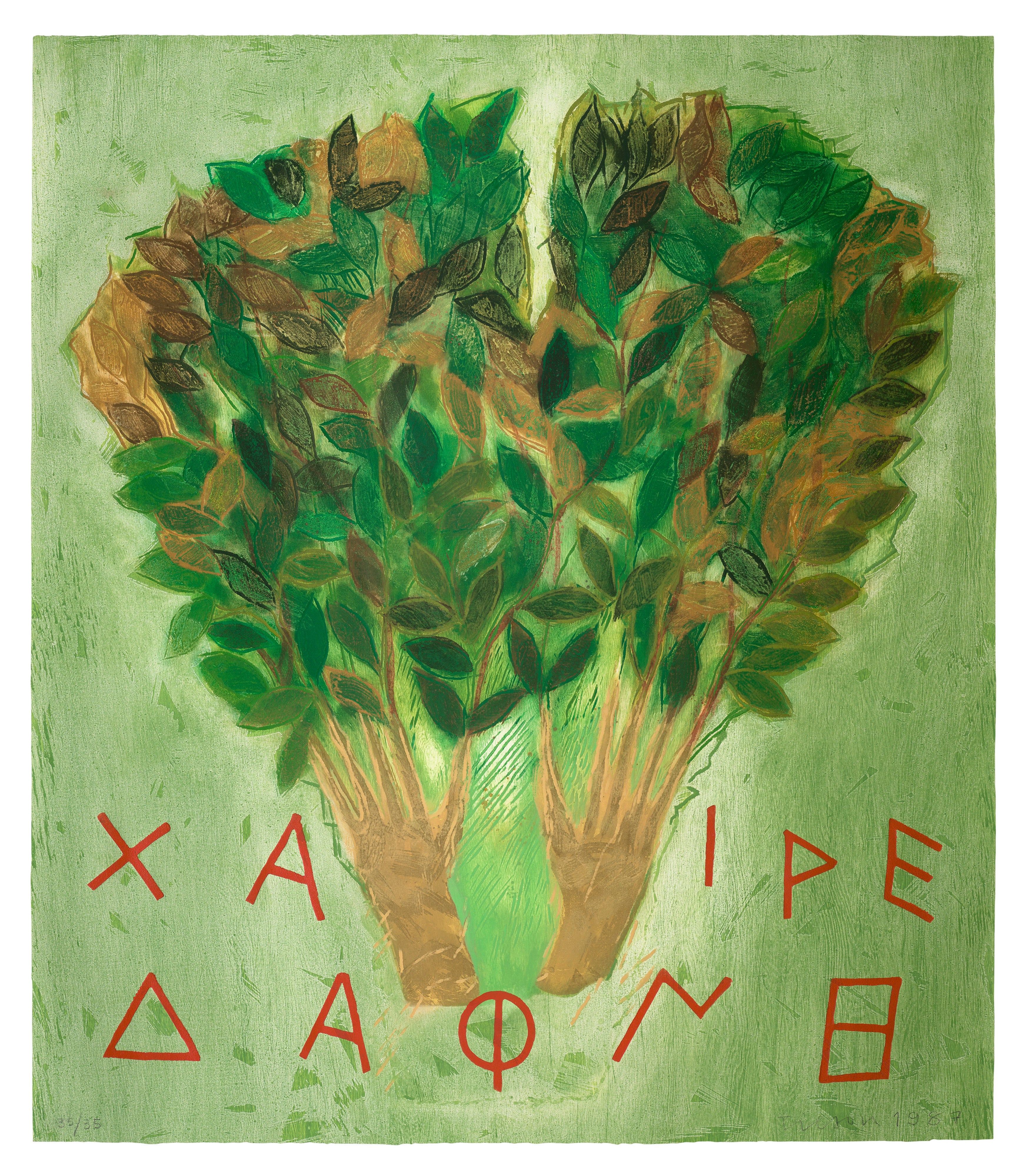
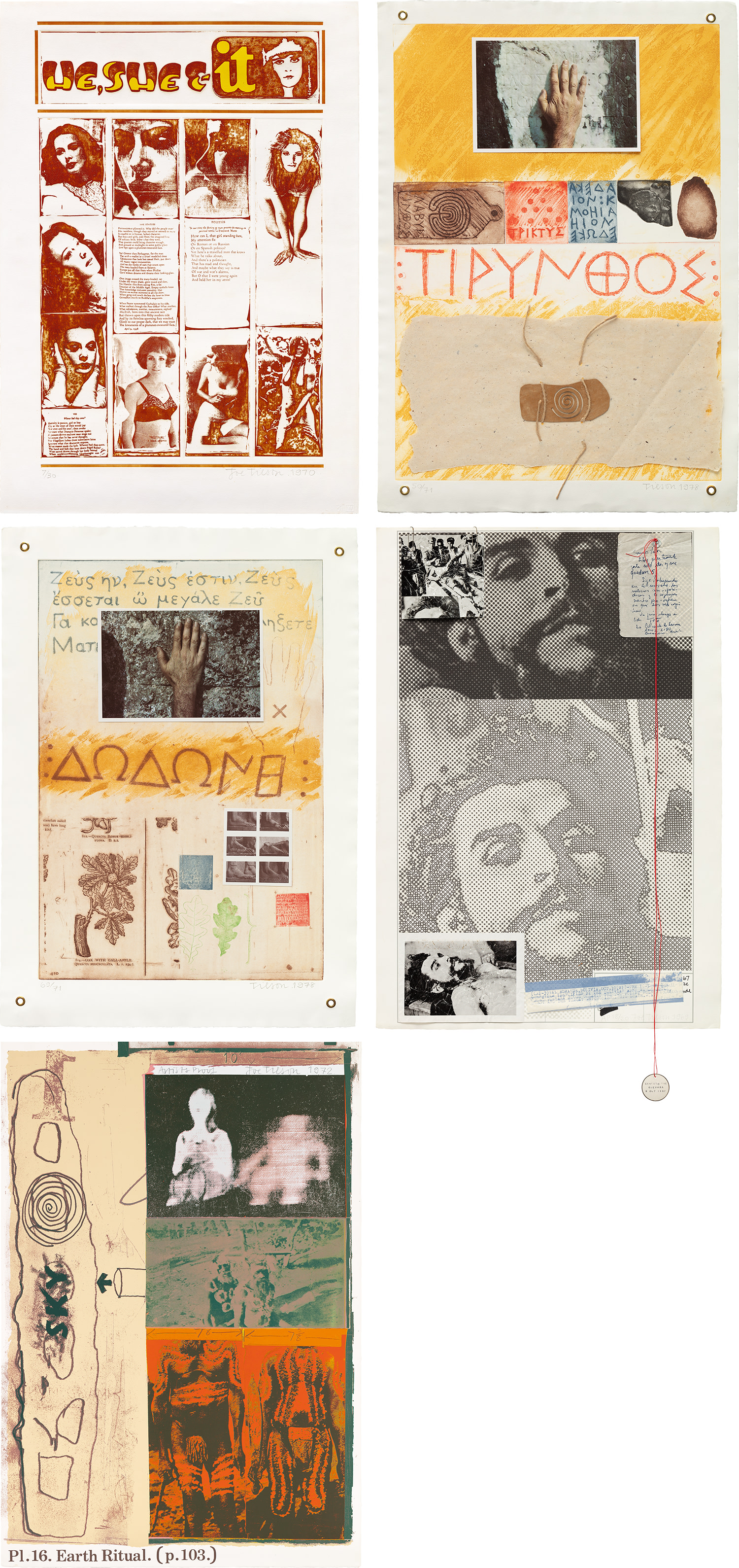
Joe Tilson
Metamorphosis of Daphne
Tamayo embraced printmaking with the same chromatic intensity he brought to painting, and his prints, well represented on The Collection, carry that distinctive smoky warmth and ancient resonance that defines his best work. Auction results for Tamayo prints have remained consistently strong across New York and Mexico City sales, and there is a sense among advisors that his graphic work remains undervalued relative to his canvases. That gap tends to close over time, and collectors paying attention to his prints now are positioning themselves ahead of a reappraisal that feels increasingly inevitable. The critical conversation around carborundum and printmaking more broadly has been shaped in recent years by a welcome shift in curatorial ambition.
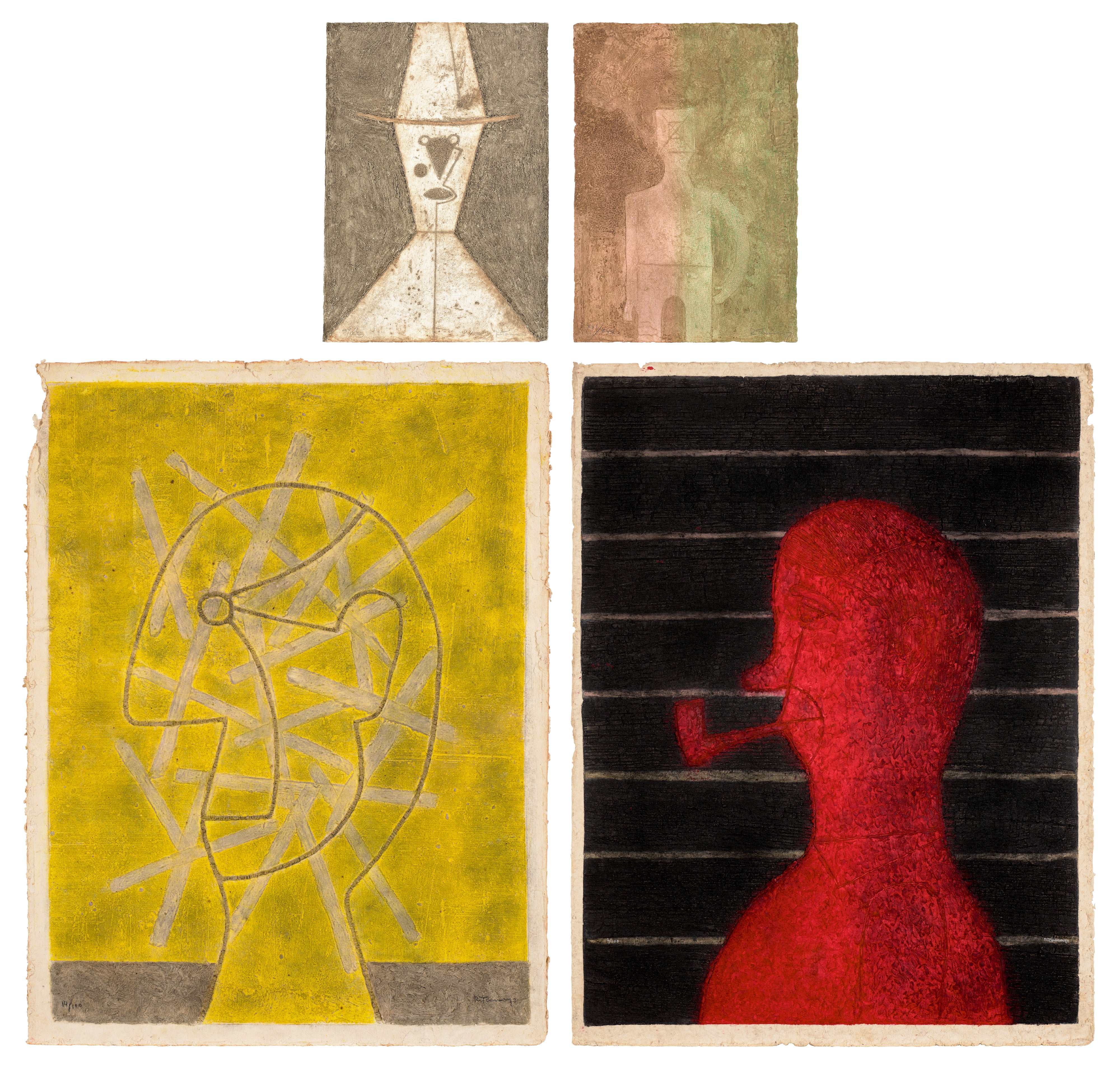
Shows like the Fundació Joan Miró's recurring focus on Miró's graphic production have brought serious scholarly attention to technique as meaning, not just method. Publications like Print Quarterly have maintained the rigorous critical space that this area deserves, and younger curators influenced by expanded notions of materiality are increasingly writing about prints in language borrowed from sculpture and installation rather than confining them to the language of editions and impressions. This cross contamination of critical frameworks is genuinely productive. Karel Appel, Jim Dine, and Mimmo Paladino each brought to printmaking the same rawness and physical directness that characterizes their work across media, and their graphic output sits comfortably within a carborundum adjacent conversation about prints that carry physical presence.

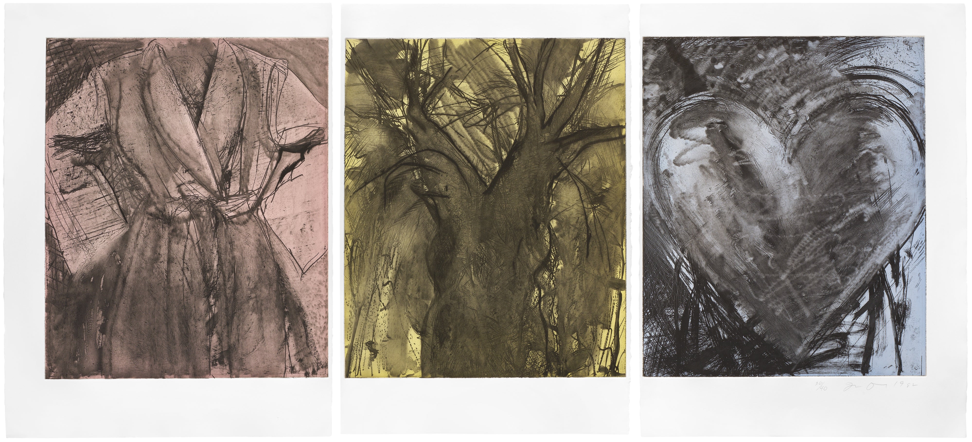
Mimmo Paladino
Il Pattinatore (The Skater) (D.M. 74)
Dine in particular has pushed intaglio processes throughout his career with a relentlessness that rewards close attention. Joe Tilson and Gillian Ayres represent different poles of the British engagement with print, Tilson's conceptual sharpness contrasting with Ayres's exuberant chromatic excess, yet both understood that printmaking could be a place of genuine risk rather than safe production. Where is the energy heading? There is a palpable renewed interest among younger collectors in works that have material integrity, things that exist as undeniable physical objects rather than as images that could just as easily be files.
Carborundum prints answer that appetite with particular conviction. They cannot be fully experienced on a screen, which in the current moment feels almost like a political statement. Dealers in Barcelona, London, and New York report consistent demand for Miró and Tàpies graphic works especially, and the prices being achieved at auction suggest that the market understands what the eye knows intuitively: that these are not prints that happen to be beautiful but objects in which beauty and process are genuinely inseparable. The grit in the surface is the meaning.