Red Accent
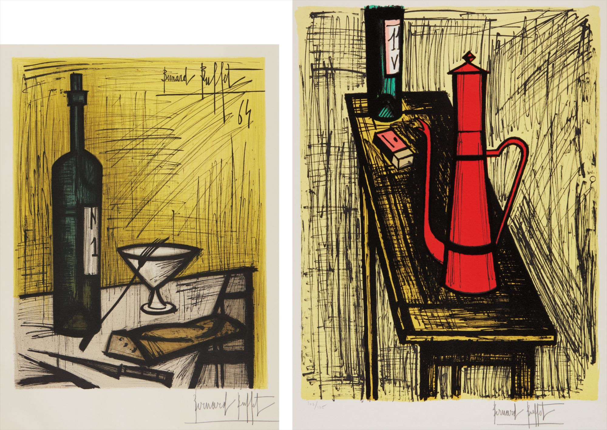
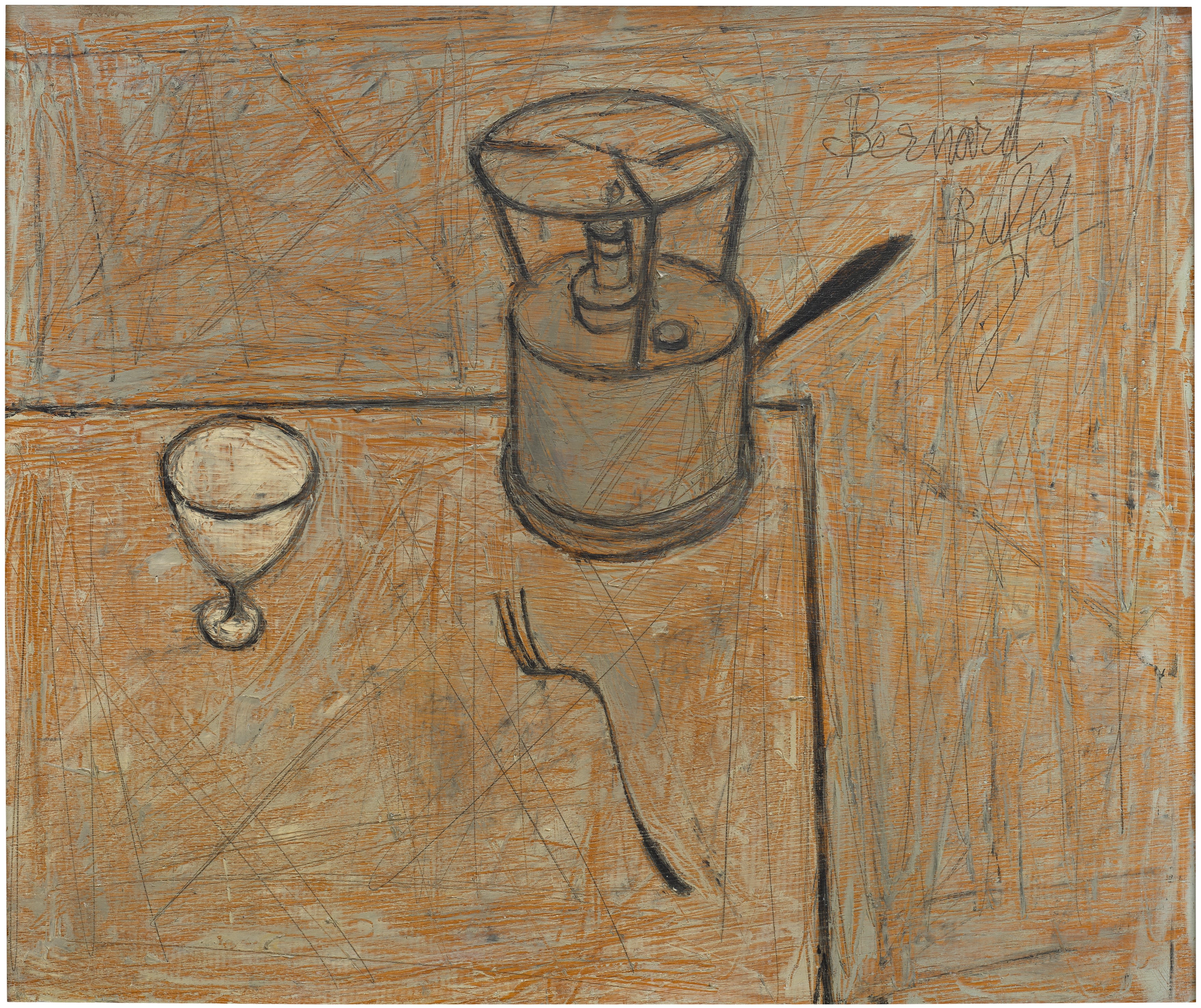
Bernard Buffet
Affiche d'Exposition - Le pain et le vin (Bread and Wine), by Charles Sorlier; and La cafetière rouge (The Red Coffee-Maker)
The Seduction of Red: Collecting with Intention
There is something almost primal about a work of art that uses red with confidence. Collectors who pursue paintings and works on paper in which red functions as an accent rather than a ground often describe the same experience: you enter a room and the work finds you before you find it. It pulls the eye across space, creates a kind of visual gravity, and then rewards closer looking with subtlety and complexity. This is not decoration.
This is the art of the considered gesture, and for collectors who understand it, living with such a work is genuinely transformative. The appeal is partly physiological. Red stimulates attention in ways that other colors do not, and artists have always known this. But the most compelling works are not those that shout.
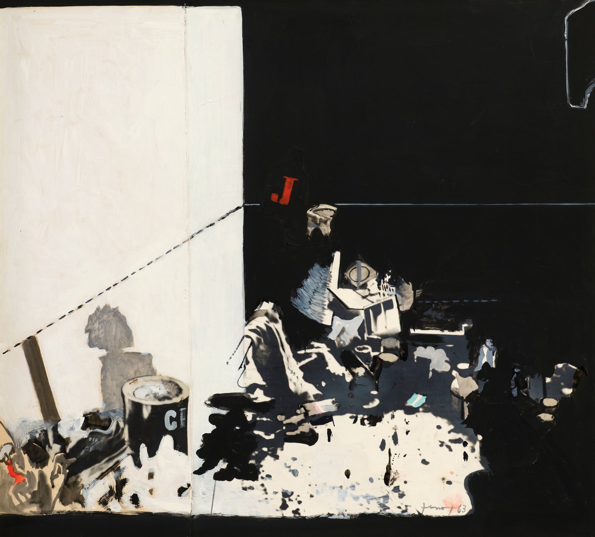
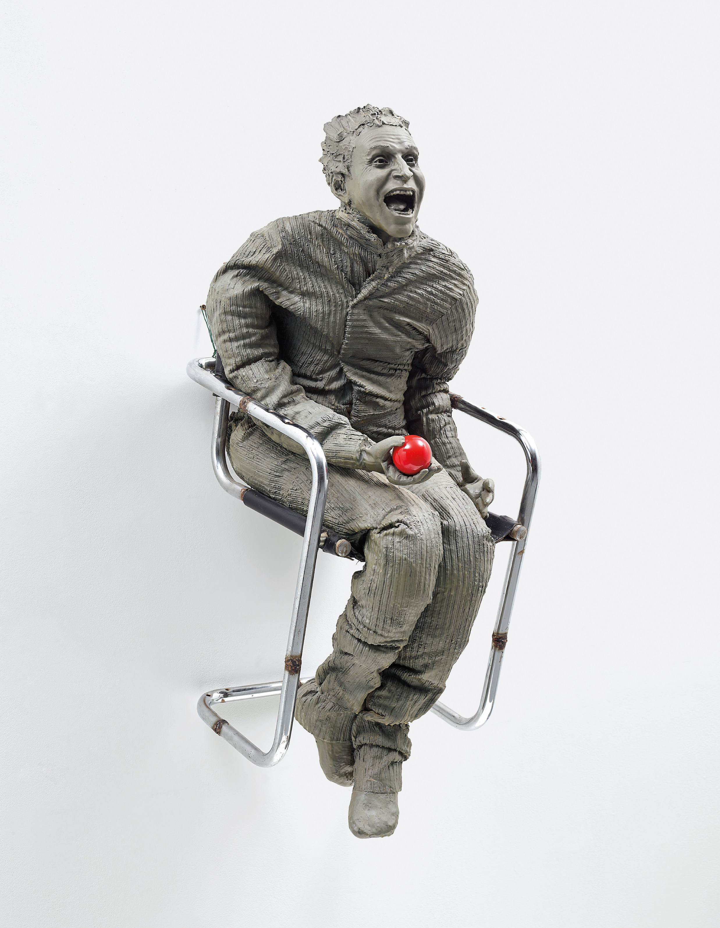
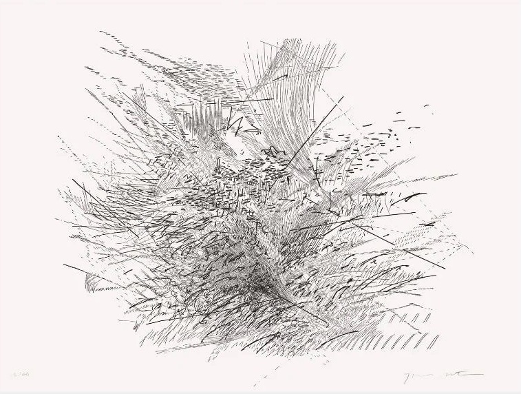
Gianfranco Ferroni
Oggetti (studio), 1963
They are the ones in which red arrives as a surprise, a punctuation mark within a more restrained palette, the moment where a composition suddenly holds together. When you find a work like this that rewards daily life rather than demanding it, you have found something worth owning. Distinguishing a good work from a great one in this category requires looking past initial impact. The question is not whether the red commands attention but whether it earns its place.
In lesser works, the accent color reads as a solution to a compositional problem, a way of rescuing something that does not quite resolve. In a great work, the red feels inevitable, as though removing it would cause the entire visual argument to collapse. Collectors should train themselves to ask: what is this color doing for the internal logic of the work? If the answer comes quickly and feels satisfying, that is usually a strong sign.
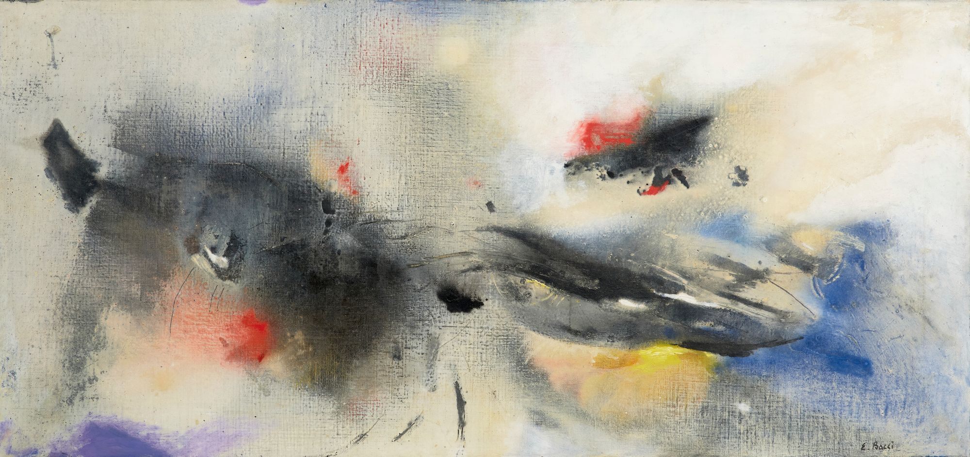
Bernard Buffet
Affiche d'Exposition - Le pain et le vin (Bread and Wine), by Charles Sorlier; and La cafetière rouge (The Red Coffee-Maker)
Scale matters too, and often in counterintuitive ways. A small accent of red in a large, monochromatic or near neutral field can carry enormous weight. The artists represented on The Collection understand this economy of means. Bernard Buffet, whose stark linear style and restrained palette made him one of the most recognizable French painters of the postwar period, understood that color used sparingly carries a different kind of charge than color used abundantly.
His work rewards collectors precisely because it operates through tension rather than abundance. The red in a Buffet is never casual. A.R.

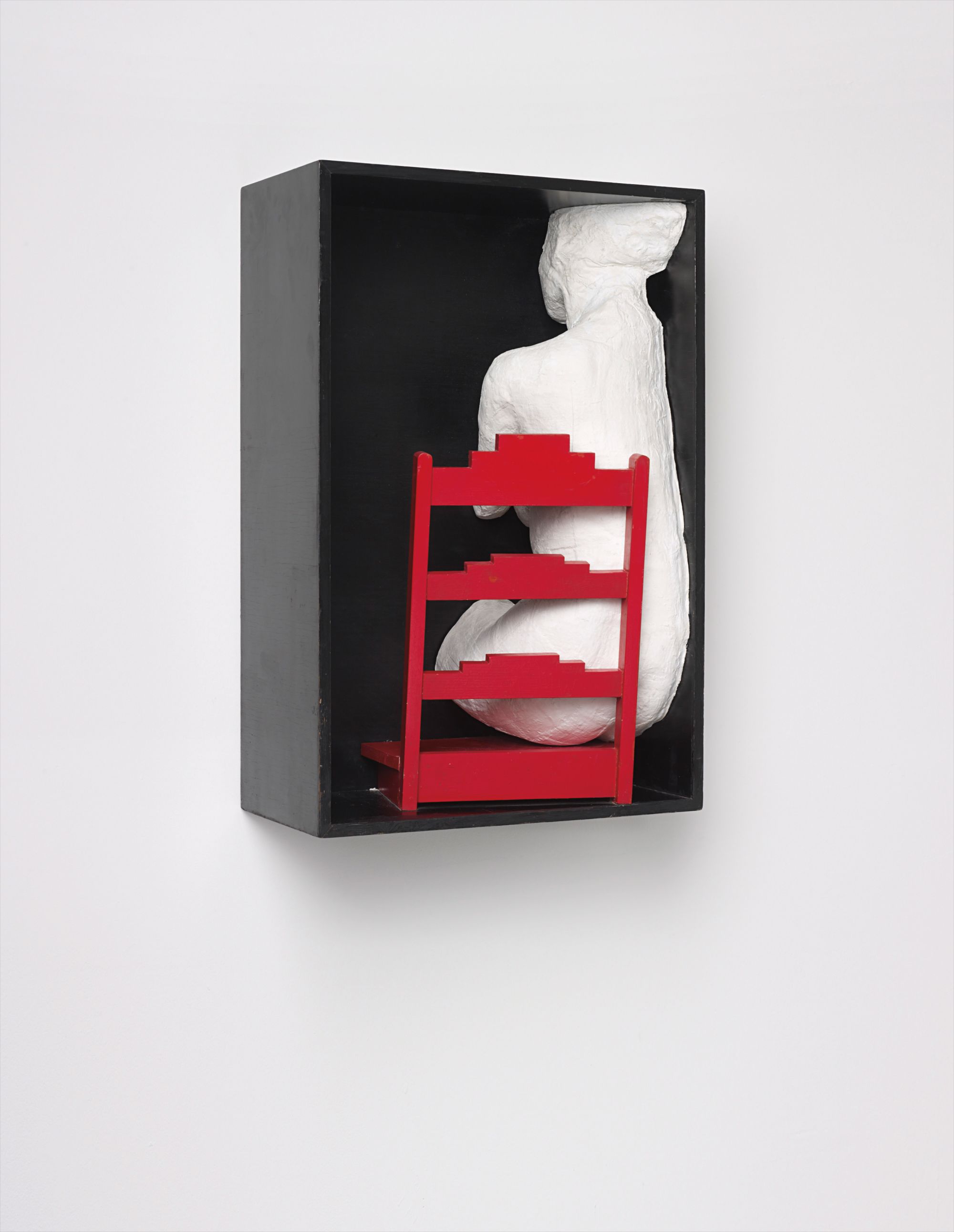
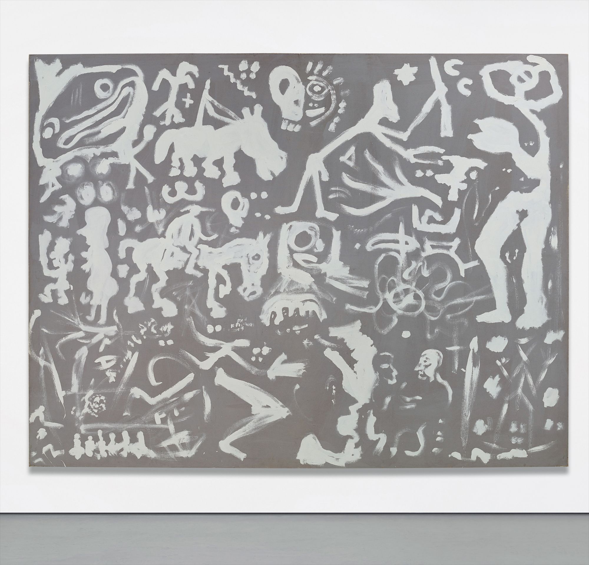
A.R. Penck
Berlin Suite
Penck presents a different but equally compelling case. His work, rooted in the visual language of prehistoric mark making and filtered through the political pressures he experienced in East Germany before his emigration to the West in 1980, uses color as signal rather than description. Penck's figures and symbols carry an urgency that collectors respond to viscerally, and his chromatic choices, including the use of sharp color accents against raw or heavily worked surfaces, feel less like aesthetic decisions than like acts of communication. Collecting Penck is collecting a kind of visual code, and there is real pleasure in learning to read it.
For collectors interested in emerging and underrecognized talent working in this vein, the strongest opportunities tend to exist among artists who are engaging seriously with figuration and with the expressive traditions that Penck and Buffet both, in very different ways, kept alive. Look for artists who are working through questions about the body, about gesture, and about what paint or mark making can still say in an image saturated world. The artists worth watching are those for whom color accent is a formal choice with conceptual stakes, not simply a stylistic habit. Gallery shows at mid sized institutions, particularly in Germany, France, and the United Kingdom, have been the most reliable place to find this kind of work before it reaches the secondary market.
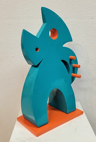
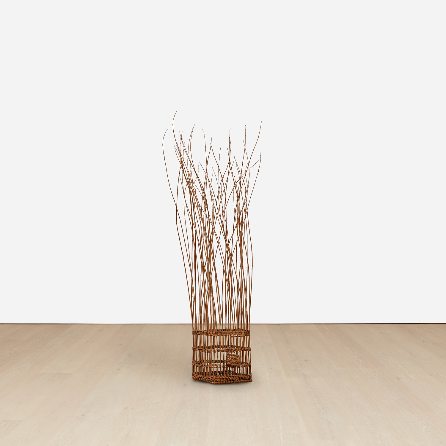
Delos Van Earl
Dancing Rhino, 2025
The secondary market for works that use strong chromatic accents with restraint has been notably resilient over the past decade. Auction results for Buffet have remained consistent across major houses, with his postwar works frequently outperforming their estimates at sales in Paris and London. Penck's market is smaller but loyal, and works that can be cleanly attributed and dated to his most productive periods in the 1970s and 1980s tend to hold value well. The collectors who have done best are those who bought with genuine conviction rather than market momentum, because the works they chose are the ones that turn out to have the strongest internal logic.
Condition is a practical concern that cannot be overstated when collecting in this area. Red pigments, particularly in works on paper and in certain synthetic formulations used from the 1950s onward, can be vulnerable to light exposure in ways that other colors are not. Before acquiring any work with significant areas of red, ask the gallery or seller for detailed condition reports and any available conservation history. Inquire specifically about whether the work has been displayed under UV filtered glass or in controlled light conditions.
This is not an arcane question. It is the kind of due diligence that distinguishes a collector from a buyer. When approaching a gallery about a work in this category, there are several questions worth asking directly. How has the work been stored and displayed?
Are there comparable works in institutional collections that can serve as reference points for condition and authenticity? For works on paper, has the piece been archivally matted and framed? For paintings, has the surface been examined by a conservator recently? These are not questions that should make anyone defensive.
A reputable gallery will welcome them as evidence that you are a serious collector who intends to care for what you acquire. The deeper truth about collecting works in which red functions as the decisive gesture is that it asks something of you as a viewer. You cannot be passive in front of such a work. It insists on being seen, and then it insists on being understood.
That is, in the end, what the best collecting always involves: not the acquisition of an object, but the beginning of a relationship that will continue to yield something new every time you look.