Paula Scher

Paula Scher Maps the World Beautifully
Artist Spotlight · The Collection Editorial
“Design is the method of putting form and content together. Design can be art. Design can be aesthetics. Design is so simple, that's why it is so complicated.”
Paula Scher
There is a moment, standing before one of Paula Scher's large scale map paintings, when the eye does not know where to rest. Words cascade across continents, city names tumble into coastlines, distances dissolve into pure color, and what began as geography becomes something closer to music. It is a sensation that collectors, curators, and casual gallery visitors have been experiencing for decades now, and it shows no sign of fading. If anything, the cultural appetite for Scher's work has only deepened as the world has grown more complex and her maps have grown more necessary as objects of contemplative beauty.
Paula Scher
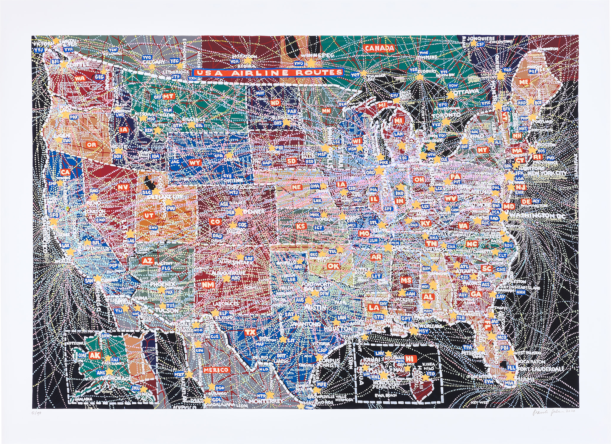
USA Airline Routes
Paula Scher was born in Washington D.C. in 1948 and grew up in a household where visual thinking was encouraged. She studied at the Tyler School of Art in Philadelphia, graduating in 1970, and entered the professional world at a moment when American graphic design was poised between the rigid formalism of the Swiss International Style and something far more expressive and culturally rooted.
Her early career at CBS Records and then Atlantic Records through the 1970s placed her at the center of album cover design, a form that demanded the same synthesis of image, type, and emotional energy that would define her entire body of work. Those years were formative not merely technically but philosophically: Scher learned that design could carry feeling, that a typeface could swagger or whisper, that color could mean something. The founding of the studio Koppel and Scher in 1984 marked her formal move into independent practice, and the work that followed demonstrated a designer utterly confident in her own visual language. She was drawing on Art Deco, Constructivism, and vernacular American commercial printing all at once, colliding references with a kind of joyful irreverence that felt genuinely new.
Paula Scher
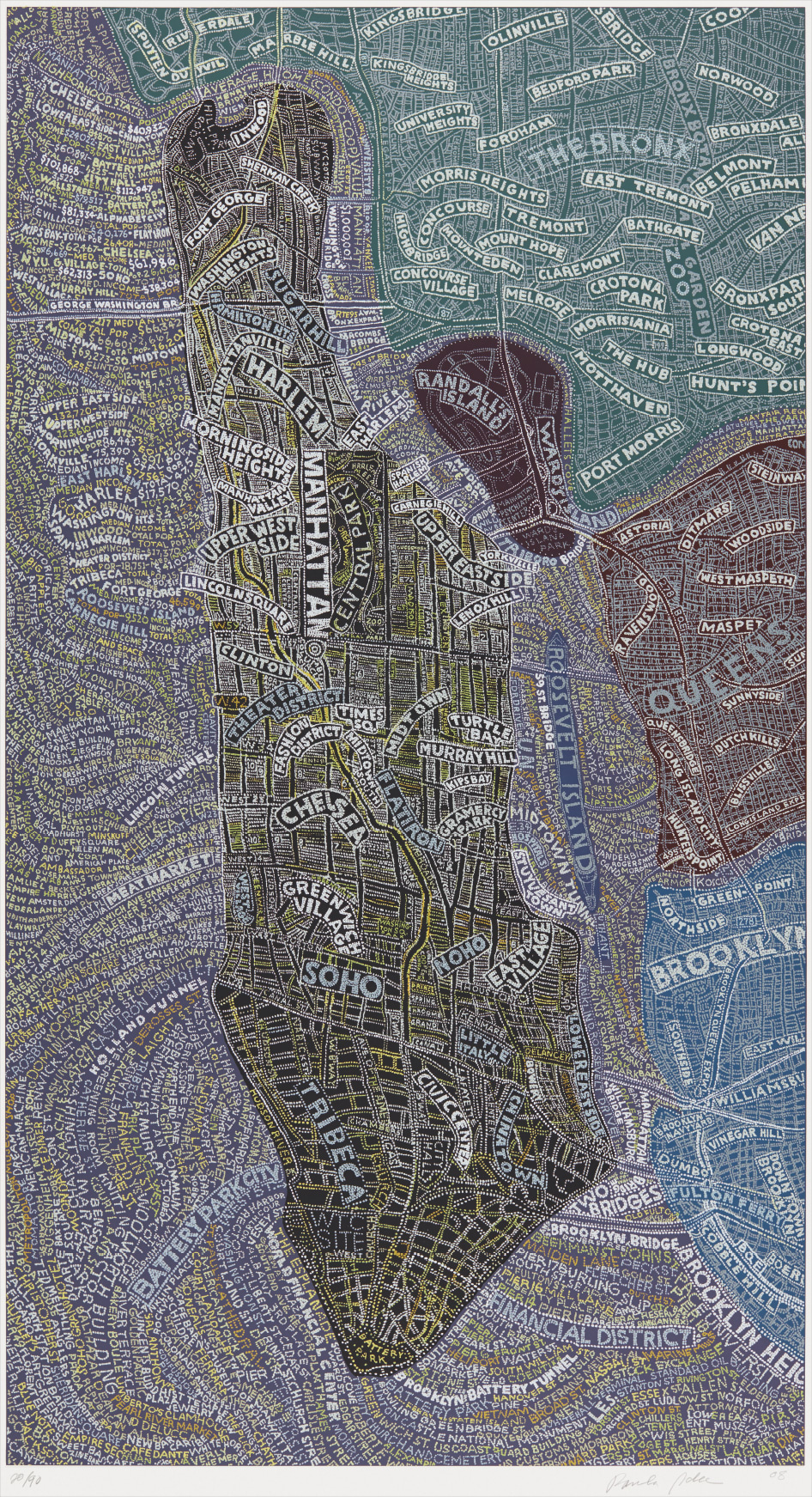
Manhattan at Night
Her work from this period engaged with the full history of graphic communication while remaining bracingly contemporary. When Pentagram, the legendary design partnership, invited her to become a principal in 1991, it was a recognition that she had built something singular and that the design world was better for having her inside its most storied institution. The identity she developed for The Public Theater in New York, beginning in 1994, is rightly considered one of the great achievements of late twentieth century design. Using bold wood type inspired by nineteenth century American broadside posters, Scher created a visual language for the institution that felt both historical and urgent, democratic and sophisticated.
“You have to be in a state of play to design. If you're not in a state of play, you can't make anything.”
TED Talk, 2008
It announced theater as something that belonged to the street, to the city, to everyone. That identity has been refined and evolved over the years but its essential character, loud and generous and deeply intelligent, remains intact. Around the same time, her work for institutions including the Sundance Film Festival and later Citi and the Museum of Modern Art demonstrated that the same principles could scale across contexts without losing their integrity. But it is the map works, which Scher began developing seriously in the 1990s, that have come to define her standing as a fine artist rather than simply a designer of genius.
Paula Scher
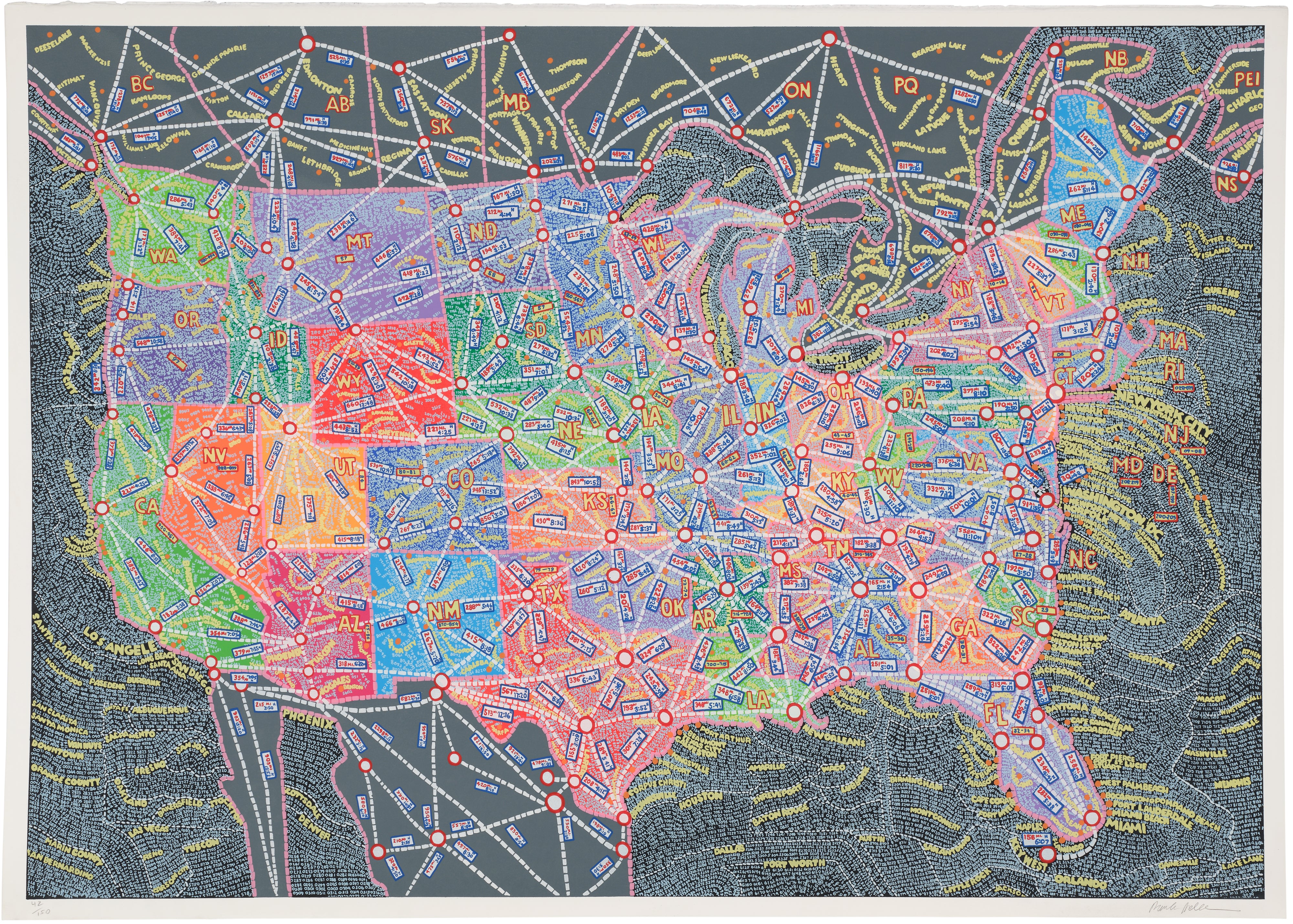
USA Distances
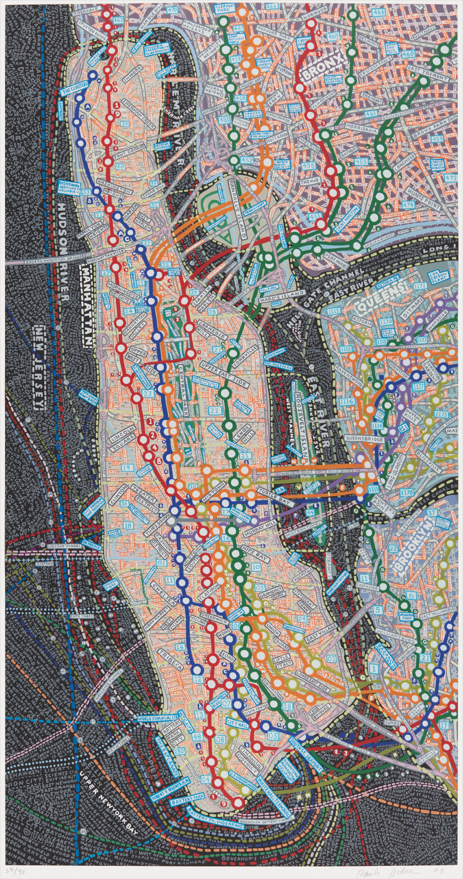
Works such as USA Airline Routes, Manhattan at Night, USA Distances, NYC Transit, and Europe are not cartographic documents in any conventional sense. They are hand lettered compositions in which the accumulation of place names, routes, and geographic data becomes a kind of visual text, dense and rhythmic, impossible to read all at once and endlessly rewarding to return to. The screenprints produced from these works, on papers including Deluxe Lana Quarelle and Lana paper, preserve the energy of her painted originals in editions that collectors have sought with increasing enthusiasm. The monumental digital pigment print USA Airline Routes, for instance, captures the dizzying interconnectedness of American aviation infrastructure and turns it into something that feels almost like a celebration of human movement and ambition.
For collectors, the appeal of Scher's prints operates on several levels simultaneously. There is the historical importance of the work: owning a Scher screenprint is owning a piece of the conversation between fine art and design that has defined so much of the past half century. There is the sheer visual pleasure of the objects themselves, which reward close looking and live happily alongside both contemporary painting and works on paper from earlier modernist traditions. Scher's prints sit naturally in conversation with the graphic work of Jasper Johns, the typographic experiments of Ed Ruscha, and the pattern saturated paintings of artists associated with the Pattern and Decoration movement of the 1970s.
Paula Scher
NYC Transit
Collectors drawn to any of these areas will find Scher's editions speak the same language with their own distinctive accent. Her works have appeared consistently at major print and multiples sales, and demand has grown steadily as institutional recognition of her dual legacy as designer and artist has solidified. Within the broader history of art and design, Scher occupies a position that very few practitioners have managed to claim. She belongs to a tradition of artist designers that includes figures like Herbert Matter, Paul Rand, and Alvin Lustig, individuals for whom the boundary between commercial work and personal artistic expression was genuinely porous.
But she has pushed further than most of her predecessors in asserting the map paintings as autonomous works of art rather than design artifacts, and the reception of those works in gallery and museum contexts has validated that assertion. Her influence on subsequent generations of designers and artists working with text and image is immeasurable and still very much active. Students encounter her work in every serious design program; younger artists cite her as a liberating example of what it means to work with conviction and delight in equal measure. Paula Scher turns seventy six this year and shows no sign of slowing.
Her continued presence at Pentagram, combined with an ongoing fine art practice that keeps producing new map works of extraordinary ambition, means that her influence remains living rather than merely historical. She is one of those rare figures whose career justifies the word legendary without any inflation of meaning. To collect her work is to participate in something that has genuinely mattered, a practice built over five decades on the belief that visual language is powerful, that beauty is serious, and that the world looks better when someone takes the time to really see it and then, with great care and great boldness, maps it back to us.
Explore books about Paula Scher