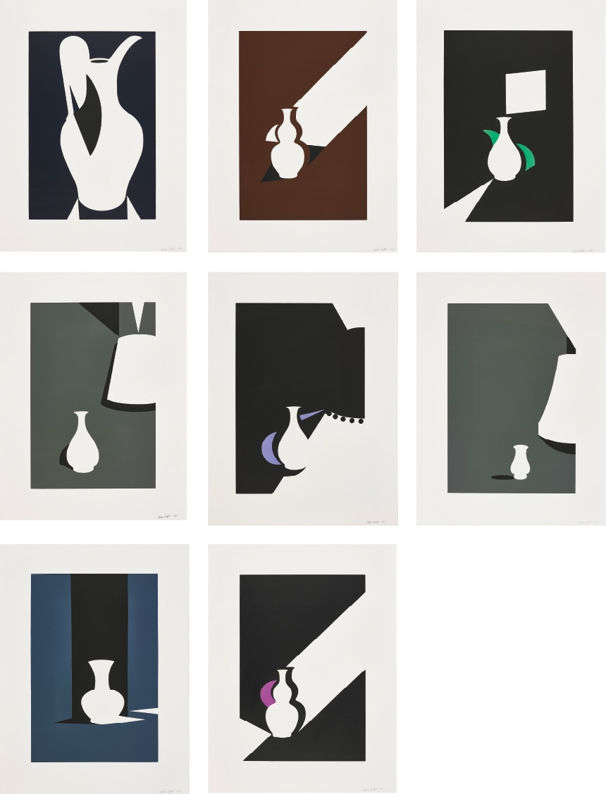
Patrick Caulfield
Patrick Caulfield: Painting the Quiet Spectacular
Artist Spotlight · The Collection Editorial
In 2013, Tate Britain mounted a major retrospective of Patrick Caulfield's work, bringing together decades of painting and printmaking under one roof and reminding a new generation just how singular this artist's vision had always been. The exhibition arrived eight years after Caulfield's death in 2005 and served as both a celebration and a correction, placing him firmly in the company of the great British painters of the twentieth century rather than in the footnotes where modest temperaments sometimes end up. Standing in those galleries, surrounded by bold black outlines and fields of flat, unmixed colour punctuated by extraordinary passages of almost photorealistic detail, visitors found themselves asking the same question Caulfield had spent four decades elegantly refusing to answer: is this irony, or is this love? The answer, it turns out, was always both.
Patrick Caulfield
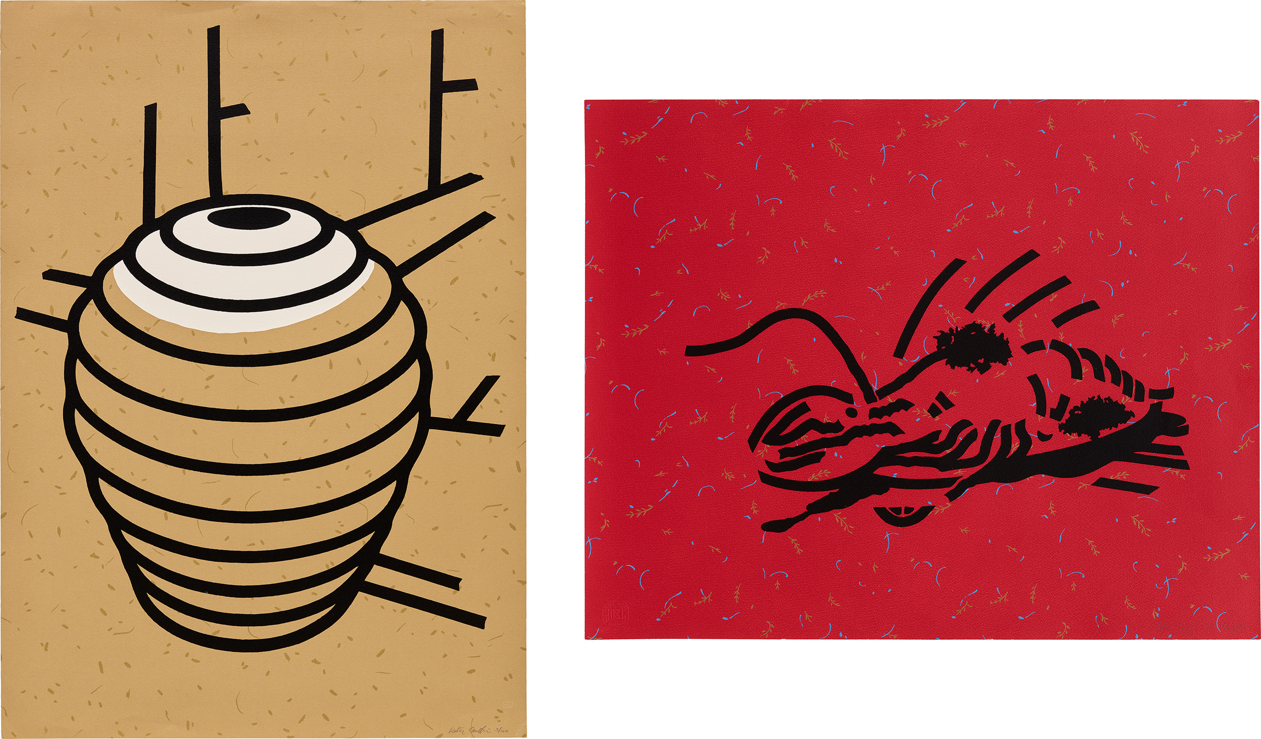
Some Poems of Jules Laforgue (C. 38)
Patrick Caulfield was born in London in 1936 and grew up in the west of the city, far from the grand institutions that would later collect and celebrate his work. He studied at the Chelsea School of Art before moving to the Royal College of Art, where he graduated in 1963 alongside David Hockney and R.B. Kitaj, a cohort whose collective influence on British painting proved immeasurable.
The Royal College in those years was a crucible of ambition and irreverence, a place where young painters were absorbing American Pop Art with one eye and European modernism with the other. Caulfield absorbed both, but what distinguished him even then was the quiet seriousness underneath the graphic bravado, the sense that he was interested not in spectacle but in looking itself. His early paintings announced an immediately recognisable style: thick black outlines delineating objects rendered in flat, unmodulated colour, images borrowed from vernacular sources and Mediterranean still life traditions alike. He was interested in the codes of depiction, in how a jug becomes a jug on a canvas, in the strange authority that a simple black line can carry.
Patrick Caulfield
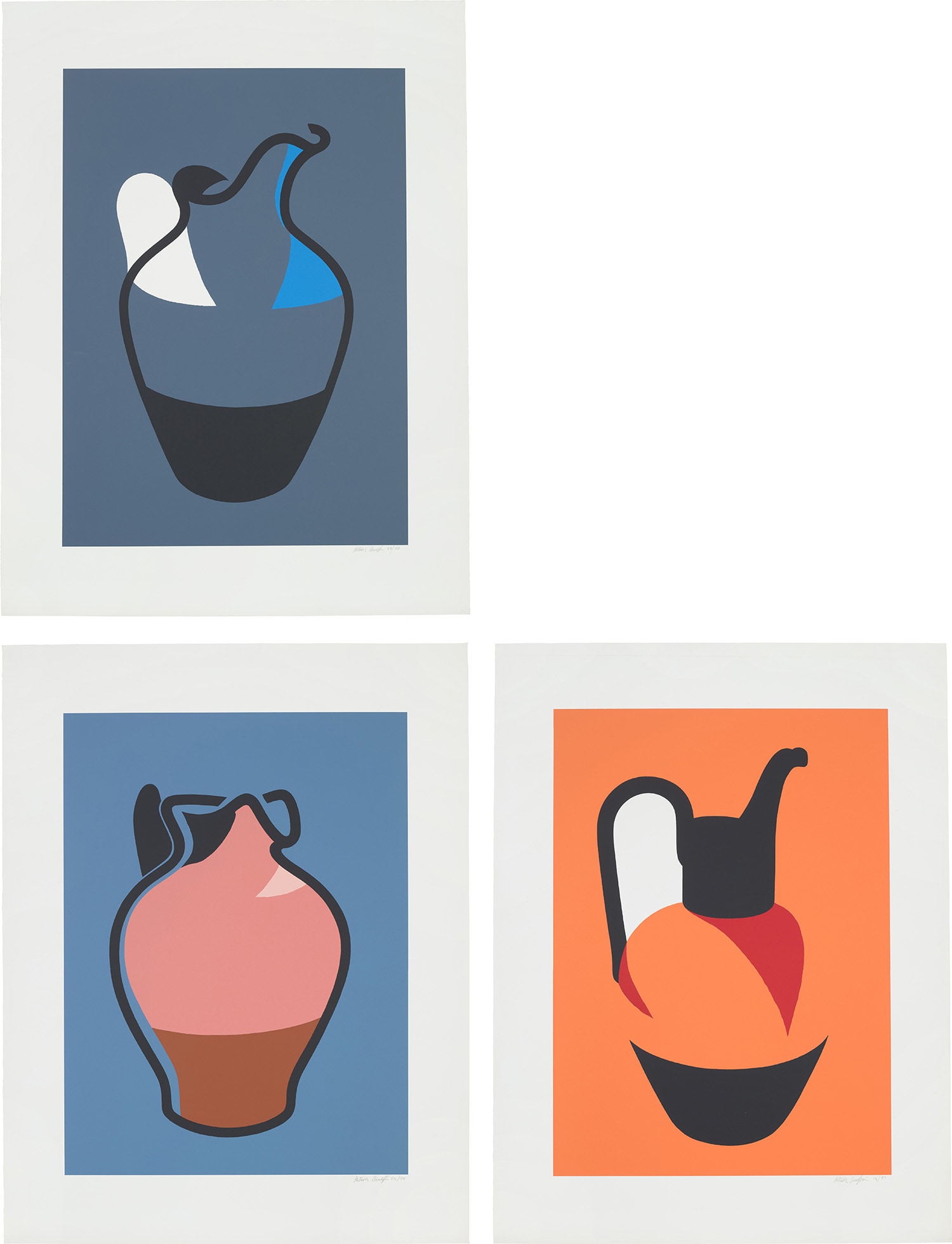
Water Jug; Brown Jug; and Pitcher (C. 66-68)
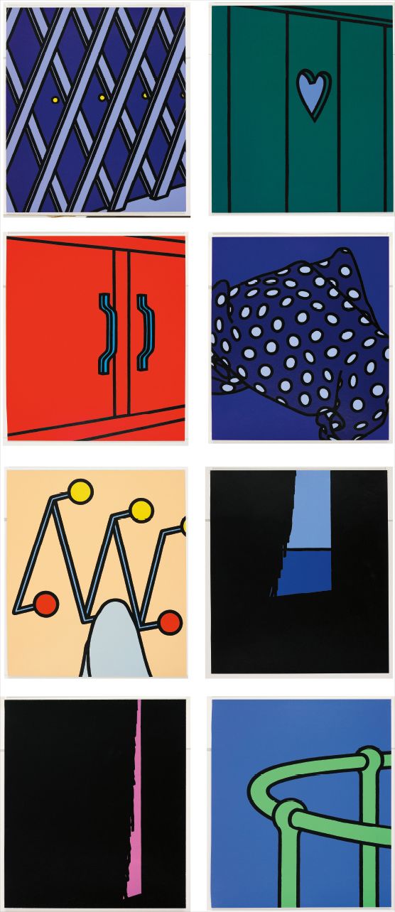
Works from the mid 1960s onward showed his debt to Fernand Léger and Juan Gris, but Caulfield was doing something distinctly his own, stripping representation down to its essential grammar and then asking what feeling might still be possible within such constraints. The answer was: a great deal of feeling, precisely because of the constraints. By the 1970s, Caulfield had introduced a technique that became one of the most talked about moves in contemporary British painting. Into canvases built from bold flat colour and clean graphic line, he would insert passages of almost trompe l'oeil realism, a window rendered in loving atmospheric detail appearing within an otherwise schematic interior.
This collision of registers was not a trick but a meditation, a way of asking how we actually see the world and how painting has taught us to see it. Works such as After Lunch, completed in 1975 and held in the Tate collection, show this strategy at full strength: a flat, almost cartoon restaurant interior interrupted by a window through which a hyperrealistic Swiss castle appears, the whole thing suspended between comedy and melancholy in a way few painters have ever managed. These were paintings about paintings, but they were also paintings about being human in rooms, surrounded by objects, half present and half dreaming. As a printmaker, Caulfield worked with some of the most respected publishers in Britain, including Petersburg Press and Waddington Graphics, producing screenprints that carried all the intellectual rigour of his paintings into an accessible and collectible form.
Patrick Caulfield
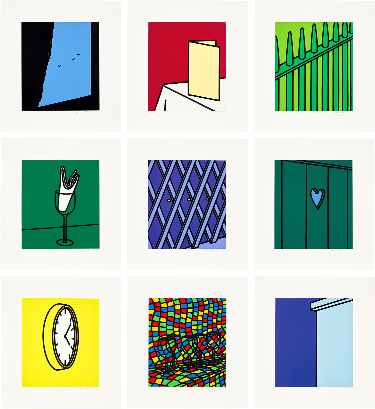
White Ware
His collaborations with these publishers yielded important series and suites, among them his illustrated response to the poetry of Jules Laforgue, a French Symbolist poet whose ironic melancholy clearly resonated with Caulfield's own sensibility. The Laforgue suite, published by Petersburg Press, stands as one of the most accomplished artist's books of the era, weaving image and text into a single sustained meditation. Other printmaking projects, including the White Ware series published by Waddington Graphics and individual screenprints such as For John Constable, demonstrated the range and consistency of his graphic vision, and these works remain among the most sought after examples of British printmaking from the period. For collectors, Caulfield's prints represent a particularly rewarding area of focus.
The screenprints combine the full force of his aesthetic intelligence with the intimacy of a limited edition object, and their edition structures, many produced in runs of between 45 and 80, with small artist's proof sets, mean that strong examples carry genuine rarity. Works from the Waddington Graphics collaborations, including the Water Jug, Brown Jug, and Pitcher series and the various still life suites, have performed well at auction and in the secondary market, valued both for their graphic quality and for their connection to the broader arc of Caulfield's career. Collectors drawn to the intersection of Pop sensibility and art historical depth, to work that rewards close looking and repays repeated viewing, find in Caulfield a deeply satisfying figure. His paintings hang in Tate Britain and in major private collections across the world, and his prints continue to circulate through the most respected rooms in the auction calendar.
Patrick Caulfield
Some Poems of Jules Laforgue: 8 plates; and Dressed Lobster
Within the broader landscape of postwar British and international art, Caulfield occupies a genuinely distinctive position. He shared with Roy Lichtenstein an interest in the aesthetics of graphic flatness, and with Eduardo Paolozzi a willingness to mine popular visual culture for serious pictorial ends, but his work has none of Lichtenstein's cool remove and none of Paolozzi's baroque accumulation. He is closer in spirit to the great Spanish still life painters he clearly loved, to Zurbarán and Sánchez Cotán, than to the billboard culture his surface style might suggest. His British contemporaries, including Hockney and Allen Jones, shared the Royal College formation but moved in quite different directions, which makes Caulfield's singular path all the more admirable in retrospect.
What Caulfield's legacy amounts to, in the end, is a body of work that insists on the continued possibility of painting as a serious and pleasurable form of inquiry. He made it look easy, which is one reason it took some critics longer than it should have to recognise just how hard it was. The 2013 Tate retrospective corrected that record with authority. His interiors are places you want to inhabit.
His still lifes make ordinary objects feel mysterious and permanent. His prints are among the most beautifully considered objects that British art of the twentieth century produced. To collect Caulfield is to collect a particular quality of attention, one that is discriminating, warm, and quietly inexhaustible.
Explore books about Patrick Caulfield
Patrick Caulfield
Marco Livingstone
Patrick Caulfield: A Retrospective
Paul Moorhouse
Patrick Caulfield: Paintings 1963-1999
Various
Patrick Caulfield: Early Works
Marco Livingstone
Patrick Caulfield: Paintings and Prints
Paul Moorhouse