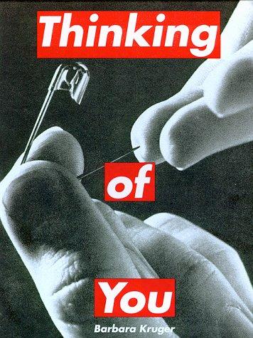
Barbara Kruger
Barbara Kruger: Words That Changed How We See
Artist Spotlight · The Collection Editorial
“I work with pictures and words because they have the ability to determine who we are and who we aren't.”
Barbara Kruger, interview with the Smithsonian
In the autumn of 2022, the Art Institute of Chicago unveiled a sweeping retrospective of Barbara Kruger's work that stopped visitors cold in their tracks. Entire rooms were consumed by her signature imagery: photographs drained of color, overlaid with urgent red text that felt less like captions and more like confrontations. The show confirmed what collectors and curators have long understood: Kruger is not merely an artist who comments on culture. She is one of the essential architects of how contemporary visual language functions, and her influence has only deepened with time.

Barbara Kruger
Don't Be A Jerk, 2017
Barbara Kruger was born in Newark, New Jersey, in 1945, and her early years in that working class industrial city left a lasting imprint. Newark in the postwar decades was a place of newspapers, billboards, television sets flickering in living rooms, and the constant low hum of commercial imagery pressing in from every direction. Kruger absorbed this environment intuitively. She went on to study at Syracuse University and then at the Parsons School of Design in New York, where she studied under the legendary graphic designer Marvin Israel and the photographer Diane Arbus.
These two figures shaped her sensibility in profound ways, giving her a rigorous understanding of image making and the emotional charge that a single photograph, cropped and reframed, can carry. After graduating, Kruger worked for years at Condé Nast publications, rising to become chief designer at Mademoiselle magazine. This was not a detour from her art practice but rather its foundation. She learned the mechanics of persuasion: how text and image could be combined to seduce, to command attention, to manufacture desire.

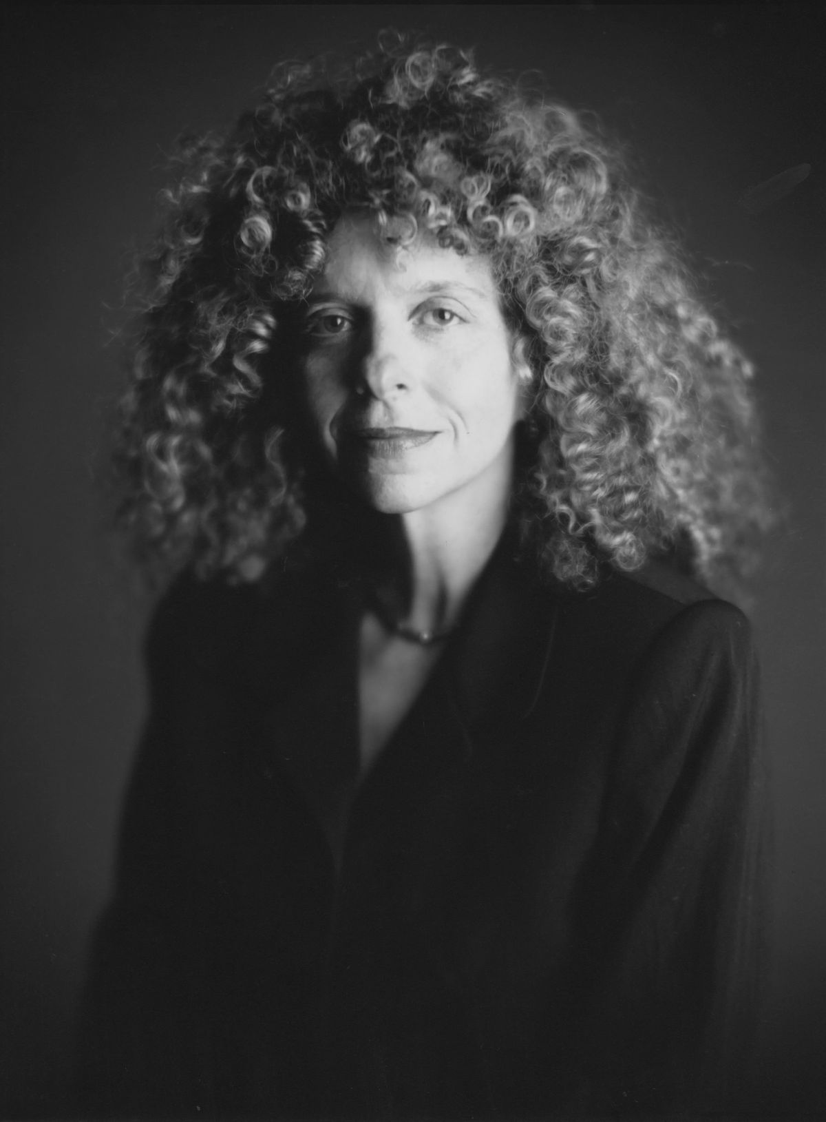
Barbara Kruger
Too Big To Fail Clock
When she turned that knowledge back onto culture itself as a critical instrument, the results were explosive. By the late 1970s, she had abandoned painting entirely and begun working with found photography, overlaying images with text in the bold Futura Bold Oblique typeface that would become her visual signature. The 1980s were the decade in which Kruger arrived fully formed on the international stage. Her works from this period feel like they were made for the age of Reagan, the culture wars, and the explosion of mass media consumption, and in many ways they were a direct response to all three.
“I'm interested in the mobilization of images and language, in how they can either oppress or empower.”
Barbara Kruger
Works addressing the gaze, ownership, and the politics of the body circulated through exhibitions in New York and Los Angeles and found their way into major institutional collections. The Mary Boone Gallery in New York and later the Sprüth Magers gallery became important platforms for her work, and her presence in landmark group exhibitions of the Pictures Generation helped define a whole critical movement. Artists including Cindy Sherman, Richard Prince, and Jenny Holzer were her contemporaries and kindred spirits, each interrogating the image and the word in their own distinct registers. What makes Kruger's formal choices so enduring is their apparent simplicity.
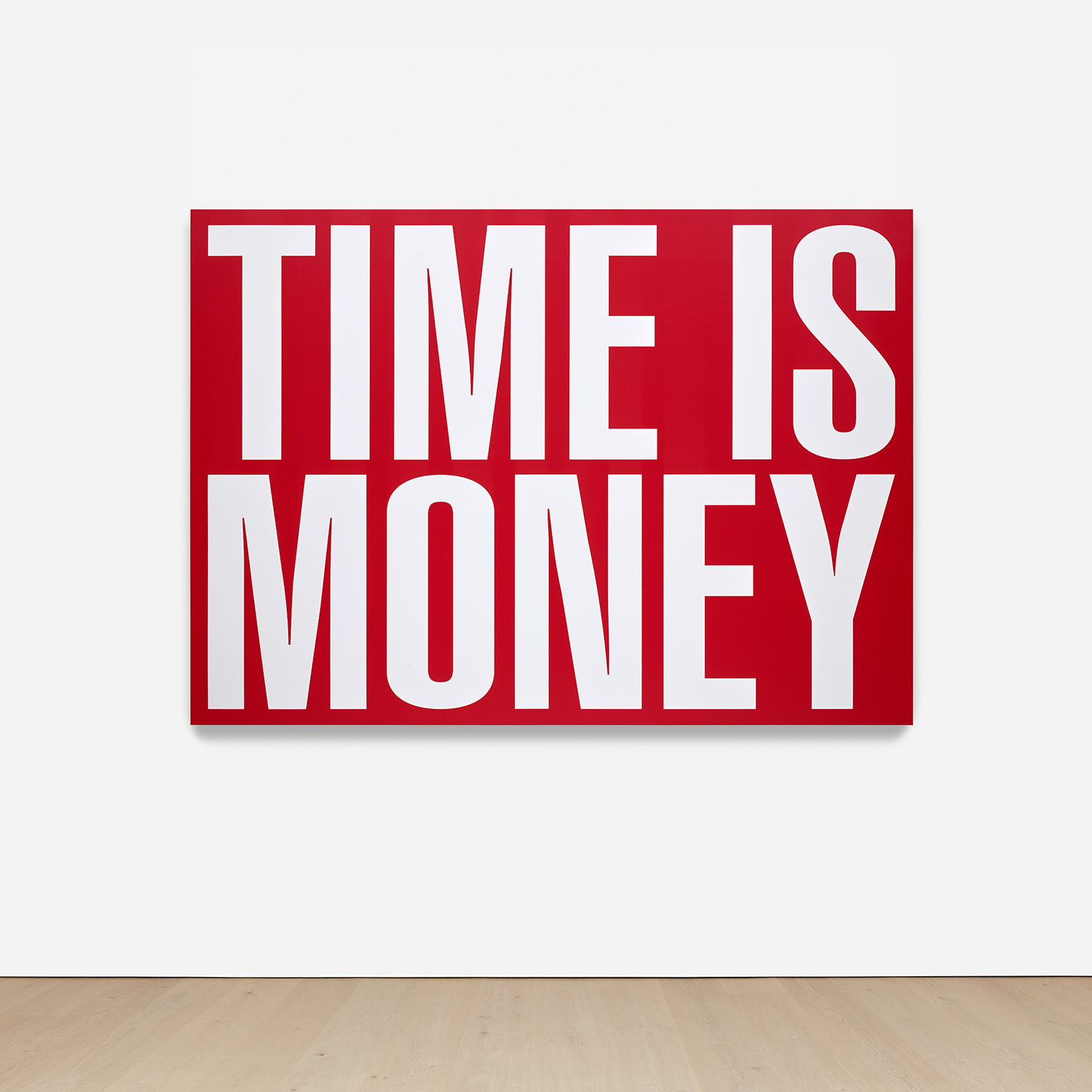
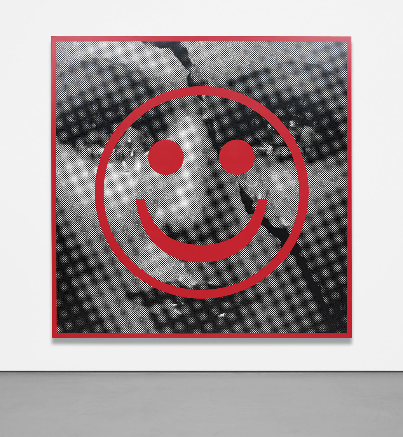
Barbara Kruger
digital print on vinyl, 2011
Black and white photographic imagery, sourced from the archives of mass media, sits beneath or beside short declarative phrases rendered in white Futura on red bars. The pronouns shift and destabilize: "Your body is a battleground," "I shop therefore I am," "Who owns what." The viewer is never a passive observer. They are addressed directly, implicated, questioned.
This is text that does not illustrate an image but rather creates a friction with it, forcing a renegotiation of meaning. Kruger understood early that the grammar of advertising could be turned inside out to expose the power structures it ordinarily conceals. Among the works available to collectors today, several stand out as particularly important entry points. "Untitled (Unique)" from 2020, rendered as a digital print on vinyl in the artist's chosen frame, demonstrates how Kruger has continued to evolve her practice while remaining faithful to its essential logic.
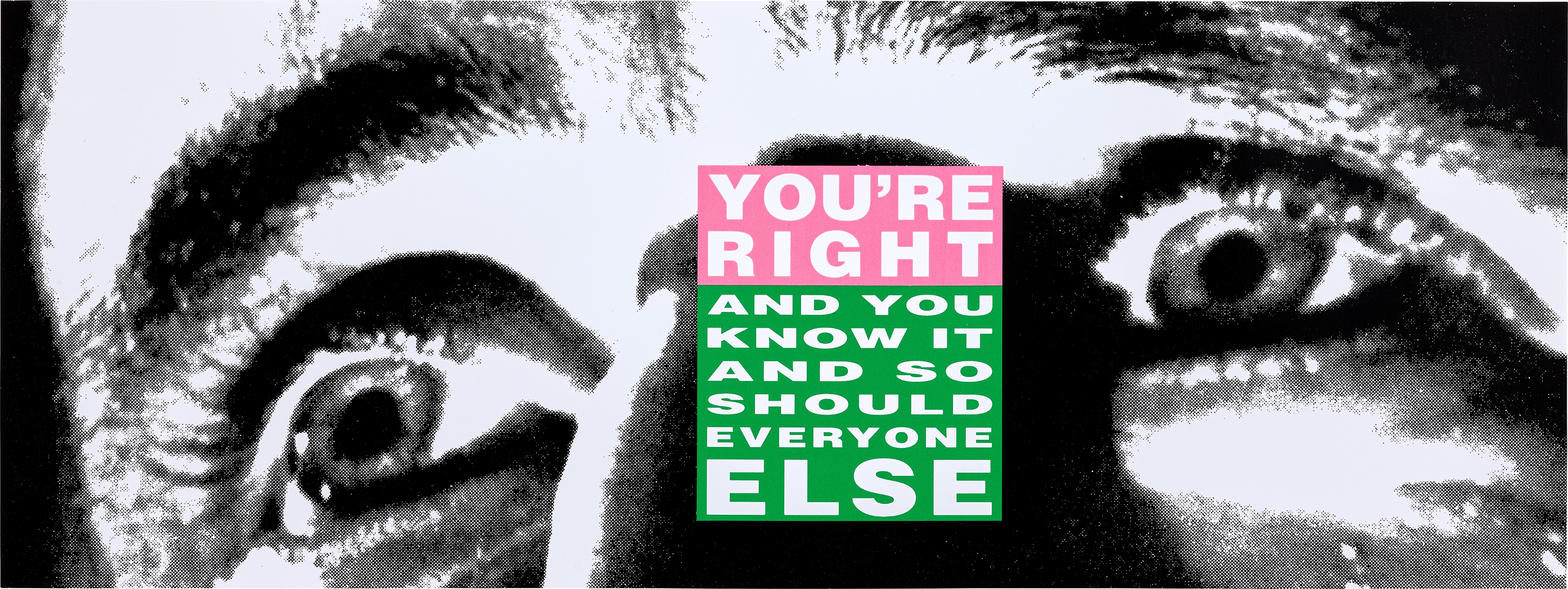
Barbara Kruger
You’re Right (and You Know it and So Should Everyone Else)
The diptych "Stay/Go" from 2007, produced as a chromogenic print in the artist's frames, captures her ongoing fascination with binary language and the way simple oppositions carry enormous ideological weight. "Who Will Write The History of Tears?" from 2011, an archival pigment print in the artist's frame, shows a more searching and elegiac dimension of her voice, asking questions rather than issuing provocations. Each of these works rewards close attention and holds its own within a serious collection.
From a market perspective, Kruger occupies a position of genuine stability and growing prestige. Her work trades at auction houses including Christie's and Sotheby's, where editions and unique works alike have attracted committed bidding from collections across North America, Europe, and Asia. Print editions, including her celebrated collaborations such as the "My Pretty Pony" portfolio with text by Stephen King, represent an accessible and historically significant point of entry. The brushed stainless steel cover and Rives paper of that complete set of lithographs and screenprints speak to the seriousness with which Kruger has always approached her editioned works, treating them not as secondary products but as fully realized objects.
For collectors who are newer to her practice, works on paper and vinyl offer a meaningful starting point, while unique and large scale works remain the domain of the most committed institutional and private buyers. Kruger's place within art history is now secure across multiple registers. She is central to the story of Conceptual Art, essential to any account of Feminist art, and indispensable to discussions of Postmodernism and the relationship between art and graphic culture. Her influence is visible in design, advertising, music, fashion, and political activism, sometimes with attribution and sometimes without it, a fact that carries its own commentary on the themes of authorship and ownership that run through her entire practice.
Artists as varied as Shepard Fairey and Hank Willis Thomas have drawn on the visual language she helped codify. What ultimately distinguishes Kruger is that her work has not aged into historical curiosity. In an era saturated by social media, algorithmic imagery, and the weaponization of language in public life, her art feels more urgent than ever. She has continued to create large scale immersive installations that transform entire architectural spaces into total environments of text and image, including projects that bring her voice into public settings where it can reach audiences far beyond the gallery walls.
Barbara Kruger has spent more than five decades asking who holds power, who is seen, and who gets to speak. The answer, in her work, always circles back to the viewer, which is precisely the point.
Featured Works

Explore books about Barbara Kruger