Robert Cottingham
Robert Cottingham: America Spelled In Neon
Artist Spotlight · The Collection Editorial
There is a particular quality of light that exists only on American commercial streets at dusk, when neon signs begin to assert themselves against a darkening sky and letters seem to float free of their buildings like words escaping from language itself. Robert Cottingham has spent more than five decades devoted to that light, that moment, and those letters. His paintings and prints of fragmented storefront signage have become among the most recognizable and beloved works in the American photorealist tradition, and his influence on how we see the built environment of the twentieth century continues to resonate with collectors, curators, and fellow artists alike. Cottingham was born in Brooklyn, New York in 1935, and came of age in a city where commercial typography was everywhere: on awnings, marquees, painted glass, and illuminated facades.

Robert Cottingham
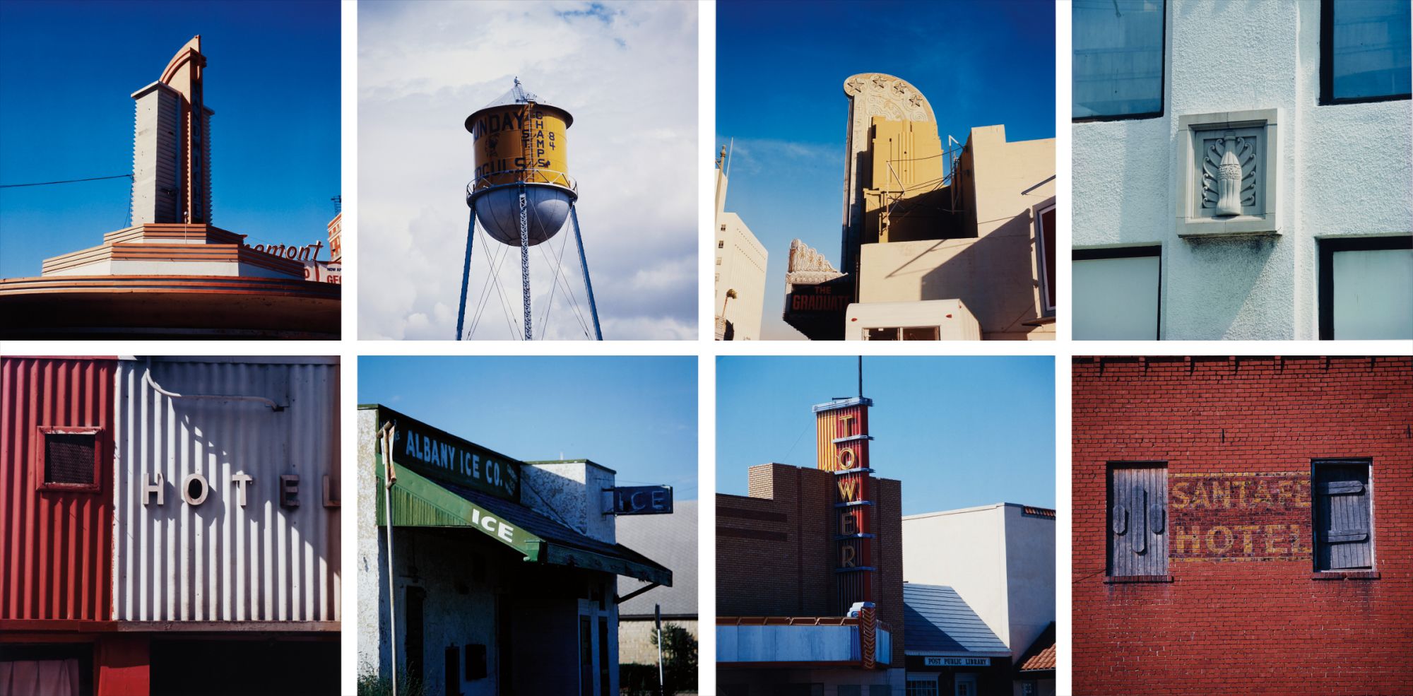
Travel Notes Portfolio: eight plates
He studied at the Pratt Institute in Brooklyn during the late 1950s, where he trained in graphic design and advertising art. That background would prove foundational. Before he ever became a fine artist, Cottingham worked as an art director at Young and Rubicam in New York and later in Los Angeles, and his years in advertising gave him an intimate understanding of how letters and images are constructed to attract the eye and command attention. When he turned that trained commercial gaze back onto the streetscape itself, the results were quietly revolutionary.
His transition to fine art came in the late 1960s, a period of enormous creative ferment in American culture. Cottingham began photographing storefronts and commercial signs around Los Angeles and New York, using those photographs as source material for paintings that isolated, cropped, and magnified single letters or partial words from their architectural context. The effect was immediately striking. By removing the full legibility of a sign and presenting only a fragment, he transformed advertising language into something closer to pure form, a kind of found abstraction rooted entirely in the real world.
Robert Cottingham
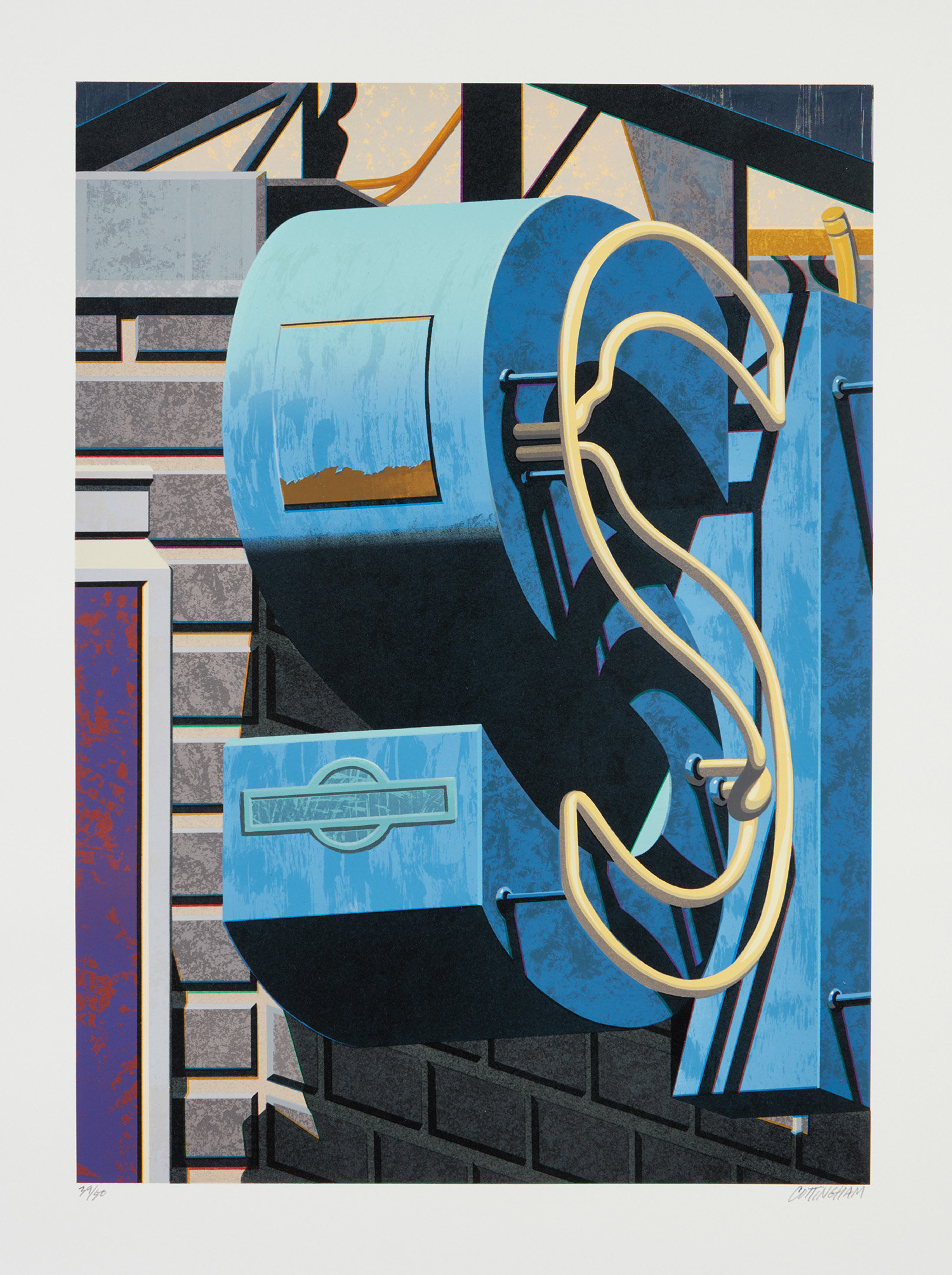
An American Alphabet: S
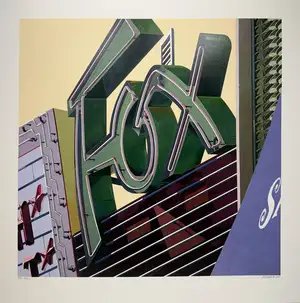
His 1971 painting Fox, depicting the cropped letters of a theater marquee in warm reds and yellows, became one of his signature images and established the visual grammar he would refine throughout the following decades. Cottingham is rightly placed within the Photorealist movement that emerged in the late 1960s and early 1970s alongside artists such as Richard Estes, Ralph Goings, and Chuck Close. Like Estes, he was drawn to urban surfaces and the poetry of the everyday American commercial environment. But where Estes often presented the full sweep of a city block, complete with reflections and spatial complexity, Cottingham worked with extreme compression and cropping, pushing his subjects toward something almost graphic in its directness.
His debt to Pop Art is also evident: Jasper Johns and Ed Ruscha both investigated the semiotics of letters and words as image, and Cottingham shares their fascination with the moment when language stops being purely functional and becomes visually charged. Yet his commitment to the handmade, to the painstaking rendering of surface and light, kept him firmly within the realist tradition. His print practice has been as rich and sustained as his work in paint and gouache. The American Signs portfolio, published in 2009 by American Images Atelier in New York, stands as one of the defining achievements of his career in printmaking.
Robert Cottingham
Fox, from the American Signs Portfolio
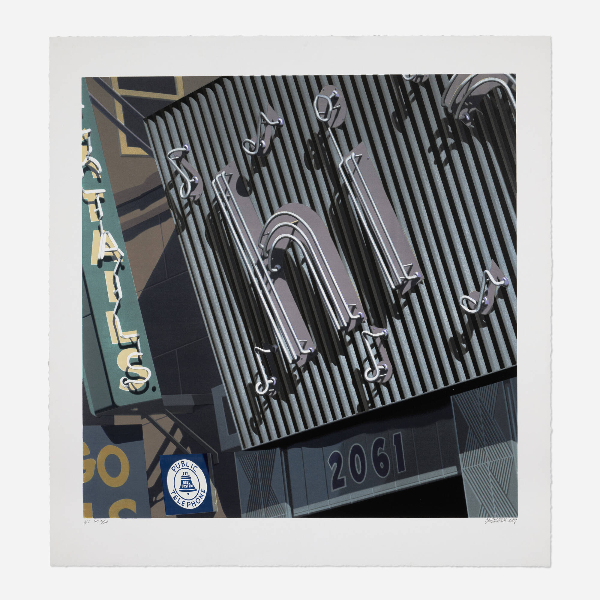
The suite of screenprints, each signed, dated, and numbered in an edition of 100, captures a range of commercial sign fragments rendered with extraordinary chromatic precision and wit. Works from this portfolio such as Fox and HI demonstrate his ability to translate the warmth and immediacy of his painted surfaces into the screenprint medium without any loss of vitality. The portfolio was issued in a gray silk covered box embossed with gold foil, a presentation that honored the gravity and completeness of the project as a unified body of work. His lithographic work, including the American Alphabet series and prints such as Bud and Orph from the Documenta portfolio on Arches paper, further demonstrates his range and his deep engagement with printmaking as a serious artistic discipline rather than a secondary activity.
For collectors, the appeal of Cottingham's work operates on several levels simultaneously. There is the sheer pleasure of looking: his images are warm, immediate, and saturated with a distinctly American nostalgia without ever becoming sentimental. The signs he depicts are often for theaters, bars, pharmacies, and small businesses that have largely disappeared from the American streetscape, which gives his work an elegiac dimension that deepens with time. His prints, particularly the American Signs portfolio works, represent an accessible point of entry into his practice and have performed consistently well at auction across major houses.
Robert Cottingham
HI (from the American Signs portfolio), 2009
Works on paper and gouaches such as the 1973 Wo offer a more intimate encounter with his process, showing the sureness and economy of his hand at close range. Collectors drawn to the American Photorealist tradition, or to artists working at the intersection of Pop and realism, will find that Cottingham holds a distinctive and irreplaceable position in that conversation. The Travel Notes series, presented as a complete portfolio of eight chromogenic prints on Fuji Flex paper, reveals another dimension of his practice: his willingness to extend his investigation of signage and commercial imagery across different media and different registers of documentation. These works carry the quality of evidence, of a sustained visual research project conducted across decades and geographies, always returning to the same essential question of what happens when we look very carefully at the letters and signs that surround us every day without truly seeing them.
Cottingham's legacy rests on something more than technical virtuosity or art historical positioning, though both are considerable. He gave serious painterly attention to an aspect of American visual culture that had been largely overlooked by the fine art tradition, and in doing so he revealed the latent beauty and formal complexity of the commercial environment that most people simply walk past. His work asks us to stop, to look again, and to find in the fragment of a neon letter or the curve of a painted awning a whole world of color, history, and human intention. That invitation remains as open and as generous today as it was when he first began issuing it more than fifty years ago.
Explore books about Robert Cottingham
Robert Cottingham
Paul Bowman
Robert Cottingham: Early and Recent Works
Linda Cathcart
Robert Cottingham: A Retrospective
Michael Paglia
Cottingham: Prints and Drawings 1968-2010
Susan Tallman
Robert Cottingham: An American Master of Realism
Constance Glenn