Koichi Sato

Koichi Sato: Poetry Rendered in Light and Silence
Artist Spotlight · The Collection Editorial
There is a particular quality of stillness that settles over you when you encounter the work of Koichi Sato for the first time. It is the stillness of early morning fog lifting from a Japanese garden, or of sunlight passing through translucent paper, diffusing into something almost immaterial. That sensation has made Sato one of the most quietly compelling figures in international graphic design and fine art for more than five decades, and yet his name remains something of a treasured secret among serious collectors who understand that underrecognition and undervalue are not the same thing. Born in Japan in 1944, Sato came of age during one of the most dynamic periods in the country's cultural history.
Koichi Sato
Brush Sense of Values
Postwar Japan was simultaneously rebuilding its material world and reimagining its relationship to its own visual traditions. Western modernism was flooding in through magazines, exhibitions, and the growing advertising industry, and young designers and artists faced a genuine question about identity: how does one absorb the International Style, Bauhaus functionalism, and Swiss typography without erasing the ink wash paintings, woodblock prints, and spatial philosophies that had defined Japanese visual culture for centuries? Sato's entire career can be understood as a sustained, luminous answer to that question. He developed his practice in Tokyo, where he became part of a generation of Japanese designers who would eventually earn global recognition while remaining deeply rooted in the aesthetics of their homeland.
His contemporaries and peers in the broader field of Japanese graphic design included figures such as Ikko Tanaka and Tadanori Yokoo, each of whom navigated the tension between East and West in strikingly different ways. Where Yokoo embraced psychedelic provocation and Tanaka pursued a more rigorous geometric clarity, Sato found his own register: the delicate, the atmospheric, the suggestive rather than the declarative. His work never shouts. It whispers, and that whisper carries extraordinary distances.
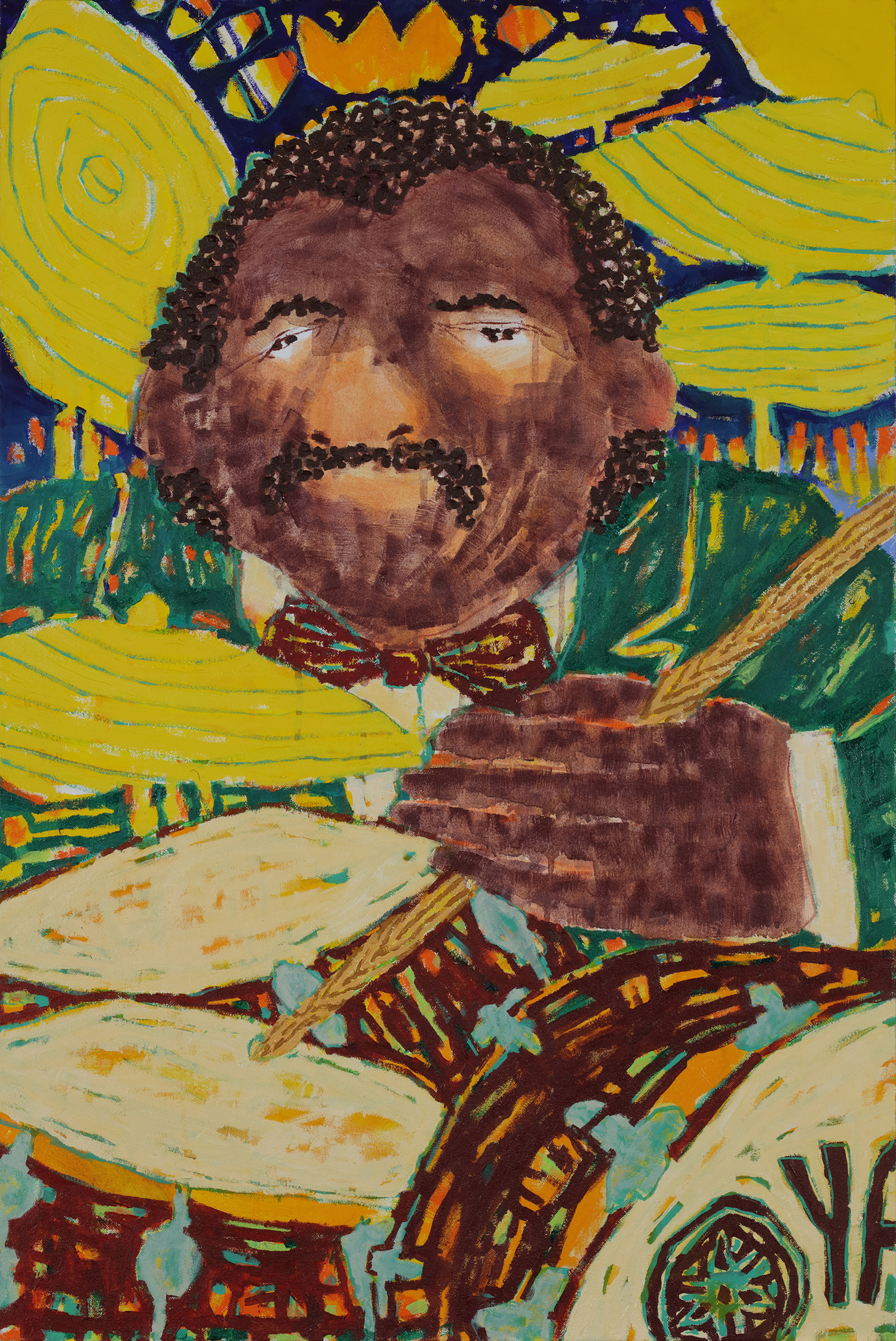
Koichi Sato
A Solo Percussionist, 2021
The signature visual language Sato developed across his poster work is immediately recognizable to anyone who has spent time with it. He builds images through layering, placing translucent fields of color atop one another in ways that recall the depth and luminosity of traditional Japanese lacquerwork or the glazing techniques of old master painting. Natural forms recur throughout his output: water, mist, petals, light diffracted through atmosphere. These are not decorative choices but philosophical ones.
Sato has consistently treated the poster format as a site of genuine poetic inquiry, asking what it means to communicate not just information but feeling, not just a message but a state of being. Among his most celebrated works is "Brush Sense of Values," a screenprint with hand finished acrylic on Saunders Waterford paper that exemplifies his synthesis of printmaking precision and painterly spontaneity. The work demonstrates his commitment to the handmade within the technically reproduced, a tension he has always managed with extraordinary grace. The choice of Saunders Waterford paper, a surface long associated with watercolor and fine art printmaking, signals that Sato positions these works not merely as graphic objects but as fine art multiples deserving the same consideration as any unique work on paper.
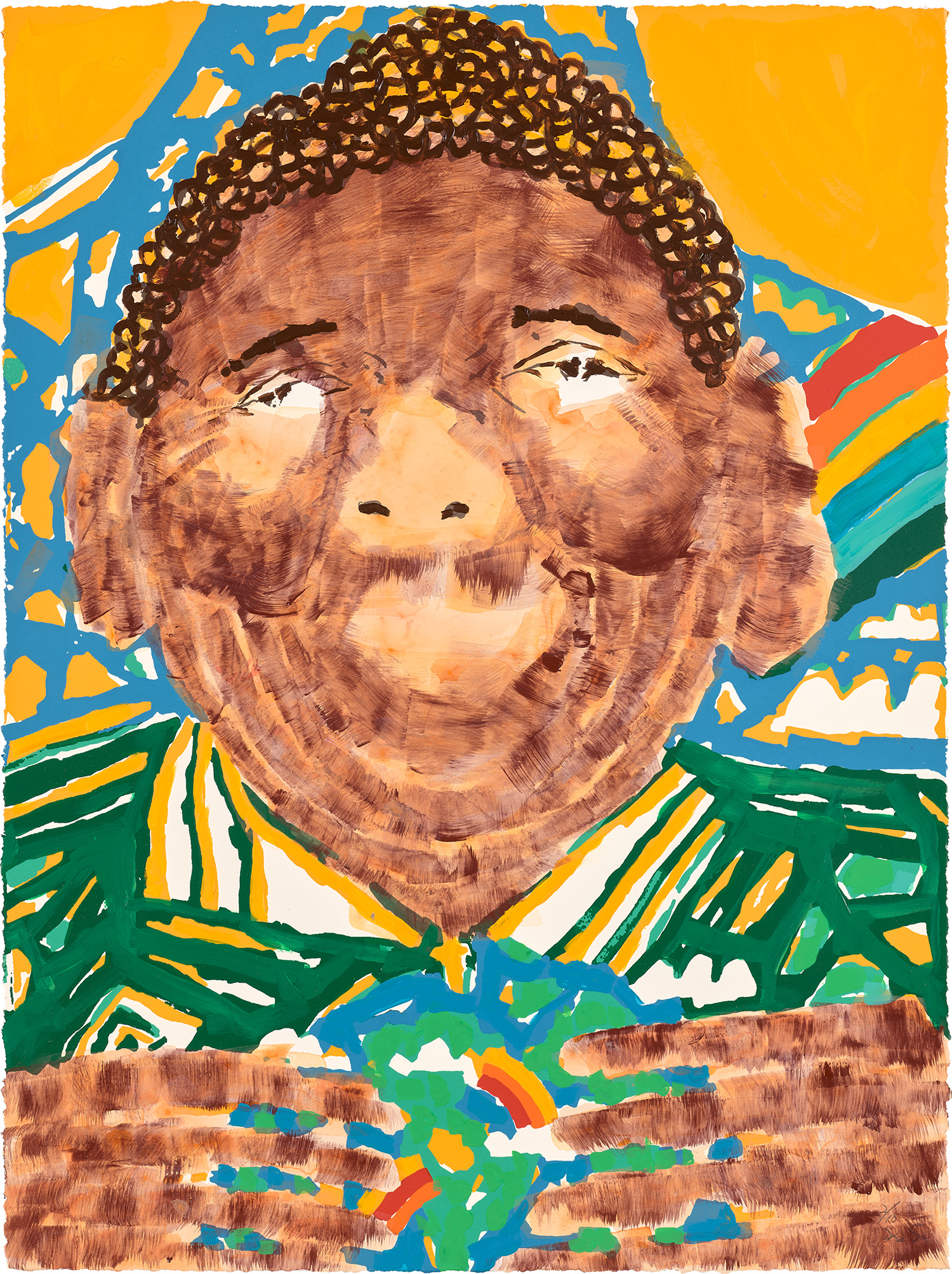
Koichi Sato
Save the World
"Save the World" similarly combines screenprint in colors with extensive hand coloring, each sheet becoming in some sense unique through the artist's direct intervention after the press. This practice places his work in a compelling conversation with artists such as Robert Rauschenberg, who also blurred the boundary between the reproduced and the touched, the mechanical and the personal. His canvas works reveal yet another dimension of the practice. "Kingdom," created in 2019 in acrylic on canvas, and the 2021 paintings "A Solo Percussionist" and "For The Heart," both executed in acrylic and oil, show an artist fully at ease in the register of pure painting.
"Tropical Rhythm and Soul" from 2020 demonstrates a warmth and chromatic richness that sits in productive tension with the more austere coolness of his graphic work. Taken together these canvases suggest a practice that has deepened and expanded in later career rather than consolidating around a single signature gesture, which is a mark of genuine artistic vitality. For collectors, Sato's work represents a genuinely rare proposition: an artist of indisputable international standing whose work remains accessible and whose depth of output rewards sustained engagement. His prints and works on paper are particularly compelling entry points.
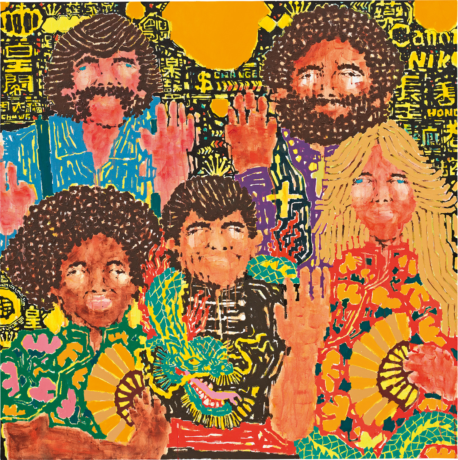
Koichi Sato
Kingdom, 2019
The hand finishing he applies to many screenprints means that no two works are truly identical, giving collectors the intimacy of an original while also acquiring a work that exists within the context of an edition. This places Sato alongside printmakers such as Helen Frankenthaler and Ellsworth Kelly, who similarly used the print medium as a serious expressive arena rather than a secondary commercial activity. The use of fine art papers and archival materials throughout his practice also speaks to a commitment to permanence, which matters enormously to collectors thinking across generations. Sato has received recognition from some of the most prestigious design institutions in the world, and his works have entered collections across Europe, North America, and Asia.
His posters have been exhibited in museum contexts that position them firmly within the history of twentieth and twenty first century art rather than merely the history of commercial communication. This institutional validation matters in the market, where the line between design and fine art can still affect how works are valued and discussed. Sato's career makes a compelling case that the distinction has always been somewhat artificial, and sophisticated collectors have long understood this. What makes Sato matter today, in a moment of overwhelming visual noise and algorithmic image production, is precisely the quality that has always defined his work: intentionality.
Every translucent layer, every hand applied stroke, every decision about paper and pigment and pressure speaks of an artist who believes that the act of looking is itself a form of attention worth cultivating. His work asks its viewers to slow down, to allow the image to unfold rather than to consume it in an instant. In a culture that increasingly treats images as disposable, that invitation feels not nostalgic but radical. Koichi Sato has spent more than five decades making the case that beauty is not decoration but argument, and that argument has never felt more necessary.