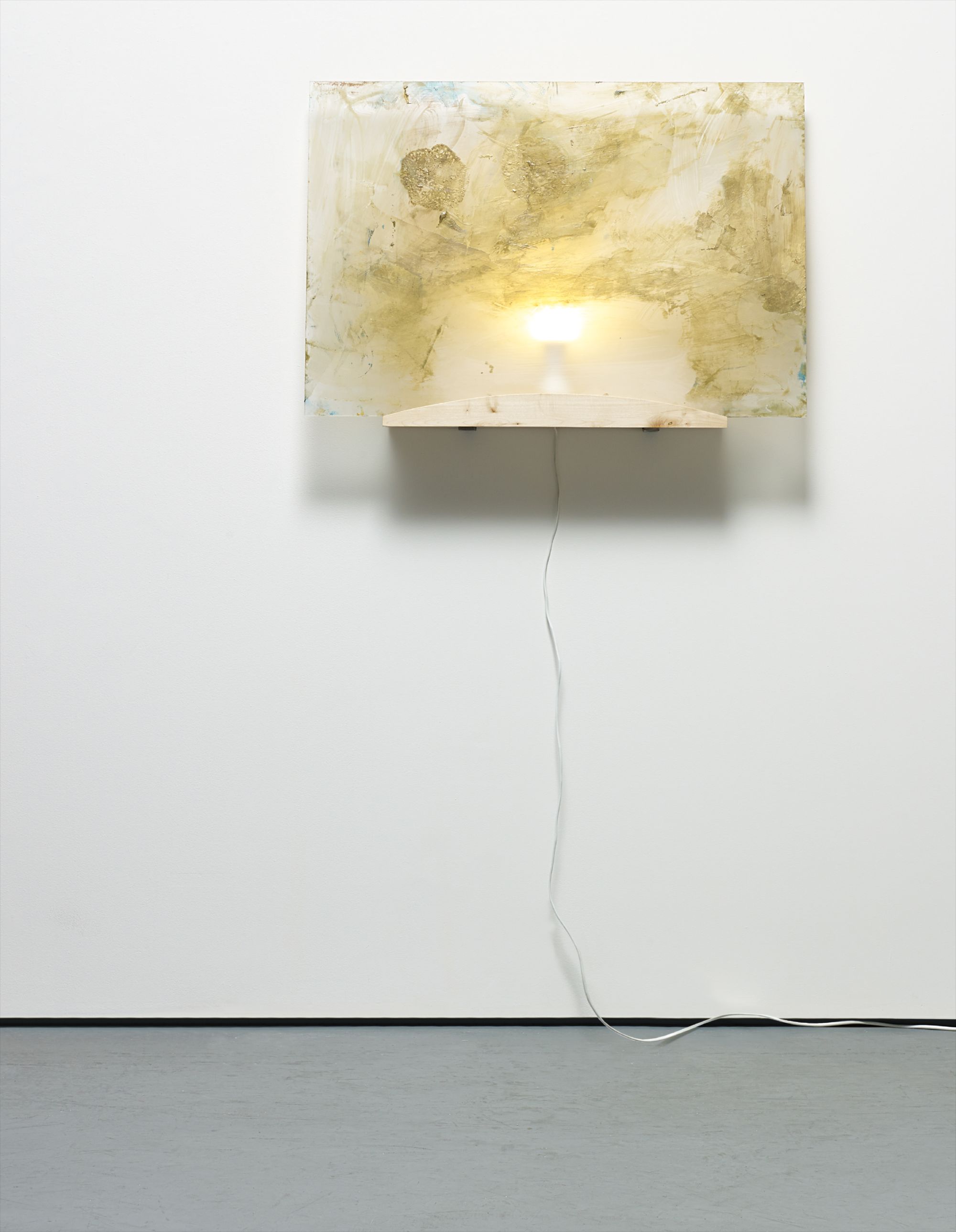
Golden Tones
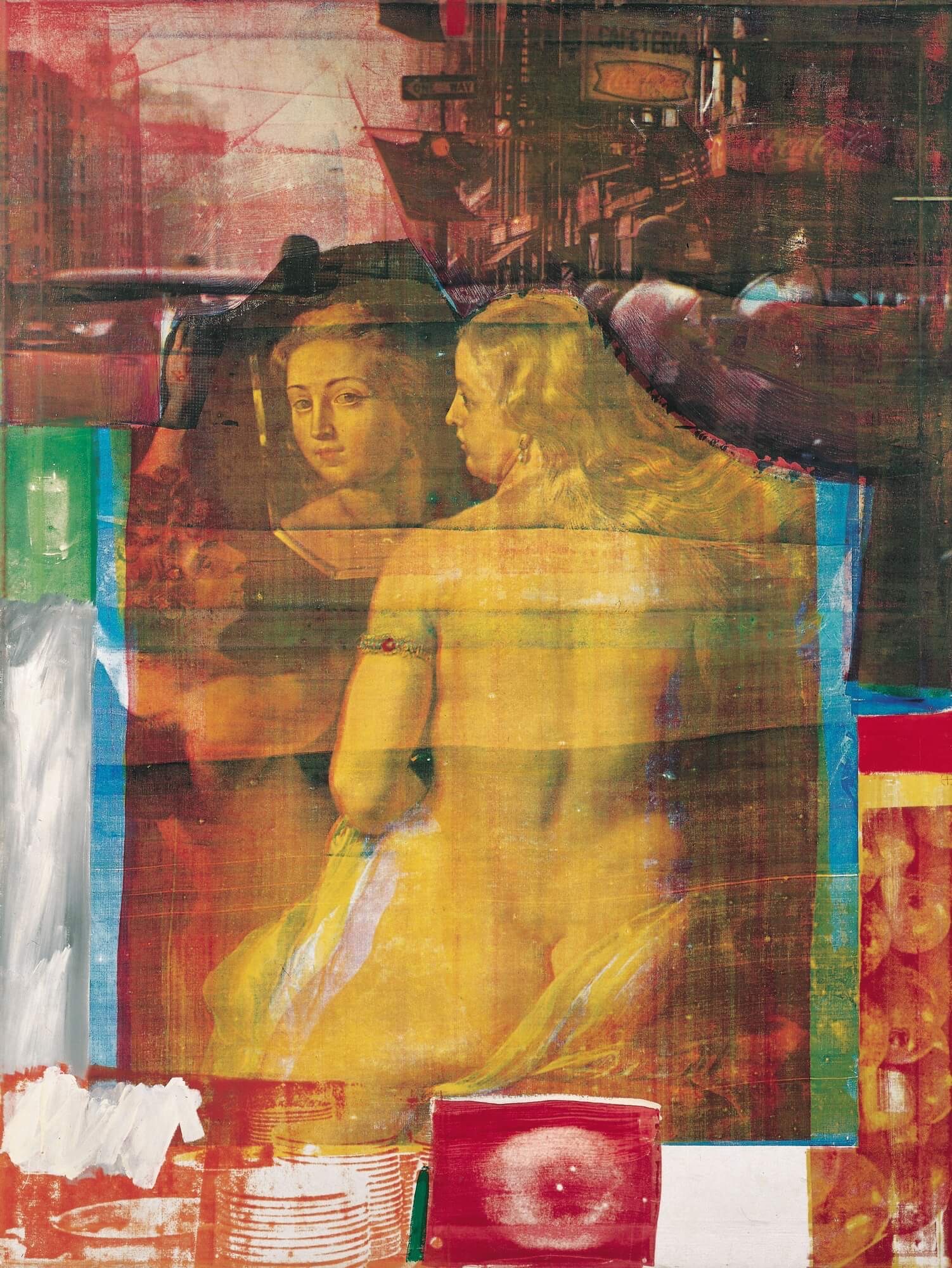
Robert Rauschenberg
Persimmon, 1964


The Warmth That Never Leaves the Room
There is a particular quality of light that certain paintings hold in perpetuity, a warmth that seems to emanate from within the canvas rather than from any external source. Collectors who live with golden toned works speak of them in almost physiological terms: the room feels different, the evening feels longer, the eye returns again and again without fatigue. This is not nostalgia exactly, though it has something to do with memory and with the way amber and ochre and burnished sienna register in the body before the mind has time to form a judgment. It is, perhaps, the oldest visual pleasure we have.
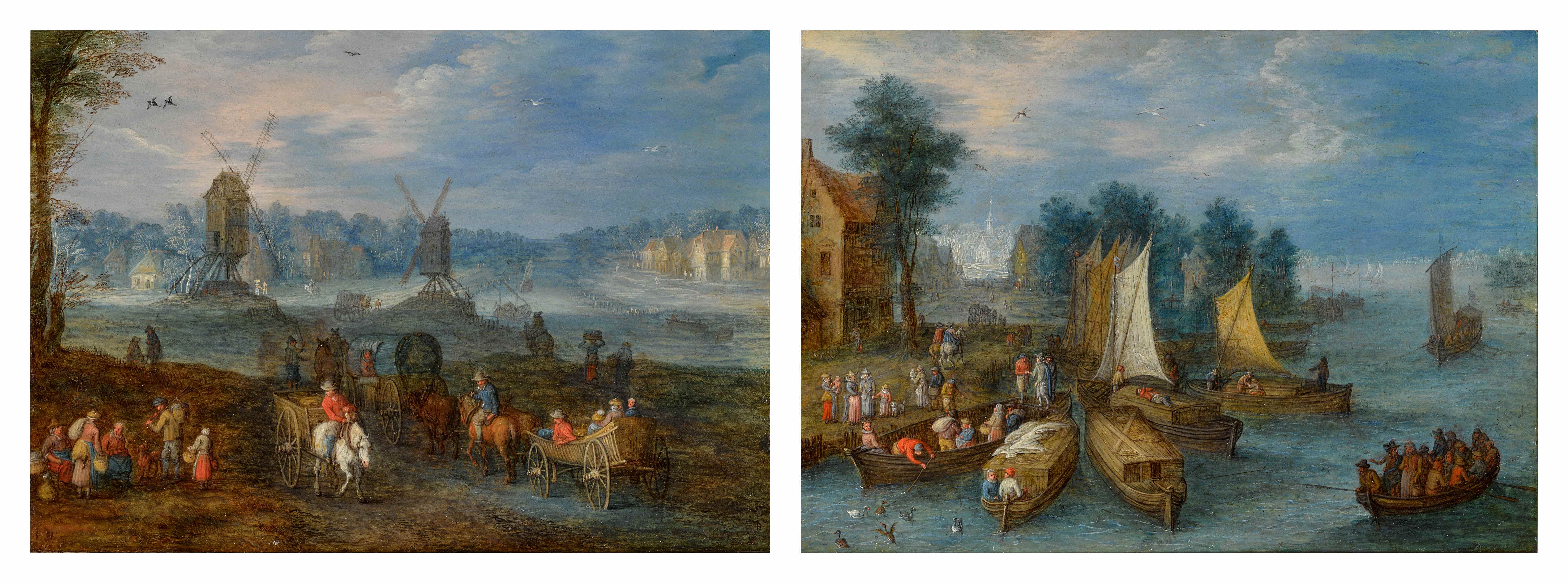
What draws serious collectors to this territory is precisely that combination of immediacy and depth. A golden toned painting rewards the glance but also the sustained look. The Dutch and Flemish masters understood this instinctively, building their luminosity through layers of translucent glazes that took weeks to dry and that still, centuries later, seem to breathe. The Venetian tradition, running from the Bellinis through Titian and into the eighteenth century bravura of Giovanni Battista Tiepolo, approached that warmth differently, through atmosphere and gesture and the particular way southern light falls across silk and skin.

Giovanni Battista Tiepolo
Giovanni Battista Tiepolo | St. Francis Of Paola Holding A Rosary, Book, And Staff
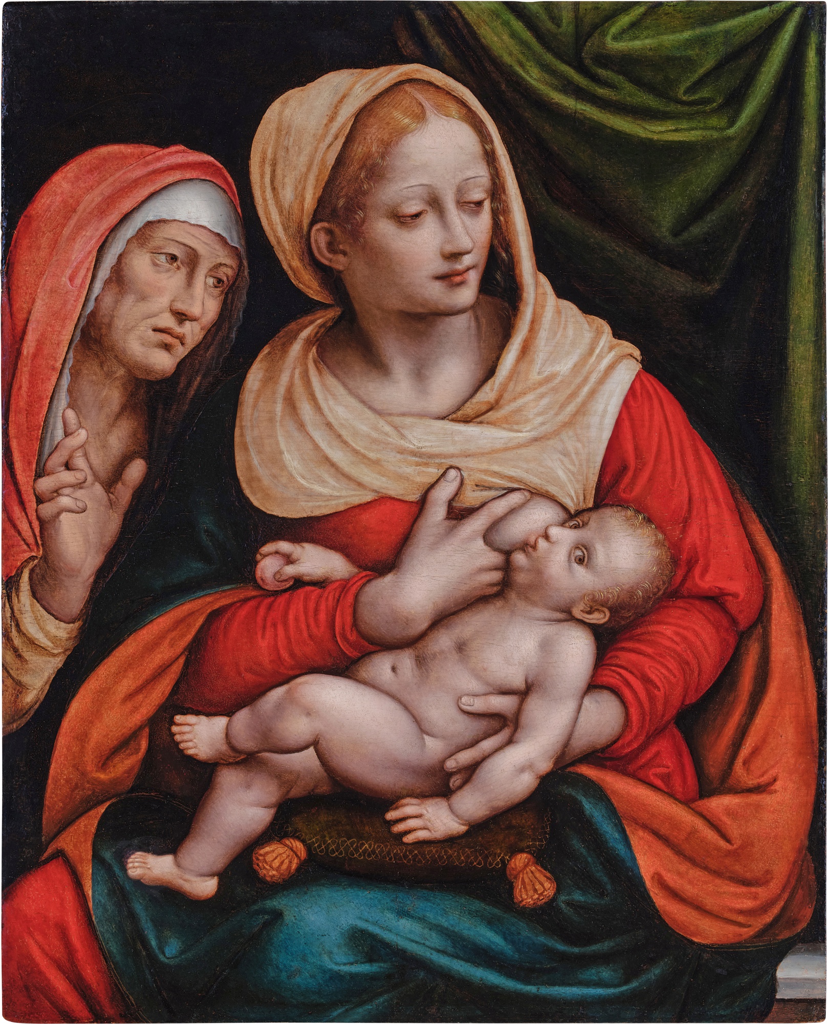
Both traditions produced works that collectors today find inexhaustible to live with. Separating a good work from a great one in this category requires attention to a specific quality that dealers sometimes call internal coherence, the sense that the warmth of the palette is not decorative but structural. In a still life by Willem Kalf, for instance, the golden tones are not applied as a mood but as a function of how he understood light moving across pewter and glass and citrus peel. The great works in this mode hold together tonally in a way that lesser examples do not: where a weaker hand produces a painting that simply looks old or yellowed, a masterful one produces something that appears genuinely lit from within.
Look carefully at whether the warmth is consistent across the composition or whether it feels applied in passages, because that inconsistency almost always signals a studio work or a later imitation. Among the artists well represented on The Collection, several reward particular attention from a market perspective. Jan van Huysum occupies a position of sustained institutional and collector interest, his flower pieces having set strong benchmarks at major houses for decades. Works attributed to or from the circle of Jan Davidsz.
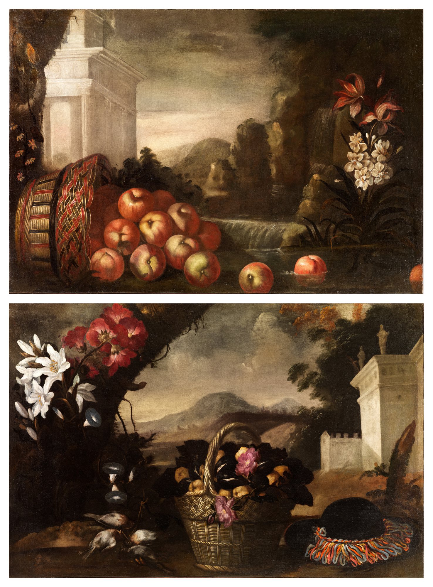
Tomás Hiepes
Nature morte au panier de pommes renversé ; Nature morte au panier de fleurs et de fruits
de Heem similarly hold value with unusual stability, partly because his influence was so wide that connoisseurship around attribution remains an active scholarly conversation, which tends to support prices when documentation is solid. Nicolaes Maes, whose candlelit interiors and warm domestic scenes were undervalued for much of the twentieth century, has seen meaningful reappraisal, and his works now trade with a confidence that reflects renewed curatorial attention. Tomás Hiepes, the Spanish still life painter whose work sits in a slightly cooler market than his Flemish contemporaries, represents one of the more compelling cases for the patient collector who believes in the long arc of art historical reassessment. The question of emerging opportunity in golden toned work is genuinely interesting right now because the category spans centuries and media.
Fredrik Værslev, whose painting practice engages directly with questions of surface, atmosphere and the passage of time, brings a contemporary intelligence to tonal warmth that feels entirely of the present moment while remaining in clear dialogue with older traditions. Richard Misrach, working in large format photography of landscape and light, produces images whose amber and gold registers have drawn serious collecting attention and whose market has grown steadily as photography collecting has matured. These are artists for whom the golden tonal register is not a stylistic choice but a philosophical one, and that distinction matters enormously over the long term. At auction, works in this tonal range perform with notable consistency across price points, though the market rewards clarity of attribution and condition above almost everything else.
Fredrik Værslev
Landscape: Gold #2
The strong results at Christie's and Sotheby's for Dutch Golden Age still life and Venetian decorative works over the past decade reflect a collector base that is genuinely international, with sustained interest from American, European and Asian buyers. What the secondary market shows, when you look at it carefully, is that warmly toned works in good condition and with clear provenance tend to hold their value through difficult periods better than cooler or more conceptually extreme work. There is something about the register of gold and amber that reassures, and that reassurance has a price. Practically speaking, collectors should be alert to several considerations before committing to a purchase.
Condition is paramount and in golden toned Old Master works particularly so, because old varnish can create a false warmth that obscures the true palette beneath. Always ask whether a work has been cleaned recently, and if not, request an ultraviolet examination to assess old restorations. For works on panel, which includes several pieces from the Flemish and Italian traditions represented on The Collection, ask about any history of cradle reinforcement and the current stability of the support. For contemporary works and photographs, ask specifically about editions: in Misrach's case, knowing the edition number and total print run is essential to understanding both the scarcity and the resale market.
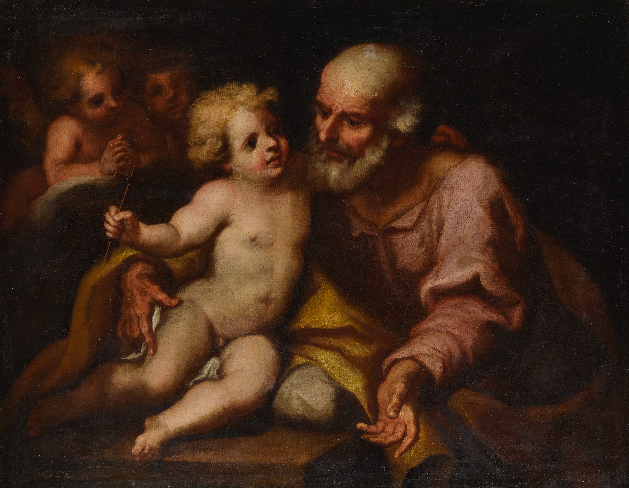
Genoese School, late 17th century
Saint Joseph and the Christ Child
When displaying golden toned works at home, resist the impulse to flood them with cool white light. Warmer incandescent or halogen sources, positioned to create directional fall rather than even illumination, will reveal the internal structure of the palette in ways that overhead LED strips simply cannot match. The painters who made these works were thinking about candlelight and firelight and the particular amber quality of afternoon sun through imperfect glass, and honoring that in your display is not sentimentality but good stewardship.