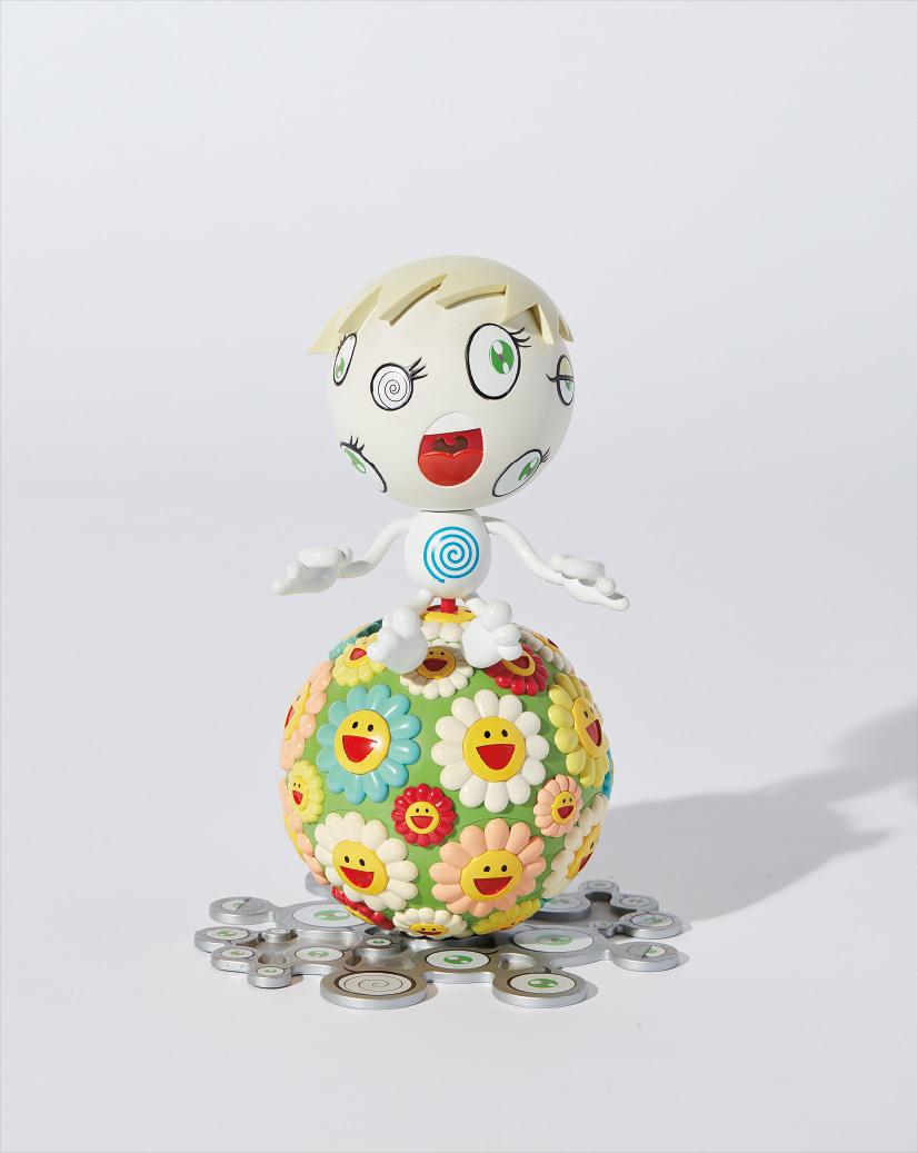
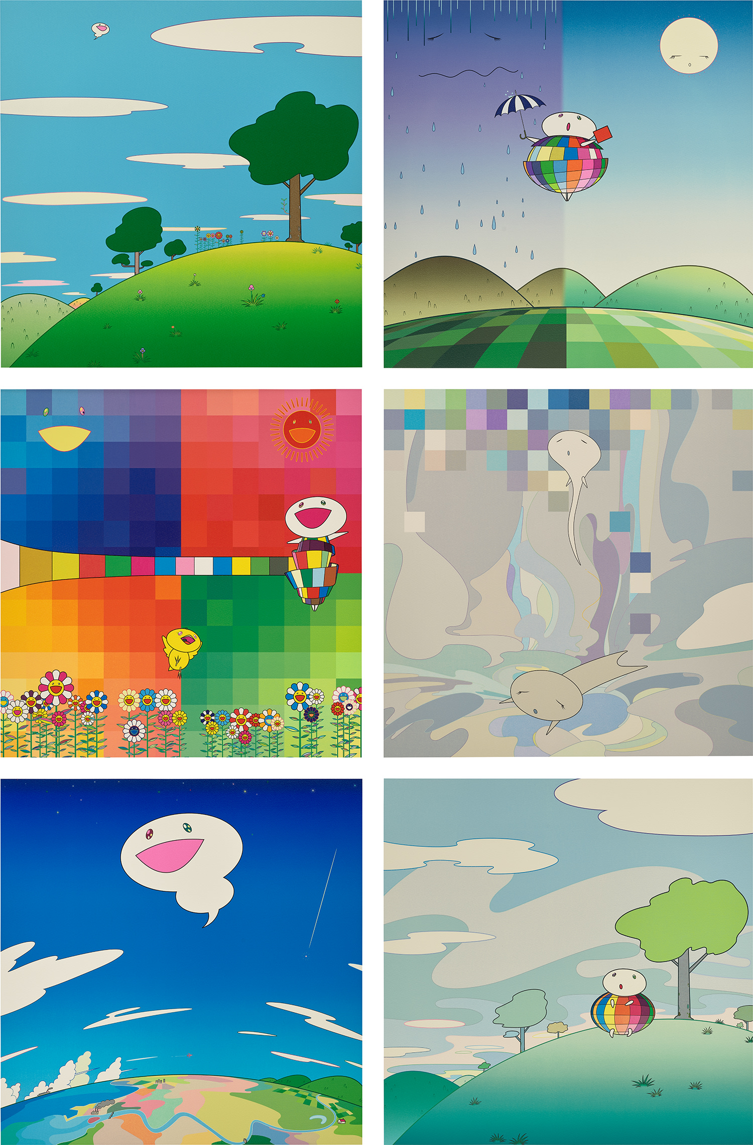
Bright Colors
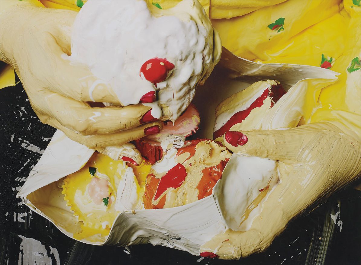
Boo Ritson
Cupcake, 2007


Color as Argument: Why Bright Sells
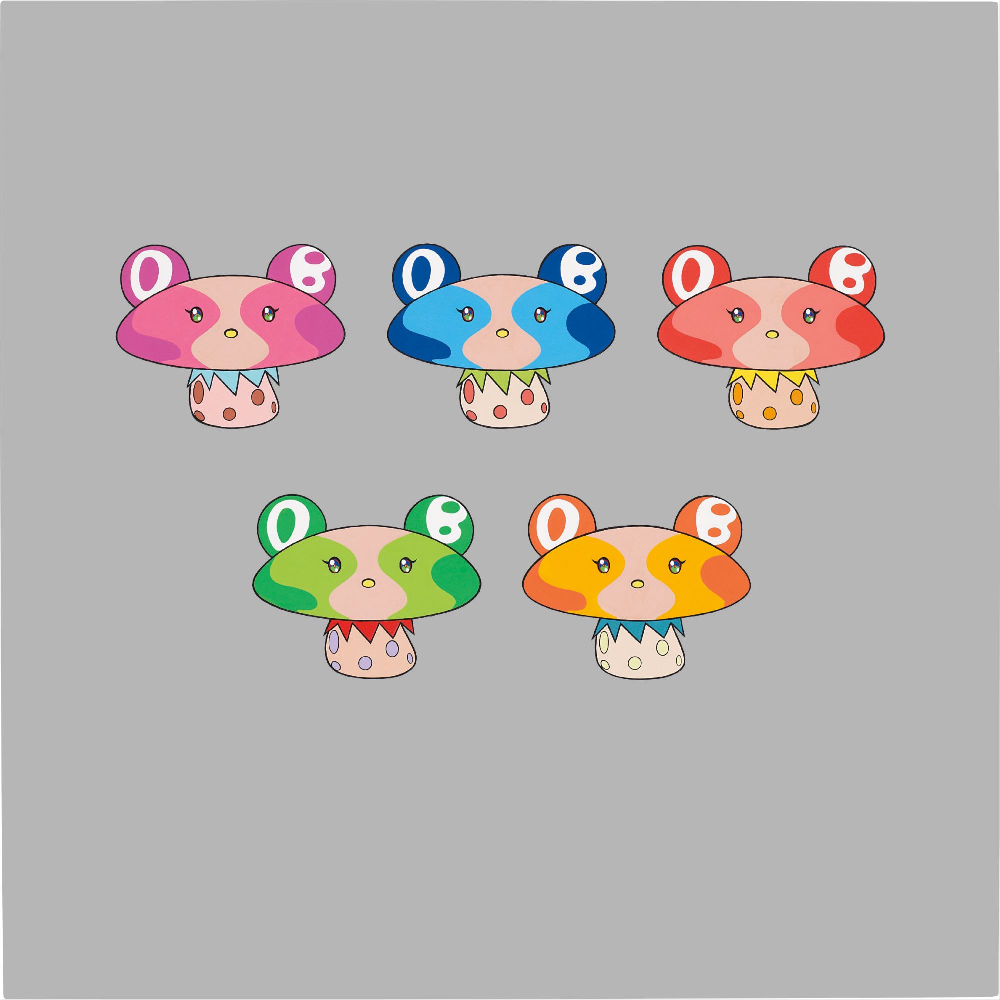
When Takashi Murakami's cheerful, psychedelically saturated canvases began commanding eight figure sums at Christie's and Sotheby's in the late 2000s, some critics dismissed the results as a symptom of market froth. More than a decade later, those prices look like early signals of a fundamental shift in how collecting culture values chromatic intensity. Brightness, it turns out, is not a superficial quality. It is a position, a philosophy, and increasingly, a reliable store of value.
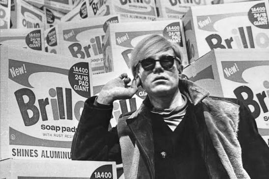
The recent surge of interest in color forward painting owes something to a broader institutional reconsideration of Pop and its aftermath. The Museum of Modern Art's 2022 Andy Warhol retrospective, which traveled extensively and drew record attendance, reminded audiences that Warhol's genius was inseparable from his promiscuous relationship with pigment. The silkscreened Maos, the Marilyns, the electric chair series: all of them use color not decoratively but rhetorically. Warhol understood that a single high key hue could destabilize a familiar image, making it simultaneously more seductive and more unsettling.
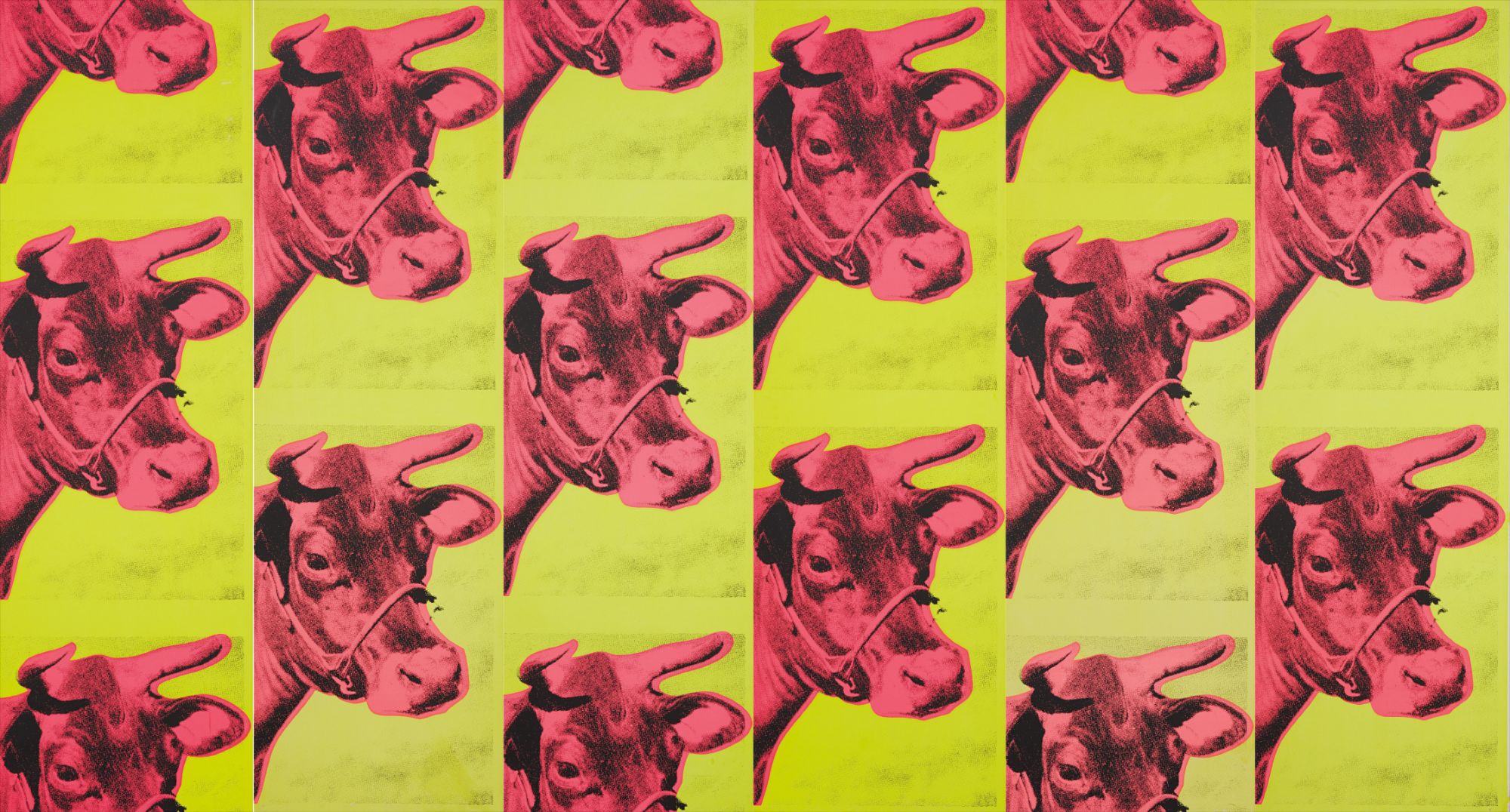
Andy Warhol
Cow Wallpaper, Wall panels
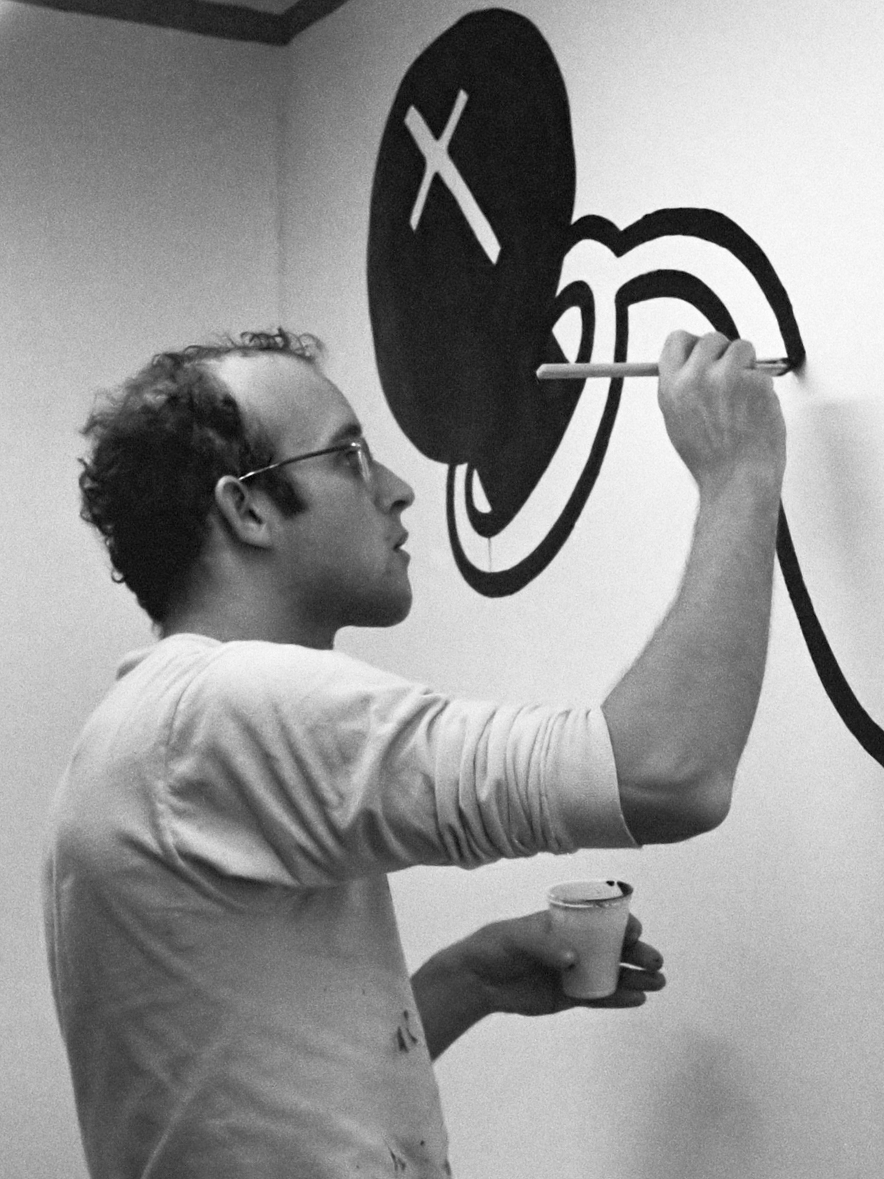
His work, well represented on The Collection, remains the clearest argument for why brightness can carry genuine critical weight. The auction market has been direct about its enthusiasm. Roy Lichtenstein's Ben Day dot works continue to perform reliably at the major houses, with major canvases regularly clearing the twenty million dollar threshold. Keith Haring's bold, graphic figures rendered in flat primary colors have seen consistent price appreciation since a wave of institutional reassessment began around the time of his foundation's fortieth anniversary programming.
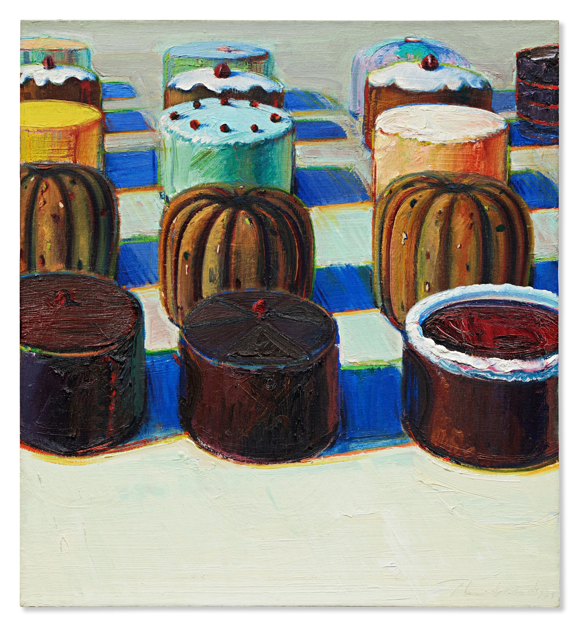
Wayne Thiebaud's confectionary still lifes, painted in luscious, almost edible impasto, achieved prices in the high millions at auction in the early 2020s, demonstrating that bright color in a resolutely painterly tradition carries just as much market conviction as its more conceptually framed Pop counterparts. What the auction results collectively reveal is less a taste for novelty than a deep hunger for works that communicate immediate, unambiguous visual pleasure while retaining enough critical complexity to reward sustained looking. Jeff Koons occupies this territory with particular authority. His balloon sculptures and paintings are designed to short circuit intellectual distance, pulling viewers into a register of pure delight before the conceptual scaffolding becomes apparent.
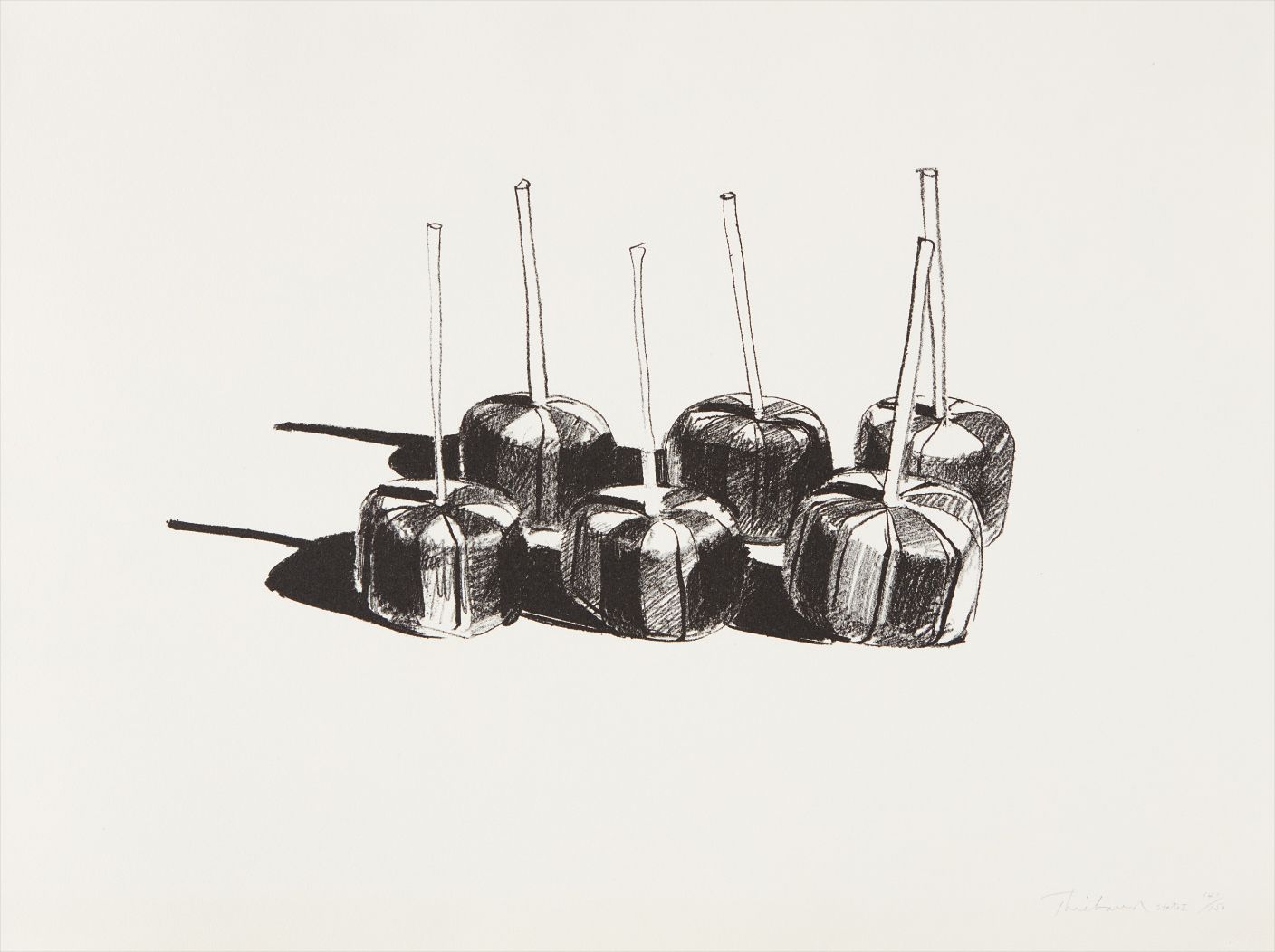
Wayne Thiebaud
Suckers (State I)
Institutions including the Whitney Museum of American Art and the Broad in Los Angeles have made significant Koons acquisitions precisely because his work sits at the productive intersection of accessibility and theoretical weight. The Broad's collection more broadly signals where institutional appetite currently lives: bright, legible, culturally fluent work that holds its own in a public facing context. Meanwhile a younger generation of artists is pushing the chromatic conversation in directions that feel less beholden to Pop's commercial vernacular. Trudy Benson's digitally inflected paintings use color in a way that feels native to screen culture without being reducible to it.
Allison Zuckerman raids art history with gleeful aggression, recombining and oversaturating canonical images until they pulse with an almost aggressive luminosity. Both artists are finding serious collectors and gaining critical traction, suggesting the conversation around bright color is expanding rather than consolidating around its canonical figures. Kenny Scharf and Peter Halley, whose roots are in the downtown New York scene of the 1980s, continue to be recontextualized as progenitors of exactly the kind of chromatic maximalism that feels urgent to younger practitioners. The critical conversation has been shaped in meaningful ways by a handful of key voices.
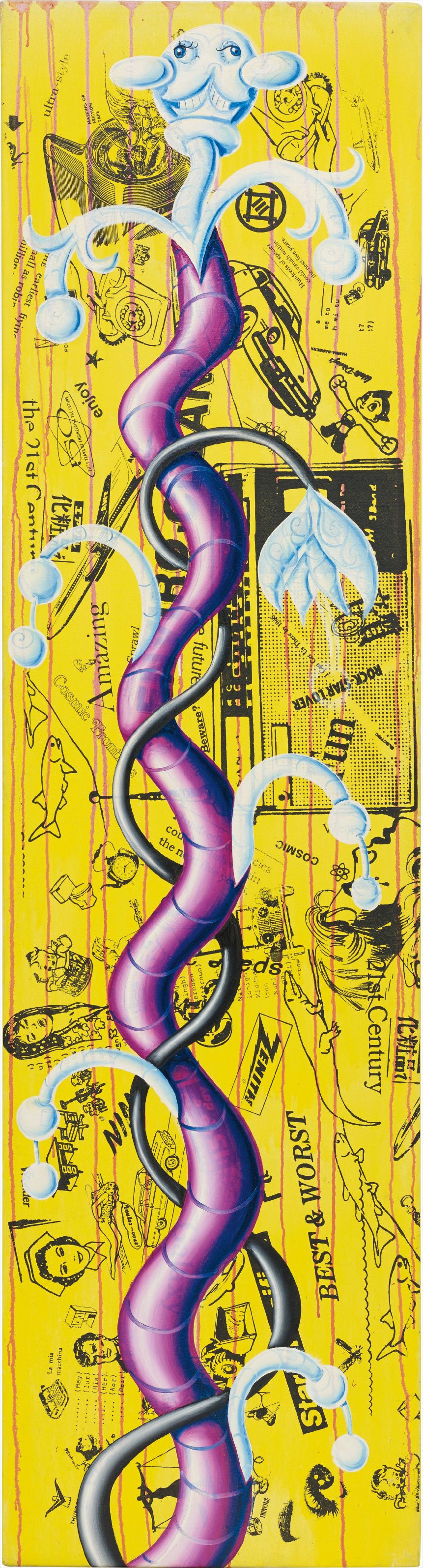
Kenny Scharf
Yellogro
Curator Katy Siegel's writing on American painting has provided useful frameworks for understanding why color operates as ideology as much as aesthetic choice. The journal October has occasionally engaged with these questions from a more skeptical angle, which usefully creates friction and keeps the discourse honest. Frieze and Artforum have both given significant column inches to the question of pleasure and its relationship to critique, with several writers arguing persuasively that the long critical suspicion of the decorative has itself become a kind of orthodoxy worth questioning. David Hockney's ongoing presence in this conversation is worth noting: his iPad paintings and his swimming pool canvases have made him something of an unlikely theorist of color in the digital age, and his 2017 retrospective at Tate Britain drew audiences that reminded the art world how hungrily the public responds to work that refuses to be dour.
International collecting has added a new dimension to where the energy sits. Yue Minjun's laughing figures, executed in acid bright flesh tones, became a flashpoint for discussions about irony, socialism, and consumer culture when they began appearing at Western auction houses in the early 2000s. They remain a sharp reminder that chromatic exuberance is not a culturally neutral category: it carries different freight depending on its context of production and reception. Javier Calleja's cartoon inflected figures, operating in a space between street art and studio practice, point toward a globalized collecting community that is comfortable moving fluidly between registers and geographies.
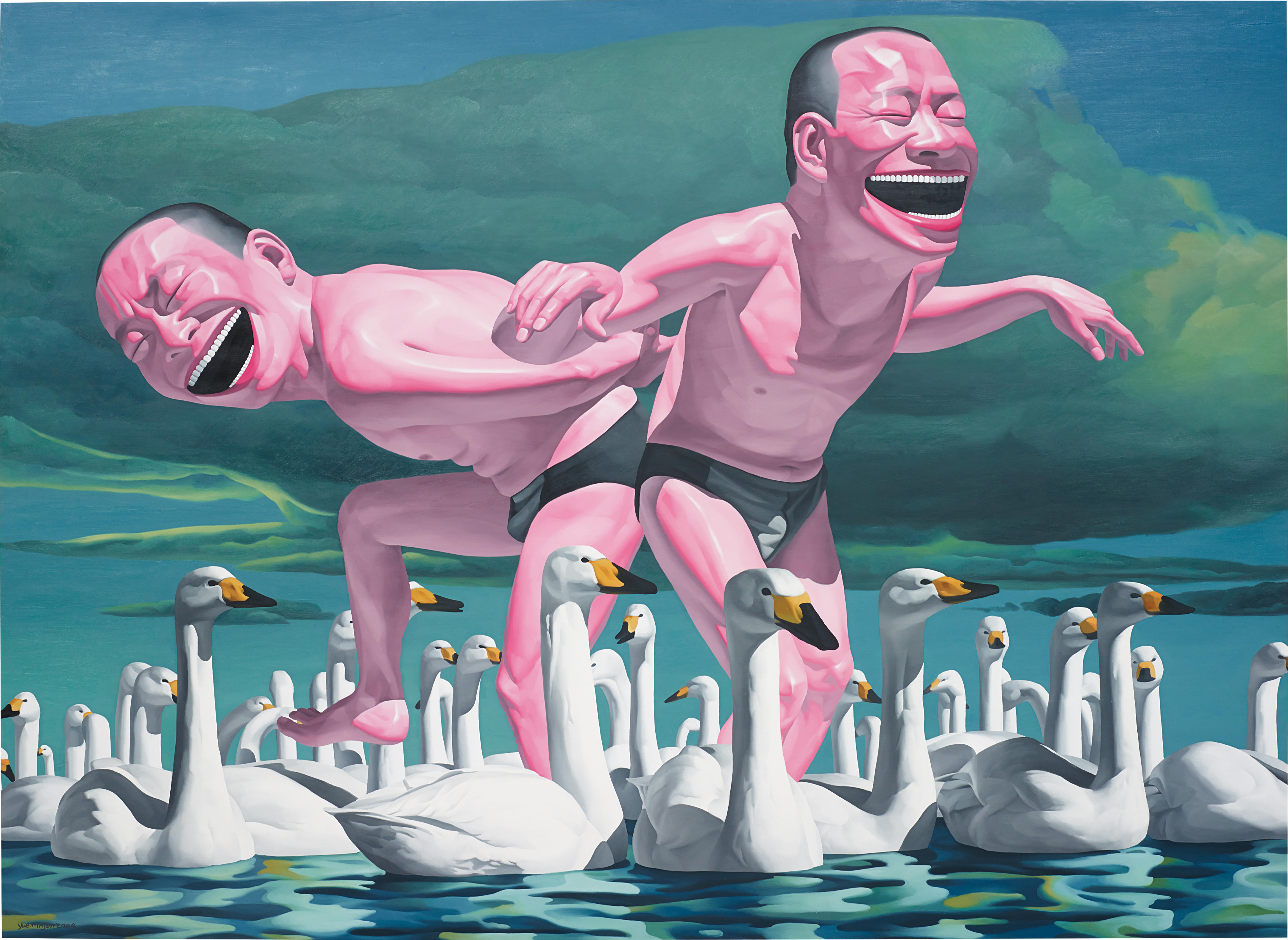
Yue Minjun
Free at Leisure No. 11
Where does the energy feel most alive right now? The most interesting space is probably the territory between painting and digital production, where artists like Benson are working, where the question of what counts as a color decision becomes genuinely unstable. There is also renewed institutional interest in figures who were not fully absorbed into the canonical story the first time around. Corita Kent, the Los Angeles nun and artist whose silkscreen works from the 1960s and 1970s blend commercial typography with spiritual yearning in dazzling color combinations, has been the subject of significant reappraisal and deserves to be considered alongside Warhol as a master of the form.
What feels settled is the core Pop canon. What feels alive is everything that sits in the margins of that story, waiting for the right exhibition or the right critical essay to make its importance legible. The works on The Collection reflect exactly that range: canonical anchors surrounded by the more restless, searching energies that make collecting genuinely exciting.