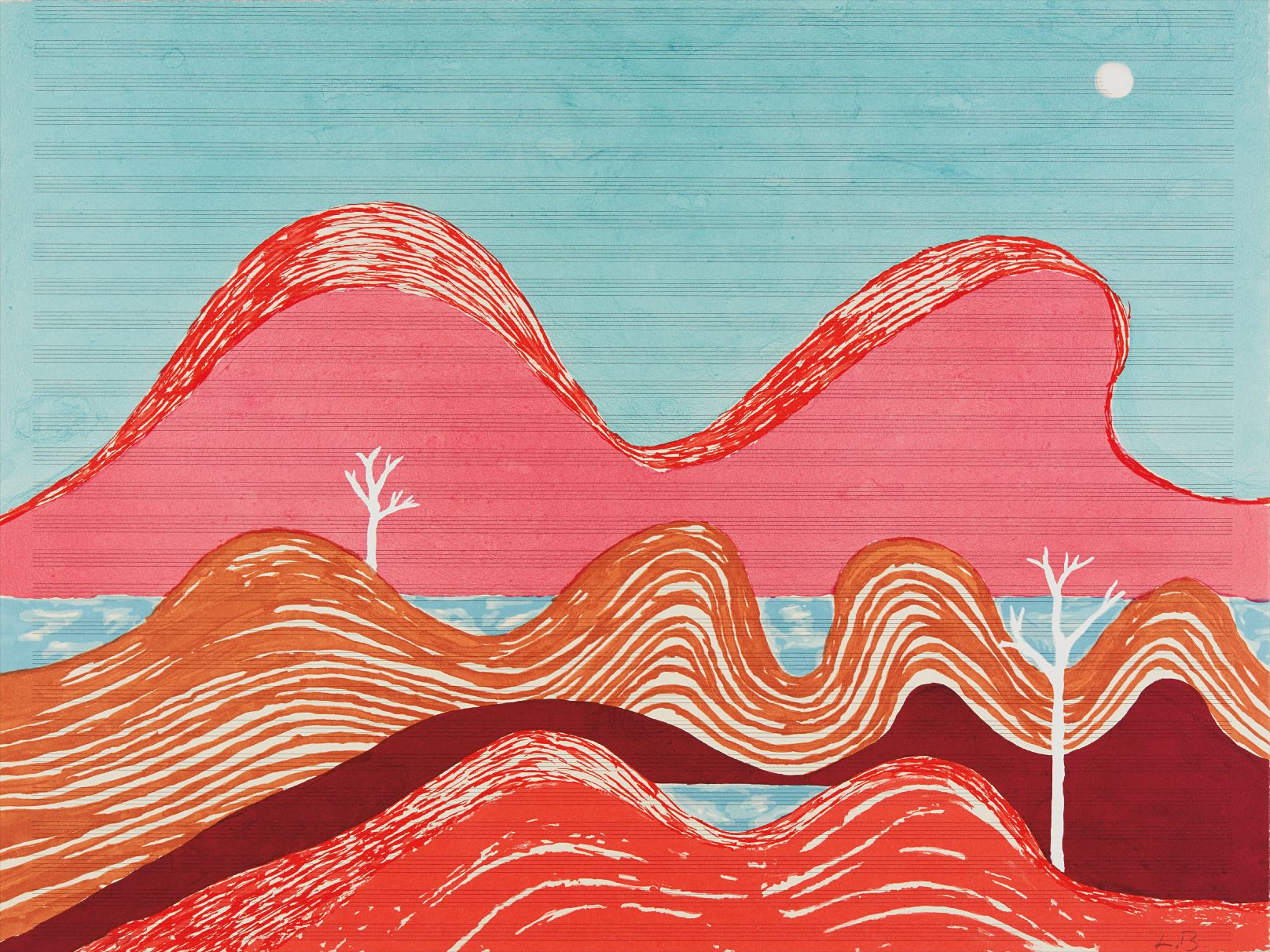
Warm Colors
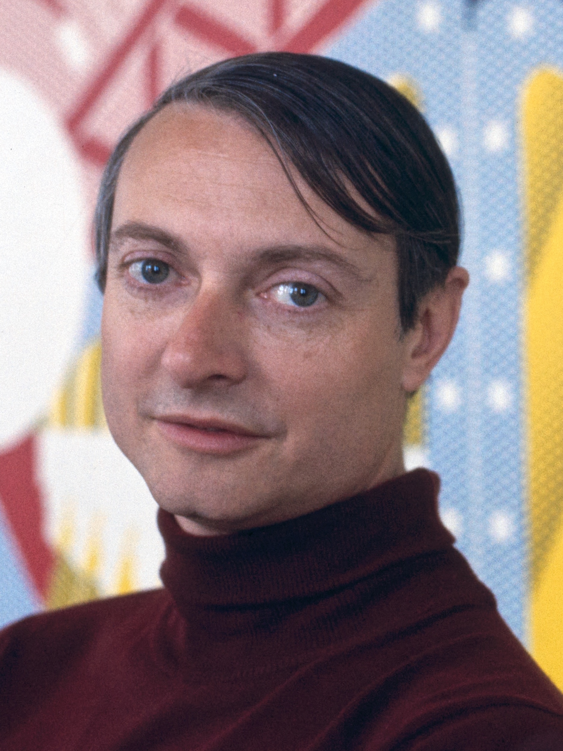
Jim Dine
Pinocchio


The Heat Inside: How Warm Colors Burn
There is a moment, standing in front of the right painting, when you feel the temperature change. The room does not warm, but something in you does. This is the particular power of warm color, one of the oldest and most visceral tools in an artist's kit, and also one of the most misunderstood. Too easily dismissed as decorative or emotionally obvious, warm color, when used with intelligence and intention, is anything but simple.
It is a carrier of memory, desire, grief, and joy, often all at once. The story of warm color in Western art begins long before the Impressionists made it famous. The reds and ochres of Lascaux, painted roughly 17,000 years ago, were not aesthetic choices so much as existential ones. The materials at hand, iron oxide, manganese, charcoal, produced a palette that happened to be warm, and that warmth gave the animals on those walls a pulsing, living quality that still arrests visitors today.
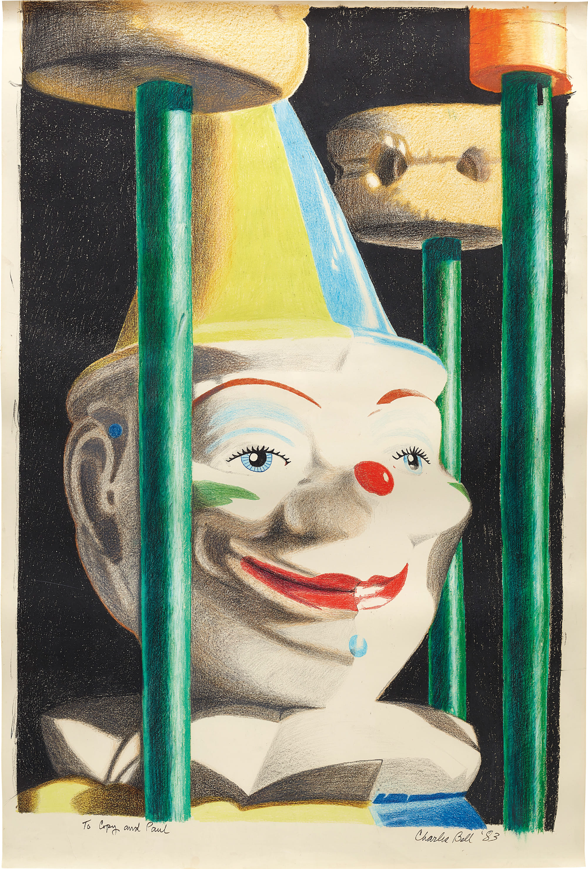
Charles Bell
Rolly Polly Clown, 1983
By the Renaissance, artists like Titian had understood that warm color could do something cool color could not: it could make flesh feel inhabited. His use of deep reds and luminous golds established a language that painters have been fluent in ever since. The nineteenth century brought a more systematic understanding of what warm color actually does to the eye and the nervous system. In 1839, the chemist Michel Eugène Chevreul published his landmark work on simultaneous contrast, explaining how adjacent colors intensify or neutralize one another depending on their position on the spectrum.
The Impressionists absorbed this knowledge eagerly. By the 1870s and 1880s, painters like Pierre Bonnard, who would go on to develop one of the most ravishing warm palettes in modern art, were beginning to understand color not as description but as sensation. Bonnard in particular treated interior spaces as vessels for accumulated warmth, rooms where the light seemed to come from inside the objects themselves rather than from any external source. Post Impressionism pushed this further into pure feeling.
Vittorio Brodmann
Inside the Beehive, 2014
Paul Gauguin, departing France for Brittany and later Polynesia, stripped color of its documentary function entirely. His 1897 painting "Where Do We Come From? What Are We? Where Are We Going?
" deployed warm golds, ochres, and earthy reds not to represent tropical light accurately but to conjure a psychological and spiritual atmosphere. Henri Matisse carried this ambition into the twentieth century with almost frightening confidence. His 1905 painting "Woman with a Hat," shown at the Salon d'Automne that year alongside work by André Derain and Maurice de Vlaminck, scandalized Paris precisely because its warm colors refused to stay in their descriptive lanes. A green stripe down a face, a red that belonged to no shadow in nature: this was warm color as declaration.
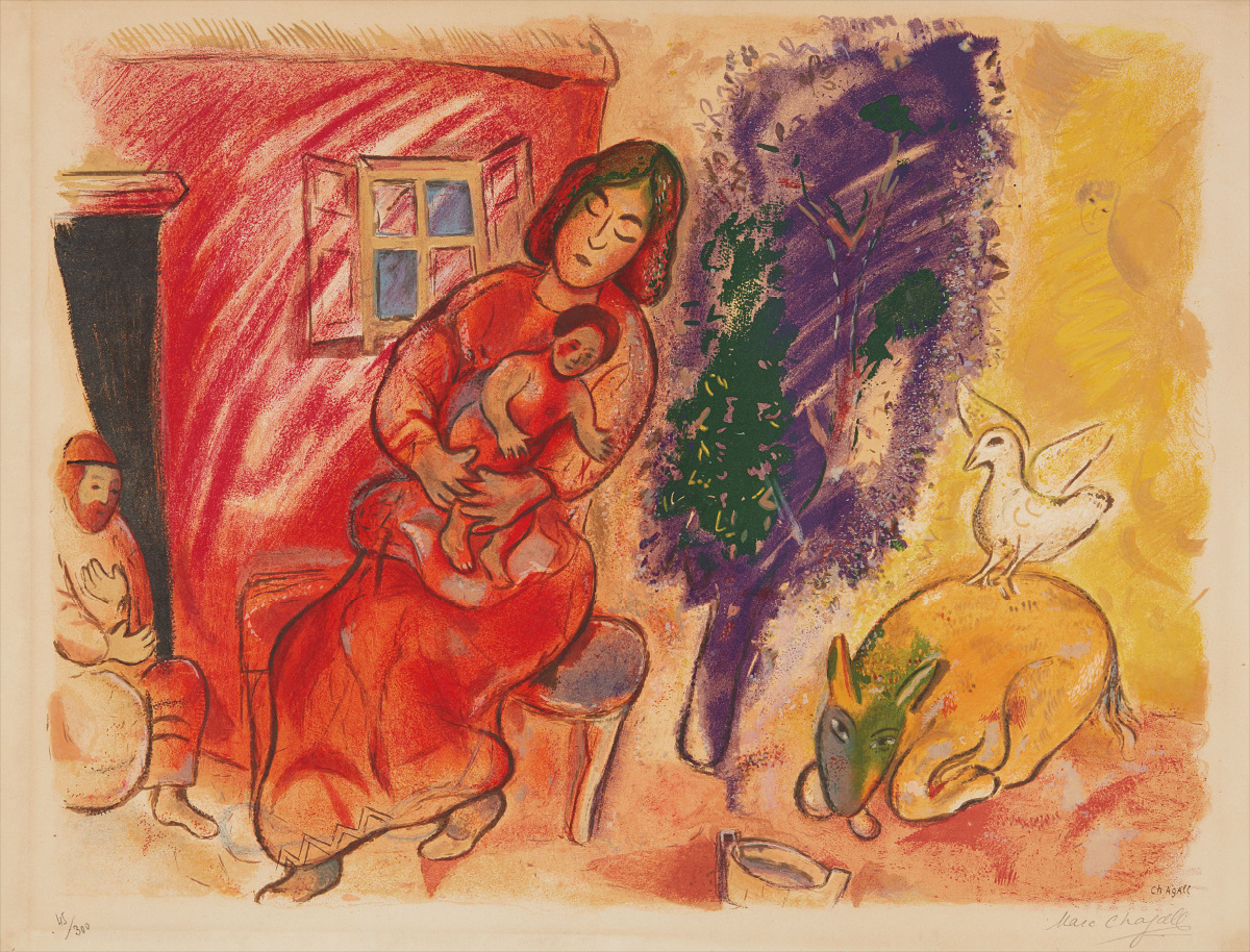
Marc Chagall
Maternité (Maternity)
The mid twentieth century saw warm color become a site of conceptual and emotional inquiry rather than simply a formal element. Marc Chagall, whose work spans the early Soviet period through to his late career in France, used warm yellows, oranges, and reds to conjure a lost world, the shtetl communities of Eastern Europe, with a tenderness that never collapsed into sentimentality. His floating figures and dreamlike compositions only cohere as images because the warmth of his palette acts as a kind of emotional gravity. Howard Hodgkin, working decades later in Britain, approached warm color from a different angle entirely: for him, it was the residue of experience, the trace left behind after a specific encounter or memory had faded.
His thickly painted boards, built up over years with layers of cadmium orange and burnt sienna, feel less like representations than like the afterglow of something intensely felt. Pop art brought warm color into an entirely new register. Roy Lichtenstein borrowed the bold reds and yellows of commercial printing and turned them into a commentary on desire and mass culture. Robert Indiana made warm color almost heraldic, using red and gold in works that felt simultaneously like road signs and love letters.
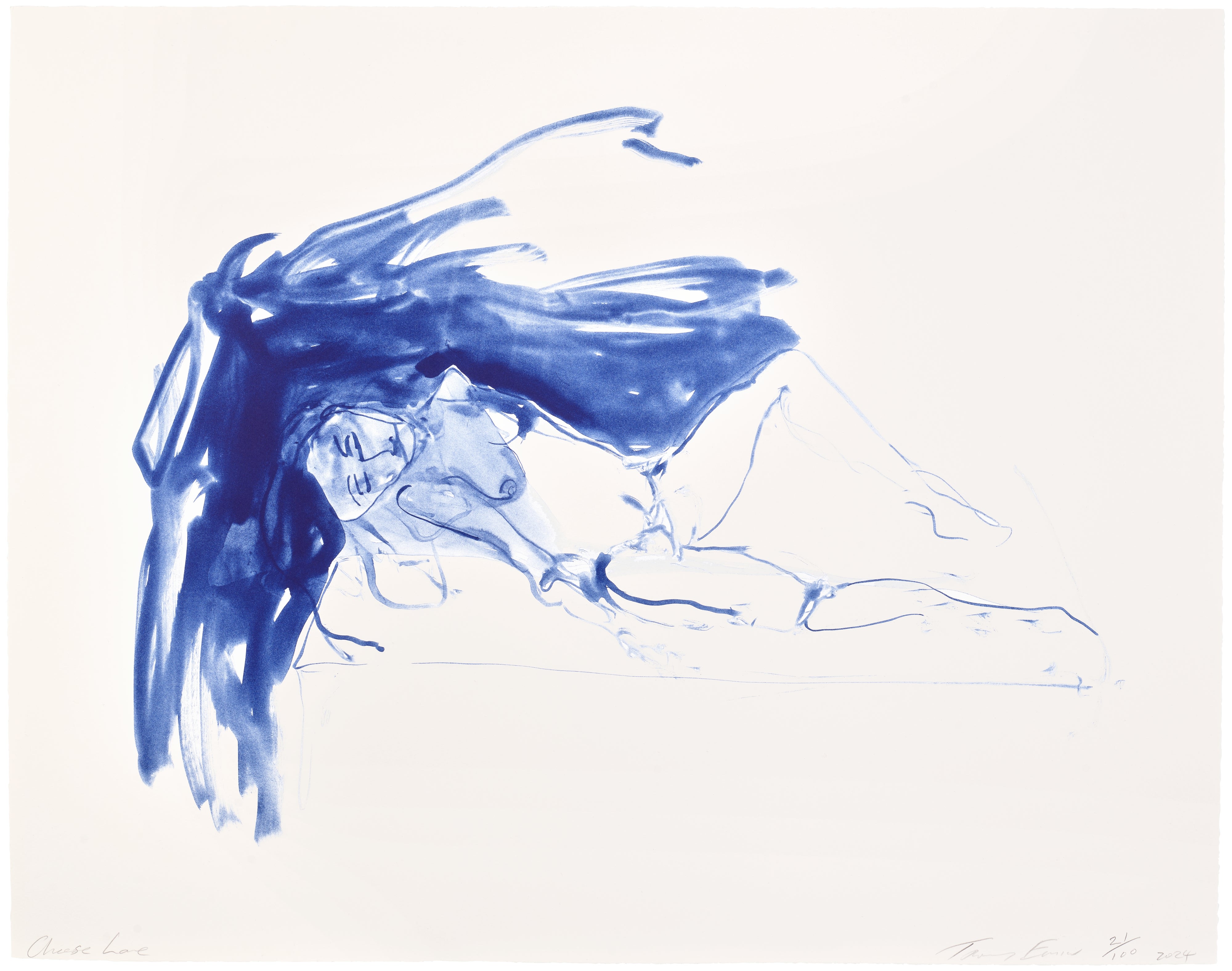
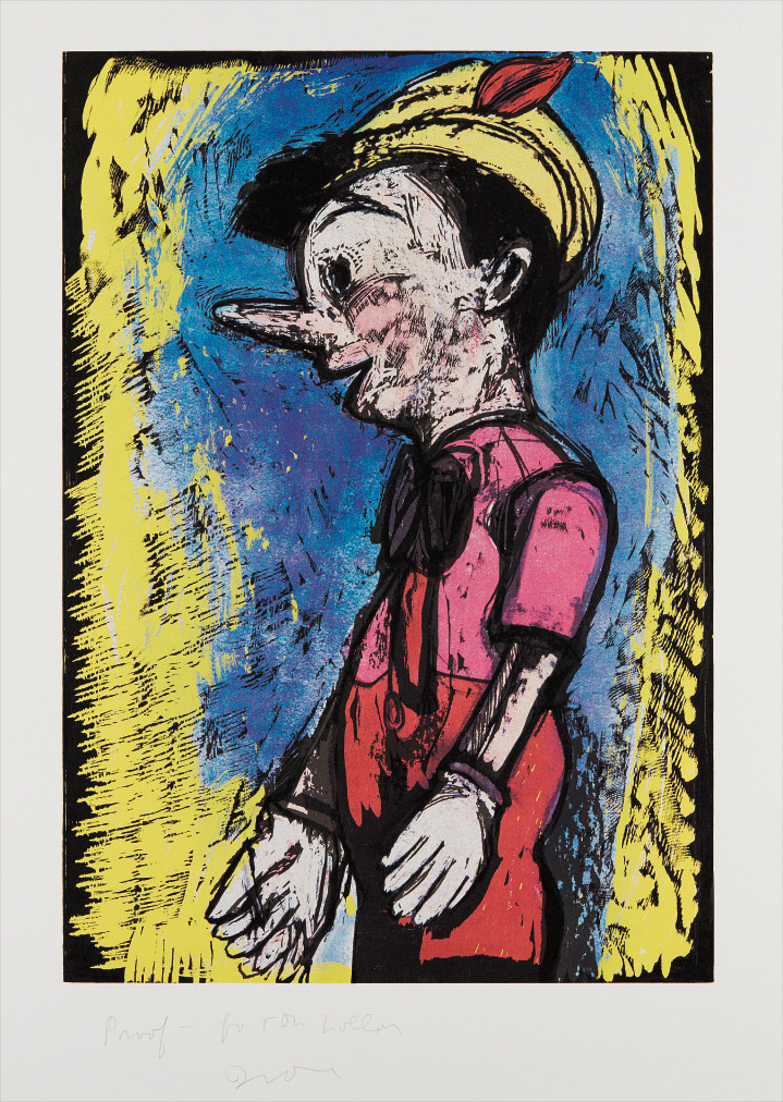
Jim Dine
Pinocchio
Jim Dine, whose output has been restlessly varied across decades, returned again and again to warm tones in his heart imagery and figure work, treating red in particular as a color that could hold both vulnerability and force at the same time. Wayne Thiebaud, painting his famous pastries and storefronts, used warm pinks and oranges to produce images that are somehow both completely literal and deeply nostalgic. More recently, artists have complicated the apparent directness of warm color with conceptual and material sophistication. Bridget Riley's investigations into optical perception have always acknowledged that warm color is not simply warm: in certain contexts and adjacencies, an orange can feel aggressive, tender, or exhausted depending entirely on what surrounds it.
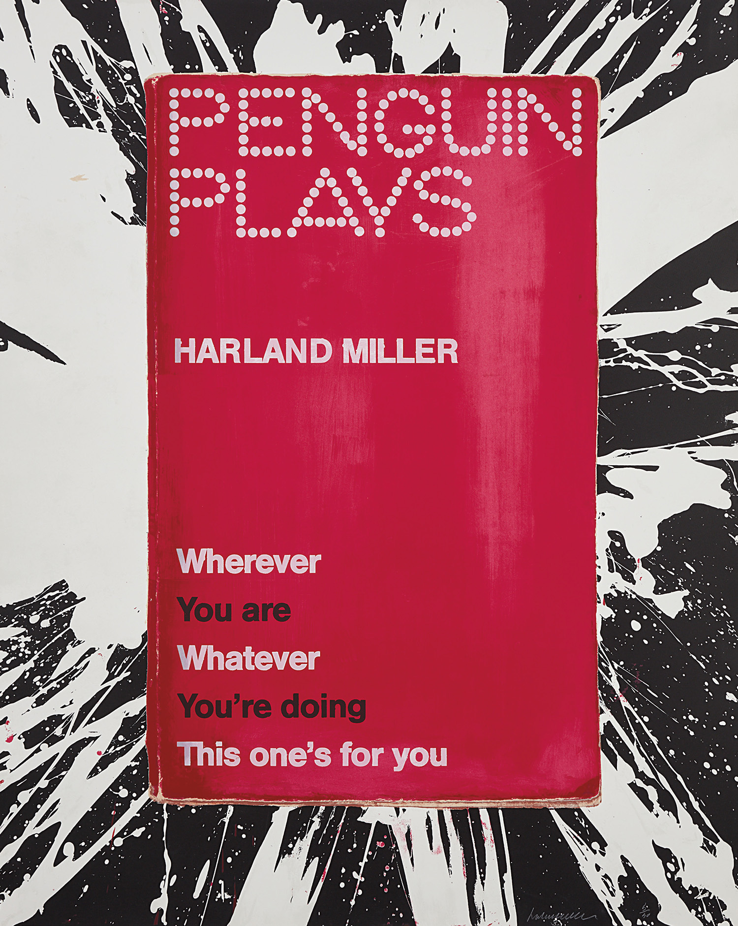
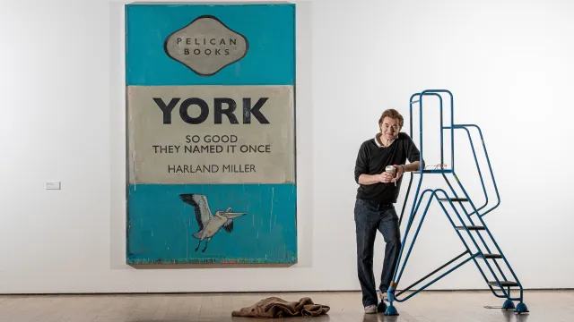
Harland Miller layers warm tones into his large scale text based paintings in ways that feel both intimate and cinematic, the warmth functioning as a kind of irony softener. Tracey Emin uses warm neon pinks and reds in her textile and light works to speak about love and longing with a directness that warm color has always made possible. Francesco Clemente, drawing on Indian miniature traditions and Western figuration alike, treats warmth as a spiritual temperature, something radiating outward from the body or the self. What warm color has always understood, and what the works gathered on The Collection confirm with remarkable range, is that it speaks to something prior to thought.
Before we analyze a painting, we feel whether it is warm or cold, and that feeling shapes everything that follows. The artists represented here, from Chagall and Bonnard to Emin and Hockney, have each found their own way to use that primal response with intelligence and precision. To collect warm color is not to choose comfort over challenge. It is to recognize that the oldest conversation in painting is still very much alive, and that it is conducted not in words but in heat.