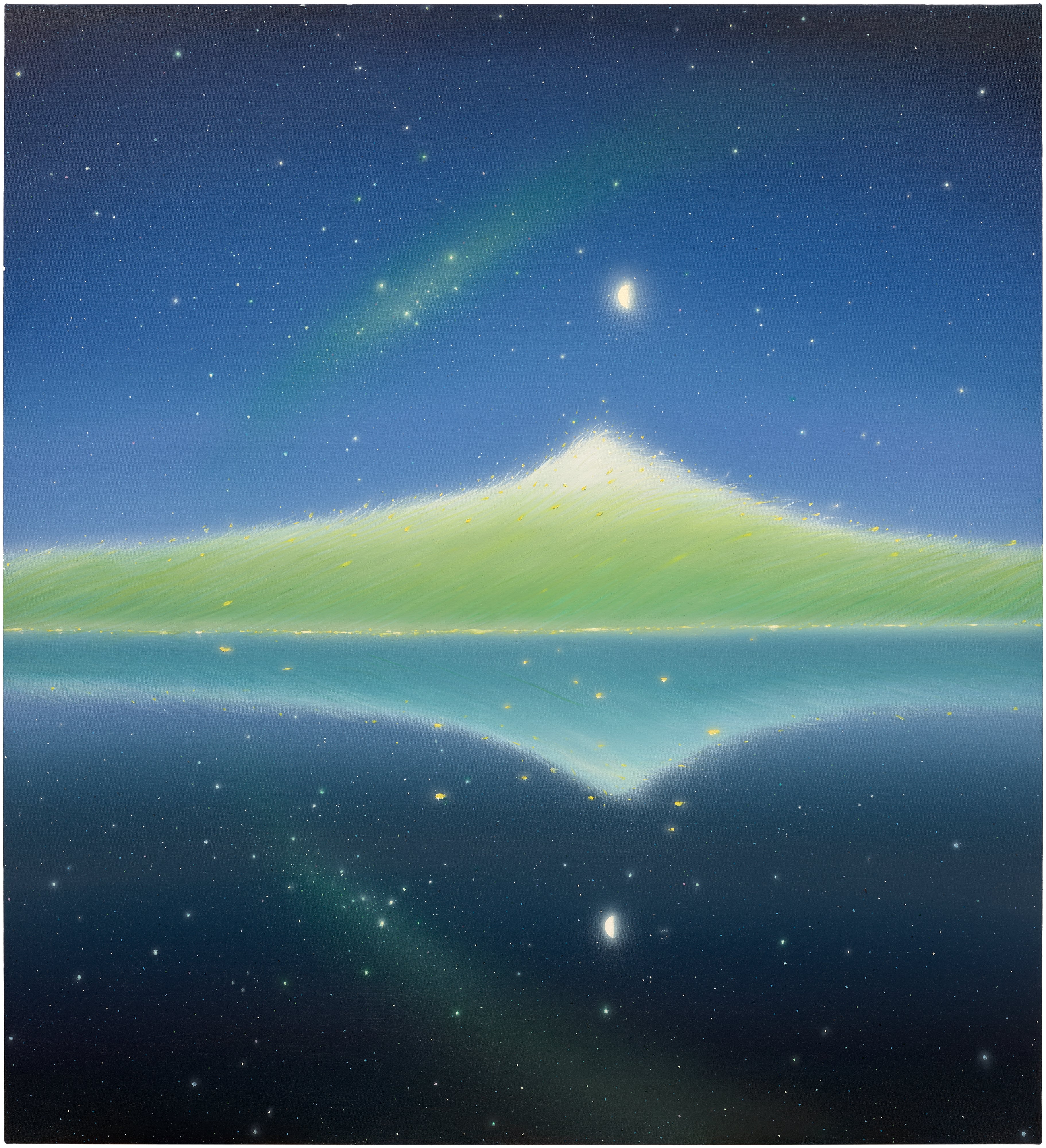
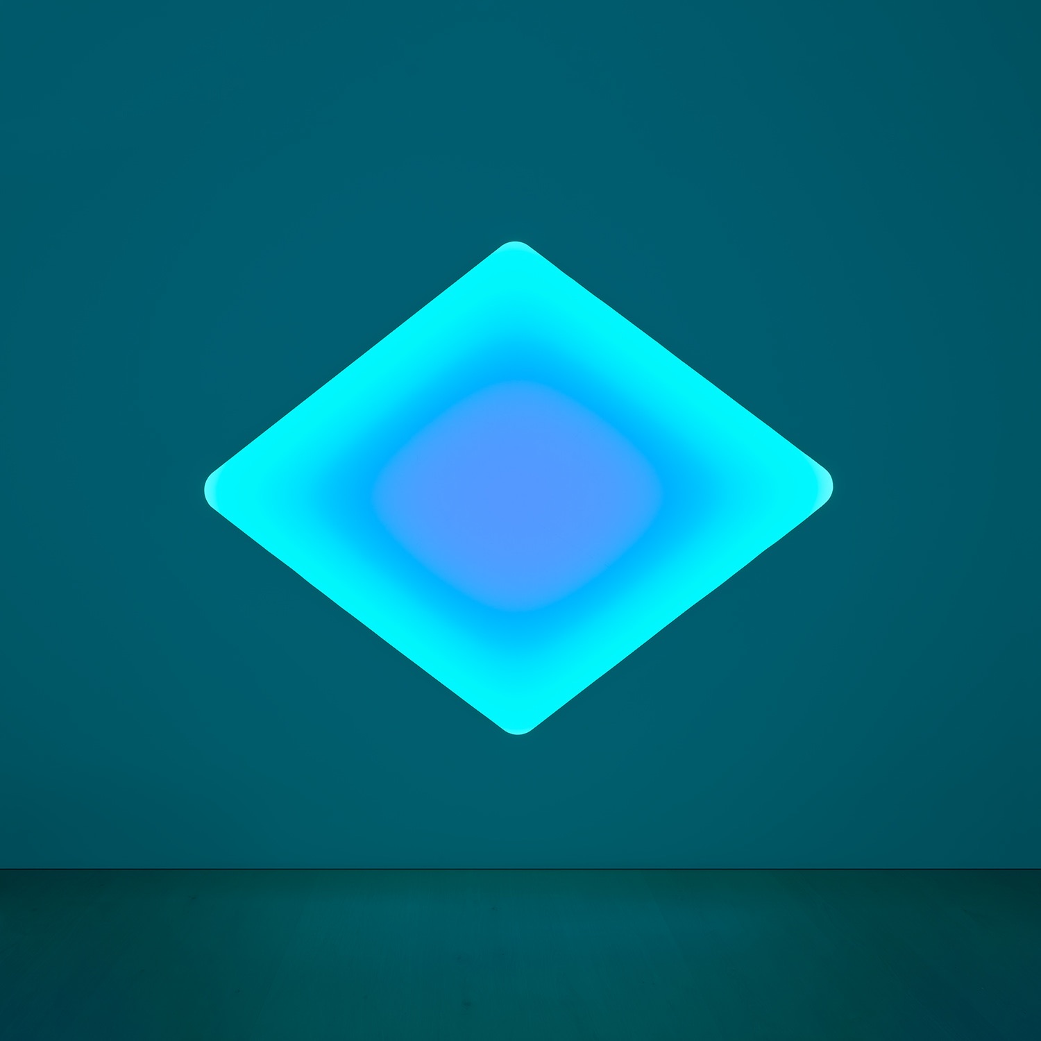
Cool Color Palette
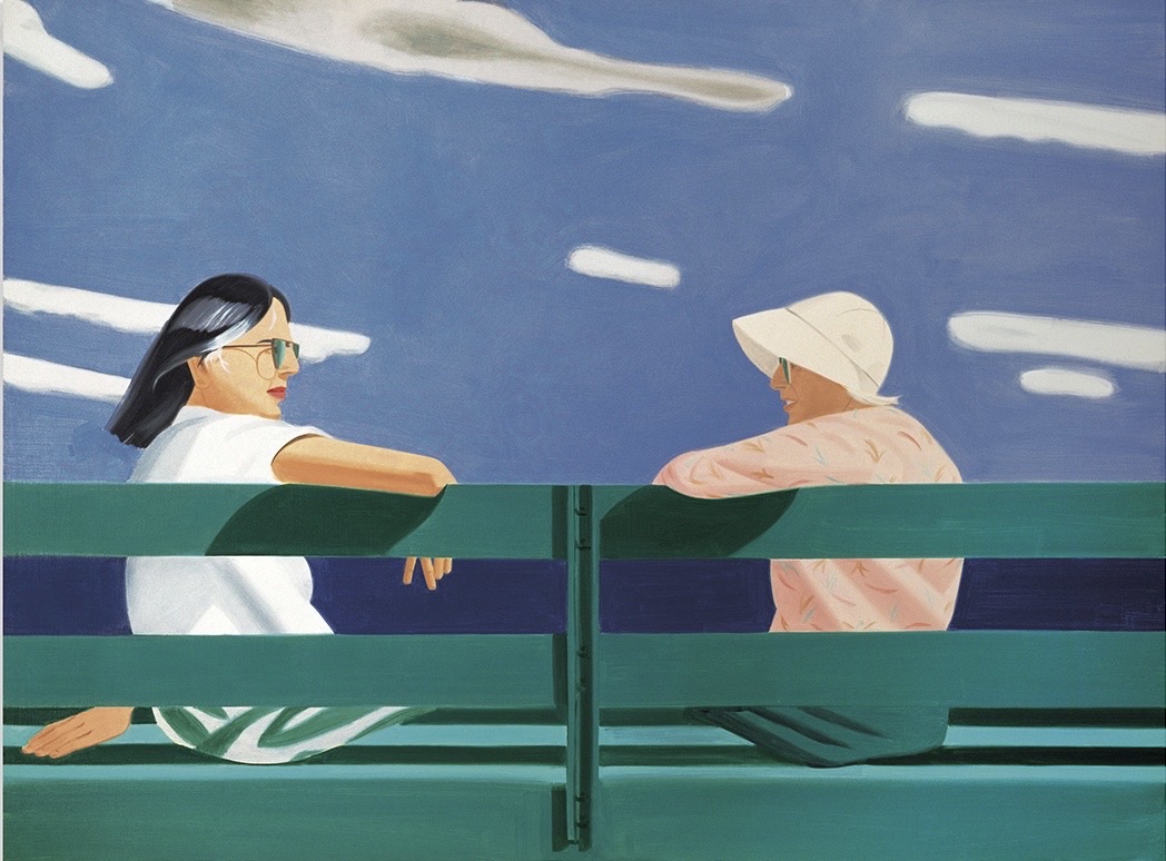
Alex Katz
On the Bench, 2015


Cold Comfort: The Seductive Power of Cool
There is something almost physiological about cool color. Stand before a canvas saturated in cerulean or slate and the body responds before the mind catches up, a slight drop in temperature, a slowing of breath, a sense of distance opening between you and the world. This is not accident or sentiment. It is the result of centuries of artists understanding that color is never merely decorative, that blue and green and silver and violet carry within them entire philosophies of perception, emotion, and control.
The cool palette as a deliberate artistic strategy has roots that reach back to the Renaissance, when painters understood that warm tones advance and cool tones recede, using this optical fact to construct depth on a flat surface. But the conscious elevation of cool color into something conceptually charged, something that could carry meaning beyond spatial illusion, belongs largely to the twentieth century. The Impressionists opened the door by breaking apart shadow and revealing it as blue, violet, and green rather than simply darkened versions of surface color. Monet's late water lily paintings, particularly those completed between 1914 and 1926 in his studio at Giverny, are essentially extended meditations on the emotional life of blue.
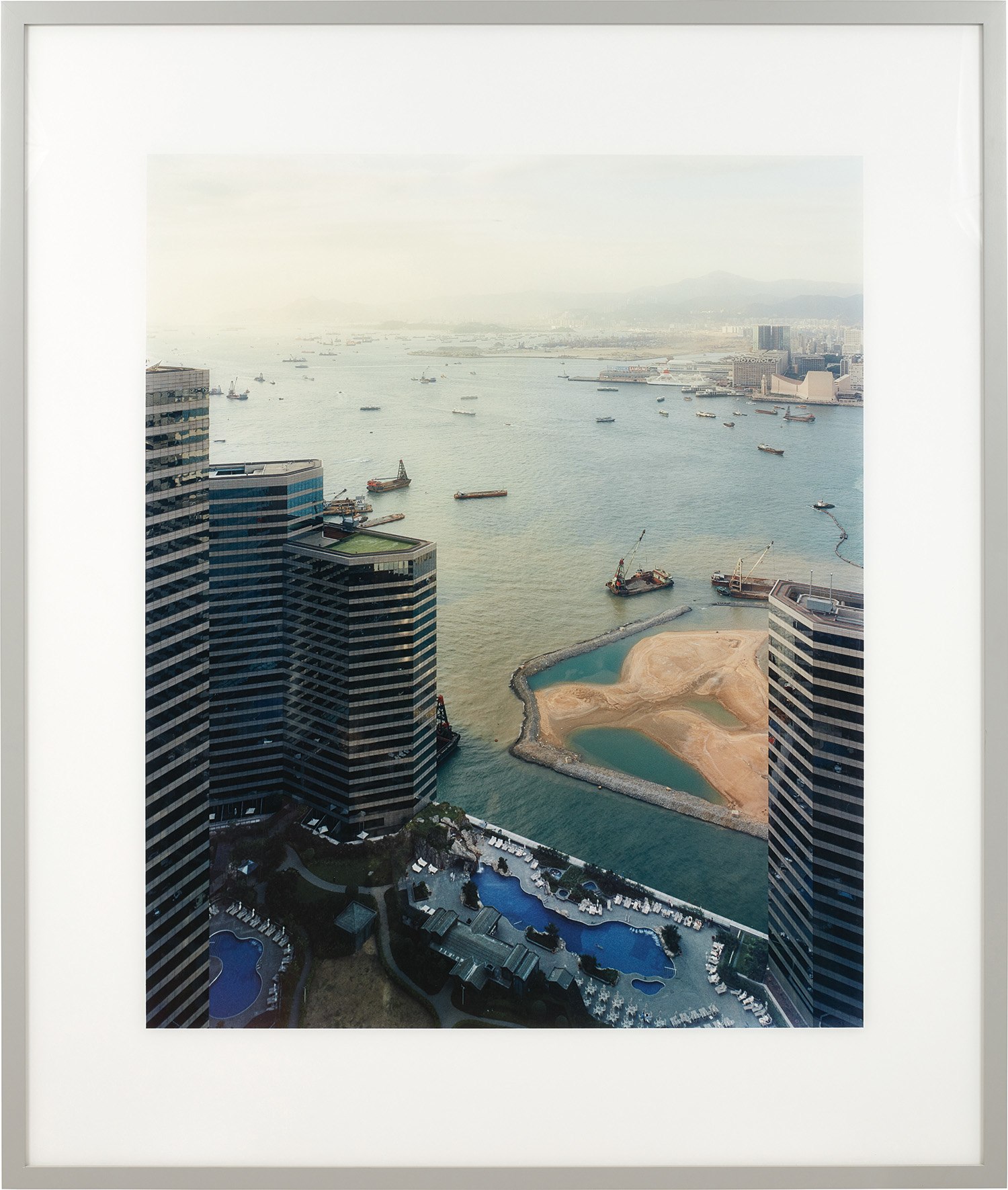
Andreas Gursky
Hong Kong, Hafen (Hong Kong Port), 1994
What followed across the next several decades was a gradual recognition that cool color could do something peculiar and powerful: it could make detachment feel beautiful. The Abstract Expressionists explored emotional extremes through both warm and cool registers, but it was the generation that followed, responding to the heat and urgency of that movement, who found in cool color a different kind of intensity. Mark Rothko's blue and grey paintings from the late 1950s and early 1960s vibrate with a stillness that is not absence but presence, a concentrated emotional field. Yves Klein's IKB, International Klein Blue, patented in 1960, turned a single cool pigment into a philosophical statement about the infinite, the void, and the limits of painting itself.
By the time Minimalism consolidated in the mid 1960s, cool color had become associated with a particular intellectual seriousness. The monumental sculptures of Donald Judd, often finished in anodized aluminum or industrial lacquer in blue, green, and steel grey, proposed that cool color was the color of objecthood, of the thing that does not perform emotion but simply exists. This sensibility migrated into photography and image making in ways that continue to define how we understand the visual language of precision and contemplation. Andreas Gursky, well represented on The Collection, builds his large scale photographs around chromatic fields that are often startlingly cool, the aqueous greens of his Rhine series or the icy blues of his crowd studies, using color temperature as a tool for creating that famous Gursky feeling of sublime indifference to scale.
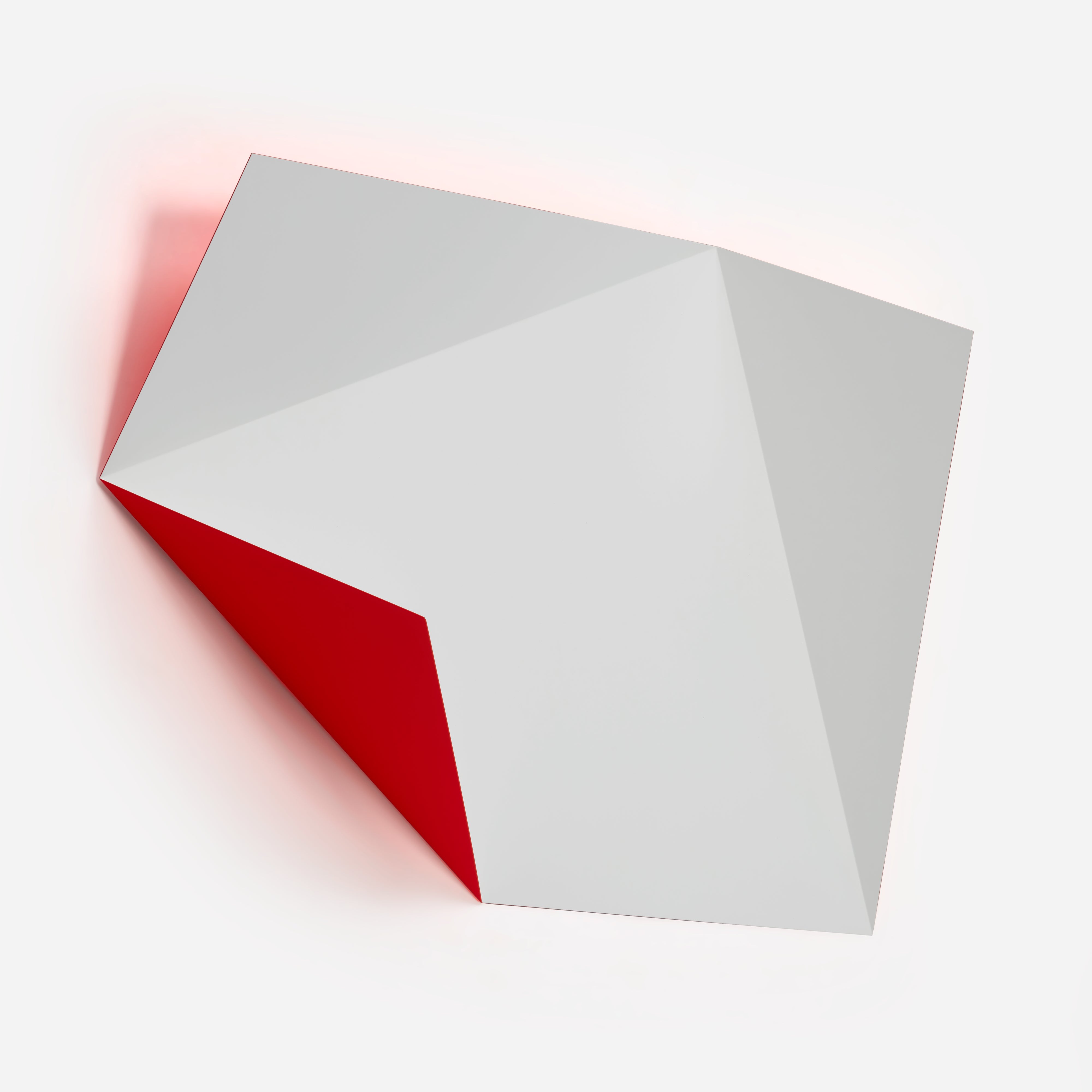
Rana Begum
No. 327 Fold, 2012
Similarly, Thomas Demand constructs his paper and cardboard environments and then photographs them in a light so controlled and even that everything acquires a slightly airless, bluish quality, cool as a still room before anyone has entered it. Candida Höfer's interiors, also present on The Collection in considerable depth, work in a related register. Her grand libraries, museum halls, and institutional spaces are photographed with an almost clinical evenness, and the palette that emerges from her images leans toward stone and marble and old paper, colors that carry the coolness of preservation, of things held in careful suspension. Thomas Ruff's large scale portrait photographs from the late 1980s and his subsequent image based work have consistently explored what happens when cool, flat light removes the warmth of personality from a face or a surface, leaving something that is simultaneously intimate and utterly remote.
This productive unease is very much a product of deliberate color thinking. Among painters working today, the cool palette operates across a wide range of intentions. Pat Steir, whose waterfall paintings began in the late 1980s and whose work appears on The Collection, allows paint to fall and pool in cascades of blue, silver, and near black, using the physics of the medium to produce something that feels simultaneously controlled and surrendered. Mark Francis constructs cellular, microbial fields of blue and green that read almost as scientific imaging, cool in temperature but dense with biological suggestion.
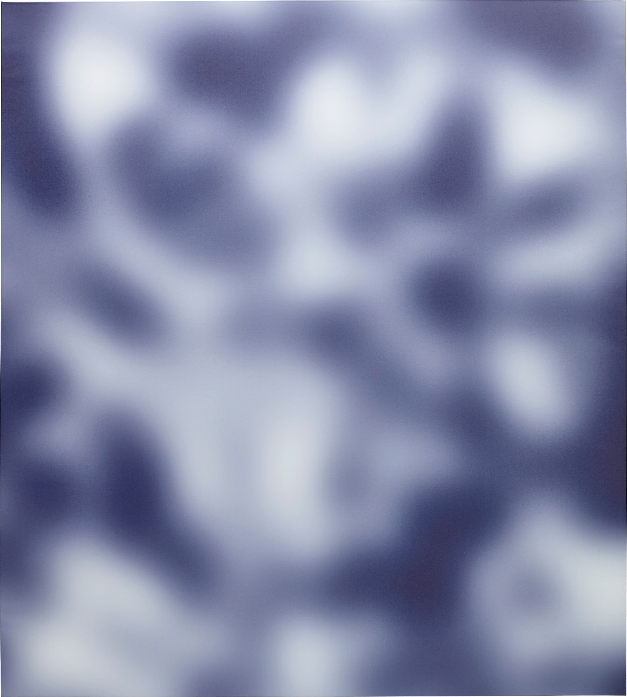
Jeff Elrod
Hey Moon, 2013
Katherine Bradford brings a warmer touch to her swimmers and nocturnal figures but locates them consistently within a blue space that feels both oceanic and dreamlike, cool enough to feel otherworldly. Jeff Elrod translates digital drawing processes into painted surfaces where the palette tends toward cool digital gradients, blues and greens that carry the temperature of a screen at night. The relationship between cool color and technology is one of the defining cultural conversations of the last thirty years. Ólafur Elíasson, who has explored light and color perception throughout his career and whose work appears on The Collection, has long been interested in the phenomenology of cool light, in how blue and silver daylight affects consciousness and spatial experience.
His work often implicates the viewer physically, asking you to feel color rather than merely see it. Iván Navarro's neon and mirror installations similarly use cold blue and white light to create vertiginous spaces that feel both seductive and unsettling, cool color as a trap you walk into willingly. What cool color ultimately offers, and why it continues to attract artists of such range and ambition, is a vocabulary for complexity that does not announce itself loudly. Cool is not cold.
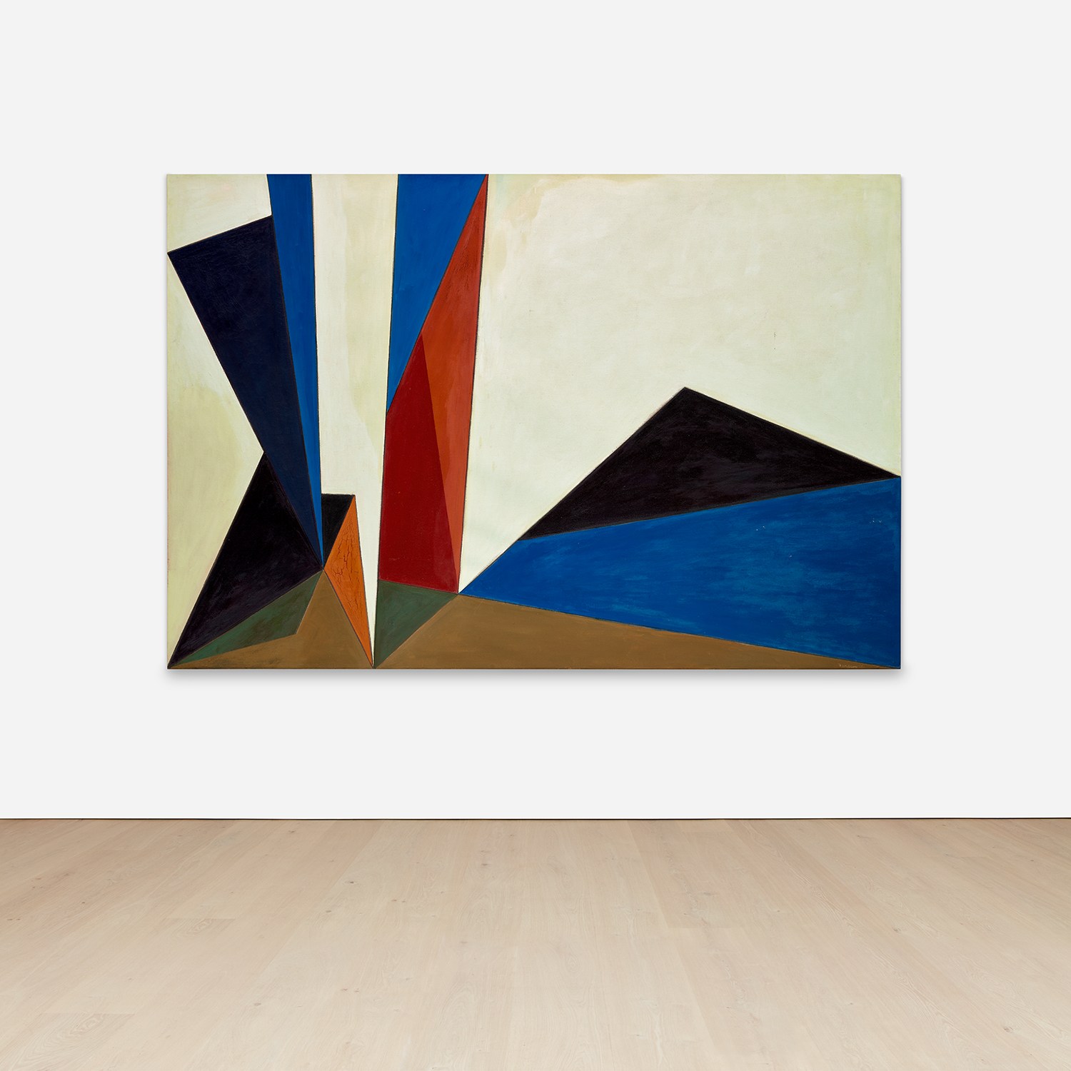
Lorser Feitelson
Magical Space Forms, 1951
It is not detached. It is reserved, and reservation creates space for the viewer to enter. A painting or photograph built in blues and greens and silvers does not tell you what to feel. It opens a climate and waits.
The best works in a cool palette on The Collection understand this invitation as a form of generosity, a trust that the viewer is capable of bringing something to the encounter. That trust, perhaps more than any specific technique or historical lineage, is what makes cool color feel so enduringly contemporary.