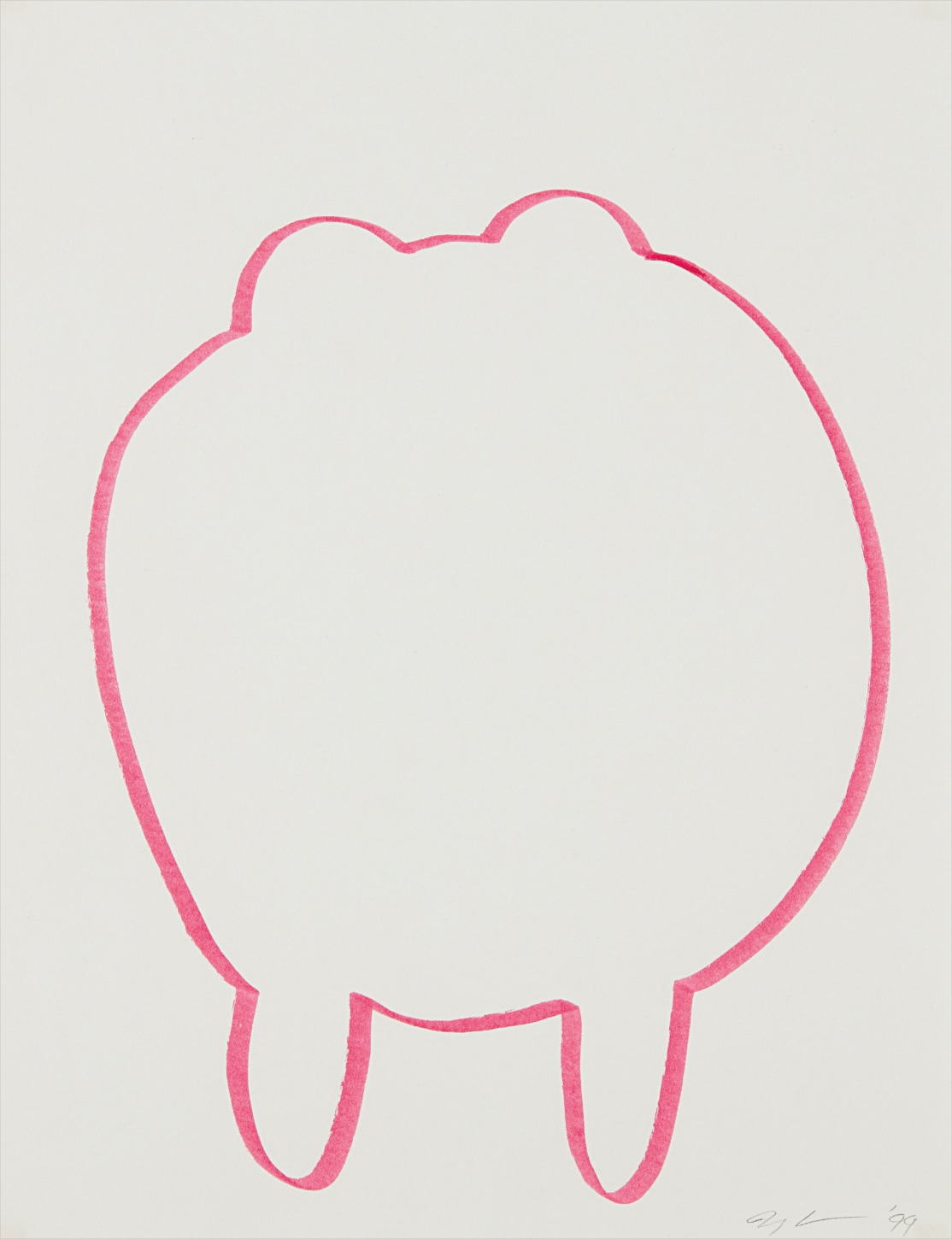
Pink
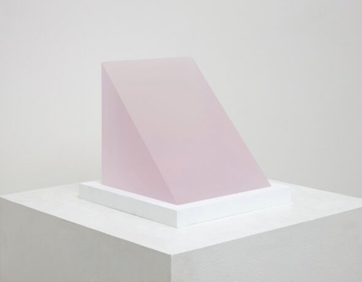
Peter Alexander
3/20/18 (Frosted Pink Wedge), 2018


The Color That Collects You Back
There is something almost confessional about a collector who admits their first serious purchase was pink. The color carries freight that other hues do not: it is soft and confrontational at once, commercially loaded yet capable of extraordinary emotional precision. What draws serious collectors to work in this register is precisely that tension. Pink resists neutrality.
It does not disappear into a wall or recede behind furniture. It insists on being present, and the best works made in this mode use that insistence as a form of argument. Living with pink art is different from living with most other work. It changes throughout the day as light shifts, going from blush to near red in late afternoon, cooling toward lilac at dusk.
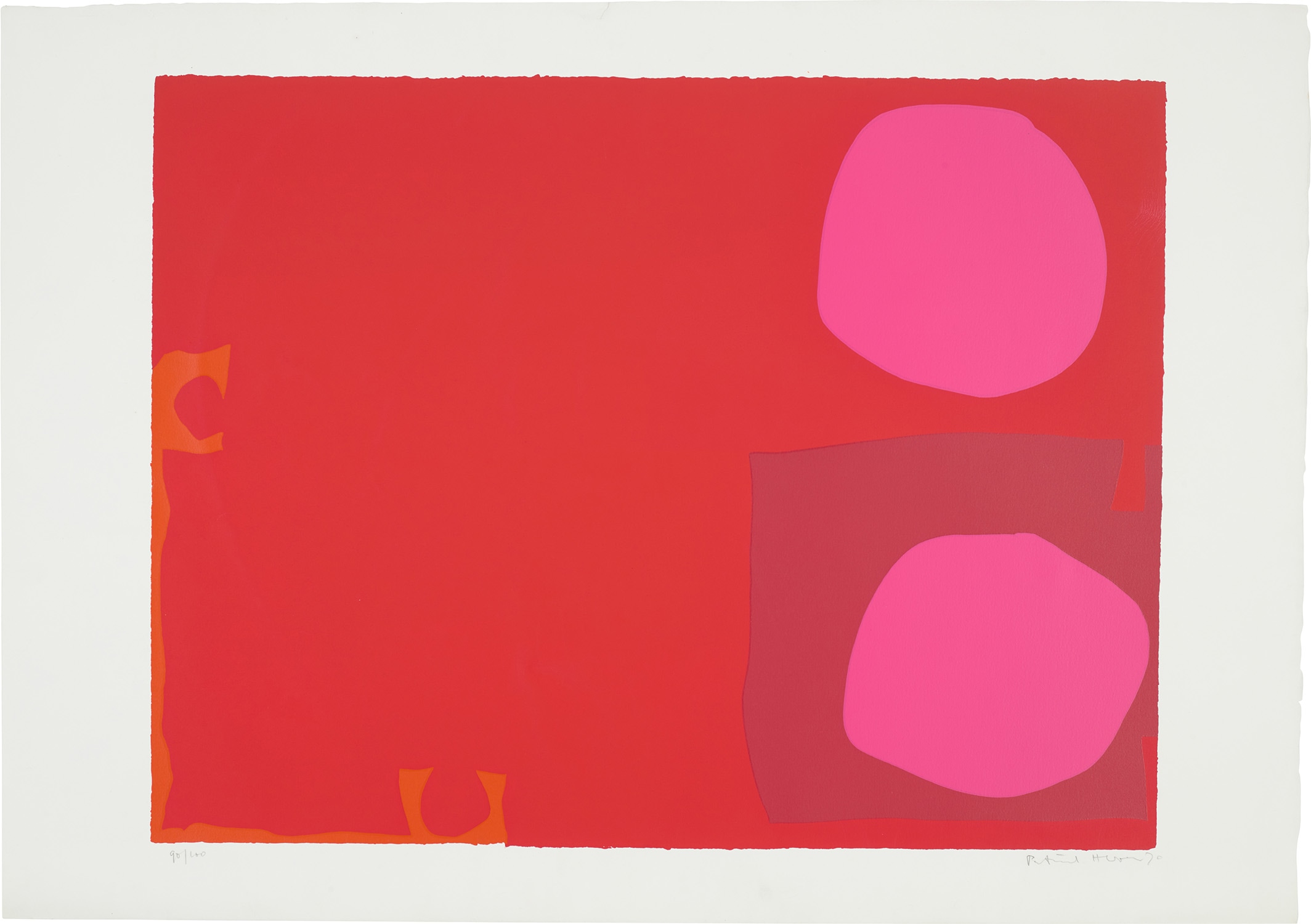
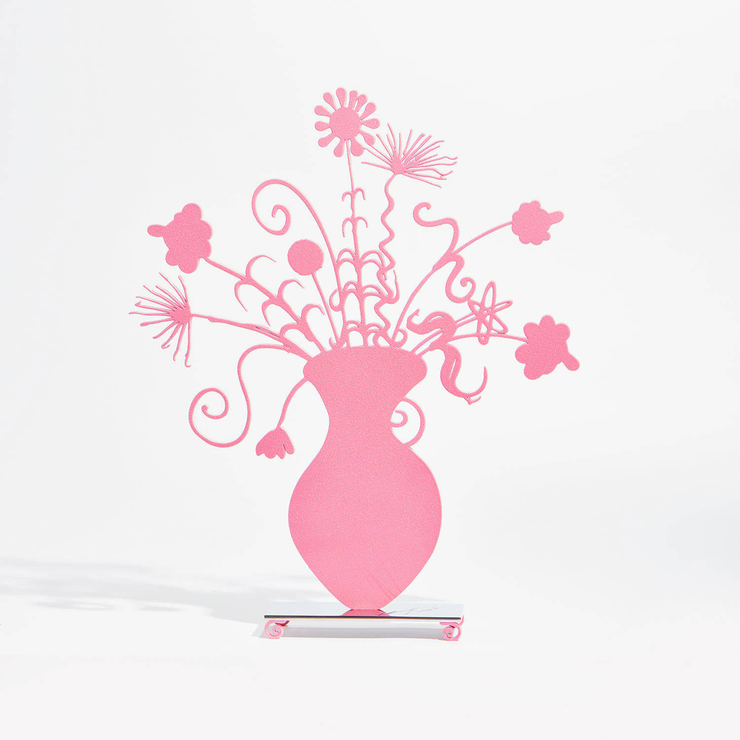
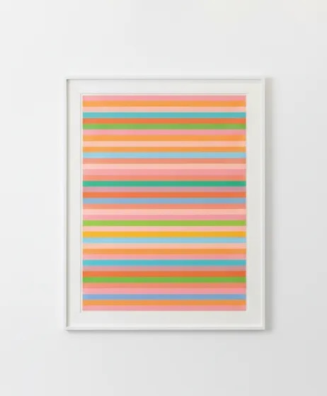
Patrick Heron
Patrick Heron
Collectors who have kept pink canvases over long periods often describe a sense that the work has moods, that it is responsive to the room and the season. This is not fantasy. It is colorist intelligence being registered by a sensitive viewer, and it reflects why colour field practitioners and Neo Expressionists alike returned to this part of the spectrum again and again. The experience of cohabiting with a strong pink work is genuinely unlike anything else, and collectors who understand this tend to hold these pieces for decades.
Separating a good pink work from a great one comes down to intention and internal structure. Pink as a background note, as decoration, or as branding shorthand produces work that flatters briefly and bores quickly. What separates the truly compelling pieces is the way the artist uses the colour to create pressure rather than comfort. Look for works where pink sits in active relationship with another tone, where there is either vibration or resistance at the edges of the form.
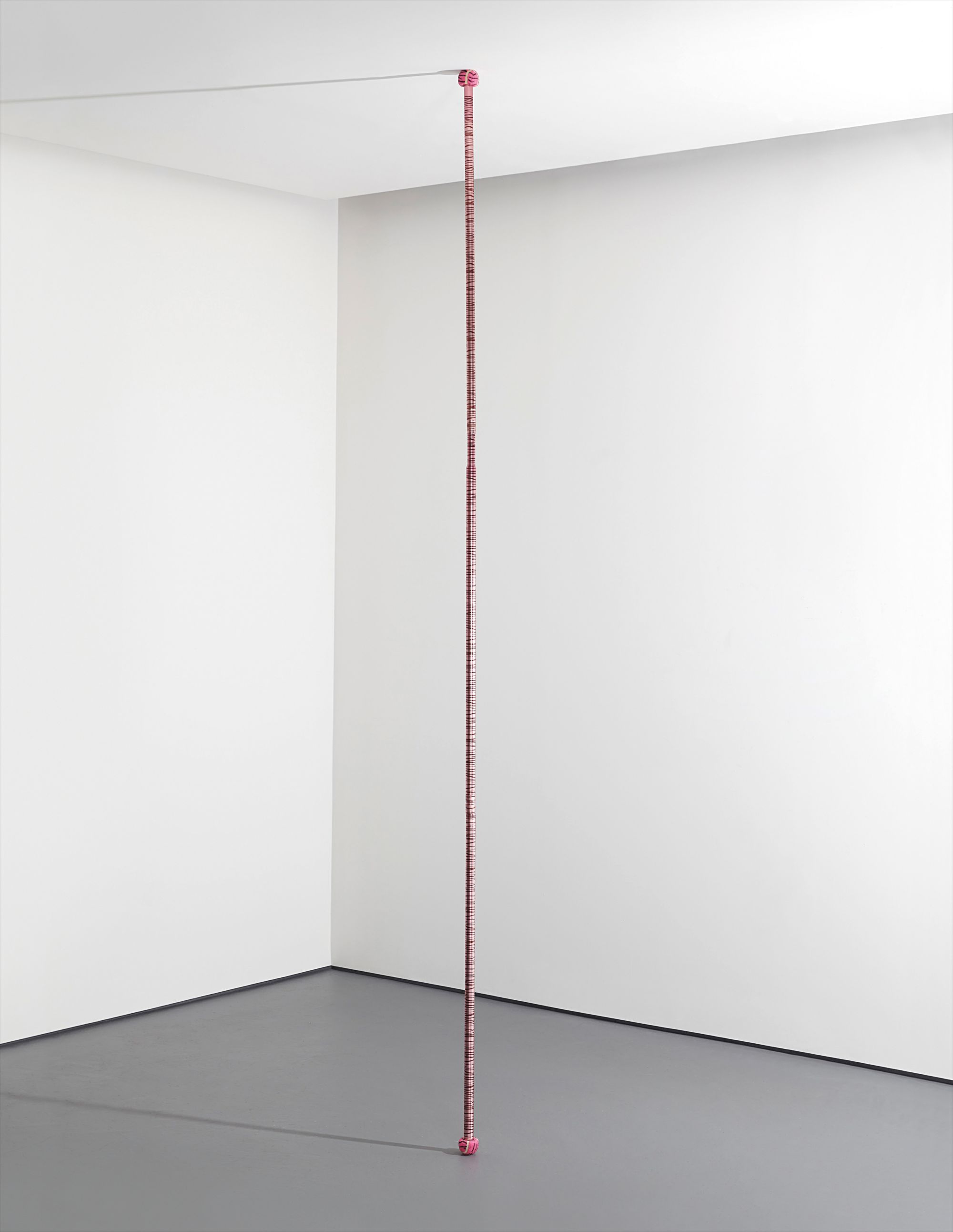
Larry Bell
Larry Bell
Bridget Riley understood this at a molecular level, and her works demonstrate how optical intensity can be coaxed from colors that might seem decorative on their own. The best acquisitions in this space reward sustained looking. If a work gives you everything in the first thirty seconds, that is usually a sign it will stop giving entirely within a year. In terms of artists representing genuine long term value, several names in The Collection's broader ecosystem stand out immediately.
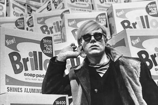
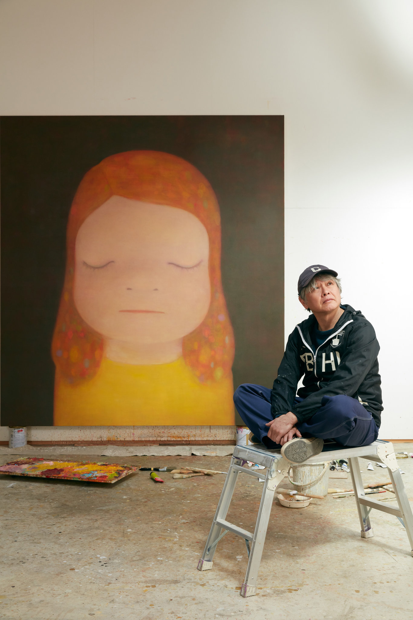
Kees van Dongen worked pink into flesh tones and theatrical atmospheres in ways that feel startlingly contemporary, and his Fauvist period works carry genuine auction heat in Paris and London. Andy Warhol treated pink as industrial pigment and emotional signal simultaneously, and his prints and works on paper in this palette remain among the most reliably traded commodities in the postwar market. Yoshitomo Nara brings something different: his pinks are tied to childhood unease, and that combination of surface cuteness and psychological undertow has made his work extraordinarily sticky with collectors in their thirties and forties who are now entering their peak buying years. KAWS operates in an adjacent territory, and while market debate about his long term trajectory continues, the works that use soft chromatic ranges including pink tend to outperform his starker compositions at resale.

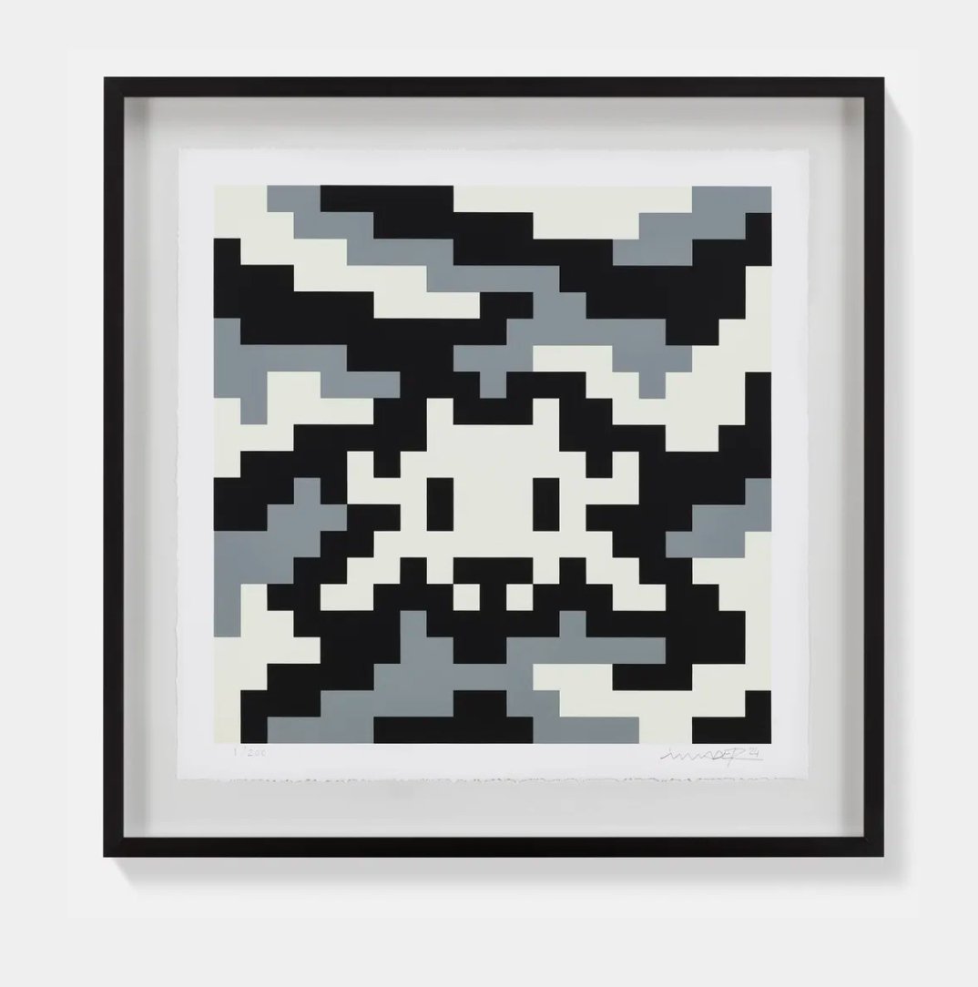
KAWS
同謀(粉紅色), 2002
The emotional temperature is simply higher. For collectors thinking about emerging positions, the artists working with AI tools in colour generative and procedural image making represent a genuinely underexplored frontier. This is not about novelty for its own sake. The interesting practitioners in this space are using algorithmic processes to interrogate how color carries cultural meaning, and pink is almost inevitably central to that inquiry given how loaded the colour is with gender signalling, commercial culture, and sentimentality.
Works that use AI generation to produce large scale fields of pink often arrive at something that feels simultaneously ancient and completely new, like a Rothko chapel remade through the logic of a training dataset. The secondary market for AI generated art is still forming, which means patient collectors who enter now are positioning themselves ahead of the institutional reckoning that is coming. When major museums fully commit to collecting born digital and algorithmically generated work, early acquisitions in this field will look prescient. At auction, pink works face an interesting structural dynamic.
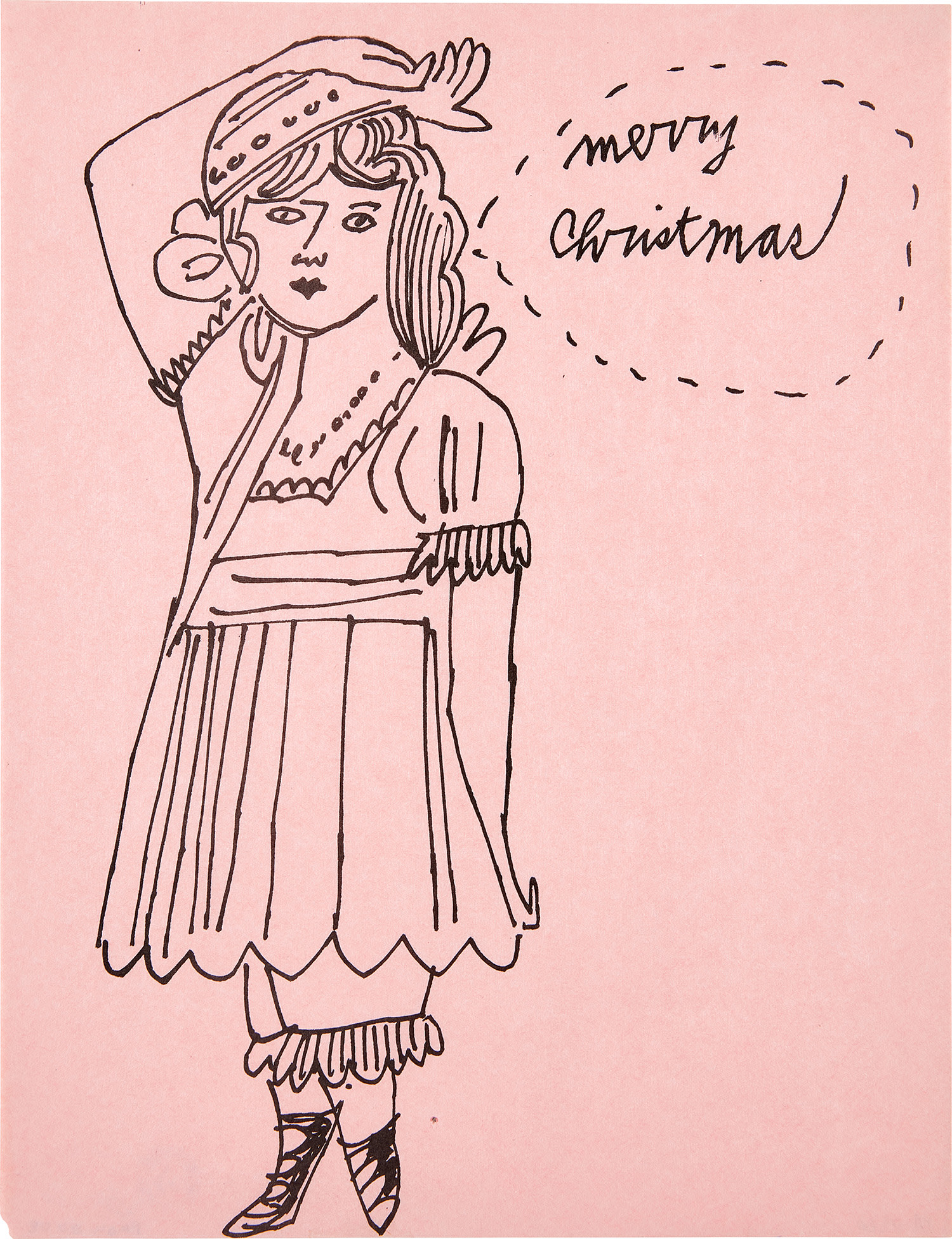
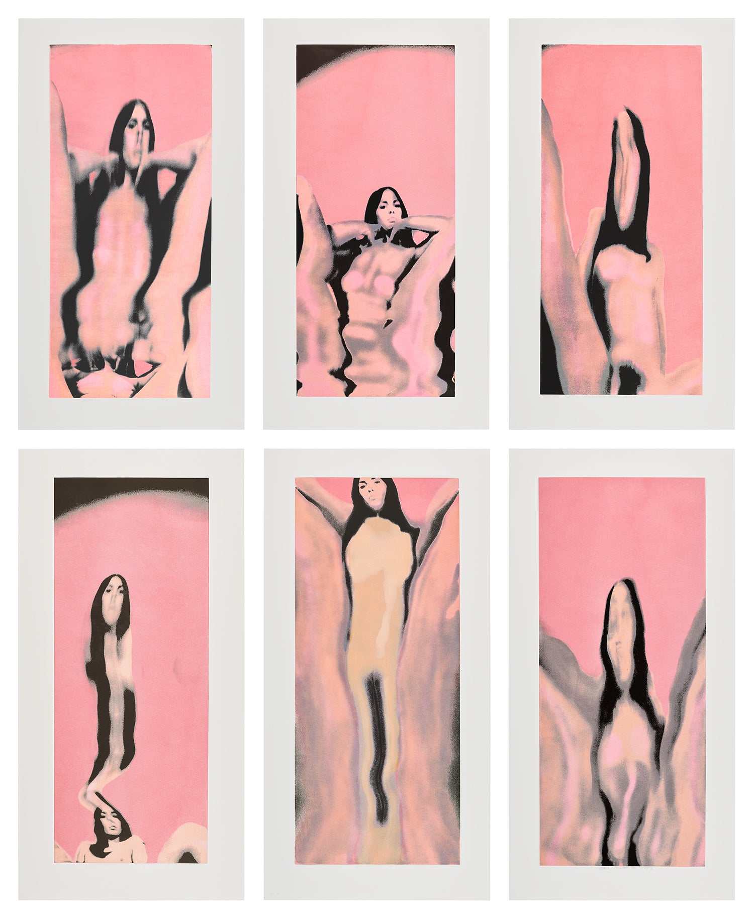
Andy Warhol
Merry Christmas (Girl with Arm Over Head)
They tend to perform above estimate when condition is excellent and provenance is clean, because the colour is so immediately readable in catalogue photography and online bidding previews. But condition problems are also more visible in pink than in darker palettes. Fading, yellowing from varnish, and surface abrasion all read harshly against pink grounds. Before acquiring any work in this register, particularly works on paper, ask explicitly about light exposure history.
Fugitive pigments used in certain synthetic pinks from the 1960s and 1970s are a known issue, and any responsible gallery should be able to provide conservation documentation or at minimum a clear account of where the work has been kept. For prints and editions, ask about the edition size and where your number sits within it. Earlier pulls typically show better registration and more saturated colour, and that matters enormously in work where chromatic precision is the central achievement. The practical question of display is worth taking seriously from the start.
Pink works require walls that work with them rather than compete, which in practice means either a neutral tone or something that creates genuine dialogue. Collectors who hang pink works against warm white or pale stone find the colour opens outward. Against beige or yellow it tends to close in and turn slightly muddy. Lighting should be daylight balanced and kept away from direct contact with the surface.
For significant acquisitions, a conversation with a conservator before installation is money well spent, not because pink works are especially fragile in all cases, but because understanding how to protect the specific pigments in your work will determine how it looks twenty years from now. The collectors who live most happily with color forward work are the ones who treat the physical object as a relationship rather than a transaction. That shift in orientation is, in many ways, the whole point.