Graphic Design Aesthetic
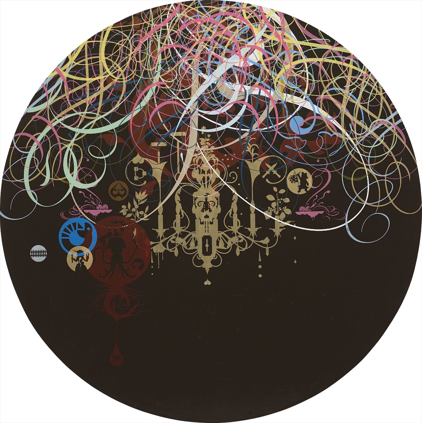
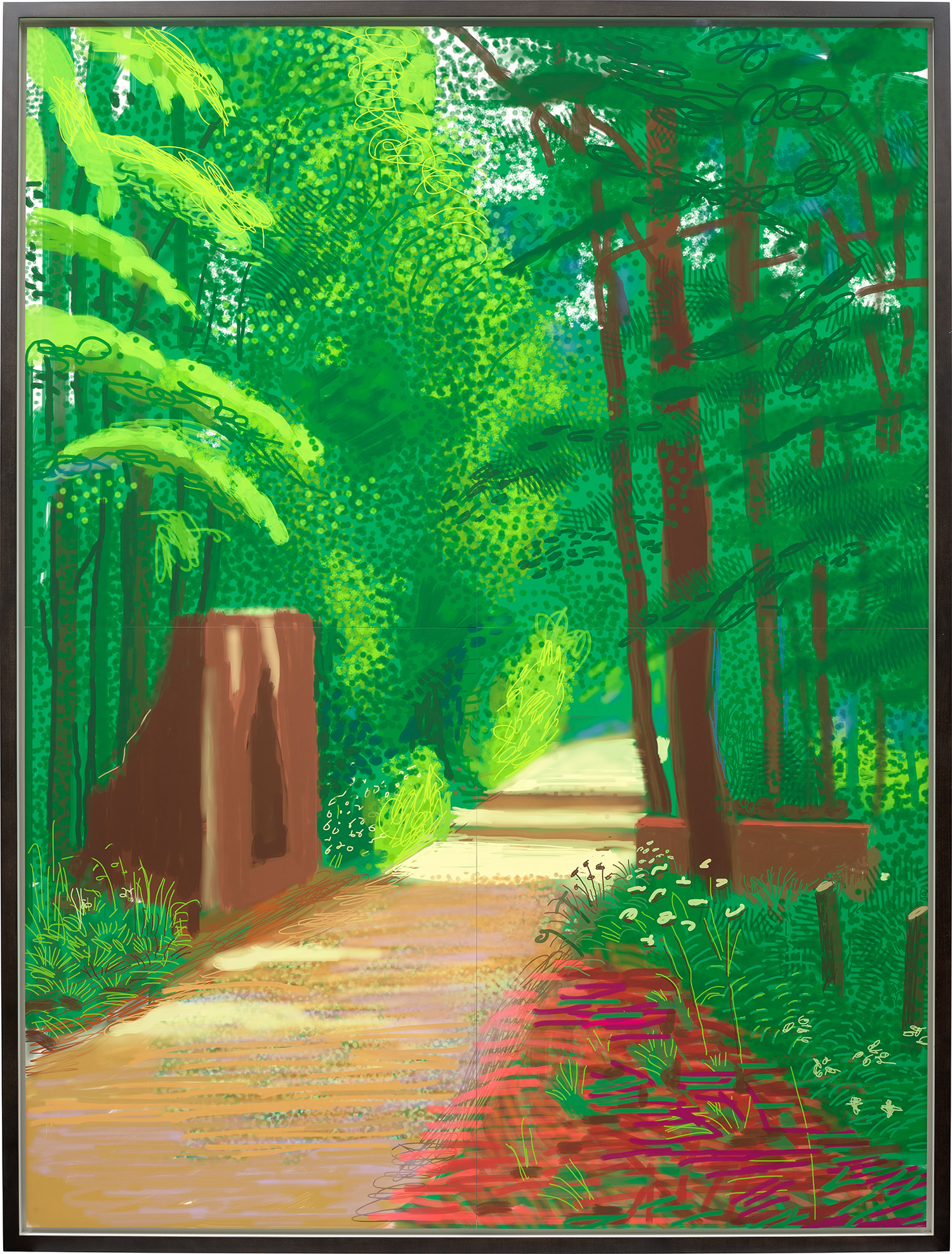
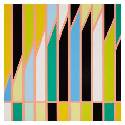
Sarah Morris
Sony (Los Angeles)

When Design Became the Most Radical Art
Last spring, a Barbara Kruger text work sold at auction for a figure that would have seemed unthinkable to critics who once dismissed her practice as glorified advertising. The result landed at nearly four times its low estimate, and the room went quiet in that particular way that means something has shifted. It was not a surprise to anyone paying close attention. Kruger's work, along with a broader constellation of artists who have collapsed the distance between commercial graphic language and fine art, is commanding the kind of collector attention that follows a long overdue reassessment.
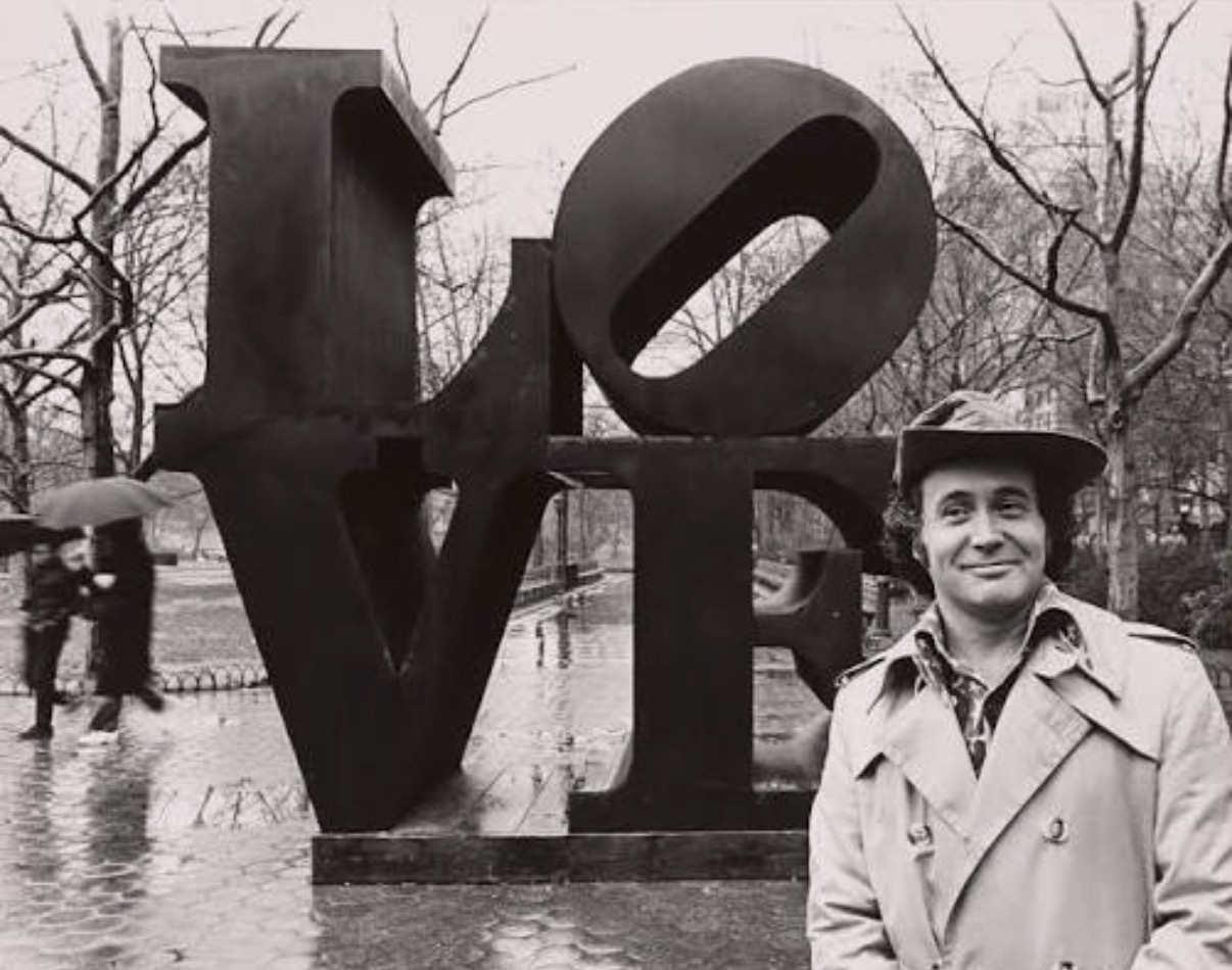
The graphic design aesthetic in contemporary art is not a single movement with a manifesto. It is more like a persistent argument, one that has been running since at least the early 1960s, about whether the visual vocabulary of mass communication can carry genuine critical weight. Robert Indiana understood this before most, building a practice around the blunt geometry of commercial signage and the declarative power of words in bold typefaces. His LOVE image became so reproduced that it nearly obscured the sharpness of his original inquiry, but the market has been quietly separating the iconic from the institutional, and serious works on paper and canvas have been finding strong homes at Christie's and Phillips in recent seasons.
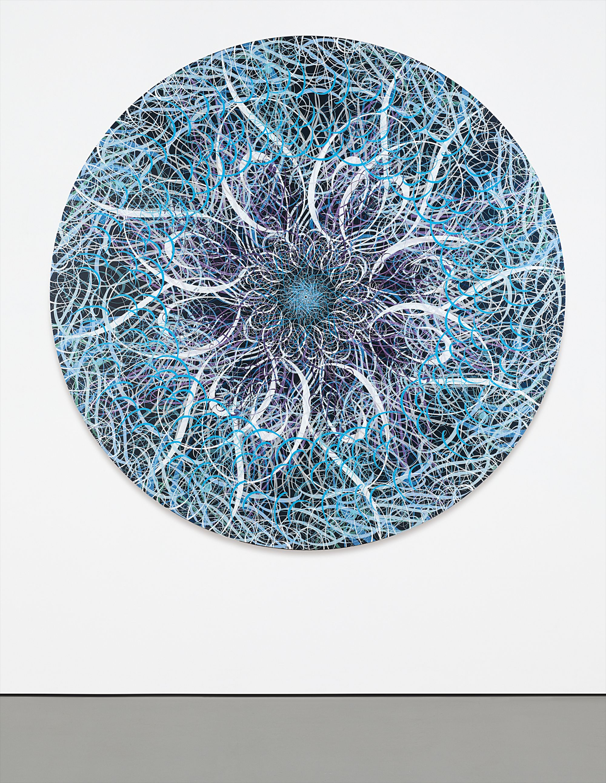
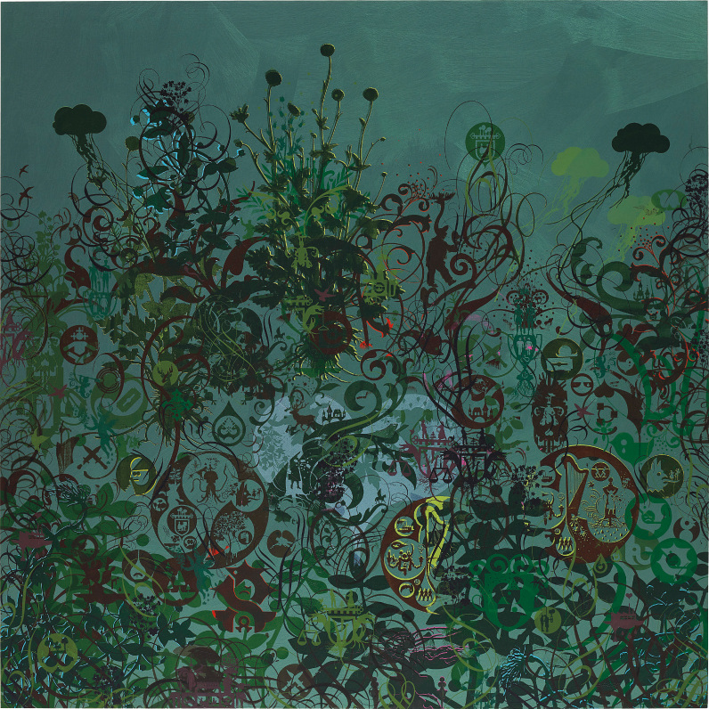
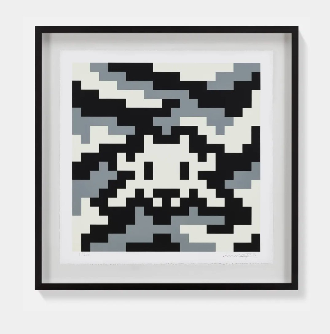
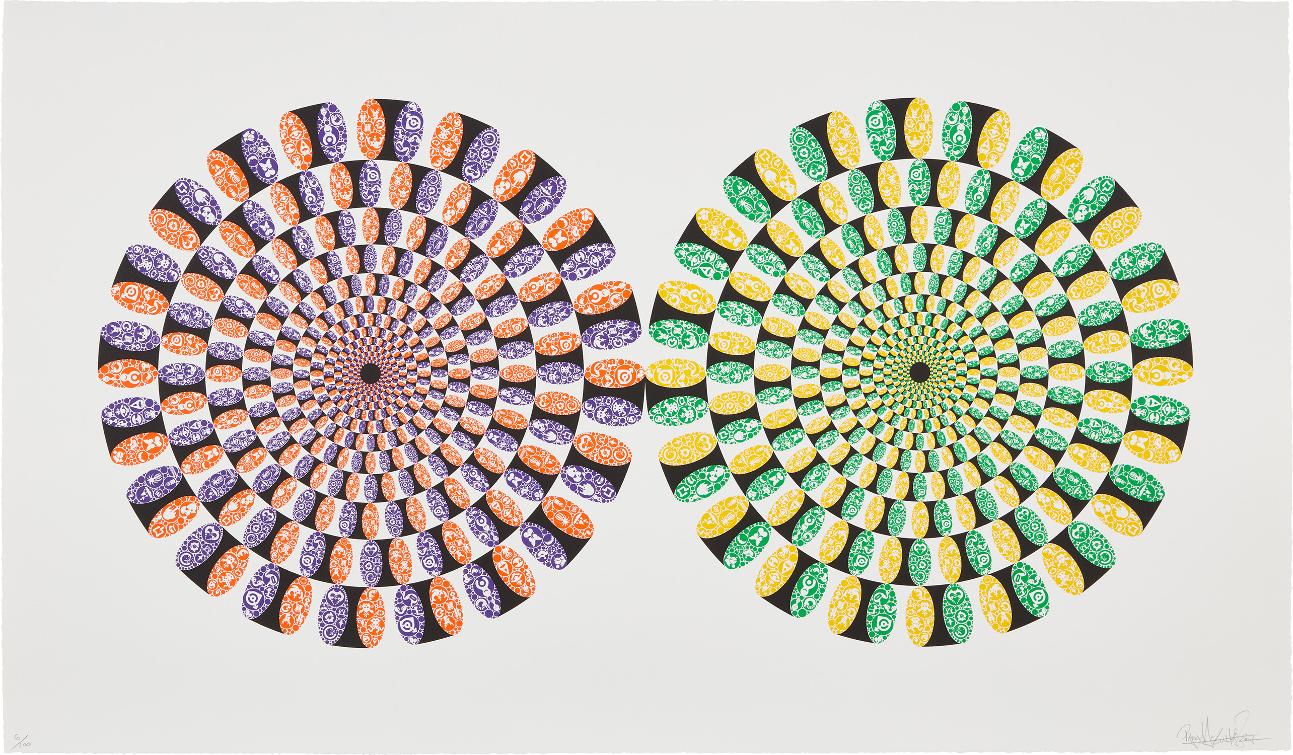
Ryan McGinness
diameter 71 5/8 in. (182 cm.)
The galleries were ahead of the auction houses on this, as they often are. Ryan McGinness had solo exhibitions at venues including Deitch Projects and Vito Schnabel Gallery that established him as one of the most rigorous thinkers working at the intersection of logo culture, pattern, and painting. His black works, where intricate iconographic systems emerge from near total darkness, demonstrate something important: that graphic design as a pictorial language is not simply a matter of flatness and legibility. It can be as spatially complex and emotionally layered as any abstract painting.
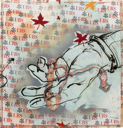
McGinness is well represented on The Collection, and the breadth of his practice there rewards careful looking. Kelley Walker entered the critical conversation more abruptly, with work that applied the tools of desktop publishing and digital reproduction to some of the most charged imagery in American photography. His 2006 exhibition at Paula Cooper Gallery generated substantial controversy and substantial scholarship in roughly equal measure. The critical debate around Walker raises questions that the graphic design aesthetic category keeps circling back to: what happens when the neutralizing logic of design is applied to content that resists neutralization.
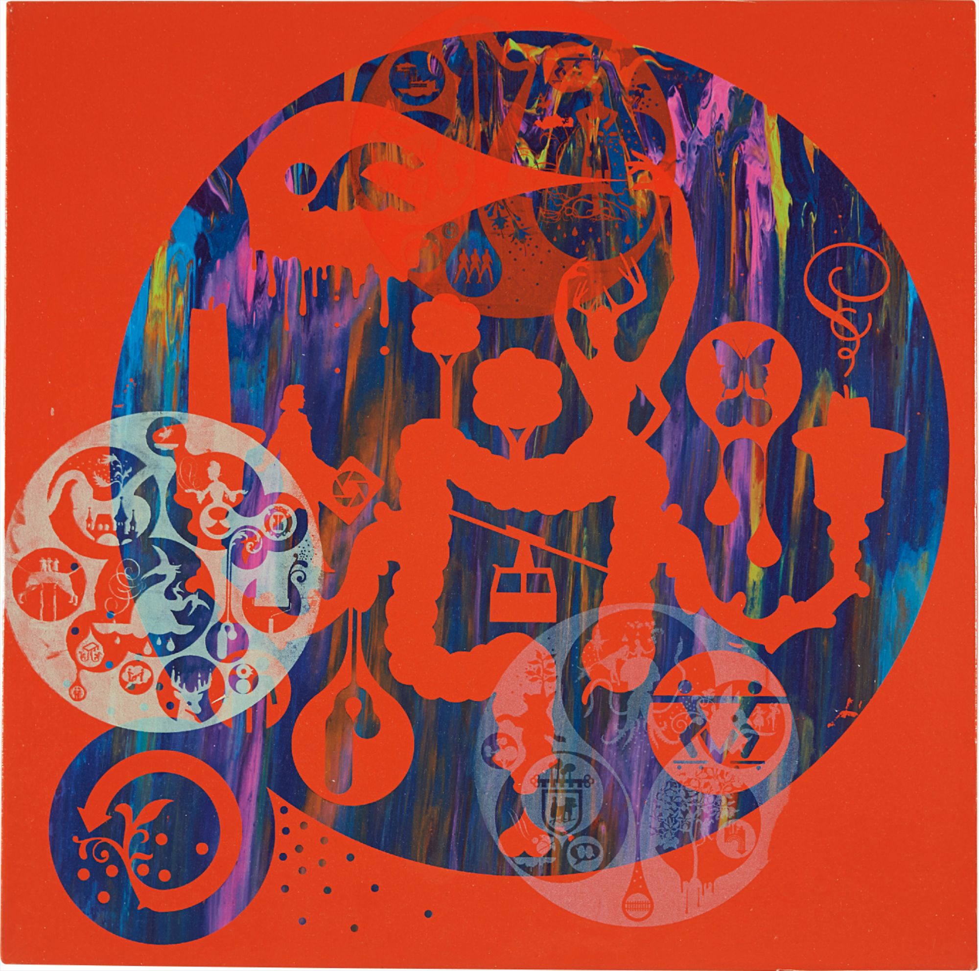
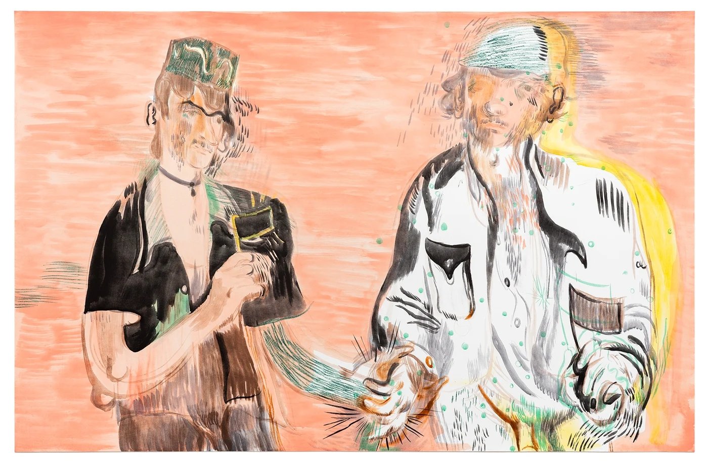
Kelley Walker
schema; Aquafresh plus Crest with Whitener, 2003
That tension, which Walker courts deliberately, is part of what makes his market profile interesting and his work genuinely difficult to place in a simple collector narrative. Sarah Morris is perhaps the figure in this group whose reputation has risen most steadily over the past decade. Her large scale paintings, which derive their geometry from architectural plans and corporate signage systems, have entered major institutional collections including the Museum of Modern Art and Tate Modern. Her films, running in parallel with the paintings and sharing their cool analytical gaze, have given curators a way to position her as both a painter and a moving image artist, which has expanded her institutional footprint considerably.
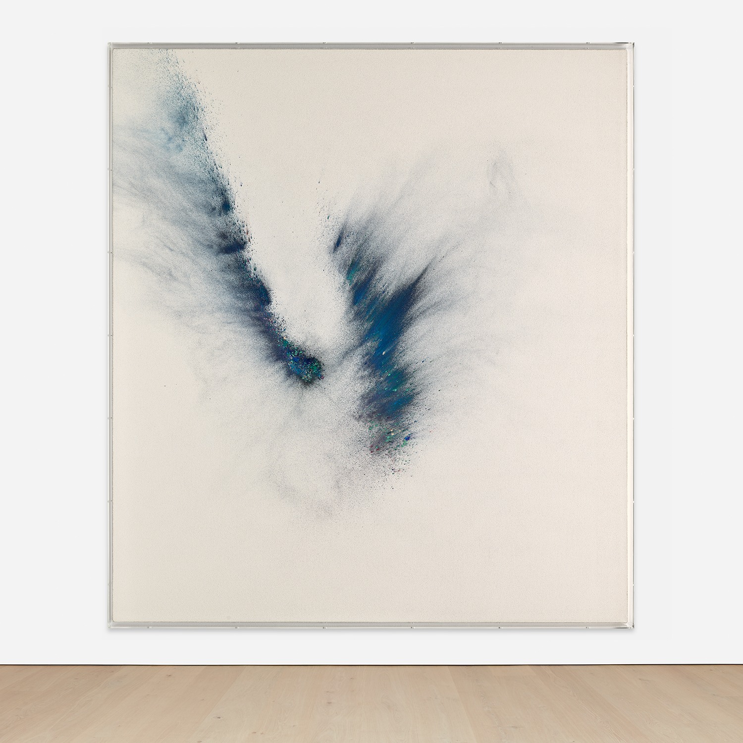
A Morris canvas at auction now functions as a reliable indicator of where serious collectors are placing their confidence. Seth Price occupies a different register in this conversation. His practice is more explicitly concerned with the conditions of distribution and reproduction than with visual pleasure, though his works are often more beautiful than that framing suggests. His 2010 survey at the Kunsthalle Zürich was a landmark moment for understanding how graphic and design logics could be extended into sculpture, video, and text simultaneously.
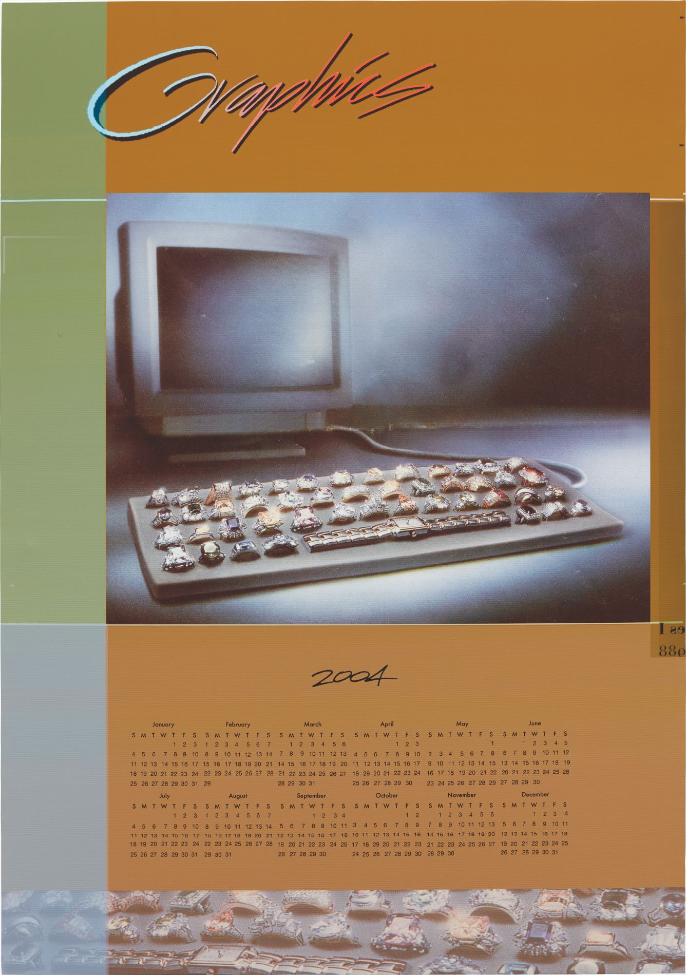
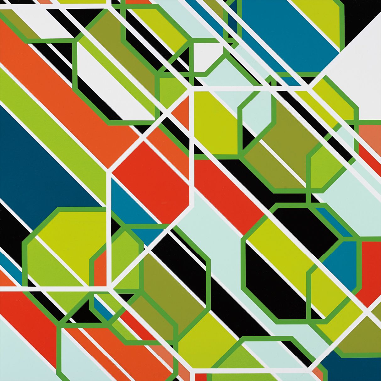
Seth Price
Olive Graphics, 2004
Price's presence on The Collection signals an understanding that this aesthetic category is not limited to works that look immediately legible as design influenced. The conceptual infrastructure matters as much as the surface. Institutionally, the collecting landscape has become more deliberate. The Walker Art Center in Minneapolis has a long history here, having supported graphic and commercial aesthetics through its design programs as well as its contemporary art collection for decades.
LACMA and the Broad in Los Angeles have been active, reflecting the particular resonance this work has in a city where entertainment industry visual culture and fine art have always been closer neighbors than the critical establishment once wanted to admit. In Europe, the Stedelijk in Amsterdam and the Nationalgalerie in Berlin have both mounted significant presentations in recent years that positioned graphic design aesthetics within longer narratives of postwar abstraction and Pop. The critical writing has kept pace. Martha Schwendener at the New York Times and Roberta Smith before her brought genuinely nuanced attention to the gallery circuit for this work.
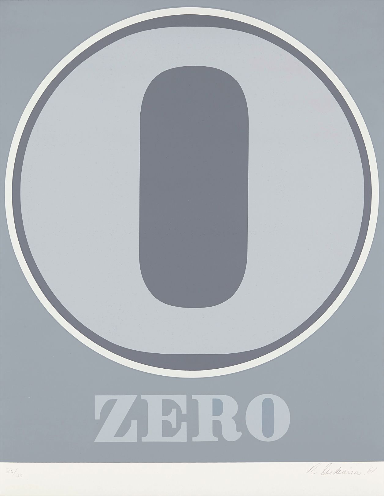
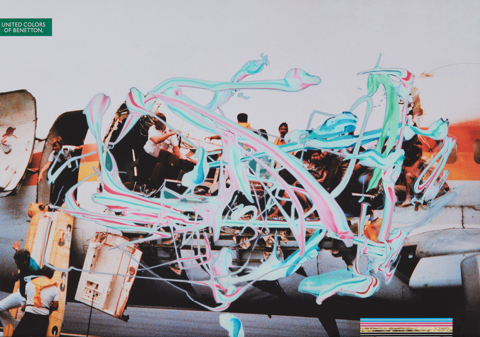
Robert Indiana
Zero, from Numbers
Catalogue essays for Kruger's retrospective at the Art Institute of Chicago in 2022 and 2023 offered some of the most serious sustained criticism the category has received. That retrospective, which traveled with considerable institutional weight behind it, forced a reconsideration of Kruger not as a historical figure but as a living artist whose methods remain provocative and unresolved. Frieze and Artforum have both dedicated substantial feature space to questions of legibility, commercial language, and artistic intention that this category keeps raising. Where is the energy heading.
The most interesting development is the generational shift in how younger artists are relating to these predecessors. Artists coming up now have grown up inside digital interfaces so thoroughly designed that the shock value of appropriating commercial language no longer works the same way. The response has been a kind of hyper awareness of visual systems, a more archaeological approach to the history of logos, typefaces, and screen culture. That shift is beginning to appear at art fairs and in gallery programming, and it suggests that the graphic design aesthetic as a collecting category still has room to develop rather than simply consolidate.
For collectors, the current moment rewards attention to the full range of the category. The blue chip names, Kruger and Indiana, anchor any serious consideration of this space. But the more complex and formally ambitious practices, McGinness, Morris, Walker, Price, are where the critical conversation is most alive and where the relationship between price and significance is still being negotiated. That negotiation is worth following closely.