Bold Contrast
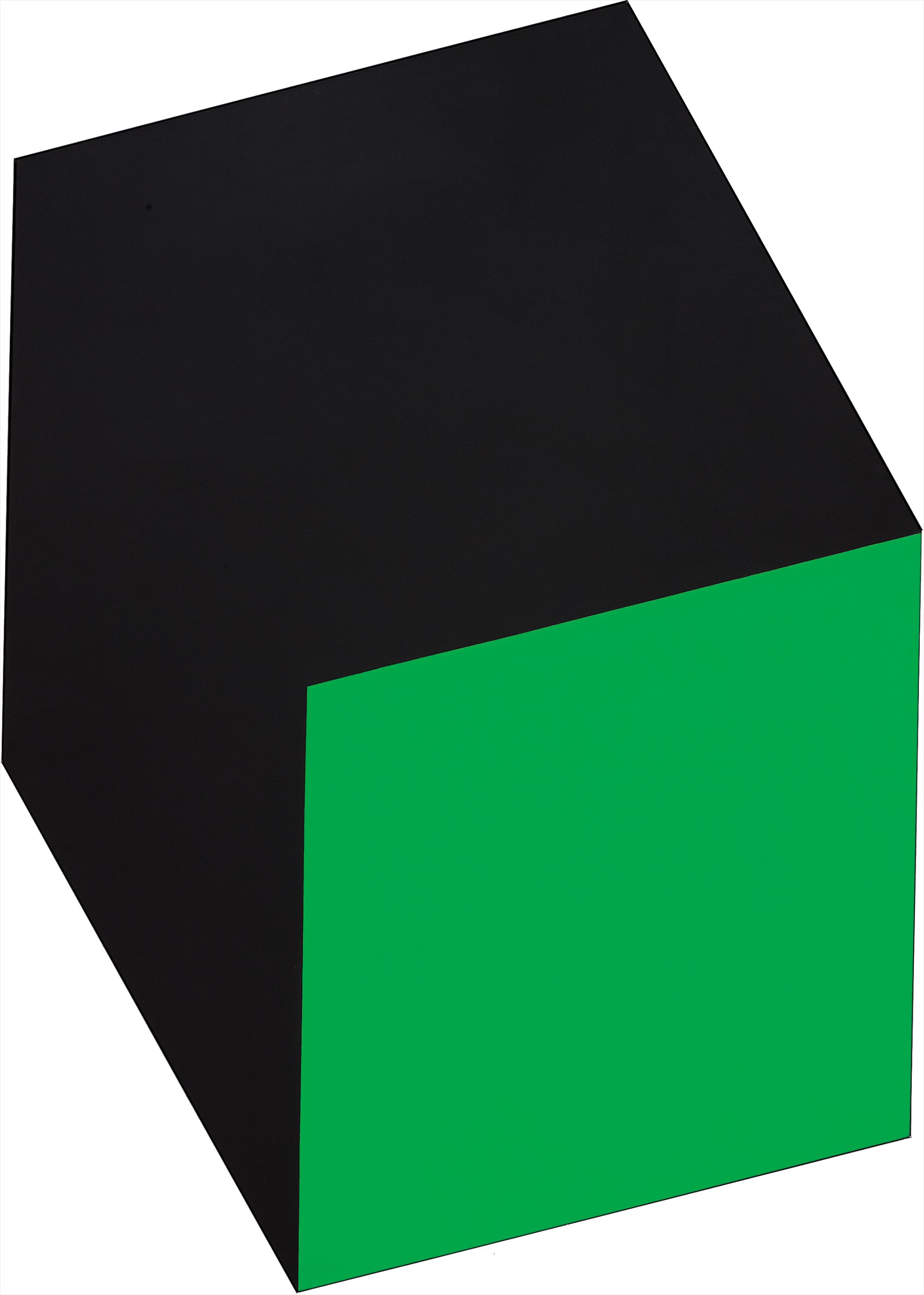
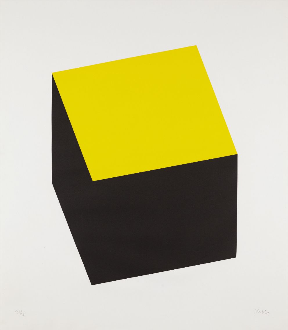
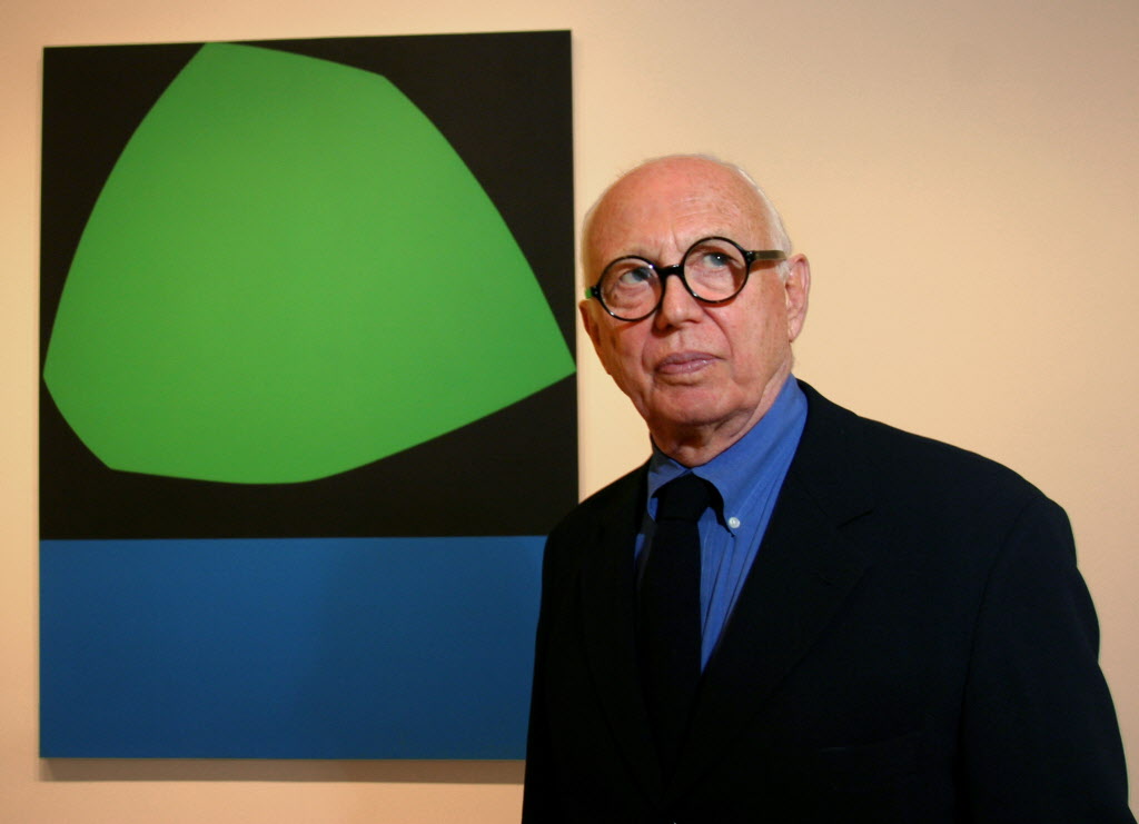
Ellsworth Kelly
Green black
The Thrill of Works That Demand Your Attention
There is something almost physiological about living with a work built on bold contrast. The eye snaps to it. The room reorganizes itself around it. Collectors who gravitate toward this territory often describe the same experience: they walked past a work, stopped, and found they could not move on.
That magnetic pull is not accidental. It is the result of a deliberate artistic intelligence at work, one that understands how the human visual system responds to tension, to the opposition of light and dark, form and void, flatness and implied depth. For a collector, that daily charge of attention is part of what makes these works worth living with over decades rather than seasons. What separates a good work in this territory from a truly great one comes down to intention and resolution.
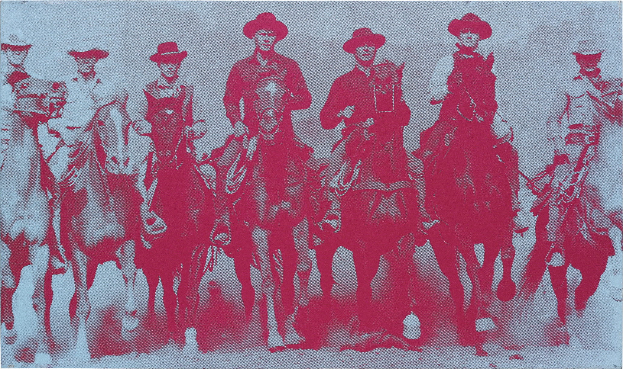
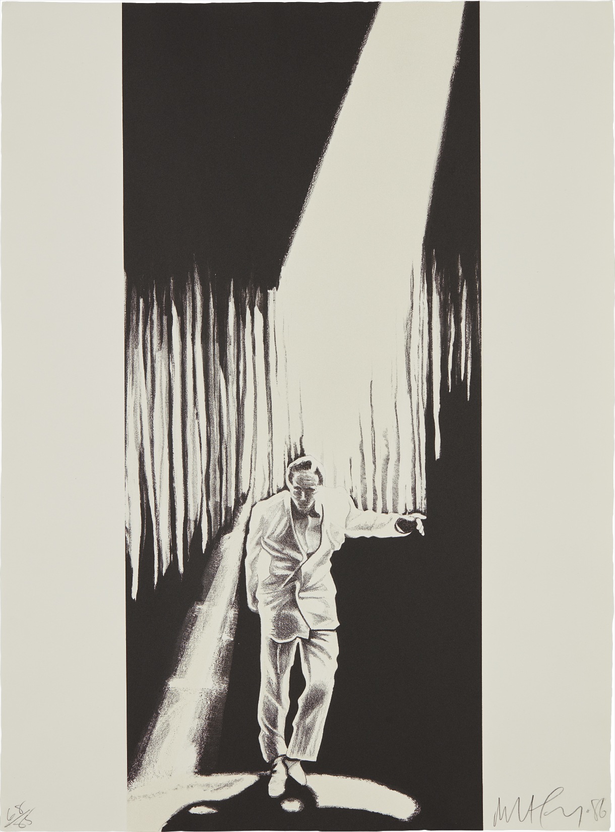
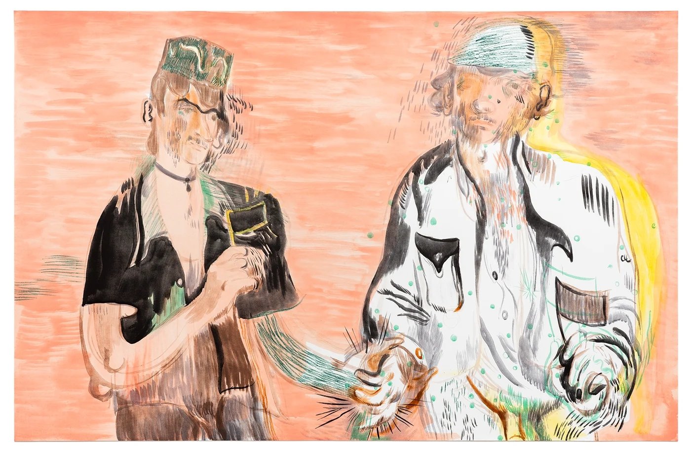
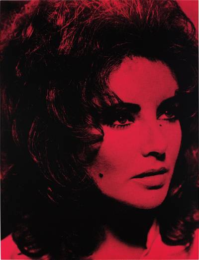
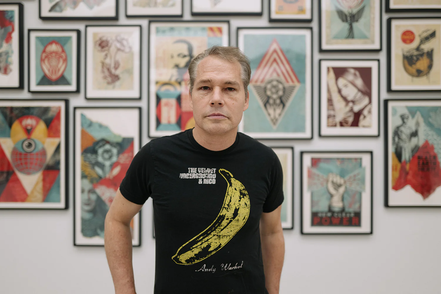
Russell Young
Sid Vicious, 2006
A work that deploys contrast merely for visual drama tends to exhaust itself quickly. The ones that endure are those where the tension feels inevitable rather than decorative, where you sense the artist arrived at each edge and boundary through rigorous decision making rather than instinct alone. Scale matters enormously here. A work that commands a wall without overwhelming the eye requires a sophisticated understanding of proportion, and that calibration is often where you separate the serious practitioners from those simply working in a fashionable mode.
Among the artists well represented on The Collection, Ellsworth Kelly stands as perhaps the clearest case of contrast elevated to philosophical inquiry. Kelly spent decades investigating what happens at the boundary between a color field and the world around it, and his works reward collectors precisely because that investigation never resolved into formula. Each piece feels like a fresh argument. Robert Longo operates in a different register entirely, his large scale charcoal works deploying contrast in a way that is almost cinematic, channeling the visual vocabulary of news photography and mass media into something monumental and unsettling.
Ellsworth Kelly
Green black
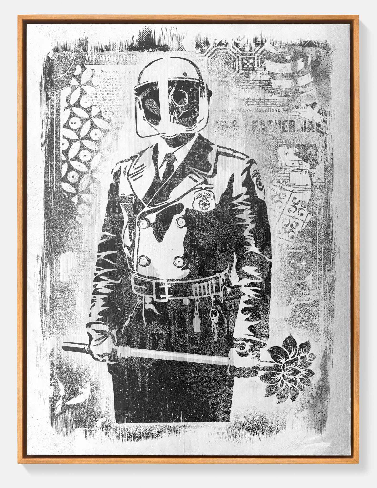
Both artists remind us that bold contrast is not a style so much as a structural commitment. Russell Young brings a different sensibility, working with silkscreen and enamel in ways that invoke Warhol but push the contrast between celebrity iconography and raw materiality into genuinely contemporary territory. The drag and texture of his surfaces create a friction that photographic reproduction rarely captures, which is worth remembering when considering a work on screen versus in person. Shepard Fairey, whose practice emerged from street culture and graphic design, has built an international reputation on the power of high contrast imagery as a form of visual argumentation.
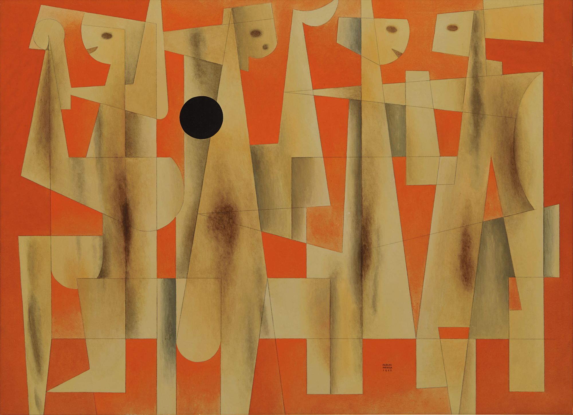
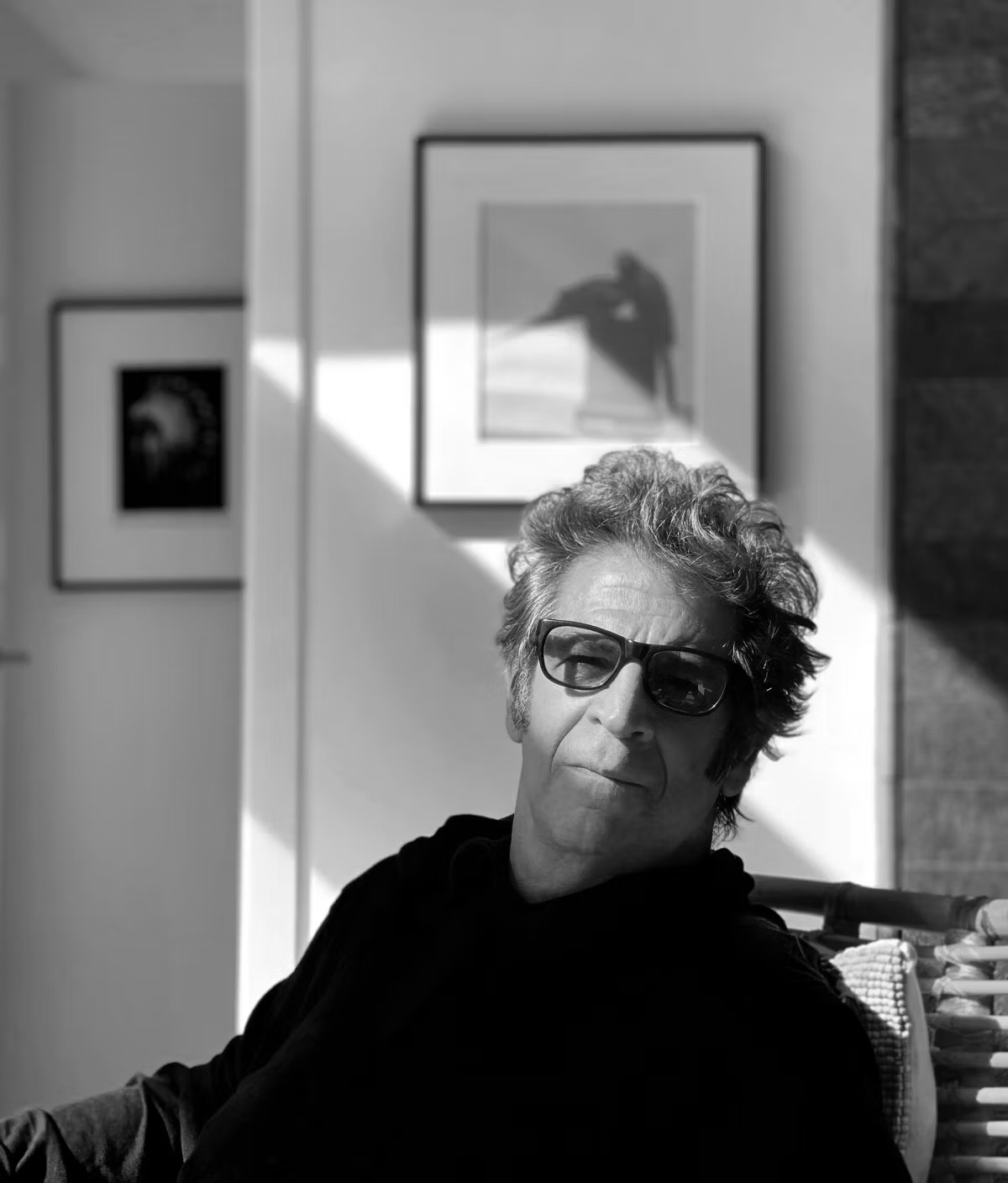
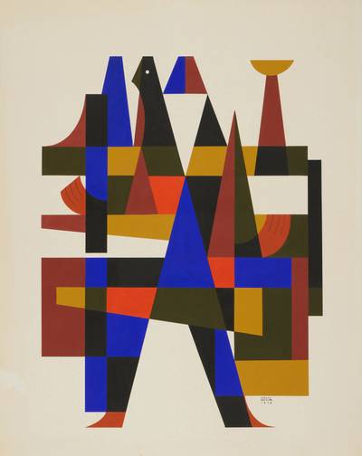
His works carry a cultural specificity that makes them particularly interesting documents of the early twenty first century, and that historical resonance is beginning to be reflected in secondary market performance. For collectors willing to look slightly beyond the most recognized names, Gerd Leufert represents a genuinely underappreciated opportunity. The Venezuelan graphic artist and designer, who died in 1998, created works of extraordinary precision that draw on both European constructivism and Latin American geometric abstraction. His work is rigorously intellectual and visually commanding, and it remains modestly priced relative to its historical importance and exhibition history.
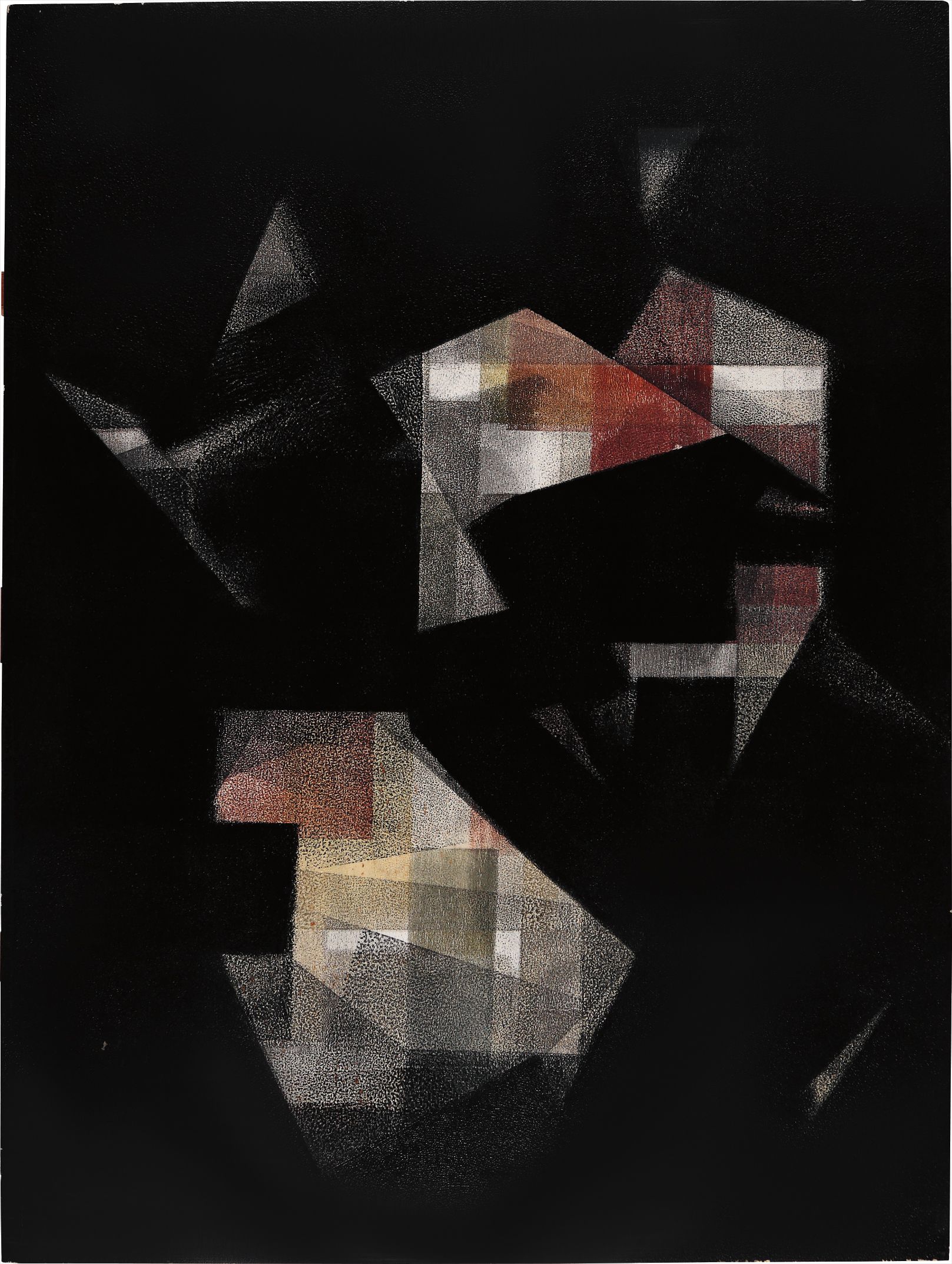
Gerd Leufert
Fondo Negro
Carlos Mérida, the Guatemalan born artist whose career spanned from early modernism through mid century geometric abstraction, occupies a similar position. As the art market continues to reassess Latin American modernism with greater seriousness, works by both Leufert and Mérida look increasingly well positioned. At auction, works built on strong contrast have shown consistent resilience. They photograph well, which matters in an era when so much preliminary collecting research happens through screens.
They read clearly in catalogue images, which translates into broader bidding pools. That said, the secondary market for artists working in this mode is not uniform. Blue chip examples by Kelly have brought significant results at Christie's and Sotheby's, while mid career and emerging artists working in related territory can still be acquired through galleries at prices that feel rational. The gap between primary and secondary market pricing for artists in this space remains one of the more interesting inefficiencies for an attentive collector to navigate.
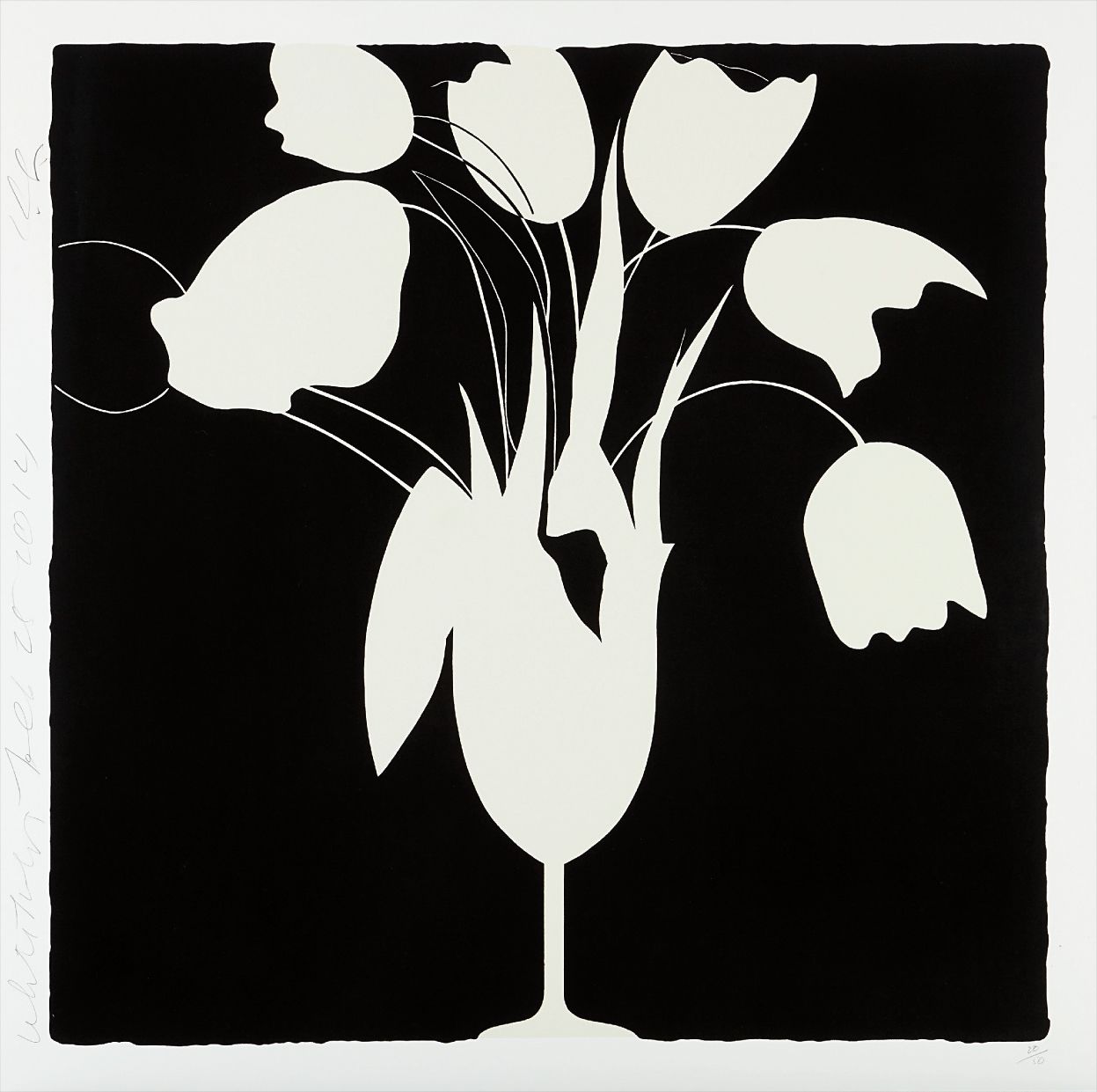
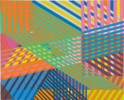
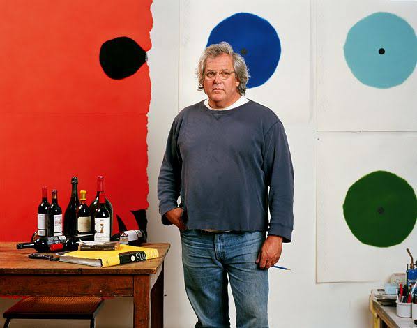
Donald Sultan
White Tulips and Vase
Donald Sultan, whose black and white works on tile board carry a gravitas that belies their relatively modest market profile, is worth serious attention at current prices. His practice draws on both still life tradition and industrial process in ways that feel original rather than derivative, and his critical reputation has always outrun his auction visibility. Kelley Walker, whose work engages with the cultural weight of contrast through appropriated imagery and material disruption, operates in a more conceptually restless space. His work appeals to collectors with an appetite for works that continue to generate interpretive friction over time rather than resolving into comfortable visual pleasure.
On the practical side, works in this category reward careful attention to condition in ways that are sometimes overlooked. Edges are everything. In a work where the entire argument rests on the precision of a boundary between black and white, or between two saturated fields, any damage to that edge is not merely cosmetic. It is structural.
When looking at works on paper, ask specifically about light exposure history and storage conditions. For works on canvas or board, request condition reports that address the stability of any ground layer as well as the upper surfaces. Prints and editions require particular scrutiny of impression quality, since contrast that reads beautifully in an early pull can become muddy or uncertain in later ones. When speaking with a gallery about acquiring work in this area, the most useful questions are often the simplest.
Ask how the work was made, and listen carefully to whether the answer reveals genuine familiarity with the artist's process. Ask about exhibition history. Ask whether the work has been shown in natural versus artificial light and what the gallery recommends for installation. If you are considering an edition, ask where in the edition your work falls and request documentation.
Bold contrast is an area where the difference between a work that transforms a room and one that merely occupies it often comes down to decisions made long before the work left the studio. The more you understand those decisions, the better equipped you are to collect with real confidence.