Flat Colors
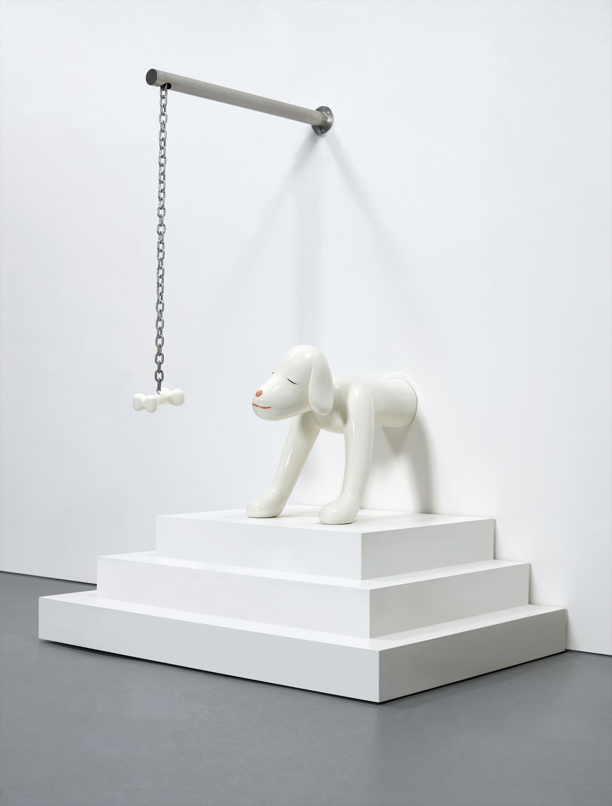
Julian Opie
Imagine You Are Driving (Fast)/Jacques

The Quiet Power of Flat Color
There is something almost paradoxical about the appeal of flat color painting to serious collectors. At first glance, the works appear simple, even reductive. No atmospheric blending, no gestural drama, no illusion of depth achieved through careful tonal gradation. And yet collectors who live with these works often describe them as among the most demanding and rewarding in their homes, pieces that change depending on the light, the hour, the mood of the room, and somehow, the mood of the person standing before them.
That tension between apparent simplicity and genuine complexity is precisely what makes flat color such fertile ground for collecting. The best works in this area do not hide behind difficulty. They ask you to look harder, to notice what is and is not there. A truly great flat color work earns its silence.
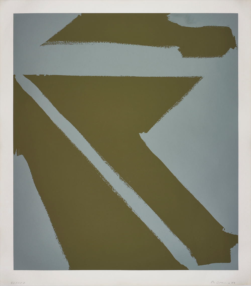
Sol LeWitt
Flat-top pyramid
The artist must make every decision with absolute commitment because there is nowhere to hide a mistake, nowhere to let a loose passage resolve itself through painterly incident. What separates a good flat color work from a great one is precisely this quality of inevitability, the sense that every edge, every proportion, every chromatic relationship has been arrived at through rigorous thought rather than intuition alone. Collectors should ask themselves whether a work feels resolved or merely finished. That distinction, subtle as it sounds, is everything.
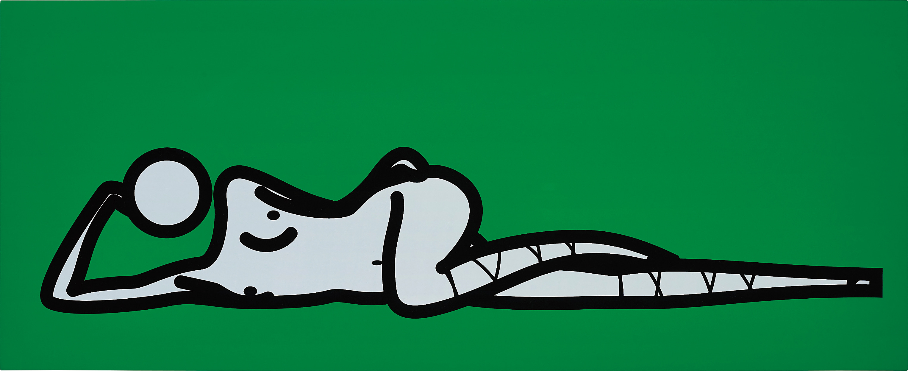
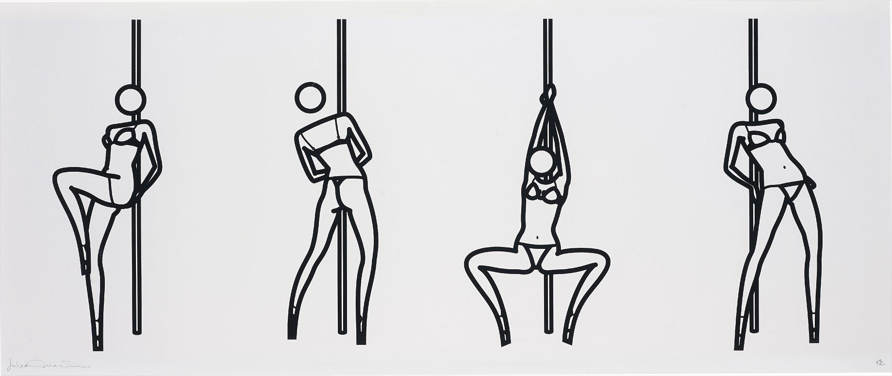
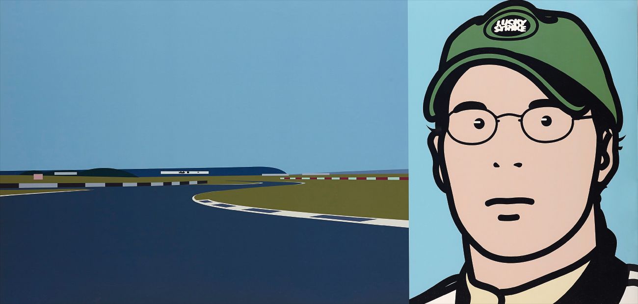
When assessing individual works, provenance and the relationship to an artist's broader practice matter enormously. A flat color work that sits at the center of what an artist has spent decades thinking about will almost always outperform one that represents an experiment or a detour. Julian Opie is a strong example of this principle in action. His work has been rooted in the vocabulary of flat color, clean outlines, and the reduction of the figure to essential information since the late 1980s, and his consistency has made him one of the most recognizable and collectible artists working in this register today.
Julian Opie
Imagine You Are Driving (Fast)/Jacques
Opie's prints and editions are particularly well represented on The Collection, and they offer collectors an accessible point of entry into a practice that has only grown in critical and commercial stature over time. His works draw on road signs, digital interfaces, and the visual grammar of mass communication, but they are never illustrational. They use flatness as a philosophical position. Sol LeWitt occupies a different but equally significant position in this conversation.
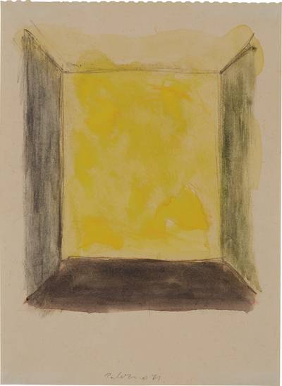
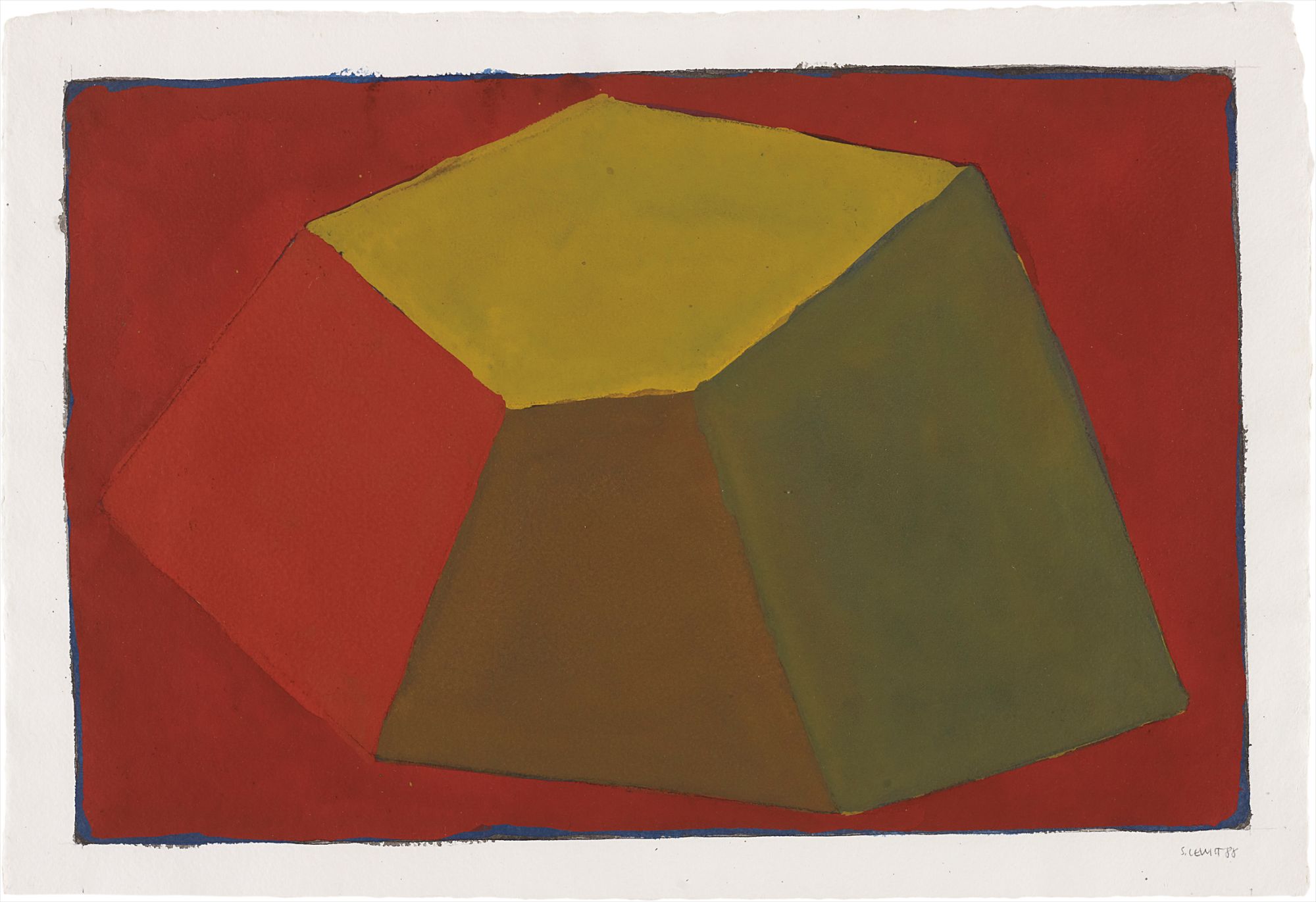
LeWitt's wall drawings and structures use flat color not as a stylistic choice but as a logical consequence of his conceptual framework. When you collect a LeWitt, you are collecting an idea that happens to manifest as color, and that distinction has made his work extraordinarily durable both intellectually and at auction. Palermo, the German artist closely associated with the Düsseldorf milieu of the 1960s and 1970s, brought a quieter but equally rigorous sensibility to flat color objects and fabric works before his early death in 1977. A Palermo in a collection signals a certain depth of knowledge, and the market has reflected this, with prices climbing steadily as institutional interest has grown.
Palermo
Palermo
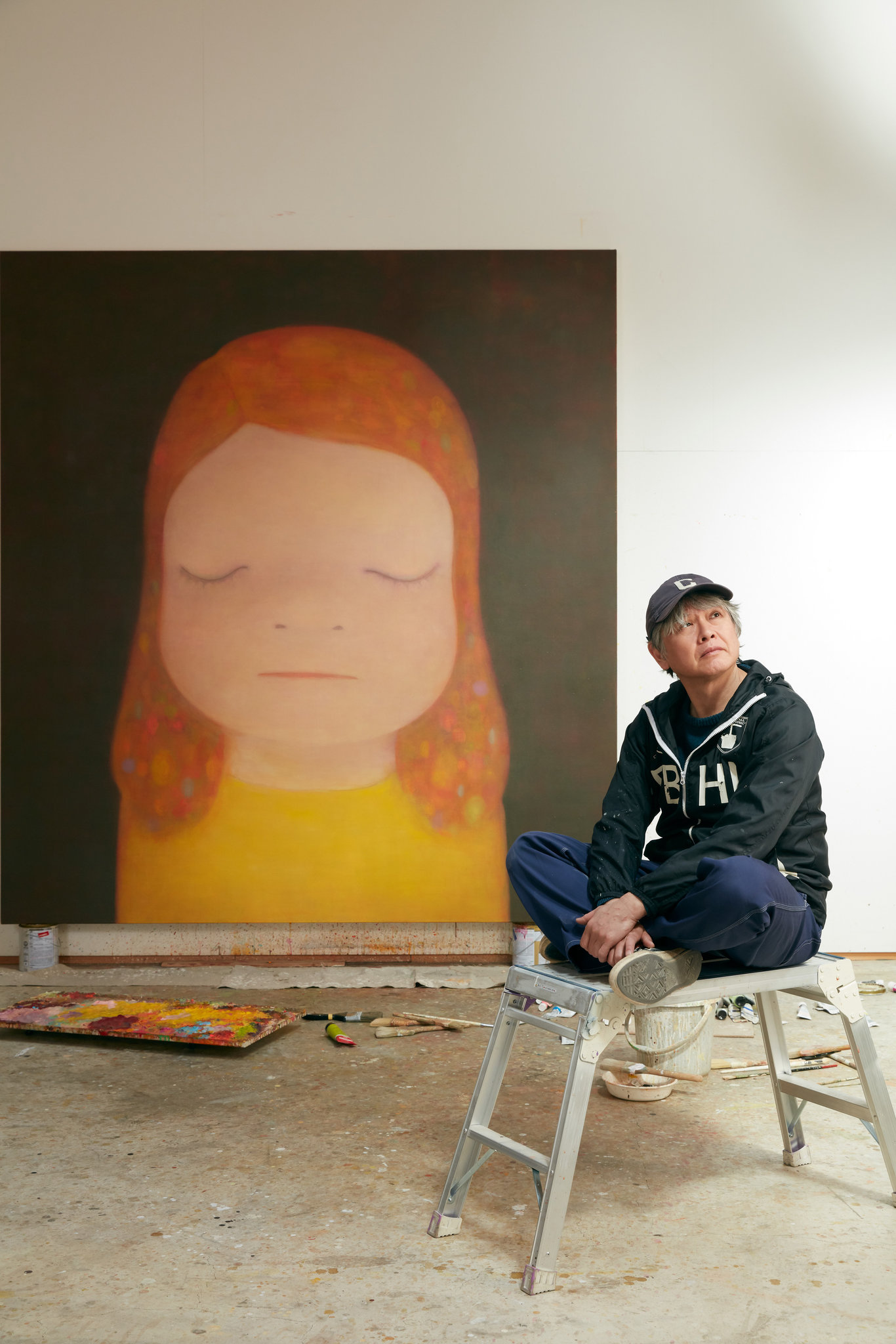
Yoshitomo Nara operates in a different register entirely, his flat color fields anchoring emotionally charged figures that have become some of the most sought after images in contemporary collecting globally. Nara demonstrates that flatness need not mean coolness, a useful reminder that this category holds enormous range. For collectors looking beyond the established names, the field is genuinely exciting right now. A younger generation of painters is engaging with flat color through the lens of digital culture, treating the screen as both subject and formal influence.
Artists exploring the overlap between painting and graphic language, particularly those working in Africa, Latin America, and Southeast Asia, are producing flat color work that carries genuine conceptual weight alongside strong visual identity. Galleries in London, Los Angeles, and Seoul are worth watching closely in this area. Buying early, when the work is still available through primary market channels and at reasonable prices, is the most reliable strategy for long term collection building. At auction, flat color works have proven remarkably consistent performers, though the category rewards patience more than speculation.
Yoshitomo Nara
This work is number 6 from an edition of six.
Opie's editions and prints have held value reliably through market cycles, and his unique works on canvas and aluminum have seen strong results at major houses. The secondary market for Nara has been extraordinary over the past decade, with auction records set repeatedly at Christie's and Sotheby's as Asian collector demand has driven prices well above estimate. The broader lesson here is that works with genuine crossover appeal, pieces that attract both Western institutional collectors and newer international buyers, tend to perform best. Flat color, with its graphic clarity and reproducibility in digital contexts, has a natural advantage in an era when so much art is first encountered on a screen.
Practically speaking, flat color works are among the most forgiving to live with and among the most demanding to display well. They need good light and clean sight lines. Because so much depends on the integrity of the surface, condition is paramount. Collectors should ask galleries about the support material, whether canvas, aluminum, or paper, and about any known sensitivity to humidity or UV exposure.
For editions, always confirm the edition size and whether the artist has placed a cap on future production. The difference between an edition of ten and an edition of one hundred matters significantly on the secondary market. Ask the gallery directly whether the work has been exhibited, whether it carries any institutional history, and whether documentation is complete. These questions are not pedantic.
They are the foundation of informed collecting, and any reputable gallery will welcome them from a serious buyer.