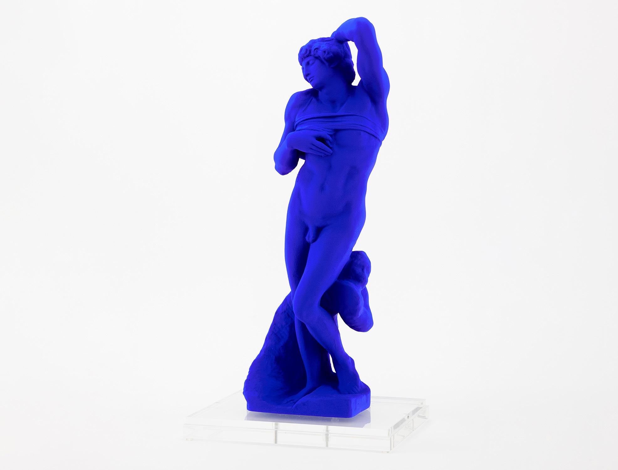
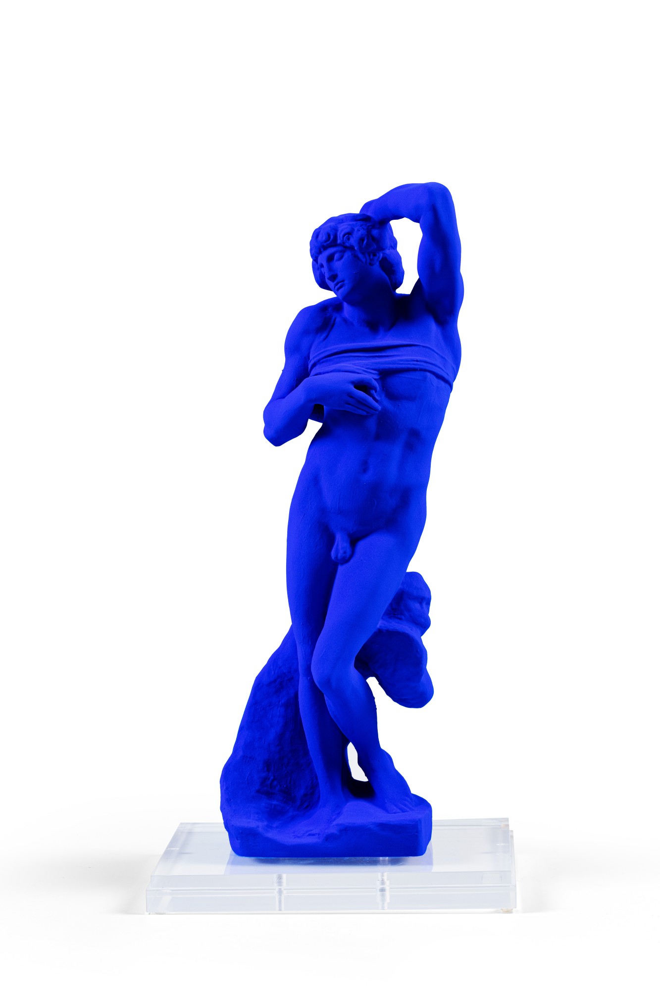
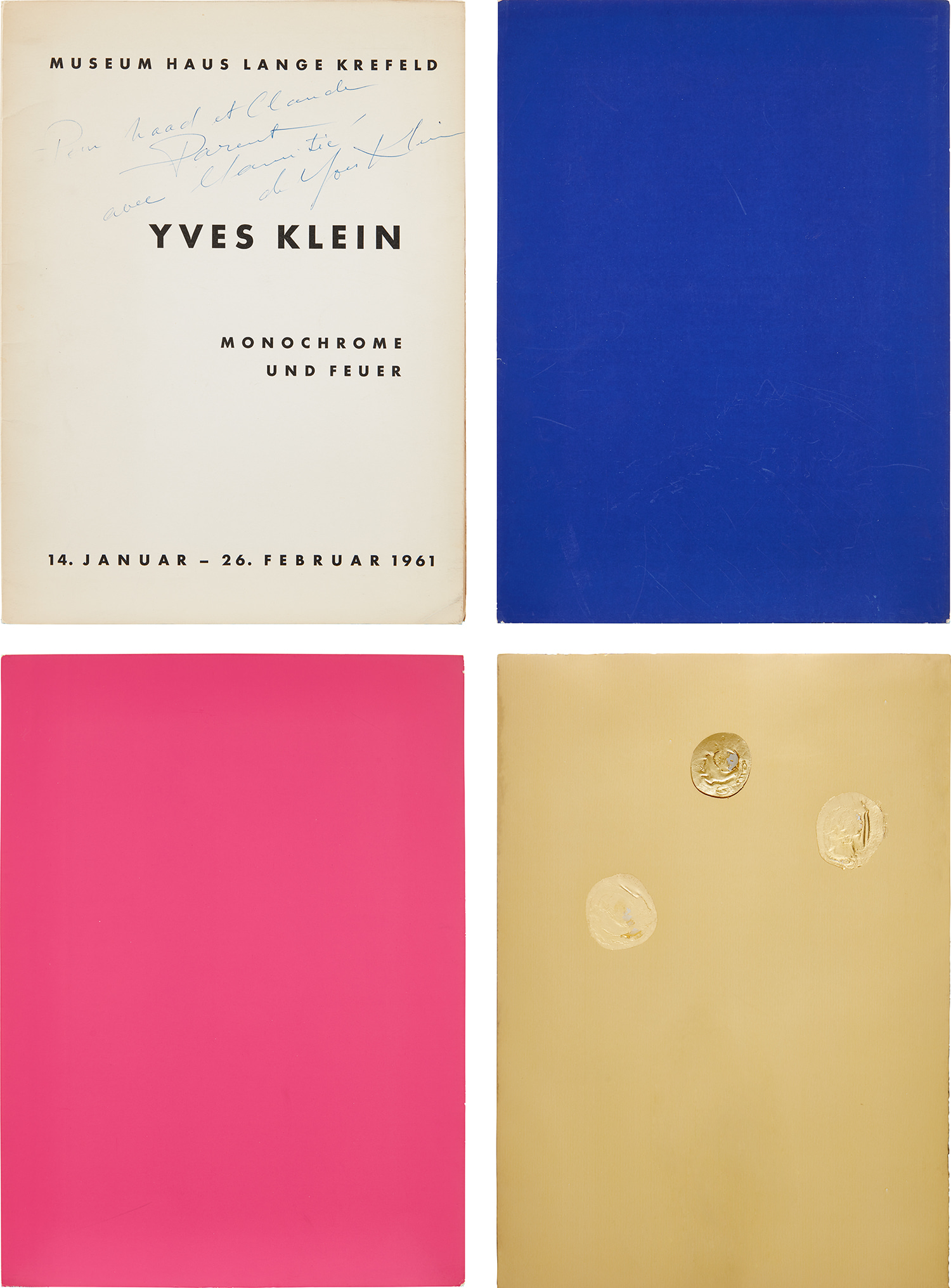
Blue Monochrome
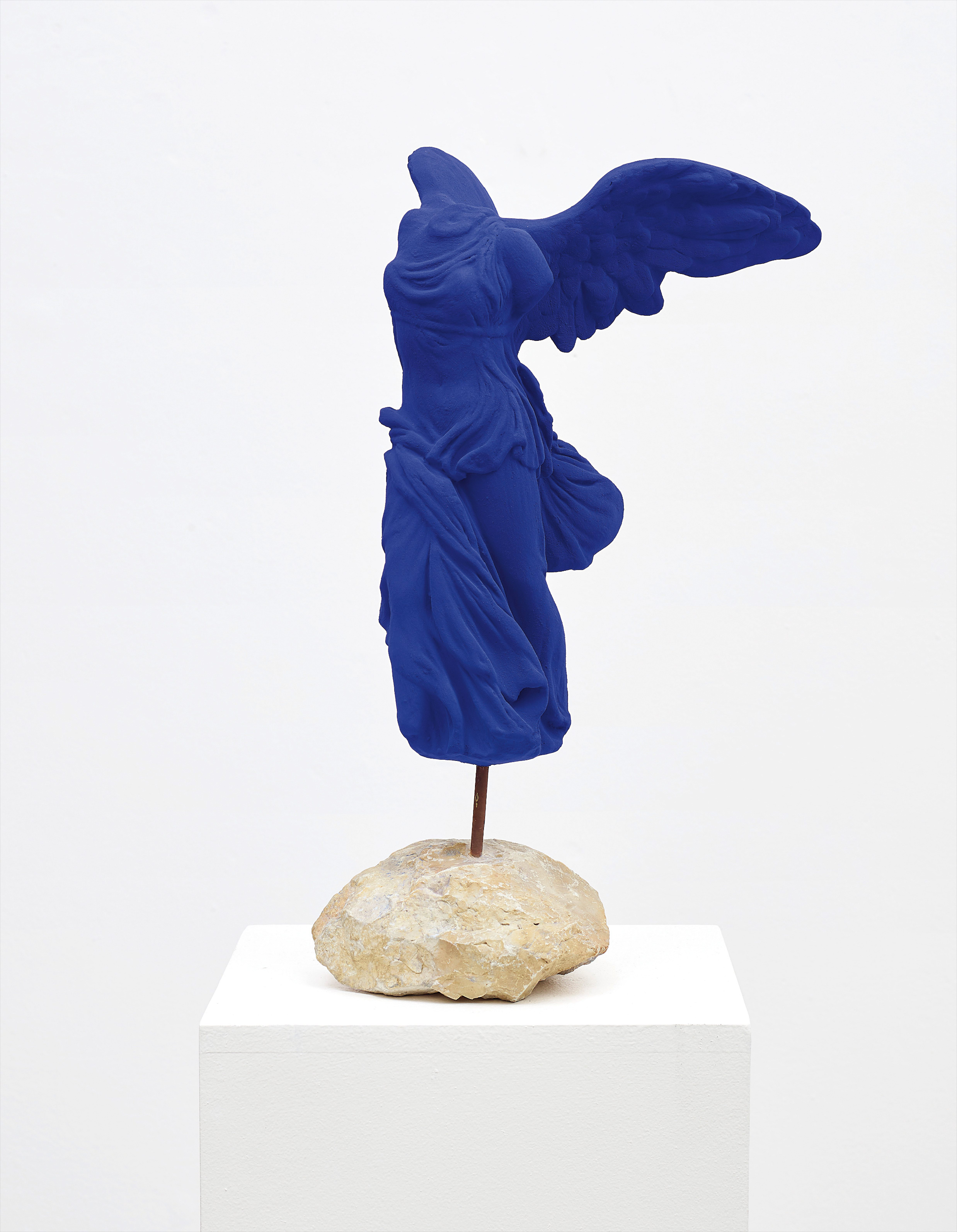
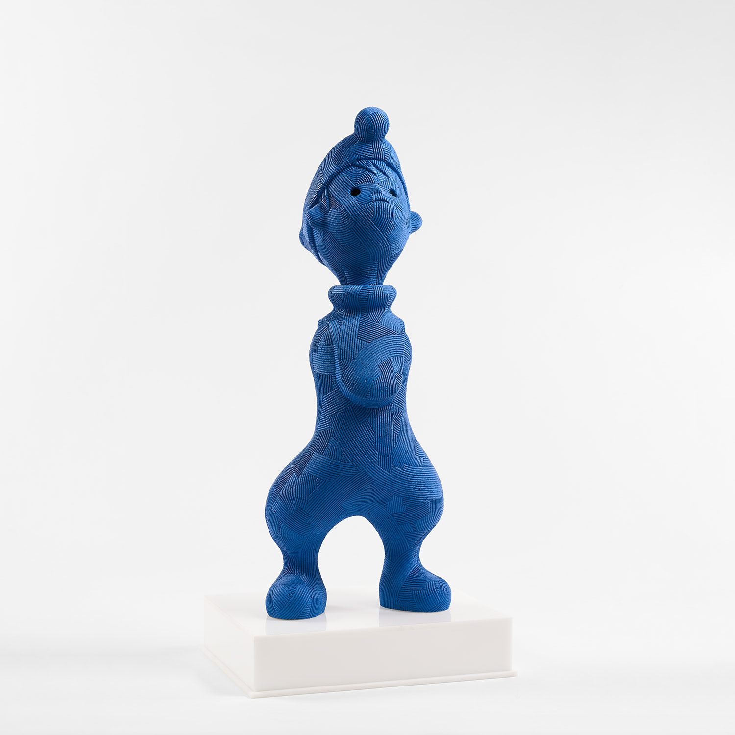
Yves Klein
La Victoire de Samothrace (S 9), 1962
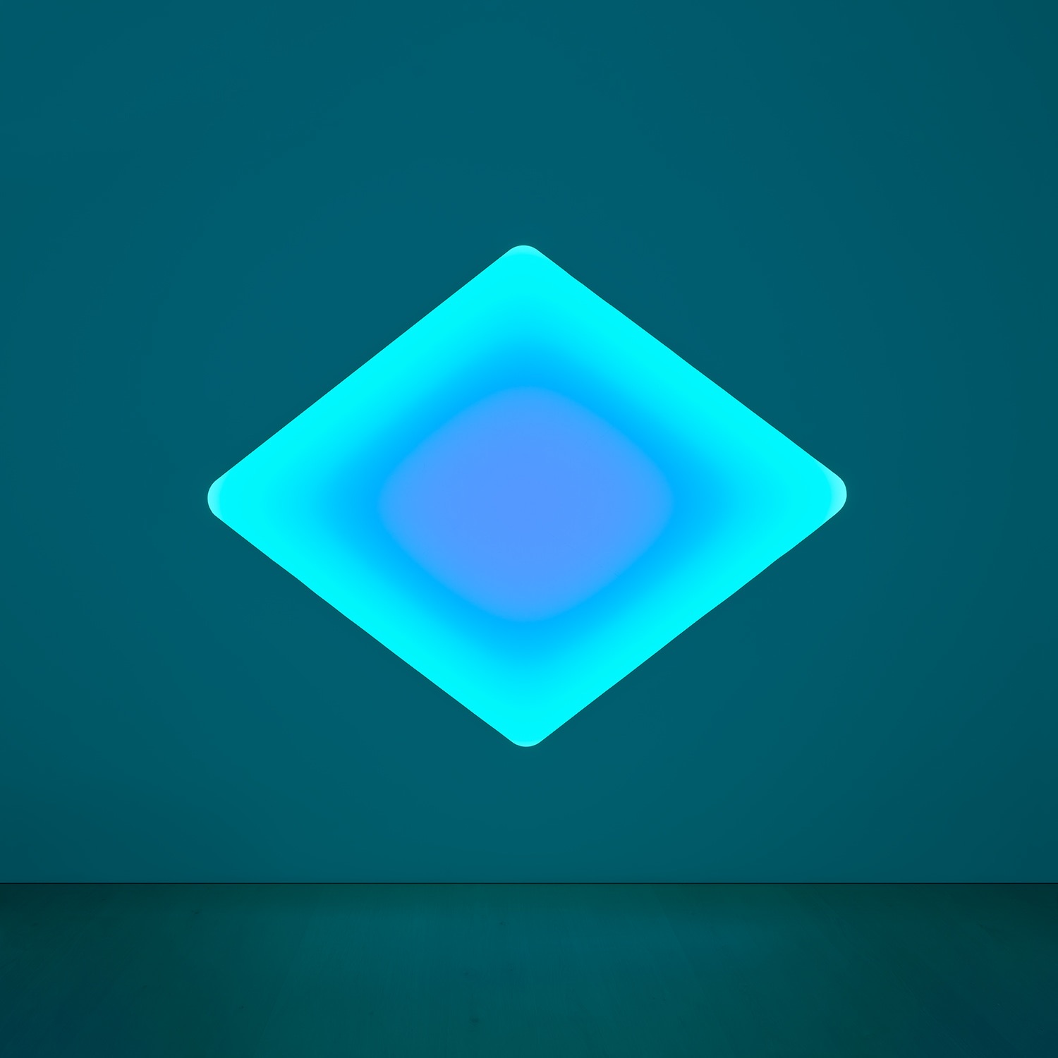
The Color That Swallowed the Void
There is a moment, standing before a true blue monochrome, when the eye stops searching for something to hold onto and simply falls in. No narrative, no figure, no horizon line. Just pigment and presence and the strange, vertiginous sense that you are looking not at a surface but through one. This is what blue monochromes have always promised, and in the hands of their greatest practitioners, it is precisely what they deliver.
The monochrome as a serious artistic proposition emerged in the early twentieth century, with Kazimir Malevich's White on White of 1918 staking a claim for painting as pure sensation, stripped of representation and ideology alike. But blue carried a particular charge that white and black did not. Spiritualists had long associated blue with transcendence and the infinite. For painters who came of age in the postwar period, exhausted by the wreckage of European civilization, the idea of stepping outside history and into pure color felt less like retreat than revelation.
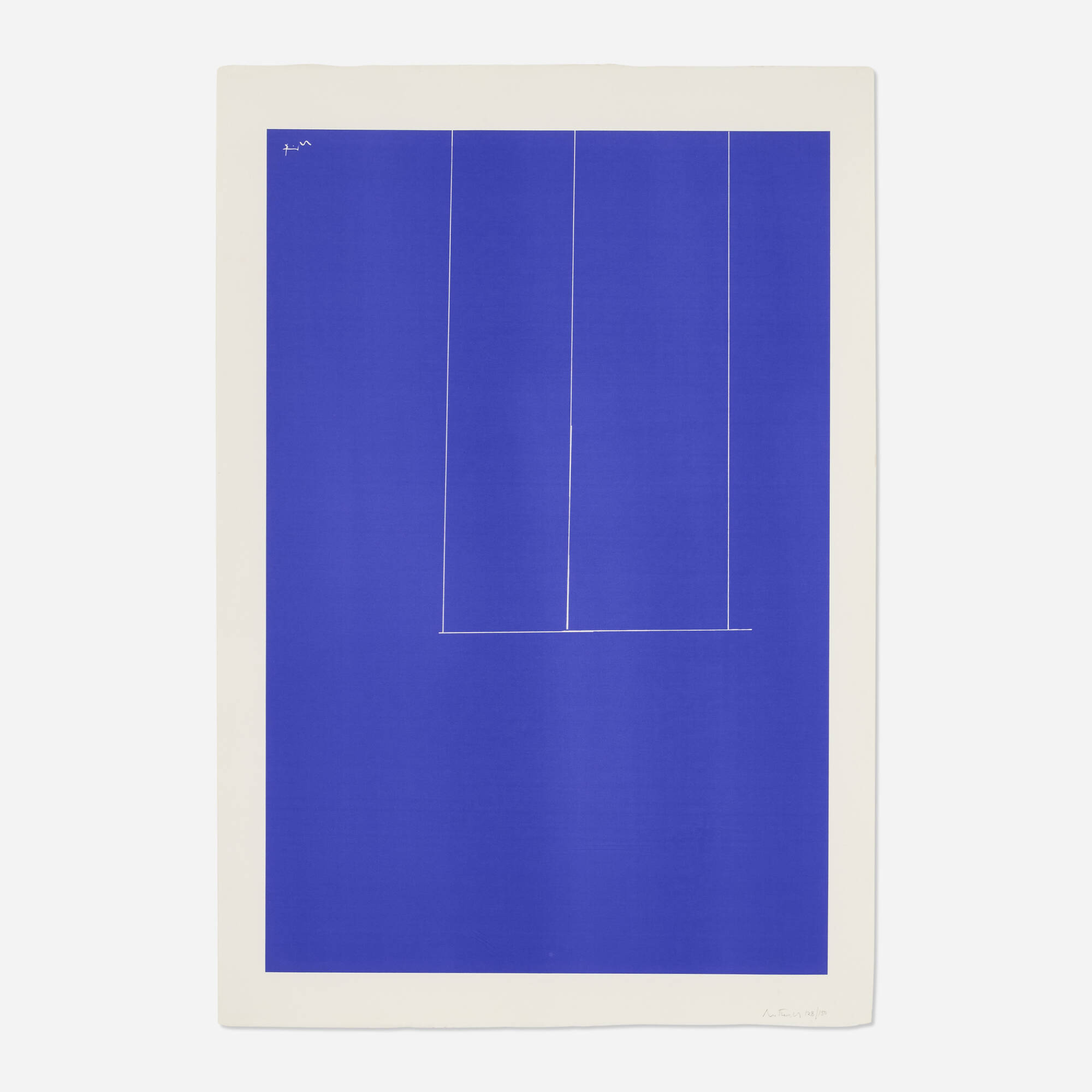
Yves Klein
La Victoire de Samothrace (S 9), 1962
No figure embodies this more completely than Yves Klein, whose relationship with blue became one of the defining artistic obsessions of the twentieth century. In 1960, Klein exhibited a series of monochromes at the Galerie Iris Clert in Paris that stopped the art world cold. He had developed his own ultramarine pigment, bound with a synthetic resin called Rhodopas M60A that preserved the pigment's raw luminosity without the deadening effect of traditional binders. He called it International Klein Blue, or IKB, and he treated it not as a color choice but as a philosophical position.
To Klein, IKB was immateriality made visible, the void given body. The works on The Collection speak directly to this commitment, offering an encounter with a sensibility that remained utterly consistent across his short life. Klein's monochromes were never simply about the absence of image. They were about total presence.
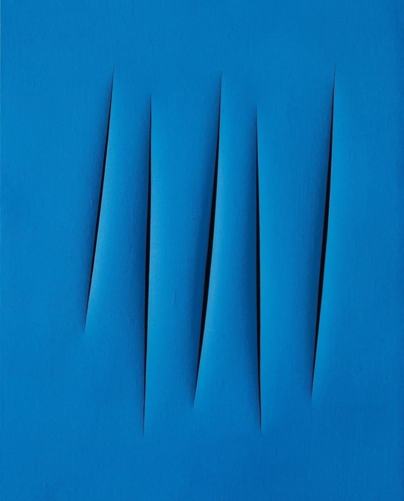
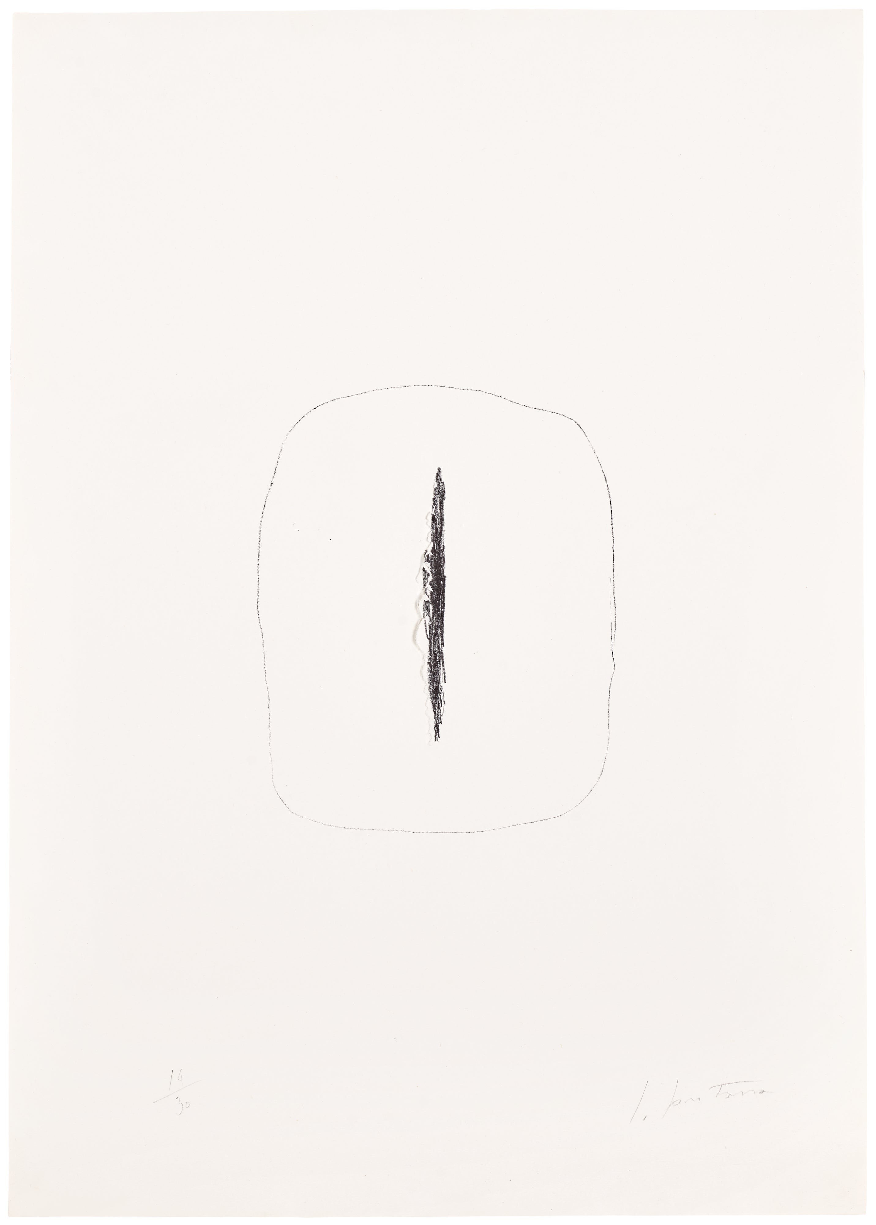
Lucio Fontana
Concetto Spaziale, Attese
He believed that a painting should emanate, that color should function less like a fact and more like an atmosphere. This put him in productive tension with contemporaries who were pursuing related questions through very different means. Lucio Fontana, whose work is also represented on The Collection, was slashing through canvas in Milan at almost exactly the same moment, insisting that the picture plane was an obstacle to be broken rather than a field to be filled. Where Klein pushed depth through pigment, Fontana created literal depth through rupture.
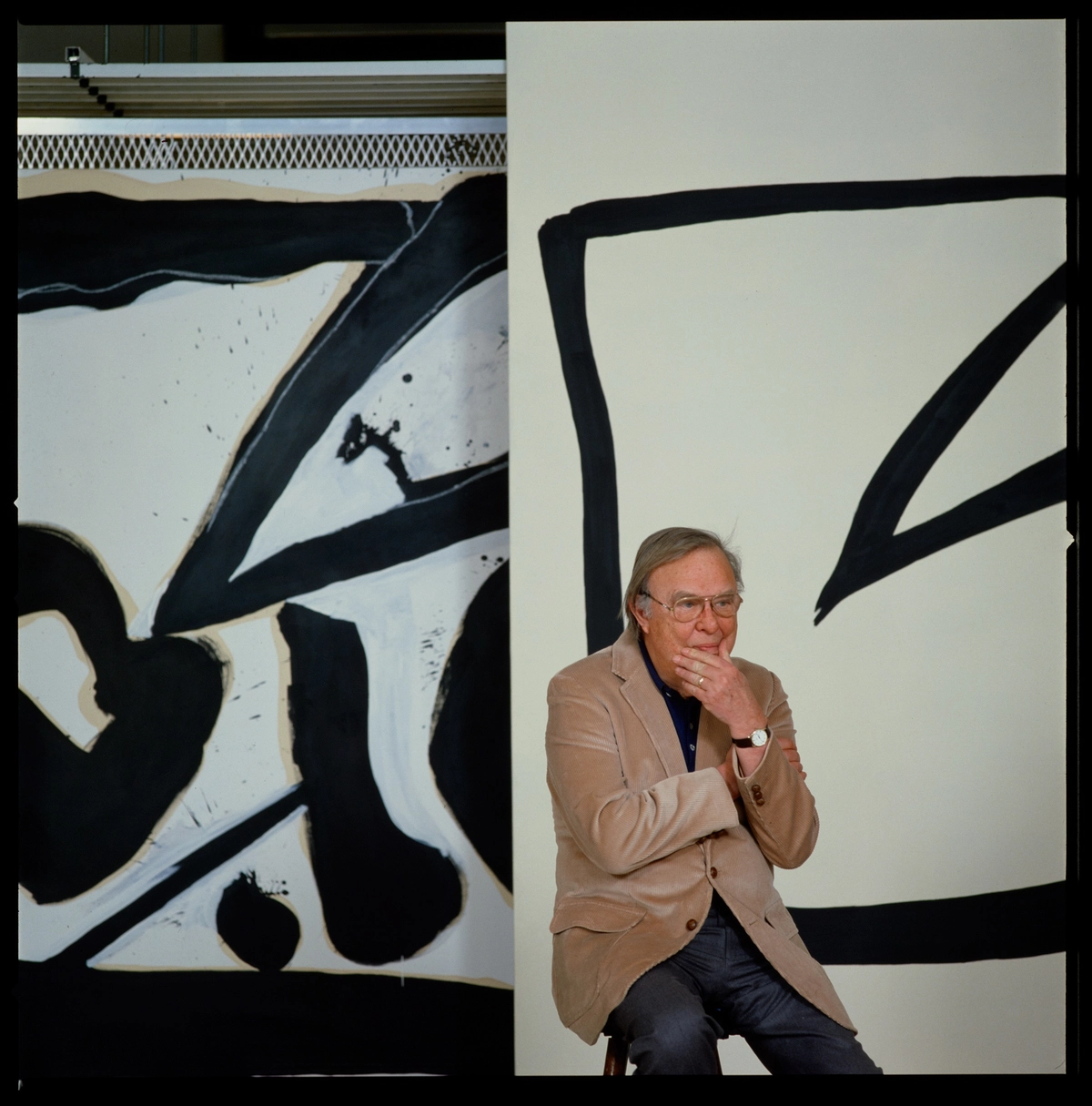
Together they mapped the outer edges of what painting could do when it refused to illustrate anything at all. The American postwar painters were arriving at adjacent territories through the particular pressures of Abstract Expressionism. Robert Motherwell, whose presence on The Collection rewards close attention, worked in a more gestural register, but his sustained engagement with the relationship between color fields and emotional weight belongs to the same broader inquiry. The question animating all of these artists was the same: what does a painting hold when it holds no image?
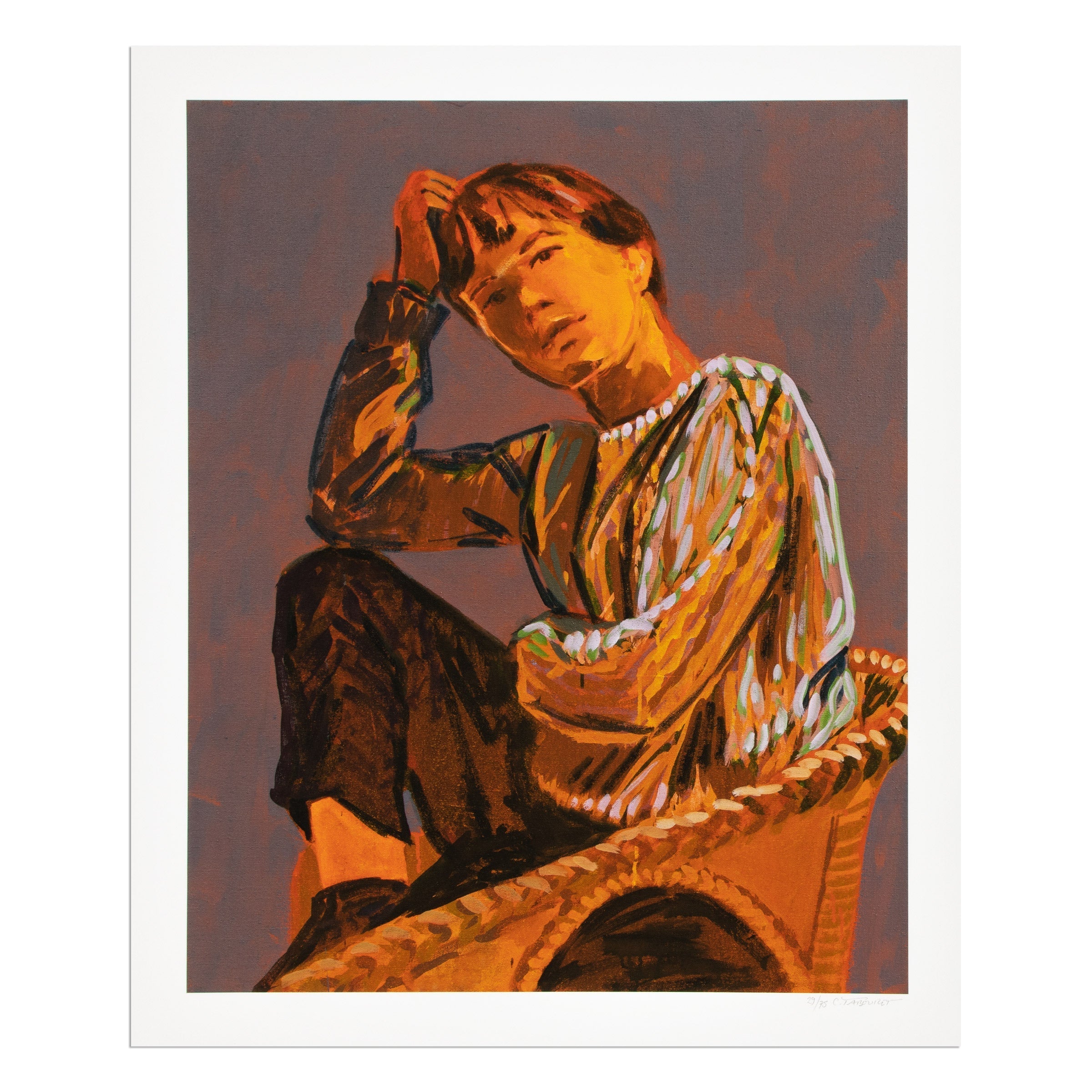
Robert Motherwell
London Series I: Untitled (Blue), 1971
The blue monochrome answered that question with a kind of bodily certainty. It held feeling. It held duration. It held the time of looking itself.
Technically, the monochrome presents challenges that are easy to underestimate. A single field of color is merciless. Every decision about surface texture, paint application, and support becomes legible in a way that figurative or compositionally complex work can absorb or obscure. Klein's use of the roller and sponge to build up IKB created a granular, almost velvety surface that catches light differently across a single canvas.
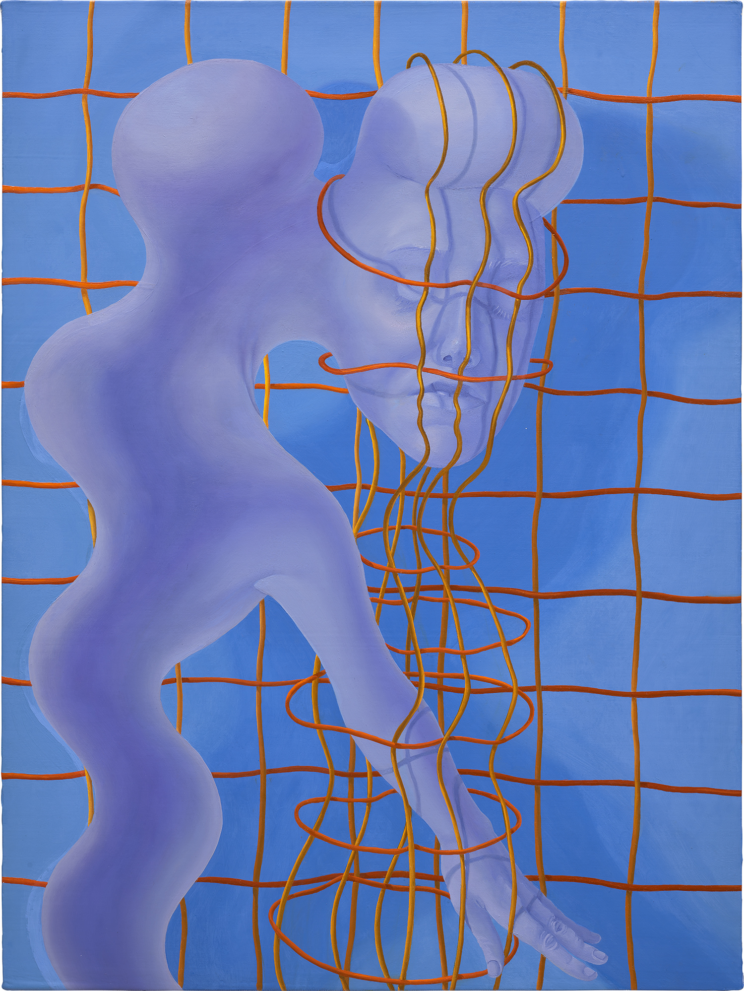
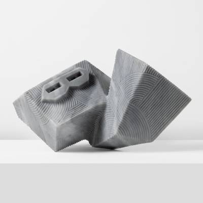
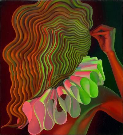
En Iwamura
Blue Astronaut
Flatness and depth coexist. The materiality of the pigment insists on its physical reality at the same moment the color seems to dematerialize the object altogether. This paradox is part of what makes great monochromes so compelling to live with over time. The influence of blue monochrome thinking has traveled far beyond the artists who first codified it.
Painters working today in modes that touch on minimalism, spiritualism, or pure optical experience almost inevitably reckon with this inheritance. En Iwamura's work, available through The Collection, engages with color and surface in ways that feel both deeply considered and genuinely contemporary, rooted in the history of painting while refusing to be confined by it. Similarly, Sascha Braunig brings an unexpected conceptual pressure to questions of surface and perception that resonates with the monochrome tradition even when departing from it stylistically. These are artists who understand what it costs to take painting seriously at this particular moment, and their work rewards the kind of sustained, attentive looking that the monochrome has always demanded.
Culturally, the blue monochrome occupies a unique position. It has become iconic enough to be subject to easy reproduction and appropriation, splashed across design objects and social media feeds in ways that strip it of context. And yet the experience of standing before an actual IKB painting, or before a work by a contemporary artist who has genuinely wrestled with this history, remains irreducibly powerful. The copy teaches you nothing.
The original teaches you everything about why the copy exists. This is the paradox of monochrome in the age of images: the less it offers the scanning eye, the more it rewards the body that stays. For collectors, works in this lineage carry a particular kind of gravity. They ask something of the room they inhabit.
They change with the light, with the season, with the mood of the person who enters. They are not decoration in any conventional sense. They are, at their best, a form of ongoing conversation between the work and the person who chose to live with it, a conversation that never quite resolves and never quite exhausts itself. That quality, so difficult to manufacture and so easy to recognize, is exactly why blue monochromes have endured from Klein's Paris to the present day, and why they continue to find their way onto the walls of collectors who understand that the most powerful images are sometimes the ones that contain no image at all.