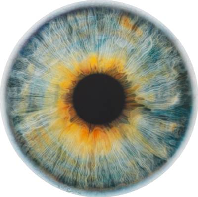
Warm And Cool Tones
Pamela Rosenkranz
Fire and Ice (Plastic Soul)

The Temperature of Color Is Everything
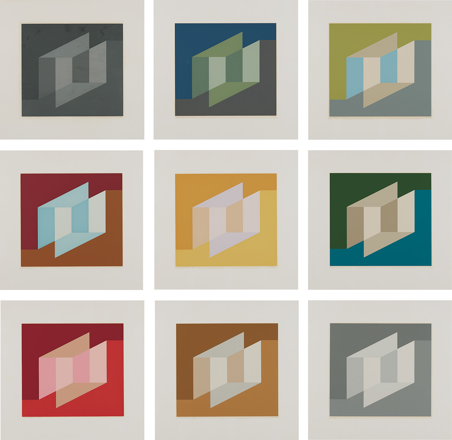
When Josef Albers's 'Homage to the Square' series appeared at Sotheby's New York in 2023, bidding climbed well past its estimate, a reminder that the market for chromatic investigation remains as charged as ever. These modest, nested squares, built entirely from adjacencies of warm and cool, continue to astonish collectors who understand that what Albers was doing was essentially scientific and essentially emotional at the same time. The work does not illustrate a theory. It demonstrates one, right in front of you, in real time.
That tension between logic and sensation is precisely why color temperature as a subject feels so urgent right now. The critical rehabilitation of color as a serious intellectual concern took decades. For much of the late twentieth century, the discourse around painting was dominated by questions of gesture, politics, and identity, and pure chromatic inquiry was sometimes dismissed as decorative or academic. What changed things was a sequence of major institutional reckonings, beginning with the Albers retrospective at the Guggenheim Bilbao and traveling across Europe in the early 2000s, which repositioned his color studies not as pedagogical curiosities but as foundational works of perceptual philosophy.
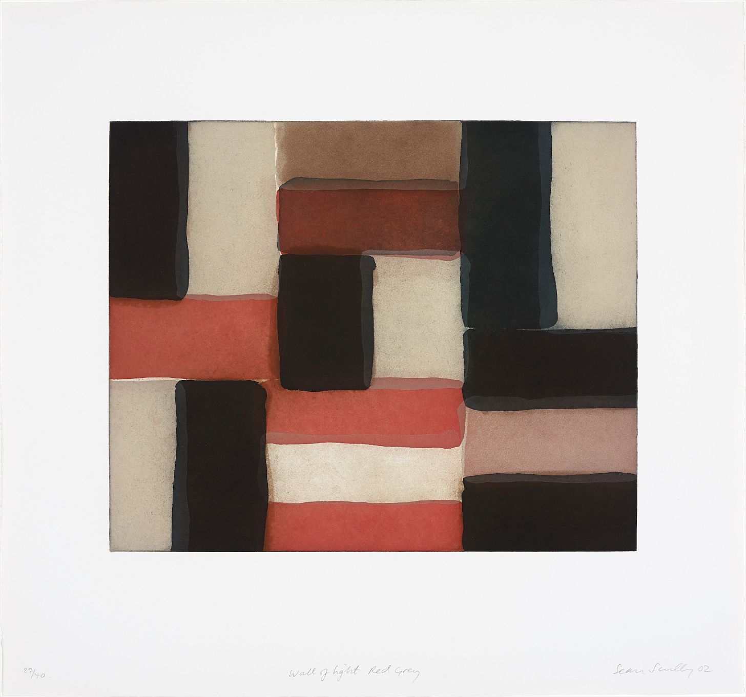
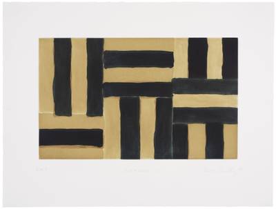
Sean Scully
Wall of Light Red Grey
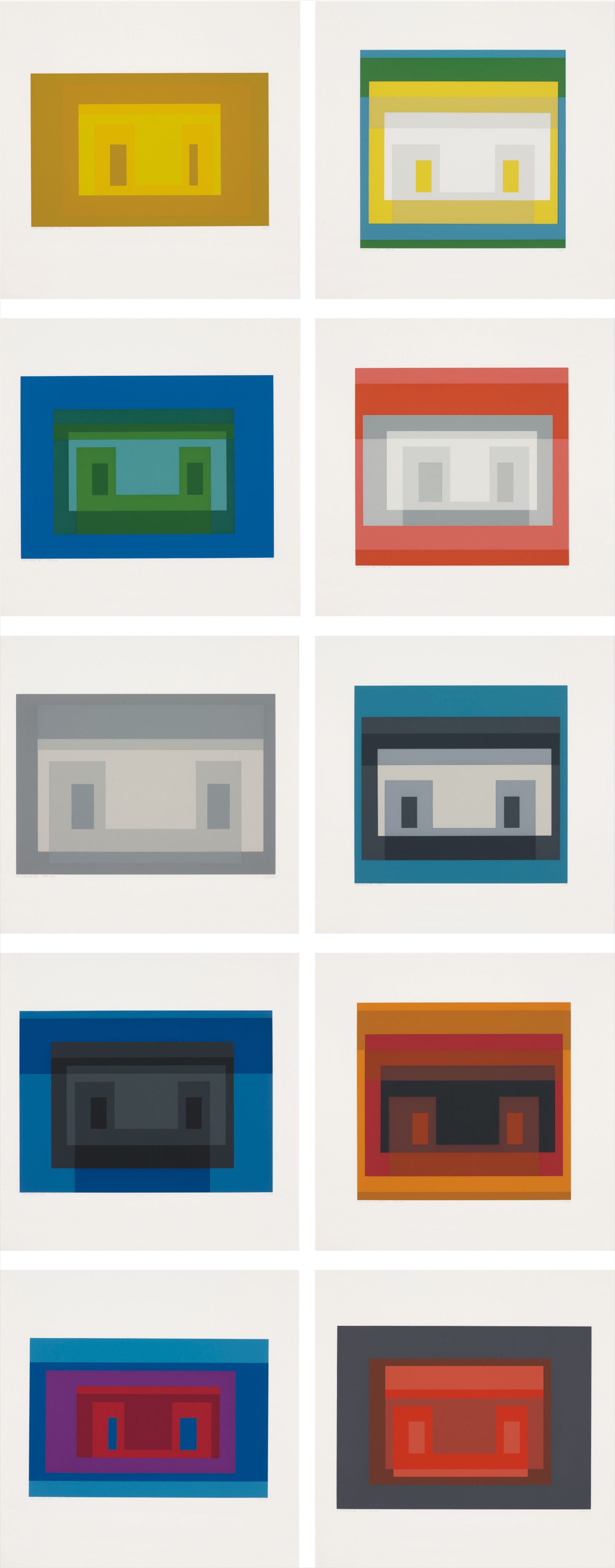
Curators began reading his 1963 text 'Interaction of Color' not as a teaching manual but as a manifesto, one that anticipated everything from digital display technology to the neuroscience of visual processing. Sean Scully occupies a different register in this conversation but an equally important one. Where Albers worked with smooth, silent adjacencies, Scully scores his warm and cool passages into the canvas with a physical insistence that is almost architectural. His retrospective at the National Gallery of Ireland in 2022 drew considerable attention to the way his stripe paintings use the friction between ochres and slate blues, between burnt sienna and chalky grey, to generate something that feels less like composition and more like climate.
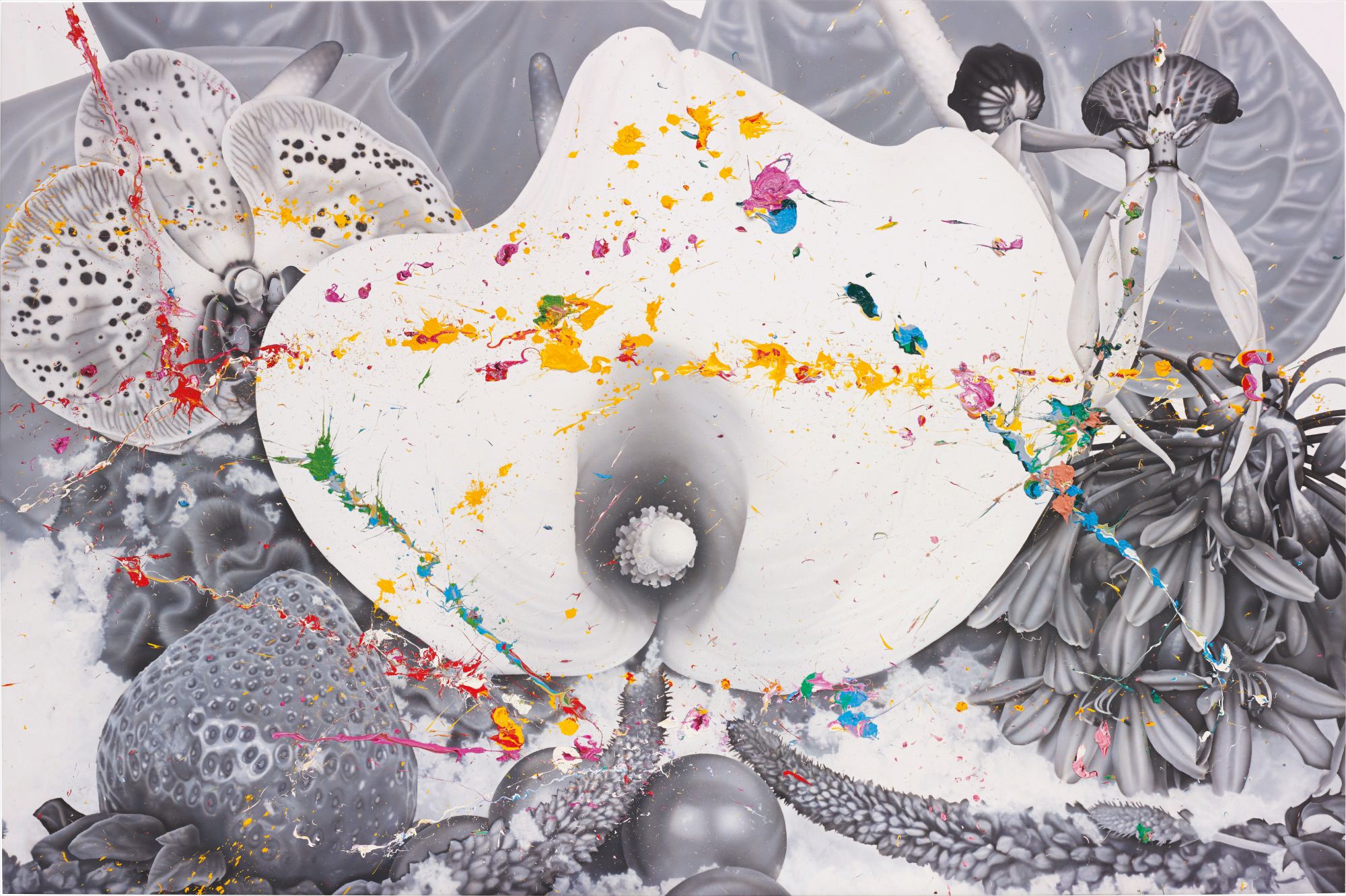
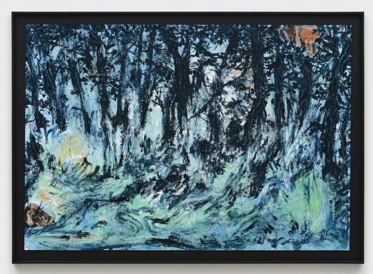
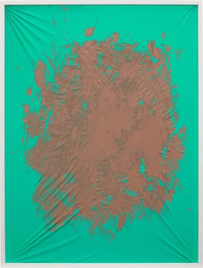
Institutions including the Metropolitan Museum of Art and the Tate hold significant examples of his work, and recent auction results at Christie's have confirmed that serious collectors on both sides of the Atlantic regard him as essential rather than optional. The conversation around warm and cool has also been energized by artists working at quite a different remove from abstraction. Marc Quinn, whose practice ranges across media with restless ambition, has explored color temperature in ways that connect chromatic sensation to the body itself, to biology and desire. Pamela Rosenkranz brings an entirely different set of concerns, using flesh tones and cool synthetic hues to interrogate what color does to a viewer physiologically, what it implies about skin, health, and the politics of the normative body.
Pamela Rosenkranz
Fire and Ice (Plastic Soul)
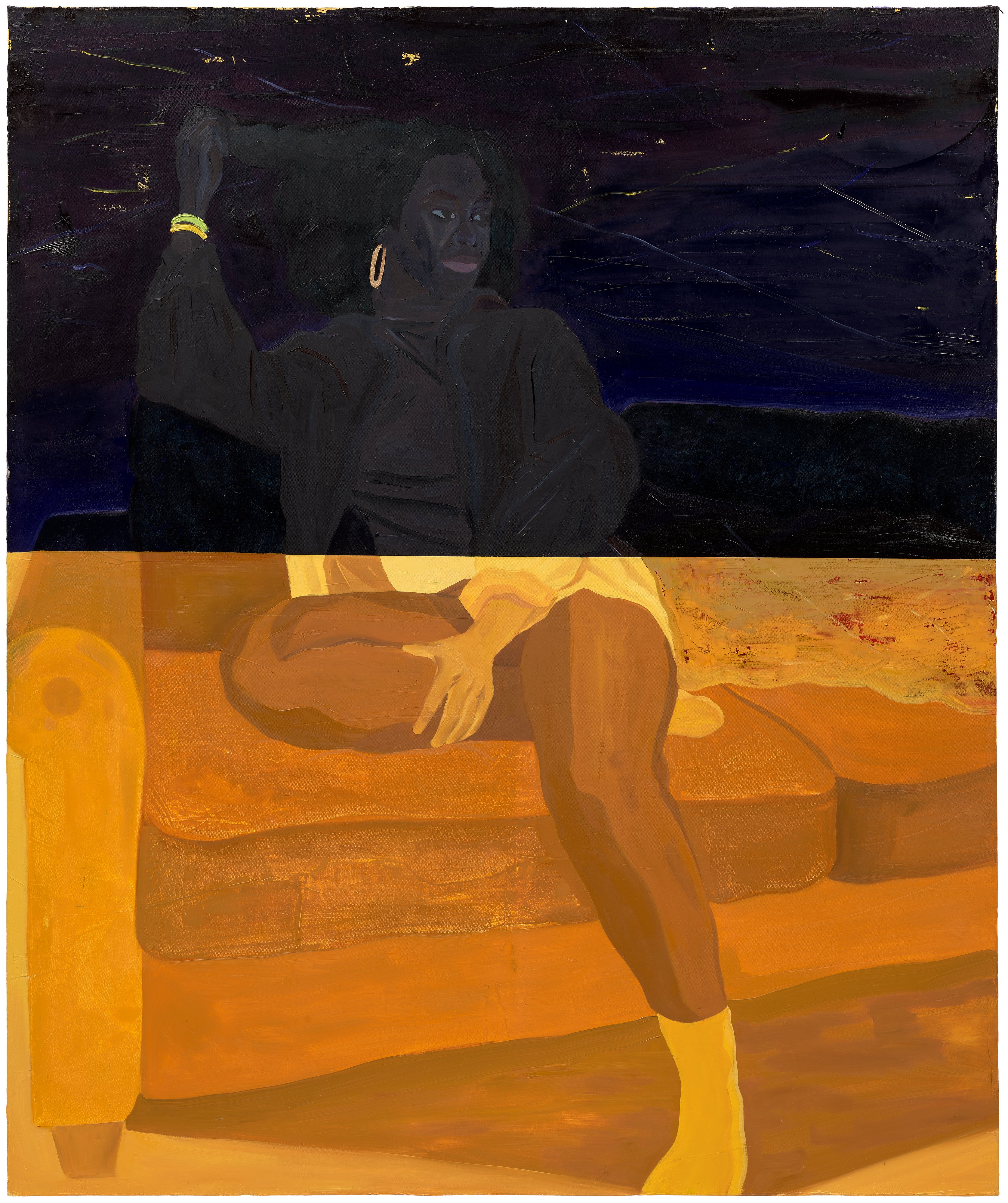
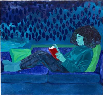
Her inclusion in the Venice Biennale Swiss Pavilion in 2015 was a landmark moment, and her work has since entered collections including the Museum of Modern Art in New York, a signal that institutions are taking chromatic conceptualism seriously as its own critical category. Dominic Chambers represents something of a generational counterpoint to these more established figures. His lush, psychologically complex paintings traffic in warm and cool as emotional registers rather than formal ones, using temperature to suggest memory, interiority, and the specific textures of Black American experience. His rise through the gallery system has been notable, with representation at Lehmann Maupin and strong results at Phillips, where younger collectors have competed for his work with an appetite that suggests real long term conviction.
Le Corbusier, meanwhile, reminds us that this conversation is not confined to canvas. His polychromie architecturale, developed across the 1930s and revised in the 1950s, was an attempt to systematize the emotional effects of warm and cool tones across built space, and the recent renewed scholarly interest in his design practice has brought fresh attention to his color theory as something far more nuanced than his reputation as a functionalist might suggest. The writers and curators shaping this conversation are increasingly drawing connections across disciplines that were once kept separate. Critics including Barry Schwabsky, whose writing in The Nation and in Artforum has long been attentive to the phenomenology of paint, have helped articulate why color temperature matters beyond aesthetics.
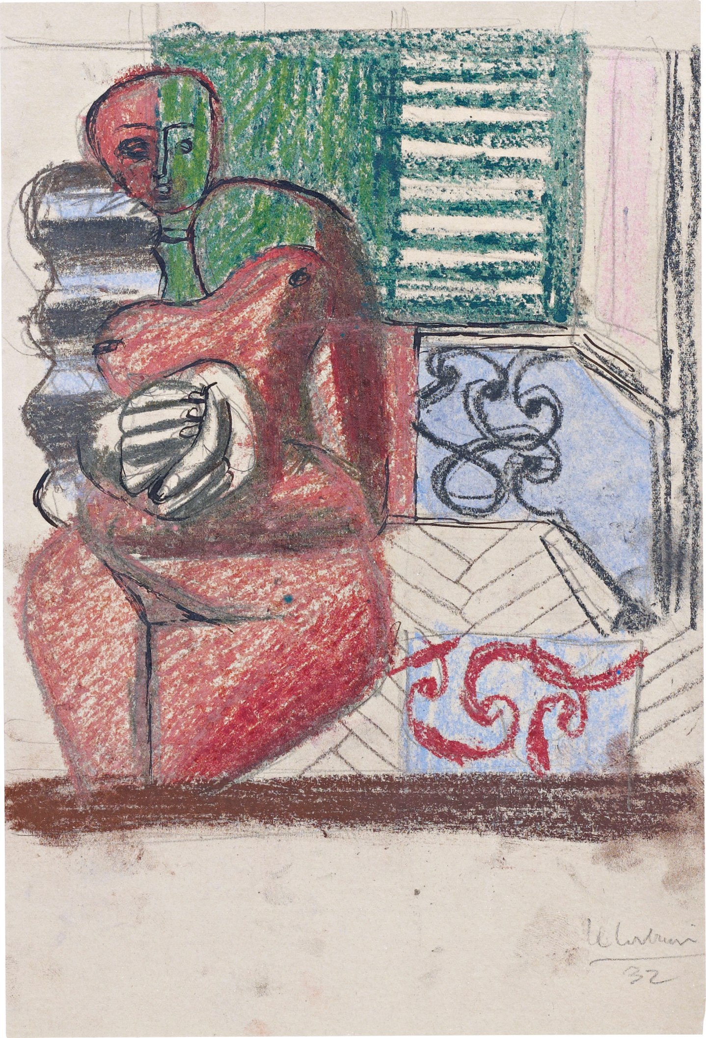
Le Corbusier
Etude de Femme Rouge et Pelote Verte
The philosopher David Batchelor's 2000 book 'Chromophobia' remains a touchstone, arguing that Western culture has historically treated color as suspect, feminized, or foreign, and that to collect chromatic work seriously is in some sense an act of cultural correction. Museum catalogues from the Kunstmuseum Basel and the Centre Pompidou have deepened the scholarly scaffolding, making it easier for collectors to understand what they are actually responding to when a painting feels warm or cool in ways they cannot immediately explain. What feels alive right now is the crossover between these chromatic concerns and a broader market appetite for work that rewards sustained looking. Collectors who built their holdings around conceptual or text based work in the 2010s are increasingly drawn to painting that delivers an immediate sensory experience alongside intellectual substance.
Warm and cool temperature is arguably the most direct route into that experience, because everyone knows it in the body before they know it in the mind. The works on The Collection reflect this range beautifully, from the rigorous geometric investigations of Albers to the more lyrical and politically resonant chromatic languages of younger painters. What they share is a belief that color is not decoration but argument, not atmosphere but content. That belief feels more widely shared now than at any point in recent memory, and the market is reflecting it with conviction.