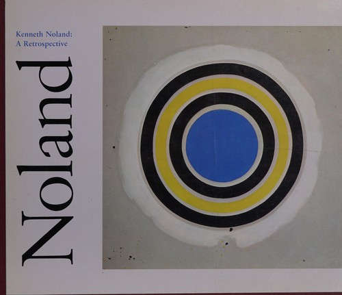
Kenneth Noland
Kenneth Noland: Color Alive and Singing
Artist Spotlight · The Collection Editorial
“Color is my day-long obsession, joy, and torment.”
Kenneth Noland
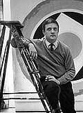
In the spring of 2024, the art world was reminded once again of Kenneth Noland's enduring magnetism when a major survey of postwar American abstraction at the Smithsonian American Art Museum placed his chevron paintings at the very center of the story. Critics and collectors who had grown up with these works found themselves stopped cold, struck by how fresh the canvases looked, how insistently the color demanded something of the eye. This is the particular power of Noland's achievement: paintings made decades ago that refuse to settle into history, that continue to hum and vibrate as though they were completed this morning. Kenneth Noland was born in 1924 in Asheville, North Carolina, a place of extraordinary natural light and mountain color that may have left deeper marks on his imagination than formal accounts of his career tend to acknowledge.
Kenneth Noland
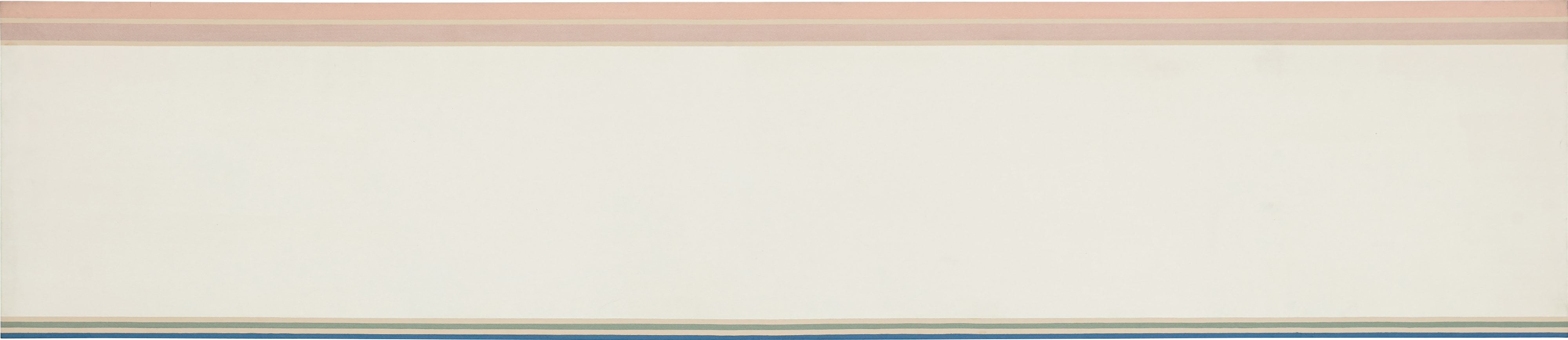
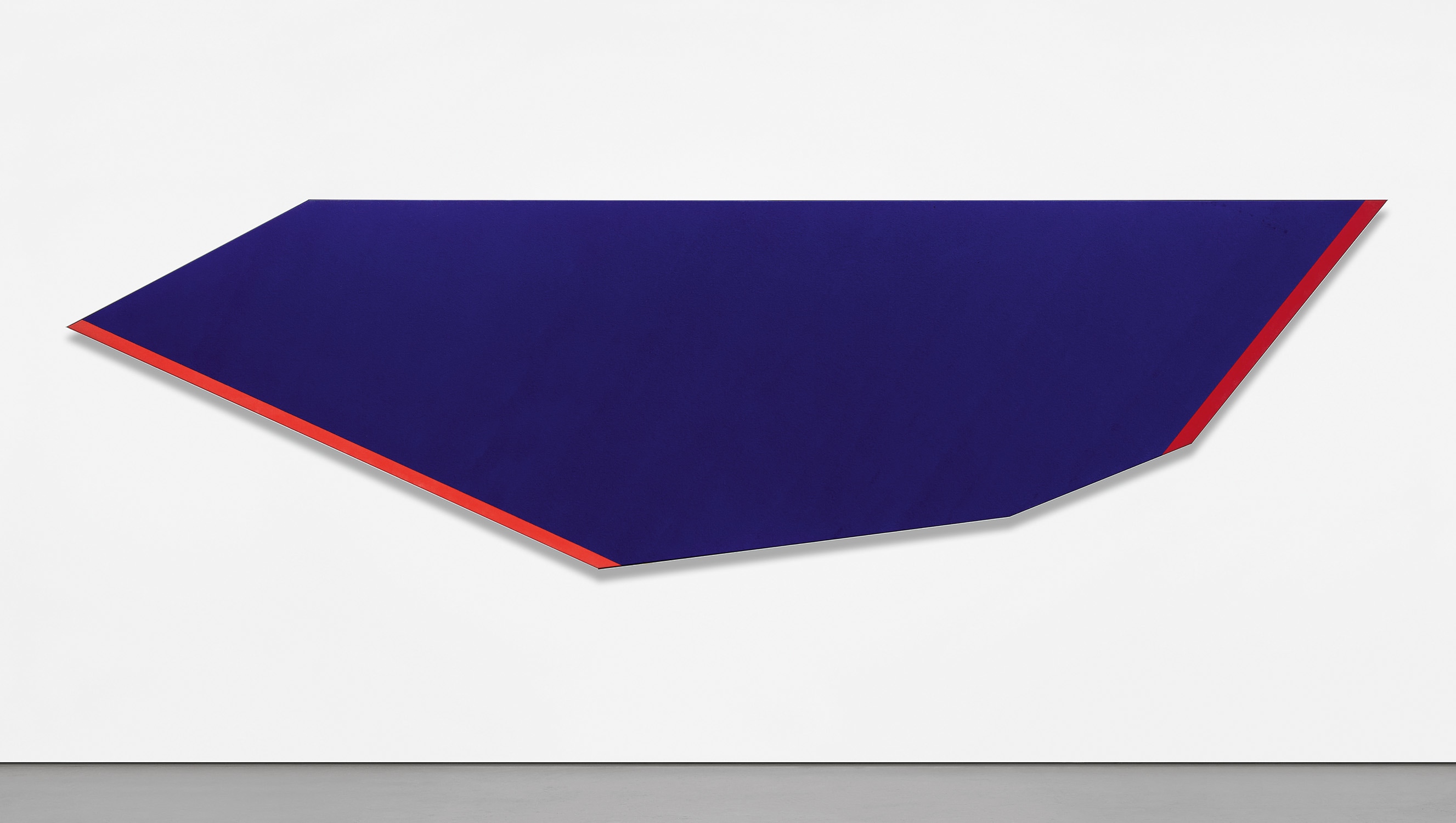
Dawn-Dusk, 1968
He studied at Black Mountain College in the late 1940s, an institution that was, at that moment, one of the most electrically charged places for art and ideas in the entire country. There he encountered Josef Albers, whose rigorous investigations into the interaction of color would prove foundational. A subsequent period studying in Paris brought him into contact with the broader currents of European modernism, but it was his return to Washington, D.C.
and his friendship with the critic Clement Greenberg and the painter Helen Frankenthaler that truly set the trajectory of his life's work. The Washington years brought with them a decisive encounter with Morris Louis, and the two painters became close friends and fierce mutual influences, founding what would come to be known as the Washington Color School. Working in the mid 1950s and into the 1960s, Noland began developing the stained canvas technique that Frankenthaler had pioneered, pouring thinned acrylic paint directly into raw canvas so that color soaked into the weave rather than sitting on the surface. The result was something entirely new: paintings in which color and ground were inseparable, in which the image had no edges in the traditional sense, no figure against a background, only color existing as pure optical fact.
Kenneth Noland
Hot Blue, 1980
Noland's artistic development moved through several distinct and thrilling phases, each of which deepened his central inquiry into what color, freed from representation, could do to a human nervous system. His concentric circle paintings of the late 1950s and early 1960s, often called the target paintings, placed rings of saturated color at the exact center of square canvases, creating a sensation of both expansion and stillness that no one had quite achieved before. Then came the chevrons, those bold V shaped configurations that marched up the canvas with a confidence that was almost architectural. In the late 1960s and into the 1970s he moved toward horizontal stripe paintings on dramatically elongated canvases, some reaching extraordinary widths, works that asked viewers to experience color as something closer to weather or landscape than to a discrete object on a wall.
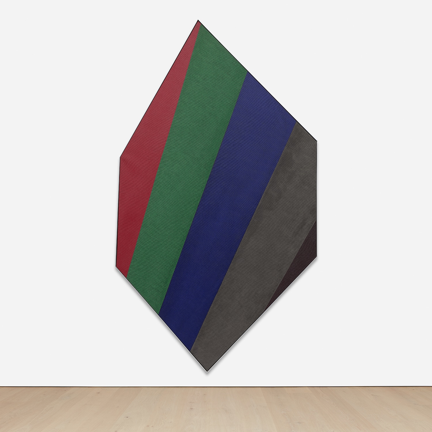
Among the works that best represent his range and ambition, "Dawn Dusk" from 1968 stands as a particularly eloquent example. The painting belongs to his mature stripe period and demonstrates his gift for holding multiple color relationships in suspension at once, each band of color altered by its neighbors in ways that feel almost musical. "Blind Passage" from 1977 shows a later, more austere quality, the palette quieter but the intelligence no less exacting. And works like "Mysteries: To Blue" from 1999 reveal that even late in his career, decades after his initial breakthrough, Noland was still finding new questions to ask of the same fundamental materials: color, canvas, light.
Kenneth Noland
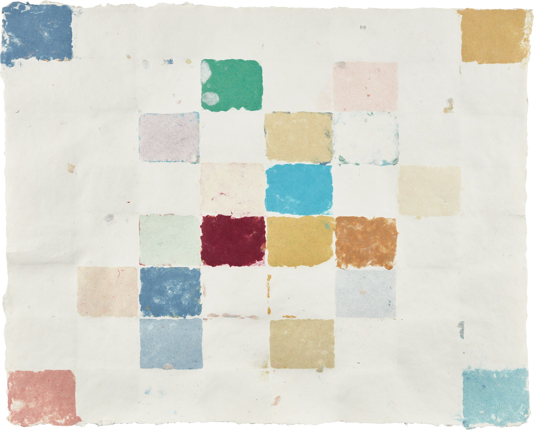
Pk-0036
For collectors, Noland's work presents one of the more compelling opportunities in postwar American art precisely because his reputation, though secure among scholars and curators, has not always commanded the auction fever that surrounds some of his contemporaries. His paintings are held in the permanent collections of the Museum of Modern Art, the Solomon R. Guggenheim Museum, the Hirshhorn Museum and Sculpture Garden, and the Tate in London, among many others, which speaks to the seriousness with which institutions have always regarded him. At auction, strong examples from the chevron and circle periods have drawn consistent interest, and collectors who have made the effort to understand the full arc of his practice often find that the stripe paintings and the shaped canvases of the 1970s and 1980s offer genuine value relative to their art historical significance.
Works on paper, including his monotypes with hand coloring and embossing, offer an especially intimate entry point into his thinking. Noland belongs to a constellation of artists who fundamentally changed the terms of abstract painting in America during the postwar decades. His closest point of comparison is naturally Morris Louis, though the two painters, working from shared premises, arrived at remarkably different emotional registers. Noland's work tends toward the assertive and the clear, while Louis moved toward something more veiled and mysterious.
Kenneth Noland
Blind Passage, 1977
Frank Stella, Jules Olitski, and Larry Poons are also important reference points, each of them engaged in related investigations of color and form. But Noland's particular contribution, the insistence on using format itself as a variable, on letting the shape of the canvas participate actively in the meaning of the color, gave him a distinctive place within that conversation. What makes Kenneth Noland matter today, more than a decade after his death in 2010, is something that can be stated simply: he believed in the emotional and perceptual power of color with a conviction so total that it produced work of genuine revelatory force. At a moment when contemporary painting often seems anxious to justify itself through irony or narrative or cultural reference, his canvases offer a different and quieter argument, that color seen clearly, color understood in its relationships and its resonances, is sufficient.
It is more than sufficient. It is, as his best work demonstrates again and again, a kind of sustenance.
Explore books about Kenneth Noland